Discovery
We make it easy for you to discover new products and connect with brands that make your store stand out. Observed
Brand book
Faire sells to independent shop owners, so the site looks like a well-curated shop rather than software: an editorial serif and linen paper borrowed from print, product and people photography doing the selling, and colour that feels like painted shop walls (maroon, olive, chartreuse, peach) rather than a tech accent. Controls stay quiet and black so the products and owners carry the colour. Our reading

The colour of each band (maroon, olive, chartreuse, peach on home; khaki, sage on about; oat on newsroom) and which photo fills it.
Source: faire.comfaire.com/aboutfaire.com/how-faire-worksfaire.com/news
Our engine's setting, built from their rules.
The real FAIRE SVG top-left, one flat colour (black on light, white on dark), nothing beside it; never retyped.
Heads GT Canon 400 (Literata 400/380/360 at -0.01em), sentence case, never bold; text GT Standard (IBM Plex Sans 450/550 at -0.008em); antialiased smoothing; no third face, no Nantes/Graphik.
Linen #FBF8F6 / white page with at most one flat earthy band at a time (#41252A, #595604, #F1F29F, #FFD0B6, #595540, #91957B, #F6EEE4); ink #161616; no gradients, no coloured buttons or links.
White 48px outline buttons, 4px radius, 1px #DADADA; black filled only in the header; chips 40px full-round with #E4E1DE line, #161616 selected.
Real shop owners or real products in warm natural light, captioned name + town inside the photo; no stock.
Sentence case, "you/your store", statement heads with a period, serial comma, CTAs "Sign up to buy" / "Sign up to sell".
Only Faire’s stated numbers and terms (over 100,000 brands, 70,000 cities, 60 days to pay, free first-order returns) with their source; nothing invented.
The wholesale marketplace that lets independent shops buy from independent brands on terms built for small businesses: curated discovery, low minimums, 60 days to pay and free first-order returns. Our reading
We make it easy for you to discover new products and connect with brands that make your store stand out. Observed
Try new brands in your store, with confidence. Observed
For any retailer, no matter what you sell. Observed
We believe the future is local Observed
Faire works with you during the first 30 days to get you in front of retailers who are a good fit for your products. Observed
Find your next bestseller
We’re Faire. The platform for retailers.
For any retailer, no matter what you sell.
Try new brands in your store, with confidence.
Started in 2017 with a simple vision to level the playing field for small, independent retailers; now modernizing a fragmented, offline wholesale market (paraphrase of the about page).
Customer-obsessed and mission-driven; small businesses’ success is ours (paraphrase).
PublishedHigh urgency, bold action, find a way even after failing (paraphrase).
PublishedHumble and hungry to improve products, craft and standards daily (paraphrase).
PublishedCurious, intellectually honest; let the truth prevail (paraphrase).
PublishedKind, low-ego, candid collaboration for company and community (paraphrase).
PublishedCategory. Online wholesale marketplace / "the global wholesale platform powering independent retail" (its own words). Observed
Faire is the global wholesale platform powering independent retail: an online marketplace where hundreds of thousands of independent brands and retailers discover each other and trade wholesale, founded in 2017 to level the playing field for local shops (paraphrase of the about page and footer; Faire’s press releases carry no fixed boilerplate).
Find your next bestseller Observed
Sign up to unlock wholesale pricing with over 100,000 brands. Observed
We’re Faire. Observed
The platform for retailers. Observed
The global wholesale platform powering independent retail Observed
The best selection of brands for your store, all in one place Observed
Where shops love to shop. Observed
Your one-stop shop for wholesale Observed
Shop wholesale online from over 100,000 brands. Observed
The perfect drinkware for your store, right this way. Observed
We believe the future is local
Your one-stop shop for wholesale
Buy for your shop, pay 60 days later.
Time to grow your wholesale business
Where do I even start to open my first store?
A little reminder to keep going. Your small business matters.
Try new brands in your store, with confidence.
Revolutionize Your Wholesale Sourcing!
60 days to pay, interest free
Flexible payment options
Faire offers flexible payment terms to qualified retail customers.
Buy now, pay invoices 60 days later with zero fees.
Discover products from a wide variety of vendors.
We make it easy for you to discover new products and connect with brands that make your store stand out.
WarmPlainRetailer-firstEncouragingLocal
wholesalebrandsretailersindependent retaillocalyour storebestsellerdiscoveruniquecommunitysmall businesseslow order minimums60 days to payfree returnslevel the playing fieldMain Street
Source: faire.comfaire.com/about




A wordmark and nothing else.




A wordmark and nothing else. FAIRE is set in widely spaced high-contrast serif capitals, one flat colour, top-left in the header and, on the about page, above the footer statement; it is centred at the top of newsroom pages and of every newsroom report graphic. The press kit ships it as SVG, EPS and dark and white PNGs; the app icon is a white serif F on black.
We’re Faire.
We’re Faire.
Near-black on warm linen, with colour arriving one full-bleed band at a time.


Near-black on warm linen, with colour arriving one full-bleed band at a time. On desktop home: linen #FBF8F6 about 46%, peach #FFD0B6 11%, maroon #41252A 10%, white header and footer 9%, the hero video 9%, olive #595604 8%, chartreuse #F1F29F 8%. About adds khaki #595540 and sage #91957B; newsroom closes on oat #F6EEE4. All type is #161616 or white.
Source: faire.comfaire.com/aboutfaire.com/how-faire-worksfaire.com/news
Find your next bestseller
Find your next bestseller
Find Your Next Bestseller
Two Grilli Type faces in Faire’s own cuts, a serif for heads and a grotesk for the rest.
Two Grilli Type faces in Faire’s own cuts, a serif for heads and a grotesk for the rest. GT Canon (a regular-weight contemporary serif) sets every head and GT Standard (a neutral grotesk) everything else. Heads never go bold; the sans uses only 400 and 500. On the site tracking is normal everywhere and nothing is set in caps except the logo; caps appear only as small kickers on social posts and video covers.
| Their face | Use | License | Open stand-in |
|---|---|---|---|
| GT Canon | Every head, 22-52px, regular weight | commercial (Grilli Type); Faire custom cut | Literata Literata 400 at -0.01em matches GT Canon width within 0.2% and ink within 0.3% at 52px, x-height within 0.2%; step to 380 at 32-43px and 360 at 31px and under. |
| GT Standard | Body, nav, buttons, captions, sub-heads (500) | commercial (Grilli Type); Faire custom M-size cut | IBM Plex Sans Plex 450 / 550 at -0.008em match GT Standard 400 / 500 within 1-2% width and 2% ink from 12 to 30px. |
Source: faire.comfaire.com/aboutfaire.com/how-faire-worksfaire.com/news/media
Do The real SVG only, one flat colour (#000000 on light, white on dark), 104px wide in the header and 118px in the footer, with nothing beside it: no symbol, no tagline lockup. On report graphics it sits small and centred above a big GT Canon title.
Letterspaced serif FAIRE wordmark, alone · Header top-left on every page (104x13 at desktop, x 24; phone beside the hamburger), about-page footer above the statement, centred atop newsroom and media pages, top-centre of every newsroom report graphic
Do GT Canon 400 (Literata stand-in) sentence-case heads at 52/64, 38/50, 30/38 or 22/32 with normal tracking, never bold; everything else GT Standard 14-22px (IBM Plex Sans stand-in) with 500 as the only emphasis. One serif size per band.
Regular-weight serif heads over a plain grotesk · Every head on home, about, how-faire-works, newsroom and media
Do Full-bleed flat bands in #41252A, #595604, #F1F29F, #FFD0B6, #595540 or #91957B, each separated by #FBF8F6 linen bands; no two colour bands touch on home. Type on the dark ones is white (plus #F1F29F for the serif head on maroon); on chartreuse and peach it is #161616.
One earthy colour band at a time between linen runs · Home (maroon, olive, chartreuse, peach), about (khaki, sage), how-faire-works (olive CTA), newsroom (oat)
Do Warm, natural-light photos of named owners in their own shops and of real products on tables; full-bleed or in square-cornered blocks; a white GT Standard 14/20 w500 caption (name, role, then city on its own line) sits bottom-left inside the photo with about 24px inset.
Real shop owners and products, captioned name + place · Home hero video, maroon band, chartreuse band, olive band, quote band; about; how-faire-works
Do button_primary: white fill, 1px #DADADA border, 4px radius, 48px tall, padding 0 20px, #161616 GT Standard 14 w400 label (Sign up to buy / Sign up to sell side by side, 16px apart). button_secondary, the header "Sign up to buy", is the one filled #161616 button, 40px tall.
Quiet white outline buttons; black only in the header · Every CTA on home and about; how-faire-works pairs
Do 40px tall full-round pills (radius 40px), padding 0 16px, 1px #E4E1DE border, GT Standard 14/20 #161616; selected = #161616 fill, white label. On the peach band the border is 1px #161616.
Round filter chips with a black selected state · Featured brands category row, Shop by your values row, More to explore row (peach band), how-faire-works topic pills
Specimens use sample copy, not Faire’s.
Quiet controls, loud photos.
Quiet controls, loud photos. White outline buttons with a #DADADA hairline and 4px radius; round chips with a black selected state; 1px rules between accordion rows; small white "Bestseller" badges (GT Standard M 12 w500, 4px radius) on product photos; underlined text links; round carousel arrows. Photos meet text with a small white name-and-town caption inside the image.
Thin line glyphs, no icon system.
Thin line glyphs, no icon system. Interface glyphs are 1.5px-stroke outlines at 16px in #161616 (search, globe, chevrons, arrows, close), with solid 16px social icons and solid 12px rating stars. A handful of 24px line icons (bag, package, phone, book) sit one at a time beside feature copy, and the Insider key is the one coloured icon, in #154548. Faire publishes no spot or feature icon set; the values badges in the newsroom graphic are bespoke illustration.
Source: faire.comfaire.com/insider
Flat, solid-fill people-and-product scenes with no outlines.


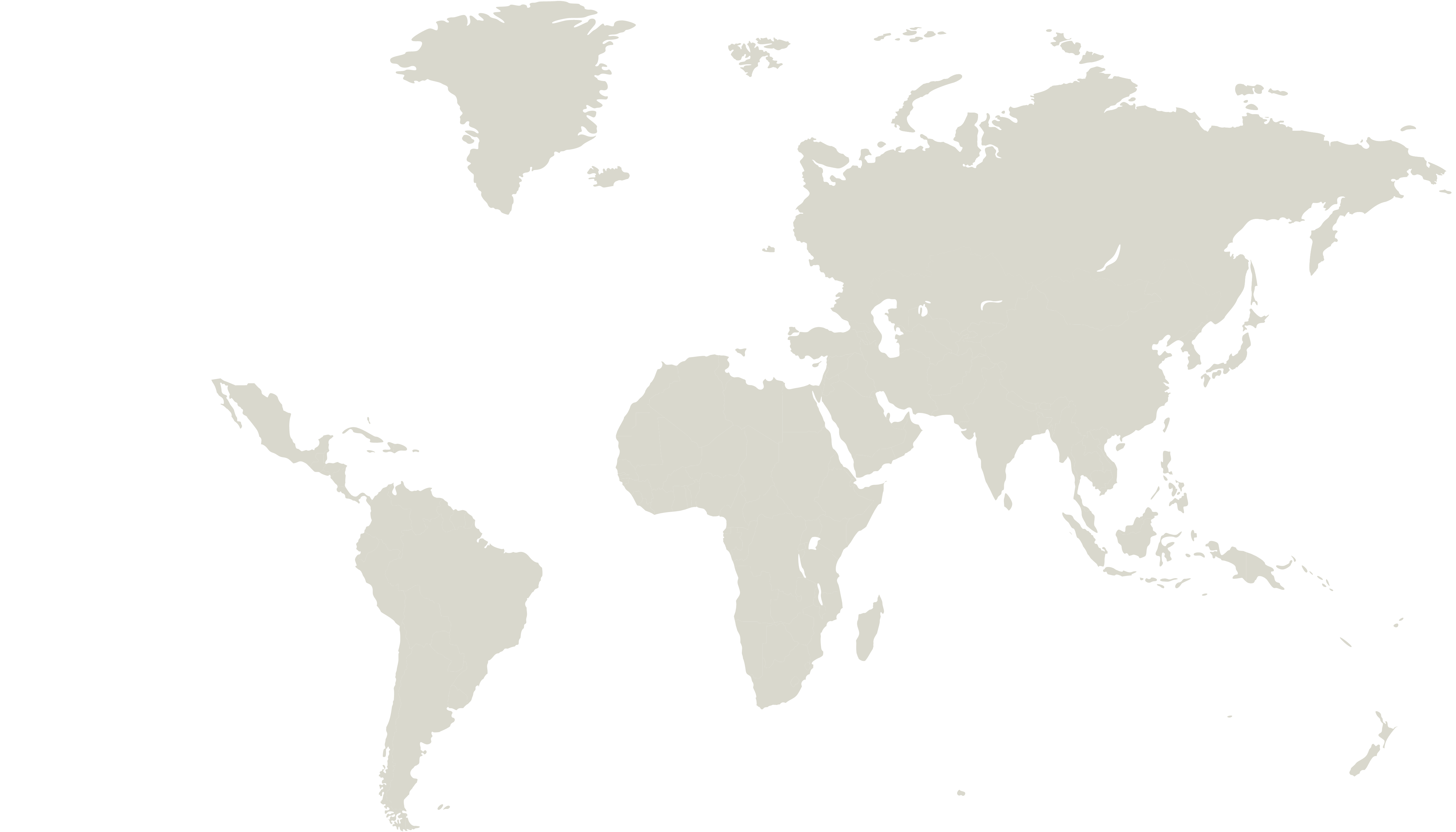


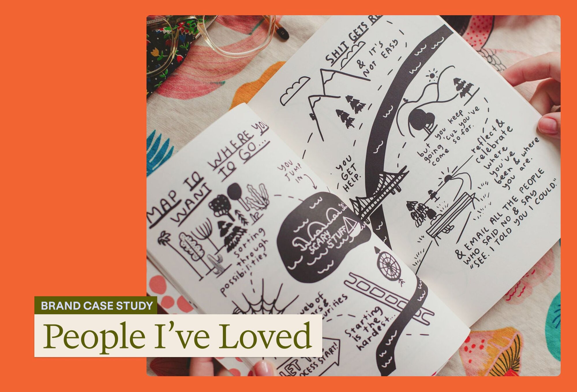

Flat, solid-fill people-and-product scenes with no outlines. The how-it-works set shows a maker in an olive apron with shipping boxes, a shopper at a computer, an owner with jars on a shelf. Palette from the SVG files: deep browns (#4D2110, #521F12, #831E12), terracotta (#C47348, #D16B51), olive (#545620, #303204), chartreuse (#F5FBAB, #BEBB3D), lilac labels (#EFC7FA), cream (#E6DED2, #F8F4E6) and one bright red-orange sparkle (#EF4A2E / #FD4201). The about page uses a flat two-tone world map; the newsroom core-values graphic uses round outlined sticker badges in coral, cream, sage, chartreuse and periwinkle. Faire Markets pages add loose orange and salmon cut-out shapes (starburst, stacked totem, arch), and blog cards use collage and hand-drawn notebook art on a flat band colour.
Source: faire.com/how-faire-worksfaire.com/aboutfaire.com/newsfaire.com/marketsfaire.com/blog
Real independent shops and the people who run them, plus real products in warm light.
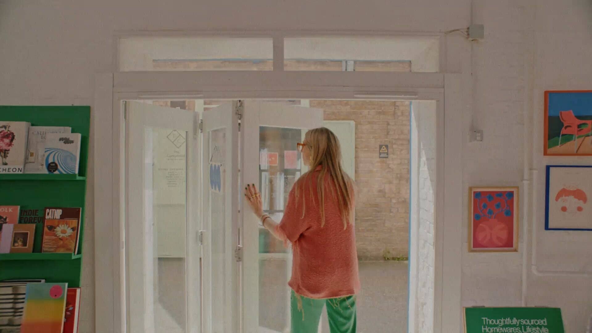

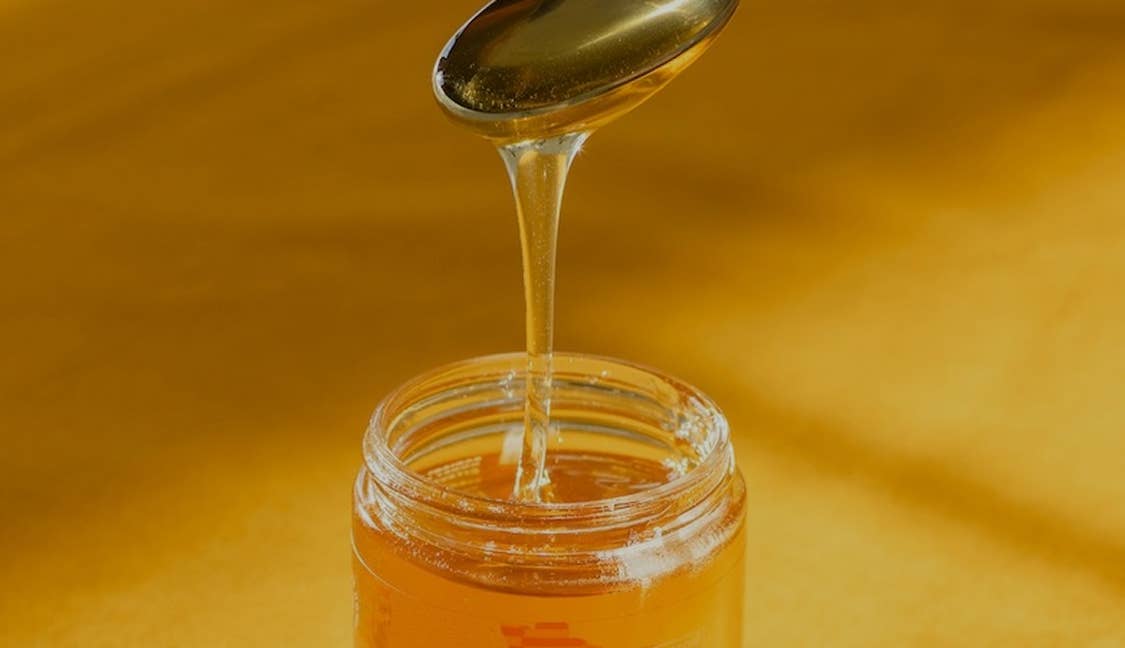




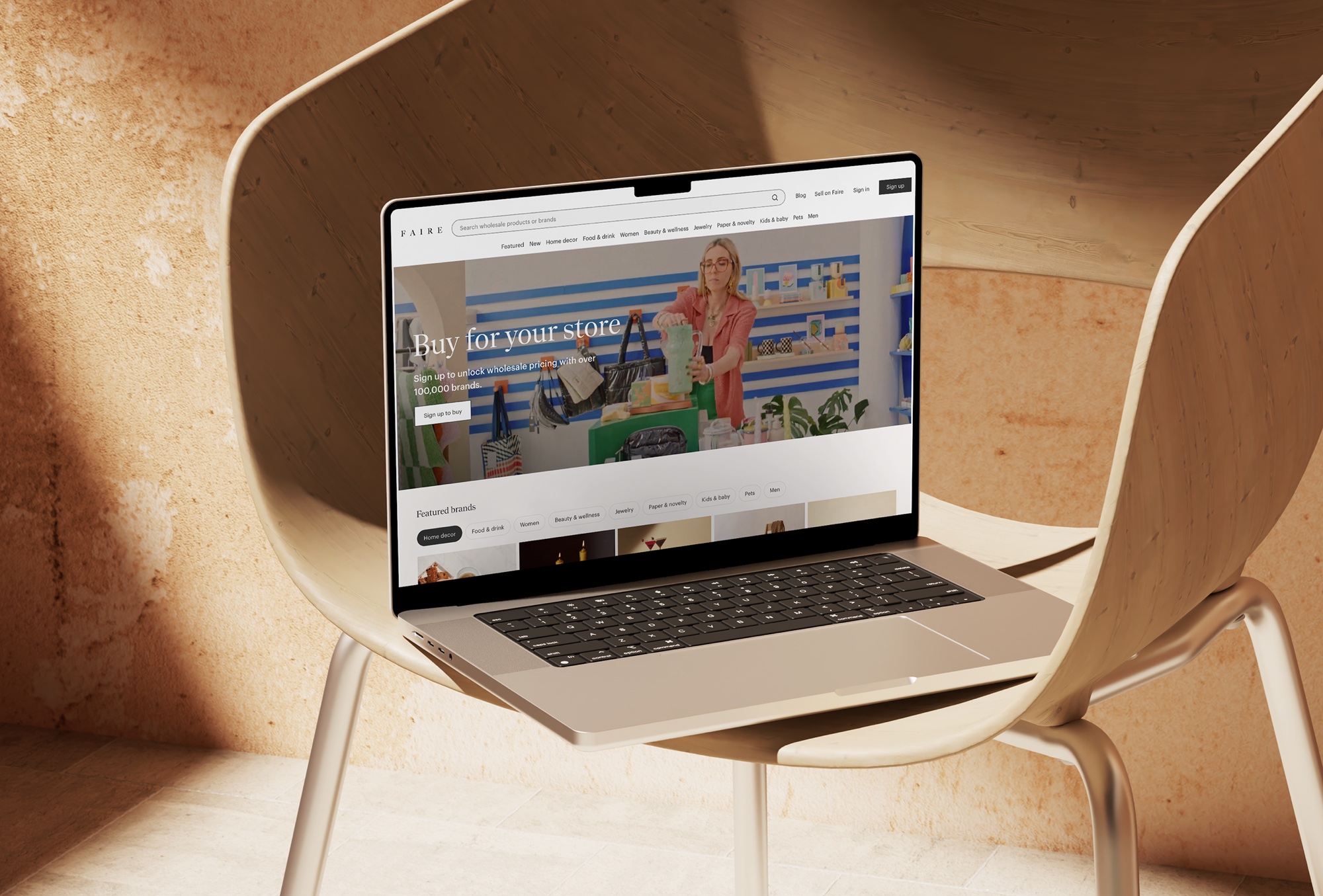

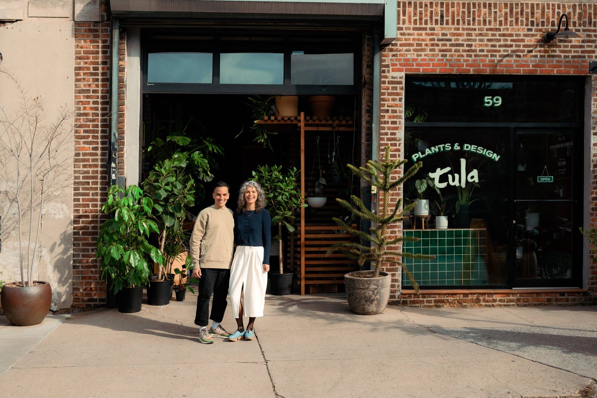
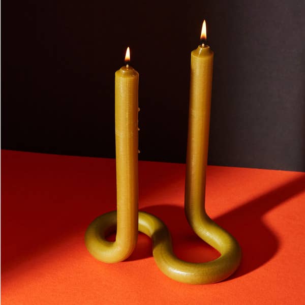
Real independent shops and the people who run them, plus real products in warm light. Owners stand in their doorways or among their shelves (Tula House, Dotter), products sit on tables in raking sunlight with deep shadows (glasses, honey, a belt on corduroy), and the hero video walks through real stores. Colour is natural and warm, slightly golden; crops are wide for scenes and square for products. Photos run full-bleed or in square-cornered blocks; captions sit inside the photo bottom-left in small white type. Press kit product shots put the Faire site on a laptop or phone in a warm, sunlit room; exec portraits are seated against beige curtains.
Full-width bands with 48px side margins at 1440 (16px on phone) and a 1344px content width; home bands carry 48px vertical padding. Heads sit left at the top of each band with a carousel or grid below; colour bands split 50/50 text and photo; the olive band centres a short head between two photo stacks; the closing peach band centres a big rotating head among floating photos. Footer: white, statement head at left, two link columns and social icons at right, legal line below a #E4E1DE rule.
Measured from faire.com's headless Chromium computed styles and bounding boxes at 1440x900 and 390x844 after a full scroll, overlays hidden, pinned to the GT Canon + GT Standard arm on 2026-11-17; every y is page y at that width.
| Measure | Desktop | Phone |
|---|---|---|
| Page margin | 48px | 16px |
| Section padding | 48px | 24px |
| Hero text width | max 622px, centered | full width |
| Card gap | 16px | 16px |
| Navigation | 108px | 108px |
Hero H1 and the peach closing head, GT Canon 52/64 white on video (phone 30/38); closing head 52/64 desktop, 38/50 phone
GT Canon · 52px (phone 30) · line 1.2308 · weight 400
Coloured-band head: "We’re Faire." (#F1F29F on maroon), olive and chartreuse heads, 38/50 (phone 30/38)
GT Canon · 38px (phone 30) · line 1.3158 · weight 400
Footer statement, GT Canon 38/50 in 3 lines at 420px (phone 22/32)
GT Canon · 38px (phone 22) · line 1.3158 · weight 400
Section title on linen ("Featured brands", "Bestsellers you might like", "Shop by your values", "Grow your retail business with Faire"), 30/38 (phone 22/32)
GT Canon · 30px (phone 22) · line 1.2667 · weight 400
"Explore categories" head and category tile labels, GT Canon 22/32 (phone: head 22/32, tile labels GT Standard 14/20 w400)
GT Canon · 22px · line 1.4545 · weight 400
"The platform for retailers." GT Standard 30/38 w400 white under the maroon head (phone 22/32 w500)
GT Standard · 30px (phone 22) · line 1.2667 · weight 400
Hero sub and maroon right-column lead, GT Standard 22/32 w500 white (phone 14/20 w500)
GT Standard · 22px (phone 14) · line 1.4545 · weight 500
Values quote and brand name, GT Standard 18/26 w500 (phone same); price 18/26 w500
GT Standard · 18px · line 1.4444 · weight 500
Chartreuse benefit rows: title w500 then body w400, 18/26 (phone 14/20)
GT Standard · 18px (phone 14) · line 1.4444 · weight 400
Body, nav, buttons, chips, card copy, captions, footer links: GT Standard 14/20 w400 (w500 for brand names, footer column heads, photo captions)
GT Standard · 14px · line 1.4286 · weight 400
"GT Standard M" 12/16: Bestseller badge (w500), Unlock wholesale price card button (w400), phone photo captions (w500)
GT Standard · 12px · line 1.3333 · weight 400
How Faire’s own landing pages are built, observed on faire.com, 2026-11-17. The full measurements are in spec.md.
Source: faire.comfaire.com/aboutfaire.com/how-faire-worksfaire.com/news
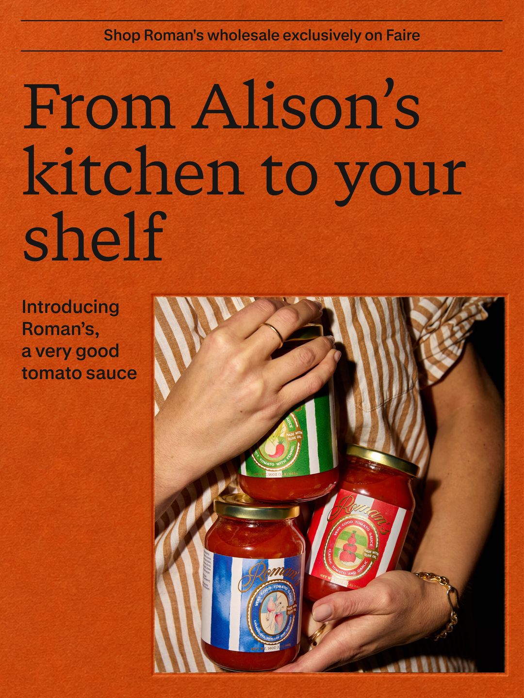
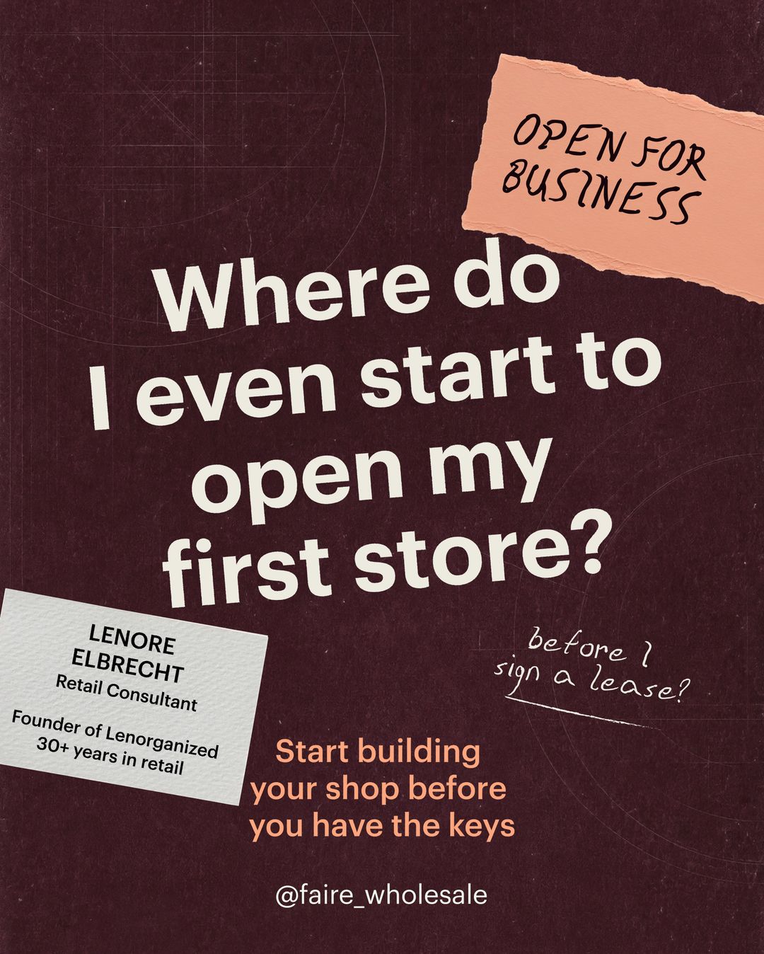
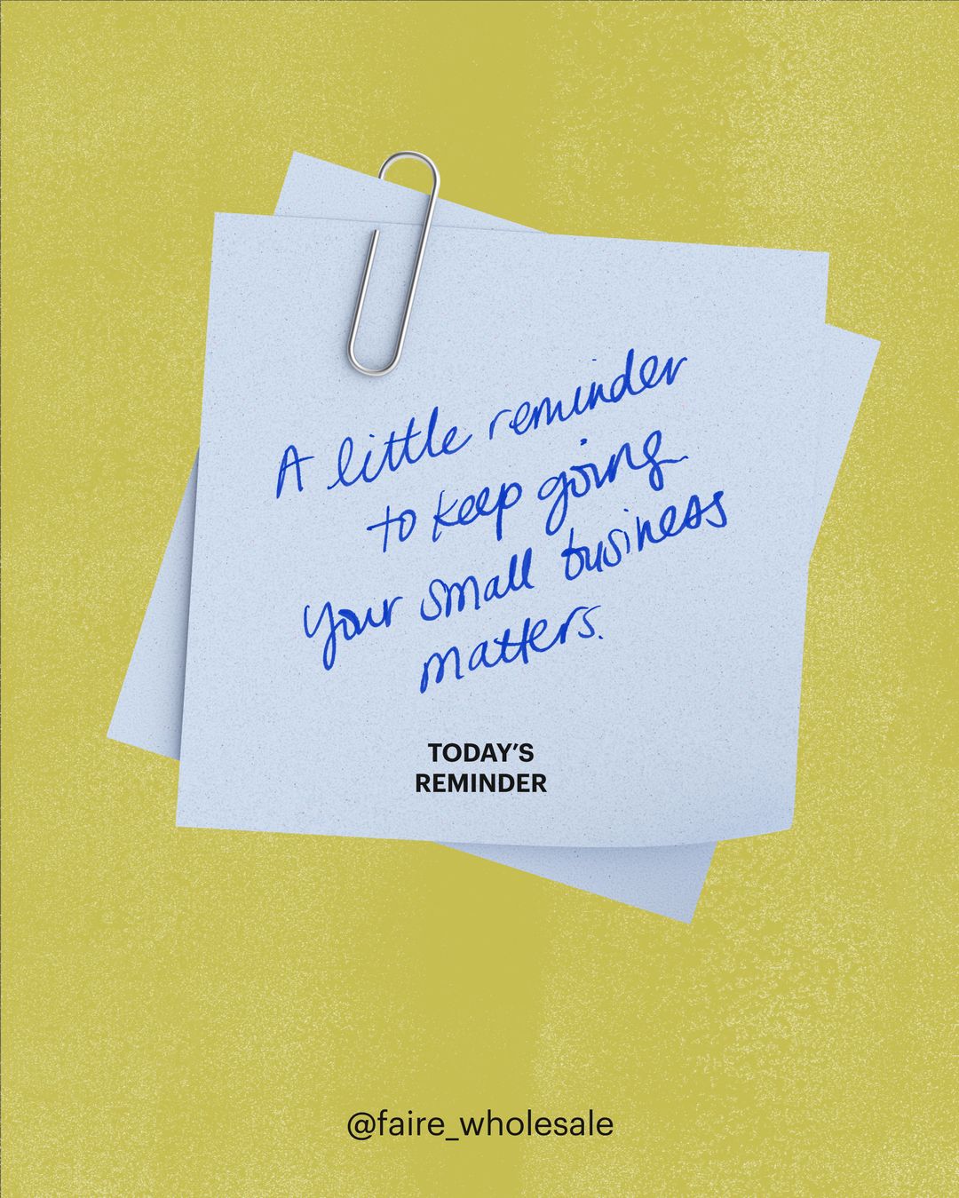



It speaks before the sale, in the reader’s own question, and keeps the brand marks small: a maroon card, a torn paper label, a real person’s name. Our reading
How the system carries from faire.com into ads, social, video covers and the app stores, observed on Faire’s own channels between September and November 2026. Paid and social pieces loosen the site: heavier sans heads, hand lettering and paper props appear there and nowhere on faire.com.
| Format | What they did | Source |
|---|---|---|
| Website | Linen page, one earthy band at a time, GT Canon heads, white outline buttons, captioned owner photos | faire.com |
| Newsroom report graphic | Flat pale chartreuse, centred wordmark, big GT Canon title, GT Standard subline | faire.com/news |
| Instagram post | One flat ground or one real photo, one headline, @faire_wholesale bottom-centre | instagram.com/faire_wholesale/p/Dezr2o9DzpJ |
| Instagram series | Open for Business: hand-lettered title, episode and guest line, maroon feed card | instagram.com/faire_wholesale/p/DePJJ1uGwml |
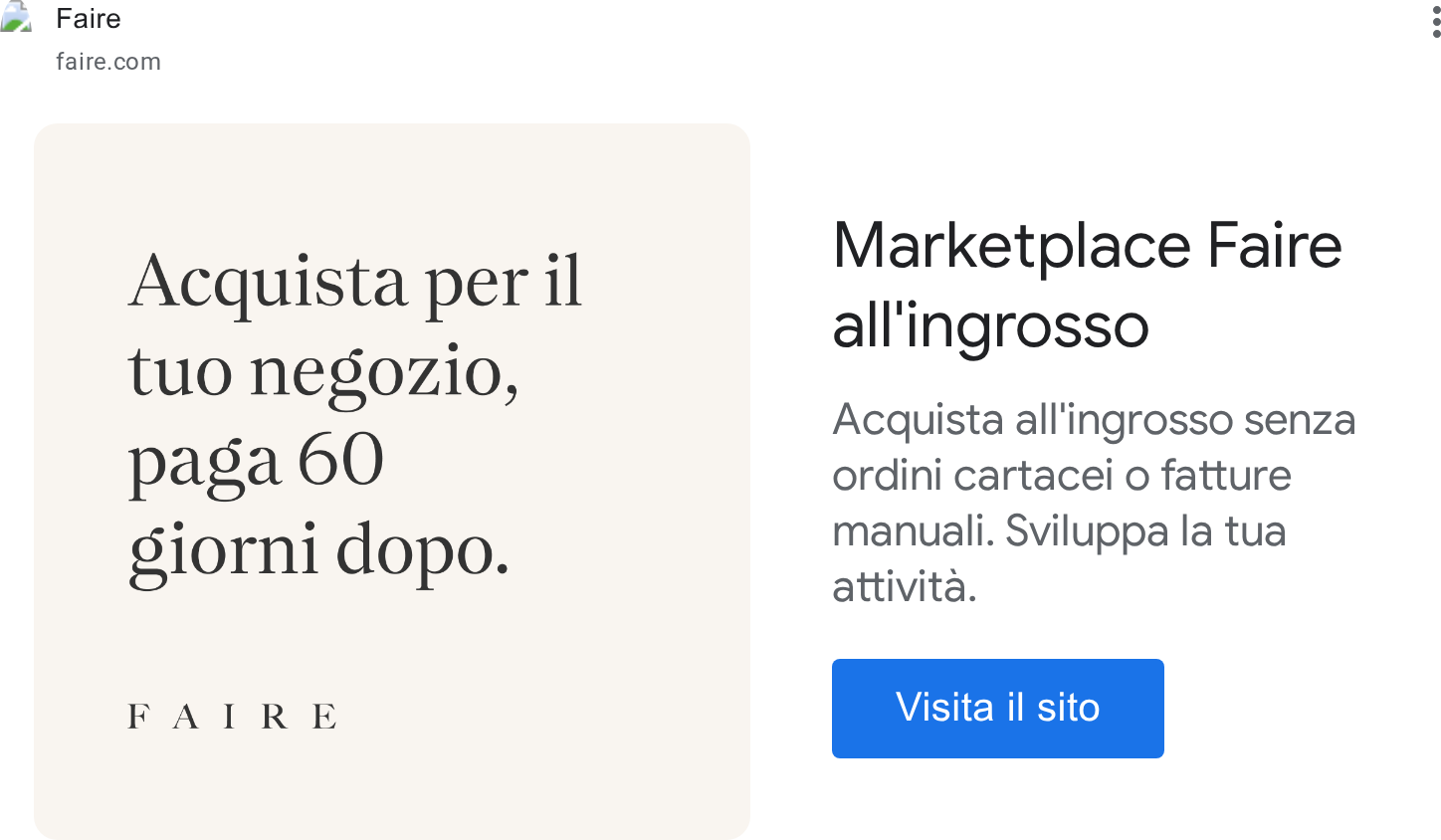
| Display ad | Square tiles in band colours or photo strips, wordmark small | adstransparency.google.com/advertiser/AR10848209154783313921/creative/CR17870242158439563265 |
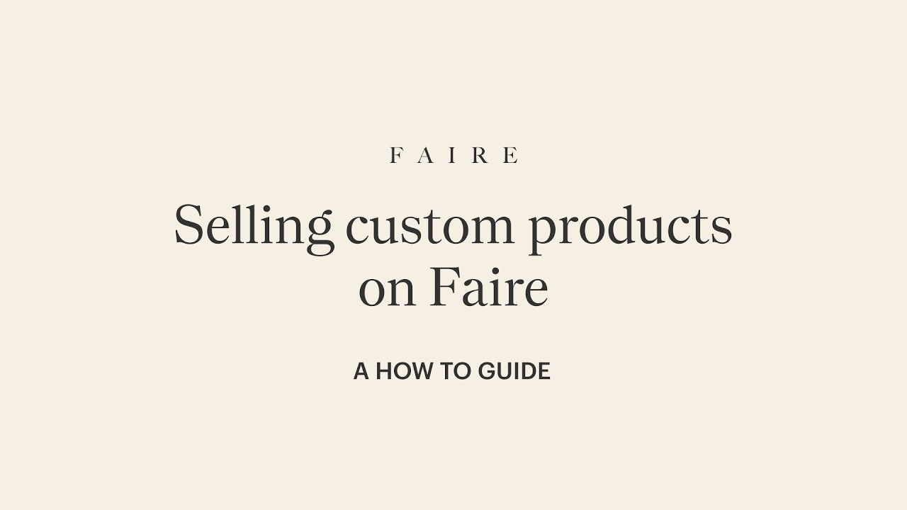
| Video cover | Flat maroon, olive or linen ground, centred wordmark, serif or sans title | youtube.com/watch |
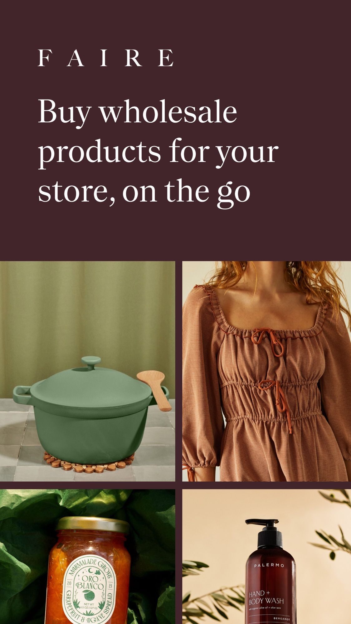
| App Store | Maroon (retailer app) or olive (brand app) screens, serif caption over product or UI | apps.apple.com/us/app/faire-wholesale/id1413340491 |
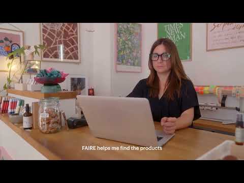
| Paid social video | Owner footage shot like a phone video, one plain caption line, offer kept off the picture | facebook.com/ads/library |
| Format | Loudness | Must appear | What varies |
|---|---|---|---|
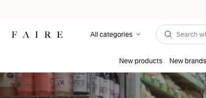
| Landing page | #FBF8F6 linen announcement bar (GT Standard 14, underlined Sign up) over a white two-row header: spaced FAIRE wordmark left, All categories, rounded search field, EN-US, Blog, Sign up to sell, Sign in and a black 4px Sign up to buy at right, category links centred below. Hero: full-bleed photo or video of a real shop, a white GT Canon 52/64 head left, a 22/32 GT Standard 500 sub, one white outline button and an underlined secondary link. Then linen bands with GT Canon 30/38 titles over 6-up product or brand grids and round chips; one flat colour band at a time (maroon with a #F1F29F serif head and a full-width captioned owner photo; olive with a centred head between photo stacks; chartreuse benefits split with a captioned owner photo); a blog row; a peach closing band with a centred 52px rotating head; white footer with a GT Canon statement, outline button pair, two link columns and social icons. | ||
| Social post, portrait | One flat earth-tone ground or one real photo filling the canvas; one headline; the @faire_wholesale handle bottom-centre; real products, real hands or real paper notes | Headline face: GT Canon serif for product and brand launches (Roman’s), a heavy grotesque sans (Graphik-like semibold, our reading; stand-in IBM Plex Sans 600) on taped paper strips or on dark grounds for advice posts; handwritten marker notes on paper as a third voice | |
| Social post | One flat paper-textured earth-tone ground (orange #CC470E in the launch); a one-line sans kicker between two thin rules; a 3-line left-aligned GT Canon headline across the full width; a narrow left column of sans copy beside one real product photo at the bottom right. | Ground: orange #CC470E (launch); the same grain on maroon #42252A, olive #595604 or chartreuse #C6BF57 on other posts. Aspect 3:4 (1080x1440) for the launch, 4:5 (1080x1350) for the rest of the feed. The left column is 3 to 4 short lines (“Introducing ...”). The photo shows the product held or placed by hand. | |
| Paid display ad tile | A flat tile in one band colour with the small letter-spaced FAIRE wordmark and one short serif or sans line, or one photo with a rotated paper sticker. The headline, description and blue button around the tile are Google’s. | Four families: linen with a serif head only; chartreuse band over a product flat-lay; taupe band with a white serif head between photo strips; cream brand-seller tile with a caps kicker and an orange oval sticker. The landscape image is a full-bleed photo with the white wordmark centred. | |
| Paid social video ad | Real shop footage shot like a phone video of an owner in their store, one plain sans caption line, and the offer in the ad’s headline and button, not on the picture. | Caption left-aligned in white with a soft shadow (English cut) or centred in white on a maroon pill (French cut); the other format is a dark iOS Notes screen with a Faire notification card. | |
| Video thumbnail: insight series | A flat colour ground with the small spaced FAIRE wordmark, one big centred headline and one small line under it; webinars swap the centre for a left headline and tilted portrait polaroids. | Ground rotates by series: maroon #492A30 and olive #575518 for insight videos, linen #F6F0E4 with a serif head for how-to guides, green grid paper for the trend forecast webinar. Webinar thumbnails carry two taped polaroids with name captions. | |
| Instagram series cover: Open for Business | Hand-lettered white OPEN FOR BUSINESS title, one sans line with episode, guest and date, and a white line-drawn storefront over tinted footage; the feed card version is a maroon card with a torn peach paper label carrying the same title. | Episode footage and the paint-chip or tape props change each cover; the feed card adds a guest business card and a guide offer. | |
| App Store screenshot | A flat maroon (retailer app) or olive (brand app) screen with a short serif caption at the top-left in cream and one piece of product or UI below it. | The first screen carries the spaced FAIRE wordmark and a photo grid or a notification card; later screens put a cropped phone UI with greyed placeholder lines in the lower 70%. |
Source: faire.comfaire.com/aboutfaire.com/how-faire-worksfaire.com/newsfaire.com/news/media
Your name and logo, Faire’s system.
Talk about my brand Use this brand in Claude
Get your brand audit Put your brand in Claude What goes in a brand book
Each value is marked published, observed, our reading or our recipe, with its source. Checked 2026-11-17. Not affiliated with Faire.
Tell us what you want to make. We’ll talk through how to put these ideas to work for your brand.