Housing
Automate the entire resident journey, from finding an apartment to all that comes after. Observed
Brand book
It borrows the frontier-AI-lab look (dark, glowing, light type) to say 'serious AI company', then softens it with warm grounds and real people because its buyers are housing and healthcare operators, not developers. Our reading

Ground temperature by audience and page era: black+deep purple on home, warm white #FDFCFB with IBM Plex Mono eyebrows on 2026 company pages, sky-blue gradient on healthcare.
Our engine's setting, built from their rules.
#7638FA appears only on the CTA, links and eyebrows; no second accent.
Heads are Inter Tight 450 (or InterVariable 400), Title Case, never bold.
Each section head carries an uppercase eyebrow above it.
4px radius, 46px tall, 10px 16px padding, Inter 16 w450; solid violet, solid white, or 1px outline.
Color moods come from soft blue-violet gradient images, not flat saturated fills.
Copy names housing and healthcare together where both apply; numbers come only from the site's stated proof points.
Wordmark only, single color matching nav text; never recolored violet.
AI automation for housing and healthcare operators that streamlines communication and operations. Observed
Automate the entire resident journey, from finding an apartment to all that comes after. Observed
Put administrative work on autopilot so practices can focus on patient care. Observed
Multiple Channels, One AI Assistant Observed
Everything You Need In One CRM Observed
AI That Improves How We Live
Multiple Channels, One AI Assistant
Smarter Operations, Powered by AI
Simplify Your Practice, Elevate Patient Care
Housing and healthcare take a large share of household income yet resisted technology as too regulated and labor-intensive; EliseAI says it was first to bring AI to housing and is rebuilding these systems (paraphrase).
Category. Agentic / conversational AI platform for property management and healthcare Observed
EliseAI is the industry-leading AI platform transforming both property management and healthcare through automation and conversational AI that help housing and healthcare organizations streamline communications and improve operational efficiency.
AI That Improves How We Live Observed
Driving the Future of Property Management and Healthcare with AI Observed
Automation AI that helps housing and healthcare organizations streamline communications and improve operational efficiency. Observed
Improve Life's Most Critical Areas Through AI Automation Observed
Always-On Automation for Centralized Operations Observed
Simplify Your Practice, Elevate Patient Care Observed
No Passengers. Only Crew. Observed
The One Agent for Your Whole Team
The 2026 Centralization Playbook is Here
AI in U.S. Multifamily
What does Apollo do for you?
AI That Improves How We Live
AI that improves how we live.
Multiple Channels, One AI Assistant
The Ultimate Omnichannel AI Experience
housing and healthcare organizations
real estate companies
Elise is a cutting-edge LLM platform for real estate.
Automation AI that helps housing and healthcare organizations streamline communications and improve operational efficiency.
confidentbenefit-ledplainspoken enterpriseoptimistic
housinghealthcareresidentspatientsoperatorsautomationagentic AIcentralizationresident journey
Source: eliseai.comeliseai.com/about-useliseai.com/platform-overvieweliseai.com/careers
Source: eliseai.comeliseai.com/about-ushealth.eliseai.comfacebook.com/ads/library


One wordmark in one color per ground. The violet e disc is the app icon only; the site serves it as a blurry raster.
One wordmark, always the nav's color.



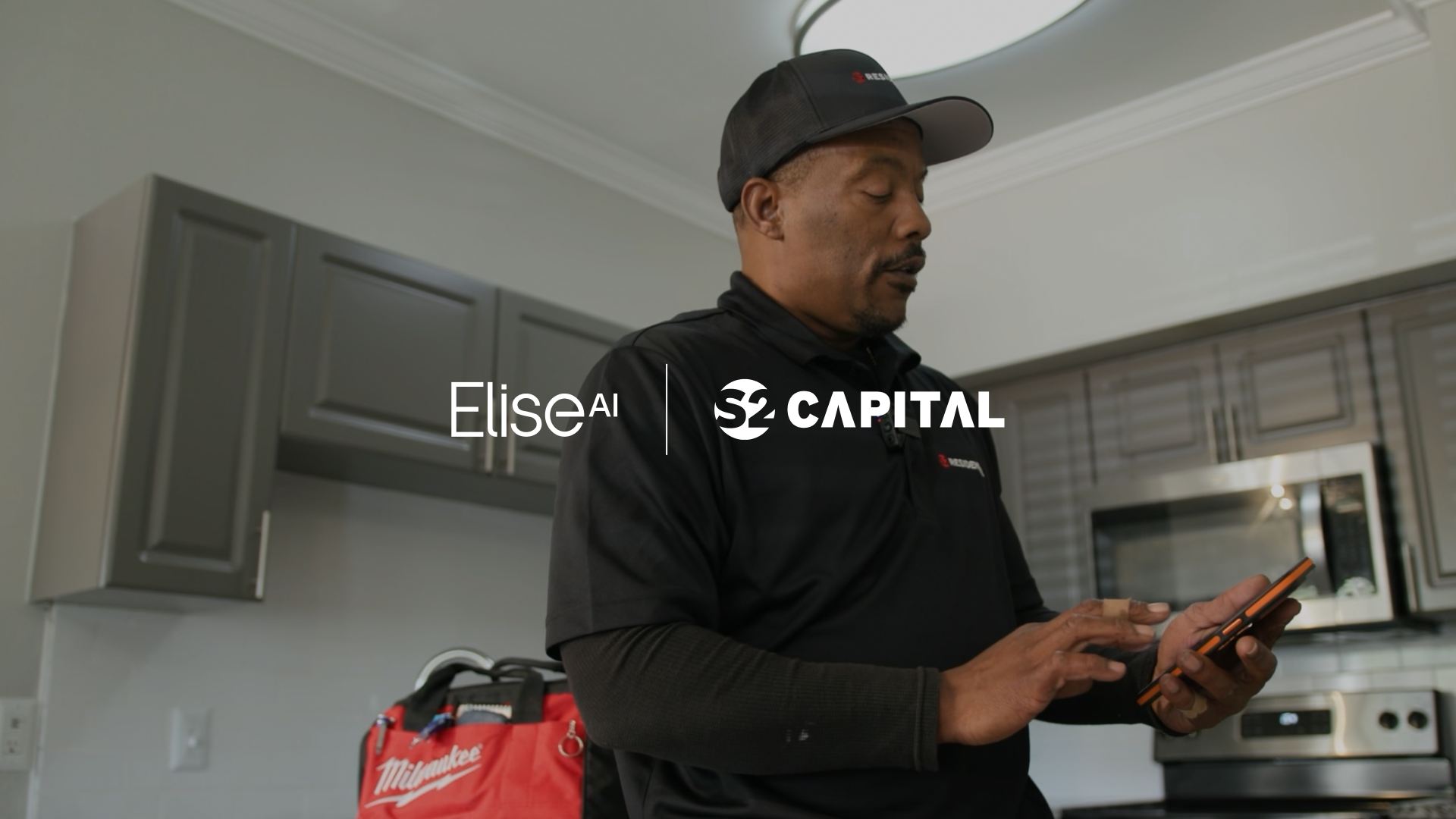

One wordmark, always the nav's color. A thin monoline 'Elise' with a superscript 'AI' sits 61x20 at the nav's left edge (56px in at 1440, 24px on phone), #FAFAFB on dark and #0E0D0C on light. In partner news it pairs with the partner's logo, split by a thin vertical rule, both in white.
Source: eliseai.comeliseai.com/customer-storieseliseai.com/blogyoutube.com/watch
Neutrals carry the page; one violet asks for the demo.
Neutrals carry the page; one violet asks for the demo. White, warm white #FDFCFB and #FAFAFB grounds alternate with black #000000 and deep purple #0F042D bands, and ink #0E0D0C and body gray #515152 carry the type. #7638FA is the only saturated UI color, kept to the demo button, buttons, eyebrows and links; mood comes from gradient images (indigo to periwinkle to blue, pale lavender washes), never flat color fills.
Source: eliseai.comeliseai.com/about-useliseai.com/customer-storieshealth.eliseai.com
AI That Improves How We Live
Light Inter, Title Case, tight leading.
Light Inter, Title Case, tight leading. Inter Tight 450 sets every head (72 hero, 60 section, 48 quote, 30 card), Inter 400 sets body at 18/27 and 450 sets buttons; the 2026 company pages move heads to InterVariable 400 at -0.03em and eyebrows to IBM Plex Mono 500 uppercase.
| Their face | Use | License | Open stand-in |
|---|---|---|---|
| Inter Tight | Every head at weight 450 (72 hero, 60 section, 48 quote, 30 card); resource tags and footer labels | OFL-1.1 | none needed: Inter Tight is open (Google Fonts) The site loads the same variable file from Google Fonts. |
| Inter | Body 18/27 and leads 20/30 at 400, buttons and nav at 450; also served as InterVariable (rsms 4.1) for 2026 heads at 400 and the channel and benefit lines | OFL-1.1 | none needed: Inter is open Google Fonts Inter, plus the rsms InterVariable file the site serves. |
| IBM Plex Mono | Uppercase eyebrows at 500 on the 2026 company pages and the funding share card | OFL-1.1 | none needed: IBM Plex Mono is open Google Fonts IBM Plex Mono. |
| Hero head | Hero H1 (Inter Tight), #FAFAFB on black; 36/37.8 phone |
|---|---|
| Section head | Section head 60/66 (60/72 on the 2-line product head); 30/39 phone |
| Statement sentence | Statement band sentence 60/78 w400 (16/20.8 phone) |
| Testimonial quote | Testimonial quote 48/57.6 w400; 20/24 phone |
| Card and panel head | Card and panel head 30/45 (solution cards, closing panels); 24/36 phone |
| Channel tile label | Channel tile label 30/36; 24/28.8 phone |
| Resource card title | Resource card title 24/28.8 (capitalize); logo-wall line 24/28.8; 20/24 phone |
| Benefit row title | Benefit row title Inter Tight 18/27 w500 |
| Section lead | Section lead on light, Inter 20/30 #515152 (18/27 on dark); 16/24 phone |
| Body and card line | Body/card line Inter 18/27; 16/24 phone |
| Channel and benefit line | InterVariable (own @font-face, font-weight 100 900) 18/25.2 -0.36px in channel/benefit lines; 16/22.4 -0.6px phone |
| Section eyebrow | Section eyebrow Inter 16/24 w500 uppercase (#7638FA light, #C1B8FF dark); 14/21 phone |
| Hero eyebrow | Hero eyebrow Inter 16/24 w400 uppercase #FFFFFF 90% |
| Button and nav label | Button and nav label Inter 16/24 w450 |
| Resource tag, footer label | Resource tag / footer label Inter Tight 14/21 w500 (w450 footer) uppercase |
| Case Study chip | Case Study chip Inter 12 w450 |
| Copyright and address | Copyright 16/24, address 14/21 #65707B |
Each type rung as measured on the homepage (desktop size first, phone after the semicolon).
Source: eliseai.comeliseai.com/about-useliseai.com/new-style-guide
Better Days for Every Team
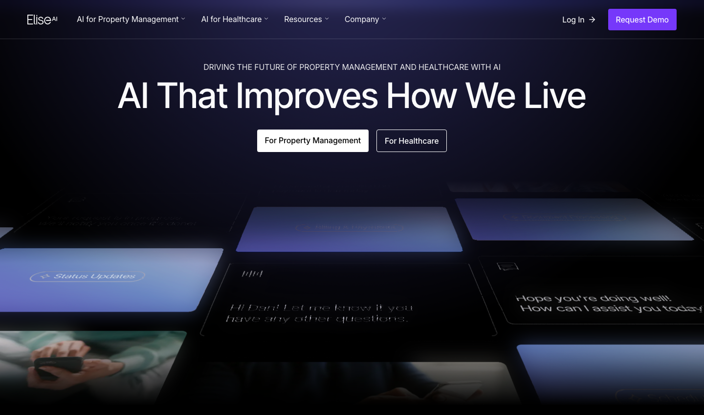
Black hero over a tilted 3D field of glowing cards · Home hero (880px desktop, 755px phone)
Better Days for Every Team
One violet: #7638FA for the demo CTA and links only · Nav Request Demo on every page, primary buttons, eyebrows, Read More links
Faster Replies, Happier Residents
Faster replies, happier residents
Centered eyebrow + big light head + gray lead · Every home section
Do Full-bleed raster gradients: indigo→periwinkle→blue (#6A6FE0→#7FA6EE feel) for CTA bands with white text; very pale lavender-to-white wash behind the statement band and light heroes; a text gradient #0080C4→#8C6CFF (274deg) on the first words of the statement line.
Soft blue-violet gradient atmospheres · Announcement bar, statement band, AI That Delivers CTA, platform hero, about closing CTA
One Assistant, Every Channel
One Assistant, Every Channel
Deep purple dark band with indigo glow · Home channels/benefits/testimonial run (≈2,900px)
Do Square-cornered cells divided by 1px lines (rgba(255,255,255,.2) on dark, #DDDCDA on light); logos white or black monochrome centered; small 'Case Study →' chip (Inter 12, dark pill) top-right of linked cells; stats in InterVariable 64 w400.
Hairline-ruled grids for logos, stats and investors · Home logo wall (black), about stats (#131115) and investors (light)
Specimens use sample copy, not EliseAI’s.
Thin lines and small marks, no ornament.


Thin lines and small marks, no ornament. Uppercase eyebrows over every head, 8px violet squares before mono eyebrows, 1px hairline grids for logos and stats, small Case Study chips, round 64px carousel arrows, thin arrows after text links, 12px-radius cards on dark and 2px faint rules between feature rows.
Source: eliseai.comeliseai.com/about-us
Outline line icons in one color.


Outline line icons in one color. Benefit rows use 32px Streamline Ultimate outline icons, 2px round stroke, in lilac #C1B8FF on deep purple; the interface uses thin arrows and chevrons: violet after Register Now and Read More, white after Log In on dark, small chevrons on nav triggers, and 24px #A9A8A6 arrow-up-right icons on about product cards.
Source: eliseai.comeliseai.com/about-us
Almost no drawn illustration.
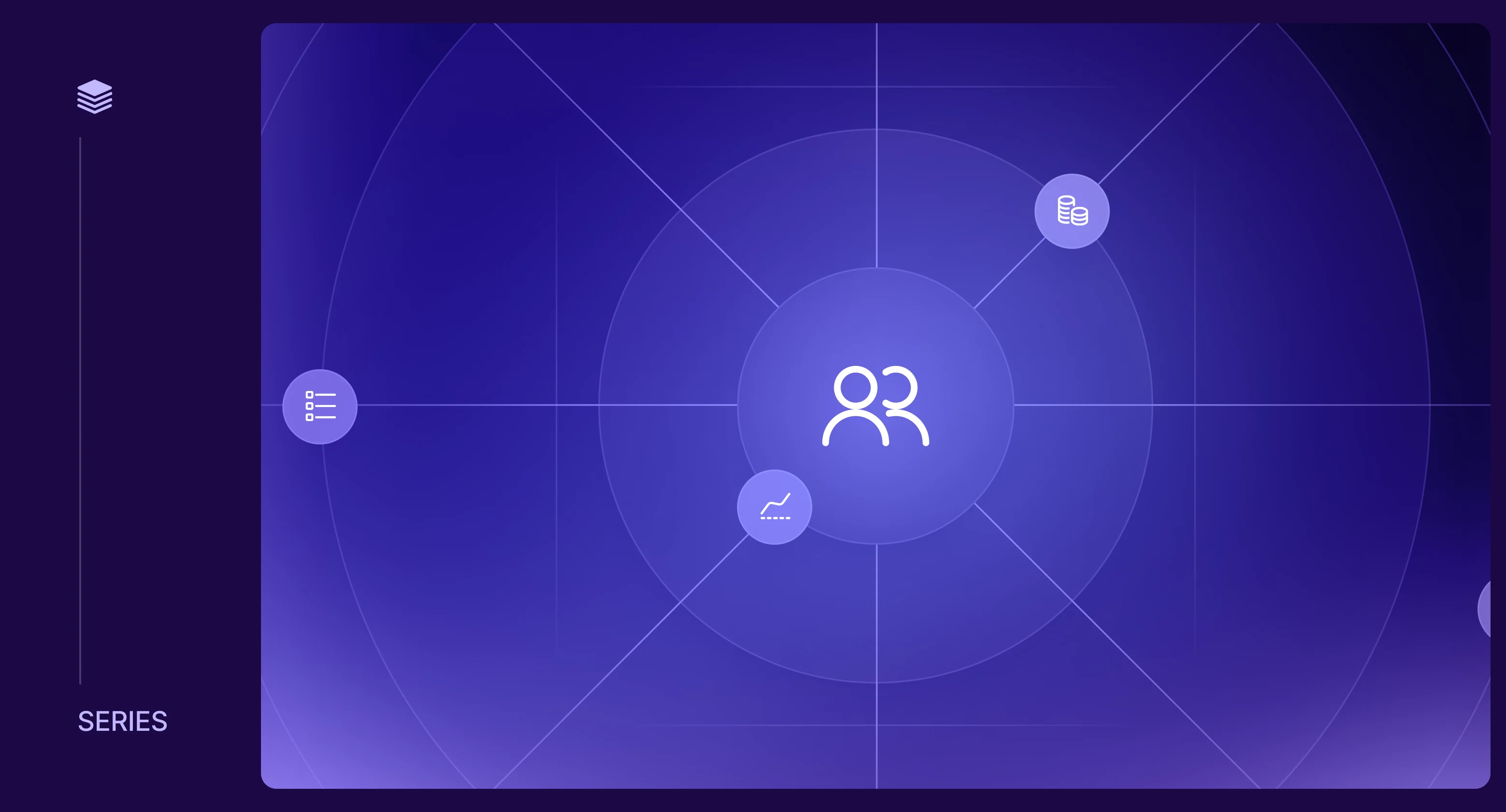

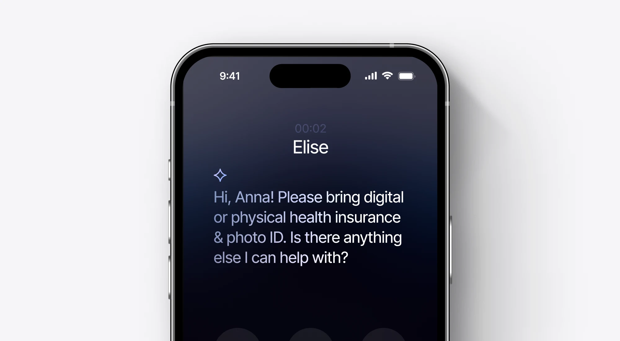

Almost no drawn illustration. Resource and award graphics are gradient panels (deep navy to violet and blue) with thin white orbit ellipses, four-point sparkles and light Inter type; the product appears as phone renders and floating chat or message cards on pale gray.
Source: eliseai.comeliseai.com/blogeliseai.com/platform-overview
Candid, documentary and warm.
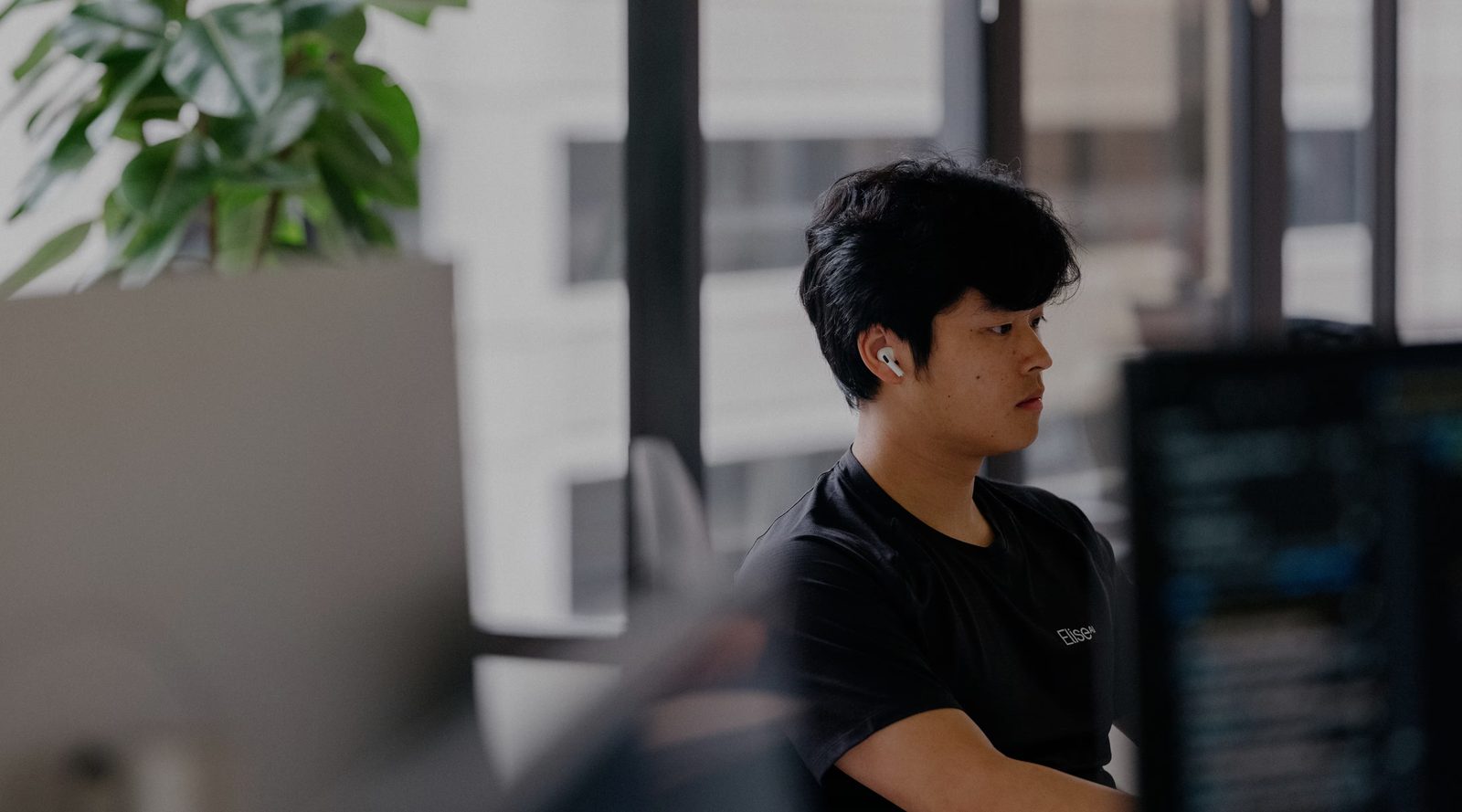

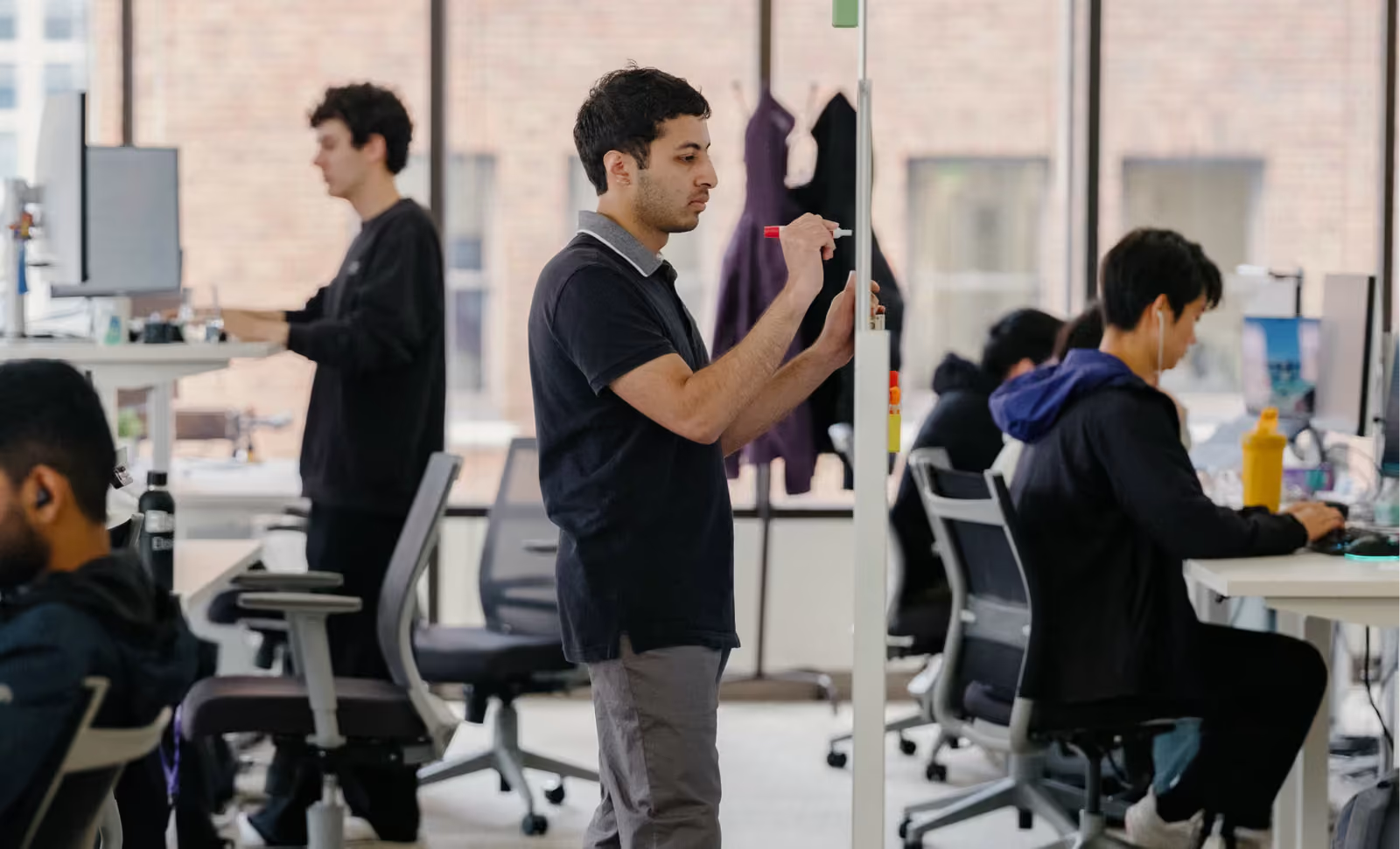
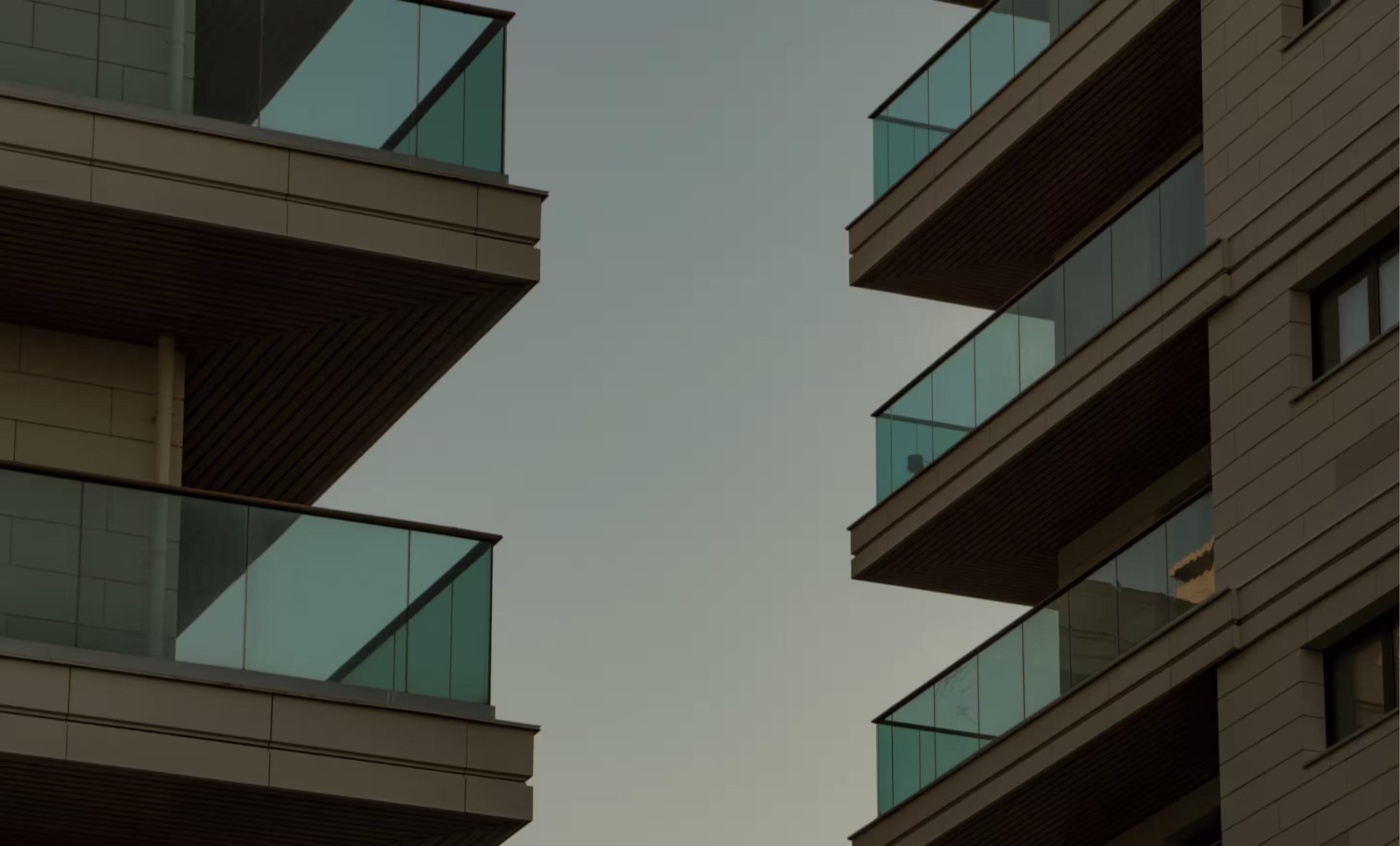


Candid, documentary and warm. Real employees, residents and property staff, shot with shallow depth of field in a muted warm grade; people are caught working, never posed to camera except in team portraits. Story covers darken the photo about 40% under a white customer logo; about and careers run full-bleed hero photos with a left-aligned white head.
Source: eliseai.com/about-useliseai.com/careerseliseai.com/customer-stories
A 1188px centered column inside full-bleed bands. At 1440 the side margin is 126px; section heads are centered (700px box) over 750px leads; cards run in 2- and 3-column grids with 12 to 16px gaps; bands pad 104px (160px on the CTA, 64px on phone). A 54px announcement bar and an 80px transparent nav sit over the hero.
Measured from eliseai.com's homepage, measured headless at 1440 and 390 wide (computed styles), 2026-11-17.
| Measure | Desktop | Phone |
|---|---|---|
| Page margin | 126px | 20px |
| Section padding | 104px | 64px |
| Card gap | 12px | 12px |
| Navigation | 80px | 80px |
Hero head
Inter Tight · 72px (phone 36) · line 1.05 · weight 450
Section head
Inter Tight · 60px (phone 30) · line 1.1 · weight 450
Statement sentence
Inter Tight · 60px (phone 16) · line 1.3 · weight 400
Testimonial quote
Inter Tight · 48px (phone 20) · line 1.2 · weight 400
Card and panel head
Inter Tight · 30px (phone 24) · line 1.5 · weight 450
Channel tile label
Inter Tight · 30px (phone 24) · line 1.2 · weight 450
Resource card title
Inter Tight · 24px (phone 20) · line 1.2 · weight 450
Benefit row title
Inter Tight · 18px · line 1.5 · weight 500
Section lead
Inter · 20px (phone 16) · line 1.5 · tracking -0.18px · weight 400
Body and card line
Inter · 18px (phone 16) · line 1.5 · tracking -0.18px · weight 400
Channel and benefit line
Inter · 18px (phone 16) · line 1.4 · tracking -0.36px · weight 400
Section eyebrow
Inter · 16px (phone 14) · line 1.5 · tracking -0.18px · weight 500
Hero eyebrow
Inter · 16px · line 1.5 · tracking -0.2px · weight 400
Button and nav label
Inter · 16px · line 1.5 · tracking -0.16px · weight 450
Resource tag, footer label
Inter Tight · 14px · line 1.5 · weight 500
Case Study chip
Inter · 12px · line 1.5 · weight 450
Copyright and address
Inter · 14px · line 1.5 · weight 400
How EliseAI’s own landing pages are built, observed on eliseai.com, 2026-11-17. The full measurements are in spec.md.
Source: eliseai.com


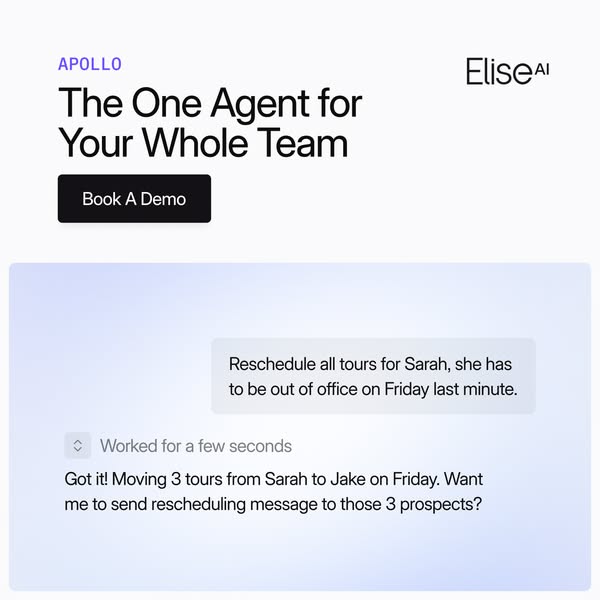


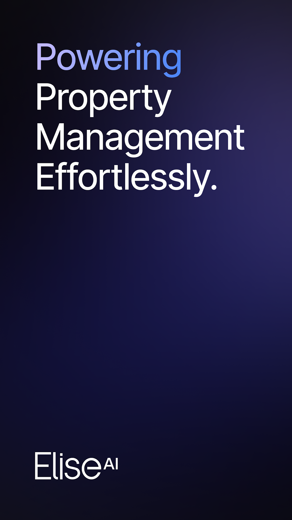
Landing page and Social post rows are observed (site measurements; the brand's own published social/share files). Deck and Email rows are our reading.
| Format | Loudness | Must appear | What varies |
|---|---|---|---|
| Landing page | Wordmark, violet Request Demo, eyebrow + light Title Case head, dark/light band alternation | Hero ground (black card field, warm photo, or blue gradient for healthcare) | |
| Social post | Full-bleed blue-violet gradient ground, centered white wordmark at top, one centered white Inter number or phrase, one short two-line white sub at the bottom. | Ground: the violet-blue gradient (announcements) or black with a thin white grid and a gradient-filled number (funding); partner news uses a centered co-brand lockup instead of a headline. | |
| Social post, landscape (link and co-brand card) | Gradient or black ground, centered lockup or number, white logos only. | Product-UI variant: a phone mockup cropped at the bottom edge on a pale #F5F5F7-to-white ground. | |
| Deck | Light Title Case heads, eyebrows, one violet | Dark vs white slide grounds | |
| Wordmark and violet CTA (inferred) | Not observed | ||
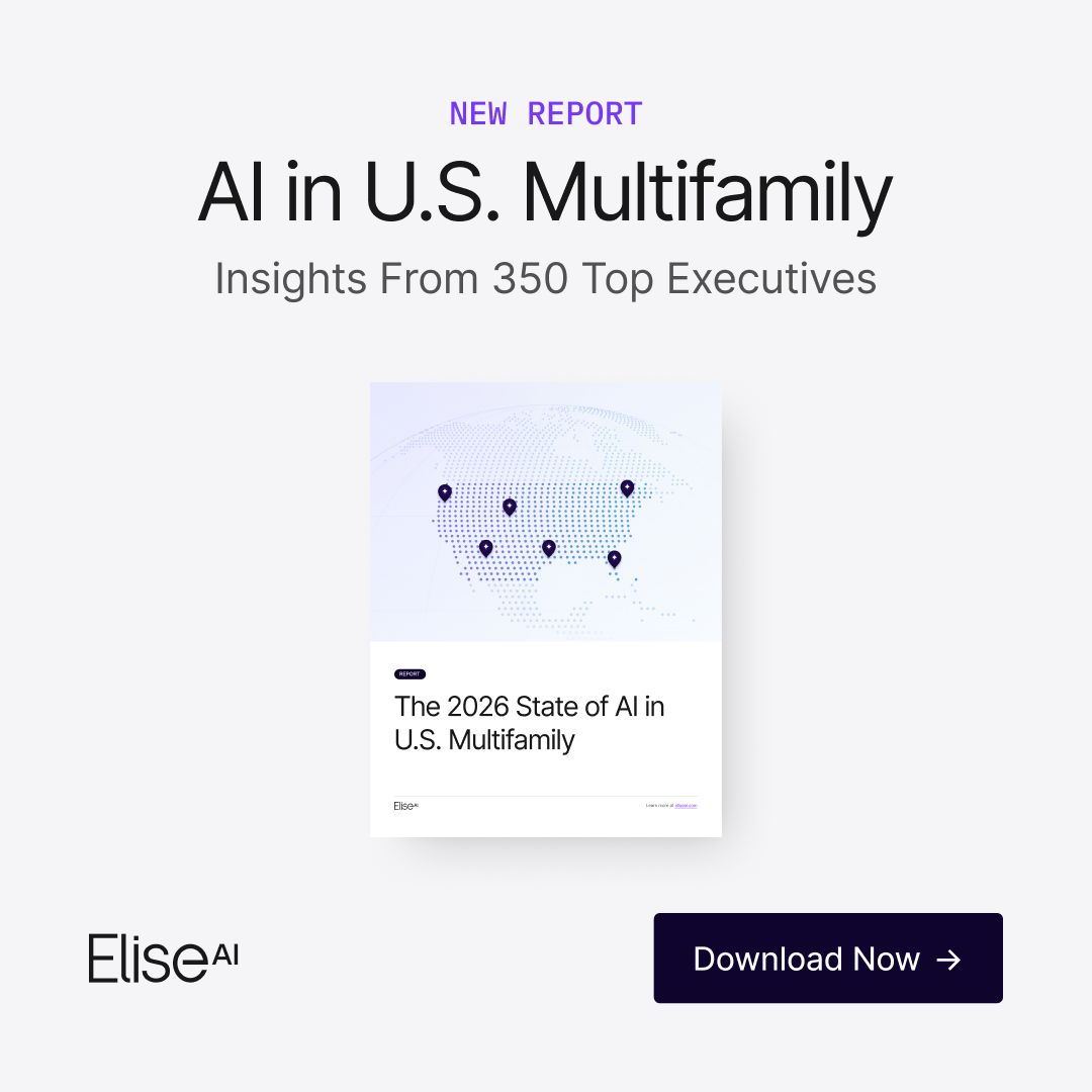
| Paid social ad | Light ground, light-weight Title Case Inter Tight headline in near-black, EliseAI wordmark, one near-black navy button with the offer verb, one visual proof (cover mockup, chat UI or phone) when the ad is not a bare headline | Ground: lavender-white gradient (playbooks), light gray (reports, covers) or off-white (Apollo); visual: book cover, product chat panel or phone mockup; button label Download Now / Book A Demo / Learn More | |
| Video thumbnail | Two scoped families: (a) In Good Company guest card; (b) customer interview still with one light white line of text | (a) series ground tint (pale blue or lavender) and guest; (b) the single stat or question, and whether a lockup shows | |
| Store listing screenshot | Screenshot 1 is a dark navy gradient title card with a 4-line headline "Powering <X>, Effortlessly." and the white wordmark; the rest are a light-gray card with a 2-line headline (one word in a lavender-blue gradient) over a phone mockup of the app | Product noun and the gradient-filled word |
Source: eliseai.com/new-style-guideeliseai.comeliseai.com/about-useliseai.com/customer-storieseliseai.com/blog
Your name and logo, EliseAI’s system.
Talk about my brand Use this brand in Claude
Get your brand audit Put your brand in Claude What goes in a brand book
Each value is marked published, observed, our reading or our recipe, with its source. Checked 2026-11-17. Not affiliated with EliseAI.
Tell us what you want to make. We’ll talk through how to put these ideas to work for your brand.