Free and open to everyone
All you need is a screen, an internet connection and a few minutes a day (paraphrased) Published
Brand book
A game you want to open: one loud green, rounded cartoon shapes and tactile buttons make learning look like play. Our reading

Ground color: secondary colors may be bold full-bleed grounds (the site adds a deep navy band for Super Duolingo); Duo goes only on select secondary grounds, the cast on a broader range.
Source: web.archive.org/web/20260823211825/https://design.duolingo.com/identity/colorweb.archive.org/web/20260602063136/https://design.duolingo.com/marketing/assetsduolingo.com
Share of the 7803px desktop homepage by band ground, measured at 1440 on 2026-10-29 (white: nav to the anytime band and the DET and closing bands; navy: the Super Duolingo band; green: the wave strip and footer). The guide publishes no ratio.
The voice never changes; the tone reads the learner's state. Duolingo publishes the states and examples; the levels are our reading, and the homepage level is observed.
Our engine's setting, built from their rules.
Cover the logo. It should still read as Duolingo: a white page, one loud Feather Green, short lowercase rounded headlines, chunky caps buttons with a solid lip, and a rounded cartoon character somewhere.
Put another app's logo on it. If the lip buttons, the green Feather headlines and the rounded cast don't feel out of place, it's generic, and it goes back.
Buttons ALL CAPS with no punctuation; Feather lines lowercase and under about 10 words; "learners", never "users"; no period at the end of a headline.
The world's most popular, most enjoyable way to learn a language (guide, "The Duolingo Difference") Published
All you need is a screen, an internet connection and a few minutes a day (paraphrased) Published
Technology plus the power of play makes language learning a joy (paraphrased) Published
Bite-sized lessons based on learning science (paraphrased) Published
Loved by people of all ages and backgrounds, 35+ languages (paraphrased) Published
The most fun way to learn languages, chess, and more!
free. fun. effective.
backed by science
stay motivated
Language learning once needed tutors, textbooks and lots of money; Duolingo opened the door so anyone with a screen can learn (paraphrased)
anything is possible when you Duolingo
Publishedlanguage belongs to everyone; free, accessible
Publishedrooting for learners, bringing the energy
Publisheda little language makes life richer
Publishedthe fun in language fundamentals; eccentric characters and sentences
PublishedCategory. Language learning app (homepage now also offers chess and math courses, observed) Published
Duolingo is the world's #1 way to learn a language. (the guide's one-sentence description; its longer press boilerplate carries dated figures and is not reproduced)
personalized learning
Learning with Duolingo is fun, and research shows that it works!
learn anytime, anywhere
POWER UP WITH SUPER DUOLINGO
duolingo english test
learn a language with duolingo
GET STARTED
I ALREADY HAVE AN ACCOUNT
TRY 1 WEEK FREE
CERTIFY YOUR ENGLISH
Everyone can Duolingo.
Go. Learn a language.
One line carries the brand: "Everyone can Duolingo." The guide frames Duolingo as free, fun, effective and for everyone, with messages written per audience (learners in developed and developing markets, institutions, recruits, volunteers). The homepage turns that into three words: "free. fun. effective."
Source: web.archive.org/web/20260823211826/https://design.duolingo.com/writing/brand-narrativeduolingo.com
Not quite correct. Try again!
Incorrect.
Correct! Awesome work!
You have successfully passed this level
Consistent voice builds trust; tone flexes with how learners feel.
expressiveplayfulembracingworldly
Four qualities (Expressive, Playful, Embracing, Worldly), a tone that reads the room, Duo as an "extra" but kind character, and detailed style rules (caps buttons, sentence-case headers, no headline periods).
learnersexercisesXPstreaklessonsskillscoursesokaywebsiteinternetlog in (verb)login (noun)sign upanytimeEveryone can Duolingo
userschallengestreeOKWeb siteInternet (capitalized)any time
Source: web.archive.org/web/20260823212032/https://design.duolingo.com/writing/voice
| Tagline | Everyone can Duolingo. |
|---|---|
| Qualities | Expressive, Playful, Embracing, Worldly |
Source: web.archive.org/web/20260823212032/https://design.duolingo.com/writing/voiceweb.archive.org/web/20260823212032/https://design.duolingo.com/writing/toneweb.archive.org/web/20260823212020/https://design.duolingo.com/writing/duoweb.archive.org/web/20260823212032/https://design.duolingo.com/writing/styleweb.archive.org/web/20260823212032/https://design.duolingo.com/writing/glossaryweb.archive.org/web/20260823211826/https://design.duolingo.com/writing/brand-narrative


Logos shown from Duolingo's own CDN and from Brandfetch for reference. Duolingo and Duo are Duolingo's trademarks. Not affiliated, and not for download.
duolingo
duolingo
The name set in Duo-inspired curves is the brand's signature; Duo beside it adds instant recognition in third-party spaces.
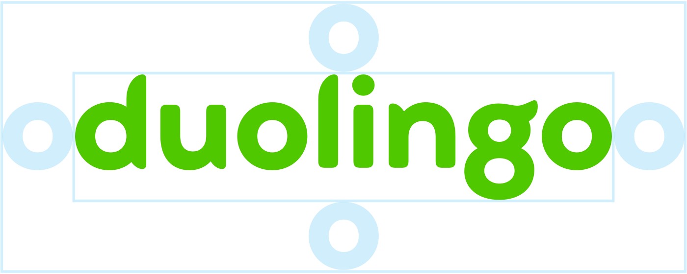
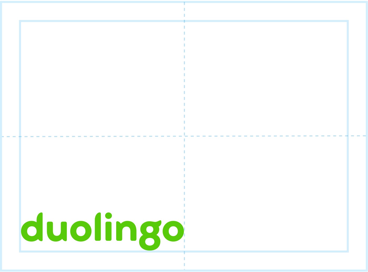
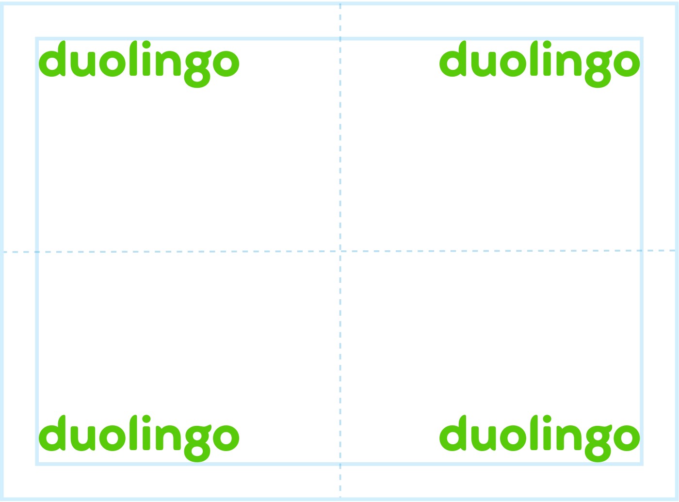
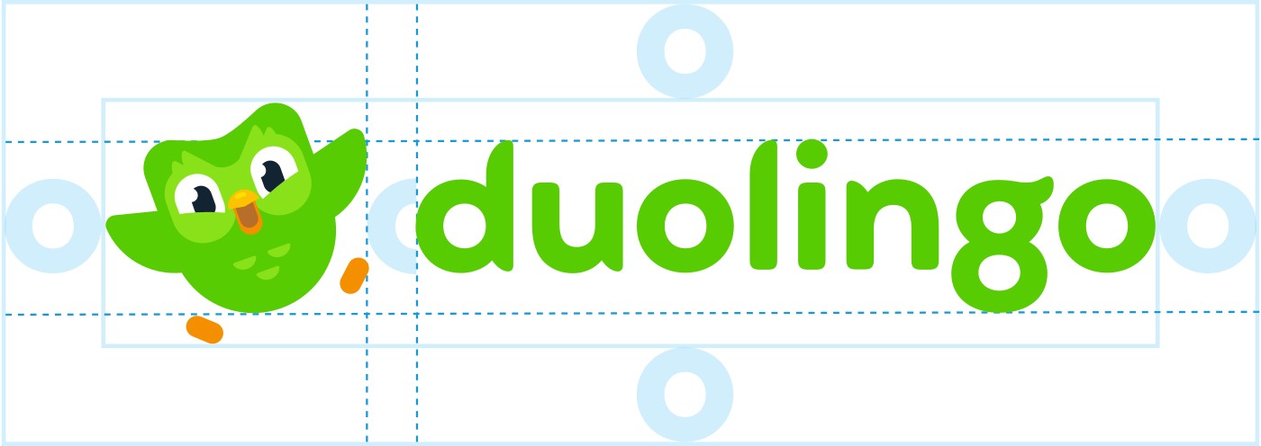
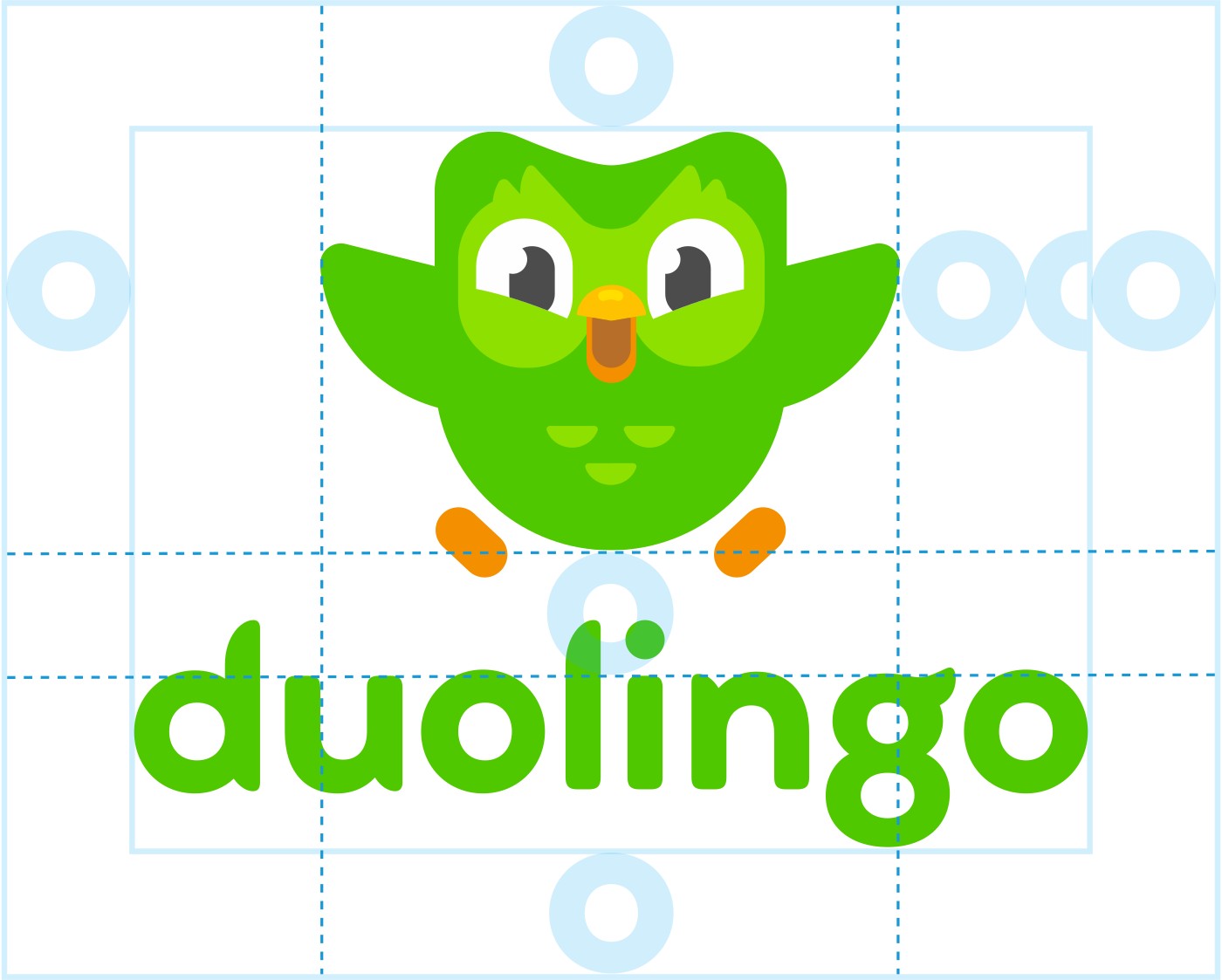

| Min size screen | 100px |
|---|---|
| Min size print | 35mm / 1.375in |
| Colorways | Feather Green, white, gray |
| Lockup gap | half the x-height |
| Rotation | 0° or 90° |
| Site nav size | 179x42 desktop, 161x38 phone (observed) |
One logotype in custom lowercase letterforms, plus two fixed lockups with Duo (landscape, portrait) and the Duo-face icon. The site uses its own single-color variant: a green Duo silhouette left of the logotype, 179x42.
Source: web.archive.org/web/20260823211825/https://design.duolingo.com/identity/logosweb.archive.org/web/20260711122151/https://design.duolingo.com/identity/brand-familyduolingo.com
free. fun. effective.
Green is the hue the world associates with Duolingo; the bright secondaries add delight without competing; neutrals give hierarchy.
| Feather Green | #58CC02, RGB 88 204 2, CMYK 58 0 96 0, PMS 361 C |
|---|---|
| Mask Green | #89E219, PMS 368 C |
| Eel | #4B4B4B, PMS 418 C |
| Snow | #FFFFFF |
| Macaw | #1CB0F6, PMS 306 C |
| Cardinal | #FF4B4B, PMS 1787 C |
| Bee | #FFC800, PMS 123 C |
| Fox | #FF9600, PMS 1375 C |
| Beetle | #CE82FF, PMS 2572 C |
| Humpback | #2B70C9, PMS 2144 C |
| Wolf / Hare / Swan / Polar | #777777 / #AFAFAF / #E5E5E5 / #F7F7F7 |
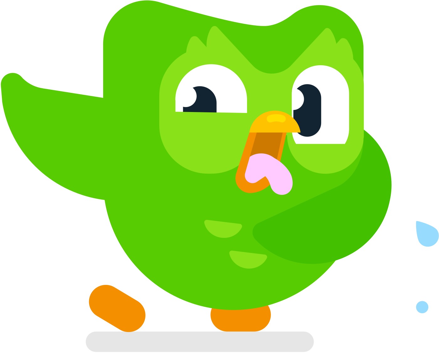
| Duo | Wing Overlay #43C000, Beak Inner #B66E28, Beak Lower/Feet #F49000, Beak Upper #FFC200, Beak Highlight #FFDE00, Tongue Pink #FFCAFF |
Four core colors taken from Duo (Feather Green, Mask Green, Eel, Snow), six bright secondaries, five neutrals, Duo's own body palette, and a 40-color illustration palette named after animals. The site runs almost entirely on white + Feather Green, with Macaw for links and outline-button labels, Wolf for body, and illustration-palette greens (Tree Frog, Turtle, Sea Sponge) for button lips and the footer.
Not published: color proportions (the homepage split in Proportion is measured, not published); the marketing "Colors" sub-section text (lost in the archive).
Source: web.archive.org/web/20260823211825/https://design.duolingo.com/identity/colorweb.archive.org/web/20260823212032/https://design.duolingo.com/illustration/shape-languageweb.archive.org/web/20260602063136/https://design.duolingo.com/marketing/assetsduolingo.com
Everyone can Duolingo.
stay motivated
Stay Motivated
A language company speaks through its type: Feather is ownable and loud; DIN Next Rounded is friendly and readable at length.





| Their face | Use | License | Open stand-in |
|---|---|---|---|
| Feather Bold (served on www.duolingo.com as "feather", weight 700) | Large, brief headlines: lowercase, left-aligned, about 10 words at most, 30px minimum, in Feather Green or white on color | Proprietary and bespoke to Duolingo; not licensable. The guide publishes Nunito as its substitute for print and documents. | Mochiy Pop P One Calibrated 2026-10-29 against the real feather woff2 beside 16 Google Fonts: Mochiy Pop P One 400 set at 0.885x the site size (42.5px for 48px, 56.5px and -1.13px for 64px) lands within 0.1-0.9% of Feather's width on most headlines ("stay motivated" 372.8 vs 373.6px), x-height 24.23 vs 24.48px, and is the only candidate with Feather's single-storey a and hooked l. Nunito 900, the guide's substitute, ran 4-7% narrow and generic on screen. |
| DIN Next Rounded (brand law); www.duolingo.com serves its own "duolingo-sans" (variable, 100-900) | Headlines of 10+ words, subheads, all body copy, ALL CAPS buttons; 14px minimum, leading 140% | DIN Next Rounded: commercial licence (Monotype). duolingo-sans: Duolingo's own web face, not licensable. Nunito is the guide's published substitute. | Baloo 2 Calibrated 2026-10-29 against the real duolingo-sans woff2 beside 9 families: Baloo 2 (variable) at the site's px sizes matches the compact DIN-rounded skeleton: hero 32/44 at 650 -0.4px is +0.3% wide, body 17/24 at 475 -0.25px +0.2%, caps 15px 650 +0.5px within +-3%, ink within +-5%. Nunito ran 10-21% wide. Load the wght@400..800 range. |
| Feather leading | 100-110% |
|---|---|
| Feather tracking | -20 (-0.02em) |
| Feather min | 30px / 30pt |
| DIN leading | 140% |
| DIN min | 14px / 14pt |
| Feather : DIN | 150% |
| Site h2 | feather 700 48/60, #58CC02 (observed) |
| Site band h1 | feather 700 64/80, -1.28px (observed) |
| Site body | duolingo-sans 400 17/24 #777777 (observed) |
| Build stand-ins | display: Mochiy Pop P One 400 42.5px 0 / 56.5px -1.13px / 32px; body: Baloo 2 hero 32px 650 -0.4px, body 17px 475 -0.25px, caps 15px 650 +0.5px, footer 15px 650 -0.3px |
Two faces: Feather Bold (bespoke, headlines) and DIN Next Rounded (licensed, everything else), with Nunito published as the substitute. The site serves "feather" for section headlines and its own "duolingo-sans" for the hero sentence, body, buttons and footer.
Source: web.archive.org/web/20260711122139/https://design.duolingo.com/identity/typographyduolingo.com
3D "lip" buttons · every CTA on the site and in the app
stay motivated
Stay Motivated
lowercase Feather headlines in green · section headlines, campaign lines
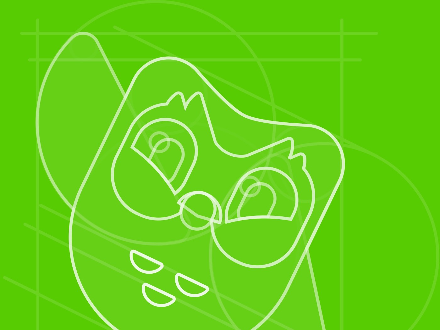
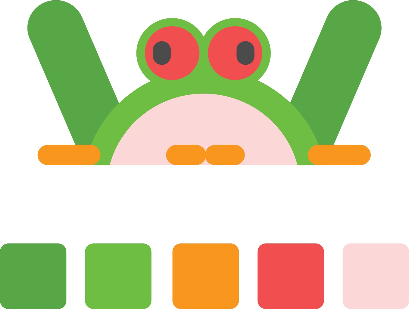
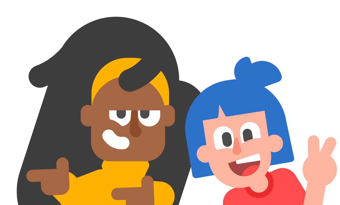
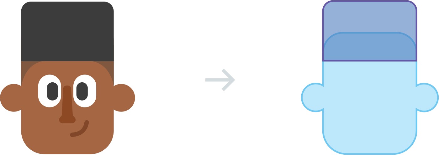
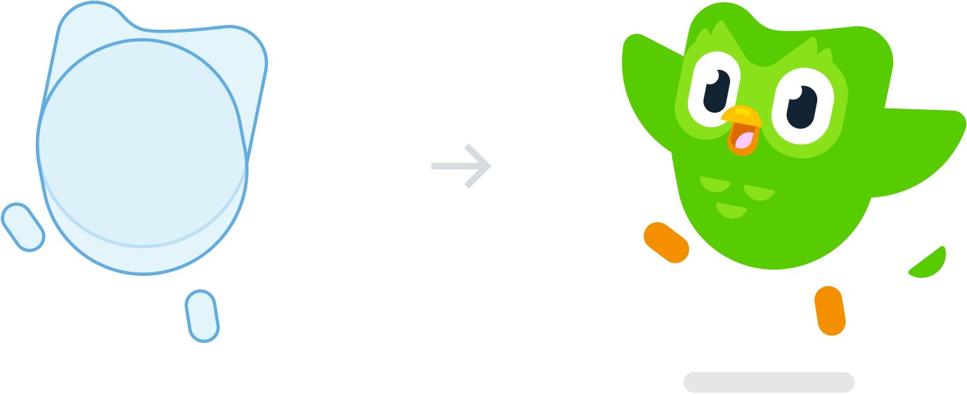
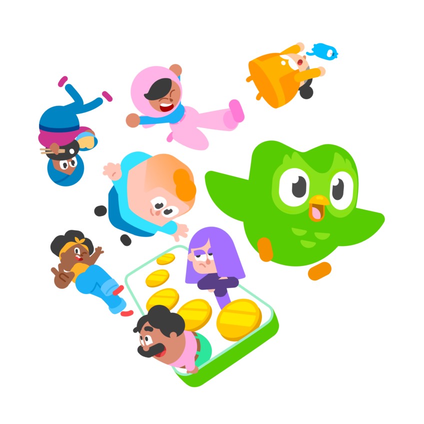
Do flat illustrations from rounded rectangles, circles and rounded triangles; about 15 shapes per figure; expressive poses, often cropped; pill-shaped shadows darker than the base; floating accents (coins, gems, flames) above or below.
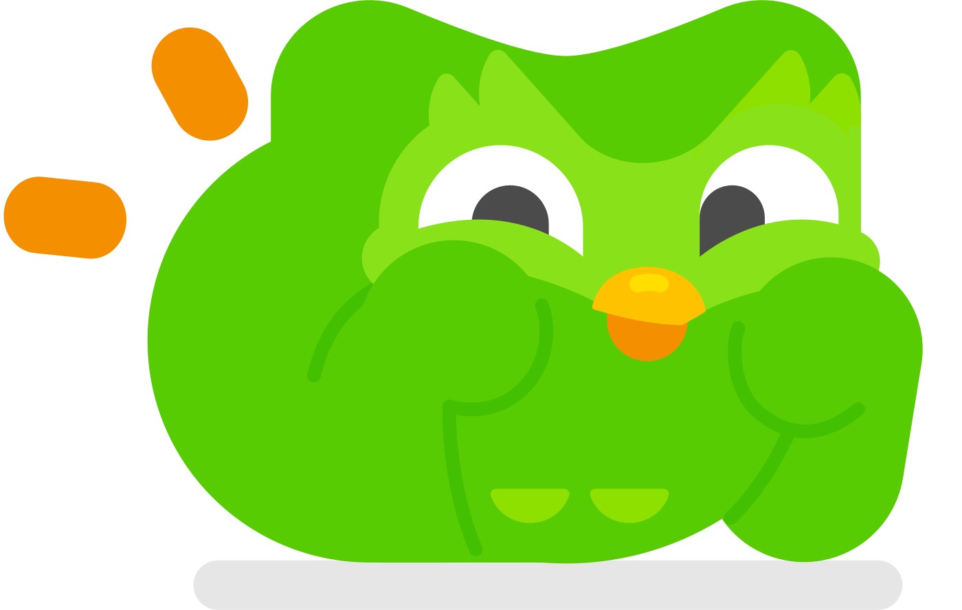
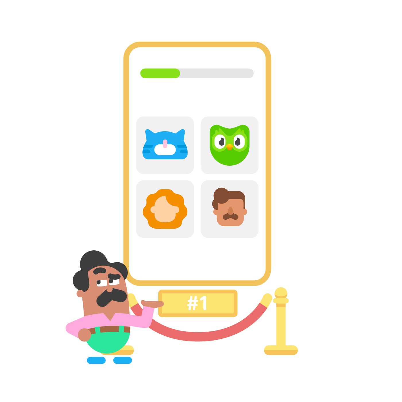
Duo and the cast, built from rounded shapes · every image slot
Do gold coins, gems, hearts, flames, chests and phones tilted in flat perspective, floating on white; the footer CTA sits on a green wave that becomes the footer.
game-reward props · feature art, anytime band, footer CTA
Specimens use sample copy, not Duolingo’s.
Characters carry emotion and story; the lip makes every action feel tactile, like the app.
| Button radius | 12px (observed) |
|---|---|
| Primary lip | 4px #58A700 (observed) |
| Outline lip | 2px #E5E5E5 + 2px border (observed) |
No abstract graphic system: the brand's "elements" are Duo, the cast of characters and the game props (coins, gems, flames, hearts). On the web, the recurring element is the chunky 3D button with a solid lip, and 2px hairlines.
Source: web.archive.org/web/20260602063136/https://design.duolingo.com/marketing/assetsweb.archive.org/web/20250822234243/https://design.duolingo.com/marketing/elementsweb.archive.org/web/20260823212020/https://design.duolingo.com/writing/duoduolingo.com
The guide publishes no UI icon set.


The guide publishes no UI icon set. Its resources page lists approved emoji for notifications. The homepage uses rounded-rectangle course flag tiles, chevrons and store glyphs.
| Icon grid | not published |
|---|---|
| Stroke | not published |
Not published: an icon grid, stroke or UI icon set.
Source: web.archive.org/web/20260823211825/https://design.duolingo.com/resourcesweb.archive.org/web/20260823212032/https://design.duolingo.com/writing/styleduolingo.com
Simple rounded shapes scale and animate easily, and read instantly as Duolingo.
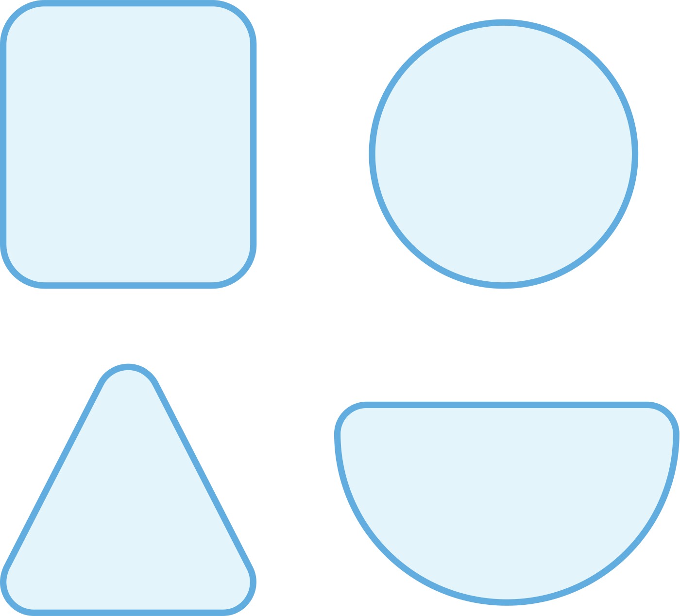
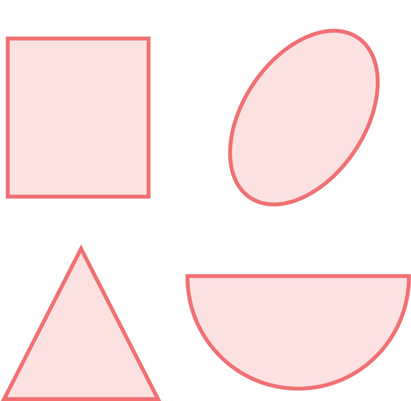
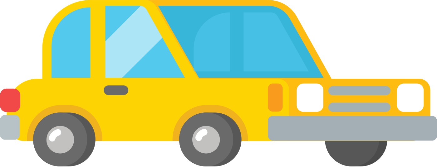
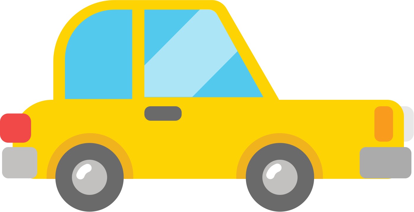

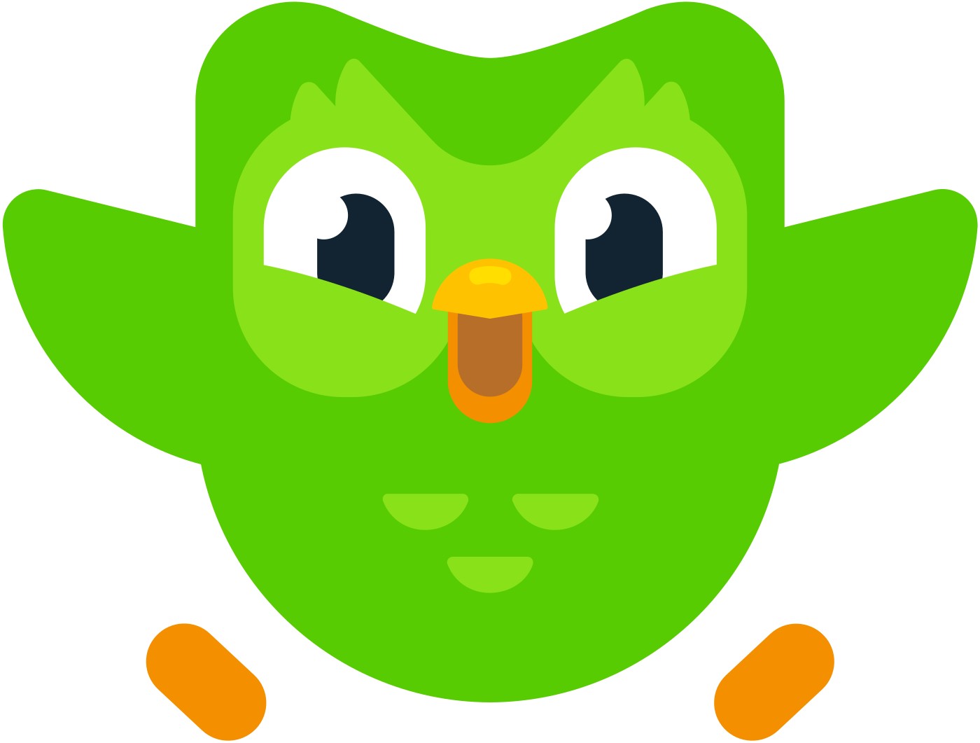
| Shapes per figure | about 15 |
|---|---|
| Max fingers | 4 |
| Eye styles | 5 |
Illustration is the de-facto visual style. Everything is built from three rounded shapes, on a flat perspective, with pill shadows and floating accents, colored from a 40-color animal-named palette.
Source: web.archive.org/web/20260823212032/https://design.duolingo.com/illustration/shape-languageweb.archive.org/web/20251226082046/https://design.duolingo.com/illustrationweb.archive.org/web/20260118083116/https://design.duolingo.com/illustration/charactersweb.archive.org/web/20260711122151/https://design.duolingo.com/illustration/duoweb.archive.org/web/20260711122151/https://design.duolingo.com/identity/imagery
Shows the millions of real people learning, in their diversity.
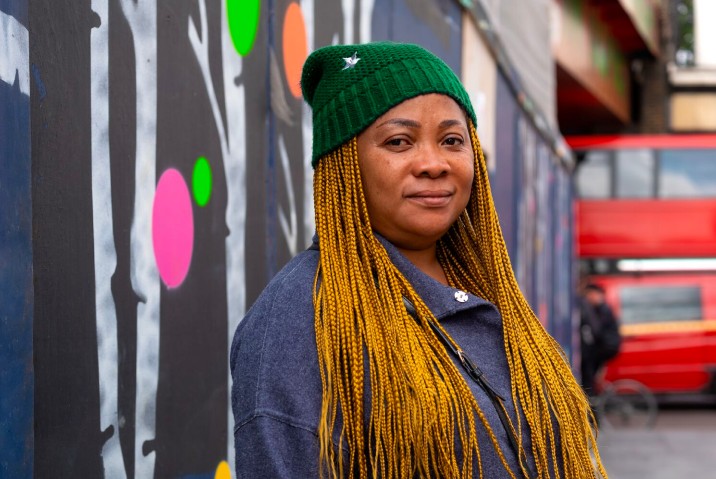
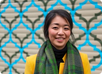
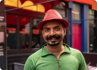
| Homepage photos | none (observed) |
|---|
Secondary to illustration. Authentic portraits and real environments of real learners, ideally with green in clothing or surroundings. The homepage uses no photography.
Source: web.archive.org/web/20260711122151/https://design.duolingo.com/identity/imagery
The guide's motion page survives in the archive with no content, so no motion system is published.
The guide's motion page survives in the archive with no content, so no motion system is published. On the homepage every illustration is a Lottie loop over a static resting frame, buttons press instantly onto their lip, and the sticky nav slides in.
Not published: motion curves, durations or principles (the guide's motion page is empty in every snapshot).
Source: web.archive.org/web/20260811044101/https://design.duolingo.com/identity/motionduolingo.comweb.archive.org/web/20260711122151/https://design.duolingo.com/illustration/duo
The homepage is one centred 988px column on white: hero split, a course strip, alternating 530px feature rows, a centred app band, one deep-navy band, a feature row, a centred closing CTA on a green wave, and a green footer.
Measured from duolingo.com's Playwright computed styles, pseudo-elements and boxes at 1440 and 390 wide, plus hover/active states, 2026-10-29; page height 7803 desktop, 8828 phone.
| Measure | Desktop | Phone |
|---|---|---|
| Page margin | 226px | 15px |
| Section padding | 96px | 96px |
| Hero text width | max 480px, centered | full width |
| Card gap | 12px | 12px |
| Navigation | 70px | 70px |
Band headline, centred, #042C60 (anytime) or #58CC02 (closing). BUILD: Mochiy Pop P One 400 56.5px, line-height 80px, letter-spacing -1.13px (-0.02em); phone 32px, line-height 45px, -0.64px. Site: feather 700 64/80 -1.28px
Feather Bold (served on www.duolingo.com as "feather", weight 700) · 56.5px (phone 32) · line 1.416 · tracking -1.13px · weight 400
Feature and DET headline, lowercase, #58CC02. BUILD: Mochiy Pop P One 400 42.5px, line-height 60px, letter-spacing 0; phone 32px, line-height 45px, 0. Site: feather 700 48/60 and 36/45
Feather Bold (served on www.duolingo.com as "feather", weight 700) · 42.5px (phone 32) · line 1.412 · weight 400
Hero sentence, #4B4B4B, centred. BUILD: Baloo 2 650 32/44, letter-spacing -0.4px (-0.0125em). Site: duolingo-sans 700, 0px
DIN Next Rounded (brand law); www.duolingo.com serves its own "duolingo-sans" (variable, 100-900) · 32px · line 1.375 · tracking -0.4px · weight 650
Feature paragraph, #777777; inline link #1CB0F6 Baloo 2 650 -0.34px, no underline. BUILD: Baloo 2 475 17/24, letter-spacing -0.25px (-0.015em). Site: duolingo-sans 400, 0px
DIN Next Rounded (brand law); www.duolingo.com serves its own "duolingo-sans" (variable, 100-900) · 17px · line 1.41 · tracking -0.25px · weight 475
Button label, course-strip label, SITE LANGUAGE control: ALL CAPS. BUILD: Baloo 2 650 15px, line-height 20px, letter-spacing +0.5px (0.033em), text-transform uppercase. Site: duolingo-sans 700 +0.8px
DIN Next Rounded (brand law); www.duolingo.com serves its own "duolingo-sans" (variable, 100-900) · 15px · line 1.33 · tracking 0.5px · weight 650
App-store badge text, #4B4B4B, mixed case. BUILD: Baloo 2 650, small line 14/17 -0.28px over big line 17/20 -0.34px (-0.02em)
DIN Next Rounded (brand law); www.duolingo.com serves its own "duolingo-sans" (variable, 100-900) · 17px · line 1.18 · tracking -0.34px · weight 650
Footer column heading, #D7FFB8. BUILD: Baloo 2 650 19/26.6, letter-spacing -0.38px (-0.02em)
DIN Next Rounded (brand law); www.duolingo.com serves its own "duolingo-sans" (variable, 100-900) · 19px · line 1.4 · tracking -0.38px · weight 650
Footer link #A5ED6E; "Site language:" label same style in #D7FFB8. BUILD: Baloo 2 650 15/22, letter-spacing -0.3px (-0.02em)
DIN Next Rounded (brand law); www.duolingo.com serves its own "duolingo-sans" (variable, 100-900) · 15px · line 1.47 · tracking -0.3px · weight 650
Site-language link, #A5ED6E. BUILD: Baloo 2 650 13/16, letter-spacing -0.26px (-0.02em)
DIN Next Rounded (brand law); www.duolingo.com serves its own "duolingo-sans" (variable, 100-900) · 13px · line 1.23 · tracking -0.26px · weight 650
How Duolingo’s own landing pages are built, observed on duolingo.com, 2026-10-29. The full measurements are in spec.md.
Source: duolingo.com
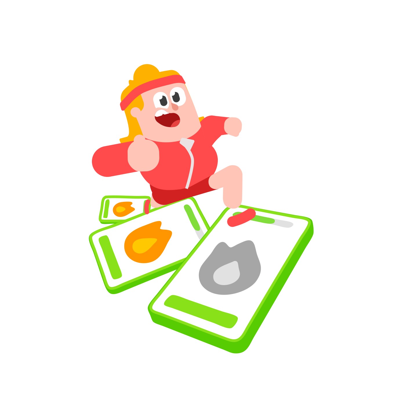
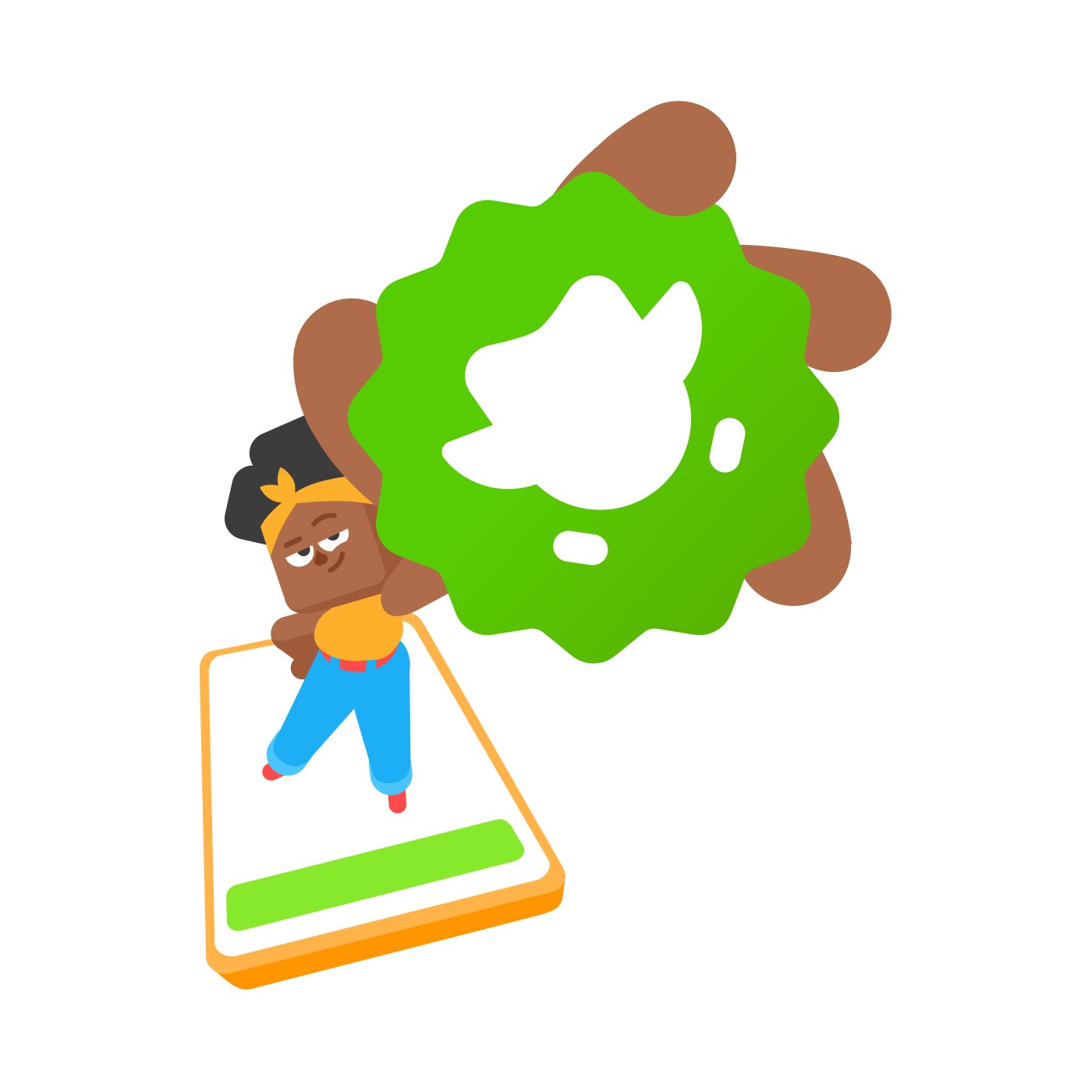
Five seconds is enough when the character is the brand: the TV spot is the joke and the push turns it into a lesson started. Our reading
Years of Duo as the persistent owl gave the audience the context, so one post could become a story people retold for them. Our reading
How loud the system gets by format: the guide's rules plus the homepage as observed on 2026-10-29.
| Format | What they did | Source |
|---|---|---|
| website (homepage) | One centred 988px column on white: hero split with two caps buttons, course strip of flag tiles, four alternating 530px feature rows with lowercase green Feather headlines, a deep-navy Super band, a green wave into a green footer (observed 2026-10-29). | duolingo.com |
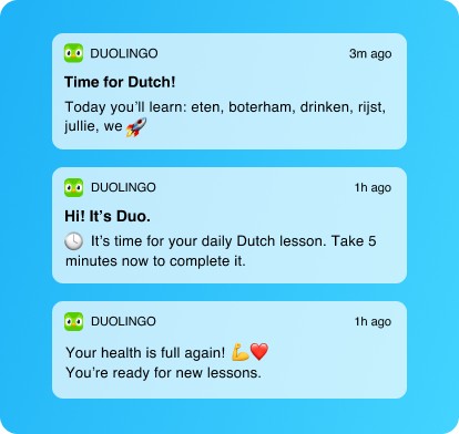
| push notification | Notifications from Duo in a light-blue card with one emoji from the approved list, omitted about half the time; examples "Time for Dutch!" and "Hi! It's Duo." | web.archive.org/web/20260823212032/https://design.duolingo.com/writing/style |
| in-app feedback | Success and stumble copy written to the learner's state: "Correct!" and "Awesome work!" versus "Not quite correct. Try again!" | web.archive.org/web/20260823212032/https://design.duolingo.com/writing/tone |
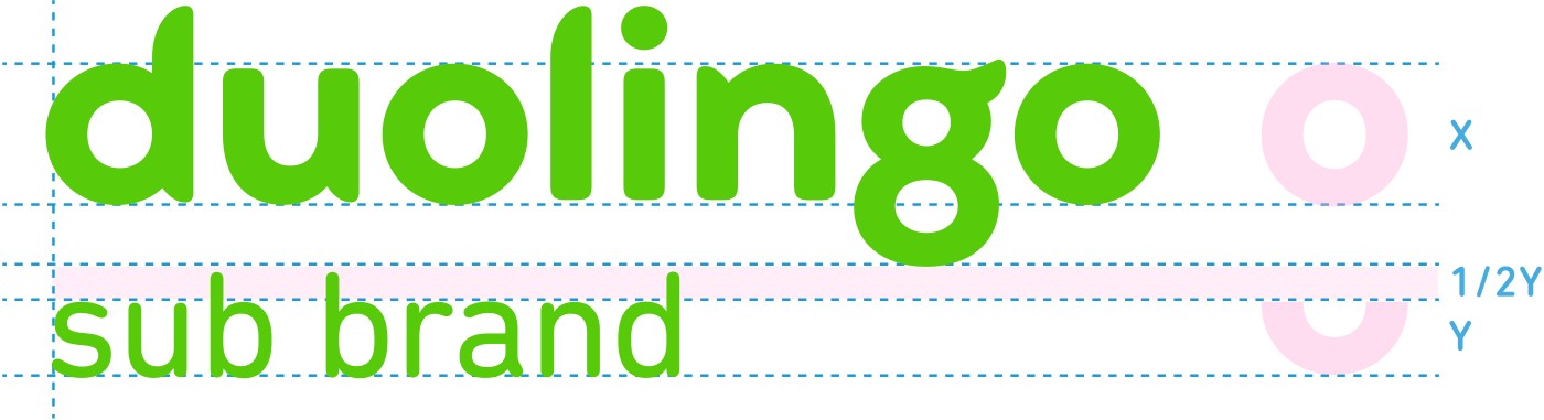
| premium sub-brand | Duolingo Plus has its own logotype: the wordmark plus a Plus token, spaced by the width of the "o" counter; its colorways change dramatically to signal the enhanced app. | web.archive.org/web/20260711122151/https://design.duolingo.com/identity/brand-family |
| sub-brands | Generic lockup for initiatives without their own rules: wordmark plus a lighter title sharing its x-height (events, incubator, podcasts, gear, ai, push, university programs, cefr checker, community, design studio). | web.archive.org/web/20260711122151/https://design.duolingo.com/identity/brand-family |
| marketing and advertising | Duo stars to express excitement, emotion or an occasion (like Valentine's Day), on select secondary grounds only; the cast appears all at once, in pairs or alone, always posed. | web.archive.org/web/20260602063136/https://design.duolingo.com/marketing/assets |
| print, banners and merch | Logo in a corner or centred, as large as possible, at least 35mm in print; rotated 90 degrees for skyscrapers, banners and merch. | web.archive.org/web/20260823211825/https://design.duolingo.com/identity/logos |
| premium web promo | Super Duolingo band on the homepage: #100F3E ground, gradient italic wordmark image, white TRY 1 WEEK FREE button with a translucent lip (observed 2026-10-29). | duolingo.com |
| Format | Loudness | Must appear | What varies |
|---|---|---|---|
| Landing page (as www.duolingo.com builds its homepage) | Exactly kit.spec.page: transparent nav with logo + language control, hero split (art left, 32px duolingo-sans sentence + GET STARTED / I ALREADY HAVE AN ACCOUNT right), course strip, alternating 530px feature rows with lowercase green Feather headlines, centred app band, deep-navy promo band, closing CTA on the green wave, green footer with verbatim links. 3D lip buttons. Homepage voice. Here the site's centred band headlines and 48px untracked Feather are correct, not a conflict with the guide. | which features, which promo band; illustrations from the slot assets only | |
| In-app / product UI | white base, Feather Green actions, caps buttons, encouraging tone | secondary colors for states | |
| Push notification / email | Duo's voice when from Duo; one emoji at most, omitted half the time | tone by learner state | |
| Social | Duo and cast, playful voice, multilingual replies | emoji freely | |
| Print / out-of-home | logo large in a corner or centred (min 35mm), Feather headline lowercase, bold secondary ground allowed | 90° logo on tall formats | |
| Third-party / press | landscape or portrait lockup with clear space | lockup choice by space |
Source: web.archive.org/web/20260825155151/https://design.duolingo.comweb.archive.org/web/20260823211825/https://design.duolingo.com/identity/logosweb.archive.org/web/20260711122139/https://design.duolingo.com/identity/typographyweb.archive.org/web/20260823212032/https://design.duolingo.com/illustration/shape-languageweb.archive.org/web/20260823212032/https://design.duolingo.com/writing/styleduolingo.com
Your name and logo, Duolingo’s system.
Use this kit for my brand Use this brand in Claude
Get your brand audit Put your brand in Claude What goes in a brand book
Each value is marked published, observed, our reading or our recipe, with its source. Checked 2026-10-29. Not affiliated with Duolingo.