Find
Find what you need fast, across Dropbox and your other apps Our reading
Brand book
Structure is the personality. Dropbox gives every piece the same calm Coconut and Graphite frame, then lets one accent and the Tab carry the feeling. Change the accent and it is still Dropbox; break the frame and it is not. Our reading

The accents and imagery. Each story or photo can take its own accent from the sixteen; the core three stay put.
Share of homepage height by band ground on dropbox.com at 1440px (observed, 2026-10-28).
Our engine's setting, built from their rules.
Cover the logo. It should still read as Dropbox: Coconut and Graphite planes, blue on the action in product and web pieces (campaigns may run full blue grounds), a medium-weight grotesk, an accent with its own dark.
Put a competitor's logo on it. If a blue-on-white SaaS page could wear it just as well, it's generic, and it goes back.
For teams drowning in scattered files and tools, Dropbox is one place to store, share and find work, so less time goes to busywork and more to finished work. Our reading
Find what you need fast, across Dropbox and your other apps Our reading
Everyone stays in sync; sharing big files doesn't slow work down Our reading
Security is built in, never second Our reading
Your Dropbox content goes to work inside the AI tools you already use Our reading
Less uploading. Less explaining. More doing.
One place to store, share, and collaborate
Find it fast, every time
Share files without the slowdown
Dropbox started in 2007 to make files sync simply; it now builds products that remove busywork so people can focus on meaningful work, against tools that interrupt and fragment teams.
act with integrity and honesty, even when no one is watching.
Publishedcustomers' success is the company's success; start from their needs.
Publishedbuild focused products; avoid needless complexity in plans and process.
Publishedtake full responsibility, clear your own blockers, learn from mistakes.
Publisheddesign for people's real needs; a compassionate, inclusive culture.
PublishedCategory. Dropbox is one place to keep life organized and keep work moving. Published
Google Drive, Microsoft OneDrive, Box (file storage); Notion, Asana and app-native search (for Dash)
Dropbox is one place to keep life organized and keep work moving. More than 700 million registered users across 180 countries rely on it. Its mission is to design a more enlightened way of working. Headquartered in San Francisco.
For All Things Worth Saving Published
Find anything. Protect everything. Observed
Go from idea to done with Dropbox. Published
Get to work, with a lot less work. Published
Security never comes second
Bring Dropbox content into your favorite AI tools
Find answers across your work
Cut through chaos with Dropbox Dash
For All Things Worth Saving
Dropbox Dash learns from your past decks, docs, and plans
Work faster with content you already have
Four pillars, framed as design-strategy prompts rather than rules: humanity (warm, soulful, relatable), clarity (surface what matters, cut what doesn't), action (the next step is always obvious, no manual needed) and delight (small moments of joy, never dull).
Source: brand.dropbox.com/framework
Upload the file. Then send the link.
Leverage seamless content-collaboration workflows.
Magic comes last and is written as "& magic": wit is the finish on clear, useful writing, not a substitute for it.
SimpleHelpfulHumanMagic
Four voice pillars that map to the brand pillars: simple (clarity), helpful (action), human (relatability), and magic (wit and surprise). The guide shows short sample lines but no tone-by-situation scale.
Source: brand.dropbox.com/voice-and-tone
Not published: tone shifts by situation; capitalization, punctuation or word lists.
Source: brand.dropbox.com/voice-and-tonedropbox.com/branding



Logos shown from Brandfetch for reference. Dropbox is a trademark of Dropbox, Inc. Not affiliated, and not for download.
Works with Dropbox
Dropbox your files
Making the logo a plane that organizes the page means the mark does layout work instead of sitting on top as a sticker.
Two expressions. Version A, the full logo (glyph plus word mark), is for high-level uses like partnerships and video. Version B, the Tab, puts the glyph inside a plane; when the Tab is used, the layout originates from it.
Not published: a numeric clear-space unit; a minimum size.
Plan the launch together
Plan the launch together
Your work, in one place
The guide calls the palette diverse and unexpected.
The guide calls the palette diverse and unexpected. Pairing every light color with its own dark keeps that range readable and stops it from turning into a rainbow.
Three groups: core (Dropbox Blue, Coconut, Graphite), sixteen accents, and a warm 20-step grey ramp from #1A1918 to #F7F6F5. The brand site pairs each light accent with a deep shade of the same hue for text, and matches an accent to each photo.
Not published: contrast or proportion rules; a usage rule for Dropbox Blue.
For All Things Worth Saving
Find the file, not the folder
FIND THE FILE
Variable weight lets the same headline look equally heavy on Coconut and on Graphite.
| Their face | Use | License | Open stand-in |
|---|---|---|---|
| DB Sharp Grotesk (Sharp Grotesk Variable for headlines) | Headlines. Two cuts on dropbox.com: Sharp Grotesk width 20 Medium (500) for hero, feature and card titles, and Sharp Grotesk 23 Book (400), a wider, lighter cut, for centered section headlines | Proprietary (custom, made with Sharp Type) | Archivo Measured match: "wdth" 112 / "wght" 650 / -0.02em for the dense Sharp Grotesk 20 Medium (line width -0.7%, ink -2%); "wdth" 125 / "wght" 400 / 0.01em, 2px larger, for the wide Sharp Grotesk 23 Book (2026-10-29). |
| Atlas Grotesk | Body, leads, buttons, labels on dropbox.com (observed in computed styles; not named in the guidelines) | Proprietary (Commercial Type) | Public Sans Closest measured match at 400 with 0.01em tracking: line width within 0.3%, ink within 3%, x-height within 2% of Atlas Grotesk (2026-10-29). Inter was as wide but taller and darker. |
One published brand family, DB Sharp Grotesk (the site sets body text in Atlas Grotesk, observed only), made with Sharp Type, with a variable version for headlines whose contrast, width and weight can be adjusted. On dropbox.com headlines are weight 500 with no tracking and line height 1.2; centered section headlines use the wider, lighter Sharp Grotesk 23 at 400.
Not published: a size scale, tracking or leading values; the body face (Atlas Grotesk observed only).
Keep every draft in one place
Keep every draft in one place
A color with its own dark · colored grounds: tiles, section openers, illustration panels
Layout starts from the Tab
Layout starts from the Tab
The Tab starts the layout · page and slide compositions; on dropbox.com the nav lockup is the Tab plus the word mark (desktop) and the bare blue glyph (phone)
Filled blue is for buttons · the dropbox.com homepage (observed on the dropbox.com homepage, 2026-10-28)
Specimens use sample copy, not Dropbox’s.
Planes are the core graphic element: flat fields that group content and set hierarchy across platforms.
Planes are the core graphic element: flat fields that group content and set hierarchy across platforms. On dropbox.com every band is a full-bleed, square-cornered plane (Coconut, white or Graphite) with 72px between bands and 120px around feature bands.
Icons and type that share corners read as one voice.
Icons borrow from Sharp Grotesk: a mix of its round and square corners, with circles modeled on its round letters. Three sizes: spot icons 120px, pictograms 64px, UI icons 24px.
Not published: stroke weight or color rules.
Source: brand.dropbox.com/iconography
Illustration explains abstract, complex or dry ideas with simple, charming scenes and metaphors, in three sizes: hero, spot and mini.
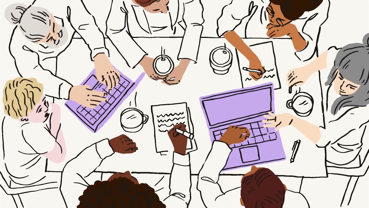
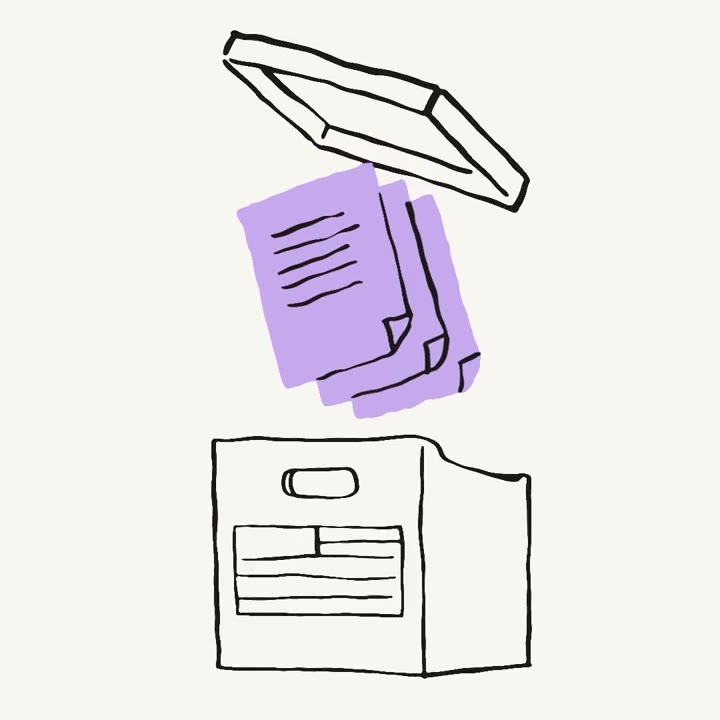
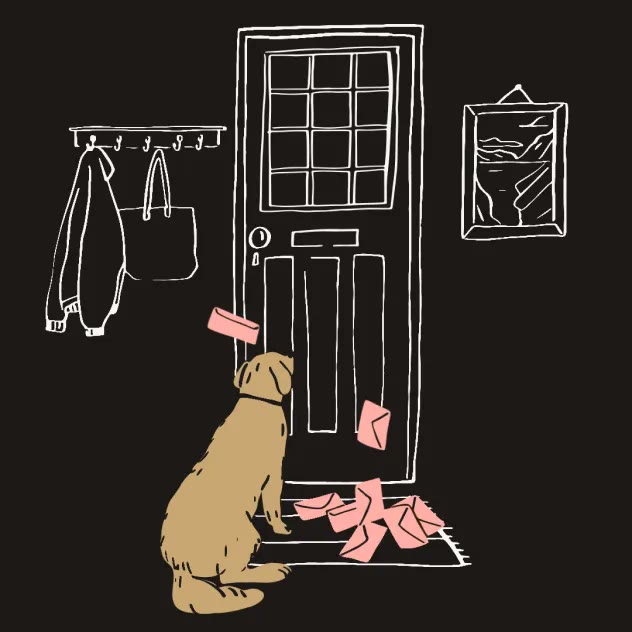
Illustration explains abstract, complex or dry ideas with simple, charming scenes and metaphors, in three sizes: hero, spot and mini. It also softens error messages.
| Job | explain the abstract, soften errors; photos prove the real |
|---|---|
| Sizes | hero, spot, mini |
| Line | loose black hand-drawn line |
| Color | flat fills from the accent palette, no gradients |
Job and sizes are published; line and color are observed from the examples, 2026-10-28.
Not published: line, color or character rules.
Source: brand.dropbox.com/imagery
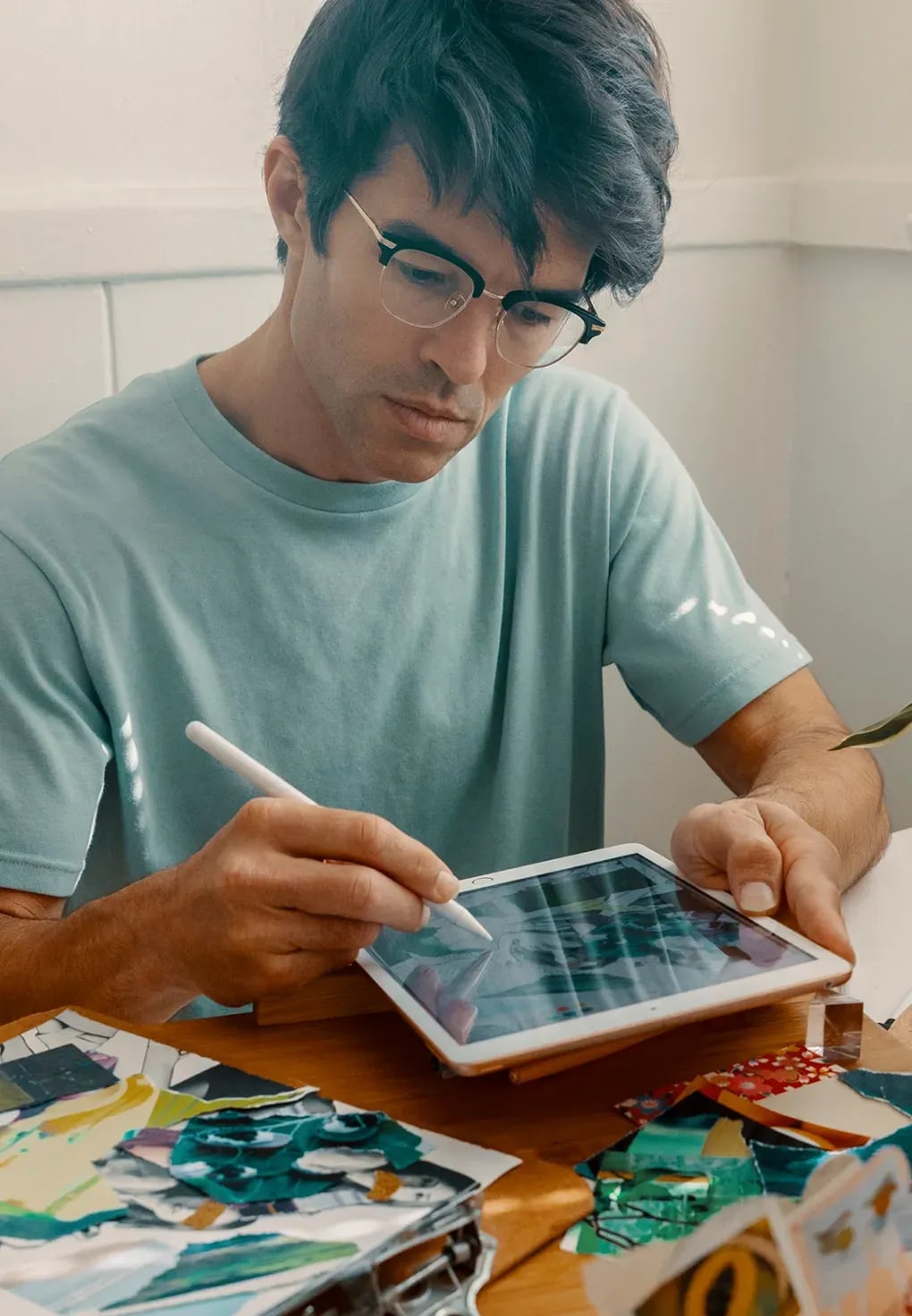
Showing a customer's real files makes the product's value concrete without a screenshot.
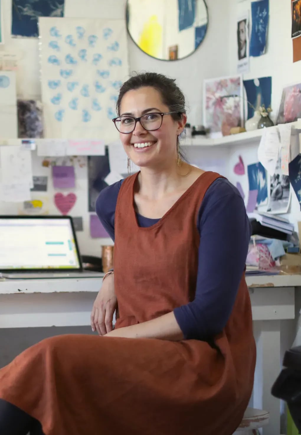

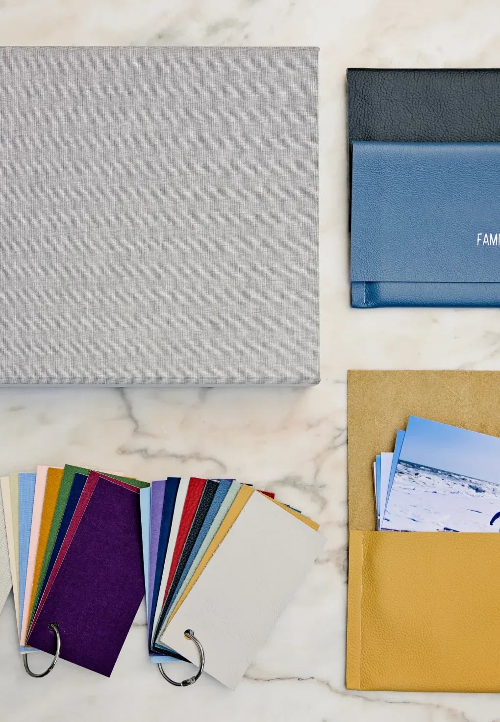
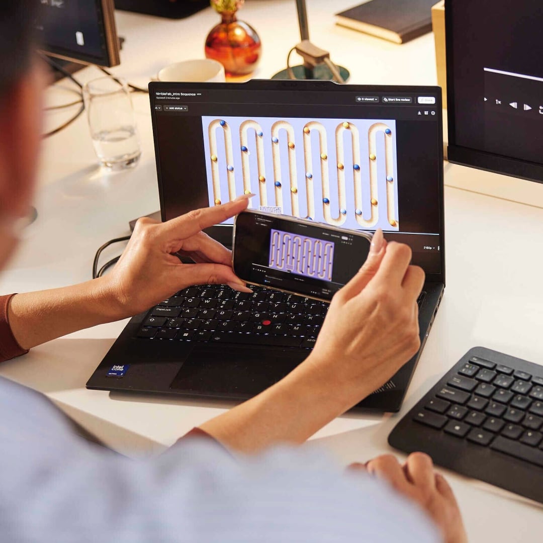
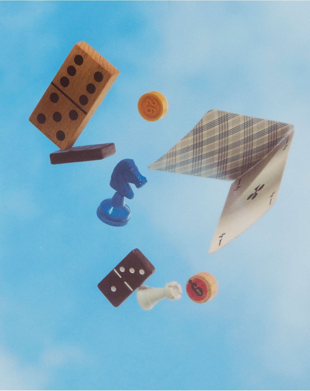




| Subjects | people, content (the work itself), teams, customer files |
|---|---|
| Light | natural, unstaged settings in the guide; on the homepage, bright daylight outdoors (hero), dark studio (fashion), floodlit track (racing), flat blue sky (objects) |
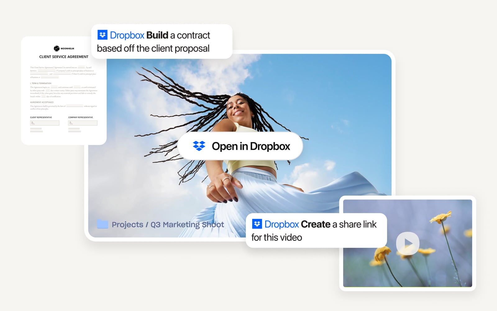
| Hero slot | one landscape photo about 5:3 (about 675 x 408 inside the frame), low angle, a person in motion against open sky; rim, pills and video tile sit over it |
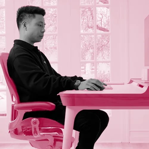
| Feature slots | square 1:1, 500 x 500, square corners, object-fit contain; one per band: fashion on a warm brown studio ground, a race car mid-corner, hands on a laptop showing the work |
| Security art | three cut-outs, about 4:5, 1:1 and 4:5 (206 x 261, 162 x 167, 374 x 473), stacked and offset: everyday objects floating in sky, textured green forms |
| Testimonial slot | square 275 x 275 (284 on phone), radius 8. Tint is baked into the file: the person in neutral greyscale, everything else flooded with one accent (pink, light #EBCCD6 to mid #C56A87; teal ground #36A2B6) |
| Industry slot | 186 x 197 (about 0.94:1), flush left, full card height, object-fit cover centered, cropped from 16:9 and 3:2 documentary photos of people at work on location; hidden on phone |
| Article slot | 390 x 219 (16:9) on top of the card, cover centered; 310 x 175 on phone |
| Product | product UI never sits inside the photo: it floats over the photo edge as white cards |
| Never | a photo used where an abstract idea needs illustration |
Subjects are published on brand.dropbox.com/imagery. Slot sizes, crops and the testimonial tint were measured on dropbox.com, 2026-10-29. The tint hexes are sampled from the image files.
Photography carries real customer stories in three subjects: people, content and teams. A fourth type, customer files, shows the customer's own work (photos, drawings, plans, tickets) as files. Each photo is matched to an accent color.
Not published: light, crop, casting or grading rules.
The guide prefers a wink to confetti: motion earns its place by explaining or confirming something.
Motion should feel fresh, inspiring and flexible, and give the same satisfying feeling as using the product. Four principles: prioritize simplicity, deepen understanding, instant feedback, subtle playfulness. The brand guide publishes one easing curve, cubic-bezier(0.65, 0, 0.45, 1); the live site's buttons use a quicker 100ms curve. Its line on restraint: a wink, not confetti.
Not published: durations.
Source: brand.dropbox.com/motion
Your headline, left-aligned
Bring your files to every tool
Full-bleed, square-cornered planes in Coconut, white and Graphite, 72px apart (120px top on feature bands). One exception: the security panel is inset 48px with radius 20, and scales in from 80% width as it scrolls into view. Content sits 48px from the edge (24 on phones); the hero headline is capped at 513px beside a framed product visual.
Measured from dropbox.com's computed styles, bounding boxes and pixel scans at 1440 and 390 px wide, on 2026-10-28 and 2026-10-29.
| Measure | Desktop | Phone |
|---|---|---|
| Page margin | 48px | 24px |
| Section padding | 72px | 72px |
| Hero text width | max 513px, centered | full width |
| Navigation | 72px | 72px |
Hero headline
DB Sharp Grotesk (Sharp Grotesk Variable for headlines) · 40px (phone 32) · line 1.2 · tracking -0.8px · weight 650
Section headline (wide cut)
DB Sharp Grotesk (Sharp Grotesk Variable for headlines) · 34px (phone 26) · line 1.13 · tracking 0.3px · weight 400
Feature headline
DB Sharp Grotesk (Sharp Grotesk Variable for headlines) · 26px · line 1.3 · tracking -0.52px · weight 650
Card title
DB Sharp Grotesk (Sharp Grotesk Variable for headlines) · 18px · line 1.2 · tracking -0.36px · weight 650
Small heading
Atlas Grotesk · 20px · line 1.2 · tracking 0.2px · weight 650
Lead
Atlas Grotesk · 20px (phone 16) · line 1.5 · tracking 0.2px · weight 400
Body
Atlas Grotesk · 16px · line 1.5 · tracking 0.16px · weight 400
Eyebrow and button label
Atlas Grotesk · 16px · line 1.2 · tracking 0.16px · weight 650
Nav link
Atlas Grotesk · 14px · line 1.43 · tracking 0.14px · weight 650
Pill label
Atlas Grotesk · 14px · line 1.2 · tracking 0.14px · weight 400
Overline
Atlas Grotesk · 12px · line 1.2 · tracking 0.12px · weight 700
Footer link
Atlas Grotesk · 14px · line 1.57 · tracking 0.14px · weight 400
One or two sentences on what this does for the reader.
One or two sentences on what this does for the reader.
Industry card: 596 x 197 at 1440, Coconut on white, radius 12, overflow hidden; image left 186px wide full height (object-fit cover); text column padding 24, gap 12: title 18/500 display, body 16/24 muted, arrow link 16/500 Graphite at the bottom. Phone: 310 wide, no image, padding 24
How Dropbox’s own landing pages are built, observed on dropbox.com, 2026-10-29. The full measurements are in spec.md.
Source: dropbox.com
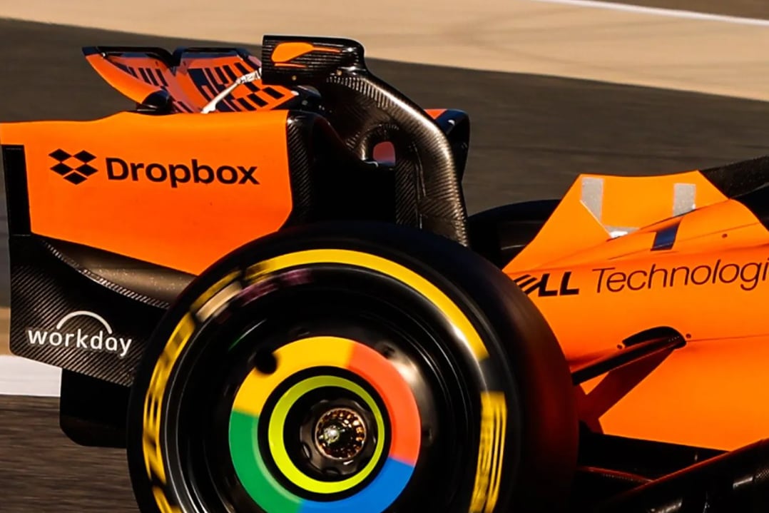
The partnership is the proof. Speed in F1 stands in for speed at work, and the shift from orange chaos to blue order acts out the product promise in the brand colors. Our reading
It makes file storage personal. The file name is the headline, so the product is in the ad without a feature list. This matches the 'human' voice pillar and the 'Make work human' value. Our reading
Expressiveness scales by context, loud in marketing and quiet in product (the team says so in It's Nice That). That is the root of today's guide, where the core three colors stay put and sixteen accents flex. Our reading
How our engine applies Dropbox's system to each format. This is our recipe built from their rules, not something Dropbox publishes.
| Format | What they did | Source |
|---|---|---|
| race livery / sponsorship | Dropbox logo on the McLaren MCL38 car and on Lando Norris's and Oscar Piastri's overalls and helmets (from 2024) | mclaren.com/racing/partners/dropbox/mclaren-racing-announces-dropbox-as-an-official-technology-partner-of-mclaren-formula-1-team |
| billboard | Dash x McLaren subway billboards: one on Graphite with an orange checkered stripe, one on full Dropbox Blue with the logo and keyword pills | sketchdeck.com/work/dropbox-dash-x-mclaren-proving-ai-can-drive-speed-without-losing-quality |
| billboard / wallscape | 'For All Things Worth Saving' print and digital OOH in five US cities, built on real customer folders | marketingdive.com/news/campaign-trail-dropbox-injects-humanity-into-file-storage-with-revamped-br/604826 |
| video ad | Dash x McLaren spots: 'Work faster with content you already have', with the key word in a blue pill and race-stripe motion graphics | sketchdeck.com/work/dropbox-dash-x-mclaren-proving-ai-can-drive-speed-without-losing-quality |
| podcast | 'Working Smarter: A podcast about AI and modern work', promoted as a homepage resource card | dropbox.com |
| webinar / announcement bar | Homepage top bar promoting a webinar on small businesses using Dropbox in ChatGPT (observed 2026-10-28) | dropbox.com |
| press release | Standard 'About Dropbox' boilerplate closes every release, e.g. the Q4/FY2025 earnings-date notice | investors.dropbox.com/node/13491/pdf |
| social | Instagram posts of real user stories as part of the 2021 platform | marketingdive.com/news/campaign-trail-dropbox-injects-humanity-into-file-storage-with-revamped-br/604826 |
| Format | Loudness | Must appear | What varies |
|---|---|---|---|
| Landing page | Announcement strip, white nav with the Tab, Coconut hero with a rimmed rounded product frame, black logo marquee, Graphite band in the wide cut, one inset rounded dark panel, black six-column footer | which feature bands, the accent in photos, how many testimonial cards | |
| Deck | Coconut slides, Graphite type, the Tab top left; blue only on the ask | one accent per section, with its dark partner | |
| Proposal page | Coconut hero, one Graphite band for the price, one blue button for the next step | a customer-files collage of the buyer's own work | |
| Ad | The Tab, a medium-weight headline, a blue button | an accent ground with its dark partner | |
| Social post | An accent ground with its dark partner, plus the glyph | a photo matched to the accent | |
| Full logo top left, one blue button | a spot illustration | ||
| Error message | Plain words and the fix | a mini illustration to soften it, as their imagery guide allows |
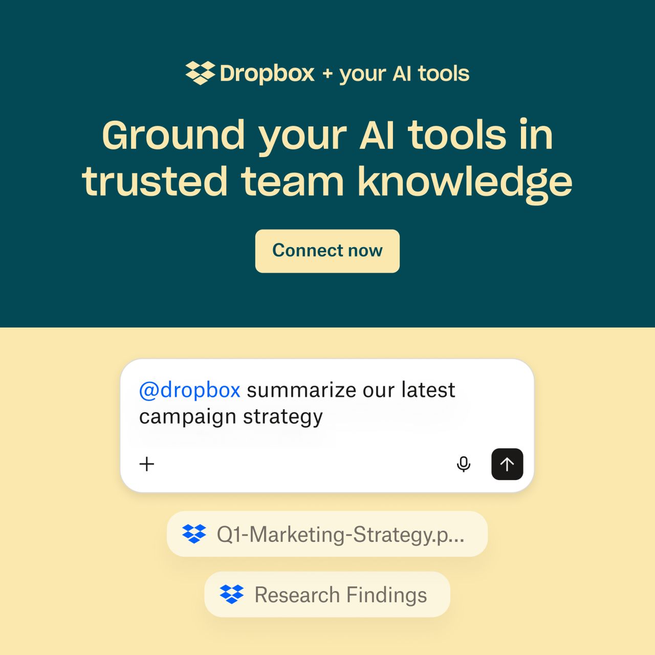 Bring your Dropbox files into your next chatLinkedIn
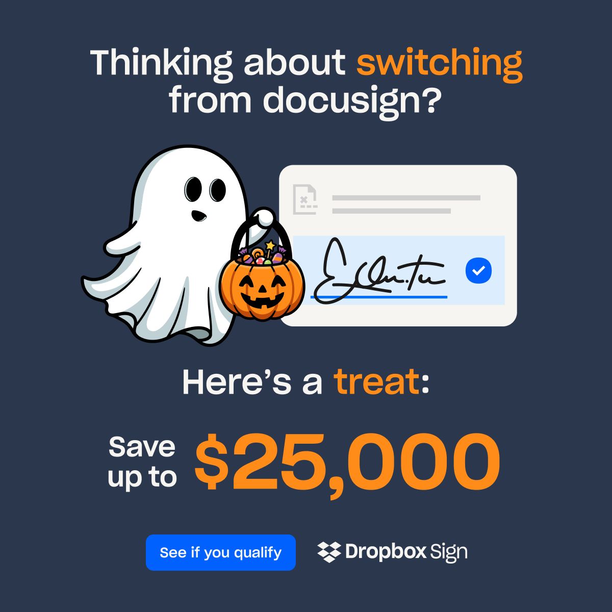 Make the move to Dropbox Sign and get up to three months…LinkedIn
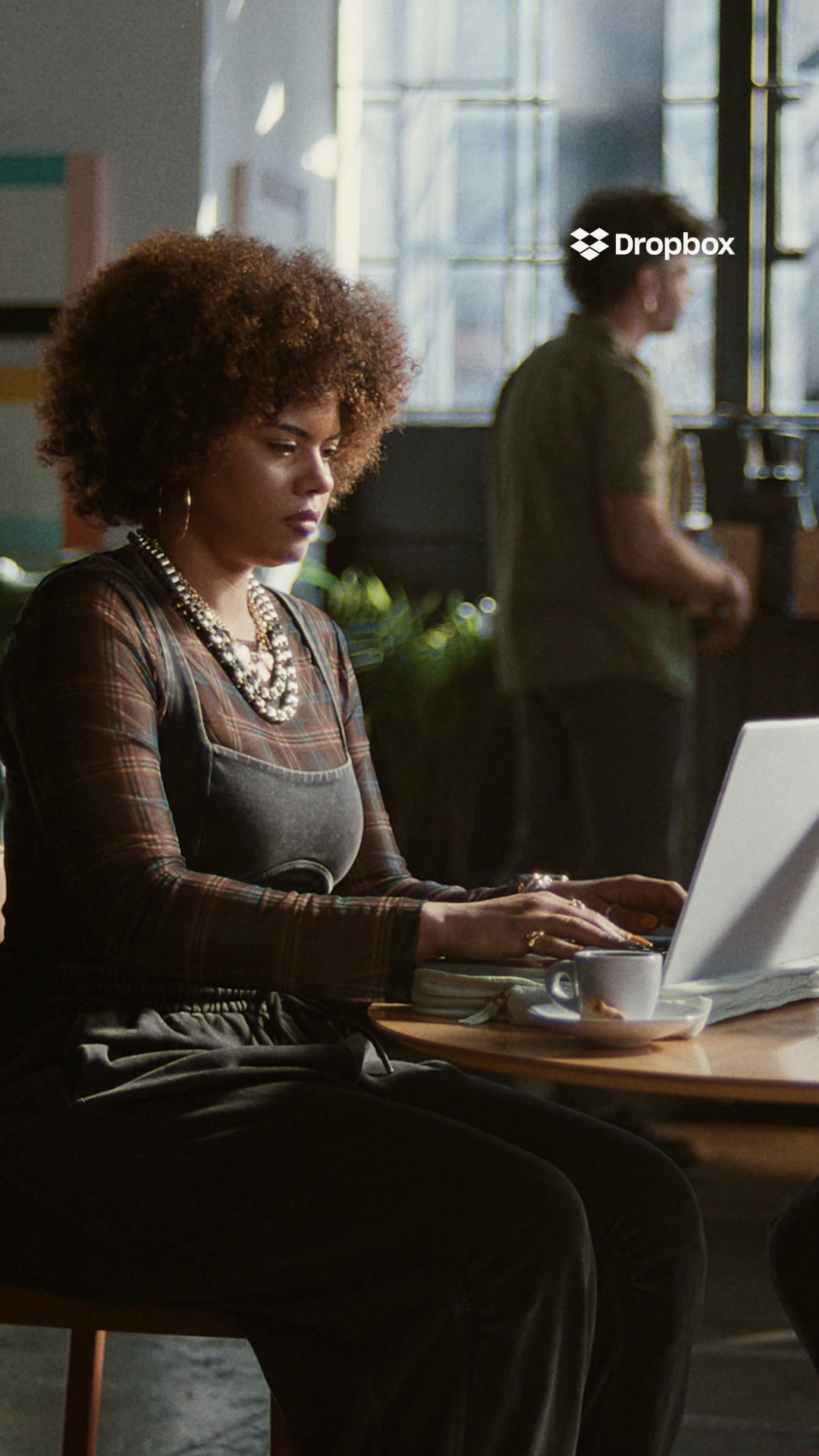 mofu greenfieldMeta · Oct 2026 – now
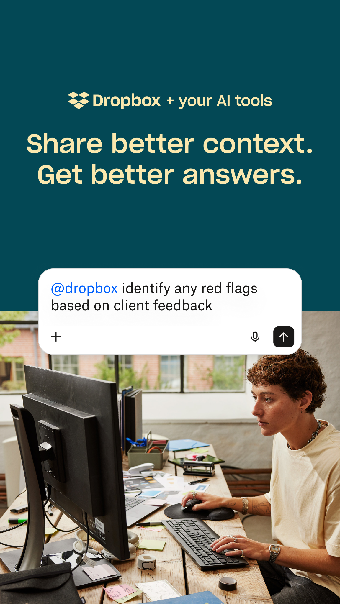 brandMeta · Oct 2026 – now
Source: brand.dropbox.com/colorbrand.dropbox.com/logobrand.dropbox.com/voice-and-tonebrand.dropbox.com/motiondropbox.com
Your name and logo, Dropbox’s system.
Use this kit for my brand Use this brand in Claude
Get your brand audit Put your brand in Claude What goes in a brand book
Each value is marked published, observed, our reading or our recipe, with its source. Checked 2026-10-28. Not affiliated with Dropbox.