Care
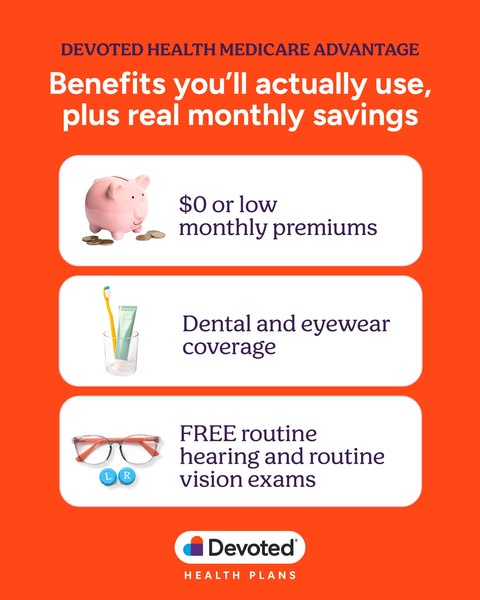
Benefits you'll actually use Observed
Brand book
Devoted sells Medicare as a relationship, not a policy: the page looks like a warm, handwritten invitation (cream paper, plum ink, one orange for "act here") so an older reader feels welcomed and never sold to, while the heart mark and "Devoted" puns keep repeating the promise of care. Our reading

The photograph: the season and setting change (meadow, river, coast, living room) but always older people in warm natural light.
Source: devoted.comdevoted.com/about-usdevoted.com/why-devoted
Approximate share of the desktop home page by area.
Our engine's setting, built from their rules.
Grounds are #FAF6F3 (cards #FFFFFF, tiles #F4EEEA); text is #3B1F54 (secondary #595959/#7C7087); #F04B24 is the only accent. No blue or purple outside the mark, no dark bands.
The page opens with the #F04B24 pill bar (50px radius, 48px inset) with the white capsule logo centred, or the 96px orange bar on phone.
Heads Figtree 700 at line-height 1.0; body Figtree 400; at most one Malila/Literata line per head; nothing renders at Figtree 500.
Buttons are #F04B24 pills with a chevron (secondary white with #E0D6E1 border); cards 38px radius with the warm glow; inputs 18px radius.
Photos show older adults in warm natural light in rounded frames; no clinical scenes, no tints, no text on faces.
Every number has an asterisk and a dated source line; benefits say "could", "may" or "many plans"; phone numbers carry TTY 711; Medicare pages end with the plan ID and "Last Updated" line.
The mark appears from the supplied SVG only (section opener 46px, card corner, footer corner), never redrawn, recoloured or rotated.
A Medicare Advantage health plan that works like a caring family member: $0-premium plans with everyday extras, U.S.-based Member Service Guides who answer fast, and its own virtual-first medical group, Devoted Medical. Our reading
Benefits you'll actually use Observed
Real monthly savings Observed
Member services Observed
Medicare, Devoted to You
Medicare Advantage plans with monthly premiums starting at $0
Built for Our Members
Compare plans in your area.
Our Members are our #1 priority. Our work puts them first.
ObservedSetbacks don't discourage us. We bounce back and keep going.
ObservedWe set clear goals. Get them done. Then repeat.
ObservedWe build diverse teams and believe that we do our best work together.
ObservedCategory. Medicare Advantage plans; "an integrated healthcare company redefining how healthcare is experienced and delivered" Observed
Founded in 2017, Devoted Health’s mission is to dramatically improve health and well-being by caring for everyone like they are family. Through an integrated care platform that brings together advanced data and AI with world-class clinical and service excellence, Devoted is redefining how healthcare is experienced and delivered. Devoted’s unique solution combines its proprietary technology and AI platform, Devoted Medical clinical services, Devoted health plans, and dedicated service Guides to deliver proactive, personalized, prevention-focused healthcare consistently and at scale. Built on the belief that informed, supported members can actively shape their own health for the better, Devoted's care model builds deep trust with members and partners with them to significantly improve care and health outcomes. Currently operating in the Medicare Advantage market, Devoted's platform is purpose-built to expand to serve broader healthcare markets over time. Learn more at www.devoted.com.
Medicare, Devoted to You Observed
Benefits you'll use. Real savings. Observed
Medicare Advantage Plans with Real Values Observed
Our vision: A care system delivering the best healthcare in the world Observed
What guides our work every day is the belief that care should feel human. Observed
Real calls. Unscripted. Observed
Find out if Devoted fits your life.
Every plan includes personal support.
We’re here to help.
See how we compare
How does Medicare work?
Medicare Advantage Plans with Real Values
Todd and Ed Park founded Devoted Health in 2017 to fix the system their own family had struggled to navigate.
Build your career with a mission-driven team that is changing healthcare.
Elder Councils turn members’ energy into action, strengthening communities nationwide.
Real calls. Unscripted.
Hear authentic, unscripted conversations with our amazing members!
you could save on your healthcare costs
you will save on your healthcare costs
Over 80% of member calls are answered within 30 seconds*
Lightning-fast support, guaranteed
Medicare Advantage plans from Devoted Health deliver unbeatable savings for every member!
Medicare Advantage plans with monthly premiums starting at $0. Benefits you'll use. Real savings.
warmplain-spokenreassuringcandid
membersMember Service Guidesrealfamilycaresavingsbenefitspersonal supportdevoted$0no obligation
exclamation marks in heads (they appear only in help copy and FAQ answers)all-caps heads (caps appear only on the founder name plate and enrollment-period labels)benefit amounts or guarantees stated without "could", "may" or a plan qualifierinsurance jargon left unexplained (Part B Giveback is always explained)fear or urgency language
Source: measure/home-desk.json, home-phone.json, about-desk.json, why-devoted-desk.json, newsroom-desk.json (2026-11-17)live computed styles, headless Chromium 1440x900 and 390x844, https://www.devoted.com/, https://www.devoted.com/about-us/, https://www.devoted.com/why-devoted/, https://www.devoted.com/newsroom/ (2026-11-17)
Source: devoted.comdevoted.com/about-usdevoted.com/why-devoteddevoted.com/benefitsdevoted.com/resources/new-funding-growth-oct-2026



One logo, always in its white capsule.



One logo, always in its white capsule. The three-colour heart mark (orange half-round cap, blue half-round, purple square) sits left of a bold geometric "Devoted" inside a white pill, centred in the orange top bar. The mark alone works as a graphic device: above heads, tucked into card corners and huge in the footer corner.
| Capsule logo | 216x54 viewBox, shown about 160x40 in the nav |
|---|---|
| Section-opener mark | 46px, centred above the head |
| Footer mark | 263x273, clipped at the bottom-right page edge |
Find a plan in your area.
Find a plan in your area.
Warm cream pages, plum type, one orange.
Warm cream pages, plum type, one orange. #FAF6F3 cream is every ground; #3B1F54 plum is every head and most body text; #F04B24 orange is the only accent (top bar, buttons, eyebrows, stats, checks). White cards with a warm glow and #F4EEEA sand tiles add depth. Blue #00A0DD and purple #592D82 appear only inside the heart mark.
| Paper | #FAF6F3 |
|---|---|
| Ink | #3B1F54 |
| Accent | #F04B24 |
| Cards / tiles | #FFFFFF / #F4EEEA |
| Secondary text | #595959, #7C7087 (serif subtitles) |
Source: devoted.comdevoted.com/about-usdevoted.com/why-devoteddevoted.com/newsroom
Medicare, Devoted to You
A friendly geometric sans with a soft serif voice.
A friendly geometric sans with a soft serif voice. Figtree 700 for every head at line-height 1.0, Figtree 400 for body; Malila (a low-contrast wedge serif) for subheads, kickers, card subtitles and the founder quote. Weight 500 in the CSS renders as 400 because the Adobe kit has no 500.
| Their face | Use | License | Open stand-in |
|---|---|---|---|
| Figtree 700 | Every head, stats, card heads | SIL OFL 1.1 (served via Adobe Fonts) | Real face; supplied as the identical Fontsource files (fonts/figtree-700.woff2). |
| Figtree 400 (and 600 for accordion rows) | Body, nav, buttons (CSS 500 renders 400) | SIL OFL 1.1 | Real face; fonts/figtree-400.woff2, figtree-600.woff2. |
| Malila 500 | Serif subheads, kickers, card subtitles, founder quote | commercial (Adobe Fonts) | Literata 450 (550 for the faux-bold hero sub) Literata 450 matches Malila 500 width within 0.6% and ink within 3% at 21-48px; x-height -1.7%. |
| Hero H1 | Figtree 700 96/96 white (phone 48/48) |
|---|---|
| Section head | Figtree 700 64/64 or 48/48 #3B1F54 (phone 30/30) |
| Card head | Figtree 700 30/39 |
| Serif lines | kicker 30/30, subhead 26, card subtitle 21/27.3 #7C7087 |
| Stat | Figtree 700 64/70.4 #F04B24 |
| Body | Figtree 400 19/24.7, captions 21/27.3 |
Source: devoted.comdevoted.com/about-usdevoted.com/why-devoted
Do Desktop: #F04B24 pill bar 1344x67 at x 48, y 24 (48px side inset, 24px from the top), 50px radius, shadow rgba(0,0,0,0.15) 0 4px 12px. Left: white pill "Find Doctors" (#F04B24 label) and an orange pill "Find Drugs" (white label), 44px tall. Centre: the white capsule logo (about 160x40). Right: white phone glyph + "1-800-990-0723 TTY 711" in white Figtree 26, then a 48px white circle holding an orange hamburger. Below it a 62px link row (Join a plan, Find doctors & drugs, My plan & benefits, Member support, Member Login, Español) in Figtree 19, white over the hero video, #3B1F54 on cream. Phone: orange bar 0-96px tall, white 48px circles for phone (left) and menu (right), capsule logo centred.
Floating orange top bar · top of every page (desktop); full-width orange header on phone
Do The mark (orange half-round cap, blue half-round left, purple square) at 46px above a centred head; at about 120px tucked into the bottom-right corner of a white card so it touches both edges; at 263x273 bleeding off the bottom-right of the footer. Always the shipped file (mark-heart.svg or mark-footer-large.svg), never redrawn or recoloured.
Three-colour heart mark as a graphic · centred above section heads (home $0-premiums head, /about-us careers card), top-left inside the personal-support card, clipped into the bottom-right corner of the white overlap cards on /about-us, and huge in the footer corner
Do #F04B24 fill, 75px radius, white Figtree 24 (renders 400), small white › chevron after the label; 70px tall, padding 20px 28px on desktop, 18px label and 63px tall on phone. Secondary: white pill, 1px #E0D6E1 border, #3B1F54 label, orange chevron.
Orange pill buttons with a chevron · every call to action
Do #FAF6F3 ground everywhere; content sits on #FFFFFF cards with 38px radius and a warm, offset-free glow rgba(179,92,67,0.12) 0 0 30px; generous inner padding (60px 180px on the big cards). Quieter tiles are #F4EEEA with the same 38px radius and no shadow.
Cream page, white glowing cards · compare-plans card, lead-form card, personal-support card, footer call card, transcript card
Do Figtree 700 #3B1F54 head (48-64px desktop, line-height 1.0) paired with one Malila line (Literata 450 stand-in) in the same plum: a 30px kicker above ("Getting Started", "How we care", "Two brothers. One mission.") or a 26px subhead below ("Benefits you'll use. Real savings."). The serif is never bold and never the main head.
Plum sans head with a serif voice line · section heads across home and /about-us
Do Three tall portrait photos (about 413x720 at 1440, 38px radius) of older members in warm natural light, each with an orange "Listen" pill (play triangle) 24px from the bottom-left. The transcript band: a full-bleed lifestyle photo with a white 38px-radius card at the left holding "Real calls. Unscripted." (Figtree 30 bold), an orange 62px play circle, a scrub bar and the transcript in Figtree 21 #595959.
Real members, real voices · "Built for Our Members" / "Healthcare built around our members" Listen cards; "Real calls. Unscripted." band
Specimens use sample copy, not Devoted Health’s.
Soft, rounded, warm.

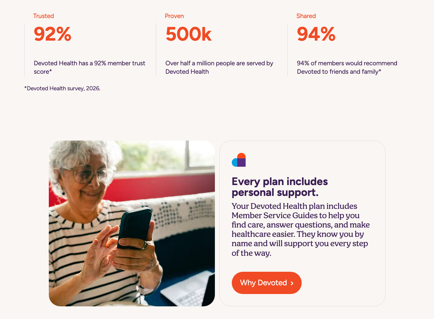

Soft, rounded, warm. Pills for every button and the top bar; 38px radius white cards with a warm glow; sand tiles; 1px rules for accordion rows and stat columns; 18px-radius inputs with 2px lilac borders; orange + / − on accordions; orange checkmarks in a white-cell comparison table.
| Card | 38px radius, padding 60px 180px on the big cards, glow rgba(179,92,67,0.12) 0 0 30px |
|---|---|
| Primary pill | 70px tall, padding 20px 28px, 75px radius |
| Input | 76px tall, 18px radius, 2px #E0D6E1 |
Orange single-colour line icons with round ends for benefits (tooth, pill bottle, food card, pills, ear, glasses, piggy bank, dumbbell) at 36px beside accordion titles.


Orange single-colour line icons with round ends for benefits (tooth, pill bottle, food card, pills, ear, glasses, piggy bank, dumbbell) at 36px beside accordion titles. Each SVG is filled paths in #F04C24 (#F04B24 for fitness).
| Size | 36x36 in the accordion |
|---|---|
| Colour | #F04C24 (file colour of the benefit icons; fitness #F04B24) |
Source: devoted.com
Little illustration on the current marketing pages.

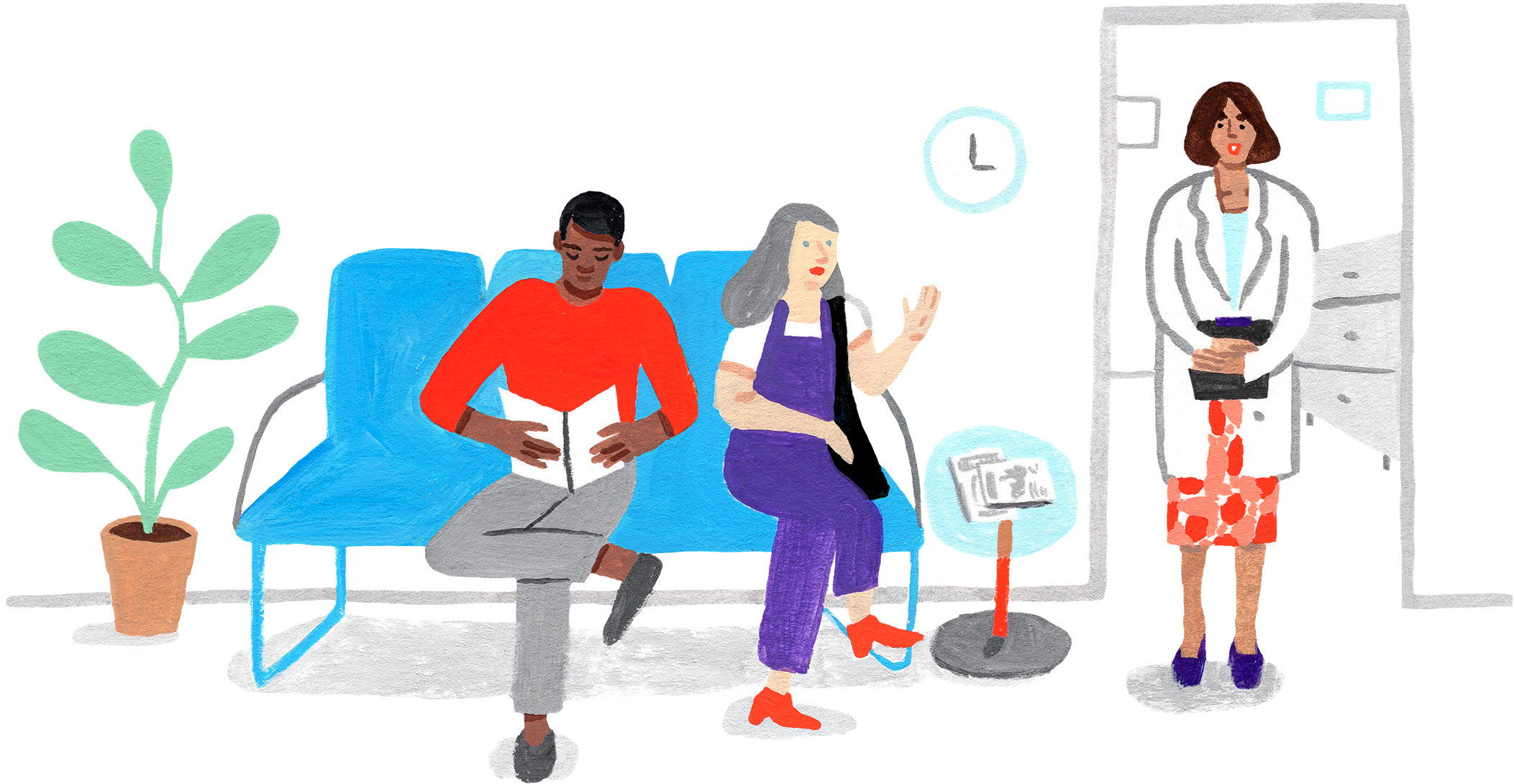
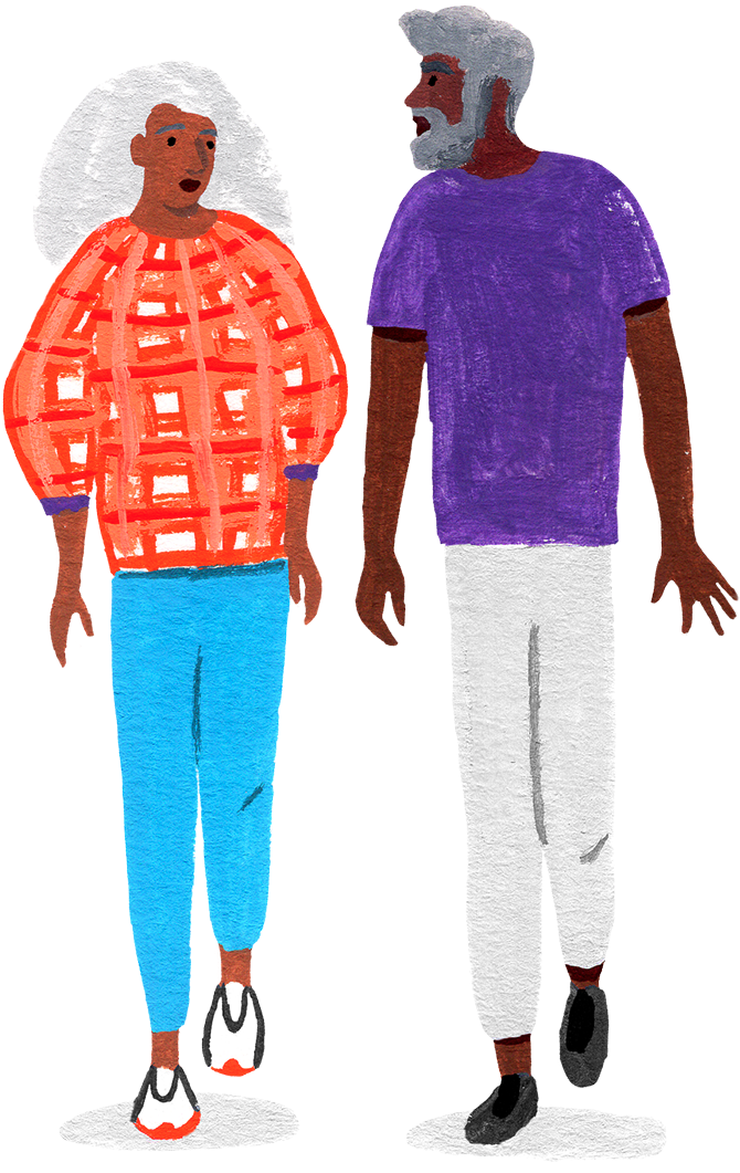


Little illustration on the current marketing pages. Two kinds exist: (1) product cut-outs (stethoscope, pill bottles) on transparent grounds inside sand tiles; (2) on older pages (Meet Our Team, careers), textured gouache-style figures of diverse older people in orange, purple, blue and teal clothing on white, no outlines.
Source: devoted.comdevoted.com/meet-our-teamcareers.devoted.com
Real-looking older people living full lives, in natural warm light.









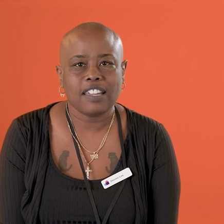


Real-looking older people living full lives, in natural warm light. Outdoor scenes (meadows, rivers, coast, park benches) and homes; grandparents with grandchildren, couples, members with dogs. Natural colour, golden-hour warmth, no tints. Photos sit in 38px-radius frames (16px for article tiles) or run full bleed under a 20% black scrim (hero) or behind a white card (transcript band, founders). Staff and founders appear in Devoted T-shirts in a brick-and-window office.
| Listen portraits | 9:16 (440x785), 38px radius |
|---|---|
| Hero video | 16:9, scrim rgba(0,0,0,0.2) |
| Article tiles | square, 16px radius |
Source: devoted.comdevoted.com/about-usdevoted.com/why-devoteddevoted.com/newsroom
Centred and calm on a cream page. Home: floating orange bar over a full-bleed video hero with a centred 96px white H1, serif sub and two pills; then a centred narrow column (868px) of the heart mark, head, serif subhead and a benefits accordion; three Listen portrait cards; a centred white compare-plans card with ZIP field; a three-up feature row on vertical rules; two sand tool tiles; an orange stats row; a photo + white card split; a big white lead-form card; a full-bleed transcript band; a comparison table; three article tiles; then the footer: an orange ZIP card beside a white Give-us-a-call card, link columns, the giant corner mark and the plan ID line. Content width 1280-1300 at 1440 (70-80px side margins).
Measured from devoted.com home at 1440x900 and 390x844 (measure/home-desk.json, home-phone.json), 2026-11-17's computed styles and bounding boxes of every band, nav, menu and hover state, headless Chromium.
| Measure | Desktop | Phone |
|---|---|---|
| Page margin | 70px | 15px |
| Section padding | 90px | 40px |
| Hero text width | max 1152px, centered | full width |
| Card gap | 30px | 30px |
| Navigation | 91px | 91px |
Home hero H1
Figtree 700 · 96px (phone 48) · line 1 · weight 700
Hero serif sub
Figtree 400 (and 600 for accordion rows) · 48px (phone 24) · line 1 · weight 450
Section head (large)
Figtree 700 · 64px (phone 30) · line 1 · weight 700
Section head (medium)
Figtree 700 · 48px (phone 30) · line 1 · weight 700
Inner page H1
Figtree 700 · 72px (phone 40) · line 1 · weight 700
Card head
Figtree 700 · 36px · line 1 · weight 700
Feature / tease head
Figtree 700 · 30px · line 1.3 · weight 700
Accordion row
Figtree 700 · 30px (phone 21) · line 1.15 · weight 600
Stat number
Figtree 700 · 64px (phone 48) · line 1.1 · tracking -0.25px · weight 700
Serif kicker
Figtree 400 (and 600 for accordion rows) · 30px (phone 21) · line 1 · weight 450
Serif sub / lead
Figtree 400 (and 600 for accordion rows) · 26px (phone 21) · line 1.3 · tracking -0.25px · weight 450
Serif card subtitle
Figtree 400 (and 600 for accordion rows) · 21px · line 1.3 · tracking -0.25px · weight 450
Eyebrow
Figtree 700 · 21px · line 1 · weight 700
Body
Figtree 400 (and 600 for accordion rows) · 19px · line 1.3 · tracking -0.25px · weight 400
Body large
Figtree 400 (and 600 for accordion rows) · 21px · line 1.3 · tracking -0.25px · weight 400
Button label
Figtree 400 (and 600 for accordion rows) · 24px (phone 18) · line 1.15 · weight 400
Nav link
Figtree 400 (and 600 for accordion rows) · 19px · line 1.15 · weight 400
Footer column head
Figtree 700 · 24px (phone 19) · line 1 · weight 700
Small bold
Figtree 400 (and 600 for accordion rows) · 16px · line 1.15 · weight 700
Legal line
Figtree 400 (and 600 for accordion rows) · 19px · line 1.4 · weight 700
How Devoted Health’s own landing pages are built, observed on devoted.com home at 1440x900 and 390x844 (measure/home-desk.json, home-phone.json, live probes of nav, menus, hover states and breakpoints), 2026-11-17. The full measurements are in spec.md.
Source: devoted.comdevoted.com/about-usdevoted.com/why-devoteddevoted.com/newsroom
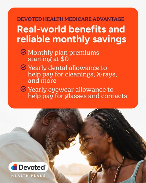
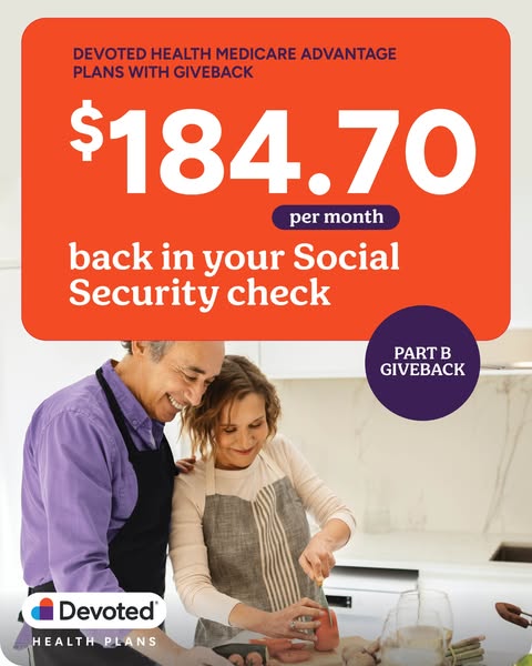
From devoted.com (home, about-us, why-devoted, newsroom, benefits, medical, meet-our-team), careers.devoted.com, two press releases, the og:image, and the public Instagram @mydevoted grid and Facebook /devotedhealthplans photos and reels grids read logged out on 2026-11-17. Ads and organic posts re-read from the Meta Ad Library (Devoted Health, active Oct 2026) and the public Instagram/Facebook grids on 2026-11-17.
| Format | Loudness | Must appear | What varies |
|---|---|---|---|
| Landing page | Cream #FAF6F3 page under the floating orange pill bar (logo capsule centred, Find Doctors / Find Drugs pills left, phone + TTY right). Hero: full-bleed warm outdoor video or photo of older people under a 20% black scrim, centred white Figtree 700 H1 (96px) with one Malila sub line and an orange primary pill + white secondary pill. Then centred plum heads (heart mark above, serif line below), 38px-radius white cards with a warm glow for forms and comparisons, sand tiles for tools, an orange stats row on thin rules with an asterisk source, Listen portrait cards of members, and the footer pair (orange ZIP card, white call card) with the corner heart mark and plan ID line. | ||
| Social post | Organic posts that announce something are the orange announcement: flat #F04B24 orange ground with confetti, the heart mark in a white circle top centre, a white bold caps headline of 4 lines, one italic caps source line. Figtree plus the light italic; the heart mark only, never the capsule logo. | The headline words and the source line; whether confetti sits on the orange. | |
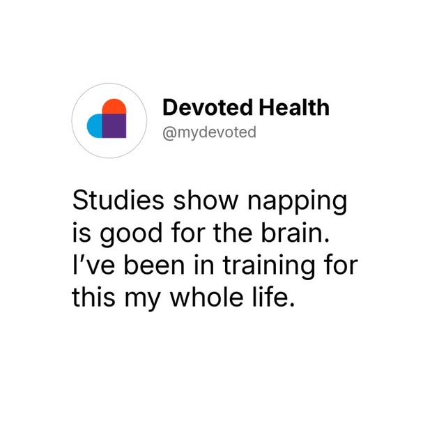
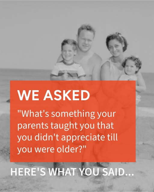
| Social post, quote card (square) | One of Devoted's two observed square families: (A) the white "post card" quote on #FFFFFF or over a full-bleed photo, or (B) a full-bleed photo with a square-cornered #F04B24 label box. Figtree only, no serif heads, the heart mark appears as the avatar or not at all. | Photo subject (real older people, family, everyday objects, vintage snapshots); quote text; whether the card sits on white or on a photo. | |
| Paid social ad, offer | Offers run on 4:5 orange: either an orange rounded panel over a real-people photo, or a flat orange ground with white rounded cards. Plum caps eyebrow "DEVOTED HEALTH MEDICARE ADVANTAGE", white bold headline, serif benefit lines, capsule logo with HEALTH PLANS under it at the bottom. One offer per ad. | Photo or cut-out; the number or benefit list; panel colour (orange on photo, white on orange); badge or button. | |
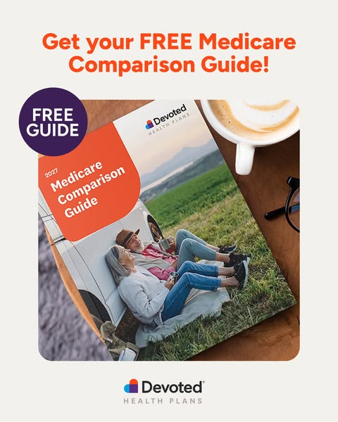
| Paid social ad, lead magnet | A free Medicare guide ad: a centred two-line headline "Get your FREE Medicare Comparison Guide!", the guide cover photographed or cut out as the hero, a plum circle "FREE GUIDE" badge overlapping its corner, capsule logo bottom centre. Ground is #F2F1ED warm grey with an orange headline, or flat orange with a white headline. | Ground (grey or orange); guide cover placement and tilt; badge side. | |
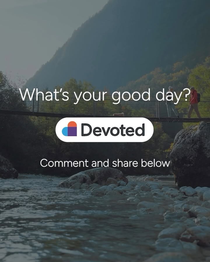
| Social post, portrait | Devoted posts most often at 4:5. Pick one of the observed families: orange statement, orange announcement with the heart in a white circle, photo + orange panel, or hero footage with the capsule logo. Text is white on orange or on darkened footage, centred unless it sits in the panel. | Family; photo or footage; whether a light italic line leads the bold line. | |
| Share card (og:image) | Real older adults laughing together, cut out on a near-white ground, with the three-colour heart present as a physical prop; no headline text on the image. | People and prop pose. |
 Get your FREE Medicare Comparison Guide today!Google, Meta · Oct 2026 – now
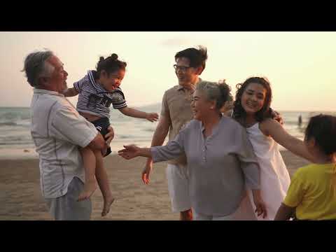 Medicare, Devoted to YouGoogle, Meta · Jan 2026 – now
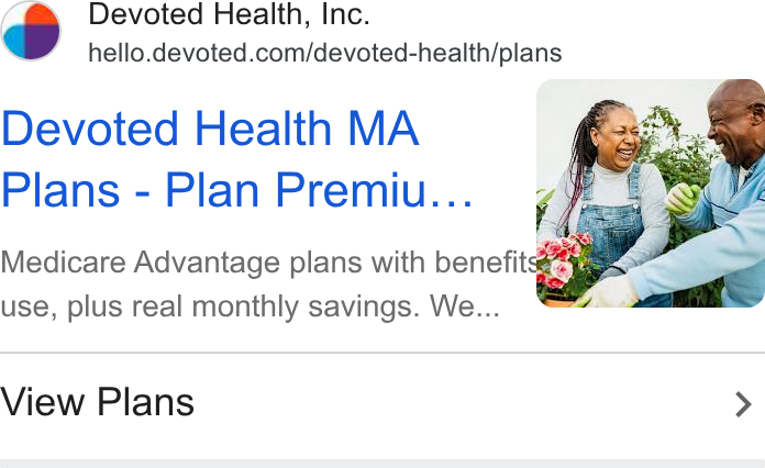 PlansGoogle · Oct 2026 – now
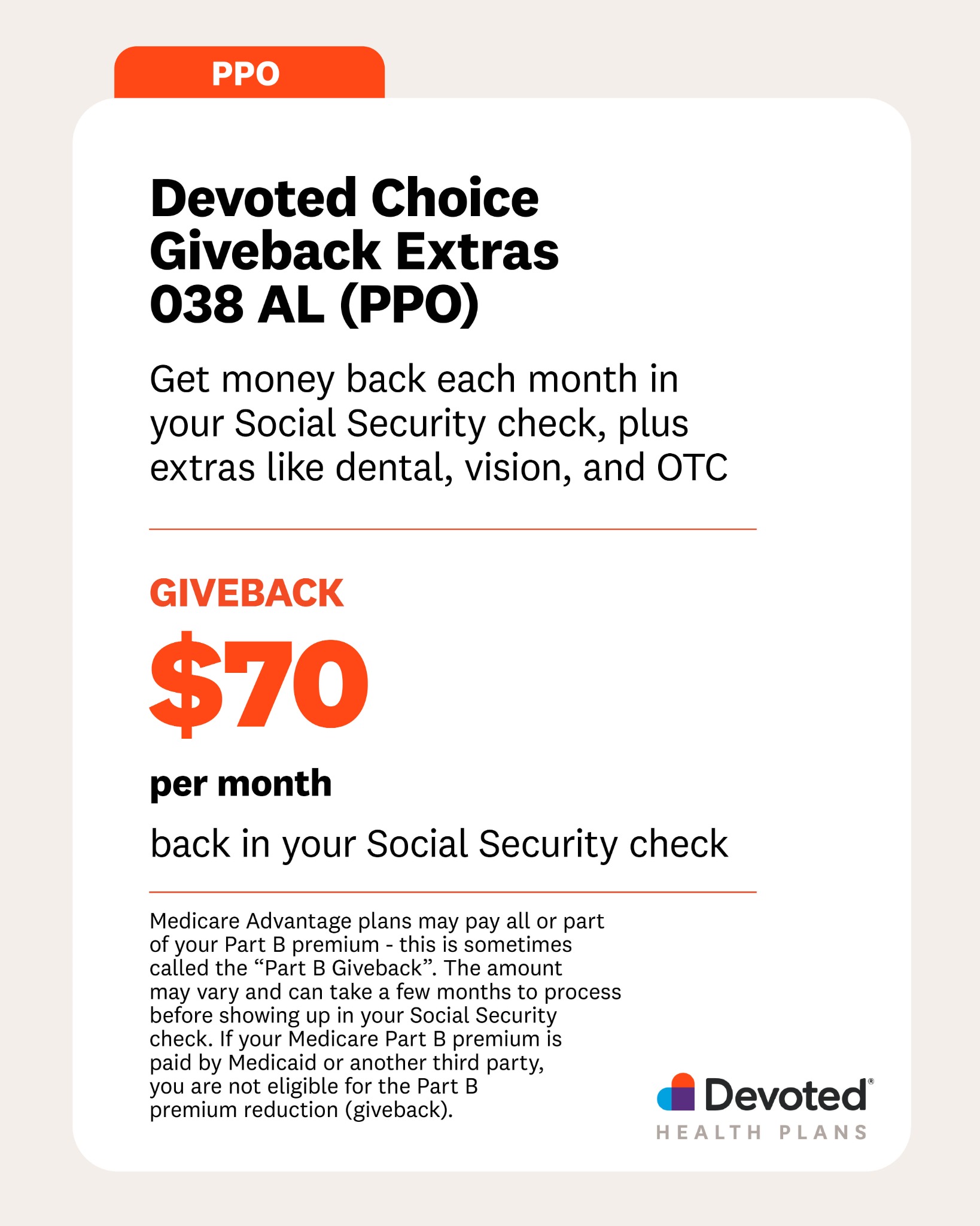 You’ve got plan options in AlabamaMeta · Oct 2026 – now
All 8Devoted Health ad campaigns →
Source: devoted.comdevoted.com/about-usdevoted.com/newsroomdevoted.com/why-devotedfacebook.com/ads/libraryinstagram.com/mydevoted/p/DexGqoiJpvO
Your name and logo, Devoted Health’s system.
Talk about my brand Use this brand in Claude
Get your brand audit Put your brand in Claude What goes in a brand book
Each value is marked published, observed, our reading or our recipe, with its source. Checked 2026-11-17. Not affiliated with Devoted Health.
Tell us what you want to make. We’ll talk through how to put these ideas to work for your brand.