Build (AOPs)
Define your workflows with natural-language AOPs that deliver faster time to value, greater transparency, and trusted results at scale. Observed
Brand book
Decagon sells a "concierge" for every customer, so the site is built to feel like hospitality, not machinery: soft platinum and lavender, dreamy unhurried photography, rounded slabs like hotel cards, quiet Book-weight type. The tech shows up only as frosted, almost weightless UI, and the brand's energy is concentrated in one warm-to-indigo gradient rim on the button you press. Our reading

The hero treatment: a WebGL lavender photo scene (home), a centred H1 over a product-UI collage (product), a plain heading over a video carousel (customers), or an indigo aurora image (legacy about).
Source: decagon.aidecagon.ai/product/overviewdecagon.ai/case-studiesdecagon.ai/about
Page ground is #F4F4F5; dark bands are #0A0A0B inset slabs with 20px radius; the page ends in the black CTA slab + #111111 footer.
Indigo #5754FF (#7370FF on dark) appears only as the eyebrow square, one highlighted word or product name, or outline-button text; never a large fill.
The primary CTA is the dark pill with the 1.5px orange-violet-indigo rim and white 16px Medium text, worded Get a demo; secondary actions are 1px outline pills.
Circular XX (or the calibrated stand-in) in sentence case at Book 450 / Medium 500 with negative tracking; no bold, no all-caps heads.
Every section opens with a hairline and a #EAEAEC tag holding an 8px indigo square and a short sentence-case label.
Only lavender-graded people photography, frosted-glass product UI, or the customer's own natural photos in rounded frames.
Every number belongs to a named customer or to a figure decagon.ai states, with its unit line in lower case.
The conversational AI platform for concierge customer experiences: enterprises build, optimize and scale AI agents across chat, voice and email in natural language, without a vendor ticket for every change. Our reading
Define your workflows with natural-language AOPs that deliver faster time to value, greater transparency, and trusted results at scale. Observed
Validate and iterate on AI logic with robust testing, observability, and experimentation, so your agent stays reliable as it evolves. Observed
Unlock critical insights with an analytics suite that turns every conversation into an opportunity to better understand your customers. Observed
Decagon unifies chat, voice, and email within a single intelligence layer, ensuring customer experiences stay consistent across every channel. Observed
Duet analyzes customer conversations to identify workflow gaps, and automatically generates, tests, and refines AOPs to improve performance. Observed
The AI concierge for every customer
Build once. Deploy everywhere.
Instant ROI on the metrics that matter.
Your business evolves. Your AI agent should too.
We value decisive action and speed over prolonged deliberation and planning.
ObservedOur core identity must always be rooted in building for our customers; this has been the foundation of our success.
ObservedFiercely competitive nature and fighting spirit are foundational.
ObservedThe best team members understand other functions deeply and promote cross functional collaboration.
ObservedCategory. Conversational AI platform (AI agents for customer experience) Observed
Decagon is the conversational AI platform that lets every brand deliver concierge customer experiences, with personalized, always-on interactions across voice, chat, email and more for the world's leading companies (paraphrase of the careers "What is Decagon?" band).
The AI concierge for every customer Observed
Build, optimize, and scale AI agents that treat every customer like the only one. Observed
Empower every brand to deliver concierge customer experiences Observed
The conversational AI platform for concierge customer experiences Observed
Rapidly build, optimize, and scale AI agents. Observed
Build once. Deploy everywhere. Observed
Your business evolves. Your AI agent should too. Observed
Deliver the concierge experiences your customers deserve Observed
Build the concierge for every customer, everywhere. Observed
A voice customers will thank Observed
Companies defining concierge experiences Observed
Instant ROI on the metrics that matter. Observed
No more hold music. Just help.
Not just deflections. Real resolutions.
9,000 complex support cases a day. Not a problem.
A voice your customers will thank you for
No more hold music. Just help.
Revolutionize your support with AI!
Build, optimize, and scale AI agents that treat every customer like the only one.
Build, optimize and scale chatbots.
9,000 complex support cases a day. Not a problem.
Thousands of tickets solved instantly
Our AI chatbot deflects tickets fast!
Not just deflections. Real resolutions.
WarmConfidentPlain-spokenCustomer-obsessed
AI conciergeconcierge customer experiencesAI agentsAgent Operating Procedures (AOPs)DuetWatchtoweromnichanneldeflectionresolutionCSATbuild, optimize, and scale
Source: decagon.aidecagon.ai/product/overviewdecagon.ai/case-studies
Source: decagon.aidecagon.ai/product/overviewdecagon.ai/aboutdecagon.ai/case-studies


One logo, always one colour.


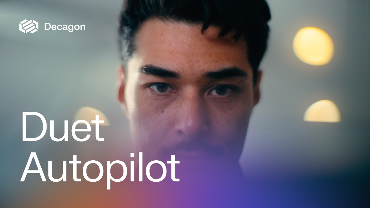
One logo, always one colour. A hexagonal mark of three interlocking ribbon bands sits beside the "Decagon" wordmark: #0A0A0B on light, white on dark or footage. It runs top-left in the header at 147x32 and at 224x48 in the footer; the white lockup sits straight on launch-video footage top-left; paid ads pair it with a partner as "Decagon | partner"; the white mark alone is the app icon.
Neutral and soft: #F4F4F5 platinum carries most of every page, white cards sit on it, and near-black #0A0A0B / #111111 slabs carry the product story and the footer.
Neutral and soft: #F4F4F5 platinum carries most of every page, white cards sit on it, and near-black #0A0A0B / #111111 slabs carry the product story and the footer. Indigo #5754FF is the brand colour but used sparingly: the 8px eyebrow square, one highlighted word per block (#7370FF on dark), outline-button text and the active channel word. Warmth comes only from gradients: the button rim (#FF8847, #D770FF, #5754FF), aurora glows (#5754FF, #89F1F7, #D499FE, #FF6F22) in the closing CTA and OG image, and the lavender photo grade. Customer ROI cards borrow each customer's own colour.
Source: measure/home-desk.json, measure/home-phone.json, measure/product-desk.json, measure/customers-desk.json, measure/about-desk.json (2026-11-17)decagon.ai :root custom properties in decagon-staging-2025.webflow.shared.5e22dd421.min.css (2026-11-17)
The AI concierge for every customer
Circular XX throughout current templates: Book 450 for section heads (40/48, -0.025em), page H1s (60/66, -0.03em), stats and quotes; Medium 500 for the home H1 (72/72, -0.04em), buttons and eyebrows; Regular 400 for body (16/20.8) and the hero lead (20/26 #4E4E56).
Circular XX throughout current templates: Book 450 for section heads (40/48, -0.025em), page H1s (60/66, -0.03em), stats and quotes; Medium 500 for the home H1 (72/72, -0.04em), buttons and eyebrows; Regular 400 for body (16/20.8) and the hero lead (20/26 #4E4E56). Everything sentence case; no bold. The about and security pages are an older template set in FK Grotesk Neue 400.
| Their face | Use | License | Open stand-in |
|---|---|---|---|
| Circular XX | Every head, stats, quotes (Book 450; Medium 500 for the home H1) | commercial (Lineto) | Figtree Calibrated 2026-11-17 against the real face rendered on decagon.ai: Figtree 400 body within 0.8% line width and 2.2% ink; Book 450 heads -> Figtree 450, Medium 500 H1 -> Figtree 550; tracking stays at the measured em values. |
| Circular XX | Body, leads, buttons, nav, eyebrows, footer (Regular 400; Medium 500 for buttons and eyebrows) | commercial (Lineto) | Figtree Calibrated 2026-11-17 against the real face rendered on decagon.ai: Figtree 400 body within 0.8% line width and 2.2% ink; Book 450 heads -> Figtree 450, Medium 500 H1 -> Figtree 550; tracking stays at the measured em values. |
| FK Grotesk Neue | About and security pages only | commercial (Florian Karsten) | Albert Sans Calibrated 2026-11-17: closest width, x-height and ink to FK Grotesk Neue of 11 open faces; Inter rejected (x-height +7%). |
Source: measure/home-desk.json, measure/home-phone.json, measure/product-desk.json, measure/customers-desk.json, measure/about-desk.json (2026-11-17)
Do Full-pill button: 1.5px rim of linear-gradient(90deg, #FF8847, #D770FF 50%, #5754FF) around an inner pill of linear-gradient(180deg, #0A0A0B, #303036); white Circular XX 16 Medium, 12px 24px padding (14px text in the header). The only filled button on current templates.
Dark pill with an orange-violet-indigo rim · Get a demo in the header, the hero email form, every closing CTA
Do A 1px #D4D4D8 rule across the 1160px container, 24px gap, then a #EAEAEC tag (radius 4px, padding 4px 16px 4px 12px) holding an 8px #5754FF square (radius 2px) and Circular XX 14 Medium #0A0A0B sentence-case text (e.g. The Decagon difference). On dark: rule #4E4E56, tag #303036, white text.
Hairline plus tagged eyebrow · Above every section head on home, product, customers, careers
Do Page ground #F4F4F5. Hero and dark bands are slabs inset 12px from the viewport edges with 20px radius; the #0A0A0B closing CTA (radius 20 20 0 0) runs into the #111111 footer (radius 0 0 16 16) as one rounded block.
Inset rounded slabs on platinum · Home hero, dark platform slab, closing CTA + footer on every page
Do The first word or product name in a head or statement is set in indigo via <strong> at the same weight: #7370FF on dark, #5754FF on light. One highlighted phrase per block.
One indigo word · Timeline heads (Build / Optimize / Scale your agent), AOPs and Duet paragraphs, the active channel word
Do Real people in calm everyday moments (walking with a coffee, on a phone call, at a laptop) graded toward lavender/periwinkle #5754FF-#C3C2FF with peach-orange warmth at the edges, soft grain; in the hero, a surreal pale moon over a lavender sky and pink ground.
Lavender-washed editorial photography · Home hero (WebGL), omnichannel band, about hero, OG image
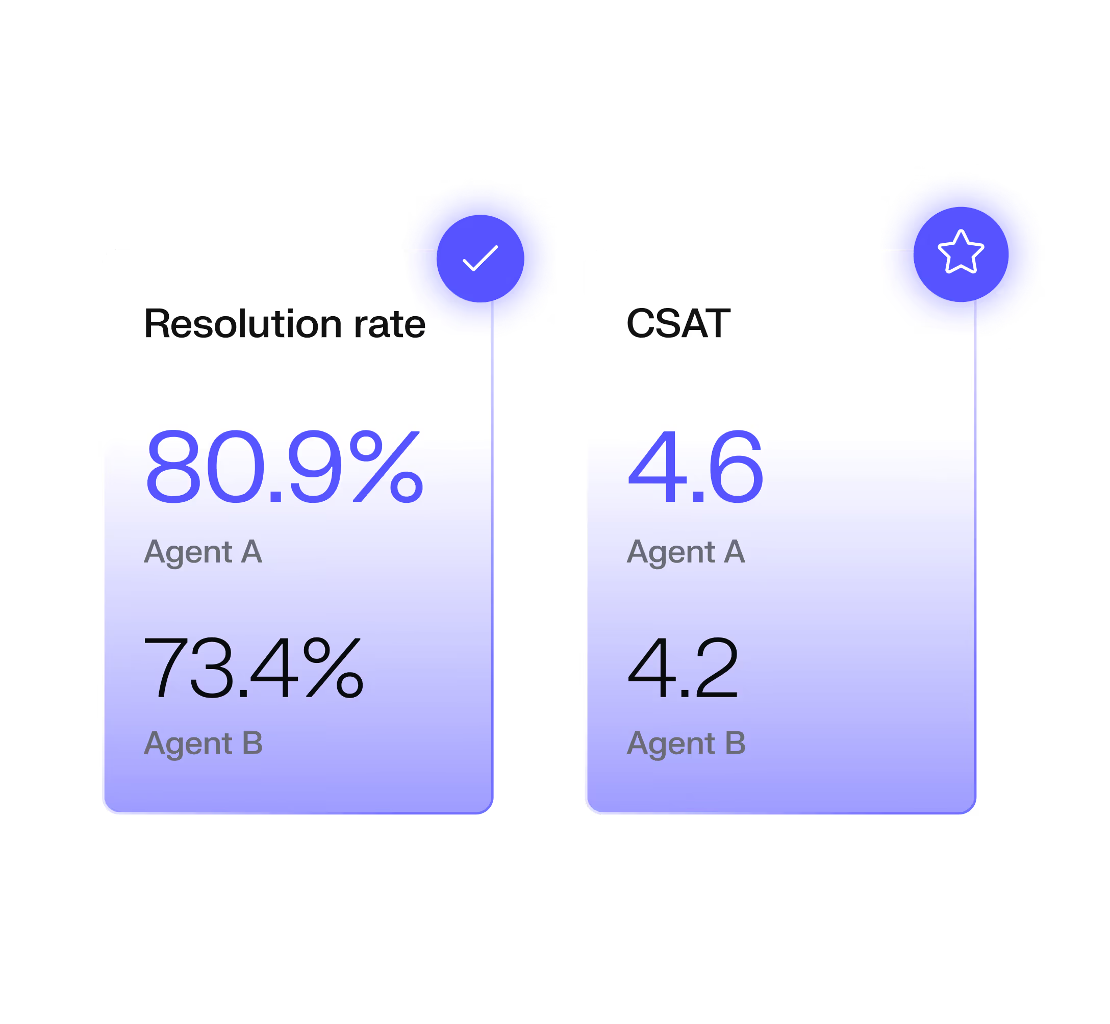
Do Product moments drawn as translucent white-glass cards (AOP lists, metric tiles 80.9% / 4.6, stacked chart panels) floating in a soft indigo-violet glow, 3D-tilted or flat; on light cards a 135deg #FFF2EB to #D7D6FF wash.
Frosted glass product UI on soft periwinkle · The Decagon difference, platform slab, agent engine cards, Duet card
Specimens use sample copy, not Decagon’s.
A small kit repeated everywhere: the hairline + #EAEAEC tag eyebrow with an indigo square; dark gradient-rim pill buttons and outline pills; round white arrow buttons; white 16-20px-rounded quote cards with a logo column and 24px quote text; accordion lists split by hairlines with a short indigo active segment; ROI cards (268x208, radius 20px, customer colour, 60px white number, 16px caption); a frosted email pill (white at 35% opacity, radius full) holding the Work email field and the CTA.

Source: decagon.aidecagon.ai/product/overviewdecagon.ai/case-studies
Icons are thin outline line glyphs.


Icons are thin outline line glyphs. Interface glyphs (arrows, chevrons, close, play, mute) run at 1.5px stroke with round caps in the text colour; the nav menu draws its product and industry icons in navy-indigo #272591 at 22px; one filled four-point sparkle marks AI and Duet; footer social icons are solid.
Source: decagon.aidecagon.ai/product/overviewdecagon.ai/industry/retail
Illustration is product UI rendered as frosted translucent glass: AOP instruction cards in 3D perspective, metric tiles, stacked chart panels, chat bubbles with sparkles, gears, a padlock and concentric memory rings, all in soft periwinkle and violet with peach glows, on near-black (platform slab) or on a 135deg #FFF2EB to #D7D6FF wash (product cards).

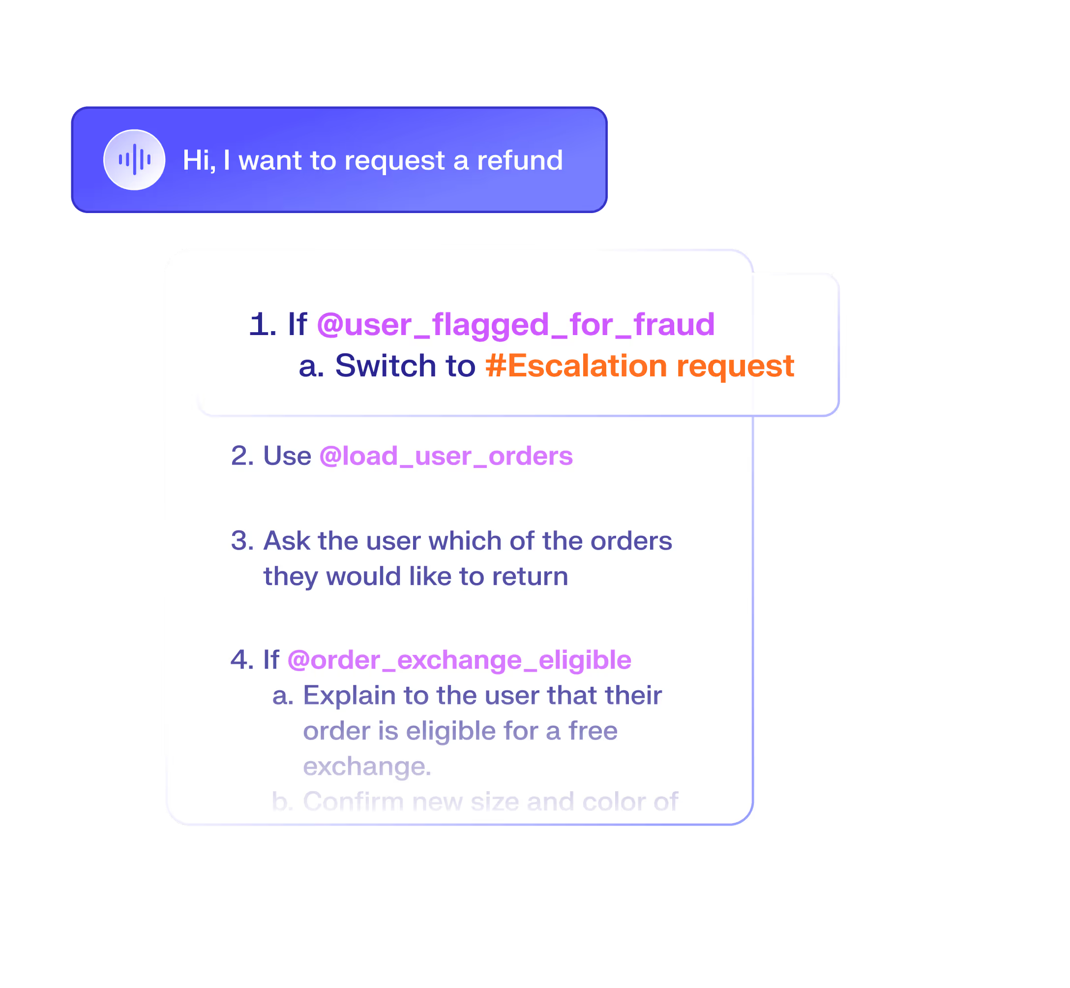


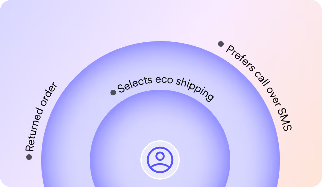


Illustration is product UI rendered as frosted translucent glass: AOP instruction cards in 3D perspective, metric tiles, stacked chart panels, chat bubbles with sparkles, gears, a padlock and concentric memory rings, all in soft periwinkle and violet with peach glows, on near-black (platform slab) or on a 135deg #FFF2EB to #D7D6FF wash (product cards). Text inside them is real product language (AOP steps, @tool names).
Two kinds of photography: lavender-graded brand scenes and natural customer photos.




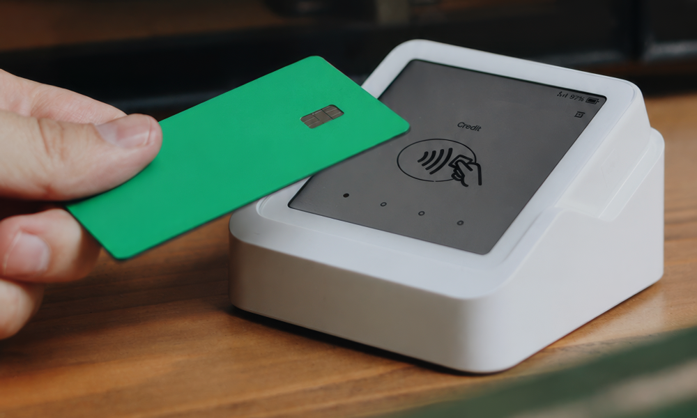
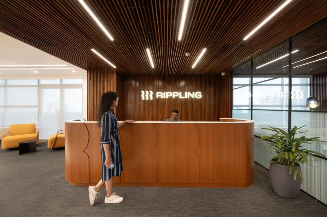
Two kinds of photography: lavender-graded brand scenes and natural customer photos. Brand photography: real people in quiet everyday moments (two people walking with coffee under a pale moon, a man on a phone call by a window, a woman with a phone, a woman at a laptop) graded toward lavender and periwinkle with peach edges and soft grain, cropped in 20px-rounded frames or composited into the WebGL hero. Customer photography: natural-colour documentary images supplied by customers (offices, products, interview video stills with a white Decagon watermark), in 12-16px-rounded frames. Founders are shown together in a natural office photo. No text over photos except name lower-thirds on video stills.
Desktop: 1160px container centred (140px gutters at 1440) on #F4F4F5; the hero and dark bands are inset 12px slabs with 20px radius; sections open with hairline + eyebrow, then a 40px head left-aligned, then a two-column split (text left about 560px, visual right about 554-580px) or a three-up card row. Closing CTA is a centred 60px white head and one gradient-rim pill on near-black with an aurora glow, merging into the footer (logo left, four link columns Product / Industries / Resources / Company). Phone: single column, 16px gutters, hero H1 about 40px, same slabs.
Measured from decagon.ai's computed styles in headless Chromium at 1440 and 390 wide on home, product, customers and about (measure/*.json, 2026-11-17).
| Measure | Desktop | Phone |
|---|---|---|
| Page margin | 140px | 16px |
| Section padding | 64px | 48px |
| Hero text width | max 672px, centered | full width |
| Card gap | 16px | 16px |
| Navigation | 77px | 77px |
Home hero H1 (Circular XX Medium 500, -0.04em = -2.88px); stand-in Figtree 550
Circular XX · 72px (phone 41.45) · line 1 · tracking -2.88px · weight 550
Closing CTA head, ROI stats, channel words (Circular Book 450, -0.03em = -1.8px); Figtree 450
Circular XX · 60px (phone 37.09) · line 1.1 · tracking -1.8px · weight 450
Section H2 (Circular Book 450, -0.025em = -1px); Figtree 450
Circular XX · 40px (phone 30.45) · line 1.2 · tracking -1px · weight 450
Timeline / Duet heads on dark (Circular Regular 400, -0.01em), first word #7370FF; Figtree 400 at -0.3px
Circular XX · 30px (phone 24.27) · line 1.2 · tracking -0.3px · weight 400
Statement paragraphs and quotes (Circular Book 450, -0.01em); Figtree 450
Circular XX · 24px (phone 20.18) · line 1.2 · tracking -0.24px · weight 450
Hero lead (Circular Regular) #4E4E56
Circular XX · 20px (phone 16.18) · line 1.3 · weight 400
Body and section leads, #4E4E56 under H2s, #131313 in the omnichannel text, #D4D4D8 on dark
Circular XX · 16px (phone 14.09) · line 1.3 · weight 400
ROI card label (Circular Book 450) white
Circular XX · 16px (phone 14.09) · line 1.3 · weight 450
Button labels (Circular Medium 500); header buttons 14/18.2
Circular XX · 16px (phone 14.09) · line 1.3 · weight 500
Nav labels (Circular Book 450) #0A0A0B
Circular XX · 14px (phone 13) · line 1.4 · weight 450
Eyebrow tag label and author name (Circular Medium 500)
Circular XX · 14px (phone 12.09) · line 1.4 · weight 500
Author title #6B6B76 (Book 450), copyright #898994 (Regular)
Circular XX · 14px (phone 12.09) · line 1.3 · weight 400
Footer links #EAEAEC and heads #898994 (-0.16px)
Circular XX · 16px (phone 14.09) · line 1.3 · weight 400
How Decagon’s own landing pages are built, observed on decagon.ai, 2026-11-17. The full measurements are in spec.md.
Source: measure/home-desk.json, measure/home-phone.json, measure/product-desk.json, measure/customers-desk.json, measure/about-desk.json (2026-11-17)ref/slices/*.png

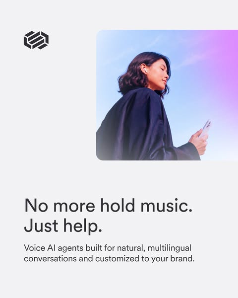

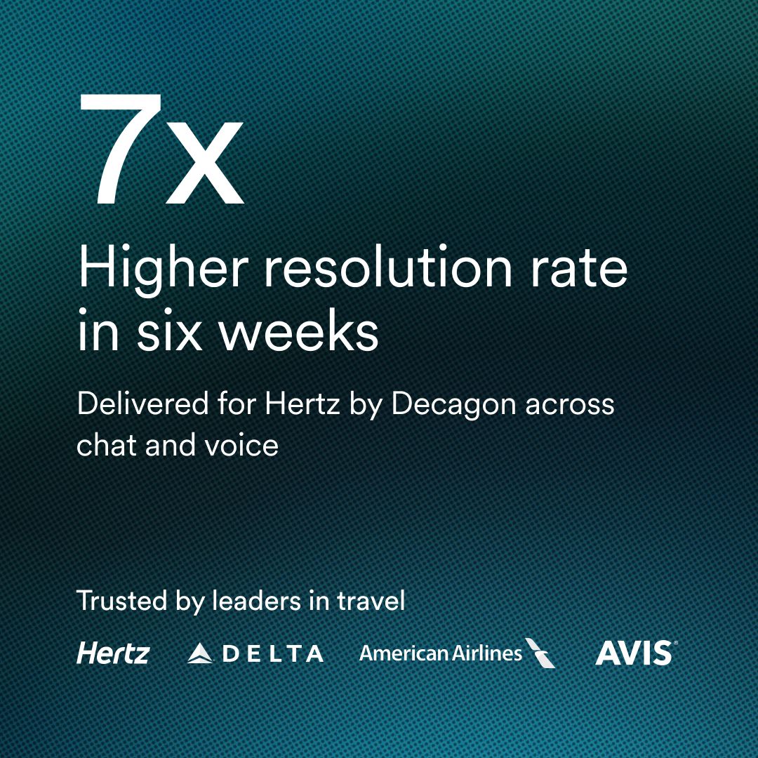
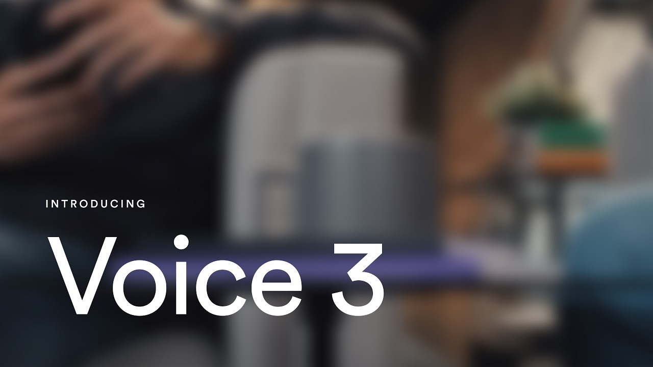
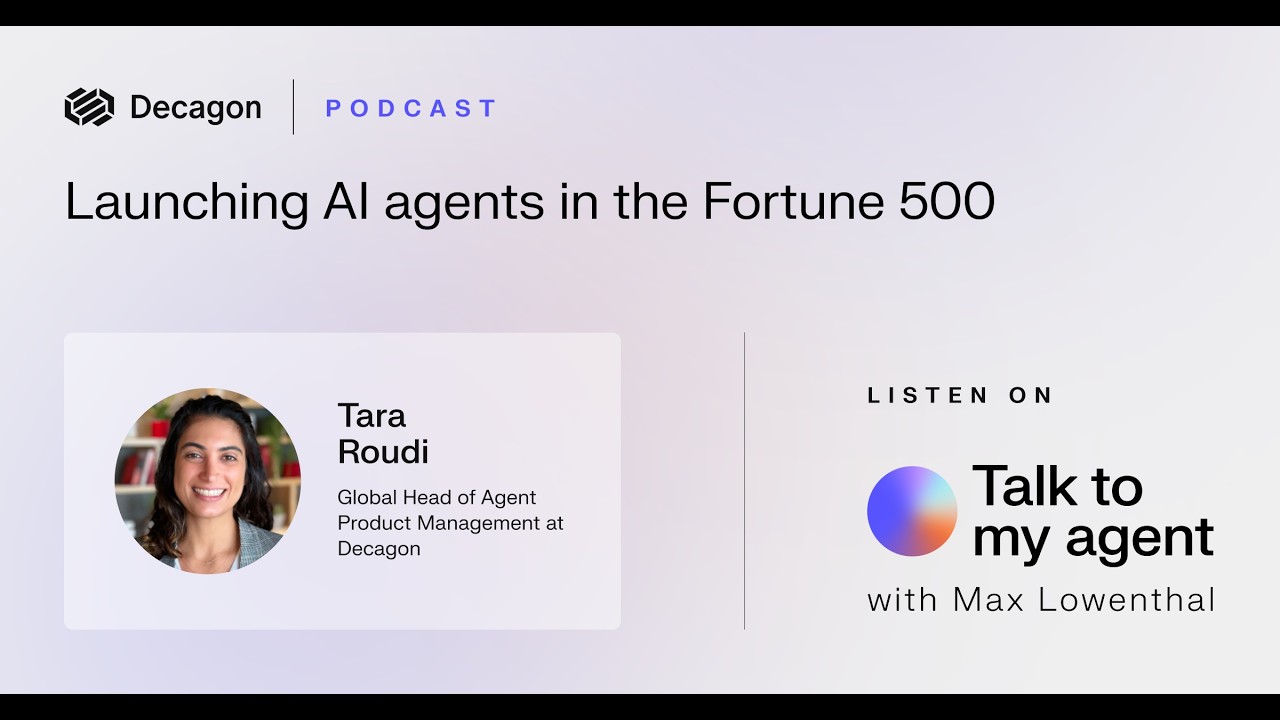
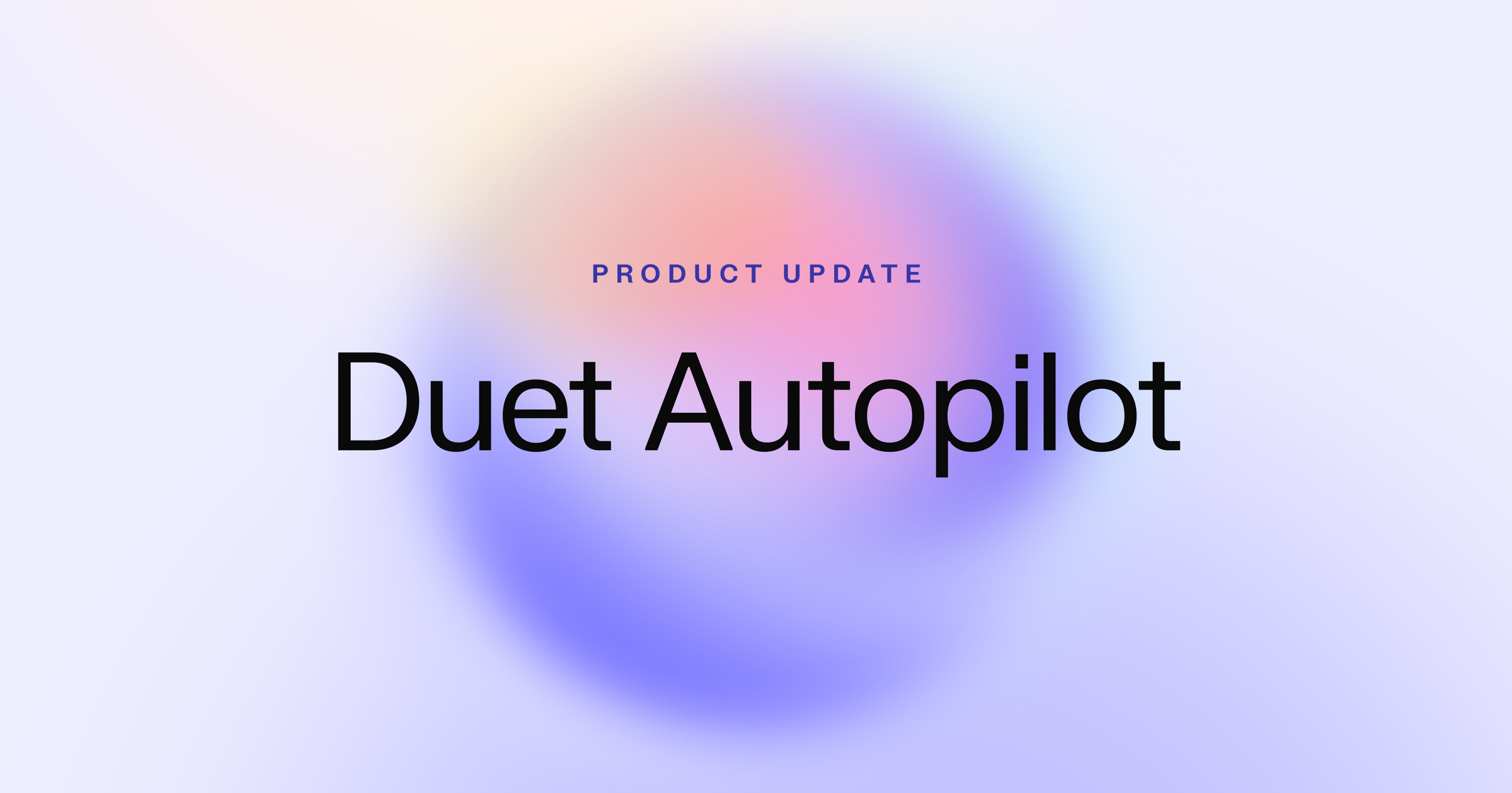
How the system carries across formats, from decagon.ai, its Meta and Google ads, LinkedIn ads, YouTube thumbnails and share cards (2026-11-17).
| Format | Loudness | Must appear | What varies |
|---|---|---|---|
| Landing page | #F4F4F5 ground; announcement pill at top; inset 20px-rounded hero slab (logo + Product/Industries/Customers/Resources/Company nav + outline Sign in + gradient-rim Get a demo) with a 72px Circular XX Medium sentence-case H1 left, a 20px #4E4E56 lead and a frosted pill email form; logo wall; sections that open with hairline + #EAEAEC tag eyebrow, a 40px Book head and a text-left / visual-right split; a #0A0A0B inset slab for the product story with indigo first words; customer ROI cards; a centred 60px white head and one gradient-rim pill in the black closing slab merging into the #111111 footer. | Hero: lavender photo scene, centred H1 over a UI collage, or a heading over customer video cards. | |
| Social post | Full-bleed pastel retro photo (teal or blue sky, coral or peach disc, one prop) with a single frosted-glass card inset 6% on every side, radius about 3.5% of the width; Decagon | customer lockup top right of the card; heavy black quote glyph; a 4-5 line Book quote with one indigo semibold outcome phrase; round avatar, name semibold, title grey; no button, no URL. | Proof posts without a quote use the dark teal halftone stat family (one huge white stat, 2-line claim, attribution, white logo row, no logo). Launch posts use the light share-card family: #EAEAEC or #F4F4F5 ground, letterspaced kicker, one centred Book head, a halftone band or aurora along the bottom. Partner posts: lockup, hairline, partner wordmark on a pastel aurora. | |
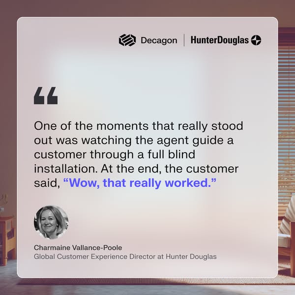
| Customer quote ad | Full-bleed pastel retro photo ground (teal or blue sky, peach or coral disc, one prop: blinds, plinth, Chevrolet, meditating figure) with one frosted-glass card inset about 6% (35px of 600) on every side and rounded about 3.5% of the width; "Decagon | partner" logo lockup top right of the card with a 1px divider; a heavy black quote glyph; a 4-5 line Book quote about 4.6% of the canvas height with one phrase in indigo semibold; a round avatar about 12% of the width; name semibold and job title regular grey below. | Avatar greyscale (Hunter Douglas) or colour; the indigo phrase is the outcome ("we went live in just 6 weeks"); 9:16 stories put the card at the top and the photo prop below. A stat variant puts one indigo numeral on the glass panel instead of a quote (Google tiles). | |
| Customer stat ad | One customer number as the whole image. Pastel family: photo ground, small "Decagon | partner" lockup top left, a frosted panel with "With Decagon, <customer> <verb> by" in two lines and one huge indigo numeral in Book weight. Dark family (LinkedIn): dark teal halftone ground, white stat, two-line claim, attribution, label and a row of white customer logos, left-aligned on a 110px margin. | Pastel for Google display and Meta; dark teal for LinkedIn. The Google frame (white text card, blue Learn more) is Google's, not Decagon's. | |
| Product benefit ad | Flat #F4F4F5 ground; small black Decagon mark top left (no wordmark); a rounded-corner lavender-to-violet gradient photo of one person bleeding off the right edge across the top 45%; a two-line dark Book head about 5.5% of the canvas height at left in the lower half; a two-line grey Regular sub; no button in the image. | Only the head changes between variants; the photo and sub stay. | |
| Podcast thumbnail | Series card scoped to the Talk to my agent podcast: pale lavender-grey ground; Decagon lockup, a vertical hairline and letterspaced indigo PODCAST top left; the episode title in 1-2 lines of Book; a frosted guest panel bottom left with a round photo, name semibold and job title; a vertical hairline; bottom right LISTEN ON over the Talk to my agent orb and "with Max Lowenthal". | Title 1 or 2 lines; guest name wraps to two lines. | |
| Launch video thumbnail | Full-bleed footage still with no scrim box: the product name only, in white Book at about 18-20% of the height, lower left on a 70-95px margin, in one or two lines; either a small letterspaced INTRODUCING kicker above it, or the white Decagon lockup top left. A colour glow (violet-orange) may rise from the bottom edge. | Kicker or lockup, never both; blurred or sharp footage. |
 Increase deflection rate & team productivity, reduce…Google · Jan 2026 – now
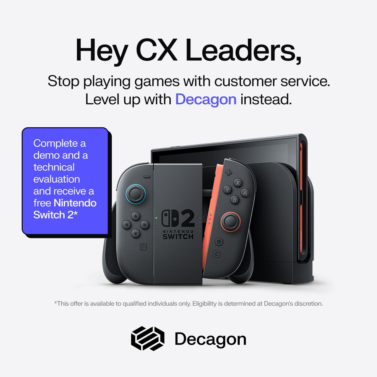 What if your support org could scale without adding…LinkedIn · Sep – Nov 2026
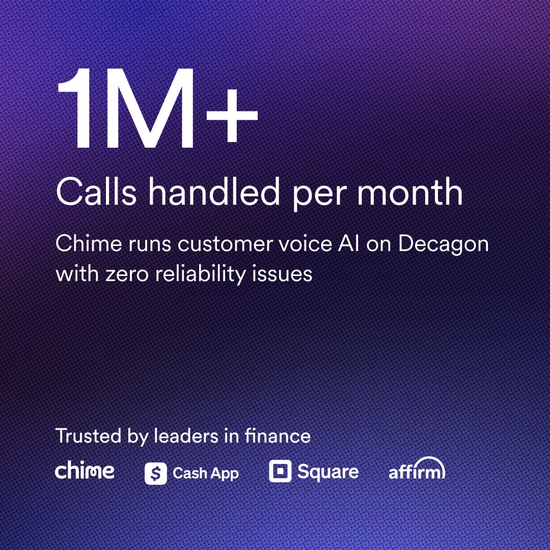 TOFU Image Clicks StrategicLinkedIn · Sep – Nov 2026
 TOFU Video Awareness StrategicLinkedIn · Oct – Nov 2026
Source: decagon.aidecagon.ai/product/overviewdecagon.ai/case-studiesdecagon.ai/aboutfacebook.com/ads/library
Your name and logo, Decagon’s system.
Talk about my brand Use this brand in Claude
Get your brand audit Put your brand in Claude What goes in a brand book
Each value is marked published, observed, our reading or our recipe, with its source. Checked 2026-11-17. Not affiliated with Decagon.
Tell us what you want to make. We’ll talk through how to put these ideas to work for your brand.