Lakebase
The first serverless Postgres database integrated with the lakehouse, built for the AI era. Observed
Brand book
Databricks sells a technical platform to large enterprises, so the site reads as calm, credible software: dark navy that frames product UI like a console, warm oat that keeps it from feeling cold, and one hot lava orange that comes from the logo and marks only what matters (the opening words, the eyebrow, the button). Mono eyebrows and mono numbers nod to the developer audience without turning the page into a terminal. Our reading

The ground of each band (navy 900, white, oat light or oat medium) and whether a page opens light (home, about) or on a navy hero (customers, newsroom).
Source: databricks.comdatabricks.com/company/about-usdatabricks.com/customersdatabricks.com/company/newsroom
Real file, top-left; red #EE3D2C mark; dark wordmark on light, white on dark; never retyped.
On web pages only #0B2026, #1B3139, #FFFFFF, #F9F7F4, #EEEDE9 as band grounds, with no orange band behind copy; launch and Summit ads may run on #FF3621.
#EB1600 only on primary buttons; #FF3621 only on the opening words of at most one head per screen; eyebrows in the coral family.
DM Sans 500 sentence-case heads with normal tracking; DM Mono uppercase eyebrows; no other faces.
Square 0-radius 40px buttons (red primary, navy secondary); text links #016BC1 with a trailing arrow.
No serial comma; '+' in Data + AI; spaced em dashes; heads without periods.
Every number is a stated Databricks or customer figure with its source; nothing invented or rounded up.
The data and AI company: one open, governed platform where enterprises build and run apps, agents and analytics on their own data, without lock-in. Our reading
The first serverless Postgres database integrated with the lakehouse, built for the AI era. Observed
The best AI isn’t just smart — it works for your business. Build high-quality, production-ready AI agents grounded in your data. Observed
Maintain compliance across data, models, dashboards and agents. Get deeper insight into your data all in one unified, open governance layer. Observed
Eliminate legacy warehouse costs and lower TCO with an open, intelligent data warehouse. Observed
Run on any cloud, data and model, with no lock-in. Be ready for innovation as your needs evolve. Observed
One database for AI, apps and agents
Lakebase is serverless Postgres for applications that scale
Build and run apps, agents and AI on your data
Databricks is the data and AI company
Founded in 2013 by seven UC Berkeley AMP Lab researchers who created Apache Spark and the lakehouse; still rooted in open source (paraphrase of the press kit founders' story).
Category. Data + AI Platform (its own category name, always with '+'). Observed
Databricks is the Data and AI company; more than 20,000 organizations, including 70% of the Fortune 500, use its unified platform (Lakebase, Genie, Agent Bricks, Lakeflow, Lakehouse, Unity Catalog) to build and scale data and AI apps, analytics and agents. Headquartered in San Francisco (paraphrase of the press kit 'Databricks today' boilerplate).
One database for AI, apps and agents Observed
Lakebase is serverless Postgres for applications that scale Observed
Build and run apps, agents and AI on your data Observed
Databricks is the data and AI company Observed
Databricks is the Data and AI company. Observed
Innovative companies lead with AI Observed
Accelerate the agentic enterprise Observed
Data + AI Platform: context, control and choice Observed
Serverless Postgres for apps and agents Observed
Start your data + AI journey Observed
Join us in building the future of data and AI Observed
Databricks is the Data and AI company.
Innovative companies lead with AI
Accelerate the agentic enterprise
Data + AI Platform: context, control and choice
Serverless Postgres for apps and agents
Start your data + AI journey
Join us in building the future of data and AI
Build and run apps, agents and AI on your data
Build and run apps, agents, and AI on your data.
$400K /month storage costs eliminated by the marketing team
Dramatically lower costs for every team
The Databricks Data + AI Platform
The Databricks Data and AI Platform
See the full story →
Click here to learn more about this customer
Unlock the power of your data with our revolutionary all-in-one platform!
Unify your data, analytics and AI. Use it to power agents, apps and natural language insights.
ConfidentPlain-spokenEnterpriseBuilder-friendlyProof-led
Data + AI Platformdata and AI companylakehouselakebaseagentsappsgovernanceopenno lock-inunifiedUnity CatalogGenieAgent BricksLakeflow
Source: databricks.comdatabricks.com/product/data-intelligence-platform
Source: databricks.comdatabricks.com/customersdatabricks.com/product/data-intelligence-platformdatabricks.com/company/careers





A red mark beside a lowercase wordmark, top-left on every page.



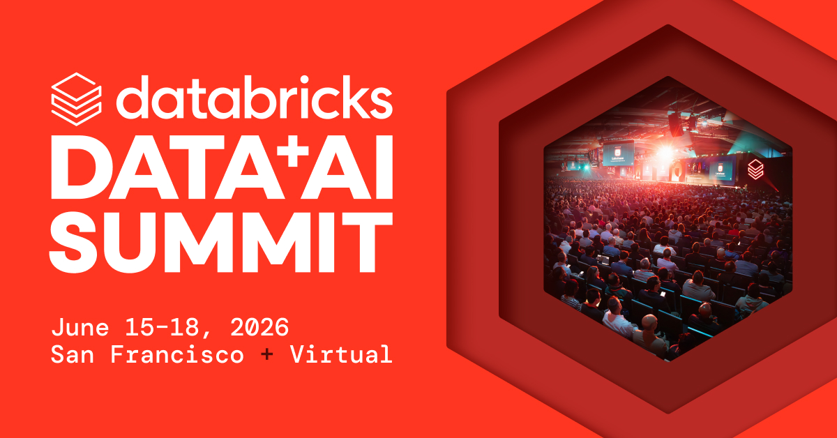
A red mark beside a lowercase wordmark, top-left on every page. The mark is a red #EE3D2C stacked-bricks line drawing; the wordmark is dark on white in the header and white on #1B3139 in the footer. The mark alone is the favicon. Event and Summit ads put the logo top-left on navy or centered at the foot of a red ground, and partner ads pair it with a thin ×.
Source: databricks.comdatabricks.com/company/newsroom/press-kitbrandfolder.com/databricks/press-kit
Navy and neutral grounds carry the page.
Navy and neutral grounds carry the page. On the homepage navy-900 covers about 41%, white about 19%, oat about 18% and the navy-800 footer about 17%. Warm orange-reds stay in small, high-signal spots: the button, the opening words of a head, eyebrows and stat numbers. Ads and event graphics are the exception: launch and Summit creative runs on a full #FF3621 ground.
Source: databricks.comdatabricks.com/customersdatabricks.com/company/newsroomdatabricks.com/company/about-us
One database for AI, apps and agents
DM Sans for everything, DM Mono for labels and numbers.
DM Sans for everything, DM Mono for labels and numbers. Heads are 500, body 400, small card titles 600-700; DM Mono carries eyebrows, labels and the big customer metrics. Tracking is normal everywhere and there is no all-caps sans.
| Their face | Use | License | Open stand-in |
|---|---|---|---|
| DM Sans | Every head | SIL OFL 1.1; the site's own files ship with this guide (sans 400/500/600/700); load them from tokens.css, never Google Fonts | DM Sans itself The real face is open (SIL OFL); no stand-in needed. |
| DM Sans | Leads, body, buttons, nav, captions | SIL OFL 1.1; the site's own files ship with this guide (sans 400/500/600/700); load them from tokens.css, never Google Fonts | DM Sans itself The real face is open (SIL OFL); no stand-in needed. |
| DM Mono | Eyebrows, content-type labels, dates, big customer metrics | SIL OFL 1.1; the site's own file ships with this guide (mono 400); load it from tokens.css, never Google Fonts | DM Mono itself The real face is open (SIL OFL); no stand-in needed. |
| Custom logotype | Logo only | Logo artwork; use the files |
Source: databricks.comdatabricks.com/customersdatabricks.com/company/newsroomdatabricks.com/company/about-us
Do The opening 1-2 words of a head set in #FF3621 (same DM Sans 500 size), the rest in #1B3139 on white or #F9F7F4. One highlighted phrase per head, one head per screen.
Lava-orange first words in the headline · Home H1, customers stat heads (Over 20,000 / Over 70%)
Do DM Mono 16/16 uppercase, normal tracking; #FF9E94 on navy, #BD2B26 on light, centered over centered heads or left over left heads; 16-24px above a 40/48 DM Sans 500 head.
DM Mono uppercase eyebrow in coral · Above every section head on home, customers, newsroom, platform
Do Band grounds cycle #0B2026 / #1B3139 (dark) with #FFFFFF, #F9F7F4 and #EEEDE9 (light). Home is about 41% #0B2026; footer always #1B3139. No other hue is used as a band ground.
Deep navy bands alternating with white and warm oat · Every page
Do 0-radius rectangles 40px tall, 8px 24px padding, DM Sans 16 w500 white; primary #EB1600, secondary #1B3139 (or 1px #90A5B1 outline on navy), 32px apart.
Square red primary + navy secondary button pair · Header (Try Databricks), every hero and closing CTA
Do Customer metric in DM Mono 88/88 w400 #1B3139 with a DM Sans 20/25 w500 unit caption (up to 3 lines) 24px to its right; on navy the stats are DM Sans 40/48 #FF5F46 with a 14/20 #C4CCD6 caption, separated by 1px rules.
Big number, short unit line · Home customer carousel, awards band stats, customers stat rows
Do Solid #FF5F46 / #FF3621 / #BD2B26 / pale coral circles, triangles, squares and quarter-circles, cropped by the frame edge, on #EEEDE9 or #1B3139, sometimes combined with grayscale-to-color photo tiles.
Flat orange geometric primitives · OG/share image, about hero collage, press-kit and campaign graphics
Specimens use sample copy, not Databricks’s.
Square corners, mono eyebrows and big numbers.
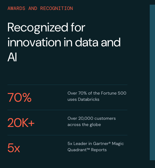
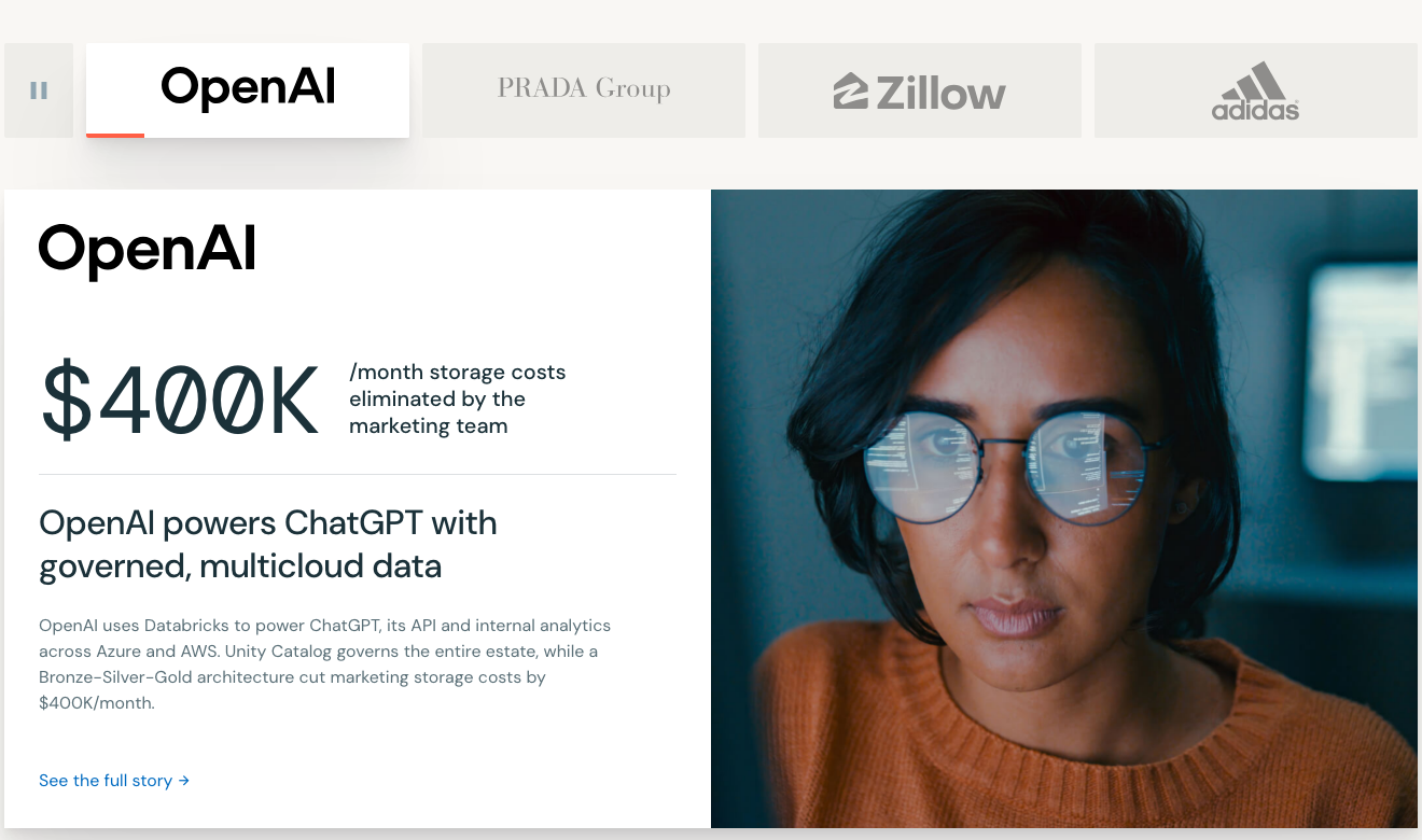
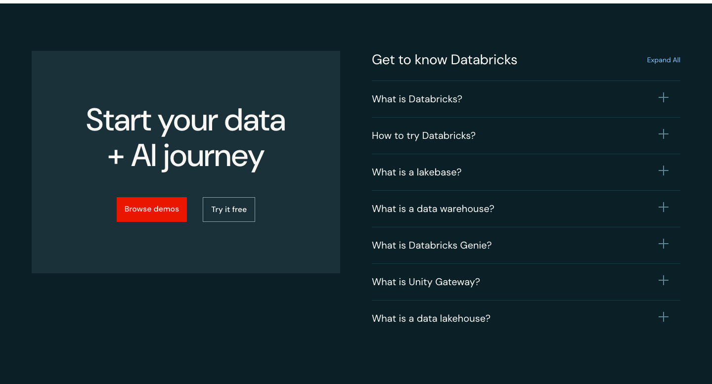

Square corners, mono eyebrows and big numbers. Buttons are square; tab pills on navy are 20px-radius; white story cards float on oat with soft wide shadows; dark navy-700 product cards hold an icon tile; stats sit in 1px hairline rows; the FAQ accordion uses thin plus icons; logo strips carry a pause button; a dotted grid sits behind the hero product shot.
Coral product glyphs on white rounded tiles.


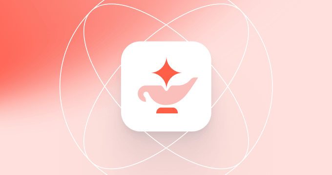
Coral product glyphs on white rounded tiles. Each product has a flat coral glyph (Lakebase stacked bars, Genie lamp, Lakehouse toggle, Unity Catalog ring) set on a white rounded-square tile; interface icons are thin single-color 16px line glyphs. Databricks publishes no larger spot-icon set.
Flat, solid-fill geometric shapes in the orange family.


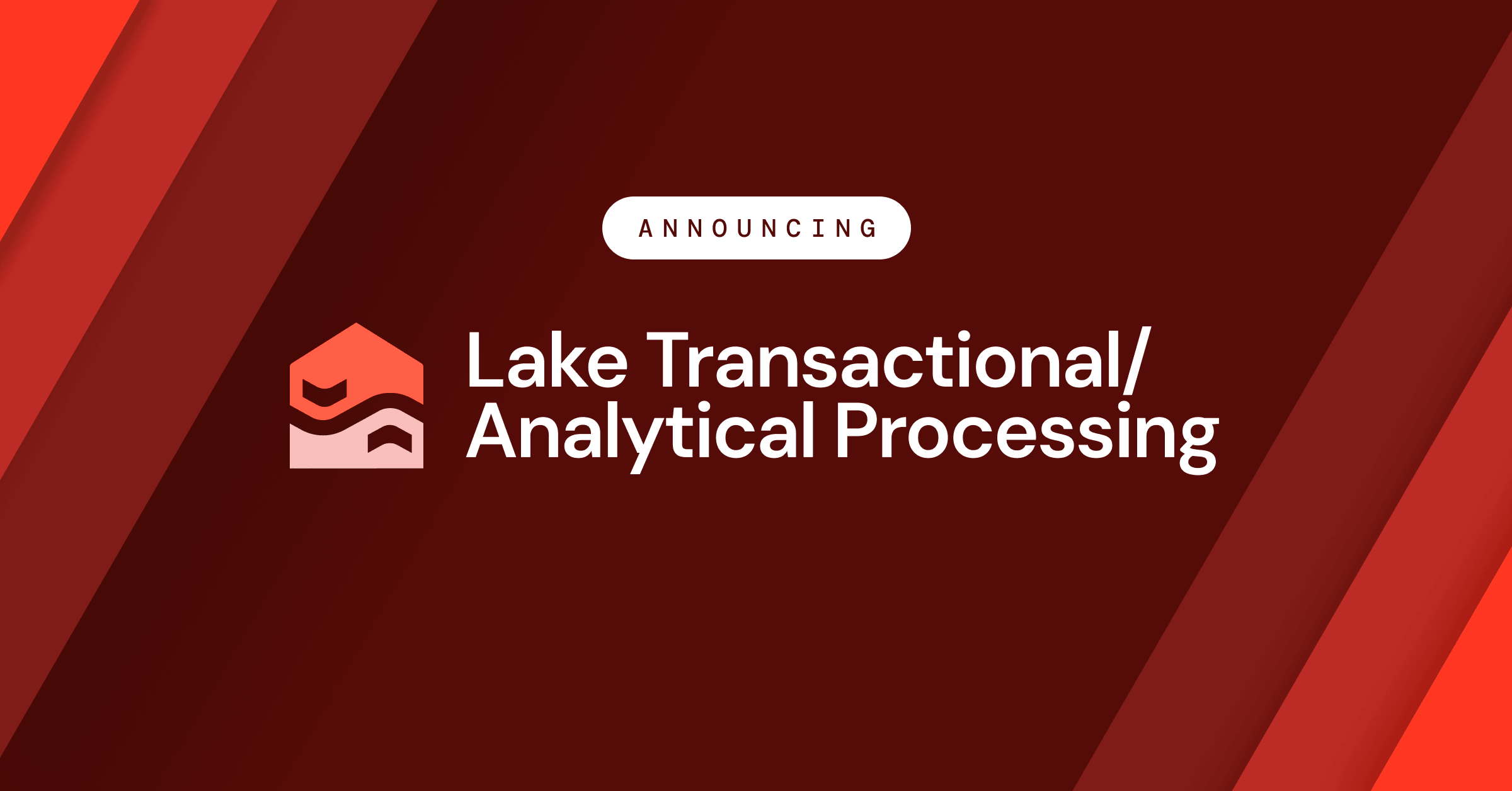
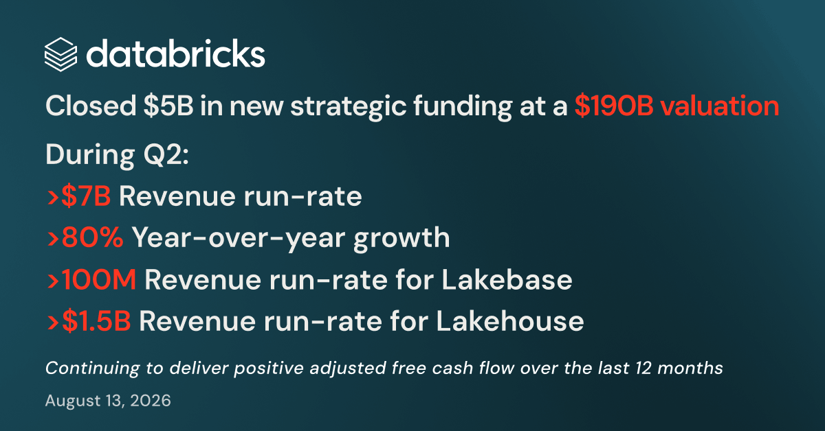
Flat, solid-fill geometric shapes in the orange family. Primitives (circles, triangles, squares, quarter-circles) and simple object icons (flask, building, car, lightning) in orange, navy, pale coral and white, with no outlines. Campaign and press graphics use deep red diagonal stripes or navy-teal gradients with white DM Sans text. The one exception to flat is an isometric gold building on the awards card; there is no 3D object library.
Real people and real customer products.




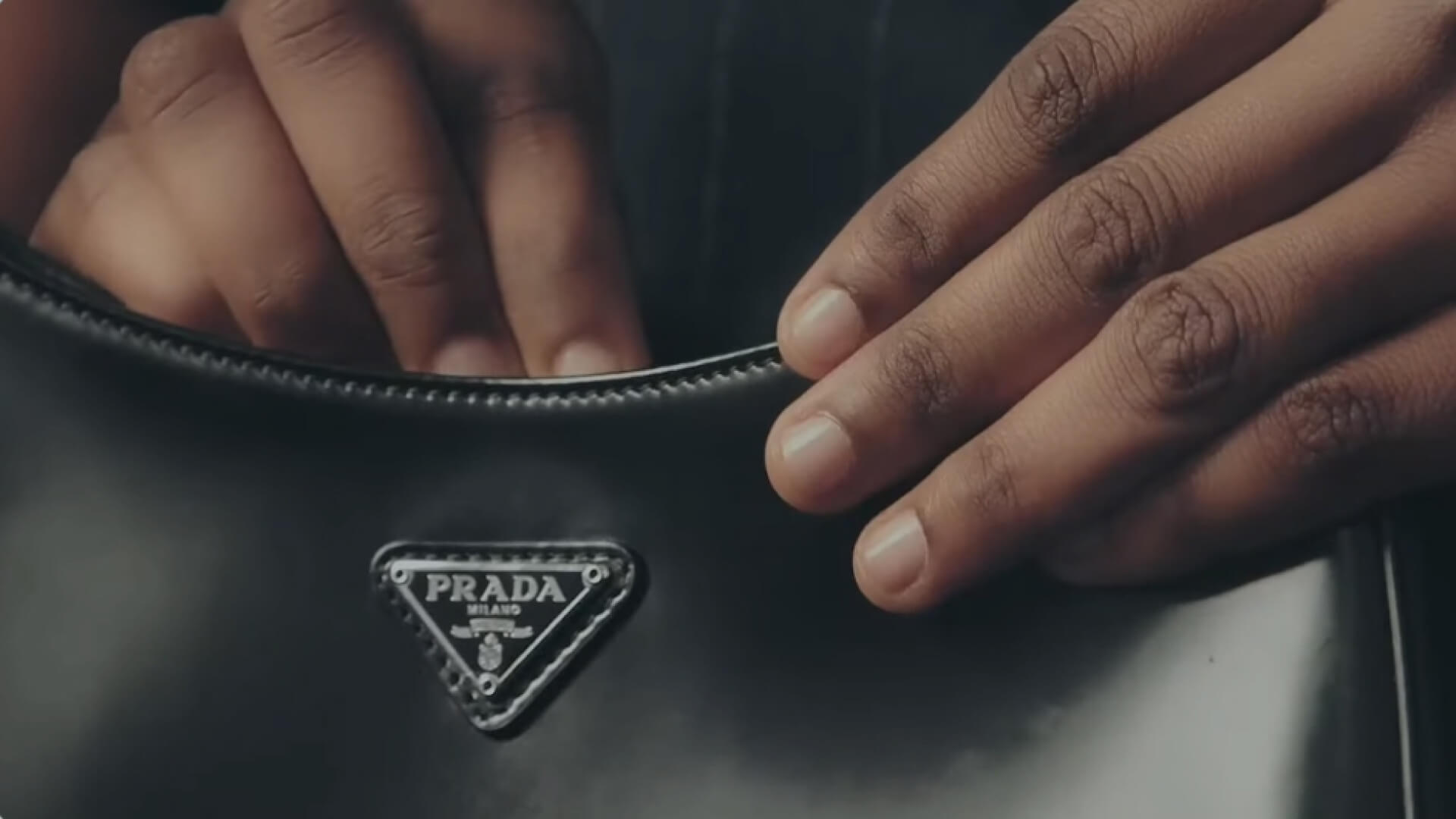

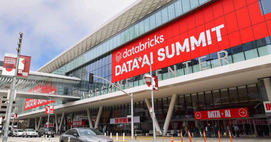

Real people and real customer products. Candid office and event photos (whiteboard sessions, the Data + AI Summit venue), customer-story stills (an interview subject in an office, product close-ups like an adidas shoe or a Prada bag). Natural light, true color, often slightly desaturated; photos sit in their own column or card, never under text. The about hero mixes grayscale and color photo tiles with orange triangles and circles.
Source: databricks.com/company/careersdatabricks.com/customersdatabricks.comdatabricks.com/company/about-us
A 1312px column with 64px gutters. Light heroes split text left and product UI right; dark heroes center a mono eyebrow, an 80px head and one red button; grids are 3- or 4-up cards; the footer is a 6-column link grid on #1B3139 with orange column heads.
Measured from databricks.com's headless Playwright computed styles at 1440x900 and 390x844 on 2026-11-16, plus measure/home-*.json.
| Measure | Desktop | Phone |
|---|---|---|
| Page margin | 64px | 20px |
| Section padding | 96px | 64px |
| Hero text width | max 624px, centered | full width |
| Card gap | 32px | 32px |
| Navigation | 64px | 64px |
Hero H1, 56/68 desktop, 44/52 phone (first words #FF3621, rest #1B3139)
DM Sans · 56px (phone 44) · line 1.2143 · weight 500
Closing CTA head, 64/72 desktop, 40/48 phone (#F9F7F4 on #1B3139)
DM Sans · 64px (phone 40) · line 1.125 · weight 500
Section H2 (w400 on the awards band)
DM Sans · 40px (phone 28) · line 1.2 · tracking -0.4px · weight 500
Panel and story head, 32/40 desktop; phone 20/28 panel, 24/30 story
DM Sans · 32px (phone 24) · line 1.25 · weight 500
FAQ head on navy
DM Sans · 28px (phone 20) · line 1.2857 · weight 400
Hero lead
DM Sans · 24px (phone 20) · line 1.3333 · weight 400
Stat number on navy (#FF5F46)
DM Sans · 40px · line 1.2 · weight 400
Product card title
DM Sans · 20px · line 1.4 · weight 600
Content card title
DM Sans · 16px · line 1.5 · weight 500
Body
DM Sans · 16px · line 1.5 · weight 400
Card body, footer links (#90A5B1 on navy)
DM Sans · 14px (phone 12) · line 1.43 · weight 400
Address, copyright, legal
DM Sans · 12px · line 1.67 · weight 400
Eyebrow, DM Mono uppercase
DM Mono · 16px · line 1 · weight 400
Proof metric, DM Mono
DM Mono · 88px (phone 48) · line 1 · weight 400
Content-type label, DM Mono uppercase (#5A6F77)
DM Mono · 12px · line 1.25 · weight 400
Nav menu item
DM Sans · 16px (phone 20) · line 1.5 · weight 400
How Databricks’s own landing pages are built, observed on databricks.com, 2026-11-16. The full measurements are in spec.md.
Source: databricks.comdatabricks.com/customersdatabricks.com/company/newsroomdatabricks.com/company/about-us
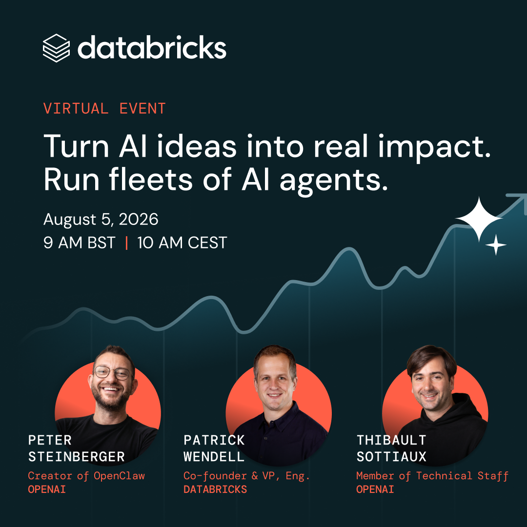

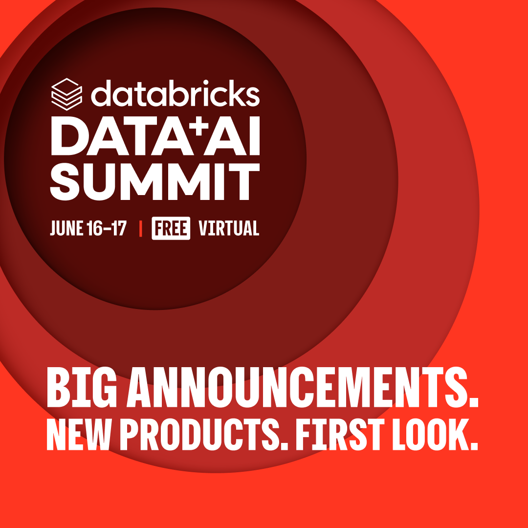

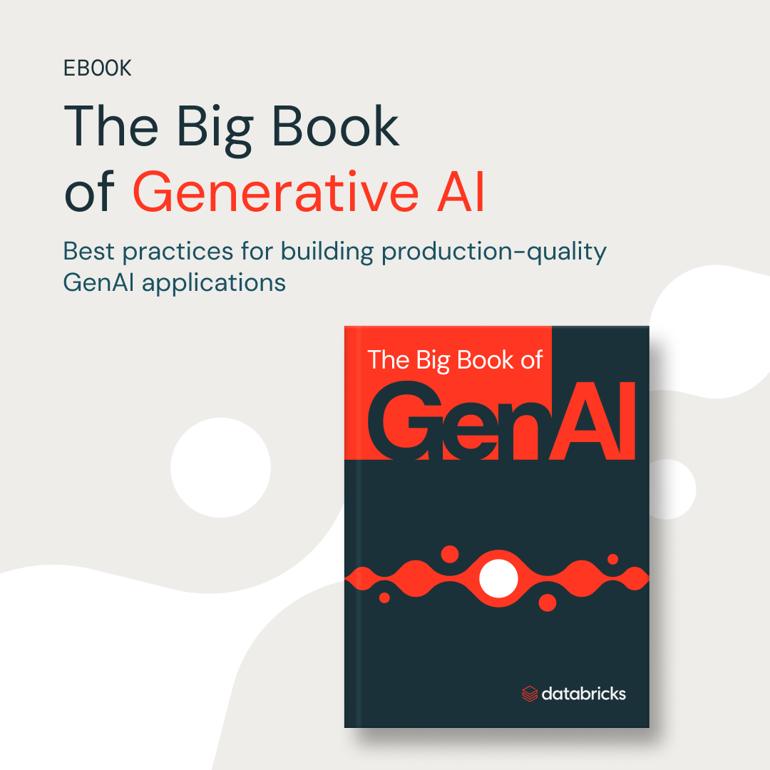

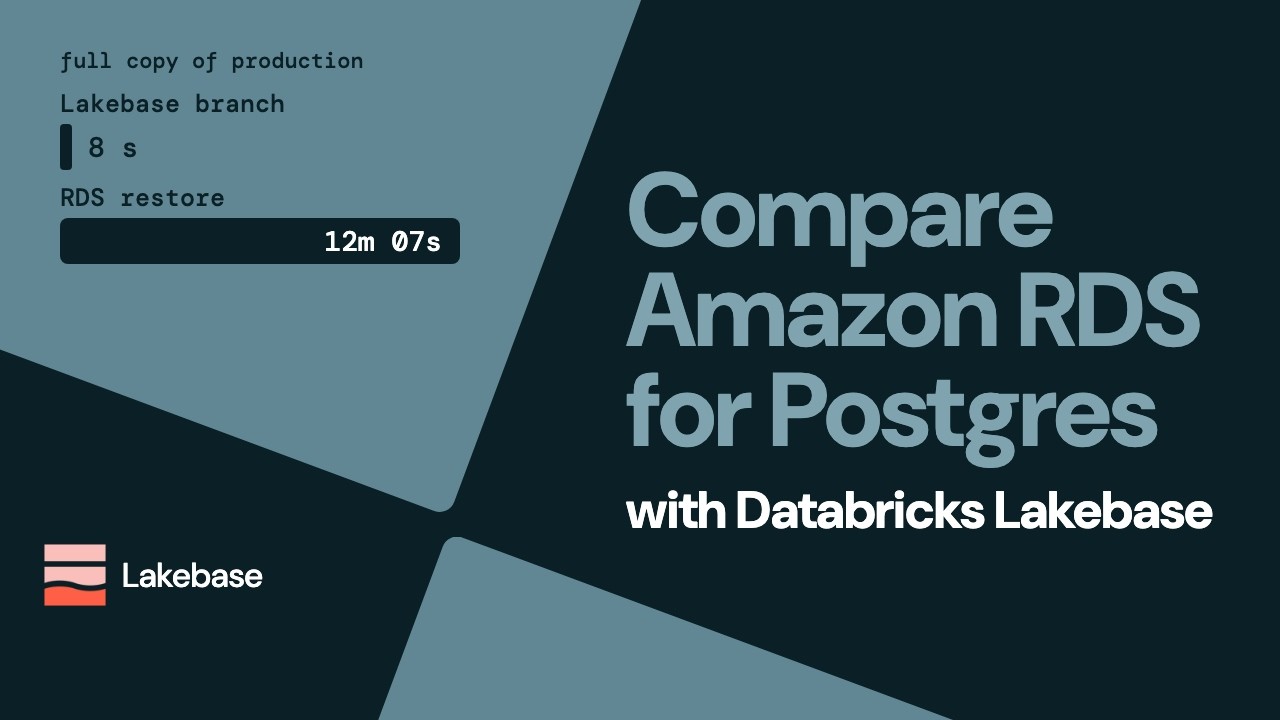

How the system carries across formats, from databricks.com, its newsroom and share graphics, and its paid ads (Meta Ad Library, Google Ads Transparency) and YouTube. Ads take liberties the website doesn't: full red grounds, highlighted words mid-head and condensed caps for the Summit.
| Format | Loudness | Must appear | What varies |
|---|---|---|---|
| Landing page | White 64px header (logo left, DM Sans 16 nav, red Try Databricks right); split hero: 56/68 DM Sans 500 head with the first words in #FF3621, 24/32 lead, #EB1600 + #1B3139 square buttons, product UI right over a dotted grid; navy-900 logo strip with a white DM Mono label; navy-900 bands with coral mono eyebrow + 40px head; oat customer-proof band with DM Mono 88px metric; navy awards band with #FF5F46 stats; white 4-up content cards with DM Mono labels and blue arrow links; navy closing CTA panel; #1B3139 six-column footer. | Whether the hero is light (split text + product UI) or navy (centered head + one red button); band ground order. | |
| Social post | Navy #0B2026 ground, white logo top-left, DM Mono caps eyebrow, a two-line white DM Sans headline at left with the key words in coral #FF5F46, one date or detail line, one image (speaker cutouts on coral circles, a product-UI sketch, or a line chart) filling the lower half, no button. | Eyebrow coral or grey #C4CCD6; image = 1-3 speaker cutouts on coral circles, a product-UI or code panel, or a rising line chart with a white sparkle; a partner logo may sit beside the logo after an x. Launch ads use the type-only red/white Lakebase family instead; events use their own series cards. | |
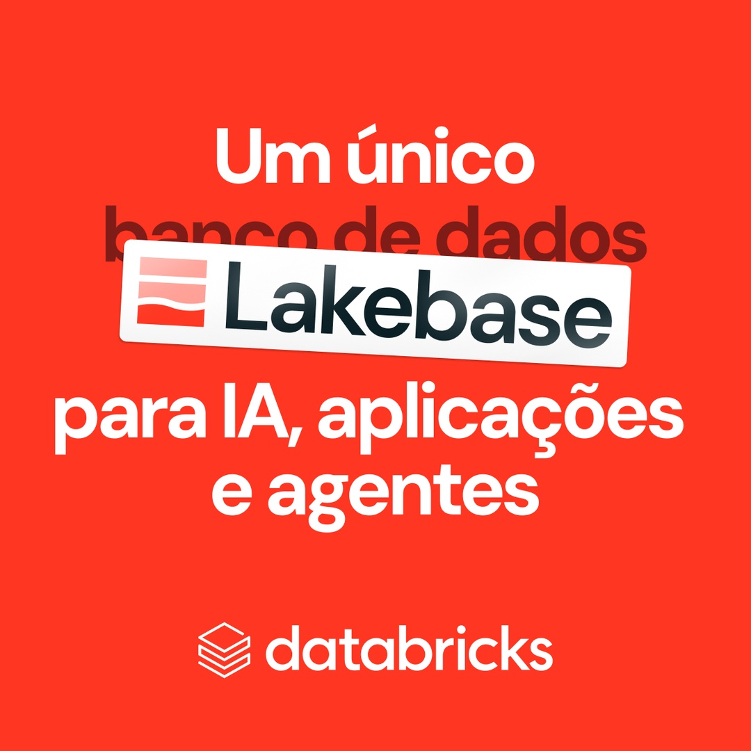
| Paid social ad: product launch | Type-only centered stack with the product name as a tilted sticker label; logo bottom-center. | Ground red or white; language by market. | |
| Paid social ad: content offer | The ebook/report cover is the hero; headline optional, no button in the creative. | Ground dark (cover only) or light (headline + cover). | |
| Video thumbnail | Built for the YouTube grid only. | Person or data graphic; maroon or navy. | |
| Data + AI Summit ad | Series scope: Data + AI Summit only. | Lockup corner varies. |
Source: databricks.comdatabricks.com/customersdatabricks.com/company/newsroomdatabricks.com/company/newsroom/press-kit
Your name and logo, Databricks’s system.
Talk about my brand Use this brand in Claude
Get your brand audit Put your brand in Claude What goes in a brand book
Each value is marked published, observed, our reading or our recipe, with its source. Checked 2026-11-16. Not affiliated with Databricks.
Tell us what you want to make. We’ll talk through how to put these ideas to work for your brand.