Visibility beyond the vault
Omnix sees credential risk on every employee login in the browser, including logins SSO and the vault miss. (paraphrase) Observed
Brand book
Dashlane wants to read as calm, competent security rather than alarm: a dark but warm (brown, not black) ground and light type feel composed, and the cool aquamarine accent signals "safe/go" exactly where the buyer should act. Indigo and the line-art planes borrow the look of security dashboards to make "proactive" visible. Our reading

Light vs dark mode by audience: business pages are dark espresso with aquamarine highlights; Personal pages are warm light #FCFAF9 with indigo highlights and dark buttons.
share of desktop home page area.
Our engine's setting, built from their rules.
Where the Design fundamentals section disagrees with a measured value, the measured value wins and the fundamentals line does not apply: running text is Geist 300 (never 400), headings track +0.01em (never negative), button and link labels are Geist 400 (never 500), and the 12px #A69F9D legal row stays as measured. One weight per role: headings, lead, body, nav, utility and footer links 300; buttons, text links, announcement link, Start a free trial, legal links 400; mono eyebrows, feature labels and tabs 300; footer heads mono 400; hero chip mono 500.
Never set -webkit-font-smoothing: antialiased or -moz-osx-font-smoothing: grayscale. The site uses the default; antialiased made the r2 build's Geist 300 read 11% thin on heads and 29% thin on body.
Business work sits on espresso #200F0A (not black, not navy) with #FCFAF9 text.
Each headline has at most one aquamarine #A2F6F5 phrase, same face and weight.
Heads are weight 300, sentence case, +0.01em; no bold heads.
Aquamarine filled primary with #1D0E09 label beside an aquamarine-outlined secondary, 4px radius.
Every claim uses a number, customer or award the site states (85%, 79%, 10%, 25,000 companies, 8 patents).
Official single-colour logo: #FCFAF9 on dark, #1D0E09 on light; never recoloured.
"Dashlane Omnix" with ® or ™ on first use.
The proactive credential security platform: password management plus browser-level credential protection that finds and fixes weak, compromised and phished logins before a breach. (paraphrase) Observed
Omnix sees credential risk on every employee login in the browser, including logins SSO and the vault miss. (paraphrase) Observed
Detect weak, compromised and phished credentials at the point of use and alert employees before they enter credentials. (paraphrase) Observed
An encrypted vault and secure sharing for every employee, with admin policies and reporting. (paraphrase) Observed
Zero-knowledge architecture plus confidential computing, with industry firsts in passkeys and passwordless. (paraphrase) Observed
Prevent credential breaches
Protect more. Manage less.
From reactive to real-time
Experience the Dashlane difference
Category. Credential security platform / enterprise password manager (also personal and family password manager). Observed
Dashlane provides complete credential security against human risk. Its Omnix platform unifies credential protection and password management, giving security teams proactive intelligence, real-time response and protected access for every employee. Over 25,000 brands, including Michelin, Air France and Forrester, trust its patented zero-knowledge security and user experience. (paraphrase)
Prevent credential breaches Observed
Protect more. Manage less. Observed
Experience the Dashlane difference Observed
The intelligent credential security platform Observed
The proactive credential security platform Observed
The leader in password security innovations Observed
Browse and log in with total confidence Observed
Real stories. Real outcomes. Observed
Trusted. Patented. Cutting-edge. Observed
1 in 3 professional logins use a weak or compromised password.
Trusted. Patented. Cutting-edge.
Real stories. Real outcomes.
This isn’t your traditional password manager. (But we do that, too.)
Traditional email filters miss 47% of phishing attacks.
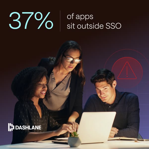
37% of apps sit outside SSO.
Protect more. Manage less.
Protect More And Manage Less!
1 in 3 professional logins use a weak or compromised password.
Weak passwords are a huge security problem.
From reactive to real-time
Revolutionary next-gen AI security
Dashlane Omnix is the most advanced security platform ever built!
1 in 3 professional logins use a weak or compromised password. Dashlane Omnix® helps you find and fix them before a breach occurs.
Our cutting-edge solution empowers your team to take control of security.
Don’t wait for a report to see where you’re vulnerable.
confidentplain-spokenproactivereassuring
credentialproactivereal-timebrowserriskremediatephishingzero-knowledgepasskeysOmnixemployeesadmins
Source: dashlane.comdashlane.com/personal-password-manager
Source: dashlane.comdashlane.com/omnix



Wordmark and mark are one flat colour on every ground; Dashlane publishes no clear-space or minimum-size rule.
Slanted-bar "D" mark plus bold uppercase DASHLANE wordmark, always one flat colour: #FCFAF9 on the espresso header (126x32 at desktop), #1D0E09 on light Personal pages.


Slanted-bar "D" mark plus bold uppercase DASHLANE wordmark, always one flat colour: #FCFAF9 on the espresso header (126x32 at desktop), #1D0E09 on light Personal pages. Social and partner posts use the full logo large and centred in white with a thin aquamarine "×" for co-branding. The favicon is the white mark on a dark espresso circle.
Espresso #200F0A covers nearly the whole page; text is warm #FCFAF9.
Espresso #200F0A covers nearly the whole page; text is warm #FCFAF9. Aquamarine #A2F6F5 is the action and highlight colour (buttons, one phrase per head, links, mono footer heads). Indigo #858DF9/#6C74DF is a second, quieter accent for the header CTA and one promo band; #2B2538 dusk cards hold testimonials. Imagery adds navy-to-espresso gradients and purple glows.
Source: dashlane.commeasure/home-desk.json, measure/home-phone.json, measure/about-desk.json, measure/customers-desk.json, measure/newsroom-desk.json (measured 2026-11-18 UTC)
Prevent credential breaches
One light grotesque for everything (intended Saans Light, rendered Helvetica Light because the Saans face is never declared), weight 300, sentence case, +0.01-0.02em tracking; Saans Mono uppercase for labels.
One light grotesque for everything (intended Saans Light, rendered Helvetica Light because the Saans face is never declared), weight 300, sentence case, +0.01-0.02em tracking; Saans Mono uppercase for labels. Buttons ask for 500 and render Helvetica Regular: Geist 400. Stand-ins: Geist 300 and Geist Mono 300.
| Their face | Use | License | Open stand-in |
|---|---|---|---|
| Saans | commercial | Geist 300, +0.01em | |
| Helvetica Light (macOS) / Arial (Windows) fallback | system | Geist 300 | |
| Saans Mono | commercial | Geist Mono 300 |
Source: dashlane.commeasure/home-desk.json, measure/home-phone.json, measure/about-desk.json, measure/customers-desk.json, measure/newsroom-desk.json (measured 2026-11-18 UTC)
Do Ground #200F0A (brown-black) with warm off-white #FCFAF9 text; announcement bar #4D3F3B; no pure black or navy grounds. Light mode (#FCFAF9 ground, #1D0E09 text) only on Personal pages.
Warm espresso dark, not black · Every band, header and footer on business pages
Do Same face, weight and size as the head; only colour changes to #A2F6F5. One phrase, first or last in the head.
One aquamarine phrase per headline · Home H1 "Prevent", "day one", "compliance", closing "Dashlane"; newsroom "newsroom"; /omnix "proactive", "traditional"
Do Weight 300 at 72/79.2 (H1), 56/61.6 (H2), 48/52.8 (H3), 36/39.6 (band head), +0.01em tracking, left aligned except the centred Omnix head; phone H1 48/52.8, H2 36/39.6, H3 28/30.8. Stand-in Geist 300.
Large light-weight sentence-case heads · All H1-H3
Do Saans Mono 300 16px, 0.06em, uppercase; aquamarine for footer heads and chip; tags in 1px outlined rectangles. Stand-in Geist Mono 300.
Uppercase mono labels · Eyebrows, logo-strip label, feature tabs, hero chip, footer column heads, case-study tags
Do Primary #A2F6F5 fill, #1D0E09 label; secondary transparent with 1px #A2F6F5 border and label; both 4px radius, 8px 16px padding, 16px Geist 400 (site CSS 500, rendered Helvetica Regular), filled 40px / outlined 42px tall, 16px gap (measured 2026-11-17: Contact Sales x80-212, Request a demo from x228). Header uses the indigo #858DF9 version; phone stacks them full width 8px apart.
Aquamarine filled + outlined button pair · Hero, customer story, closing CTA
Do 1px #E3CCC0 frames at 8-12px radius around dark panels; faint square grid lines and corner "+" or bracket marks in imagery; product UI shown as stacked, offset window frames with a soft indigo glow.
Hairline frames, grids and crop marks · Stat cards, tabbed product panel, CTA panel, compliance grid, case-study tiles, social posts
Specimens use sample copy, not Dashlane’s.
Hairline frames (#E3CCC0), faint square grids, corner "+" crop marks and brackets, stacked offset window frames around product UI, a dotted aquamarine particle swirl behind the closing CTA panel, and the outlined mono pill chip in the hero.



Thin outline line icons, two-tone: aquamarine glyph with blond-wood framing lines, sharp corners, sometimes inside a partial square or bracket frame; 72-80px in feature rows.










Source: dashlane.comdashlane.com/omnix
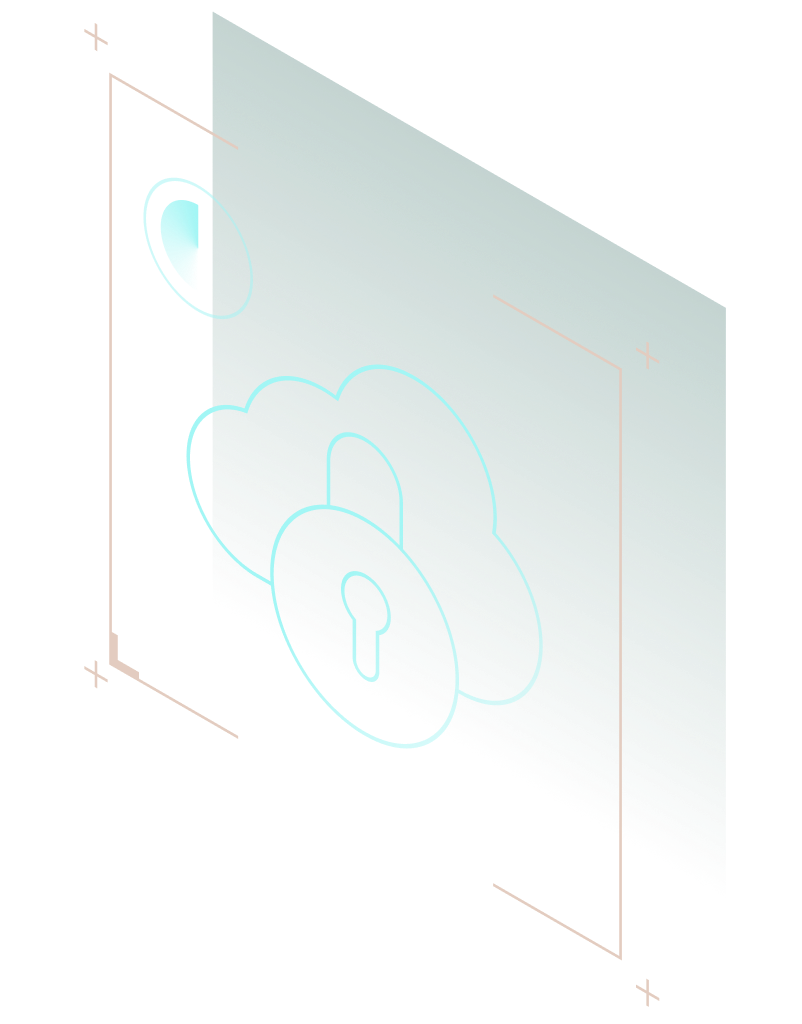
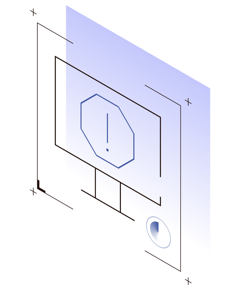
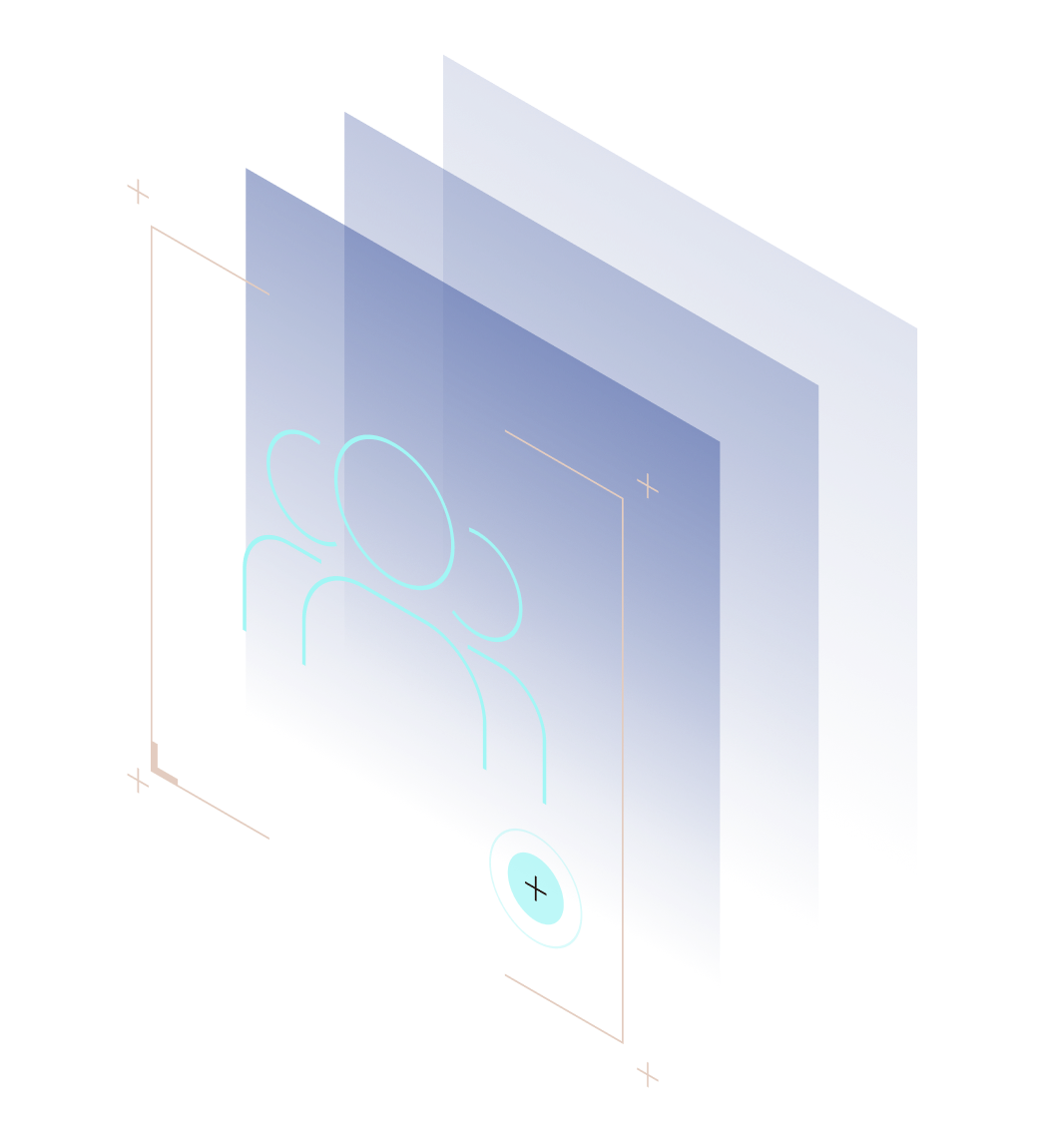
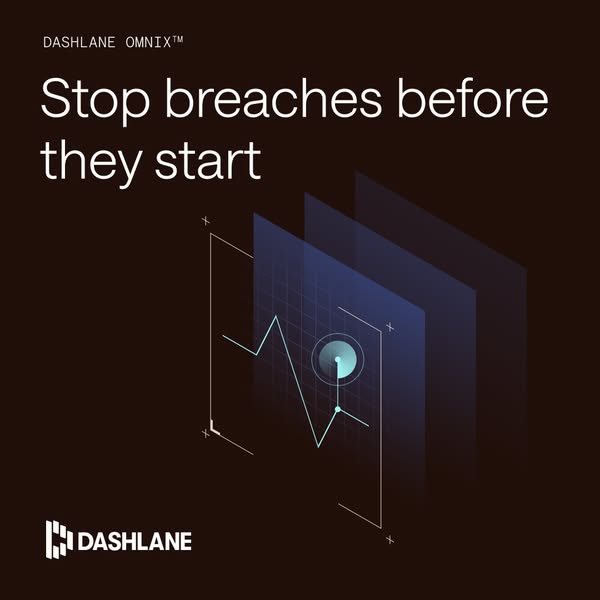
Isometric thin-line wireframe scenes: translucent indigo or sea-green planes stacked in perspective, with aquamarine line objects (cloud and padlock, warning octagon on a monitor, users, certificate) and small crosshair marks; plus flat product UI screenshots in dark espresso/violet frames, and gradient case-study tiles (navy-to-violet with a white customer logo and grid).

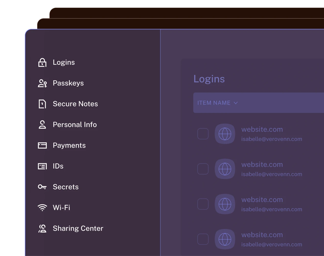


Source: dashlane.comdashlane.com/omnixdashlane.com/our-customers
Candid, staged-natural photos of people working at laptops: on business pages low-key evening office light with blue/teal bokeh, diverse professionals, mid-shot to close crop, cool-warm grade that sits on the espresso ground; on Personal pages bright daylight interiors.
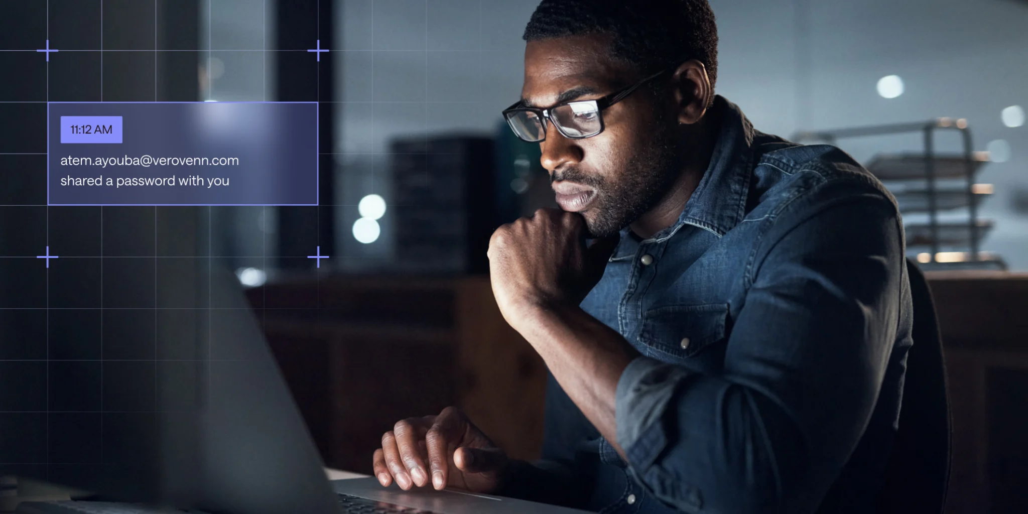
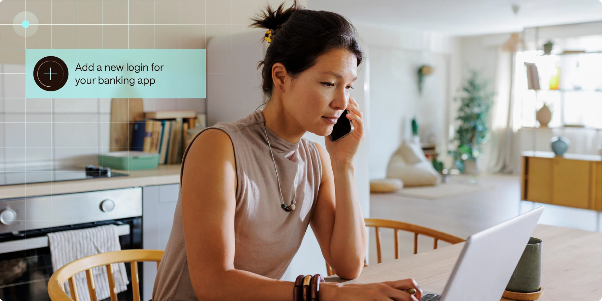


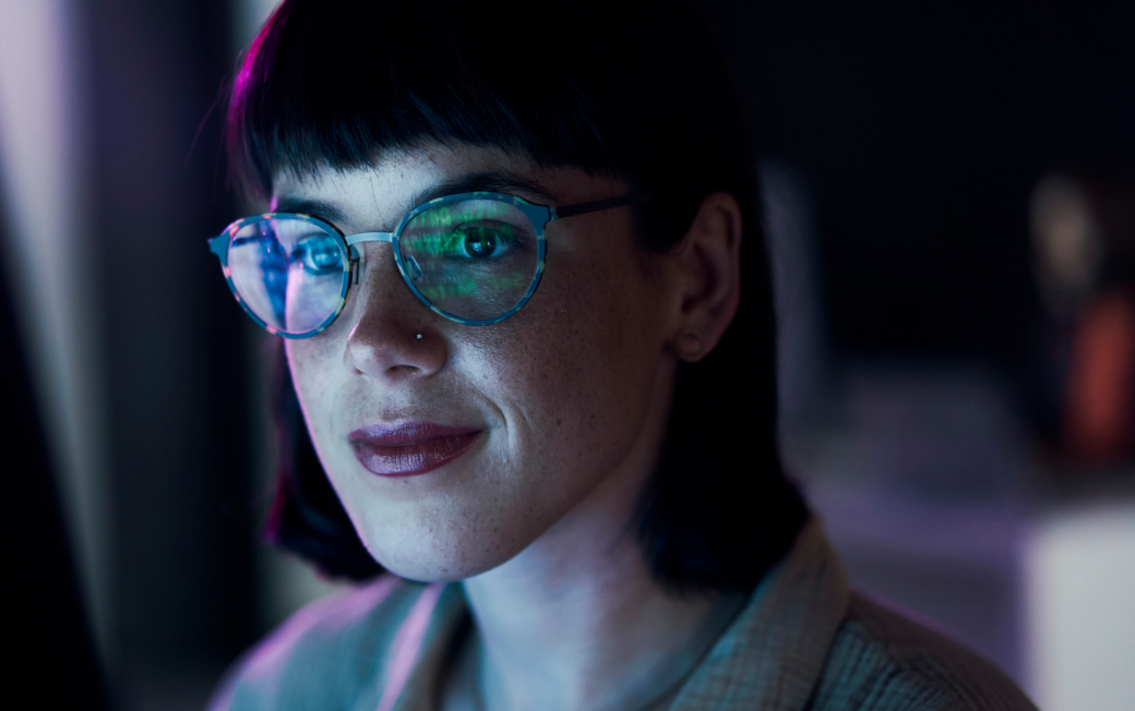



Candid, staged-natural photos of people working at laptops: on business pages low-key evening office light with blue/teal bokeh, diverse professionals, mid-shot to close crop, cool-warm grade that sits on the espresso ground; on Personal pages bright daylight interiors. Photos are 8px-rounded rectangles; hero photos carry a translucent UI toast chip and faint grid overlay. Customer proof uses plain studio headshots and a daylit JFK T4 exterior with the customer logo overlaid.
Source: dashlane.com/omnixdashlane.com/business-password-managerdashlane.com/personal-password-managerdashlane.com/our-customers
1440 canvas, 80px side padding (1280 content), 12-column grid with 20px gaps; split hero (copy left 600px, product video right 600px); bands 64-120px vertical padding; centred heads only for section intros and the logo strip. Phone: 20px gutters, single column, full-width stacked buttons, H1 48px.
Measured from Headless Chromium on https://www.dashlane.com/ at 1440x900 and 390x844 (chat widget blocked, chip marquee frozen), 2026-11-17; measure/home-desk.json, measure/home-phone.json's computed styles and bounding boxes of every heading, paragraph, link, button, image and video, document coordinates after a full scroll.
| Measure | Desktop | Phone |
|---|---|---|
| Page margin | 80px | 20px |
| Section padding | 64px | 24px |
| Hero text width | max 600px, centered | full width |
| Card gap | 20px | 20px |
| Navigation | 204px | 204px |
Hero H1
Saans · 72px (phone 48) · line 1.1 · tracking 0.72px · weight 300
Section H2
Saans · 56px (phone 36) · line 1.1 · tracking 0.56px · weight 300
H3 panel and story head
Saans · 48px (phone 28) · line 1.1 · tracking 0.48px · weight 300
Promo band head
Saans · 36px (phone 24) · line 1.1 · tracking 0.36px · weight 300
Testimonial quote
Saans · 28px (phone 20) · line 1.2 · tracking 0.28px · weight 300
Stat number
Saans · 100px (phone 52) · line 1.1 · tracking 1px · weight 300
Lead
Helvetica Light (macOS) / Arial (Windows) fallback · 18px · line 1.5 · tracking 0.36px · weight 300
Body
Helvetica Light (macOS) / Arial (Windows) fallback · 16px · line 1.5 · tracking 0.16px · weight 300
Nav link
Helvetica Light (macOS) / Arial (Windows) fallback · 14px (phone 16) · line 1.5 · tracking 0.14px · weight 300
Button
Helvetica Light (macOS) / Arial (Windows) fallback · 16px · line 1.5 · weight 400
Eyebrow
Saans Mono · 16px · line 1.1 · tracking 0.96px · weight 300
Tab label
Saans Mono · 14px · line 1.1 · tracking 0.84px · weight 300
Footer column head
Saans Mono · 14px · line 1.1 · tracking 0.84px · weight 400
Hero chip
Saans Mono · 12px · line 1.1 · tracking 0.12px · weight 500
Footer link
Helvetica Light (macOS) / Arial (Windows) fallback · 14px · line 1.5 · tracking 0.14px · weight 300
Legal
Helvetica Light (macOS) / Arial (Windows) fallback · 12px · line 1.5 · tracking 0.12px · weight 300
How Dashlane’s own landing pages are built, observed on Headless Chromium on https://www.dashlane.com/ at 1440x900 and 390x844 (chat widget blocked, chip marquee frozen), 2026-11-17; measure/home-desk.json, measure/home-phone.json, 2026-11-17. The full measurements are in spec.md.
Source: measure/home-desk.json, measure/home-phone.json, measure/about-desk.json, measure/customers-desk.json, measure/newsroom-desk.json (measured 2026-11-18 UTC)


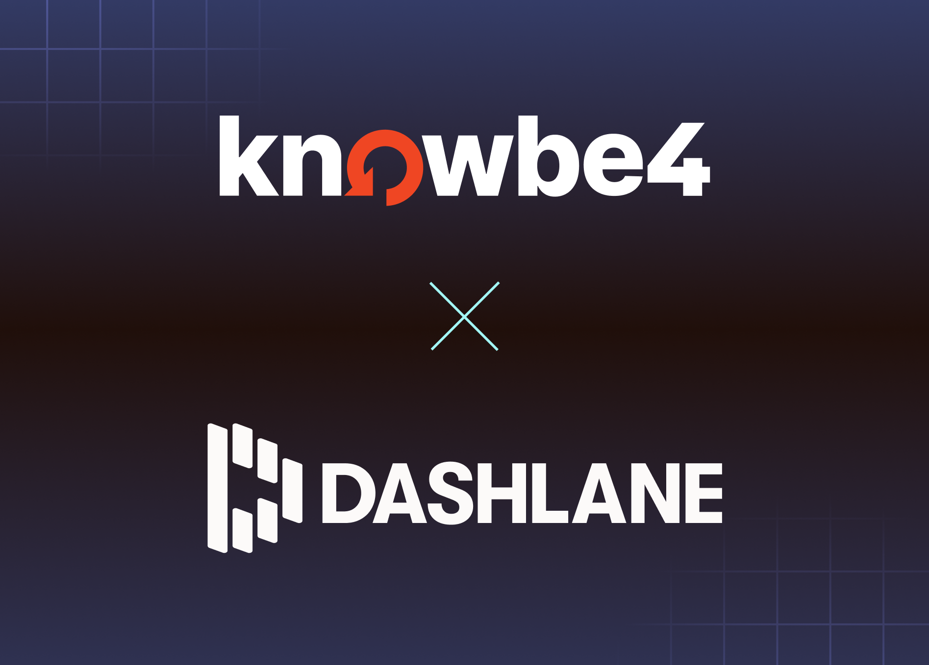
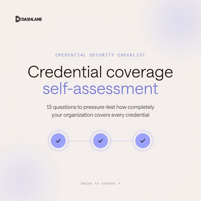
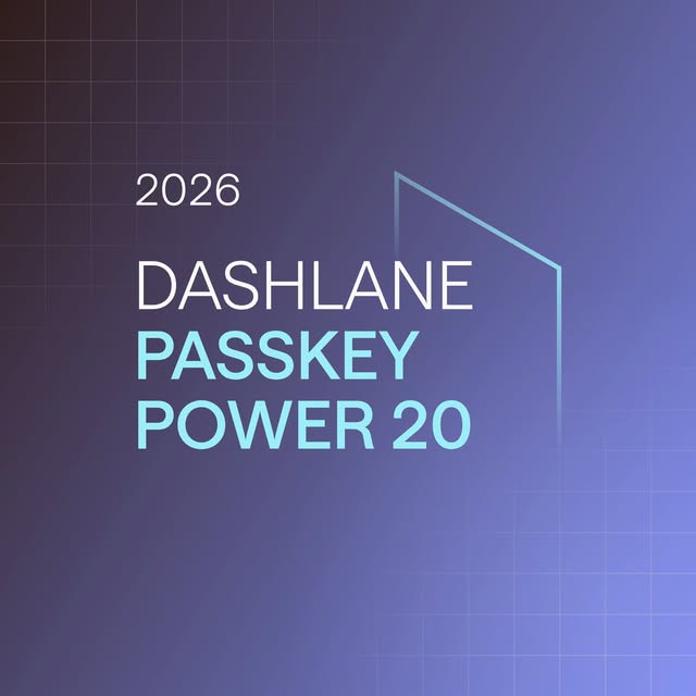
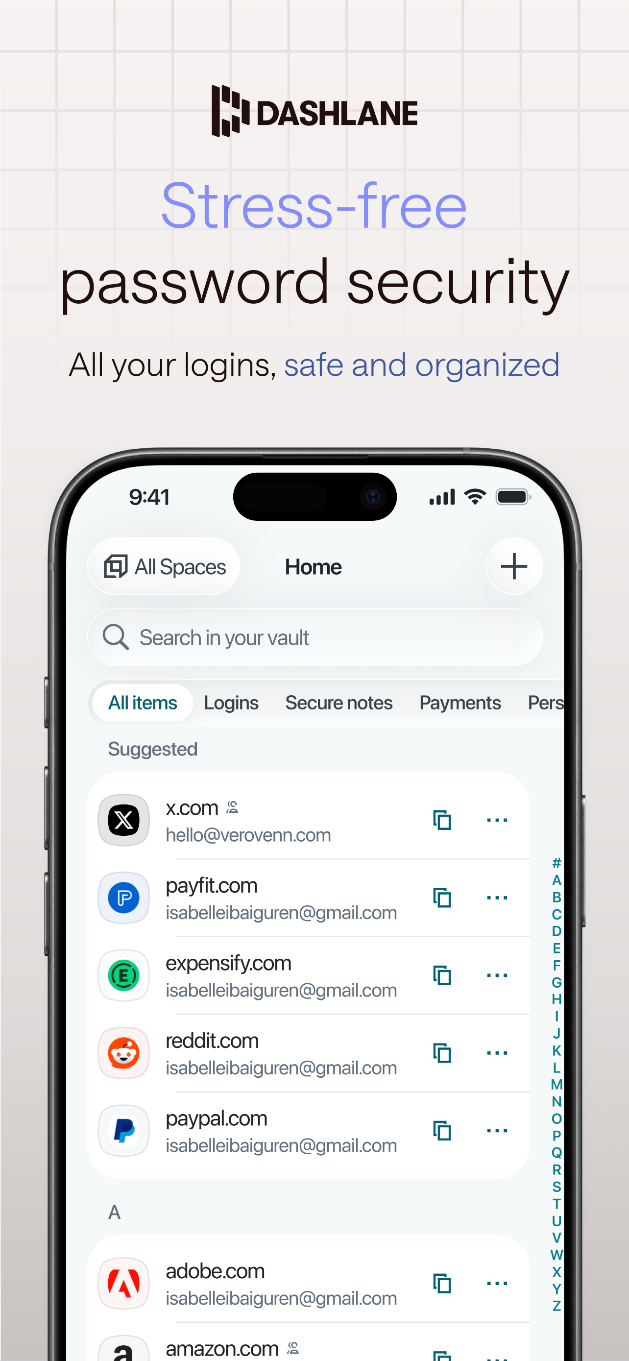
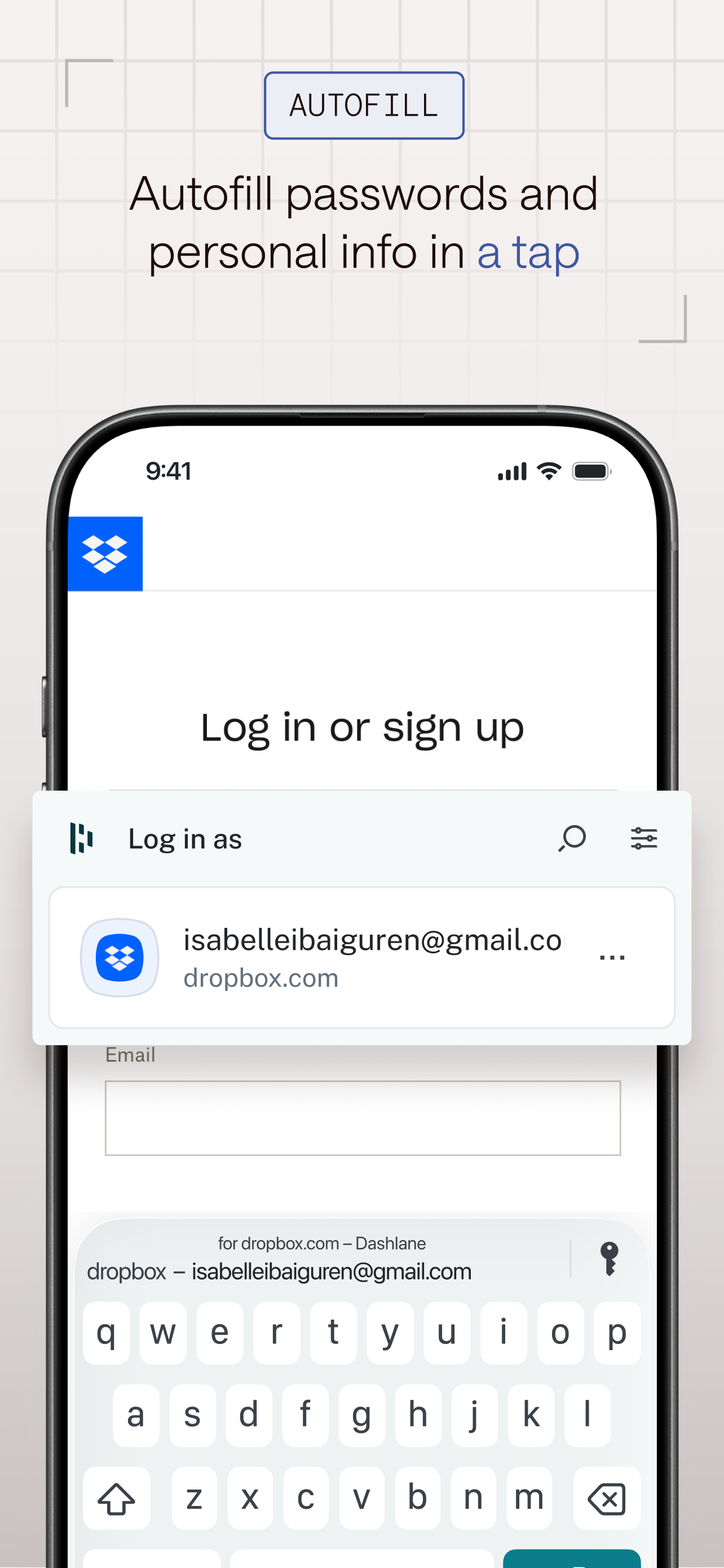
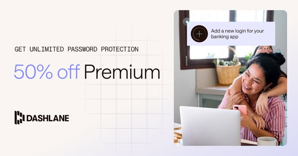
How the system carries across formats, from the site, the newsroom, Instagram, the Meta Ad Library and the App Store. Deck and email are not shown anywhere public, so their settings are our reading.
| Format | Loudness | Must appear | What varies |
|---|---|---|---|
| Landing page | Espresso #200F0A ground; #4D3F3B announcement bar; header with white logo, light nav and indigo Contact Sales; left-aligned 72px light head with one aquamarine phrase, 18px lead, aquamarine button pair; framed product visual right; mono logo-strip label; indigo promo band; stat cards with hairlines; tabbed product panel; testimonial cards #2B2538; hairline-framed closing CTA over a particle swirl; mono-headed footer. | Which proof band (stats, customer story, quotes, compliance) | |
| Social post | Saans-light headline (Geist 300) with the last phrase in the accent colour, the Dashlane logo, a quiet grid texture, and nothing else loud. Light editorial family on off-white is the most frequent; dark gradient family with a partner-logo lockup for announcements. | Ground family (light #F8F6F7 off-white, espresso #200F0A, or #301E1E to #8390F0 gradient); logo centred top or small top-left; optional mono eyebrow, one sub line, or one product UI card; closest observed announcement family: dark navy-espresso-navy vertical gradient with a centred partner-logo x Dashlane-logo stack (newsroom-1) | |
| Deck | Not shown on the site. | ||
| Not shown on the site. | |||
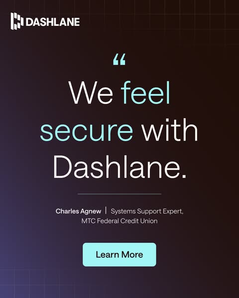
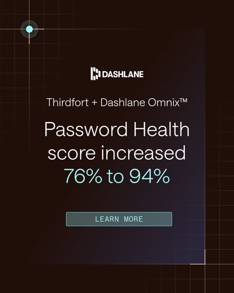
| Paid social ad | Espresso ground that warms to indigo at the bottom, light Saans-light headline of 2 to 4 lines with one accent phrase or number in aquamarine, the white logo, one image (photo with a red alert ring, a line-art concept, or nothing), and an aquamarine filled Learn More button only on the quote ads. | Family by job: customer quote (centred quote, attribution, button), stat hook (large aquamarine number or phrase top left, photo below), customer result (partner lockup, result in aquamarine, outlined mono button), concept (eyebrow plus headline over a line-art illustration), consumer offer (light grid ground, indigo offer). | |
| Store screenshot | Light grid ground, centred or tagged top, a 2 to 3 line light headline with one indigo phrase, and one iPhone with the app UI bleeding off the bottom edge, or a full-bleed lifestyle photo with a glass proof panel. | Top of the frame: logo (first two screenshots) or a mono feature tag in an outlined indigo rectangle (feature screenshots); bottom: phone, device pair, or award panel. | |
| Carousel cover | Off-white grid ground, logo top, a 2 to 3 line light centred headline with the last phrase in indigo, and a swipe cue in mono at the bottom. | Eyebrow tag and sub line (lead magnet) or only the headline (guide); cue is an arrow over SCROLL or the words Swipe to assess →. |
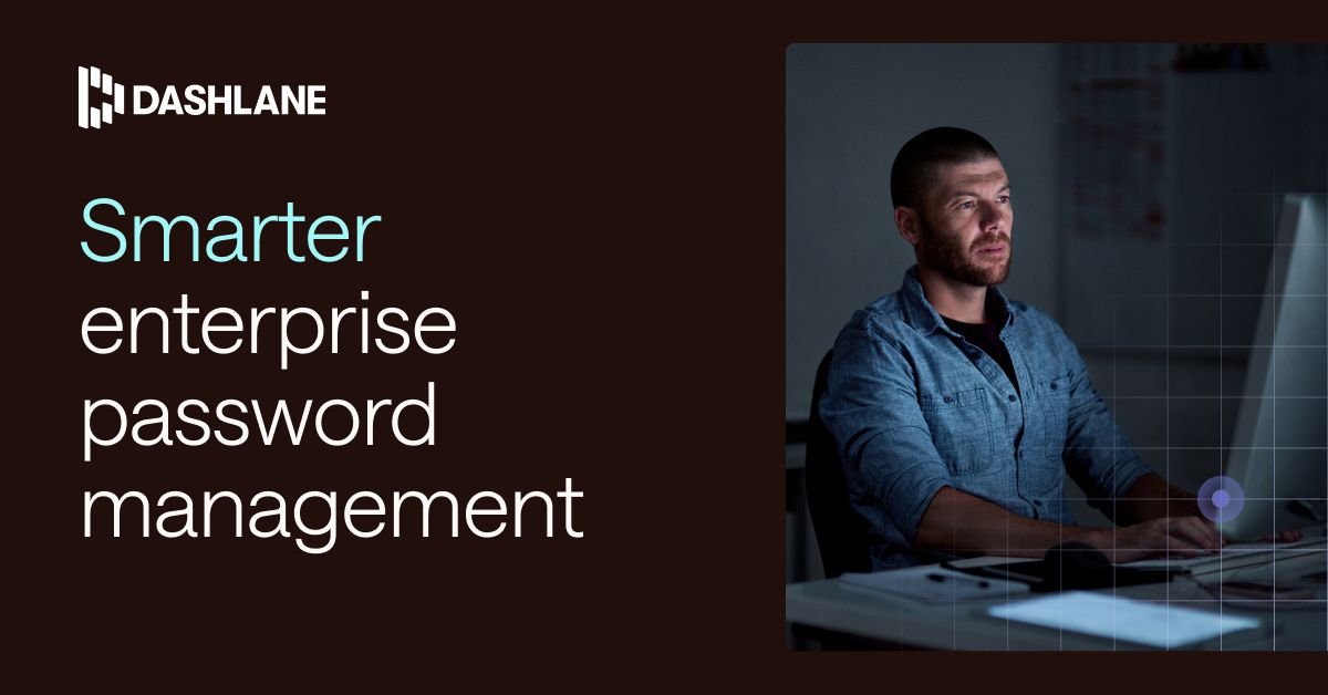 UK SingleImage B2B PaidLPMeta, LinkedIn · Jan 2026 – now
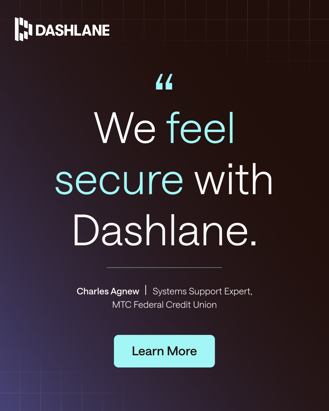 Prevent credential breachesMeta · May 2026 – nowI’m David, Sales Director at Dashlane, the credential…LinkedInI’m Ted, Global Team Lead at Dashlane, the credential…LinkedIn
Source: dashlane.comdashlane.com/omnixfacebook.com/ads/library
Your name and logo, Dashlane’s system.
Talk about my brand Use this brand in Claude
Get your brand audit Put your brand in Claude What goes in a brand book
Each value is marked published, observed, our reading or our recipe, with its source. Checked 2026-11-17. Not affiliated with Dashlane.
Tell us what you want to make. We’ll talk through how to put these ideas to work for your brand.