Network visibility
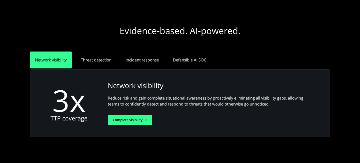
Reduce risk and gain complete situational awareness by proactively eliminating all visibility gaps, allowing teams to confidently detect and respond to threats that would otherwise go unnoticed. Observed
Brand book
Corelight sells network evidence to SOC teams who live in dark-mode tools. A black ground with glowing data lines makes the product's subject (light moving through a network) the brand image, and keeps the site feeling like the consoles its buyers use; plain Open Sans and sentence case keep it sober and technical, while a single neon-green button and teal highlight words act like an alert colour pointing at what matters. Our reading

Which glowing-lines illustration or graded photo fills the hero and cards
rounded estimate; illustrations and photos counted by dominant hue.
Our engine's setting, built from their rules.
The page or piece is on #000000 (or the blue-black main gradient); no white or grey bands.
Heads are Open Sans 400, sentence case, no full stop, white with at most 1-3 words in teal #19D7A7.
Each CTA group has one #35FF94 4px-radius button with black SemiBold 14px label and chevron; any second action is a white text button.
Green covers under ~20% of the area, appears as accents (button, bar, icon) and the greens are not combined in one area.
Signature glowing-lines images sit only on black or the Corelight gradient and are unmodified.
Logo is a supplied SVG (white + green on dark), with clear space equal to its height; never retyped.
Copy leads with one benefit, says "evidence", names products exactly (Open NDR Platform, Smart PCAP, Zeek®) and invents no numbers.
Corelight transforms network data into definitive evidence, powering AI-driven detection and expert-authored workflows, and enabling the AI SOC ecosystem. Observed
Reduce risk and gain complete situational awareness by proactively eliminating all visibility gaps, allowing teams to confidently detect and respond to threats that would otherwise go unnoticed. Observed
Multi-layered detection that fuses machine learning, behavioral analytics, curated signatures and threat intelligence into prioritized alerts (paraphrase). Observed
AI-powered explainability, automated triage and integrated response workflows that contain threats and lower MTTR (paraphrase). Observed
Transparent, auditable AI built on forensic-grade network evidence, with agentic triage (paraphrase). Observed
The defensible AI SOC
Uncover hidden threats with network evidence
Evidence-based. AI-powered.
We put evidence at the heart of security.
With humility, we turn expertise into execution. We take thoughtful risks, and build on each others’ work to uncover the best ideas.
PublishedWe question constantly, but not aimlessly. We draw on data, ideas and evidence from anywhere to drive success (lightly edited from the careers page).
PublishedHelping is a calling. We serve our customers, our open source communities, and each other.
PublishedCategory. Network Detection & Response (NDR), now framed as the evidence layer of a "defensible AI SOC" Published
Corelight transforms network and cloud activity into evidence that security teams use to proactively hunt for threats, accelerate response to incidents, gain complete network visibility, and create powerful analytics. Corelight's customers include Global 2000 companies, major government agencies, and large research universities. Based in San Francisco, Corelight is an open-core security company founded by the creators of Zeek®, the widely used open-source network security technology. For more information, visit www.corelight.com.
The defensible AI SOC Observed
Uncover hidden threats with network evidence Observed
Industry-leading network detection & response Observed
Evidence-based. AI-powered. Observed
We put evidence at the heart of security. Observed
Complete visibility. Explainable detections. Accurate response. Trustworthy AI. Observed
Future-ready defense starts here Observed
DISRUPT ATTACKS WITH NETWORK EVIDENCE Published
Make evidence the heart of security Published
Complete visibility. Explainable detections. Accurate response. Trustworthy AI.
Future-ready defense starts here
Corelight makes your existing solutions even more powerful
EDR evasion is rampant. Stop attackers that evade existing point solutions.
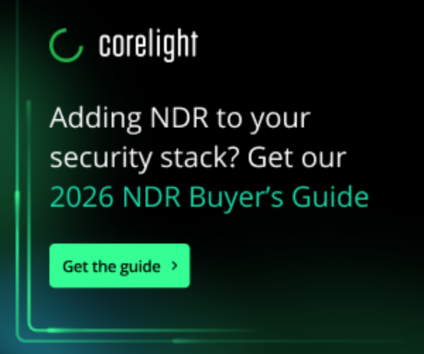
Adding NDR to your security stack? Get our 2026 NDR Buyer’s Guide
Have questions?
Every message turns network data into evidence.
Source: corelight.comcorelight.com/platformcorelight.com/company/about-corelightCorelight Brand Guidelines v2.0 (July 2023), linked from the public brand portal https://app.pickit.com/#/brand/64276b70b16393929b2d1b6f (1.2-1.4)
Uncover hidden threats with network evidence
Are Hidden Threats Hurting Your Business?
Evidence-based. AI-powered.
Next-gen AI that revolutionizes your SOC!
Our Revolutionary AI Platform Stops Every Threat!
Uncover hidden threats with network evidence
Click here to learn more about our solutions
Get a demo
SmartPCAP and Suricata IDS, built on open source technology
Smart PCAP and IDS, built on open-source Zeek® and Suricata®
confidenttechnicalconciseevidence-led
network evidenceevidence-baseddefensible AI SOCOpen NDR Platformcomplete visibilitydisrupt attacksdefendersthreat huntingtransparentexplainable
Title Case headlinesfull stops on headlinesSmartPCAPSuricata IDSopen source (adjective, unhyphenated)problem-first openings
Source: Corelight Brand Guidelines v2.0 (July 2023), linked from the public brand portal https://app.pickit.com/#/brand/64276b70b16393929b2d1b6f; saved at corelight-brand-guidelines-july-2023.pdf (1.4)corelight.comcorelight.com/company/about-corelightcorelight.com/platformfacebook.com/ads/library


The horizontal logo sits top-left in the header on every page.


The horizontal logo sits top-left in the header on every page. It is 185x42 at 1440 and 390, white wordmark with the green C; the footer carries no Corelight logo, only award badges. The brand portal publishes horizontal, spotlight and text-only logos in green/black, white/green, all-white and all-black.
Source: Corelight brand portal (Pickit, public, no login) https://app.pickit.com/#/brand/64276b70b16393929b2d1b6f, linked from https://corelight.com/company/newsroom ("visit our brand portal"), read 2026-11-17Corelight Brand Guidelines v2.0 (July 2023), linked from the public brand portal https://app.pickit.com/#/brand/64276b70b16393929b2d1b6f; saved at corelight-brand-guidelines-july-2023.pdf (2.1-2.6)corelight.com
The defensible AI SOC
The defensible AI SOC
Black carries the page and colour is rationed.


Black carries the page and colour is rationed. White Open Sans, one neon-green #35FF94 button per group, teal #19D7A7 on a highlight word, an eyebrow or an inline link, Midnight #273038 card hairlines and #14181C FAQ rows; colour volume comes from glowing-lines art and teal/purple gradient card images. The guide asks for large neutral areas, green in small areas only.
Source: Corelight Brand Guidelines v2.0 (July 2023), linked from the public brand portal https://app.pickit.com/#/brand/64276b70b16393929b2d1b6f; saved at corelight-brand-guidelines-july-2023.pdf (3.1-3.6)Corelight brand portal (Pickit, public, no login) https://app.pickit.com/#/brand/64276b70b16393929b2d1b6f, linked from https://corelight.com/company/newsroom ("visit our brand portal"), read 2026-11-17measure/home|about|platform|newsroom-desk.json + -phone.json and live computed styles in headless Chromium at 1440 and 390 (2026-11-17)
The defensible AI SOC
Future-ready defense starts here
FUTURE-READY DEFENSE STARTS HERE
Open Sans does everything.

Open Sans does everything. Regular 400 for every head and body, SemiBold 600 14px for buttons, Bold 700 rarely (announcement link); heads are sentence case with line-height about 1.07 and normal tracking; body 16/24.
| Their face | Use | License | Open stand-in |
|---|---|---|---|
| Open Sans (heads, Regular 400) | every head (H1 46/49, H2 36/39, H3 28/30, H4 24/24) | SIL Open Font License 1.1 (Copyright 2020 The Open Sans Project Authors; OFL.txt in fonts/) | not needed: open face, exact files supplied |
| Open Sans (body, Regular 400) | body 16/24, small 14/24 | SIL Open Font License 1.1 (Copyright 2020 The Open Sans Project Authors; OFL.txt in fonts/) | not needed |
| Open Sans SemiBold 600 | buttons 14/16 -0.28px | SIL Open Font License 1.1 (Copyright 2020 The Open Sans Project Authors; OFL.txt in fonts/) | not needed |
| Tungsten Rounded | wordmark only; use the SVG files | commercial (Hoefler & Frere-Jones); logo only | never typeset |
Source: Corelight Brand Guidelines v2.0 (July 2023), linked from the public brand portal https://app.pickit.com/#/brand/64276b70b16393929b2d1b6f; saved at corelight-brand-guidelines-july-2023.pdf (4.1-4.3)measure/home|about|platform|newsroom-desk.json + -phone.json and live computed styles in headless Chromium at 1440 and 390 (2026-11-17)
Do Page ground #000000; heads Open Sans 400 sentence case, white #FFFFFF: H1 46/49, H2 36/39 centred section heads, H3 28/30, H4 24/24; body 16/24 white. No light bands anywhere.
Black ground, white Open Sans Regular heads · every page, every band, including the footer
Do 1-3 words of the head wrapped in <strong> coloured #19D7A7 at the same weight 400 and size; often the second half or last word; teal eyebrow line (16/24 #19D7A7) above hero H1s ("Company", "Platform", "Industry-leading network detection & response").
Teal highlight word in a white head · hero ("The defensible AI SOC"), blog card titles, partner cards ("Work faster", "Threat hunting"), footer ("Sign up for our newsletter", "We’re hiring!", "Get in touch")
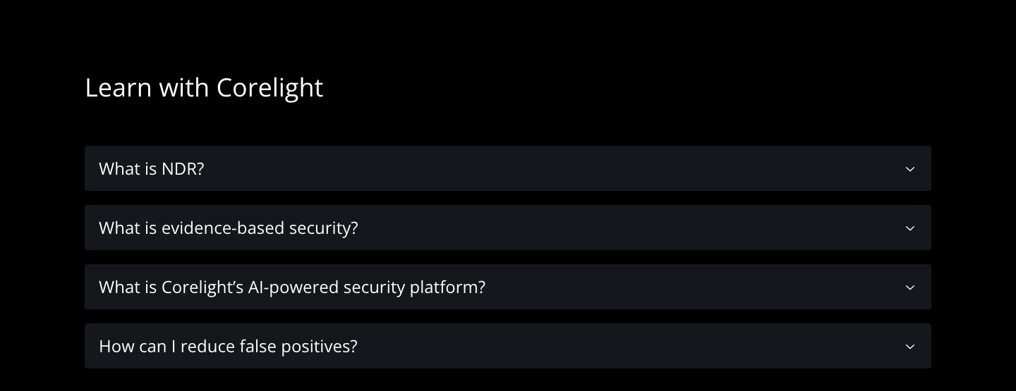
Do #35FF94 fill, #000000 Open Sans 600 14/16 -0.28px, 4px radius, padding 12px 18px 12px 20px (40-42px tall), black angle-right chevron 8x12 after the label; paired at most with a button_text + chevron, or (nav) a 1px #35FF94 button_secondary.
One neon-green button with chevron · every CTA group: hero, banner card, tab panel, FAQ answers, footer, nav Contact us
Do Luminous green/teal/cyan/violet light streaks and bokeh on #000000 or the blue-black main gradient (#041526 -> #162A47), lines bleeding off one edge, never on white; the C-lines version echoes the logo C for About content.
Glowing lines on black · home hero (orbit lines over black, looping video), footer CTA band (curved lines bottom-right), about hero (C-lines), platform feature bands, guide imagery
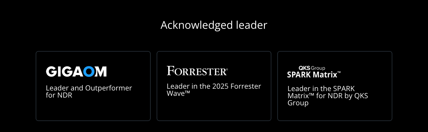
Do Card 2px solid #273038 border, 8-9px radius, padding 48px 32px; background either black or a teal/purple/blue gradient image (card-gradient-*.png) or a teal-graded photo bleeding to the bottom; title H3 28/30 or H4 24/24 white with teal highlight; text link "Read the blog >" SemiBold 14 white.
Dark cards with Midnight hairline and gradient art · Latest from Corelight (3-up), Acknowledged leader (3-up), partner integrations (4-up), review slider, Gartner banner, newsroom grid
Do 54px full-bleed bar, linear-gradient(to right, #00AB49, #000000); white circle-exclamation icon, white 16/24 message centred and a Bold 15px "Get the report" link + chevron.
Green-to-black announcement bar · top of the home page above the nav
Specimens use sample copy, not Corelight’s.
Buttons, bordered dark cards and tabs do the work.





Buttons, bordered dark cards and tabs do the work. Neon-green 4px-radius button_primary with a chevron; 2px #273038 bordered dark cards with gradient art; capability tabs (active tab neon fill, inactive transparent) above a rgba(39, 48, 56, 0.5) panel with a 120px stat; FAQ accordion rows #14181C; a review slider with prev/next chevrons; a green-to-black announcement bar; a footer CTA band with glowing lines bottom-right.
Source: measure/home|about|platform|newsroom-desk.json + -phone.json and live computed styles in headless Chromium at 1440 and 390 (2026-11-17)
Two families: solid UI glyphs and glowing feature icons.




Two families: solid UI glyphs and glowing feature icons. UI icons are Font Awesome 6 Solid glyphs (angle-right chevron, circle-exclamation, magnifying-glass, social marks) filled in the text colour; feature icons are thin neon/teal line drawings with a glow. The guide names Streamline Regular and the in-house Core Line set, but that library is behind the DAM wall, so only icons served on the site are shown.
Source: measure/home|about|platform|newsroom-desk.json + -phone.json and live computed styles in headless Chromium at 1440 and 390 (2026-11-17)Corelight Brand Guidelines v2.0 (July 2023), linked from the public brand portal https://app.pickit.com/#/brand/64276b70b16393929b2d1b6f; saved at corelight-brand-guidelines-july-2023.pdf (6.1)
Glowing lines are the brand image.
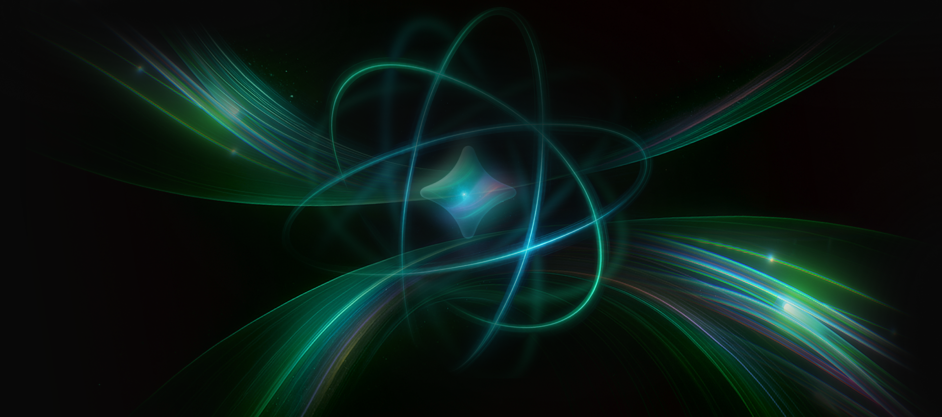



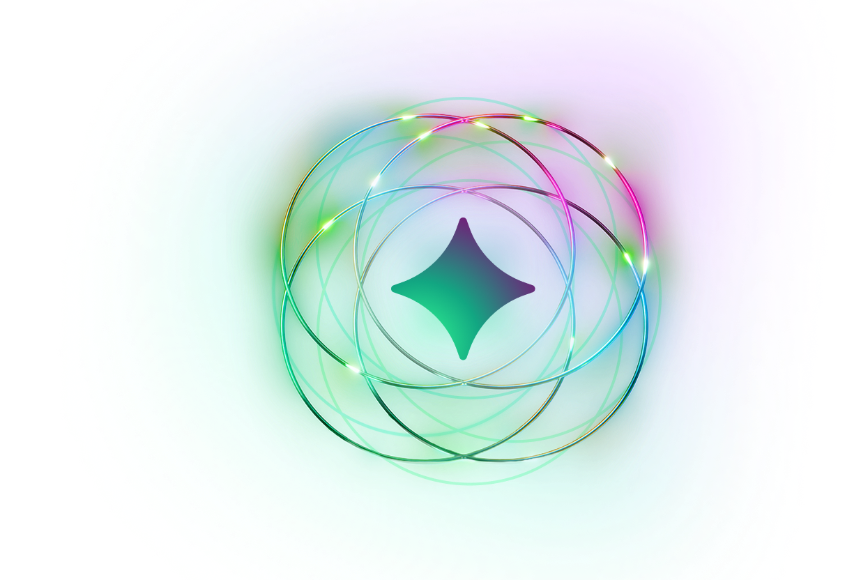
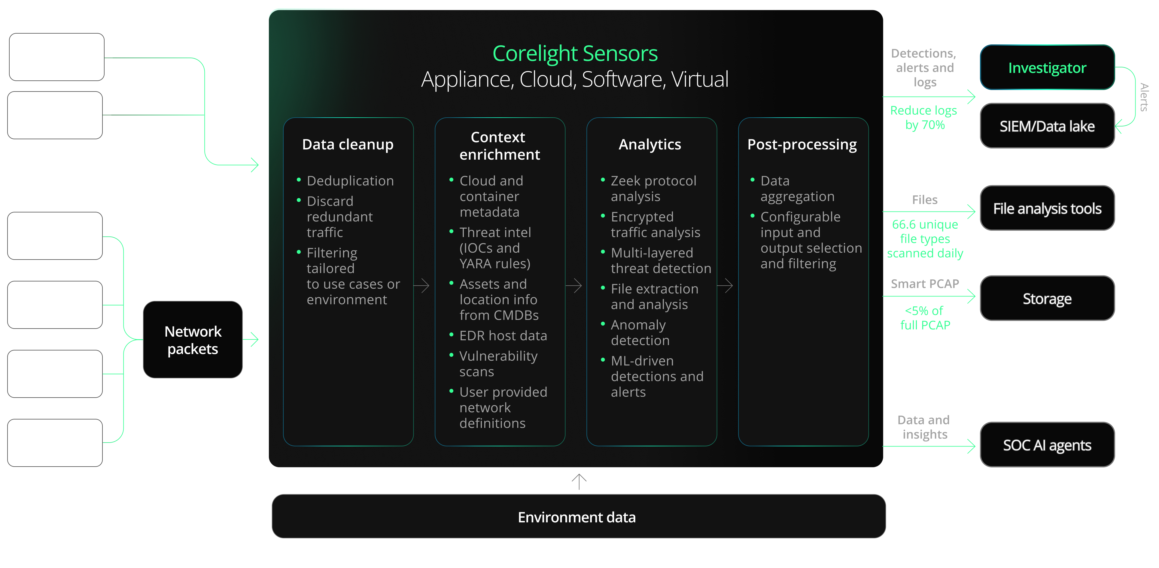
Glowing lines are the brand image. The signature imagery is luminous glowing lines and particles (green, teal, cyan, violet, hot-pink hot spots) on black or the blue-black main gradient: orbit rings in the home hero, sweeping C-lines on About, curved line bundles in the footer, layered horizontal streams and data stacks on the platform page, and 3D glossy product illustrations (sensor stacks, Zeek frame). Pillar illustrations are paired with fixed topics (cloud + lines = complete visibility, red anomaly = faster investigation, globe = expert hunting, green wormhole = Smart PCAP).
Source: Corelight Brand Guidelines v2.0 (July 2023), linked from the public brand portal https://app.pickit.com/#/brand/64276b70b16393929b2d1b6f; saved at corelight-brand-guidelines-july-2023.pdf (5.1-5.3)corelight.comcorelight.com/company/about-corelightcorelight.com/platform
Photos are rare and colour-graded.

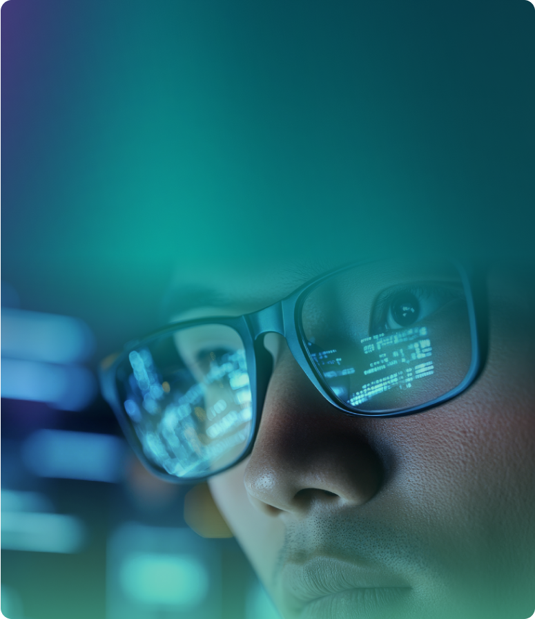

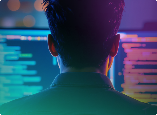
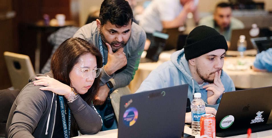
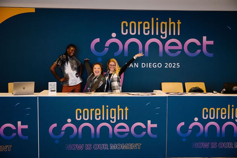

Photos are rare and colour-graded. People photos are used sparingly, mainly as blog/feature card art: analysts at screens, close crops of faces with screen reflections in glasses, hands on a laptop keyboard. All are colour-graded into the brand's teal-to-violet range and fade to the card's gradient so the white title sits on a calm area at the top. Event/careers photos (Corelight Connect) are the only natural-colour photos.
Source: corelight.comcorelight.com/company/about-corelightcorelight.com/company/careers
One centred 1200px column on black. 1200px centred container (120px margins at 1440). Section padding 104px top / 32px bottom on most home bands (64px on the analyst band); section heads centred H2 36px; cards in 3-up (386px, 20px gap) or 4-up (285px) rows; split bands 50/50 text + image on about/platform. Phone (390): single 326px column with 32px side padding (hero 24px: text column 342px at x 24), section padding 64px top / 32px bottom, heads 31px, cards stacked full width. Footer: CTA band 384px (104px 48px padding) with glowing lines, then 3 columns (newsletter / hiring / get in touch), then legal row.
Measured from corelight.com/%20(headless%20Chromium%20at%201440x900%20and%20390x844,%20cookie%20banner%20hidden,%202026-11-17;%20measure/home-desk.json,%20measure/home-phone.json)'s computed styles and bounding boxes of every band, card, heading and button at 1440 and 390; hover states read from computed style and re-checked on 2x screenshots.
| Measure | Desktop | Phone |
|---|---|---|
| Page margin | 120px | 32px |
| Section padding | 104px | 64px |
| Hero text width | max 900px, centered | full width |
| Card gap | 20px | 20px |
| Navigation | 158px | 158px |
Stat figure (tab panel)
Open Sans (heads, Regular 400) · 120px (phone 72) · line 1 · tracking 1.2px · weight 400
Page H1 (hero slide 2, inner-page heroes)
Open Sans (heads, Regular 400) · 46px (phone 41) · line 1.07 · weight 400
Hero slide-1 head
Open Sans (heads, Regular 400) · 41px · line 1.07 · weight 400
Section H2
Open Sans (heads, Regular 400) · 36px (phone 31) · line 1.08 · weight 400
Footer CTA H2 "Have questions?"
Open Sans (heads, Regular 400) · 36px · line 1 · tracking -0.72px · weight 400
Card and panel H3
Open Sans (heads, Regular 400) · 28px (phone 23) · line 1.07 · weight 400
H4: analyst card titles, review quotes, FAQ questions, stat label
Open Sans (heads, Regular 400) · 24px (phone 19) · line 1 · weight 400
Eyebrow above hero heads
Open Sans (body, Regular 400) · 16px · line 1.5 · weight 400
Body
Open Sans (body, Regular 400) · 16px · line 1.5 · weight 400
Nav links
Open Sans (body, Regular 400) · 16px · line 1.125 · tracking -0.32px · weight 400
Tab labels
Open Sans (body, Regular 400) · 16px · line 1 · weight 400
Buttons
Open Sans (body, Regular 400) · 14px · line 1.14 · tracking -0.28px · weight 600
Small print: consent, Gartner disclaimer
Open Sans (body, Regular 400) · 14px · line 1.71 · tracking -0.28px · weight 400
Footer legal and trademark
Open Sans (body, Regular 400) · 14px · line 1.29 · tracking -0.28px · weight 400
Utility phone number
Open Sans (body, Regular 400) · 14px · line 1.29 · tracking -0.14px · weight 400
Mega-menu column heading
Open Sans (body, Regular 400) · 14px · line 1.14 · tracking -0.28px · weight 700
One or two sentences on what this does for the reader.
One or two sentences on what this does for the reader.
Radius 9px on blog and analyst cards, 8px on partner, review and Gartner banner cards. No shadow. Hover: transition on filter/scale/background 0.5s ease-in-out, no measured change at rest-to-hover.
How Corelight’s own landing pages are built, observed on corelight.com/%20(headless%20Chromium%20at%201440x900%20and%20390x844,%20cookie%20banner%20hidden,%202026-11-17;%20measure/home-desk.json,%20measure/home-phone.json), 2026-11-17. The full measurements are in spec.md.
Source: measure/home|about|platform|newsroom-desk.json + -phone.json and live computed styles in headless Chromium at 1440 and 390 (2026-11-17)

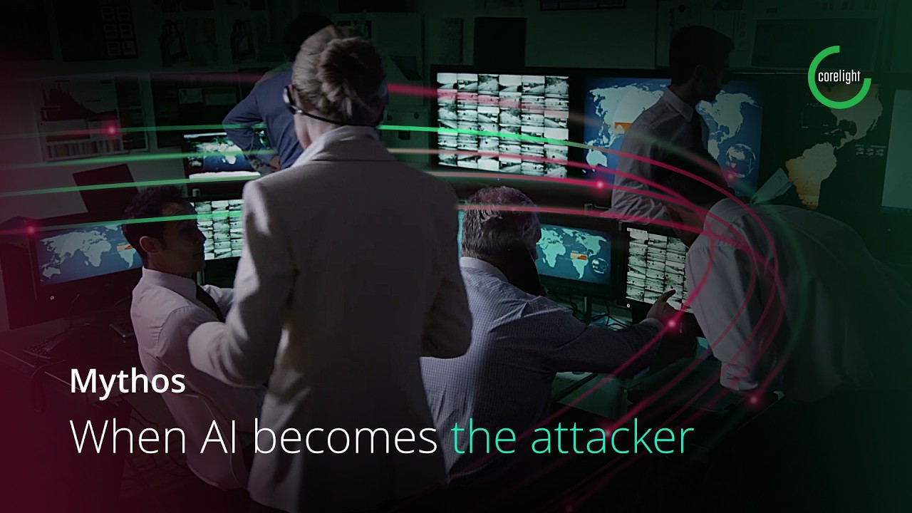
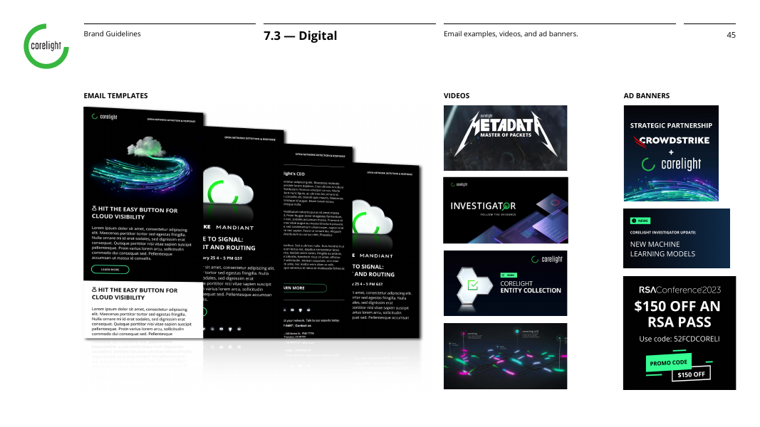
Landing page from the live site; email and display ad from the 2023 guide's 7.3 Digital examples.
| Format | Loudness | Must appear | What varies |
|---|---|---|---|
| Landing page | black ground, Regular white heads with teal highlight, neon 4px button with chevron, glowing-lines hero | which proof bands follow (banner card, tabs, cards, slider) | |
| black ground, glowing art, green CTA | hero illustration | ||
| Display ad banner | dark ground, glowing lines, logo | head copy | |
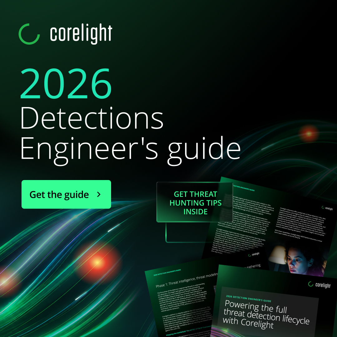
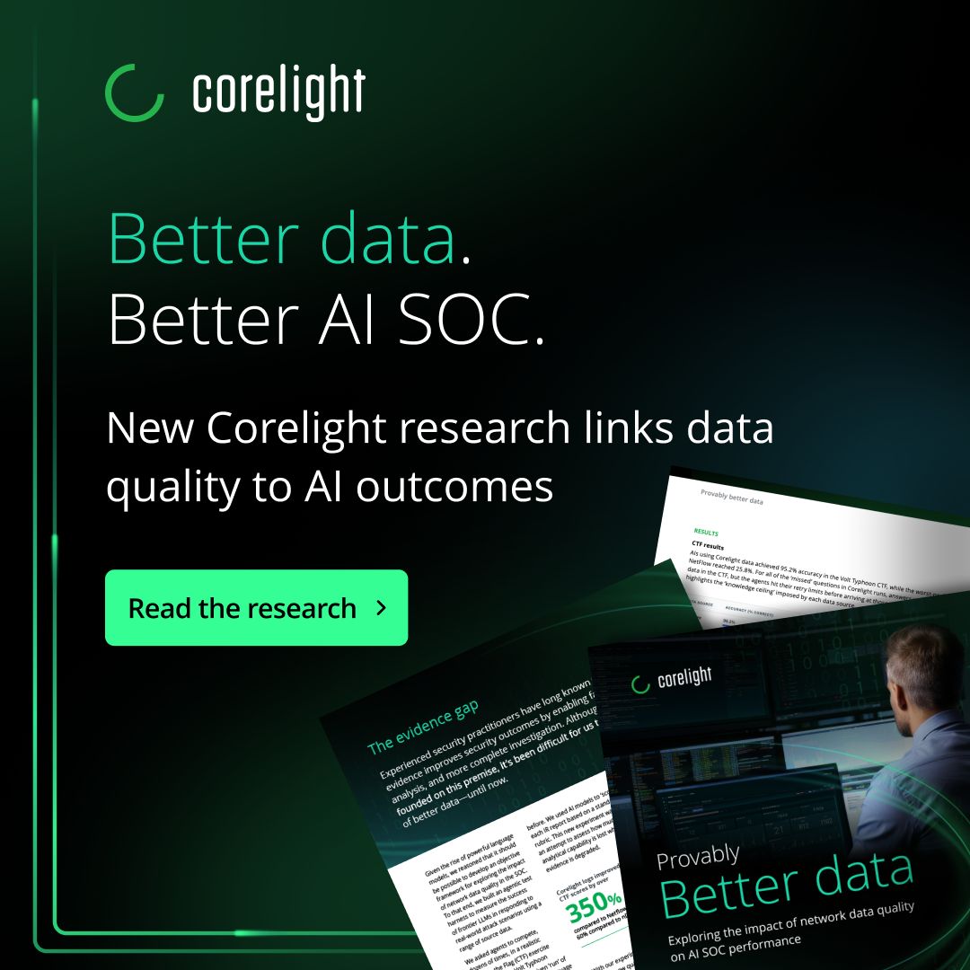
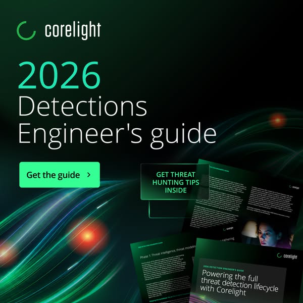
| Social post | Black #000000 square, logo top-left, a left-aligned Regular white head of 2-3 lines with one line or phrase in #19D7A7 (the offer or the year), one neon #35FF94 button under it, and the guide or product mock tilted into the bottom-right corner over light ribbons. Homepage voice, sentence case. | announcement (default, anatomy below) or brand card (logo-on-dark.svg centred at 640px wide on black with a #00AB49 glow from the bottom-left corner, nothing else, as the og:image); artwork: hero-home-ai-orbits.png, footer-glow-lines.webp or the About C-lines (about-hero-c-lines.svg) in place of the ribbons; asset mock or none; button or no button | |
| Paid ad: lead-magnet offer | black ground, logo top-left, left-aligned Regular white head of 2 to 3 lines with one teal phrase, one neon #35FF94 button with a chevron under it, the guide mock tilted into the bottom-right corner | the asset name as the teal phrase (the year, "2026 NDR Buyer's Guide"); light-ribbon art at the bottom or a thin green line frame; a small uppercase chip on the mock; the 9:16 version centres the stack inside a 1px frame | |
| Paid carousel | cover with logo, a left-aligned head with a teal phrase and a lead-in line with a teal arrow; step cards in a translucent dark panel outlined in teal with a teal lead word and a row of 5 numbered pills; an end card pointing to the caption | cover photo of an analyst or a ribbon background; panel title copy; how many steps (5 observed) | |
| Display ad: brand message | black ground with a green glow, logo top-left, a 2-line white Regular head whose closing phrase is bold, one neon bold text line with a chevron, a person or light ribbons filling the lower right | person in teal light or glowing ribbons; the closing bold phrase | |
| Video thumbnail | dark ground, logo, short Regular white title with a teal phrase, no button; podcast episodes keep the one cover art | campaign video: dimmed photo with light arcs and a lead word; demo or series: black with corner glows and a centred title or lockup; podcast: the DefeNDRs cover with an optional caption strip |
Source: Corelight brand portal (Pickit, public, no login) https://app.pickit.com/#/brand/64276b70b16393929b2d1b6f, linked from https://corelight.com/company/newsroom ("visit our brand portal"), read 2026-11-17Corelight Brand Guidelines v2.0 (July 2023), linked from the public brand portal https://app.pickit.com/#/brand/64276b70b16393929b2d1b6f; saved at corelight-brand-guidelines-july-2023.pdf
Your name and logo, Corelight’s system.
Talk about my brand Use this brand in Claude
Get your brand audit Put your brand in Claude What goes in a brand book
Each value is marked published, observed, our reading or our recipe, with its source. Checked 2026-11-17. Not affiliated with Corelight.
Tell us what you want to make. We’ll talk through how to put these ideas to work for your brand.