Front End: Patient Access
Improve access to care by removing friction before the visit. Observed
Brand book
Commure sells "agentic" automation to conservative health-system buyers, so the site borrows the look of frontier AI and consumer tech (black ground, extended light type, glowing cyan, product video) to signal it is a new kind of company, then grounds every claim in scale numbers and named health systems so the futurism reads as proof, not hype. Our reading

The hero image: product video under a glowing arc (home), a B&W landscape behind a giant head (company, news, careers), or a B&W clinician photo beside the head (customers).
desktop home band heights in px, 6971px page; /company and /customers are ~98% black; /news is ~48% white card grid.
Our engine's setting, built from their rules.
Every web band #000000 (only the cyan banner, the #D3F9FF-#A8F4FF CTA band and form cards differ). Posts: #090A1A with blue-violet corner glows.
#A8F4FF only on buttons, stats, labels, banner and one CTA phrase; no second accent; no cyan paragraph text.
Extended light (GT America Extended 300 at -0.0675em, or Archivo 270 wdth 112 at -0.025em), Title Case; 36px section heads open (+0.01em real, +0.06em stand-in); never bold.
Satoshi 900 caps +0.04em; full-round cyan pills for CTAs; 4px-radius glowing cyan buttons only for product lockups.
Supplied SVG, one colour (white on black, black on cyan); co-brand with a 1px rule.
Every number is one the site states (40M+, $25B+, 130+/150+, 100M+, 400K+, customer results) with its customer named; nothing invented.
Real product UI, B&W landscapes/people or the customer's real building; no generic colour stock.
An agentic AI platform that does healthcare’s administrative and clinical work (calls, notes, codes, claims) end to end on one data model, deployed with embedded engineers inside large health systems. Our reading
Improve access to care by removing friction before the visit. Observed
Support clinicians throughout the encounter with robust clinical intelligence tools Observed
Connect clinical activity directly to reimbursement with automated workflows Observed
Its Forward Deployed Engineering teams work directly with clinicians and administrators Published
The Agentic Platform for Every Voice, Note, and Claim
Turn labor into software with AI-powered inbound and outbound calling, intake, documentation, coding, claims, and payment solutions.
One Data Model. End-to-End RCM Automation.
Reshaping the healthcare landscape.
At Commure, we develop cutting-edge technology with leading health systems to simplify every step in the delivery of healthcare. Providers no longer have to fight mountains of documentation, administrators aren’t chasing endless denial queues, and security teams have the infrastructure they need to manage staff safety.
Act fast; decisions made at the lowest level without waiting for buy-in (paraphrase)
ObservedLean teams where every person contributes at a high level (paraphrase)
ObservedEvery disappointed customer is treated as an emergency (paraphrase)
ObservedEveryone, CEO down, does the actual work; no pure managers (paraphrase)
ObservedOwn the outcome, not just the inputs (paraphrase)
ObservedCategory. The Agentic Platform (home) / "the AI platform for healthcare" (press release) Observed
Commure delivers next-generation AI infrastructure for health systems, integrating ambient workflows, agentic AI, and revenue cycle automation on a single platform. Its Forward Deployed Engineering teams work directly with clinicians and administrators to boost margins, reduce burden, and improve patient engagement. (first two sentences of the published "About Athelas/Commure" boilerplate)
The Agentic Platform for Every Voice, Note, and Claim Observed
Turn labor into software with AI-powered inbound and outbound calling, intake, documentation, coding, claims, and payment solutions. Observed
One Data Model. End-to-End RCM Automation. Observed
Reshaping the healthcare landscape. Observed
Trusted by World Leading Health Systems Observed
From Los Angeles to Boston and everything in between. Observed
Join our team to shape the future of healthcare. Observed
We build AI powered healthcare technology. Observed
Ready to bring AI to your health system? Observed
Boost payments, faster. Observed
Commure, the AI platform for healthcare Observed
Trusted by World Leading Health Systems
From Los Angeles to Boston and everything in between.
Join our team to shape the future of healthcare.
We build AI powered healthcare technology.
Ready to bring AI to your health system?
Boost payments, faster.
Commure, the AI platform for healthcare
One Data Model. End-to-End RCM Automation.
A revolutionary, all-in-one platform for the future of healthcare!
40M+ Ambient Appointments
Millions of clinicians love our AI
Ready to bring AI to your health system?
Contact us to learn more about our solutions.
Our innovative AI solutions help healthcare organizations work smarter!
Turn labor into software with AI-powered inbound and outbound calling, intake, documentation, coding, claims, and payment solutions.
ConfidentOperationalPlain-spokenClinician-first
The Agentic Platformhealth systemscliniciansprovidersAmbient AIAutonomous Codingrevenue cycleRCMForward Deployed Engineeringsites of careend-to-endEHR
Source: commure.comcommure.com/companycommure.com/customerscommure.com/newscommure.com/careers
Source: commure.comcommure.com/companycommure.com/customerscommure.com/press-releases/commure-raises-70m-at-7b-valuation-to-transform-healthcare-operations-using-ai




One interlocking-rings mark beside a lowercase "commure" wordmark, always one colour.


One interlocking-rings mark beside a lowercase "commure" wordmark, always one colour. White on the black header (128x47), #D9D9D9 in the footer (121x44), black on cyan on the share card. Co-brand lockups put commure left, a 1px grey vertical rule, partner logo right (news graphics).
Source: commure.comcommure.com/news
Ready to bring AI to your health system?
Ready to bring AI to your health system?
Black #000000 carries every page.

Black #000000 carries every page. Velocity #A8F4FF is the single accent. Soft whites #D9D9D9 / #FFFFFF for text. A white ground appears only on /news card grid and inside form cards. News/press graphics (not web pages) add an electric blue-violet glow on near-black (file name "Black 090A1A").
Source: commure.comcommure.com/companycommure.com/customerscommure.com/news
The Agentic Platform for Every Voice, Note, and Claim
Trusted by Leading Health Systems
Trusted by leading health systems
Wide, light, Title Case heads over a clean geometric sans.

Wide, light, Title Case heads over a clean geometric sans. GT America Extended Light for heads, centered, -0.0675em; one open section-head style at +0.01em (36px). Bold extended only for numbers. Satoshi for everything else, with 900 uppercase +0.04em for buttons and eyebrows.
| Their face | Use | License | Open stand-in |
|---|---|---|---|
| GT America Extended | Every headline (300) and stat number (700) | Commercial (Grilli Type); the site serves a Trial build ("GT America Trial Ext Lt") | Archivo 270 at wdth 112, -0.025em (calibrated 2026-11-17: 828 vs 827.8px at 48px, ink -1%; open style +0.06em; stats Archivo 800 wdth 106 -0.0425em) Commercial face; open stand-in to be calibrated by rendered width, ink and x-height in the anatomy step |
| Satoshi | Body, leads, buttons (900 caps), labels, nav, footer, card heads (700/900) | ITF Free Font License via Fontshare (free for commercial use; not OFL, not bundled) | Satoshi from Fontshare only where the build may load it; otherwise Red Hat Display (Google Fonts) with the calibrated offsets in typography.body.open_stand_in_tracking Not OFL, so the site files are not shipped with the book |
Source: commure.comcommure.com/company
Do Ground #000000 on every band; #A8F4FF is the only accent, as the 67px top banner, pill and product-button fills, 48px stat numbers, metric bubbles, labels and the last phrase of the CTA head. Text #FFFFFF or #D9D9D9.
Black page, one cyan · Every page: banner, buttons, stats, labels, CTA band
Do GT America Extended 300 at -0.0675em (48px: -3.24px; 128px: -8.64px); stand-in Archivo 270 wdth 112 at -0.025em; Title Case, centered; line-height 1.0-1.1; #D9D9D9 or #FFFFFF. Section heads at 36px use the open +0.01em variant.
Wide, light, tightly-set headlines · Every H1 and section head
Do 1px border drawn as a 1px-padded wrapper with linear-gradient(157deg, #FFFFFF 1.46%, transparent 50.73%, #FFFFFF) around a black inner; pills 32px tall radius 42px, Satoshi 14-16 #D9D9D9/#FFFFFF with a bold number ("40M+") then the label; cards radius 10px.
Gradient-hairline chips and cards · Hero stat chips, feature capability pills, testimonial cards
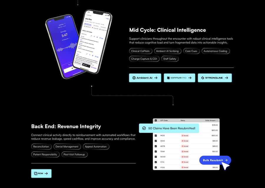
Do #A8F4FF fill, 4px radius, 46px tall, 9.92px 16px padding, black product SVG lockup 26px tall (Agents, Engage, Ambient AI, commure PRO, Strongline, RCM) + 6px gap + 24px black arrow, box-shadow 0 0 4px #A8F4FF; grouped with 16px gaps under a 1px white divider on desktop (phone: directly under the pills, no divider).
Glowing cyan product lockup buttons · Under each home feature row, product links
Do GT America Extended 700 48/52.8 at -3.24px in #A8F4FF over a Satoshi 16 label; home stats have a 2px x 90px bar linear-gradient(#A8F4FF, transparent) on the left; /company stats are separated by 1px white vertical rules; numbers count up on scroll.
Cyan count-up stats · Home trusted band, /company stats row
Do Monochrome imagery on black; the only colour is the cyan rim light of the hero arc.
Glowing arc, dotted globe, B&W landscape · Home hero (cyan-glow arc horizon behind the product video), trusted band (dotted halftone globe), /company hero (B&W mountains with the H1 between photo layers), /news and /careers heroes (dark mountain ridges)
Specimens use sample copy, not Commure’s.
Thin gradient hairlines and one cyan glow do all the decorating.

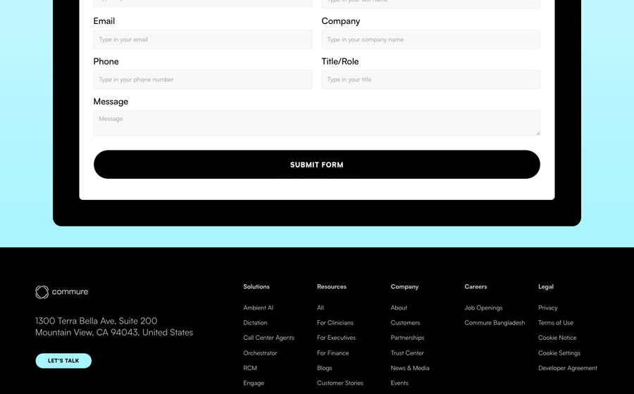
Thin gradient hairlines and one cyan glow do all the decorating. Gradient-hairline pills (32px, radius 42px) list capabilities; a 64px-radius translucent nav capsule (rgba(255,255,255,0.05), blur 1px) holds caps links; cyan glowing product buttons; outline cyan CASE STUDY pills; cyan metric bubbles (8px radius) overlapping photos; 2px cyan-to-transparent stat bars; dotted connector lines between feature rows; a white form card inside a 20px-radius black panel on a cyan gradient band; blog cards with a 1px cyan border, radius 11.2px, and a grey-teal tag pill.
One white geometric mark per product, plus a handful of outline UI glyphs.


One white geometric mark per product, plus a handful of outline UI glyphs. The mega-menu draws a 40px white geometric icon (rings, dots, offset squares) for every product and resource; product lockups pair that mark with caps type and turn black on cyan buttons; UI glyphs (arrows, chevrons, play/pause) are thin outlines in white, black or cyan; social glyphs are solid white.
Source: commure.comcommure.com/customers
No characters and no spot illustration, only light and dots.




No characters and no spot illustration, only light and dots. Atmospheric graphics: a cyan-rimmed arc horizon behind the home hero, a white dotted halftone globe, dotted line connectors, thin neon outline maps on regional news. News/press graphics: near-black ground with soft electric blue-violet corner glows, white extended type, cyan caps labels and cyan stats; a light variant uses a lavender ring watermark on white.
Source: commure.comcommure.com/news
Black-and-white people and landscapes for heroes, the customer’s real building in colour for proof.


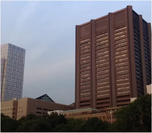


Black-and-white people and landscapes for heroes, the customer’s real building in colour for proof. (1) Black-and-white: landscapes (mountains in cloud) as hero grounds, studio portraits of clinicians on black, business people. (2) Real customer buildings and signs in natural colour (Mount Sinai, Yale New Haven, HCA, NEMS) cropped into cards with a cyan metric bubble overlapping a corner. (3) Candid colour event and team photos (company strip, careers). Text never sits on a busy photo except the giant /company H1 layered between mountain photo layers.
Source: commure.comcommure.com/companycommure.com/customerscommure.com/careers
A centered black page on a 1280px column. 1440 canvas, 1280 content (80px gutters), centered heads, alternating two-column feature rows at 1101px, 3-up card carousels, centered CTA. Phone: single column, type scaled ~0.61x, buttons and pills keep their shapes.
Measured from commure.com's computed styles and bounding boxes of every band at 1440 and 390 (npm run fidelity -- measure, home, company, customers, news) plus headless Playwright probes, 2026-11-17.
| Measure | Desktop | Phone |
|---|---|---|
| Page margin | 80px | 16px |
| Section padding | 96px | 52px |
| Hero text width | max 928px, centered | full width |
| Card gap | 40px | 40px |
| Navigation | 113px | 113px |
Home hero H1
GT America Extended · 48px (phone 29.36) · line 1.1 · tracking -1.2px · weight 270
Inner-page H1
GT America Extended · 128px (phone 43.1) · line 1 · tracking -3.2px · weight 270
Feature head 64
GT America Extended · 64px (phone 32.6) · line 1 · tracking -1.6px · weight 270
Open section head
GT America Extended · 36px (phone 22.83) · line 1.2 · tracking 2.16px · weight 270
Closing CTA head
GT America Extended · 32px (phone 19.57) · line 1.3 · tracking -0.8px · weight 270
Stat number
GT America Extended · 48px (phone 26.09) · line 1.1 · tracking -2.04px · weight 800
Metric bubble number
GT America Extended · 16.08px (phone 9.13) · line 1.2 · tracking -0.16px · weight 800
Feature row head
Satoshi · 28px (phone 16.31) · line 1.3 · weight 700
Lead / quote
Satoshi · 20px (phone 16.31) · line 1.2 · tracking -0.1px · weight 400
Story / card title
Satoshi · 24px (phone 15) · line 1.2 · tracking -0.36px · weight 700
Body
Satoshi · 16px (phone 13.05) · line 1.3 · tracking -0.08px · weight 400
Small / chips / dates
Satoshi · 14px (phone 9.79) · line 1.3 · tracking -0.07px · weight 400
Caption
Satoshi · 12px (phone 7.83) · line 1.3 · tracking -0.06px · weight 400
Button / label caps
Satoshi · 12px (phone 9.79) · line 1.5 · tracking 0.84px · weight 900
Nav link
Satoshi · 12px (phone 14.68) · line 1.3 · tracking 0.36px · weight 900
Form label
Satoshi · 20px (phone 13.05) · line 1.2 · weight 500
How Commure’s own landing pages are built, observed on commure.com, 2026-11-17. The full measurements are in spec.md.
Source: commure.comcommure.com/companycommure.com/customerscommure.com/news



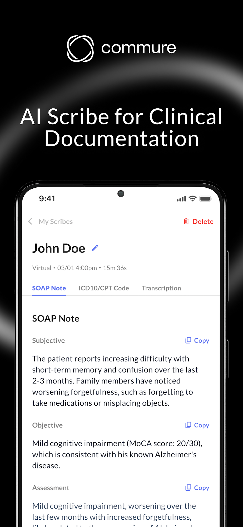

Deck and Email: the site shows no deck, slide or email; see gaps. A deck would carry the landing-page system (black slides, extended light Title Case heads, cyan stats) but that is inferred, not observed.
| Format | Loudness | Must appear | What varies |
|---|---|---|---|
| Landing page | Cyan #A8F4FF 67px announcement banner (Satoshi 16 w700 black text left, black full-round button right); black header with white logo left, translucent 64px-radius nav capsule center (SOLUTIONS, RESOURCES, COMPANY, CAREERS in Satoshi caps), cyan CONTACT pill right; black hero, centered GT America Extended Light H1 in Title Case at 48/52.8 -3.24px #D9D9D9, Satoshi lead, gradient-hairline stat chips, then a product video framed by a glowing cyan arc; every later band black; closing CTA band on a #D3F9FF to #A8F4FF gradient holding a black 20px-radius panel and a white form; black footer. | Hero visual (product video + arc, B&W landscape, or B&W people photo); whether the closing band is the cyan-gradient form or a centered black CTA (company: eyebrow, 64px head, cyan pill). | |
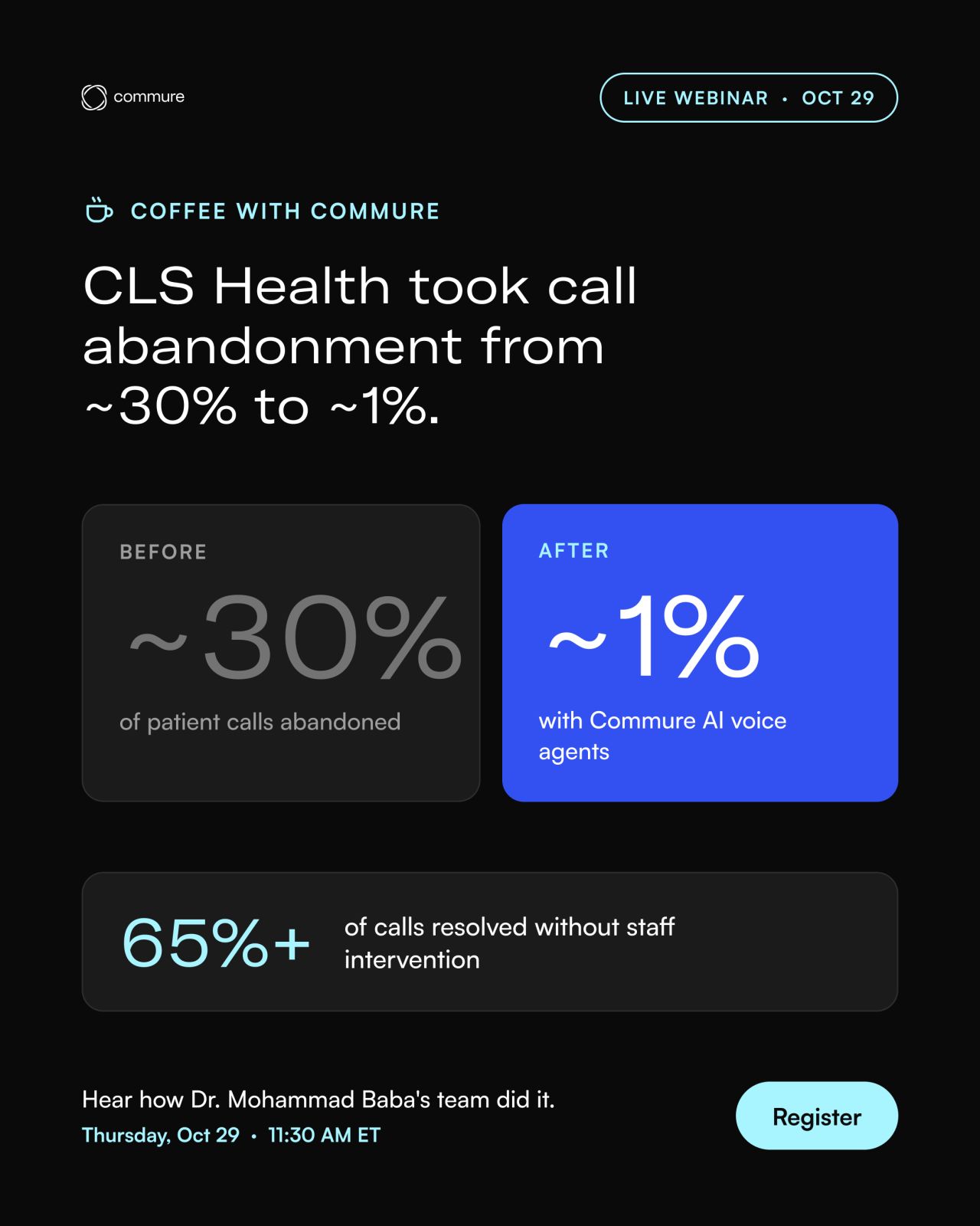
| Social post | Near-black ground (#090A1A per the brand's own file name) with soft electric blue-violet glows in the top-right and bottom-left corners; co-brand logo row top-left; cyan caps label; white GT America Extended Light head left-aligned; optional cyan stats under a hairline. | Lower block: 3 cyan stat columns, 2 labelled designation columns, or nothing (logo-lockup-only acquisition square, centered, with a one-line grey caption). | |
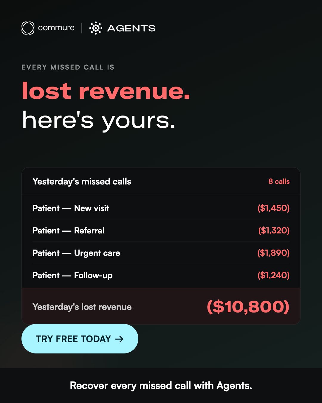
| Paid social ad | Agents family: black ground with a faint grid, white product lockup top-left, white extended-light two-line head, Satoshi white sub, a grid of dark rounded tiles showing call outcomes, a centered cyan GET A DEMO pill and a tiny commure logo under it. | Scribe (sub-brand) ads run a light family: white/lavender ground, black logo, black "ChatGPT for" + blue gradient "Clinicians" head, phone UI with a feature list, blue pill CTA. Most Scribe ads are UGC clinician videos. | |
| Video thumbnail (Prescribing the Future podcast series) | Series-scoped: near-black left half with "Prescribing the Future PODCAST" wordmark top-left, a small cyan "Episode N" tag, a white italic bold Satoshi-like title over 4 lines; right half a B&W guest portrait in a thin rounded frame with name and title under it; commure logo top-right. | Single-speaker webinar thumbnails put a colour speaker cut-out on a dark mountain ground with the commure logo top-left. | |
| Store listing screenshot | Black ground with soft grey ring swirls; white logo or small underlined white label at top; centered white sans head (2 to 3 lines, key number or phrase in bold); a phone UI mockup bleeding off the bottom edge. | Audience screenshot swaps the phone for a photo collage of clinicians in 3 columns with black round icon tiles. |
Source: commure.comcommure.com/companycommure.com/customerscommure.com/newsfacebook.com/ads/libraryplay.google.com/store/apps/details
Your name and logo, Commure’s system.
Talk about my brand Use this brand in Claude
Get your brand audit Put your brand in Claude What goes in a brand book
Each value is marked published, observed, our reading or our recipe, with its source. Checked 2026-11-17. Not affiliated with Commure.
Tell us what you want to make. We’ll talk through how to put these ideas to work for your brand.