Speed
The fastest real-time database and warehouse: columnar storage and vectorized execution return analytical queries in milliseconds. Observed
Brand book
ClickHouse dresses like the tool its users live in: a dark console where the only colour is a highlighter yellow marking what matters, because the product's whole claim is speed and the brand wants to be found instantly in a sea of blue-and-purple tech. Our reading

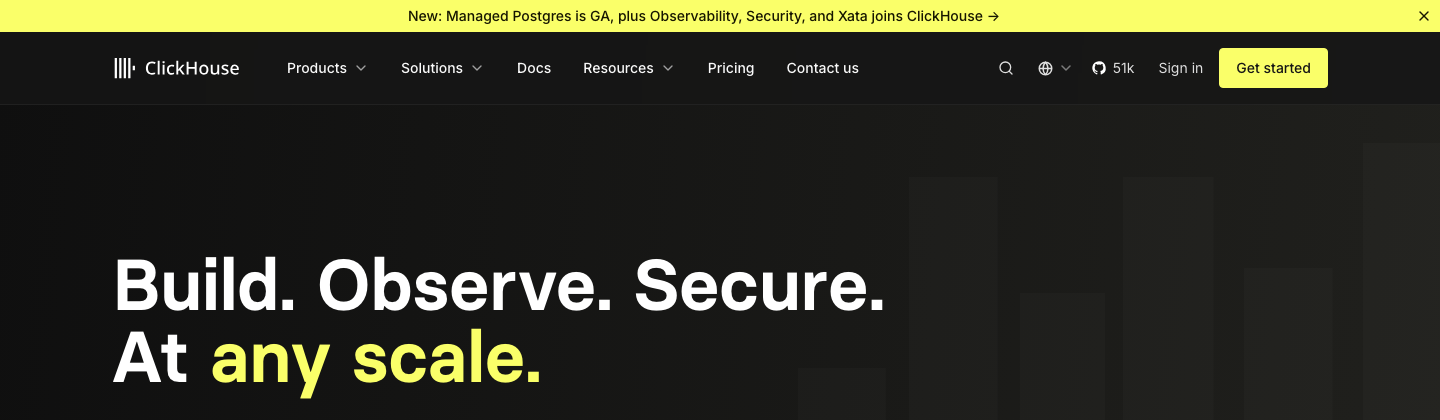
How much yellow: the site keeps yellow to slabs on a mostly black page, while booths, tees and social go all-yellow with black type; the brand says it is moving the website toward more yellow.
Source: clickhouse.design/brand/visual-identityclickhouse.com
Share of the desktop home page area, estimated from band geometry: dark grounds #131312, #151515 and #1F1F1C; yellow #FAFF69; grey #414141 panels; photos and logos (overlapping quote cards counted at their width).
Our engine's setting, built from their rules.
Only #FAFF69 (favicon #FCFF74) as the bright colour, used as solid slabs, primary buttons or one highlight per head; text on it is black.
Each headline has at most one highlighted word or phrase, same face and size, square box or yellow text.
Official SVG, single flat colour (white on dark, black on light/yellow), no recolouring or effects; mark alone only when the full logo cannot fit.
Heads Basier Square 600 (or the Geist stand-in) in sentence case; body Inter 16/24 #DFDFDF on dark; no all-caps heads.
Every claim carries a number, benchmark or named customer that ClickHouse itself states; no invented figures.
No leverage/cutting-edge/next-generation, no hype or emoji, Oxford comma, US spelling, "ClickHouse" spelled right.
4px radius, yellow primary with black label, olive-outlined secondary; pills only for filter chips.
The fastest and most resource-efficient real-time database and data warehouse, open source or as ClickHouse Cloud on AWS, GCP and Azure. Published
The fastest real-time database and warehouse: columnar storage and vectorized execution return analytical queries in milliseconds. Observed
Resource-efficient compression and compute cut storage and infrastructure cost. Observed
Apache 2.0 open source with a large contributor community; simple SQL; runs locally, self-hosted or in the cloud. Observed
In production at 5k+ customers, from Tesla and Anthropic to Sony, Lyft and Cisco. Observed
Build. Observe. Secure. At any scale.
Build real-time data products that scale
Join the 100k+ developers using ClickHouse today
Get started with ClickHouse Cloud for free
Speed in query time and in action and culture: punchy copy, fast motion, tight loops.
PublishedWhat works beats what trends; direct minimalism, nothing decorative.
PublishedSpeak to builders in precise language; no marketing fluff.
PublishedBend rules to move faster; bold campaigns and unconventional layouts.
PublishedDon't posture; prove claims with numbers, benchmarks and examples.
PublishedCategory. Real-time analytical (OLAP) database and data warehouse; now a data platform for AI (databases, observability, security, AI engineering) Observed
ClickHouse is the fastest, most resource-efficient real-time database and data warehouse, serving data-intensive work from interactive user-facing dashboards to ad-hoc historical analysis over petabytes. ClickHouse Cloud is used by enterprises worldwide, including Tesla, Anthropic, Lyft, Sony, IBM, GitLab, Twilio and HubSpot, and is available as open source or as a cloud service on AWS, GCP and Azure. (paraphrase of the published technical description; a 50-word version exists for social bios)
Build. Observe. Secure. At any scale. Observed
Built for engineers, trusted by leaders. Published
Raw, confident, and engineered for performance. Published
Build real-time data products that scale Observed
Join the team building the leading data platform for AI Observed
Query billions of rows in milliseconds Published
SQL has never been simpler Published
Get started with ClickHouse Cloud for free Observed
Unmatched query speed, at a fraction of the cost
Four launches. One open, composable platform.
Query billions of rows in milliseconds
Join the team building the leading data platform for AI
1B rows. Sub-second queries. No compromises.
The most innovative next-generation analytics platform for modern data teams
ClickHouse Cloud is now available in Asia Pacific. Same speed, closer to your data.
We're SO THRILLED to announce the most AMAZING expansion EVER!!!
We're excited to share that ClickHouse has the capability to potentially process up to 1B rows in approximately one second or less.
ClickHouse processes 1B rows in under a second.
Our innovative solution leverages cutting-edge technology to deliver best-in-class performance for your analytics needs.
Columnar storage means analytical queries only read the columns they need. Less I/O, faster results.
ClickHouse is incredibly fast and performs really well.
100x faster than Postgres on analytical queries. See the benchmark.
directtechnicalconfidentproof-driven
real-timefastscaleopen-sourcecolumn-orientedSQLcost efficiencyresource efficientbuildersdevelopersagents
leverageutilizefacilitatecutting-edgenext-generationrockstarninjawizardsynergyparadigm shiftsherpamaster/slaveClickhouse (lowercase h)
Source: clickhouse.comclickhouse.com/company/our-storyclickhouse.com/user-stories
Source: clickhouse.design/brand/guidelines/voice-and-toneclickhouse.design/brand/guidelines/writing-for-marketingclickhouse.design/brand/guidelines/grammar-and-mechanicsclickhouse.comfacebook.com/ads/libraryfacebook.com/ads/library


One five-bar mark beside a light wordmark, always in one flat colour.
One five-bar mark beside a light wordmark, always in one flat colour. White on the dark site header and footer, black on yellow booths and slides. The favicon is the bars in yellow on a near-black rounded square. Product lockups add the product name beside or under the logo.
Source: clickhouse.design/brand/logo-usageclickhouse.com/static/brand-clickhouse-logo.zipclickhouse.com/static/brand-clickhouse-logomark.zip
Two published core colours, yellow #FAFF69 and black #151515, plus a neutral grey ramp.
Two published core colours, yellow #FAFF69 and black #151515, plus a neutral grey ramp. The site is dark: #131312 page ground with a faint warm 275deg gradient, #151515 header and footer, #1F1F1C and #414141 panels. Yellow appears as solid slabs (quote cards, the Deploy band, the CTA panel, feature tiles, card header strips), primary buttons, and one highlighted phrase per head. The accent never becomes a link colour on light; on dark, inline links are yellow with an arrow. Coral #FF7575 appears only in two outline icon tiles and diagram cells.
Source: clickhouse.design/brand/colorclickhouse.design/brand/visual-identitymeasure/home-desk.json, measure/home-phone.json, measure/our-story-desk.json, measure/user-stories-desk.json, measure/media-desk.json (measured 2026-11-18 UTC)
Build. Observe. Secure. At any scale.
All heads on the site are Basier Square 600, sentence case, normal tracking, tight leading (72/72 hero, 36/45 sections, 20/25 cards).
All heads on the site are Basier Square 600, sentence case, normal tracking, tight leading (72/72 hero, 36/45 sections, 20/25 cards). Body is Inter 400 16/24 in #DFDFDF, leads 18-20px; numbers jump to Inter 700 72px. Small caps eyebrows at 14px with 0.35px tracking. Code and the install command use Inconsolata. The brand guide names Söhne for marketing display and Inter for body; Söhne is loaded but not rendered on the measured pages.
| Their face | Use | License | Open stand-in |
|---|---|---|---|
| Basier Square (web display, observed) | Every head on clickhouse.com: home H1 72/72, section heads 36/45, card heads 20/25, uppercase eyebrows 14px; weight 600, sentence case | commercial | Geist 600 Commercial (Atipo) and not supplied; Geist 600 at -0.008em was the closest of 17 open faces on width and x-height against the site's own file |
| Inter | Body 16/24 #DFDFDF, leads 18-20px, nav and buttons 500, stats 72px 700 | OFL-1.1 | Inter (the real face) Open (SIL OFL 1.1); the site's own variable files ship in the kit, so no stand-in is needed |
| Inconsolata | Code and the install command "$ curl https://clickhouse.com/ | sh" 16/24 600; user-story category labels 12px in yellow | OFL-1.1 | Inconsolata (the real face) Open (SIL OFL 1.1); the site's own variable file ships in the kit |
| Söhne (published marketing display face) | Published as the marketing display face on clickhouse.design; loaded but not rendered on the measured clickhouse.com pages | commercial | Not calibrated Commercial (Klim); no head on the measured pages renders in it, so the kit keeps the Basier stand-in |
Source: clickhouse.design/brand/typographymeasure/home-desk.json, measure/home-phone.json, measure/our-story-desk.json, measure/user-stories-desk.json, measure/media-desk.json (measured 2026-11-18 UTC)headless Chromium computed styles at 1440x900, https://clickhouse.com/, 2026-11-17
Deploy your way
Deploy your way
Electric yellow slabs on near-black · Announcement bar, primary buttons, customer quote cards, the Deploy your way band, the Get started CTA panel, the five feature tiles, user-story card header strips; booths, tees and social in the published examples
Join the 100k+ developers using ClickHouse today
Join the 100k+ developers using ClickHouse today
One highlighted word or phrase in the headline · Home H1 ("any scale." in yellow), community head ("100k+" in a yellow box), CTA ("Cloud" in a black box on yellow), our-story lead ("fast" boxed), booth "billions", web banners "real-time"
Do Flat vertical columns 77-91px wide and 375-710px tall at 1440, 18-31px apart, irregular: each has its own top and bottom (never bottom-aligned, never a stepped bar chart). They sit at opacity 0.03 over the ground (they read #1C1C1A-#232320 on #171715-#1D1D1B), and hero-slabs.svg holds all seven at their positions. A soft yellow radial bloom sits at the bottom edge of the hero over the use-case row.
Rising vertical bars from the logomark · Home hero background (right half: faint dark-grey columns of different heights rising from the bottom, catching a yellow glow at the base); the logo itself; the column-store diagram cells
Near-square yellow and outlined buttons · Every CTA on the site
CLICKHOUSE IS TRUSTED BY
Small tracked caps labels · Above section content on dark: SEE WHAT YOU CAN BUILD WITH CLICKHOUSE (grey), CLICKHOUSE IS TRUSTED BY and FILTER BY (yellow), HIGHLIGHT on user-story card rules, FOLLOW US
Do Greyscale photo, 4px radius, with a loose 6-10px yellow #FAFF69 marker stroke tracing the subjects; or a straight-edged yellow polygon entering from the bottom or right at a slight angle (about 3-15 degrees).
Black-and-white photos with a yellow scribble or wedge · Our-story founders photo (hand-drawn yellow outline around the three people on a greyscale photo); slide template and booth: an angled yellow wedge cutting across a black or white slide
Specimens use sample copy, not ClickHouse’s.
Few devices, all flat.
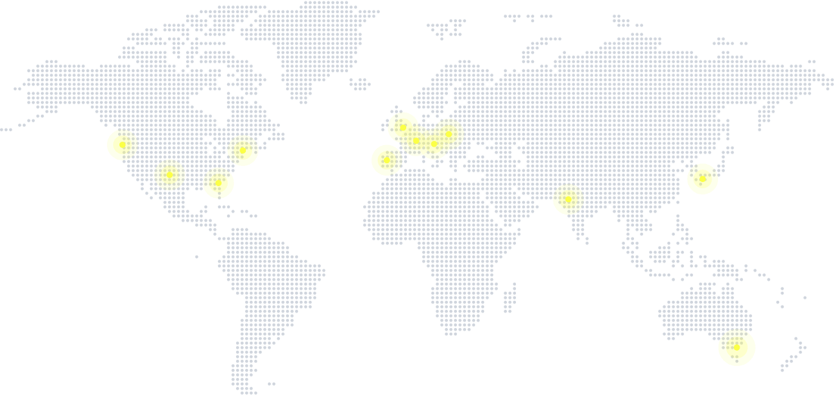


Few devices, all flat. Graphic devices are few and flat: the highlight box behind one word, rising vertical bars behind the hero, a soft yellow glow line at the bottom edge of dark panels, 1px olive or grey hairlines, numbered FAQ rows (01-05) with a divider and a plus, a dotted world map with yellow glowing pins, and in decks and booths an angled yellow wedge.
Source: clickhouse.comclickhouse.com/company/our-storyclickhouse.design/brand/supporting-tools
Simple outline icons, coloured by their ground.


Simple outline icons, coloured by their ground. White line icons sit on the product cards, yellow line icons on dark in the Why ClickHouse? panel and the Deploy cards, black line icons on yellow tiles, and 72px rounded-square tiles outlined in coral #FF7575 (fast, FAQ) or black on yellow (deploy) open sections. Social links sit in 64px #151515 squares with white glyphs.
Source: clickhouse.comclickhouse.design/brand/visual-identity
Diagrams, not decoration.


Diagrams, not decoration. Illustration is diagrammatic, not decorative: flat dark-grey panels and cells with yellow and coral highlights (row vs column store), a platform diagram of dark boxes linked by thin yellow lines with a yellow glow around the core, and a dot-matrix world map. The published marketing examples add flat cartoon motifs (a red-and-white rocket over yellow clouds, a black-and-yellow burst) on yellow or black grounds.
Source: clickhouse.comclickhouse.com/company/our-storyclickhouse.design/brand/visual-identity
People, not product.
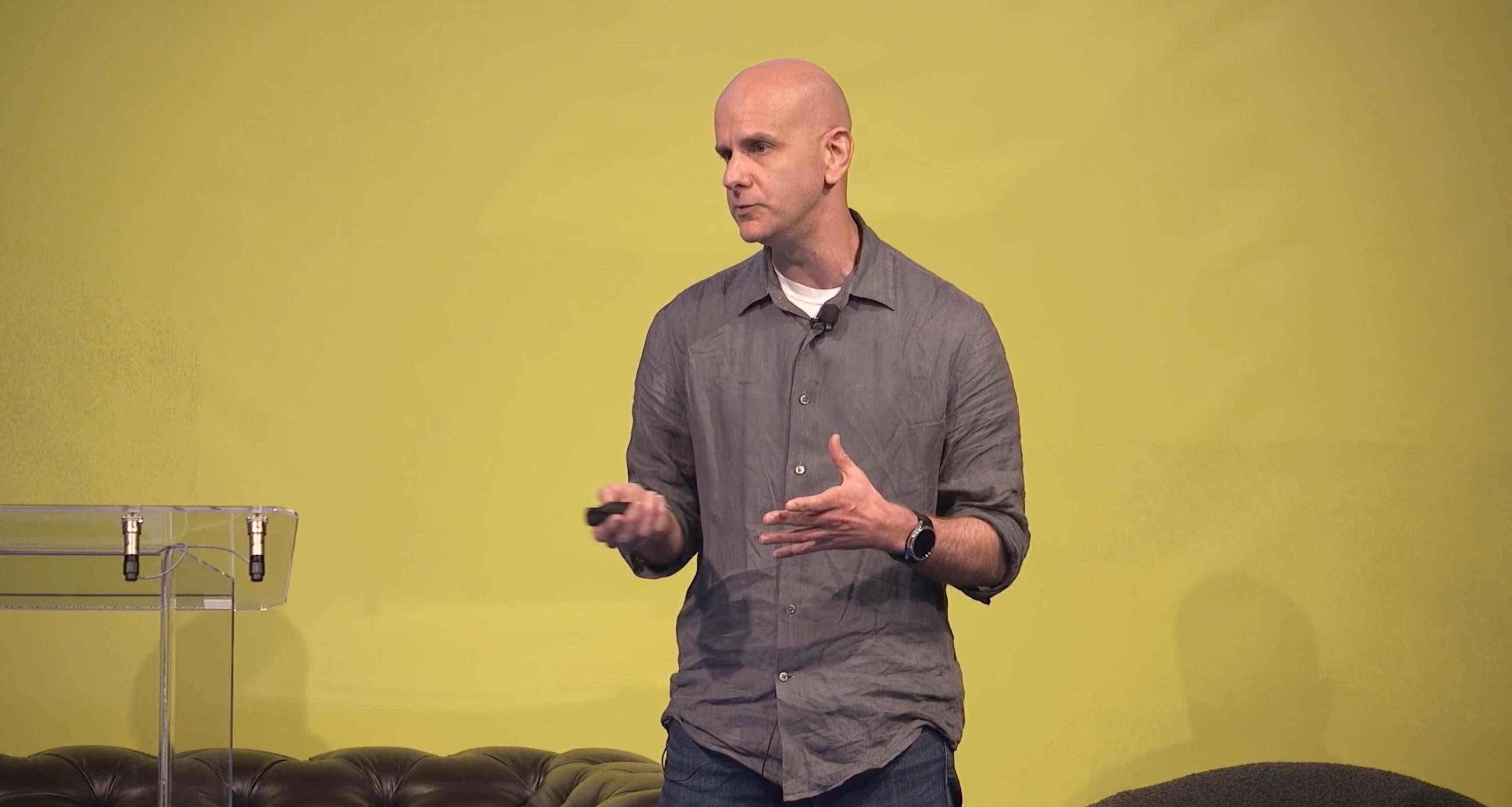

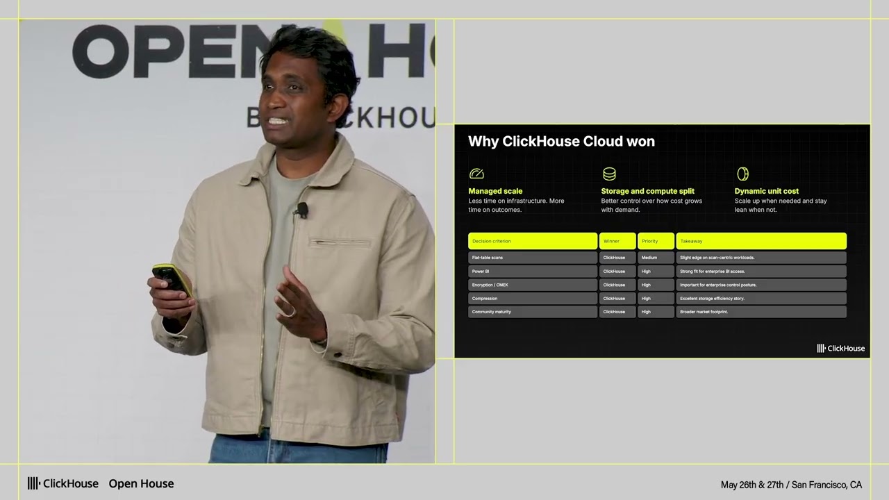
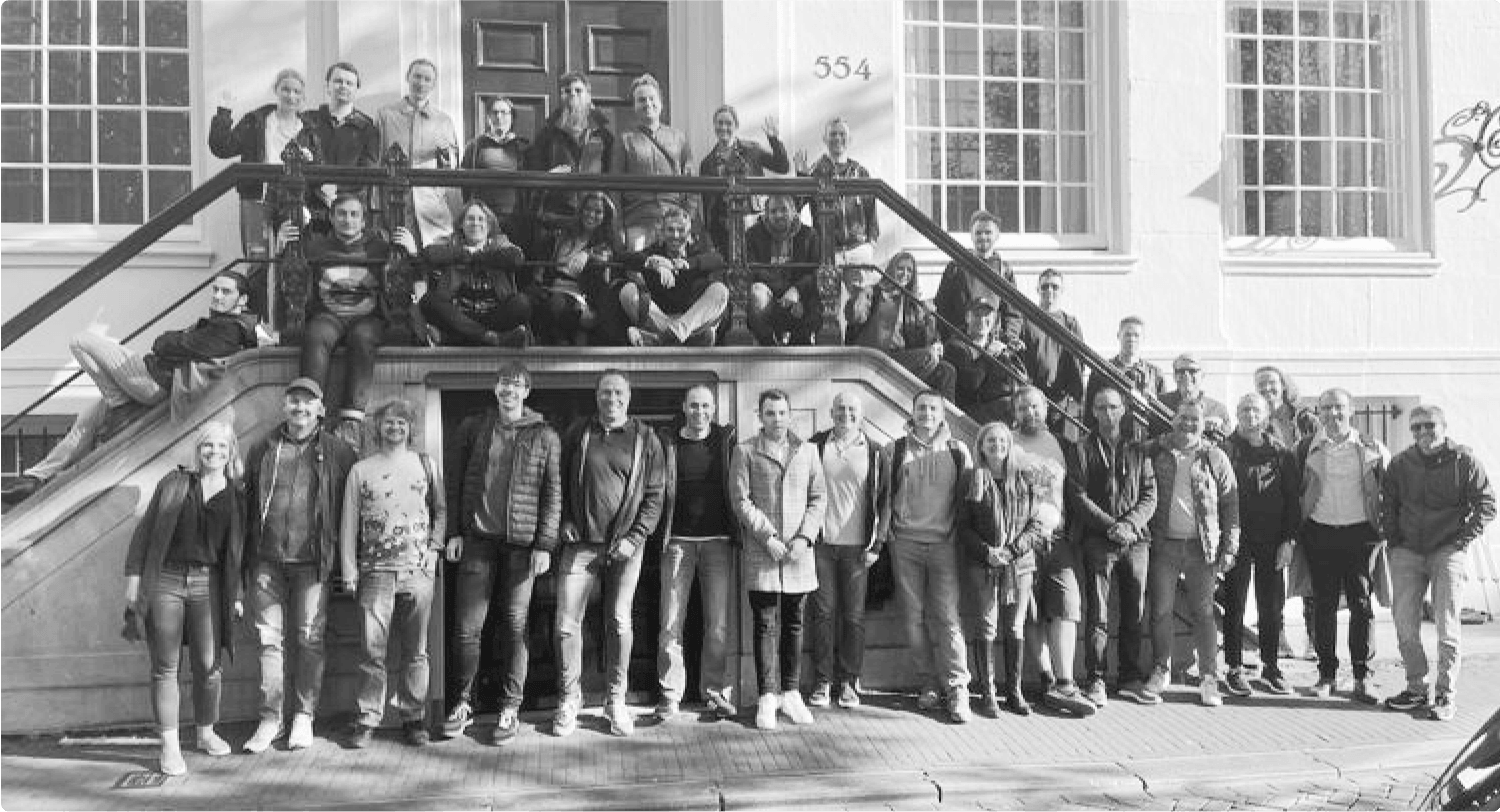


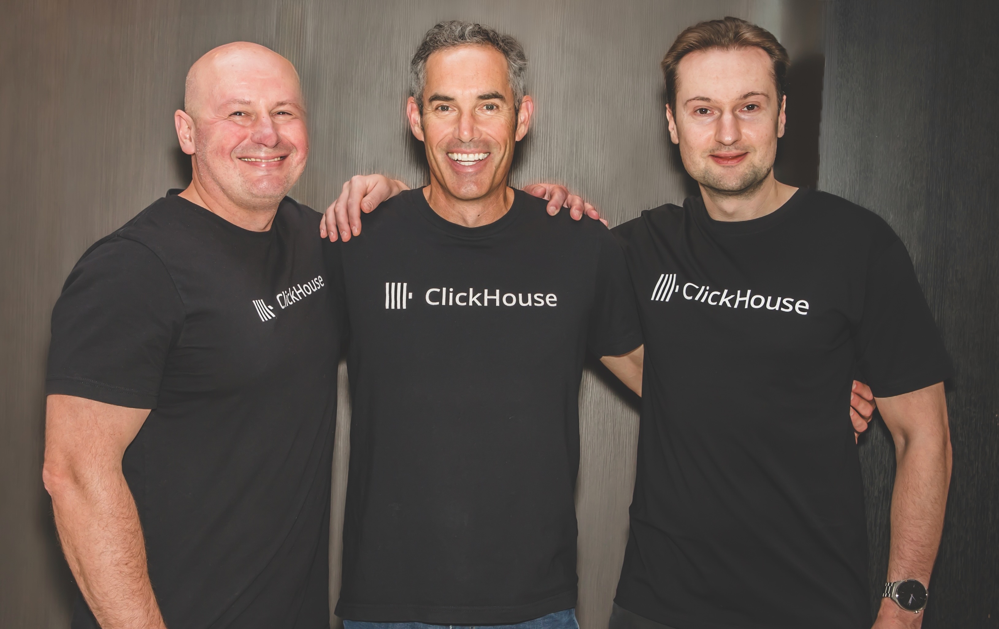
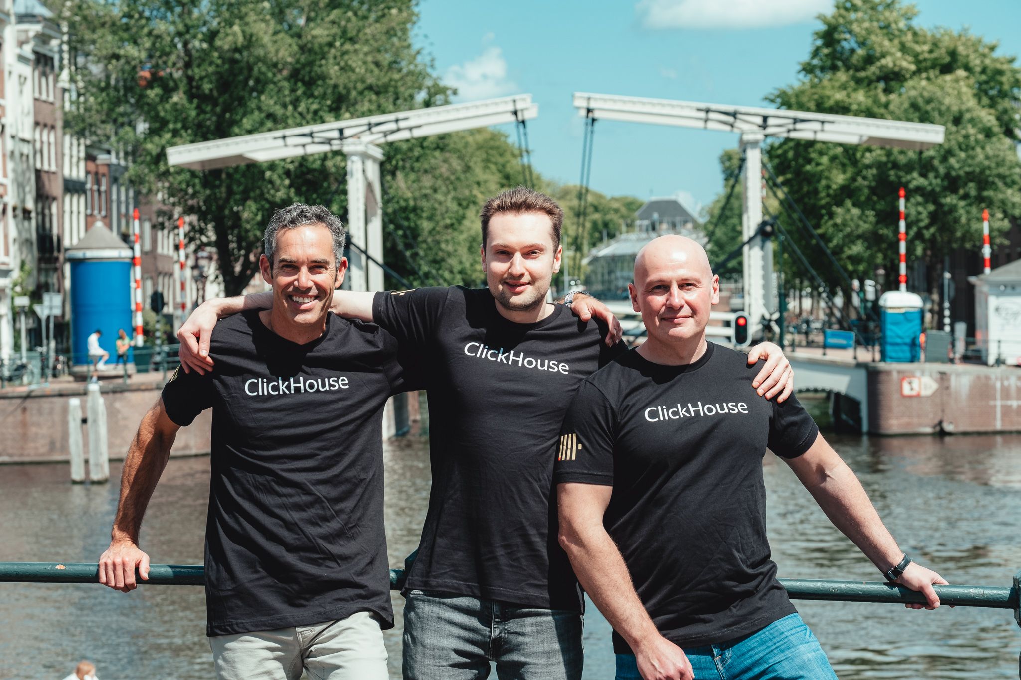
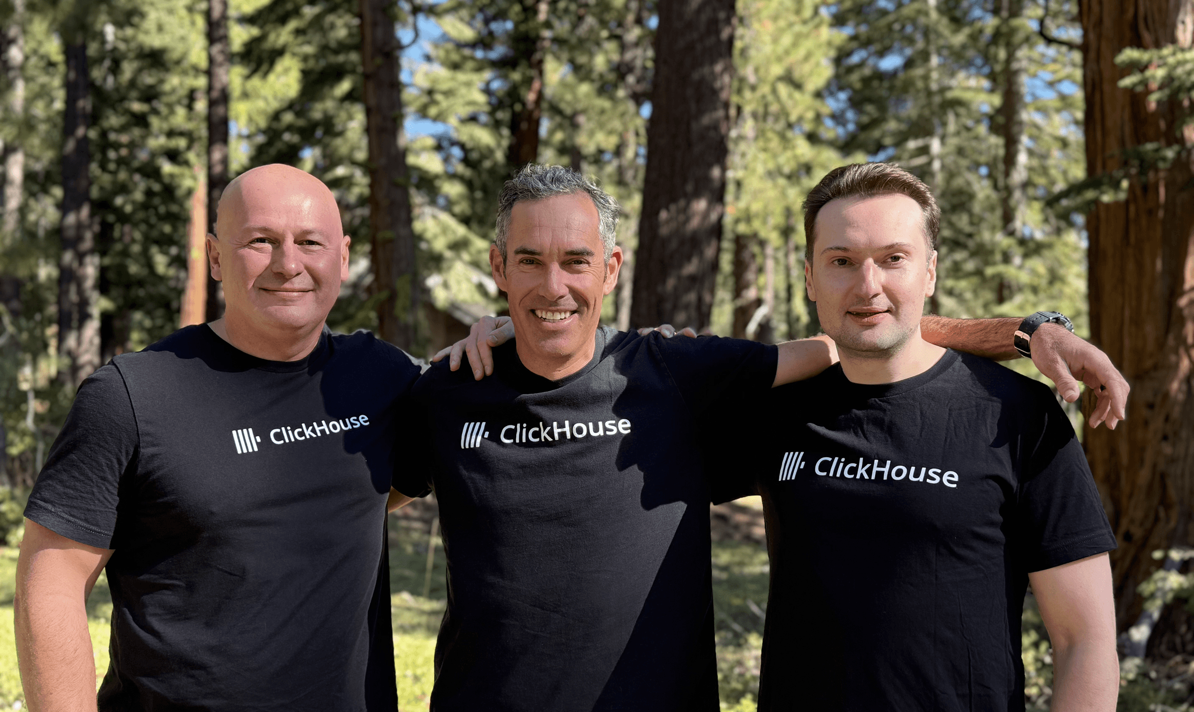
People, not product. Candid conference talk stills (a speaker on a yellow stage wall, framed 16:9, with a round dark play button), black-and-white company and team photos, greyscale circular founder headshots with a yellow rule beside the name, and colour press portraits of the three founders in black ClickHouse tees. Photos sit inside 8px-radius cards or 4px-radius frames, never full-bleed behind text. The brand says imagery is "still under development".
Source: clickhouse.comclickhouse.com/company/our-storyclickhouse.design/brand/media-kitclickhouse.design/brand/visual-identity
A dark page built in stacked bands. Centred 1216px container (1280 with 32px side padding) on a 1440 canvas; bands stack dark, yellow, grey, dark with generous vertical space (96px top/bottom on the Why band, 64px inside the panel, 144px above the hero head). Heroes are left-aligned, section heads mostly centred with a short lead under them. Grids of 3, 5 and 6 equal columns; cards are flat with hairline borders. On phone everything stacks to one column at 16px margins, buttons go full width.
Measured from clickhouse.com's home page, computed in headless Chromium at 1440 and 390 wide on 2026-11-17.
| Measure | Desktop | Phone |
|---|---|---|
| Page margin | 112px | 16px |
| Section padding | 0px | 0px |
| Hero text width | max 576px, centered | full width |
| Navigation | 73px | 73px |
Home H1, last phrase in #FAFF69
Basier Square (web display, observed) · 72px (phone 36) · line 1 · weight 600
Inner page H1 (Who we are, User stories), centred
Basier Square (web display, observed) · 48px (phone 36) · line 1.25 · weight 600
Section H2, white on dark, #000000 on yellow. Line shapes measured in Basier at 1440 (match them, whatever the stand-in does): "Build real-time data" / "products that scale" (text-wrap: balance, 334px); "Join the 100k+ developers using" / "ClickHouse today" (548px, hard break after "using"); one line each for Why ClickHouse? (294), Seamlessly integrate with your stack (626), Why is ClickHouse so fast? (458), Deploy your way (279), FAQs (89), Get started with ClickHouse Cloud for free (733)
Basier Square (web display, observed) · 36px (phone 24) · line 1.25 · weight 600
Card, feature and tile heads
Basier Square (web display, observed) · 20px · line 1.25 · weight 600
CTA strip head (Or run ClickHouse yourself)
Basier Square (web display, observed) · 17.5px · line 1.25 · weight 600
Uppercase eyebrow, #C0C0C0 (Basier) or #FAFF69 (Inter 600 14/21)
Basier Square (web display, observed) · 14px · line 1.25 · tracking 0.35px · weight 600
Hero lead #DFDFDF
Inter · 20px · line 1.375 · weight 400
Customers lead #A0A0A0
Inter · 18px · line 1.5 · weight 400
Running copy #DFDFDF
Inter · 16px · line 1.5 · weight 400
Quote on yellow #000000, text-wrap: balance in the full 602px box (first card 18/27, greedy wrap)
Inter · 24px · line 1.5 · weight 400
Community numbers #FFFFFF; labels Inter 700 24/33 #FAFF69. Phone scales the whole stat block by 0.64 (46px numbers, 15.4px labels)
Inter · 72px (phone 46) · line 1 · weight 700
Footer links #A0A0A0, nav 14/20 500 #F9F9F9, FAQ answers
Inter · 14px · line 1.5 · weight 400
Install command, "$" in #FAFF69
Inconsolata · 16px · line 1.5 · weight 600
How ClickHouse’s own landing pages are built, observed on clickhouse.com, 2026-11-17. The full measurements are in spec.md.
Source: clickhouse.design/brand/guidelines/writing-for-marketingmeasure/home-desk.json, measure/home-phone.json, measure/our-story-desk.json, measure/user-stories-desk.json, measure/media-desk.json (measured 2026-11-18 UTC)clickhouse.comclickhouse.com/company/our-storyclickhouse.com/user-stories

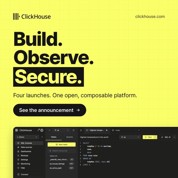
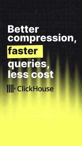

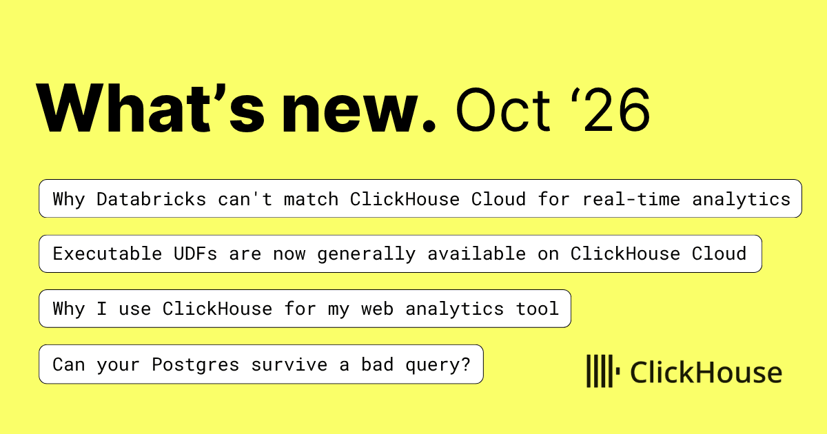
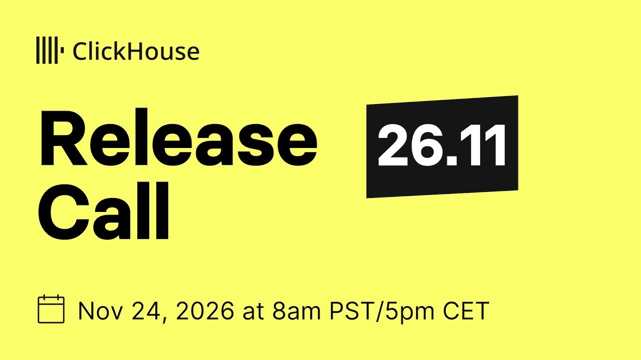
How the system carries across formats, from the site and the brand site's published examples.
| Format | What they did | Source |
|---|---|---|
| Paid social | Yellow square ads with a heavy black headline, one boxed word and a black button; a near-black variant for lead magnets | facebook.com/ads/library |
| Events | Webinar and meetup cards on yellow, split yellow and dark, or off-white with a yellow halftone | clickhouse.com/company/events/202611-AMER-Webinar-Postgres-Vision-ClickHouse |
| Newsletter | Monthly "What's new." cover on flat yellow with four outlined title pills | clickhouse.com/blog/202610-newsletter |
| Video | Release and customer thumbnails: yellow title cards or near-black with an olive glow | youtube.com/watch |
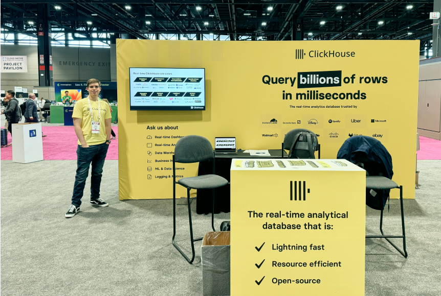
| Booths | All-yellow backdrop, black logo, one boxed word in the headline, staff in yellow tees | clickhouse.design/brand/visual-identity |
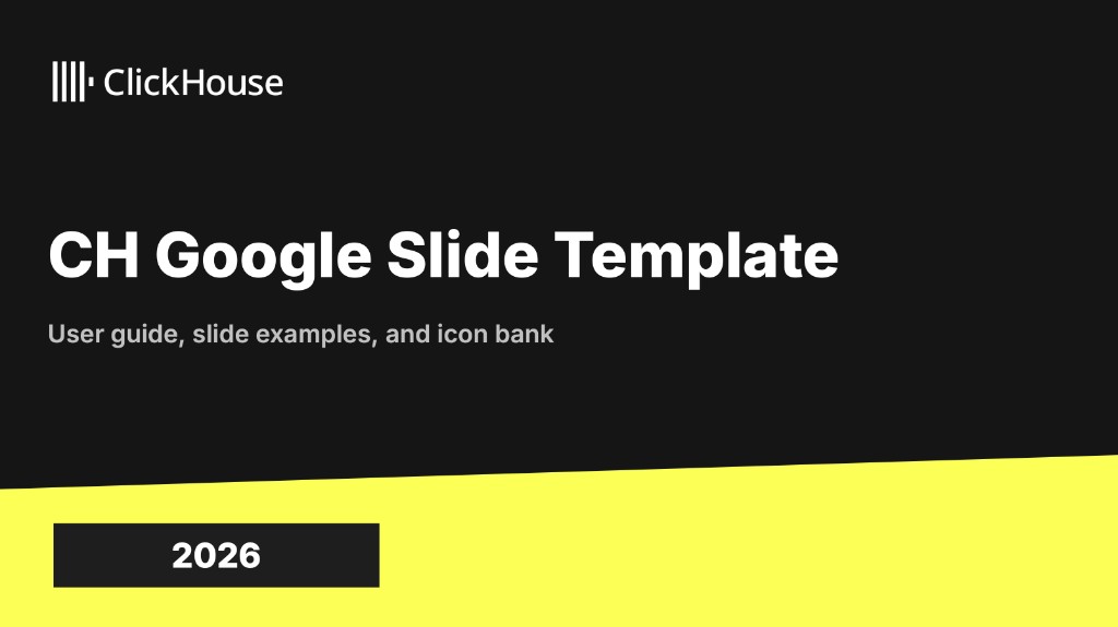
| Slides | Google Slides template: black title slide, white content slides, yellow angled wedge | clickhouse.design/brand/supporting-tools |
| Format | Loudness | Must appear | What varies |
|---|---|---|---|
| Landing page | Dark #131312 ground, yellow announcement bar, white logo header, left-aligned Basier hero with one yellow phrase, yellow primary + olive-outlined secondary button, logo strip, yellow proof cards, yellow closing CTA | How many bands go yellow; which proof (quotes, stats, diagrams) | |
| Social post | Flat yellow #FAFF69 ground; black logo top left; heavy black Basier/Inter-style headline of 3 to 4 short lines with one word or the last line boxed in #151515 (white or yellow text); one black pill button; at most one picture, either a dark product-UI panel bleeding off the bottom and right edges or a faint network/grid texture on the ground. A near-black variant (lead magnet) swaps in white and yellow text and a yellow button. | Yellow family (offer or announcement) or the near-black lead-magnet variant; picture is product UI, a partner book cover or none; the logo is large (about 57% of the width) on a type-only offer or small (about 21%) when a UI panel follows | |
| Share card (link preview) | Same families as the Social post row at their native size: split yellow/black with slanted edge; type-only yellow with dot grid; home card = homepage hero (logo, H1 with "any scale." in yellow, lead) over faint slabs; partner/customer cards = logo lockups on black or yellow. | Family by post type | |
| Deck | Black title slide with white logo top-left and heavy white title; content slides white with black heads; yellow angled wedge at the bottom or right edge; number boxes #151515 with yellow digits; confidentiality footer in small grey caps with logo bottom right | Wedge position (bottom strip or right panel) | |
| Event booth | All-yellow backdrop, black logo, big black headline with one word boxed in black, checklist of three claims, staff in yellow tees | Headline | |
| One message and one CTA, clear subject line, short paragraphs, bullets of fragments, link arrow (Read the release notes ->) | Visual design not published | ||
| Paid ad, vertical (story) | Yellow, off-white or black ground; centred or top-left black or white logo; a heavy two- to three-line headline with one boxed or highlighted phrase; a product-UI screenshot or a yellow glow filling the bottom third; no body copy | Ground and the highlight device (yellow box, yellow highlighter stroke, hand-drawn arrow) | |
| Video thumbnail (host series) | Near-black ground with a faint grid and an olive-to-black gradient at the bottom; a cut-out presenter at the right pointing at the subject; the subject (a customer logo, a two-line white headline plus a diagram, or a product pairing) at the left; ClickHouse logo top or bottom left | Subject: customer logo, claim plus diagram, or product pairing | |
| Event announcement card | Logo top left (black on light, white on dark); a small caps eyebrow naming the format (WEBINAR, LIVE WEBINAR, BREAKFAST AND LEARN, HANDS-ON WORKSHOP, INSTRUCTOR-LED TRAINING); heavy title; date, time and venue lines in a light weight; square speaker photos with caps names and roles; yellow used as ground, panel, label or block, not as text | Ground family: yellow, split yellow and #151515, dark #1F1F1C, off-white halftone or grey for partner events | |
| Newsletter cover (monthly) | Flat yellow ground; heavy black "What’s new." with the month in a light weight beside it; four white outlined pills (8px radius, 1px black) holding article titles in a monospace face; black logo bottom right; no image | Month and the four titles only |
 Fastest Analytical Database - Interactive SQL ConsoleGoogle · Jul 2025 – now
 All the speed & power that you expect from ClickHouse,…Google · Sep 2026 – now
 Start a free 30-day trial and see why ClickHouse is…Google · Jul 2025 – now
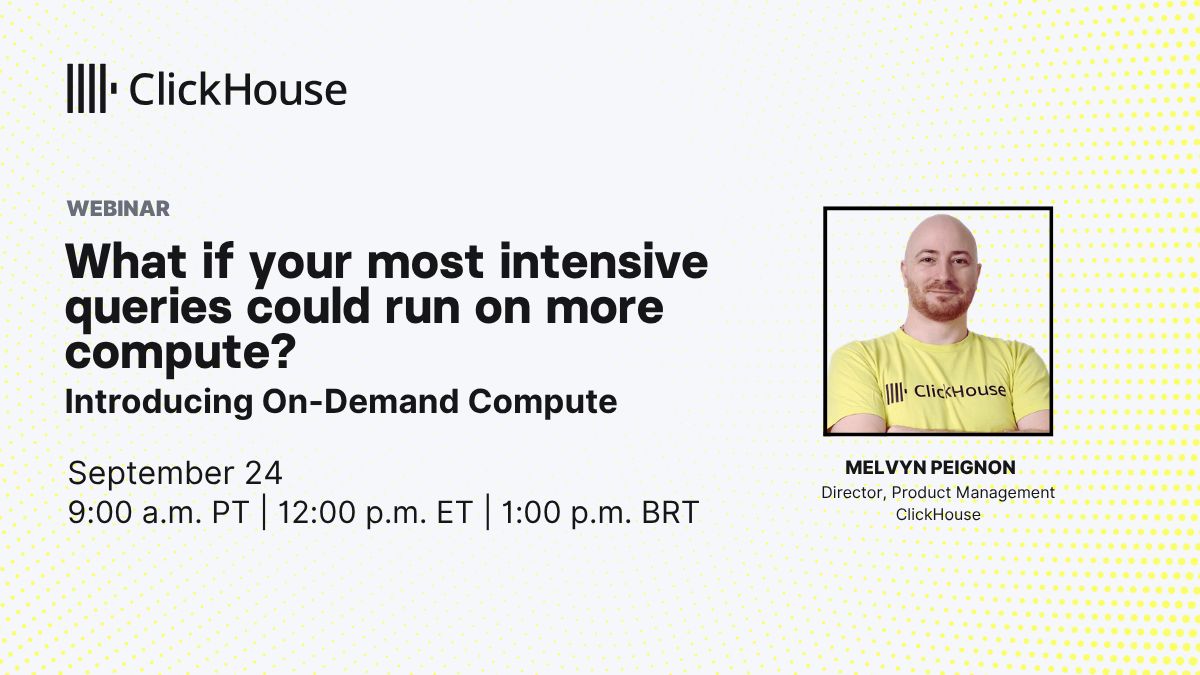 202609 AMER Webinar On Demand ComputeLinkedIn · Sep 2026
All 8ClickHouse ad campaigns →
Source: clickhouse.design/brand/logo-usageclickhouse.design/brand/colorclickhouse.design/brand/guidelines/voice-and-toneclickhouse.design/brand/guidelines/grammar-and-mechanicsclickhouse.design/brand/media-kit
Your name and logo, ClickHouse’s system.
Talk about my brand Use this brand in Claude
Get your brand audit Put your brand in Claude What goes in a brand book
Each value is marked published, observed, our reading or our recipe, with its source. Checked 2026-11-17. Not affiliated with ClickHouse.
Tell us what you want to make. We’ll talk through how to put these ideas to work for your brand.