Eliminate CVEs
Zero-CVE container images rebuilt from source daily, with remediation SLAs (paraphrase) Observed
Brand book
Chainguard dresses supply-chain security as an engineering blueprint: ruled grids, mono labels and terminal panels say "built and verified", while the blurple accent, an octopus mascot and colour-coded tints keep it friendly rather than fearful. Our reading

the tint hue (fuchsia, green, aqua, solar) that codes each card, tab and eyebrow highlight
approximate share of the home page by visible background area (overlapping layers removed, rounded).
Our engine's setting, built from their rules.
Blurple #6226FB only on buttons, links, arrows, logo, mono labels and at most one full closing band; tint hues only as small tabs, cursors, highlights or card headers.
Content sits in a centred column framed by 1px #E7E8E8/#EDEDED rules on #FBFBFF (or #3D4449 on #0D161C); no pill shapes or heavy shadows. Dots only in the hero band; chapters on plain #FBFBFF.
Gellix Bold at -3% (or the Outfit 700 stand-in at -0.027em) for every head; Roobert SemiMono caps at 6% (DM Mono at +0.067em) for eyebrows and tags; regular sans 16/24 for body.
Real SVG: blurple on light, white on #6226FB or #0D161C; mark and wordmark together except avatar/app-icon uses.
Sentence-case heads without final stops, counts with "+", spaced dashes, short verb-first CTAs ("Talk to an expert", "Start for free"), no exclamation marks.
Every stat is one chainguard.dev states (e.g. 3,000+ images, 97.6% fewer CVEs, 4.7 on G2) or the customer's own, with its page.
Product UI or terminals on graph paper, or real Chainguard people/customers; no stock, scenes or 3D.
The trusted source for open source: hardened artifacts for every layer of the stack, from containers to libraries, CI actions and agent skills (paraphrase) Observed
Zero-CVE container images rebuilt from source daily, with remediation SLAs (paraphrase) Observed
A vetted catalog of Python, Java, JavaScript, Go and .NET packages, CI/CD actions and agent skills (paraphrase) Observed
Smaller images and same-day patched artifacts, powered by Athena (paraphrase) Observed
Block artifacts from outside your org; provenance, SBOMs and FIPS images for FedRAMP (paraphrase) Observed
Drop-in adoption via 200+ Helm charts, the Guardener agent and a CLI (paraphrase) Observed
make customers' lives easier and their software supply chains safer (paraphrase)
Observed"We prioritize, plan, test, fail, learn, and grow."
Observed"Serious about our mission, playful about everything else."
Observedgood intentions by default; supportive, collaborative, fun (paraphrase)
ObservedCategory. Software supply chain security / trusted open source artifacts ("Leader in the 2026 Magic Quadrant™ for Software Supply Chain Security") Observed
Chainguard is the trusted source for open source: hardened, production-ready artifacts for engineers and AI agents that help organizations prevent AI supply chain attacks, move faster with less toil and stay compliant; venture-backed, with Fortune 500 and industry-leader customers (paraphrase)
The trusted source for open source Observed
Prevent AI attacks with trusted open source Observed
We’re building the trusted source for open source Observed
Switch to trusted open source with zero developer friction Observed
Works with what already works Observed
Start building with Chainguard Observed
Your open source foundation for the agentic coding era Observed
Build software securely with Chainguard Observed
Trusted by the best. Backed by results. Observed
directtechnicalconfidentwry
trustedopen sourcehardenedCVEsmalwareagentsagenticsupply chainzero-CVESLA
Title Case Headlines (none seen)exclamation marks in headlines (none seen)closed-up em dashes (dashes are spaced)
Source: chainguard.dev/%20measure/home-desk.json%20+%20home-phone.json%20(2026-11-10)live computed styles, headless Chromium 1440x900 (2026-11-10)
Source: chainguard.devchainguard.dev/about-uschainguard.dev/products/containerschainguard.dev/pricingchainguard.dev/careers





An octopus mark (egg-shaped head, four rounded tentacle lobes) left of a geometric sans wordmark "Chainguard", one colour.
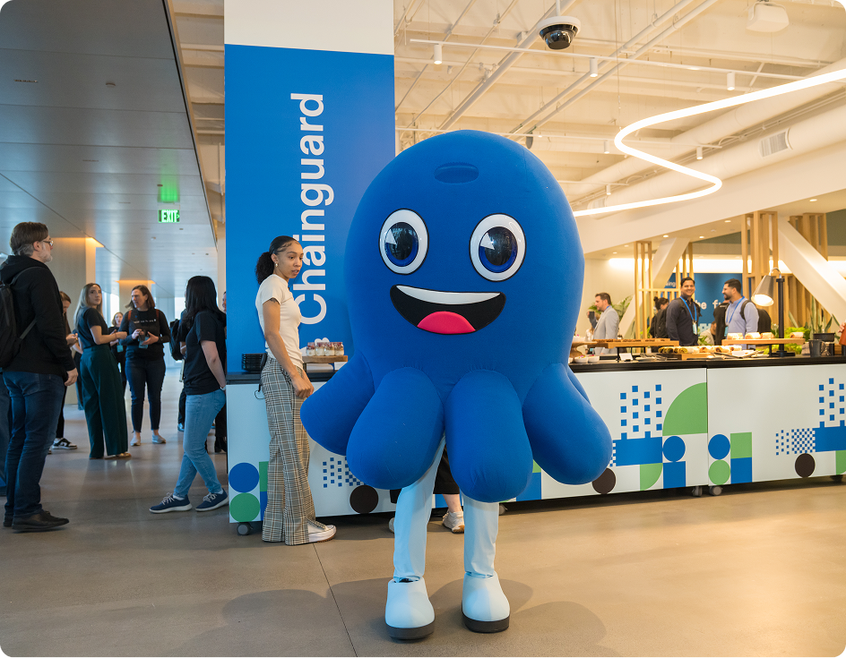
An octopus mark (egg-shaped head, four rounded tentacle lobes) left of a geometric sans wordmark "Chainguard", one colour. #6226FB on #FFFFFF nav and #F8F6FE footer; #FFFFFF on the #6226FB closing band and og:image; the favicon is the white mark on a blurple square. The chat assistant "Linky" uses the mark as avatar, and the about page shows a costumed octopus mascot.
Lavender-white #FBFBFF carries 88-94% of every page; #0D161C ink for heads and two dark bands on home; #6226FB blurple on buttons, links, arrows, logo and the closing band (2-3% of area); #F8F6FE wash for secondary buttons and the footer bar.
Lavender-white #FBFBFF carries 88-94% of every page; #0D161C ink for heads and two dark bands on home; #6226FB blurple on buttons, links, arrows, logo and the closing band (2-3% of area); #F8F6FE wash for secondary buttons and the footer bar. A four-hue code (fuchsia #FD2BF2, green #04BD13, aqua #2BBAFD, solar #FD3964) appears only as small tabs, cursors and card headers, with matching tints and deep text tones.
Source: chainguard.dev/%20measure/home-desk.json%20+%20home-phone.jsonlive computed styles, headless Chromium 1440x900
The trusted source for open source
Gellix Bold for every head at -3% (Outfit 700 stand-in at -0.027em) (hero 64/64, about hero 96/96, band heads 40/48 and 48/48, closing 72/72; phone 40/40 hero, 24-32 bands); Gellix Regular body 16/24 #565C60 and 18/24 leads; Gellix Medium 14 nav; Roobert SemiMono uppercase 14/20 at 6% for eyebrows, tags, tabs and footer labels; Roobert SemiMono (DM Mono stand-in) in the HTML terminal panel; Source Code Pro only inside supplied illustration files.
| Their face | Use | License | Open stand-in |
|---|---|---|---|
| Gellix Bold | commercial; open stand-in Outfit 700 at -0.027em (calibrated, see kit.typography.display) | ||
| Gellix Regular / Medium | commercial; open stand-in Albert Sans 400 / 500 (Medium) / 600 (SemiBold) (calibrated) | ||
| Roobert SemiMono | commercial; open stand-in DM Mono 400 at +0.067em (calibrated) | ||
| Source Code Pro | open (OFL), loaded by the site; appears only inside the supplied illustration files, never in HTML text (the stack-diagram terminal is Roobert SemiMono) |
Source: chainguard.dev/%20measure/home-desk.json%20+%20home-phone.json
Do #6226FB on a #FBFBFF page with #0D161C ink; about 2-3% of page area except the full #6226FB closing band (72px Gellix Bold #FBFBFF head, white-outline button, white logo right).
Blurple as the one accent · primary buttons, nav Contact us block, text links, arrows, logo, closing CTA band, mono labels on every page
Do 1px #E7E8E8/#EDEDED rules on #FBFBFF (#3D4449 on #0D161C); content column 1246px at 1440 (x 97-1343), 356px column box on phone (x 17-373, own rules at 17 and 372, inside outer rules at 0 and 389; text 322px at x 34); a faint SQUARE-dot grid (4px squares at 9% blurple, 24px pitch) in the hero band only; every other gutter is plain #FBFBFF; cells square-cornered. Bands that go edge to edge keep the column rules: the #0D161C dark band and the stack-diagram pinstripe field are full viewport width; the closing panel, the resources lavender half and the footer legal bar stay inside the column.
Blueprint frame · every page: centred column framed by 1px rules, bands and cells divided by rules
Do Roobert SemiMono 14/20 uppercase, 6% tracking, #7A7E81 (or #6226FB); last phrase on a tint (#FDDFFC, #DFF4FE, #E9FCEA); ends in a 10x16 solid block cursor (#6226FB, #FD2BF2, #2BBAFD or #04BD13) that blinks.
Mono caps eyebrow with a colour highlight and blinking cursor · home band intros, containers "WHY CHAINGUARD?", "LEARN MORE ABOUT TRUSTED OPEN SOURCE", "CHAINGUARD CONTAINERS" hero label
Do one hue per card: tint ground (#FEF5FE / #F2FDF2 / #F5FCFF / #FEF6F6), headline in the deep tone (#A10099 / #108000 / #006A97 / #B20028), 76x29 solid tab in the bright tone (#FD2BF2 / #04BD13 / #2BBAFD / #FD3964) flush top-right or under the row.
Colour-coded tinted cards with a corner tab · containers stat cards, about values, home feature-card headers
Do 0px-radius buttons, Gellix Bold 18, 16px padding, followed by a small dotted pixel arrow; product icons are 16px pixel-grid glyphs in #6226FB; checkerboard of purple squares on covers.
Square blocks and pixel-dot arrows · every CTA and text link; product-suite icons; guide cover pattern
Do Gellix Bold, letter-spacing -3% (with the Outfit 700 stand-in: -0.027em), line-height 1.0-1.2, #0D161C; 64-96px heroes, 40-48px band heads, 72px closing band.
Gellix Bold heads at -3% · all headlines
Specimens use sample copy, not Chainguard’s.
1px ruled frame around a centred column (a square-dot grid in the hero band only); bands and cells divided by rules; square-cornered buttons and nav blocks; 8px feature cards with a colour header field; mono tags (BLOG POST, GUIDE, CASE STUDY, POPULAR) as small filled or outlined rectangles; blinking block cursors; colour tabs 76x29 on tinted cards.

Source: chainguard.devchainguard.dev/products/containerschainguard.dev/pricing
Pixel-grid icons: product-suite glyphs as 16px blocky shapes in #6226FB, dotted pixel arrows after every CTA, pixel chevrons on accordions; thin outline checkmarks and tier icons on pricing; solid social icons in the footer.
Source: chainguard.dev/products/containerschainguard.dev/pricingchainguard.dev
No drawn illustration.


No drawn illustration. "Illustrations" are product UI and terminal panels: light UI cards and black terminal windows with monospace output set on tinted graph-paper grids (pink, green, cyan), wide card headers filled with a flat tint colour (#FD2BF2, #2BBAFD, #04BD13) holding a UI screenshot or chart, and a stack diagram of tiles around the mark. Collateral covers (guides) use dark violet with a purple pixel-checker band.
People only, never product.


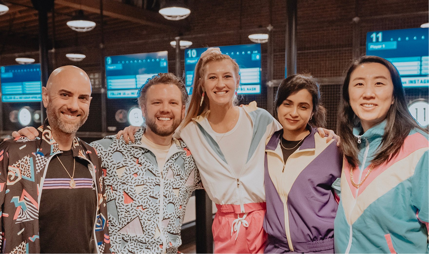
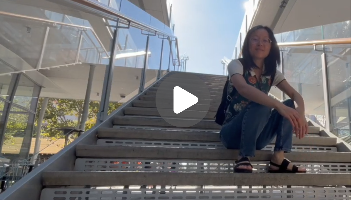
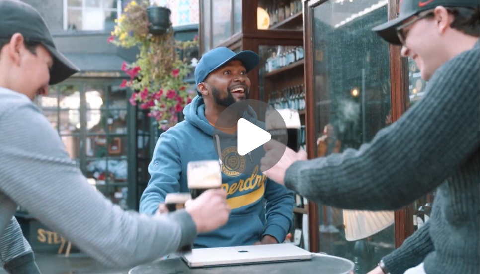


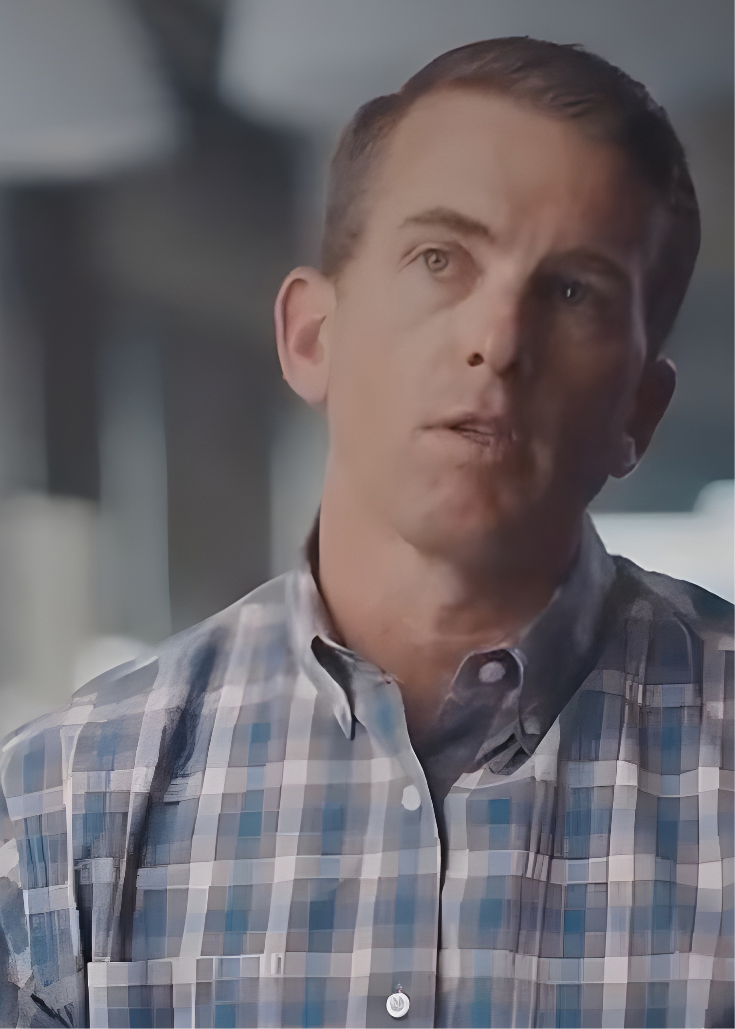
People only, never product. Candid team and event photos in natural warm colour (stage talk under blue light, crowded office party, retro-tracksuit team night, octopus mascot), cropped 4:3 with 8px corners in a row of three; exec headshots on dark gray studio grounds, square with 16px corners; customer-story covers are documentary video stills of customers, dark and moody, 5:7 portrait. Photos sit in ruled cells and never carry text on top.
Source: chainguard.dev/about-uschainguard.dev/careerschainguard.dev/customers
Announcement bar (#F1ECFE) over a 64px white nav with square blocks for Log in (#F8F6FE) and Contact us (#6226FB) at the right edge. Centred column framed by 1px rules (1246px at 1440; 356px column box on phone, text 322px inside it) (square-dot grid in the hero band only). Home: centred hero (H1, sub, two square buttons), 5x3 ruled logo grid, big centred statement, three feature stacks with a sticky side-tab rail, dark #0D161C bands, compliance band, resources, full #6226FB closing band, four-column link footer, #F8F6FE bottom bar. Phone: single column, full-width buttons, purple square menu button.
Measured from 's .
| Measure | Desktop | Phone |
|---|---|---|
| Page margin | 96px | 16px |
| Section padding | 64px | 48px |
| Hero text width | max 729px, centered | full width |
| Card gap | 0px | 0px |
| Navigation | 64px | 64px |
Hero H1
Gellix Bold · 64px (phone 40) · line 1 · tracking -1.73px · weight 700
Closing band head
Gellix Bold · 72px (phone 40) · line 1 · tracking -1.94px · weight 700
Statement
Gellix Bold · 48px (phone 32) · line 1.1 · tracking -1.3px · weight 700
Band head (H2)
Gellix Bold · 40px (phone 24) · line 1.2 · tracking -1.08px · weight 700
Card head (H3)
Gellix Bold · 24px (phone 18) · line 1.33 · tracking -0.65px · weight 700
Cell head
Gellix Bold · 18px · line 1.33 · tracking -0.18px · weight 700
Lead / body
Gellix Regular / Medium · 16px · line 1.5 · weight 400
Nav / footer link
Gellix Regular / Medium · 14px · line 1.43 · weight 400
Accordion item
Gellix Regular / Medium · 16px · line 1.25 · tracking -0.144px · weight 500
Button label
Gellix Bold · 18px · line 1.33 · tracking -0.18px · weight 700
Eyebrow
Roobert SemiMono · 14px (phone 12) · line 1.43 · tracking 0.94px · weight 400
Footer label / EN
Roobert SemiMono · 12px · line 1.67 · tracking 0.8px · weight 400
Tag chip
Roobert SemiMono · 14px · line 1.29 · tracking 0.14px · weight 400
Terminal text
Roobert SemiMono · 12.3px (phone 9.8) · line 1.45 · weight 500
One or two sentences on what this does for the reader.
One or two sentences on what this does for the reader.
Card: 8px corners on the surface band, 0px apart.
How Chainguard’s own landing pages are built, observed on chainguard.dev, 2026-11-10. The full measurements are in spec.md.
Source: chainguard.dev/%20measure/home-desk.json%20+%20home-phone.jsonmeasure/about-desk.json + about-phone.jsonmeasure/containers-desk.json + containers-phone.jsonmeasure/pricing-desk.json + pricing-phone.json
From chainguard.dev pages, the homepage og:image and the og:image share cards of 8 Unchained blog posts; no organic social posts, ads, decks or emails were reachable.
| Format | Loudness | Must appear | What varies |
|---|---|---|---|
| Landing page | #FBFBFF page, #F1ECFE announcement bar, 64px white nav with square Log in (#F8F6FE) and Contact us (#6226FB) blocks. Centred hero in a 1px-ruled column with dot grid: Gellix Bold 64/64 H1 at -3%, 16/24 #565C60 sub, square 58px #6226FB "Talk to an expert" + #F8F6FE "Start for free" with pixel arrows. Ruled logo grid with a mono caps header and G2 rating; mono eyebrow with highlighted phrase and blinking cursor over each 40/48 band head; feature cards with tinted header fields and graph-paper UI; #0D161C band with white heads; #6226FB closing band (72px #FBFBFF head, email field, outline button, white logo); four-column link footer with mono labels. | ||
| Social post | One flat ground (#FD2BF2, #6226FB or #060C10), square pixel tiles only at the left and right edges, one mono caps eyebrow over a centred Gellix Bold headline of at most 3 lines in white. Nothing else. | Ground colour per campaign (fuchsia #FD2BF2 for launches, blurple #6226FB, near-black #060C10 for recaps); tile pattern; eyebrow present or not. Two other observed card families may replace the tile card: the editorial bar card (#FBFBFF grid ground, headline set in solid #FD2BF2 / #6226FB bars, #14003D icon square) and the frame card (#192228 or #6226FB ground, white hairline frame with square nodes, headline in white bars). Portrait 1080x1350 not added: no portrait posts observed. Observed 2026-11-10: no organic announcement posts reachable (X empty logged out, Instagram login wall, LinkedIn not visited) and no single-image offer ads (Meta: no Chainguard advertiser; Google image ads are Google-assembled), so this row is unchanged; the closest observed family for an announcement is the Event / webinar promo card (colour top band with lockup and mono date, mono eyebrow with square cursor, left bold headline; ref/examples/event-1.png). | |
| Link share card (og:image) | Same families as the Social post row at 1.91:1: edge-tile announcement card, editorial bar card, white-hairline frame card, or flat #6226FB with the centred white logo (homepage). | Ground per post; homepage card is logo only. | |
| Video thumbnail | Flat #6226FB or #0D161C ground, small white lockup top left, a big white bold headline stacked left, and one right-hand visual: a presenter cut-out, a product pixel icon on a colour panel, or nothing. | Speaker variant (cut-out right, pixel squares in the top-right corner) or product-demo split (left 61% ground, right 39% #6226FB/#FD2BF2 panel with the product's white pixel icon); text-only recap with corner squares. One campaign thumbnail ("Open source is DYING") uses a full-bleed photo with pixel-art props and a pixel font; keep that to campaign films. | |
| Event / webinar promo card | Colour top band (#6226FB, #FD2BF2) or a hairline-ruled top row on #14003D, holding the white lockup left and a mono caps date right; below, a mono caps eyebrow with a square cursor over a left-aligned bold headline of 2-4 lines. | Speaker column on the right (1-3 rows split by 1px rules, name bold, role and company in mono, cut-out photo); Learning Labs series uses big #6226FB blocks and no band; conference cards use a ruled grid (logos, date, venue photo duotoned blurple, booth line) or a logo lockup over a #6226FB bottom band. Scoped to event and webinar promotion. | |
| Video lower third (customer story) | A solid white block bleeding off the near edge, then the name in white bold and the role in white regular beneath, on the subject's open side of the frame. | Left or right side, whichever is open; burned-in caption on a dark translucent bar at the bottom centre when present. |
Source: chainguard.dev
Your name and logo, Chainguard’s system.
Talk about my brand Use this brand in Claude
Get your brand audit Put your brand in Claude What goes in a brand book
Each value is marked published, observed, our reading or our recipe, with its source. Checked 2026-11-10. Not affiliated with Chainguard.
Tell us what you want to make. We’ll talk through how to put these ideas to work for your brand.