Cedar Pay
End-to-end patient payments: pre-visit payments, post-visit billing and communications, payment plans and financing (paraphrase). Observed
Brand book
Cedar sells to hospital finance teams but its product is felt by anxious patients opening a medical bill, so the site borrows the calm of a wellness brand: warm off-white paper, a soft regular-weight serif, grey body copy, real people at home, and only one loud color (lime) reserved for the action. Proof is carried by big quiet numbers and named executives rather than visual hype. Our reading

The ground of each band: white, off-white #F9F8F1, near-black #0F130A or lime #DBFFB5 (plus the one Rive-drawn band, #1B2C2C), and whether the band carries a photo, product UI or a gradient card.
Real lowercase cedar wordmark file, #0F130A on light; centered in the nav pill or large on the lime footer; never recolored or boxed.
Serif (Gambarino or Gelasio stand-in at -0.025em) 400 for heads, sans (Aeonik or Funnel Sans) 400 for body, mono eyebrow uppercase grey; nothing bold.
Grounds only #FFFFFF, #F9F8F1, #0F130A, #DBFFB5; heads #2D3A20; body #6E6E6E; lime #B2F200 only on pill buttons.
Pill 640px radius, 8/24 padding, 16px regular, #1B280B text; one primary per band.
Only the supplied taupe-sky-lime arcs or stripes; no new gradients, never behind copy.
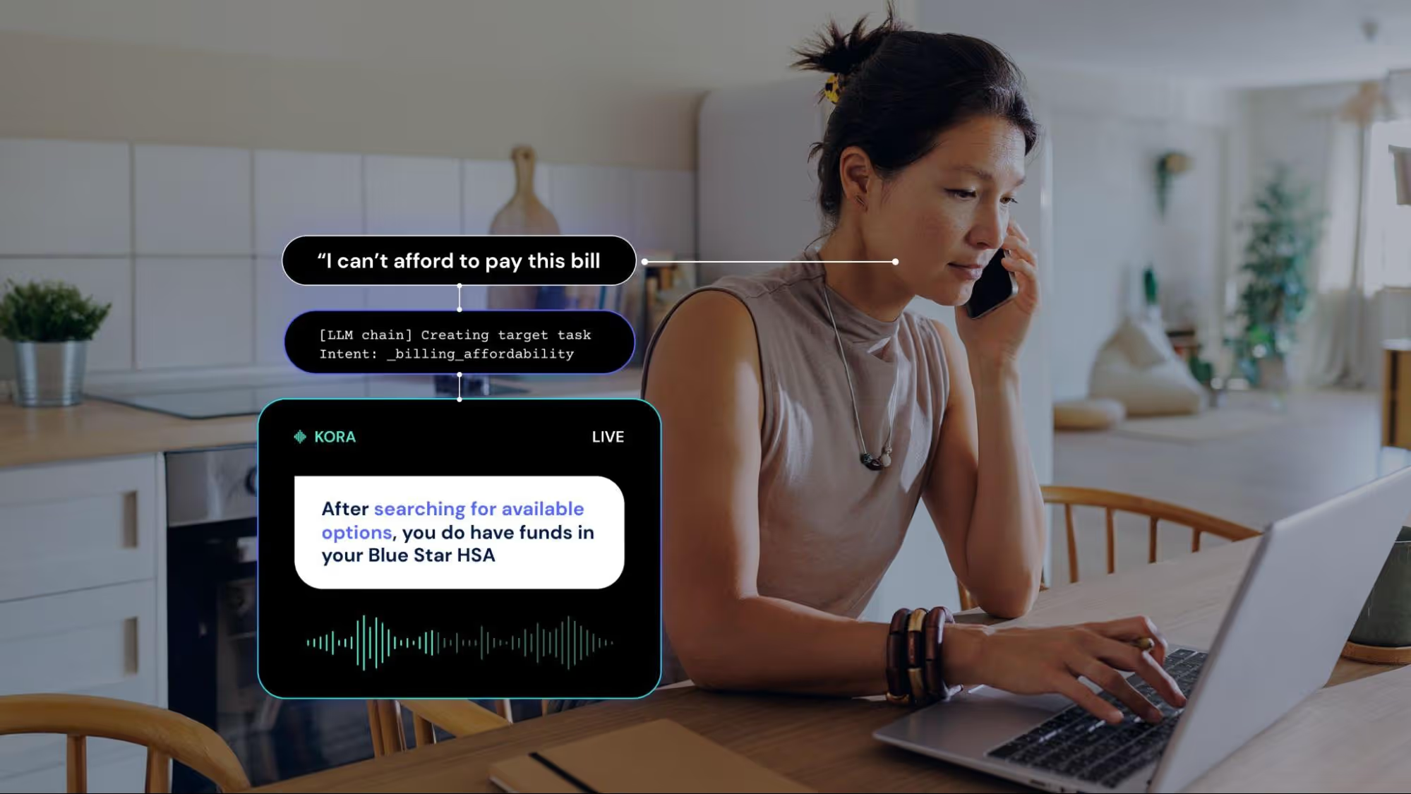
Warm real-people photos with phones/bills or Cedar product UI; no clinical stock.
Sentence-case heads without periods (except parallel triplets); every number traces to cedar.com with its date; serial comma kept.
Page ends on the #DBFFB5 footer with the serif sign-off 'Built for patients. Powered by intelligence. Proven in performance.'
The patient financial experience platform for providers: one intelligent system for billing, payments, coverage and support that collects more at lower cost while treating patients with empathy. Our reading
End-to-end patient payments: pre-visit payments, post-visit billing and communications, payment plans and financing (paraphrase). Observed
Coverage and aid: Medicaid and ACA enrollment, keeping Medicaid coverage, resolving denials (paraphrase). Observed
AI voice agent and call-center servicing that resolves billing inquiries (paraphrase). Observed
AI personalization engine built only for patient financial engagement, powering every product (paraphrase). Observed
Accountable partnership, one complete platform and data-driven optimization: aligned incentives, fewer vendors, and a platform that learns from every interaction (paraphrase of the three differentiators). Observed
Built for patients. Powered by intelligence. Proven in performance.
Cedar unifies billing, payments, coverage, and support through one intelligent platform—driving stronger margins for providers and simpler financial experiences for patients.
The financial intelligence healthcare has been waiting for
Empower the patients others write off
Healthcare costs are rising for patients, with high deductibles and many un- or underinsured, so Cedar builds billing that patients can understand and afford while providers get paid (paraphrase). Its headline metrics count from 2017, per the site footer.
Commit to the mission of improving the healthcare financial experience, and prioritize actions that advance it (paraphrase).
PublishedSolicit diverse perspectives, set high standards, challenge assumptions, and raise the bar on thinking and performance.
PublishedStay optimistic, resilient, and curious; embrace difficult problems and learn from setbacks.
PublishedAct with accountability, bold thinking, integrity, and practical decision-making.
PublishedCategory. The complete patient financial experience platform. Observed
Patients are healthcare's fastest-growing payor class, but billing was built for insurers. Cedar's AI-driven technology, powered by more than 1.5 billion patient interactions, meets patients across billing, payments and financial assistance, and has processed over $13.6 billion in payments for more than 63 million patients (paraphrase of the Aug 13, 2026 press boilerplate).
Built for patients. Powered by intelligence. Proven in performance. Observed
The lift providers want. The experience patients deserve. Observed
Intelligence that scales. Performance that delivers. Observed
Patients get clarity. Providers get paid for the care they deliver. Observed
Paying for care should be easy and affordable
Precision care, extended to the payment experience
For the smarter, more supportive patient journey
Powering the first one-of-one patient financial experience
The Agentic Platform Built for Patient Financial Resolution
A Connected Patient Affordability Solution
When collections gets harder, patient billing needs to get smarter
Your impact starts here
Better billing isn't the answer
Revenue cycle will never be the same
Good vs. great AI in 2026
The lift providers want. The experience patients deserve.
The #1 AI platform for revenue cycle teams
Empower the patients others write off
Empower The Patients Others Write Off.
58M+ patients served
Millions of happy users
Our AI-powered revenue cycle solution maximizes your collections!
Built for patients. Powered by intelligence. Proven in performance.
Cedar helps healthcare consumers pay their bills faster.
Patients get clarity. Providers get paid for the care they deliver.
Leverage best-in-class AI to optimize RCM KPIs.
When collections gets harder, patient billing needs to get smarter
EmpatheticConfidentPlain-spokenOutcome-focused
patient financial experienceCedar IntelligenceKora Platformcost-to-collectshoulder-to-shoulderproviderspatients
Source: cedar.comcedar.com/about-uscedar.com/solutions/cedar-paycedar.com/press
Source: cedar.comcedar.com/about-uscedar.com/solutions/cedar-pay



One lowercase monoline 'cedar' wordmark, always a single dark fill.


One lowercase monoline 'cedar' wordmark, always a single dark fill. Its continuous stroke runs from the c into the e. It sits centered in the floating nav pill at 70x22 (left on phone) and large, 200x70, top-left in the lime footer. There is no symbol and no tagline lockup; the app icon and favicon put the wordmark on a pale lime tile, and the share image sets it over the gradient arcs.
Source: cedar.com
Quiet, warm neutrals carry the pages and lime is kept for the action.
Quiet, warm neutrals carry the pages and lime is kept for the action. Quiet, warm neutrals carry the pages: white and off-white #F9F8F1 make up most of each page, a near-black olive #0F130A band holds the product solutions, and every footer is lime #DBFFB5. Text is dark green #2D3A20 for heads and grey #6E6E6E for everything else. Lime #B2F200 appears only on pill buttons and tiny numbered tags. A taupe-sky-lime gradient (#81796A, #57AFC9, #DFF386, #E1F9D5) appears only in imagery: hero arcs, card art, the footer stripe strip.
Source: cedar.comcedar.com/about-uscedar.com/solutions/cedar-paycedar.com/press
Built for patients. Powered by intelligence. Proven in performance.
A soft editorial serif, a neutral grotesk and a mono, all at regular weight.
A soft editorial serif, a neutral grotesk and a mono, all at regular weight. A soft, slightly condensed editorial serif (Gambarino, regular only) for every head and quote, a neutral grotesk (Aeonik) for everything else, and a mono (Apercu Mono) for eyebrows and numerals. No bold anywhere: hierarchy is size and color.
| Their face | Use | License | Open stand-in |
|---|---|---|---|
| Gambarino | Every heading, testimonial quotes, footer sign-off | ITF Free Font License (Fontshare); not OFL, not shipped | Gelasio 400 at -0.025em Not OFL; Gelasio matches width within 0.1% when tracked, x-height -8.5%, ink -4.7%. |
| Aeonik | Body, leads, buttons, nav, stat numerals, captions | Commercial (CoType) | Funnel Sans 400/500 Commercial face; Funnel Sans is +1.6% width, -2.0% x-height, +0.6% ink. |
| Apercu Mono Pro | Eyebrows, numerals 01/02/03, tags | Commercial (Colophon) | Fragment Mono 400 Commercial face; Fragment Mono is -0.3% width, +4.0% x-height, +0.7% ink. |
Billing patients can understand
Billing patients can understand
Soft serif head under a grey mono eyebrow · Every section on every page
A whole band in lime
Lime pill button · Nav Contact Us and every primary CTA
Do Horizontal gradient #81796A → #57AFC9 → #DFF386 → #E1F9D5 (linear-gradient 94deg, stops 6/29/72/100%) drawn as soft stacked arcs that crest upward (gradient-hills.png, card-automate-hills.png) or as a strip of vertical gradient bars (gradient-stripes.png). Use the supplied image files.
Taupe-sky-lime gradient arcs · Home hero (product UI floating over stacked curved gradient bands), Get more cards (03), Cedar Pay card 03, the 54px gradient stripe strip at the very bottom of every footer and under the about pull-quote, the stats progress bar, the og:image
Made for people. Proven in practice.
Made for people. Proven in practice.
Lime footer with the tagline sign-off · Every page footer
“It finally made sense what I owed.”
“It finally made sense what I owed.”
Square sand/mint quote cards with serif quotes · Home and Cedar Pay testimonial carousels, about testimonial wall
Do Full-width 1px #6E6E6E top rule, mono numeral 01/02/03 at far left, Gambarino 32 head at about 33% across, Aeonik 14/21 #6E6E6E description at about 66%, 24px above and 72px below; stats variant: Aeonik 108px numeral #2D3A20 with a 48px #ADE9A8 unit (B, M+, %), caption Aeonik 14-16, rule below.
Numbered hairline rows · What sets us apart (home), Our market differentiators (Cedar Pay), stats bands
Specimens use sample copy, not Cedar’s.
Cedar’s elements are quiet and few.


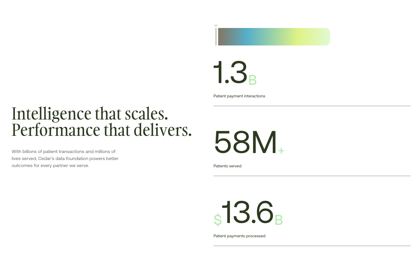
Cedar’s elements are quiet and few. Pill buttons, a floating rounded nav pill, square cards, 1px hairline rows with mono numerals, outlined mono tags, big stat numerals with mint units, and a gradient progress bar.
Source: cedar.comcedar.com/about-us
Icons are nearly absent.



Icons are nearly absent. A 16px outline globe (#6E6E6E stroke) leads the hero eyebrow, thin chevrons open the nav menus, small outlined arrows mark external links, and a white play triangle sits on the about video. Beyond that the site carries only 22px outline social icons and six 24px perk icons on careers; numbered mono tags and photos do the work feature icons would.
Source: cedar.comcedar.com/about-us
Cedar draws no illustration today: its graphic language is the gradient.



Cedar draws no illustration today: its graphic language is the gradient. Soft stacked arcs crest upward in taupe, sky blue, yellow-lime and pale mint, used as hero ground, as card art, and as a stripe strip of vertical gradient bars. Flat people illustration and blue line art appear only on older, pre-rebrand case-study and blog cards.
Source: cedar.comcedar.com/about-us
Real-looking patients and families at home, in warm natural light, holding a phone or a paper bill.
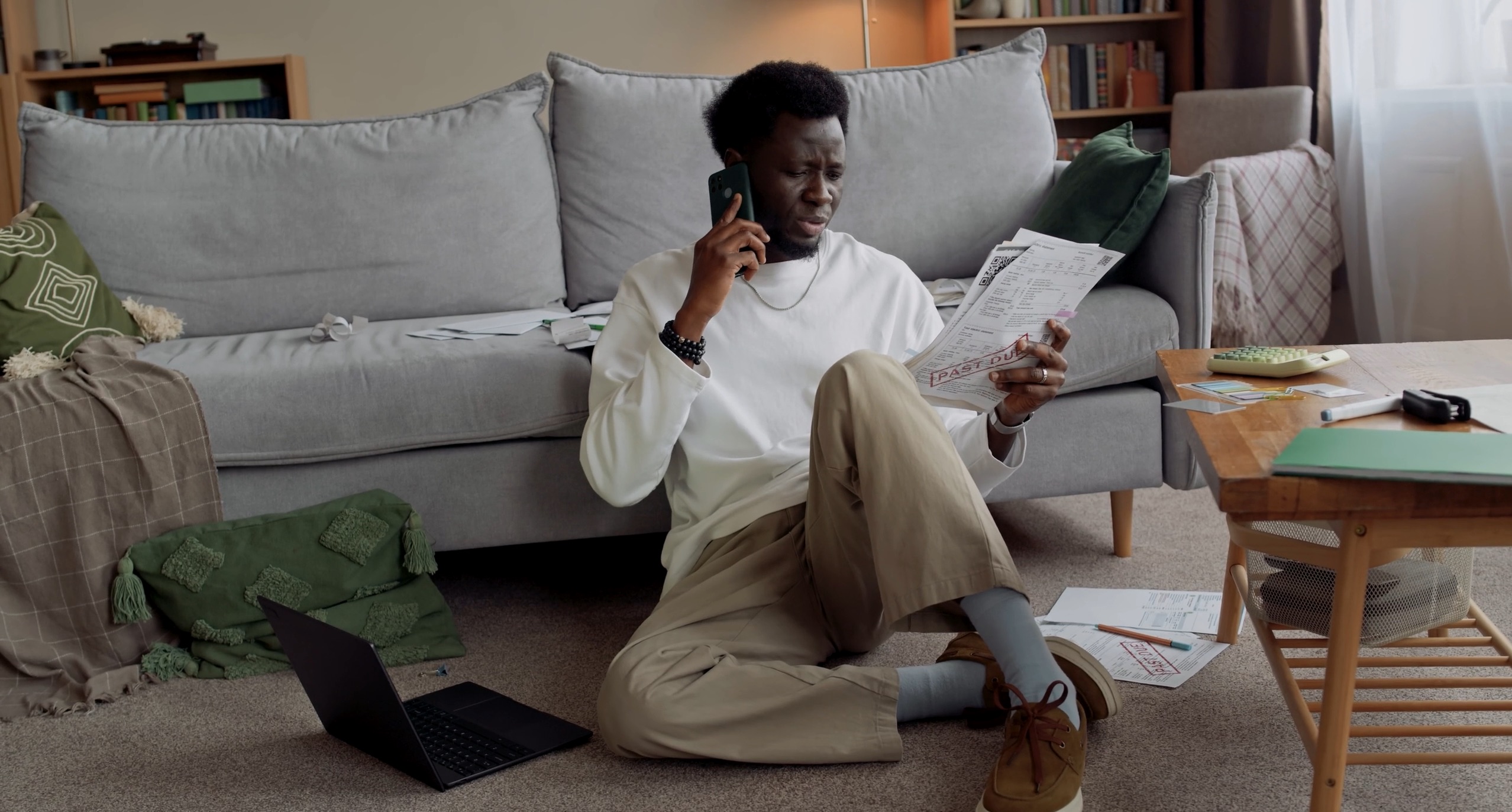



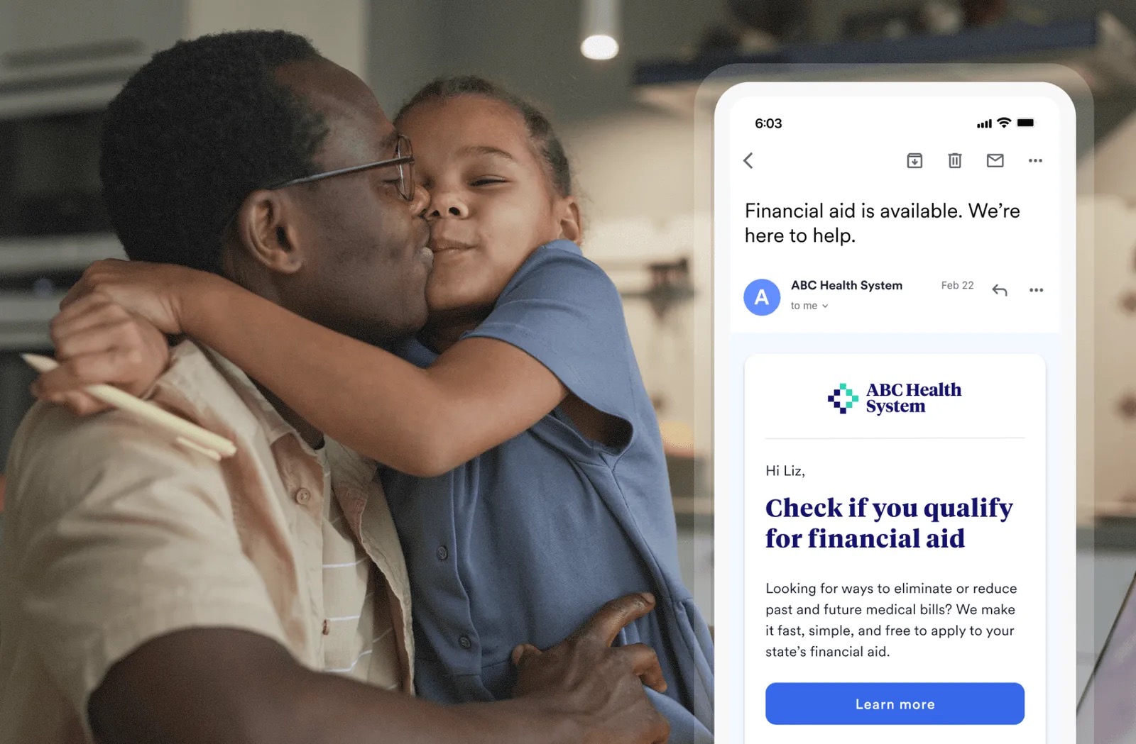




Real-looking patients and families at home, in warm natural light, holding a phone or a paper bill. Mid-shot, shallow depth of field, soft beige/olive tones, diverse ages and ethnicities. Product phone screens are composited over the photo (Cedar Pay, Cedar Cover). Leadership portraits are chest-up and smiling, with the background removed. Card photos get a black-to-clear bottom fade (linear-gradient 0deg, rgba(0,0,0,.6)) so white Aeonik labels sit on them.
Source: cedar.comcedar.com/about-uscedar.com/solutions/cedar-paycedar.com/solutions/cedar-cover
Bands are full-bleed and mostly split, with generous empty space. A 1376px content width (container 110rem, 32px gutters) on a 12-column-like grid. Most bands are split: head top-left in the left half, copy and actions in the right third, with generous empty space. Only the home hero is centered. Bands are full-bleed color changes; the nav is a floating rounded pill inset 32px with a 1px #F0E9D3 border. Product UI: Product appears as clean UI for a fictional 'ABC Health System' (navy/indigo hospital brand inside the screens): a reporting dashboard with $88.45M Billed and line charts, and a patient phone bill 'Hi Sam, ... Pay total: $56.00'. Phones float over gradient arcs or photos.
Measured from cedar.com's headless Playwright (Chromium) computed styles and bounding boxes on https://www.cedar.com/ at 1440x900 and 390x844 (isMobile), 2026-11-17; measure/home-desk.json, measure/home-phone.json; consent banner hidden; lazy images loaded by scrolling first.
| Measure | Desktop | Phone |
|---|---|---|
| Page margin | 32px | 15px |
| Section padding | 64px | 46px |
| Hero text width | max 1128px, centered | full width |
| Card gap | 16px | 16px |
| Navigation | 96px | 96px |
Section display head
Gambarino · 72px (phone 30.5) · line 1 · tracking -1.8px · weight 400
Sign-off head
Gambarino · 56px (phone 26.7) · line 1 · tracking -1.4px · weight 400
Hero H1
Gambarino · 48px (phone 38.1) · line 1.15 · tracking -1.2px · weight 400
Solutions head
Gambarino · 48px (phone 38.1) · line 1 · tracking -1.2px · weight 400
What sets us apart head
Gambarino · 48px (phone 22.9) · line 1.1 · tracking -1.2px · weight 400
Row head and testimonial quote
Gambarino · 32px (phone 19.1) · line 1.1 · tracking -0.8px · weight 400
Image-card head (sans)
Aeonik · 32px (phone 22.9) · line 1.1 · weight 400
Numeral
Aeonik · 108px (phone 61) · line 1 · weight 400
Stat unit, mint #ADE9A8
Aeonik · 48px (phone 38.1) · line 1 · weight 400
Hero lead, grey #6E6E6E
Aeonik · 18px (phone 17.2) · line 1.5 · weight 400
Body, grey #6E6E6E (testimonial intro #2D3A20)
Aeonik · 16px (phone 15.3) · line 1.5 · weight 400
Small paragraph and caption
Aeonik · 14px (phone 13.3) · line 1.5 · weight 400
Footer disclaimer, grey #6E6E6E
Aeonik · 12px (phone 11.4) · line 1.5 · weight 400
Footer column title, #2D3A20
Aeonik · 16px (phone 15.3) · line 1.5 · weight 500
Nav link, #222222
Aeonik · 16px (phone 15.3) · line 1.5 · weight 400
Pill label
Aeonik · 16px (phone 15.3) · line 1.5 · weight 400
Eyebrow and numerals, uppercase
Apercu Mono Pro · 14px (phone 13.3) · line 1 · tracking 0.26px · weight 400
Provider / patient tag, uppercase
Apercu Mono Pro · 14px (phone 13.3) · line 1.5 · weight 400
How Cedar’s own landing pages are built, observed on cedar.com, 2026-11-17. The full measurements are in spec.md.
Source: cedar.comcedar.com/about-uscedar.com/solutions/cedar-pay
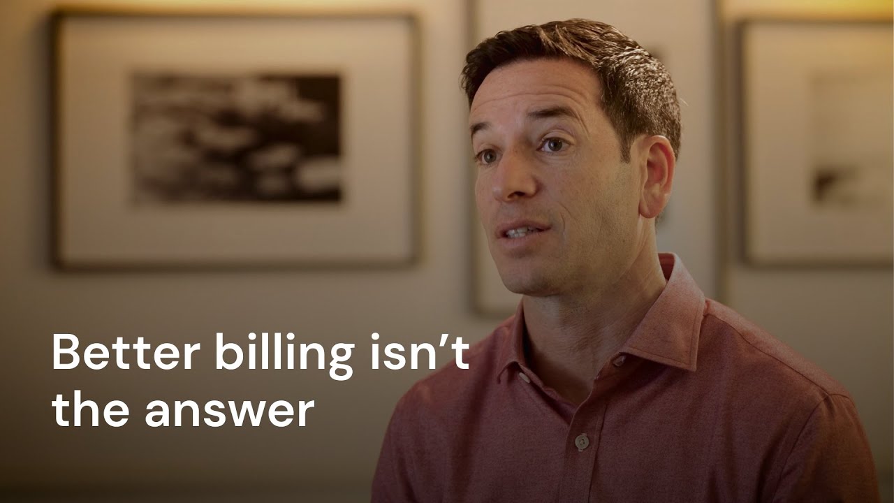


Landing page is observed from cedar.com. Social post is derived from the homepage system and Cedar's own share cards because no organic posts were reachable (X login wall, Instagram empty logged out, LinkedIn not visited).
| Format | Loudness | Must appear | What varies |
|---|---|---|---|
| Landing page | Floating #F9F8F1 nav pill (centered wordmark, lime Contact Us pill right); hero with mono eyebrow, Gambarino head 48-72 #2D3A20, grey 18px lead and one lime 'Schedule a demo' pill, over gradient arcs with product UI or a split photo; logo wall 'Leading providers rely on Cedar'; numbered hairline differentiators; #0F130A solutions band; stats with mint units; sand/mint quote cards; off-white demo band; lime #DBFFB5 footer with serif tagline and gradient strip. | Hero layout: centered with gradient + product (home) or split text/photo with composited phone (Cedar Pay, Cover). | |
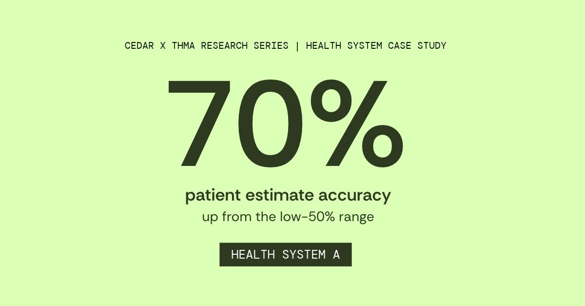
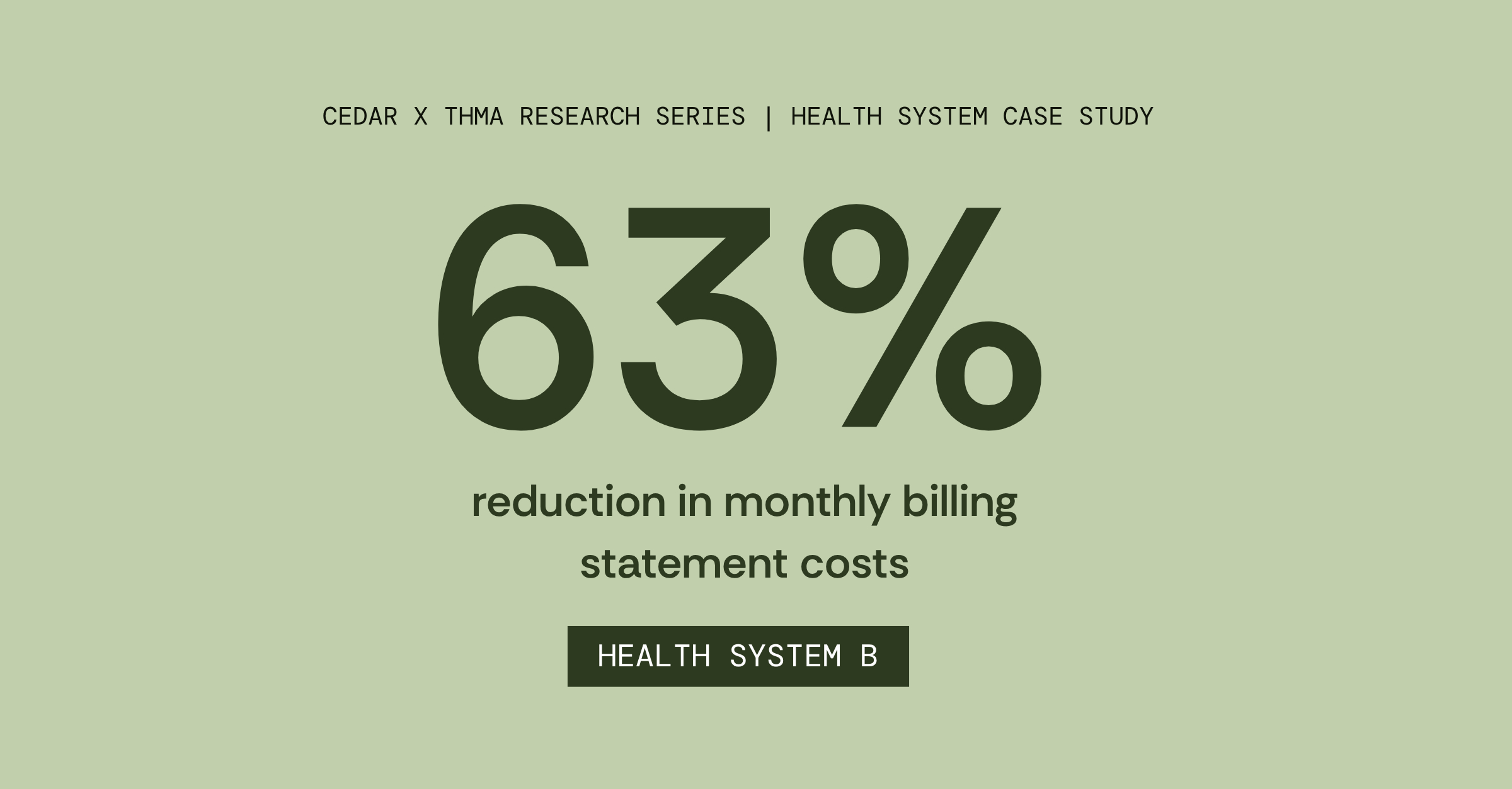
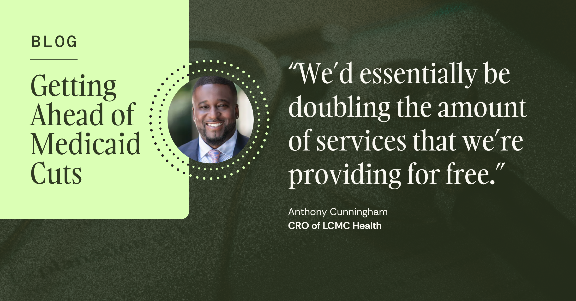
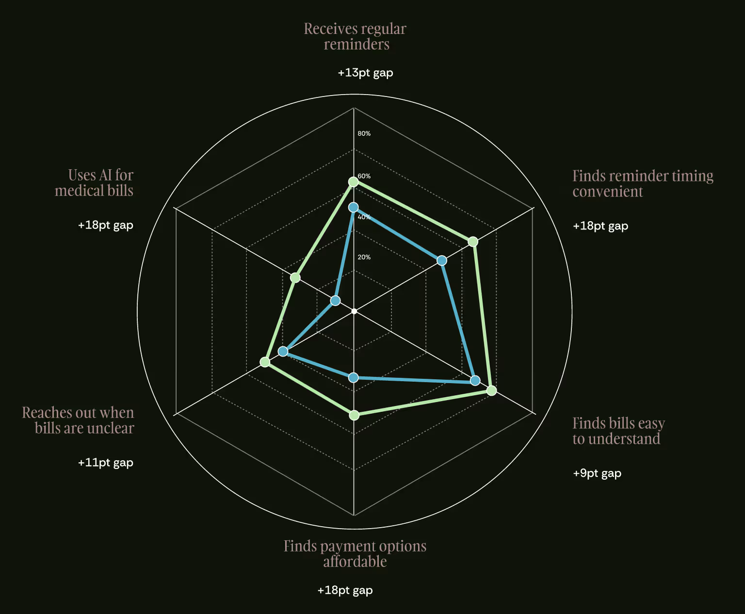
| Social post | Off-white #F9F8F1 (or near-black #0F130A) square: mono grey eyebrow, a Gambarino 400 head of at most 3 lines in #2D3A20, one short grey line, the cedar wordmark, and the taupe-sky-lime gradient arcs (or a product phone over them) filling the lower part. Quiet, airy, no button. | Ground #F9F8F1 (default) or #0F130A for data and research posts; image zone = gradient arcs alone, arcs + one product phone screen, or a warm candid photo with a phone UI overlaid; eyebrow may carry a number (50M PATIENTS SERVED NATIONWIDE). Closest observed families (no organic posts or offer ads exist): the lime-panel quote card (https://www.cedar.com/blog/medicaid-cuts-getting-ahead-lcmc-health-system) and the one-number stat card. | |
| Video thumbnail: Hot Takes series | A speaker interview frame filling the canvas with a two-line white sans headline at lower left. No logo, no button. | Speaker left, centre or right; the headline is a claim or question from the interview. | |
| Blog share card: customer stat | Flat pale-green ground with one giant dark-green numeral, a two-line label and a mono pill naming the system. | Ground lime #DBFFB5 or sage #C1CFAD. |
Source: cedar.comcedar.com/about-uscedar.com/solutions/cedar-paycedar.com/press
Your name and logo, Cedar’s system.
Talk about my brand Use this brand in Claude
Get your brand audit Put your brand in Claude What goes in a brand book
Each value is marked published, observed, our reading or our recipe, with its source. Checked 2026-11-17. Not affiliated with Cedar.
Tell us what you want to make. We’ll talk through how to put these ideas to work for your brand.