Frontier research
Its team pioneered state space models (SSMs), Mamba and H-Nets, and builds products on them (paraphrase). Observed
Brand book
Engineered precision with a human hand. The ruled column, hatch rails and measured superlatives read as a research lab that publishes its benchmarks; the serif headlines, watercolour washes and a symbol drawn from a human figure soften it toward the mission of AI that "interacts like humans". Our reading

The illustration family per page: green watercolour orbs (home, agents), flowing green line diagrams (Ink, Sonic, agent pipeline), outlined people scenes (Ink, Sonic), isometric green tiles (deployment), watercolour + hand-drawn blog covers.
Our engine's setting, built from their rules.
Cover the lockup: warm off-white grounds, #e4e3db hairlines and 16px hatch rails (ticks every 8px), two-tone Kyoto serif headlines and one green button should still read as Cartesia.
Archie is in front of the wordmark, from the supplied file, in Verdant/ink, all black or all white; no effects, outline, rotation or retyped CARTESIA.
Verdant #309d4b appears only on the primary action, Archie and illustration; no green headlines, links or second accent.
Headlines are PP Kyoto 500, or the calibrated stand-in Literata at weight 400 (never 500: Literata 400 already matches Kyoto 500 in darkness), sentence case, muted lead-in at 70% ink and full-ink payoff, with the stand-in tracking from the type table.
Cartesia (never Cartesia AI); Sonic-3.6, Ink-2 with hyphenated versions.
Every superlative or number traces to a Cartesia page (ranking with its source, latency, languages, customer figure); nothing invented.
Imagery is Cartesia's watercolour/hand-drawn or line art, candid team photos, or the campaign film; no stock or generic AI art.
The #1-ranked realtime voice platform: Sonic text to speech, Ink speech to text and Managed Agents in one API fast enough for live conversation, built on Cartesia's own State Space Model research (paraphrase).
Its team pioneered state space models (SSMs), Mamba and H-Nets, and builds products on them (paraphrase). Observed
Low latency for live conversation: first audio under 90ms (Sonic), time to final transcript 0.1s (Ink) (paraphrase). Observed
Ranked #1 for naturalness and accuracy by independent leaderboards (paraphrase). Observed
The same models and agents across cloud, on-premise and on-device, with in-region inference (paraphrase). Observed
HIPAA compliant, SOC 2 Type 2, GDPR and PCI (badges). Observed
The founding team met as PhDs at Stanford AI Lab, where they invented State Space Models, and spent four years building the theory and scaling it across text, audio, video, images and time series. Today the products are Sonic text to speech, Ink speech to text and Managed Agents. Founders: Karan Goel (CEO & Founder), Albert Gu (Chief Scientist & Co-founder), Arjun Desai and Brandon Yang (Co-founders). Offices in San Francisco, London and Bangalore (paraphrase).
Category. Real-time voice AI: speech models and voice agents
Cartesia builds real-time voice AI: voice agents for production phone calls, lifelike text to speech (Sonic) and accurate speech to text (Ink) in 44 languages, on State Space Model architectures its founders pioneered at Stanford. (paraphrase of the home meta description and /company)
#1-ranked for realtime voice. Models and agents built on frontier research. Observed
Architecting AI that learns and interacts like humans. Observed
The full stack for interactive intelligence Observed
Build the future of interactive intelligence Observed
Deploy AI anywhere. Own it everywhere. Observed
Realtime AI models and voice agents Observed
Sonic: the fastest, most realistic text to speech model Observed
Ink: The fastest and most accurate speech to text model Observed
Voice agents that set a new frontier. Observed
Help architect AI that learns and interacts like humans Observed
Pricing for every stage. Observed
Built with Cartesia. Observed
Voice AI for startups. Your first year is on us. Observed
Home leads with ranking ("#1-ranked for realtime voice."), then research ("Models and agents built on frontier research."), then the product stack (Ink, Sonic, Managed Agents), customer proof (EliseAI), research, deployment, and a two-way CTA. The footer line "Architecting AI that learns and interacts like humans." is the standing tagline.
Source: cartesia.ai
A research company selling speed proves claims with numbers.
PreciseConfidentResearch-groundedWarm
Short, confident product claims with proof; we/you address; sentence case; two-sentence headline pairs; spaced em dashes and serial commas. Research pages speak about architectures and the mission. Naming rules are published.
Cartesia AI
Source: cartesia.ai/brandcartesia.aicartesia.ai/soniccartesia.ai/inkcartesia.ai/blog
| Headline length | 3-10 words per sentence |
|---|---|
| Case | sentence |
| Person | we / you |
Not published: tone of voice guide.
Source: cartesia.ai/brandcartesia.aicartesia.ai/soniccartesia.ai/ink


All logo files come from the brand page download links (/brand/*.svg|png); the brand-assets zip holds the same wordmark and Archie files. The "Startups" lockup is a sub-brand for the startup grant program.
The symbol carries the human side of the mission; the serif caps wordmark matches the PP Kyoto headlines.




| Lockup aspect | 1102:156 (SVG viewBox) |
|---|---|
| Archie aspect | 504:464 |
| Primary colors | Archie #309D4B, wordmark #1E1C1A (file fills) |
| White version | #FEFEFE fills |
| Nav size | about 140px wide at x 81 (observed) |
| Startups lockup | lockup + 1px vertical rule + "Startups" in the serif |
The brand page publishes the logo (Archie at the front of an uppercase serif CARTESIA), Archie on its own, and a Startups lockup, each in primary, black and white, as SVG and PNG, plus four don'ts per mark and a six-tile color-combination grid. Archie is "derived from a stylized human form and an asterisk" (short quote).
Not published: clear-space measurement; minimum size.
Source: cartesia.ai/brand
Neutral paper grounds let the green symbol and the green watercolour carry the identity.
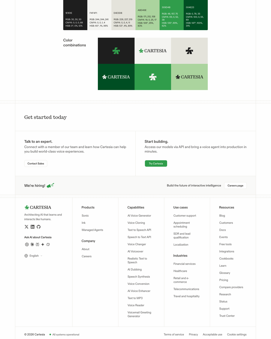
| Published | Carbon #1E1E1E, White #F4F4F1, Canvas #E4E3DB, Growth #ABD49E, Verdant #309D4B, Forest #004E23 |
|---|---|
| Site ground | #fefefe page, #f9f9f8 band, #f3f2ef panel |
| Site text | #1e1c1a heads, #525150 body, #a7a6a2 mono labels |
| Line | #e4e3db 1px; rails at 30% opacity |
| Accent | #309d4b fill with #f9f9f8 label |
The brand page publishes six colors with hex, RGB, CMYK and HSB: Carbon #1E1E1E, White #F4F4F1, Canvas #E4E3DB, Growth #ABD49E, Verdant #309D4B, Forest #004E23, described as built around deep greens, dark graphite and neutral tones. The site runs on a CSS neutral ramp a step warmer and lighter: page #fefefe (~80% of the page), bands #f9f9f8 (~8%), illustration panels #f3f2ef (~5%), text #1e1c1a and #525150, lines #e4e3db. Verdant covers under 1%: one filled button per group, Archie, the #f4faef announcement bar. No measured page has a dark band. CSS also defines orange and blue ramps and "Memory" #99b0c8 / "Mist" #d1e2e8 tokens; none were measured on a band.
Not published: usage ratios; tints and accessibility pairs; the site's neutral ramp (#fefefe, #f9f9f8, #1e1c1a, #525150) is not on the brand page.
Source: cartesia.ai/brandcartesia.ai
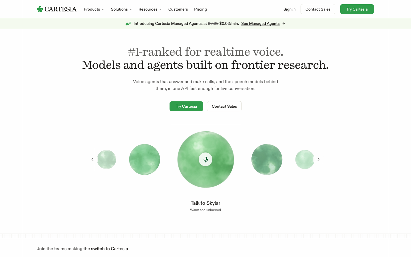
#1-ranked for realtime voice. Models and agents built on frontier research.
A soft literary serif for claims, a neutral grotesk for facts, mono for system labels.
| Their face | Use | License | Open stand-in |
|---|---|---|---|
| PP Kyoto | H1 and H2, pricing figures | Commercial (Pangram Pangram); open stand-in Literata 400 (SIL OFL), calibrated 2026-11-10 | Literata |
| ABC Diatype | Nav, body, buttons, H3, footer | Commercial (Dinamo); open stand-in Hanken Grotesk (SIL OFL), calibrated 2026-11-10 | Hanken Grotesk |
| IBM Plex Mono | Small labels and swatch values | Open (SIL OFL 1.1) |
| H1 | PP Kyoto 500 40/46, -0.01em (phone 32/36.8) |
|---|---|
| H2 | PP Kyoto 500 26/33.8 |
| H3 | ABC Diatype 465 20/26 |
| Body | ABC Diatype 400 16/24 #525150 |
| Button | ABC Diatype 500 14/20 |
| Label | IBM Plex Mono 500 12/16.5 |
PP Kyoto (Pangram Pangram) weight 500 for H1/H2 in sentence case: 40px/46px with -0.4px tracking on heroes (48px on the brand and agents heroes, 32px on phone), 26px/33.8px for section heads. ABC Diatype (Dinamo) for everything else: 16/24 body in #525150, 14/20 weight 500 nav and buttons, 20/26 weight 465 card titles, 17/24 weight 465 footer heads. IBM Plex Mono 12px weight 500 for small labels. The brand page intro mentions typography specs, but the page and the asset zip publish none.
Not published: type specification; font licences; open stand-ins (Literata 400, Hanken Grotesk) are ours, calibrated 2026-11-10.
Source: cartesia.aicartesia.ai/pricing
Do PP Kyoto 500 (Literata 400 stand-in at +0.35px H1, +0.5px phone H1, +0.55px on 26px heads), sentence case: hero 40px/46px, -0.01em in the real face (48px on brand and agents heroes; 32px/36.8px on phone); sections 26px/33.8px. The lead-in in #1e1c1a at 70% opacity, the payoff in full #1e1c1a; a two-sentence hero puts each sentence on its own line, muted first..
Two-tone Kyoto headline · Every hero H1 and most H2s (home, Sonic, Ink, Agents, Pricing, Startups, Blog)
Do Content column 1278px wide between full-height 1px #e4e3db verticals at x 81 / x 1359 (1440 viewport). Bands are divided by a 16px full-width rail (14px of ticks between two 1px rules) of 1px #e4e3db vertical ticks every 8px at 30% opacity. Cells inside bands split by 1px #e4e3db; logo wall = 4x2 cells plus a 320px "Ranked #1" cell on #f9f9f8. Phone: the verticals sit 16px in..
Ruled column and hatch rails · Whole page on every measured page
Do UI color is warm off-white (#fefefe page, #f9f9f8 bands, #f3f2ef panels) and warm grey text (#1e1c1a, #525150). Verdant #309d4b appears as the single filled primary button per group (8px radius, 36px, #f9f9f8 label), in Archie, and as the #f4faef announcement tint..
One green on warm neutrals · Buttons, logo, announcement bar
Do Primary lockup: Verdant Archie in front of an uppercase serif CARTESIA wordmark in #1e1c1a (file aspect 1102:156). Nav lockup 140x20 at x 129, y 22 (the 48px column padding). On photos and green grounds the all-white file; on Growth the all-black file..
Archie + serif CARTESIA · Nav top-left, footer, og image, film end card
Do Green watercolour washes (Growth to Forest) overlapping loose black hand-drawn outlines on a warm off-white paper ground; product pages use thin green line drawings (flowing curves carrying words set in Kyoto; outlined people in street and office scenes) and soft green watercolour orbs for voices..
Watercolour and hand-drawn line · Blog covers and share images, Managed Agents page, product illustrations
Specimens use sample copy, not Cartesia’s.
Graph-paper rules make the page feel measured and technical without dark UI.
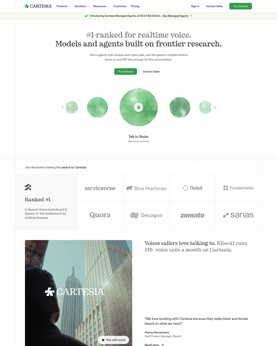
A sticky 64px white header with a 1px #e4e3db bottom rule; a 38px #f4faef announcement bar; the 1278px column between full-height hairlines; 16px hatch rails (1px ticks every 8px, 30% opacity) between bands; ruled cell grids (logo wall, Get started two-up, footer five columns); outline cards with 8px radius on #f9f9f8; tab bars on a #f3f2ef track; a floating "Talk to Cartesia" pill with a green orb at bottom-right.
Not published: component specs.
Source: cartesia.ai
Off-the-shelf outline icons stay quiet next to the illustration.
Lucide outline icons (lucide-* classes): 2px stroke, round joins, currentColor, at 24px in lists (megaphone, handshake, headset on Sonic; cloud, server, cpu on home), 16px for arrows and chevrons, 14px in demo chips. A filled green megaphone illustration marks the hiring strip.
Not published: icon guidelines.
Source: cartesia.aicartesia.ai/sonic
Hand-made marks give an AI voice company a human texture.
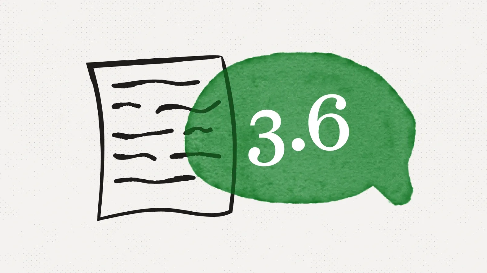
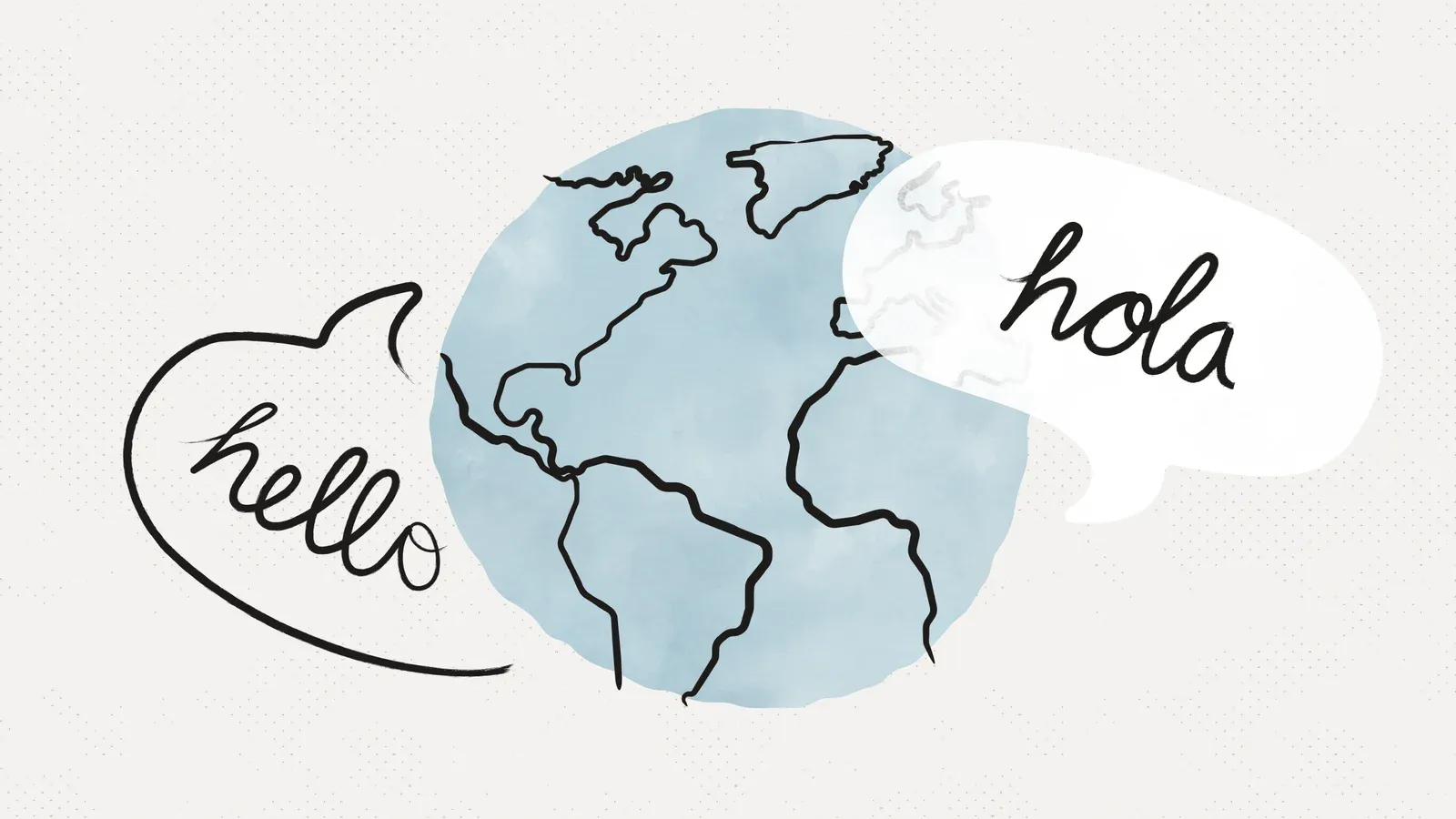
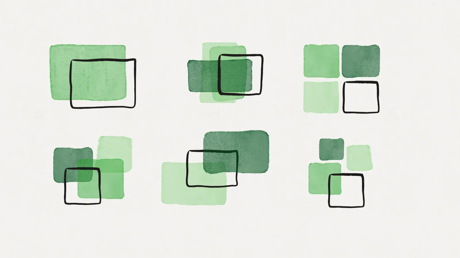
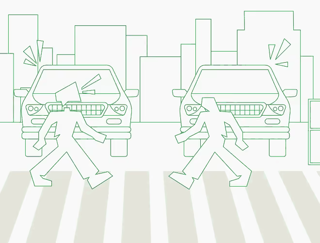



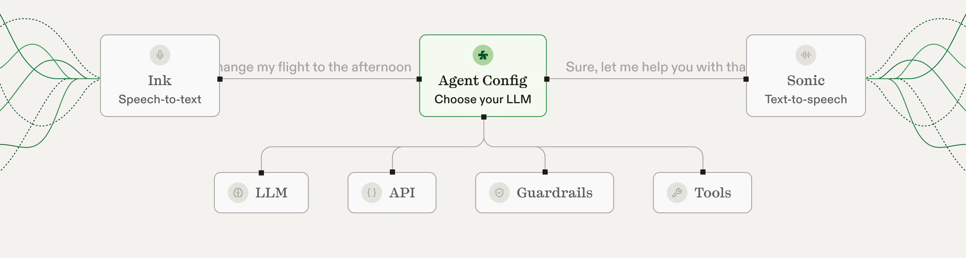
Four related families, all green-led on warm off-white: (1) watercolour washes in Growth-to-Forest greens with loose black hand-drawn outlines (blog covers, share images); (2) thin green line diagrams where words set in the serif ride flowing curves into a mic or waveform node (Ink and Sonic cards, agent pipeline); (3) outlined people in street, office and home scenes, thin pale-green or black lines, sometimes one figure in solid Verdant (Ink, Sonic); (4) soft green watercolour orbs as voice personas (home hero, agents), and isometric pale-green tiles for cloud, on-premise and on-device. A few blog covers and the Agents page add orange or blue watercolour.
Not published: illustration guidelines.
Source: cartesia.ai/blogcartesia.ai/inkcartesia.ai/soniccartesia.aicartesia.ai/agents
Real people and a cinematic film keep the human promise concrete without stock imagery.
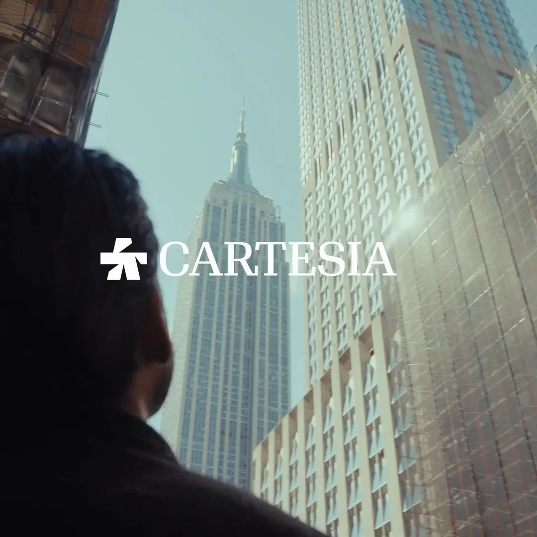
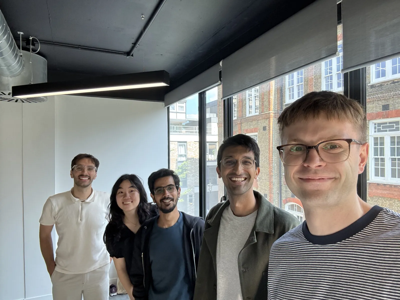
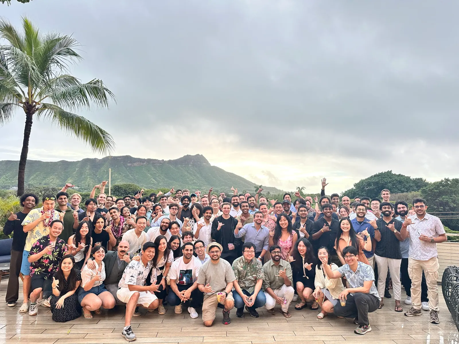
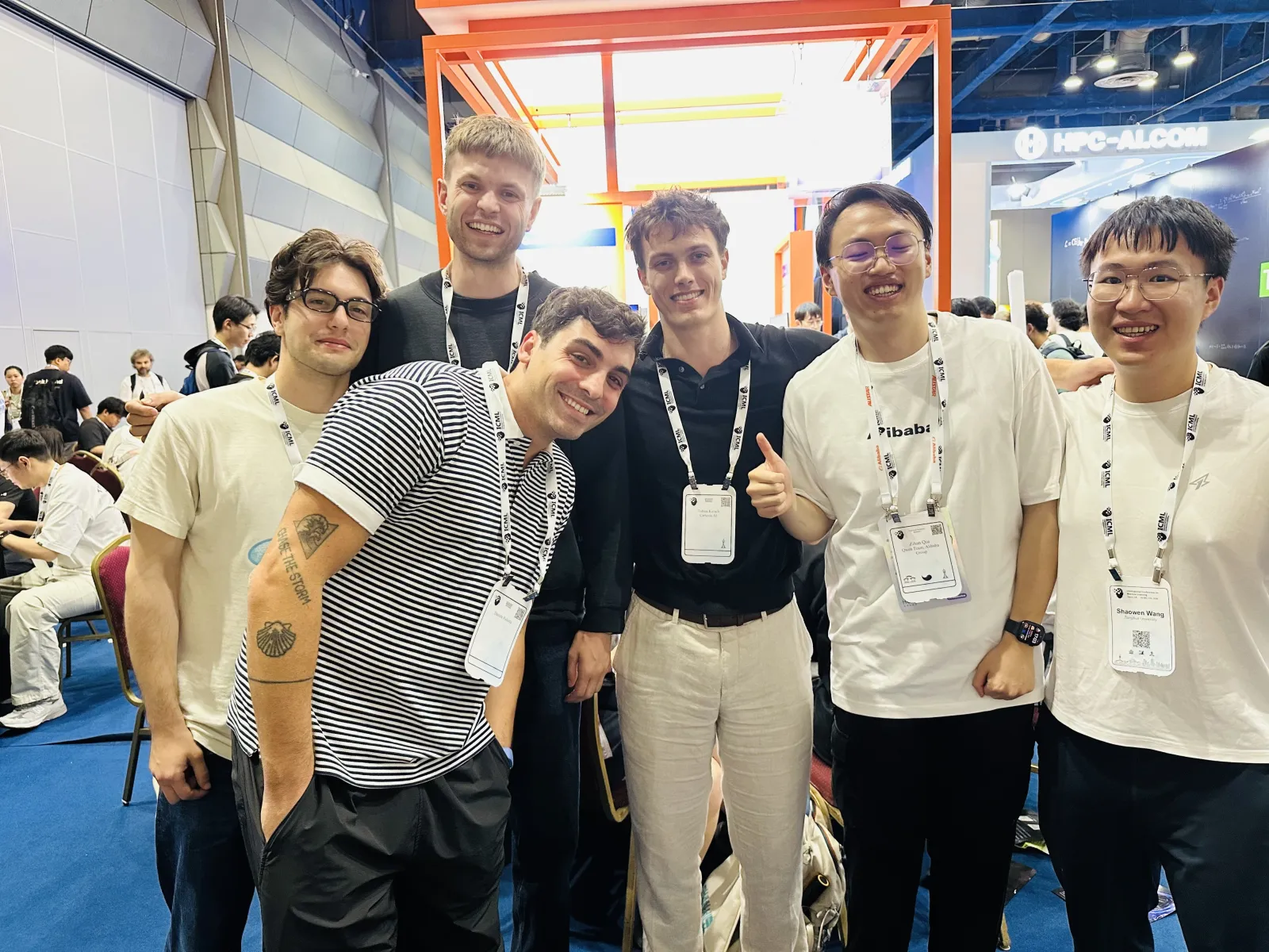
Photography is rare and kept to people and campaign: candid, available-light team snapshots on Company and Careers (offsites, office, conference booth, social), landscape 4:3, uncropped groups, no color treatment; and one campaign film (home testimonial band) shot low-angle in Manhattan with a cool teal grade, a figure in silhouette in the foreground and the white lockup over the image. Photos sit in 8px-radius frames inside ruled cells; text never overlays team photos.
Not published: photography guidelines.
Source: cartesia.ai/companycartesia.ai
Quick, damped motion suits a latency brand.
CSS tokens: feedback 100ms and panels 200ms on cubic-bezier(.23,1,.32,1); accordions 350ms ease; section reveal 700ms cubic-bezier(.32,.72,0,1) with a 60ms stagger. The hero orb carousel rotates voices; the Ink and Sonic cards are short looping videos of the line illustrations.
Not published: motion guidelines.
Source: cartesia.ai
1440 desktop: 1278px column between hairlines at x 81 / x 1359; heroes centred (home, brand) or split headline-left / lead-right (Sonic, Pricing); section heads left-aligned at x 129 with a lead below and an outline button at right; content in two-up or three-up ruled cells. Phone: 390 wide, hairlines 16px in, everything stacks, hero 32px.
Measured from cartesia.ai's headless Playwright (default UA) at 1440x900 and 390x844: computed styles converted to sRGB hex through canvas, hover and keyboard-focus probes, the three desktop dropdowns and the phone menu opened, inline SVGs serialized, and a canvas font calibration against the loaded PP Kyoto and ABC Diatype (2026-11-10).
| Measure | Desktop | Phone |
|---|---|---|
| Page margin | 129px | 33px |
| Section padding | 56px | 32px |
| Hero text width | max 865px, centered | full width |
| Card gap | 40px | 40px |
| Navigation | 64px | 64px |
Hero H1 (Literata 400 stand-in values; real PP Kyoto 500, -0.4px)
PP Kyoto · 40px (phone 32) · line 1.15 · tracking 0.35px · weight 400
Section H2 (Literata 400 stand-in values; real PP Kyoto 500, 0px)
PP Kyoto · 26px · line 1.3 · tracking 0.55px · weight 400
Dropdown product name (Literata 400 stand-in values; real PP Kyoto 500)
PP Kyoto · 18px · line 1.4 · tracking 0.38px · weight 400
Subhead / card title (H3)
ABC Diatype · 20px · line 1.3 · weight 465
Hero orb name
ABC Diatype · 18px (phone 16) · line 1.375 · weight 465
Lead (large)
ABC Diatype · 18px · line 1.3 · weight 400
Footer column head
ABC Diatype · 17px · line 1.41 · weight 465
Body / lead
ABC Diatype · 16px · line 1.5 · weight 400
Card label
ABC Diatype · 16px · line 1 · tracking 0.16px · weight 500
Footer link / footer text
ABC Diatype · 15px (phone 17) · line 1.33 · weight 400
Nav / button / announcement
ABC Diatype · 14px · line 1.43 · weight 500
Small descriptor
ABC Diatype · 12px · line 1.375 · weight 400
Mono group label
IBM Plex Mono · 12px · line 1.375 · weight 500
How Cartesia’s own landing pages are built, observed on cartesia.ai, 2026-11-10. The full measurements are in spec.md.
How our engine applies Cartesia's system to each format. Our recipe from the observed site, its share images and the published brand rules.
| Format | Loudness | Must appear | What varies |
|---|---|---|---|
| Landing page | Build it the way cartesia.ai is built: sticky 64px #fefefe header with the primary lockup, a #f4faef announcement bar, the 1278px column between #e4e3db hairlines, a centred two-tone PP Kyoto hero (40px, Literata stand-in) with a #525150 Diatype lead and a green "Try Cartesia" + outlined "Contact Sales" pair, 16px hatch rails between bands, a ruled logo wall with the "Ranked #1" cell, green line or watercolour illustration on #f3f2ef panels, and the Get started two-up, hiring strip and five-column footer. Product voice with proof. | Hero art (voice orbs, line diagram or demo panel); centred or split hero; which product cards | |
| Social post | Build it the way Cartesia's own single-image offer ad is built: a textured Verdant watercolour ground, the white lockup top left, a white serif setup headline with a white italic serif payoff line under it, one white rectangular button, and the product shown as a dark-chrome browser window bleeding off the bottom edge. Words are Cartesia's: a two-beat line, setup then turn. | Product art inside the browser window (the glitched watercolour orbs with the black phone disc, or another product UI). Observed alternative family for the same job: the retro Windows XP parody (meta-2: XP window on the hill photo, blue underlined serif headline, bevelled button, white lockup bottom centre); use it only for a deliberately playful campaign, never mixed with the green family. When a post must carry no offer, the blog share card illustration family is the closest observed organic look. | |
| Paid social ad | Use the Social post row's green offer family; it is the same job. The retro XP parody is the only other observed single-image family. | Green offer family (meta-1) or XP parody (meta-2); 9:16 versions of the XP ad move the button and copy into a notification dialog low on the canvas with the lockup bottom right. | |
| Paid video ad cover | A single bold idea per frame on a flat or painted ground: hand-drawn phone on Verdant, a notepad checklist under a Forest band, or a CRT TV on a lime sunburst. The frame carries at most a short label; the message sits in the ad text. | Illustration (phone, notepad) or object-in-scene (TV); live-action frames of people are also used but carry no brand element | |
| Video thumbnail: tutorial | The host's cut-out photo on one side over a dark code or UI screen, with a huge white all-caps serif title (a word in Verdant) on the other side. | Host left or right; partner icon and Archie lockup when a partner is involved | |
| Video thumbnail: brand or customer film | A full-bleed cinematic film still with one white serif title (or the white lockup with a partner's logo) and nothing else. | Title centred in the lower third (Multilingual Voices), stacked upper left (Speaking of the future), or a centred lockup pair joined by 'x' (Nugget by Zomato) | |
| Video thumbnail: monthly changelog (series) | Scoped to the 'Updates & changelog' series only: textured Verdant ground, small black month line, two-line white serif title left, white gear with black loop arrows right. | Only the month changes | |
| Event graphic | Forest ground (or Canvas for a co-hosted event), white lockup top left with the event mark beside it, a big serif title whose second part is italic or Growth green, a short description, and icon-led date/time/place rows; one flat illustration on the right or bottom. | Watercolour object with black outline (bottles) or flat geometric scene (coffee truck, fireplace); co-hosted: both logos in a top band, centred title | |
| Email newsletter | One white column: an illustrated 1200x300 header ('What's new from CARTESIA'), a personal greeting and one-paragraph rundown, a Forest rule, then sections with bold sans heads; each feature is a product screenshot on a pale grid ground, a bold head, two lines of body and a green underlined text link ending in an arrow. Events sit as image left, text right. | Number of features and events; one issue observed, so section order is from that issue | |
| Blog share card | Build it the way Cartesia's own blog covers and site share images are built, in one of two families. Photo square: a full-bleed cinematic photograph with the white lockup across the middle and nothing else (the home film poster, 1080x1080). Illustration card: a #f4f4f1 paper ground carrying one centred composition, a watercolour wash (bubble, orb, band or block) overlapped by a black hand-drawn outline object, with no headline, logo or CTA. A number may sit inside the wash in the white serif (Sonic-3.6). A text headline is not observed on any share image; when a post must carry words, use the derived type lines below. | Photo square (campaign, video cover) or illustration card (launch, feature, research post). Wash colour: Verdant/Growth green by default; pale blue for a languages/global topic, orange for scheduling or agents, an orange-red-to-green full-bleed wash for on-device and voice-changer posts. Native size 1600 x 900; the square sizes in the anatomy scale by 1600/1080 on the width. |
Source: cartesia.ai/brand
Your name and logo, Cartesia’s system.
Talk about my brand Use this brand in Claude
Get your brand audit Put your brand in Claude What goes in a brand book
Each value is marked published, observed, our reading or our recipe, with its source. Checked 2026-11-10. Not affiliated with Cartesia.
Tell us what you want to make. We’ll talk through how to put these ideas to work for your brand.