Capital Marketplace
Access a safer, healthier, and more equitable market. Observed
Brand book
Capitolis borrows the look of a private bank or luxury-metal object (black, chrome, silver, rose gold) to signal safety and scale to bank buyers, then uses a single hot magenta to say 'technology company' and to mark the one thing to do. Our reading

The hero ground: a dark ribbon video with white type on home, light silver or rose-gold wave video with black type on inner pages.
Source: capitolis.comcapitolis.com/companycapitolis.com/solutionscapitolis.com/media
Share of the 4174px home page at 1440 by band ground.
Every head and body line renders in Px Grotesk (Light/Regular/Bold), not Public Sans or Helvetica. If a render looks like Public Sans 300 at 36px headings, custom fonts failed.
#FF2EA3 appears only on the filled button, the Contact Us tab, labels/links on black and keyword highlights; no magenta grounds or body text.
Every band is #000000, #FFFFFF, #F2F2F2 or a silver/bronze gradient; no coloured photo or tertiary purple/blue grounds.
The reverse chrome-chevron lock-up sits only on black, top-left, about 202px wide at desktop; never on white.
Hero heads are Px Grotesk Light, Title Case, 80px desktop / 40px phone, at most three lines, no end punctuation.
Every number (100+ institutions, 300+ employees, $1.9B valuation, awards) matches a Capitolis page or release; nothing invented.
Cards and images have square corners; buttons 6px; arrow buttons are 56px white circles.
We’re a financial technology company that unlocks capital constraints, enabling greater access to more diversified capital and investment opportunities. Observed
Access a safer, healthier, and more equitable market. Observed
Optimize balance sheet positions so you can do more with your capital. Observed
Unlock additional revenue opportunities from existing portfolio assets. Observed
At Capitolis, we believe the financial system can—and should—work better for everyone.
Capitolis is a trusted partner to the financial services industry
We innovate at the speed of the global market.
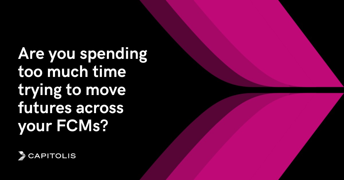
Are you spending too much time trying to move futures across your FCMs?
Purpose and value creation go hand in hand; intentional in everything (paraphrase).
ObservedInnovate to solve big problems, move fast, but never break what matters (paraphrase).
ObservedSeek advice widely, then decide on values, data and logic (paraphrase).
ObservedClear long-term vision, relentless delivery now (paraphrase).
ObservedA professional sports team, not a family: high standards, direct feedback, deep care (paraphrase).
ObservedCategory. financial technology company for the capital markets (financial resource optimization) Observed
Capitolis, the financial technology company, works with leading banks and financial institutions to address critical funding, capital and balance-sheet challenges through its Capital Marketplace, Portfolio Optimization and Securities Lending solutions (paraphrase).
Creating Safer and More Vibrant Capital Markets Observed
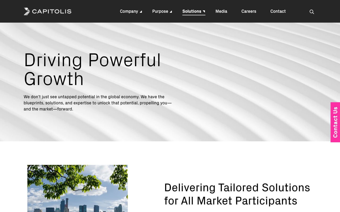
Driving Powerful Growth Observed
An Unrivaled Approach Observed
Powerful Solutions for Capital Markets Observed
Delivering Tailored Solutions for All Market Participants Observed
A Legacy of Lasting Impact Observed
Capitolis is a pioneering technology provider for the capital markets. Observed
We’re creating a better financial system for everyone. Observed
Capitolis to Acquire eSecLending
Capitolis Announces $220 Million in Financing, Including $120 Million Series E at $1.9 Billion Valuation
Super Smart, Badass, Good Humans
We have to be a little crazy to change the world.
Creating Safer and More Vibrant Capital Markets
Creating safer capital markets!
Capitolis to Acquire eSecLending
Big news: we’re buying eSecLending
Our solutions reduce risk, promote the safety of the system, unlock capital efficiency, and enable growth
Guaranteed returns with zero risk
Our platform delivers best-in-class returns for investors!
Our solutions reduce risk, promote the safety of the system, unlock capital efficiency, and enable growth and prosperity for more participants.
assuredinstitutionalpurpose-drivenplainly ambitious
capital marketscapital efficiencyunlockreduce riskfinancial resource optimizationCapital MarketplacePortfolio OptimizationSecurities Lendingmarket participantstrusted partnersafervibranthealthier
Exclamation marks in headlinesPromised or guaranteed returnsHype superlativesSentence-case section heads
Source: capitolis.comcapitolis.com/companycapitolis.com/solutionscapitolis.com/media
Source: capitolis.comcapitolis.com/solutionscapitolis.com/valuescapitolis.com/careers





Only the reverse lock-up is published, always on black.


Only the reverse lock-up is published, always on black. The lock-up is a silver-gradient chevron mark plus white wide-set CAPITOLIS wordmark, always on black (header at 85% black over video, footer #000000). The chevron also appears alone: solid black as the favicon, silver on white as the share image, and as a large chrome 3D render in the home hero.
Source: capitolis.comcapitolis.com/companyinstagram.com/lifeatcapitolis
Unlock capital efficiency across your portfolio
Black and white do almost all the work; silver and bronze gradients add metal between them.

Black and white do almost all the work; silver and bronze gradients add metal between them. Magenta #FF2EA3 lives only on buttons, the edge tab, labels/links on black and the solution keyword ticker. Plum #7A0949 labels press items on light grounds and fills press-card art. The violet-pink gradient fills stat numerals and one thin bar.
Source: capitolis.com/wp-content/plugins/sbx-genesis-collections/css/variables.csscapitolis.com
Creating Safer and More Vibrant Capital Markets
Driving Powerful Growth
Driving Powerful Growth
One family, Px Grotesk, in three weights loaded as three families.
One family, Px Grotesk, in three weights loaded as three families. Light for big heads and numbers, Regular for section heads and body, Bold for buttons, labels, links and the footer.
| Their face | Use | License | Open stand-in |
|---|---|---|---|
| Px Grotesk Light 300 | hero heads, stat numerals, card titles, solution display words | commercial (Optimo); NOT shipped; the site's files are kept in ref/fonts-commercial/ for calibration only | Hanken Grotesk 300 (OFL, fonts/) |
| Px Grotesk Regular 400 | body copy 18/26, section heads 48/56, nav 18/24 | commercial (Optimo); NOT shipped; the site's files are kept in ref/fonts-commercial/ for calibration only | Hanken Grotesk 430 at every size (OFL, fonts/) |
| Px Grotesk Bold 700 | buttons, uppercase labels, text links, footer | commercial (Optimo); NOT shipped; the site's files are kept in ref/fonts-commercial/ for calibration only | Hanken Grotesk 680 at every size (OFL, fonts/) |
| Public Sans (variable 100-900) | theme base; renders only if custom.css fails | OFL | n/a |
Source: capitolis.comcapitolis.com/wp-content/plugins/sbx-genesis-collections/css/custom.css
Do Full-bleed black band with an abstract black-ribbon looping video (video-hero-dark.mp4) under a 90deg black-to-transparent gradient; the logo's two-blade chevron rendered as a large brushed-silver 3D object (hero-chevron-mark.png, about 423x503) on the right half; Px Grotesk Light 80/80 white headline in three lines on the left at x 100.
Black ground with chrome chevron · home hero (697px at 1440) and the logo on every page
Do Px Grotesk Light 300 at 80/80 (40/44 phone), normal tracking, Title Case, three short lines max at about 706px measure; section heads step down to Px Grotesk Regular 48/56.
Px Grotesk Light, very large, Title Case · every hero H1 and every stat numeral
Do #FF2EA3 fill, white Px Grotesk Bold 24px uppercase label, 14px 32px padding, 6px radius; hover #7A0949. The rotated 40px Contact Us tab is fixed on the right edge on every desktop page.
One magenta action · LEARN MORE / SUBMIT buttons and the Contact Us edge tab
Do Soft light-grey silver gradient (bg-silver-gradient.svg, linear 10deg white-to-#BFBFBF washes) or a bronze/rose-gold wash (bg-bronze-gradient.svg, video-hero-light-rosegold.mp4) behind black type; never busy, never coloured.
Brushed-metal gradient grounds · home stats band (808px), /company awards and investors bands, newsroom Media grid, inner-page hero videos
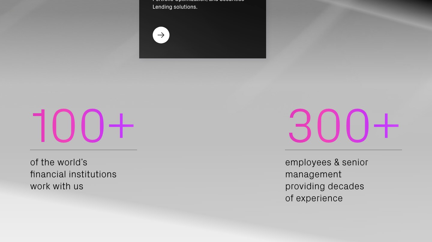
Do Numbers (100+, 300+) in Px Grotesk Light 160px filled with radial-gradient(#DE55F9, #C233FD, #F143BA, #D632BF), a 1px #595959 rule beneath, caption Px Grotesk Light 32/40 black underneath, two stats split left and right at x 100 and x 950.
Violet-to-pink gradient numerals · home stats band
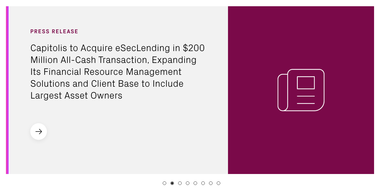
Do Card split 60/40: #F2F2F2 text side (75px 72px padding, plum uppercase PRESS RELEASE label, Px Grotesk Light 32/40 headline, 56px white round arrow button) and a #7A0949 panel with a thin white outline newspaper icon; 9px violet-pink gradient bar on the card edge; dot pagination below.
Plum press card · home Media slider, newsroom featured article
Specimens use sample copy, not Capitolis’s.
Square cards, round arrows and hairline rules on metal grounds.



Square cards, round arrows and hairline rules on metal grounds. Hairline dividers after section heads, round 56px white arrow buttons with soft shadow, square cards, 12px dot pagination, the rotated Contact Us tab, and metal gradient textures (black card gradient behind the Our Solutions card).
Source: capitolis.comcapitolis.com/companycapitolis.com/wp-content/plugins/sbx-genesis-collections/css/custom.css
Thin single-colour outline icons; only the footer social glyphs are filled.
Thin single-colour outline icons; only the footer social glyphs are filled. Strokes about 2px with rounded joins, in one colour: white on black, magenta on white, white on plum. The footer social glyphs (Font Awesome) and the menu close X are filled shapes, as supplied.
Magenta line drawings, for values and culture only.

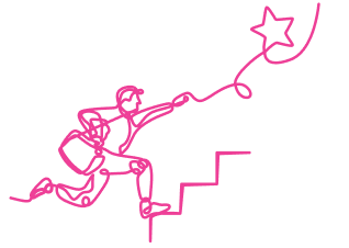
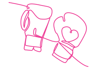
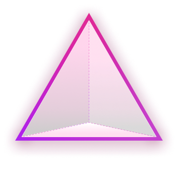
Magenta line drawings, for values and culture only. Single-line drawings of people (holding a globe, climbing, boxing gloves, hiking) mark the five values; one magenta outline triangle with a soft glow and a pale pink fill sits on /careers. The drawings are line only on white; the triangle is the one filled, glowing exception.
Heroes run on abstract metal motion; bands use bright photos of people and places.





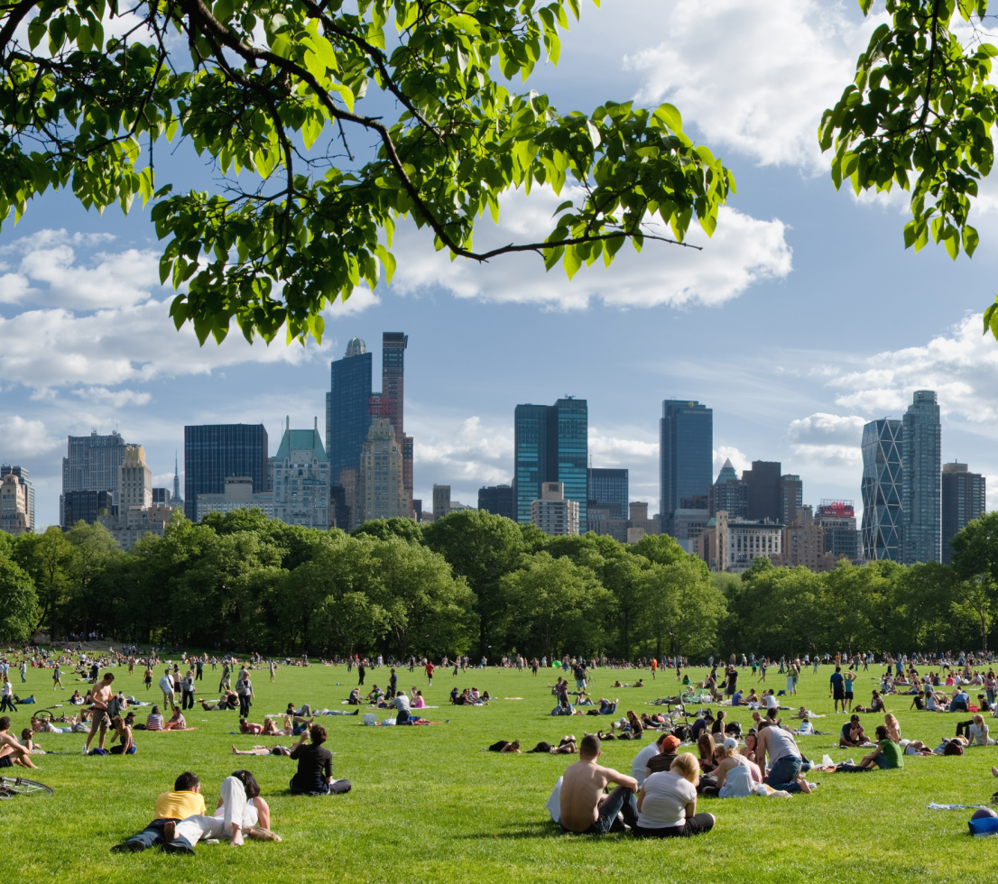


Heroes run on abstract metal motion; bands use bright photos of people and places. Abstract: looping 3D metal ribbon/wave videos (black, silver, rose gold) and the chrome chevron, used for every hero. People and places: bright, airy, desaturated-leaning stock (Getty) of professionals in glass offices, an aerial city roundabout, Central Park skyline; one woman on a white staircase on home. Studio founder portraits on pale grey. Photos sit in square half-width panels beside text, never behind it.
Source: capitolis.comcapitolis.com/companycapitolis.com/solutionscapitolis.com/purpose
Full-bleed bands on a 12-column grid. 100px page margin and 30px gutter at 1440 (30px at 768-1439, 20px below), 100px vertical module spacing at desktop (40px phone). Heads left-aligned; split bands 50/50 with image flush to an edge.
Measured from capitolis.com's https://capitolis.com/ at 1440x900 and 390x844, headless Chromium with a browser UA, custom.css applied, AOS fade-ins forced visible, cookie banner answered (measure/home-*-sections.json, _tmp/boxes-home-*.txt, 2026-11-17).
| Measure | Desktop | Phone |
|---|---|---|
| Page margin | 100px | 20px |
| Section padding | 100px | 40px |
| Hero text width | max 706px, centered | full width |
| Card gap | 30px | 30px |
| Navigation | 96px | 96px |
Hero H1
Px Grotesk Light 300 · 80px (phone 40) · line 1 · tracking 0.55px · weight 300
Solution display word
Px Grotesk Light 300 · 64px (phone 40) · line 1.0625 · tracking 0.5px · weight 300
Stat numeral
Px Grotesk Light 300 · 160px (phone 100) · line 1 · weight 300
Section head (H4)
Px Grotesk Light 300 · 48px (phone 32) · line 1.1667 · tracking 0.25px · weight 430
Ticker keyword
Px Grotesk Light 300 · 40px (phone 24) · line 1 · weight 430
Card title (H5, multicard)
Px Grotesk Light 300 · 32px (phone 28) · line 1.25 · tracking 0.25px · weight 300
Press headline (H5, media slider)
Px Grotesk Light 300 · 32px (phone 24) · line 1.25 · tracking 0.25px · weight 300
Stat caption
Px Grotesk Light 300 · 32px (phone 20) · line 1.25 · tracking 0.25px · weight 300
Subhead (bold)
Px Grotesk Regular 400 · 28px (phone 22) · line 1.1429 · weight 680
Body
Px Grotesk Regular 400 · 18px · line 1.4444 · tracking 0.15px · weight 430
Nav label
Px Grotesk Regular 400 · 18px (phone 17) · line 1.3333 · weight 430
Button label
Px Grotesk Regular 400 · 24px · line 1.0833 · tracking -0.65px · weight 680
Text link
Px Grotesk Regular 400 · 22px · line 0.9091 · tracking 0.75px · weight 680
Eyebrow label
Px Grotesk Regular 400 · 18px · line 1.1111 · tracking 2.4px · weight 680
Footer head
Px Grotesk Regular 400 · 18px · line 1.4444 · tracking 0.95px · weight 680
Footer sub-link
Px Grotesk Regular 400 · 16px · line 1.375 · tracking 1px · weight 680
Legal / copyright
Px Grotesk Regular 400 · 16px · line 1.375 · tracking 0.9px · weight 430
How Capitolis’s own landing pages are built, observed on capitolis.com, 2026-11-17. The full measurements are in spec.md.
Source: capitolis.com/wp-content/plugins/sbx-genesis-collections/css/variables.css



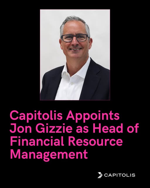
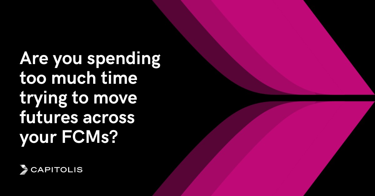
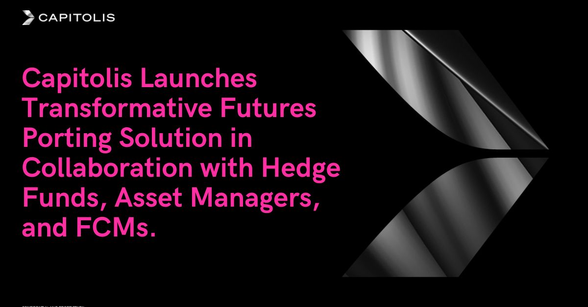

The website, Capitolis's public Instagram (@lifeatcapitolis) and the LinkedIn ad library are the observed formats. LinkedIn ads: 10 live, five distinct single-image creatives, all announcement or product-pain layouts of one family. X showed nothing without login (walled). Meta Ad Library showed only other advertisers, Google shows text ads only, TikTok shows none, Milled returned 403. Deck and email formats are not public.
| Format | Must appear | What varies |
|---|---|---|
| Landing page | Black 96px header with the reverse logo; Light 80/80 hero head on metal video; alternating black, white and silver bands; one magenta button per band; black footer | |
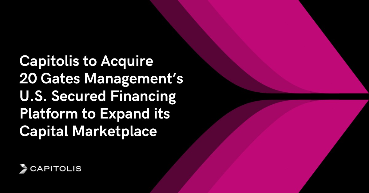
| Social post, landscape (news share card) | #000000 ground; Bold white headline that starts with 'Capitolis' + a verb, left column; the oversized three-stripe magenta chevron OR the chrome ribbon image filling the other half; small reverse logo | chevron on the right (text left) or on the left (text right); a 1-3 line #FFFFFF deck under the headline; the key figure picked out in #FF2EA3; text right with the chevron mirrored on the left, logo bottom right (instagram-4, linkedin-5) |
| Social post, portrait | #000000 ground; one framed portrait or one lock-up image in the top half; Bold #FF2EA3 (or #FFFFFF) headline in the lower half; reverse logo bottom-right | portrait photo vs. partner lock-up on the dark ribbon; headline colour #FF2EA3 for people news, #FFFFFF for holidays/thank-yous |
| Social post | #000000 ground (or #7A0949 for a greeting); the three-stripe magenta chevron on the right 45%; Bold #FFFFFF headline left; reverse logo bottom-left | one phrase in #FF2EA3; a 1-2 line deck; text right with the chevron mirrored on the left, logo bottom right |
| Paid social ad (LinkedIn single image, announcement) | #000000 ground; Bold headline in Title Case that starts with 'Capitolis' + a verb (announcement) or is a question (product pain point); the three-stripe magenta chevron, bleeding off the top and bottom edges; reverse logo in a corner | chevron on the right (text left) or mirrored on the left (text right, logo bottom right); white headline (all news ads) or #FF2EA3 headline with the chrome chevron (launch ad); chevron in plum #7A0949 range instead of bright magenta |
Source: capitolis.comcapitolis.com/companycapitolis.com/solutionscapitolis.com/mediainstagram.com/lifeatcapitolislinkedin.com/ad-library/search
Your name and logo, Capitolis’s system.
Talk about my brand Use this brand in Claude
Get your brand audit Put your brand in Claude What goes in a brand book
Each value is marked published, observed, our reading or our recipe, with its source. Checked 2026-11-17. Not affiliated with Capitolis.
Tell us what you want to make. We’ll talk through how to put these ideas to work for your brand.