Boldness
Boston's brand starts from boldness of opinion, thought and diversity, and a shared City. Published
Brand book
Bold but human: the City underlines what matters, speaks plainly, and keeps the seal for when it must look official. Our reading

Supporting blues and grays when the primaries do not work; full-color or blue-overlay photography.
Source: boston.gov/government/cabinets/innovation-and-technology/brand-guidelines%20(Color;%20Photography)
Our engine's setting, built from their rules.
Cover the B. It should still read as Boston: Montserrat caps on heavy Charles Blue rules, Lora italic blue links, white with gray bands, a red accent used once.
Put another city's seal on it. If the underlines, the red-white-blue and the plain we/you copy still feel at home, it is not specific enough.
The City of Boston, speaking with boldness and warmth: official when it must be, human by default. Our reading
Boston's brand starts from boldness of opinion, thought and diversity, and a shared City. Published
Make things easier and simpler: information that is useful, clear and relevant to each person. Published
Write for the person with the least knowledge: active voice, short lines, plain words. Published
Accessible and inclusive, in every language the City serves. Published
Boston.gov's brand was built in 2016 with the redesign of the site: a bold underlined B, a red-white-and-blue palette with a modern gray, and Montserrat with Lora. The guide calls itself a foundation to build on, added to as the site comes to life.
Strong statements, direct, quick to the point (paraphrase).
PublishedUseful, easy to understand, relevant to the individual (paraphrase).
PublishedEvery problem arrives with a plan to fix it (paraphrase).
PublishedNever arrogant, verbose or exaggerated (paraphrase).
PublishedWe and you; honest, approachable, inclusive (paraphrase).
PublishedCategory. Municipal government: the official website and communications of the City of Boston, Massachusetts Observed
The official City seal (adopted 1823) where authority is needed: bills and non-digital forms.
Boston.gov is the City of Boston's official website: services, public notices, news, events and the people who serve the City, built on the open-source Fleet pattern library.
The guide opens with a short manifesto about boldness, diversity and a shared City, closing on "We are Boston." The homepage carries no slogan: it leads with today's date, City services and people.
Source: boston.gov/government/cabinets/innovation-and-technology/brand-guidelinesboston.gov
Plain, direct words serve people with the least knowledge, second-language readers and Google Translate alike.

ConfidentHelpfulOptimisticHumblePersonal
Five principles: Confident, Helpful, Optimistic, Humble, Personal. The writing guide turns them into plain-language rules: active voice, 11-word headlines, we and you, no may or shall, AP style with City exceptions.
weyoumust
maybemaycouldshallthe subjunctive&@%jargon and legaleseacronyms without explanation
Source: boston.gov/government/cabinets/innovation-and-technology/brand-guidelines
| Tone | Confident, Helpful, Optimistic, Humble, Personal |
|---|---|
| Headline | max 11 words, title case |
| Sentence | 15-20 words |
Source: boston.gov/government/cabinets/innovation-and-technology/brand-guidelinesboston.gov/departments/boston-digital-service/city-boston-writing-guide


Logo files link to the City's own pattern-library URLs. Seals are described, not shown; download them from the City's folders linked in the guide.
The underline says what matters; the B and logo make the City human, the seal keeps its authority.



| Clear space | not published |
|---|---|
| Minimum size | not published |
| Variants | B dark, B light, City of Boston logo dark and white |
The mark is a bold B, underlined in red; the longer City of Boston logo sets CITY and BOSTON in Montserrat-like caps with a small italic "of", BOSTON underlined. Two seals sit beside it: a digital seal for all digital properties and the official 1823 seal for authority on bills and forms.
Source: boston.gov/government/cabinets/innovation-and-technology/brand-guidelines%20(Logo%20and%20seals)
Pay a Parking Ticket
Pay a Parking Ticket
The palette pays homage to the City's past (the Charles, the Freedom Trail) while white space keeps content clear.
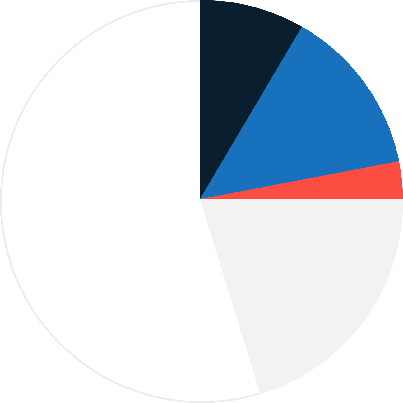
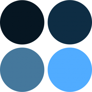
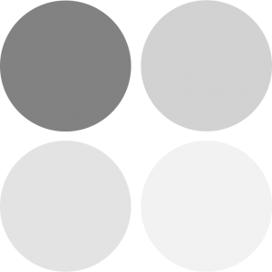
| Charles Blue | #091F2F / Pantone 295C |
|---|---|
| Optimistic Blue | #1871BD / Pantone 285 C |
| Freedom Trail Red | #FB4D42 / Pantone 1788C |
Red, white and blue against a modern gray. White is the primary color of the site; Charles Blue, Optimistic Blue and Freedom Trail Red are bursts that point at notices and functions; supporting blues and grays fill in only when the primaries do not work.
Not published: exact color ratios (the guide shows a proportion image, no numbers).
Source: boston.gov/government/cabinets/innovation-and-technology/brand-guidelines%20(Color)github.com/CityOfBoston/patterns/blob/develop/stylesheets/variables/_colors.styl
We are Boston.
FEATURED RESOURCES
Featured resources
The bold sans and the warm serif together read as the guide's "bold, yet human" voice.
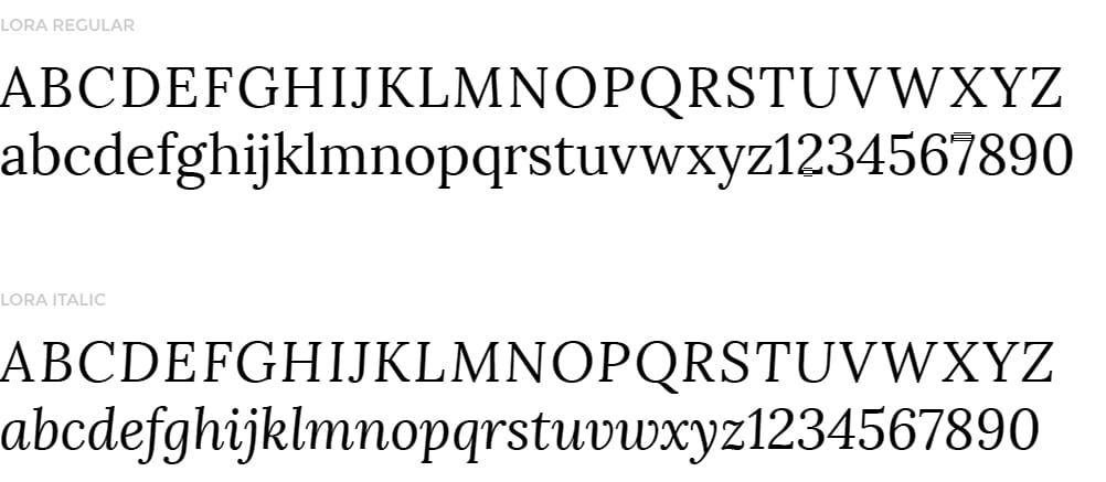
| Their face | Use | License | Open stand-in |
|---|---|---|---|
| Montserrat | Navigation, buttons, primary headers, uppercase bold | Open (SIL OFL 1.1), Google Web Fonts; site serves a 2016-era build | Montserrat No stand-in needed: the real face is open. |
| Lora | Body text; large italic for quotes and secondary text | Open (SIL OFL 1.1), Google Web Fonts | Lora No stand-in needed: the real face is open. |
| Display | Montserrat Bold, uppercase |
|---|---|
| Text | Lora Regular and Italic |
| Georgia / Arial |
Two Google Web Fonts chosen for contrast and boldness: Montserrat, inspired by urban street posters, for navigation, buttons and primary headers, always uppercase bold; Lora, a calligraphic contemporary serif, for body text small and for quotes large and italic. Replacement faces are named for Arabic and Chinese.
Source: boston.gov/government/cabinets/innovation-and-technology/brand-guidelines%20(Typography)github.com/CityOfBoston/patterns/blob/develop/stylesheets/variables/_fonts.styl
FEATURED RESOURCES
Featured resources
The underline · the B, the BOSTON wordmark, links, and every section header
LATEST NEWS
Uppercase header on a heavy rule · every homepage section
FRIDAY, OCTOBER 30
Date strikethrough · the daily status row under the hero
CITY OF BOSTON
Blue photo overlay with type · heroes
Pay a Parking Ticket
Lora italic links · every card title, kicker and lead
OCT 31
Date ribbons · news and event cards
Specimens use sample copy, not City of Boston’s.
The underline is the logo's idea carried into every layout.
| Header rule | 8px #091F2F |
|---|---|
| Input border | 3px #091F2F |
| Icon stroke | 3px |
Boston underlines: the red bar under the B and BOSTON, 8px Charles Blue rules under every section header, the date set in a strikethrough. Square edges everywhere; circles only for headshots and icon frames; bookmark ribbons carry dates.
Source: boston.gov/government/cabinets/innovation-and-technology/brand-guidelinesboston.gov
Three families: experiential icons, bold line icons with 3px strokes and mostly hard edges, for actions; departmental icons, solid Charles Blue shapes underlined in Freedom Trail Red, for wayfinding; small circular icons inside a 3px circle, used inline and on the homepage.


| Stroke | 3px |
|---|---|
| Color | Charles Blue |
Source: boston.gov/government/cabinets/innovation-and-technology/brand-guidelines%20(Iconography)
Three subjects (people, skylines, landmarks) and two treatments (full color, and Optimistic Blue overlay with type).
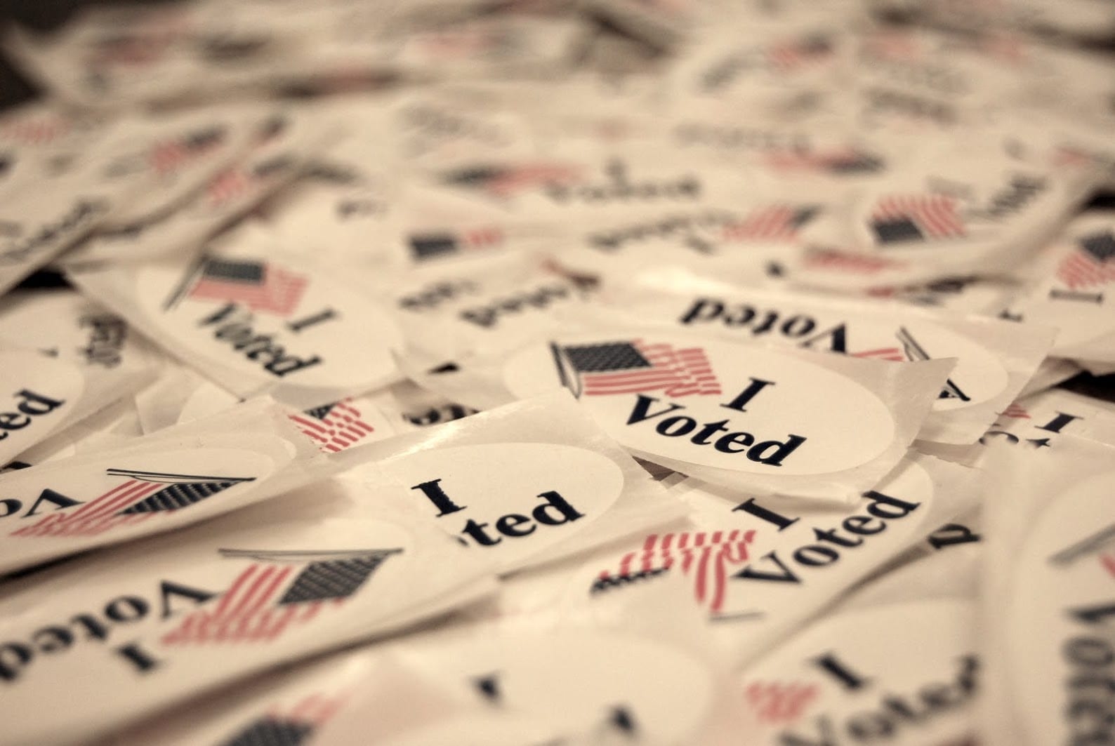

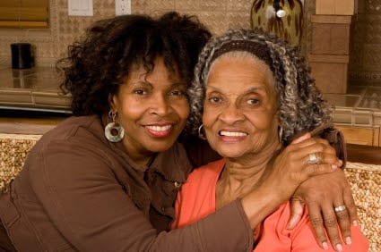
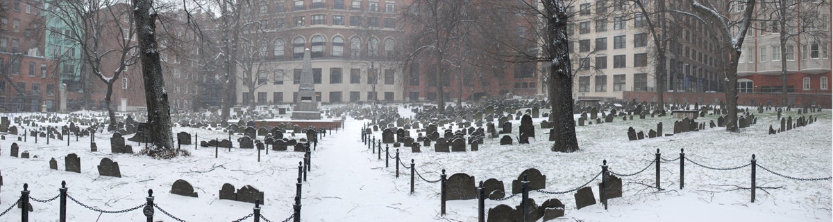
Three subjects (people, skylines, landmarks) and two treatments (full color, and Optimistic Blue overlay with type). People are candid and close, in the less famous parts of Boston, never models, stock or selfies; skylines and landmarks from unusual, human-level viewpoints. Headshots are always circles.
| Treatments | full color; 60% Optimistic Blue overlay with type |
|---|---|
| Headshots | circle |
Source: boston.gov/government/cabinets/innovation-and-technology/brand-guidelines%20(Photography)
Motion is almost absent: buttons turn red on hover, cards fill blue, the menu drawer fades, and the header language label cycles.
| Button hover | #1871BD to #FB4D42 |
|---|---|
| Menu | opacity 0.5s |
Source: github.com/CityOfBoston/patterns
White dominant pages of alternating white and light gray bands in a 1200px container; uppercase section headers on heavy rules; card grids of four, three or two; one full-bleed row of flat color tiles.
Measured from boston.gov's Page anatomy measured from computed styles on boston.gov at 1440 and 390 (2026-10-30); tokens from the open-source Fleet stylesheets; rules from the boston.gov Brand Guidelines and Writing guide..
| Measure | Desktop | Phone |
|---|---|---|
| Page margin | 120px | 39px |
| Section padding | 56px | 35px |
| Hero text width | max 1200px, centered | full width |
| Card gap | 28px | 28px |
| Navigation | 65px | 65px |
Hero H1
Lora · 90px (phone 40) · line 1 · tracking -1px · weight 700
Section header
Lora · 45px (phone 20) · line 1 · tracking -1px · weight 700
Hero kicker
Lora · 35px (phone 18) · line 1.32 · weight 400
Lead (stay connected)
Lora · 30px (phone 18) · line 1.5 · weight 400
Guide tile title
Lora · 30px (phone 20) · line 1 · weight 700
Mayor subhead
Lora · 30px (phone 18) · line 1.08 · tracking 1px · weight 600
Date strikethrough
Lora · 28px (phone 21.45) · line 1 · weight 700
Card title link
Lora · 25px (phone 18) · line 1.32 · weight 400
News headline
Lora · 22px (phone 19.56) · line 1.27 · tracking 0.4px · weight 400
Body
Lora · 18px (phone 16) · line 2.17 · weight 400
Card description
Lora · 18px (phone 15) · line 1.5 · weight 400
Status note / councilor title
Lora · 16px (phone 14) · line 1.5 · weight 400
Date ribbon
Lora · 18px (phone 16) · line 1 · weight 700
Person name / status title
Lora · 18px (phone 16) · line 1.1 · weight 400
Button
Lora · 16px (phone 14) · line 1.125 · tracking 1px · weight 700
Form label
Lora · 16px (phone 14) · line 1.4 · tracking 1px · weight 700
Department label
Lora · 16px (phone 14.2) · line 1.22 · weight 400
Nav link
Lora · 14px (phone 12) · line 4.64 · tracking 1px · weight 400
Footer link
Lora · 14px (phone 12) · line 1 · tracking 1px · weight 500
Banner text
Lora · 13.32px (phone 11.84) · line 1.3 · weight 400
How City of Boston’s own landing pages are built, observed on boston.gov, 2026-10-30. The full measurements are in spec.md.
Source: boston.gov/government/cabinets/innovation-and-technology/brand-guidelinesgithub.com/CityOfBoston/patternsboston.gov
How our engine applies Boston's system to each format. This is our recipe built from their rules, not something the City publishes. Level = how much color the format carries (0 plain, 5 full color blocks).
| Format | What they did | Source |
|---|---|---|
| presentation slides | Three Google Slides decks for City employees to duplicate. | boston.gov/government/cabinets/innovation-and-technology/brand-guidelines%20(Employee%20toolkit) |
| documents | Blank document, memo, report and year-in-review templates in Google Docs. | boston.gov/government/cabinets/innovation-and-technology/brand-guidelines%20(Employee%20toolkit) |
| email signature | Two signature options to copy. | boston.gov/government/cabinets/innovation-and-technology/brand-guidelines%20(Employee%20toolkit) |
| newsletter | Upaknee layout and size guide (PDF) for the newsletter system. | boston.gov/government/cabinets/innovation-and-technology/brand-guidelines%20(Layouts%20for%20media%20platforms) |
| phone and desktop backgrounds | Branded wallpapers. | boston.gov/government/cabinets/innovation-and-technology/brand-guidelines%20(Employee%20toolkit) |
| Format | Loudness | Must appear | What varies |
|---|---|---|---|
| Landing page | Build it the way boston.gov is built (kit.spec.page, homepage voice): Charles Blue banner, white header with red MENU square and the City of Boston logo; photo hero under 60% Optimistic Blue with Lora italic kicker and Montserrat 90px caps; uppercase section headers on 8px Charles Blue rules; alternating white and #F3F3F3 bands; square white cards with Lora italic blue titles; square Optimistic Blue buttons; Charles Blue footer with the white B | which sections and how many cards; a row of flat color tiles (blue, Charles Blue, red) once per page | |
| Deck | White slides, Montserrat caps headers on a Charles Blue rule, Lora text, the B in a corner | a blue-overlay photo title slide | |
| Proposal page | White ground, Charles Blue headers, plain-language copy, one Optimistic Blue button | one light gray band | |
| Social post | Candid photo under 60% Optimistic Blue with Montserrat caps, or a flat Charles Blue ground | Lora italic kicker | |
| Georgia and Arial fallbacks, white ground, Optimistic Blue button | a Charles Blue header strip | ||
| Print notice | Official seal where authority is needed; Charles Blue type; plain language | none |
Source: boston.gov/government/cabinets/innovation-and-technology/brand-guidelinesboston.gov/departments/boston-digital-service/city-boston-writing-guide
Your name and logo, City of Boston’s system.
Use this kit for my brand Use this brand in Claude
Get your brand audit Put your brand in Claude What goes in a brand book
Each value is marked published, observed, our reading or our recipe, with its source. Checked 2026-10-30. Not affiliated with City of Boston.