Letterbox pioneers
Bloom & Wild invented letterbox flowers in 2013: slim boxes that fit through the door so nobody has to be in. Observed
Brand book
Bloom & Wild dresses a practical online shop like a thoughtful gift: a neutral, square, charcoal-and-white frame that stays out of the way, a bold bookish serif and warm linen that make it feel personal and British, and small yellow "highlighter" moments that read like a handwritten note. Seasonal colour fields let each campaign feel new without touching the frame. Our reading

The seasonal colour field and photography of the current campaign (forest and burgundy for Christmas 2026 on the home page; plum, bottle green and pine on product tiles)
Share of the 6959px desktop home page (split hero, footer included) by band ground, measured 2026-11-18; photography fills half of each split band and the image cards..
Our engine's setting, built from their rules.
Only the emotional band head is the bold serif (Tiempos, or Source Serif 4 800 at "opsz" 16); everything else is Unica 77 or Arimo at 400/500, sentence case.
Text and buttons are #262626 on white; the only pure black is the logo file.
Photos, cards and bands have 0 radius; buttons 2px; only search is a pill.
#FDF888 only on banners, tabs and tags, always with #262626 text.
Deep campaign colours fill half a split with white type; never two in one band and never gradients.
Every number (4.6 average, 76,438 reviews, 30m+, B Corp 106.5) matches the site's current wording and date; "most-loved online florist" keeps its asterisk footnote.
Sentence-case heads with no end punctuation, we/you, British spelling, the ampersand in the name.
We're the UK's most-loved online florist* Observed
Bloom & Wild invented letterbox flowers in 2013: slim boxes that fit through the door so nobody has to be in. Observed
Small acts of care matter as much as grand gestures; this idea shapes what it sells, how it packs and how it talks. Observed
Flowers are still the heart, but hampers, treats, pamper sets and baby gifts now make up 35% of the range. Observed
B Corp since 2023, recyclable packaging, net zero by 2045 and the Thoughtful Marketing Movement opt-outs. Observed
Customer Delight team goes the extra mile if anything is not perfect; rated Excellent on Trustpilot. Observed
Counting down the days
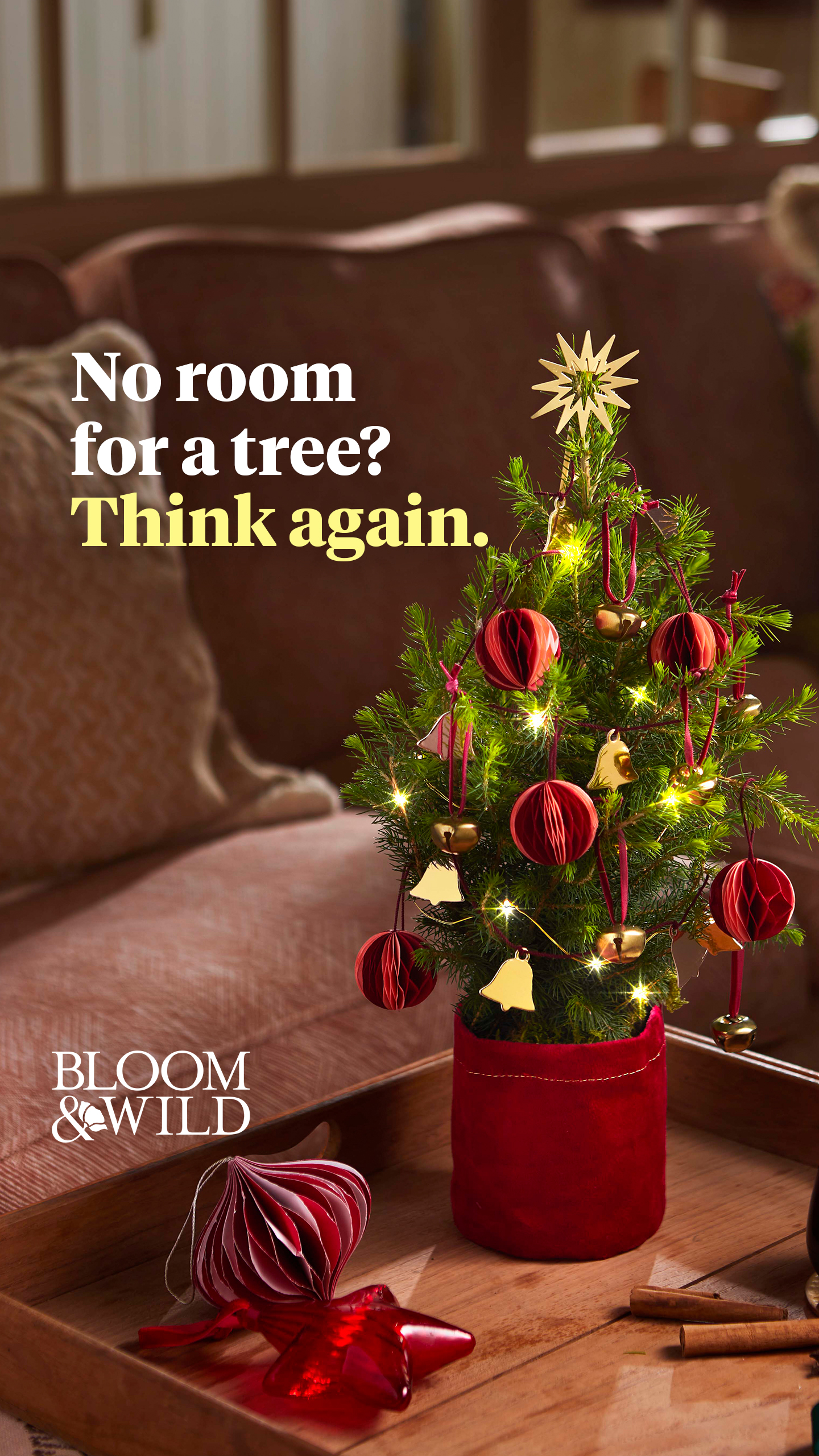
Tiny Trees, big magic
We treat every order like it's our own
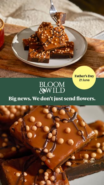
Big news. We don't just send flowers.
The founders had both sent bouquets that arrived late or needed a signature, so in 2013 they tested a letterbox-sized box from New Covent Garden Market; within months they shipped thousands a week, on their own technology and app (paraphrase).
Small acts of care matter as much as grand gestures (paraphrase).
ObservedLet anyone opt out of messages about painful occasions such as Mother's Day (paraphrase).
ObservedResponsible growers, recyclable packaging, net zero by 2045, charity partners such as Carers Trust and Tommy's (paraphrase).
ObservedTreat every order like our own; the Customer Delight team fixes anything less than perfect (paraphrase).
ObservedCategory. UK online flower and gift delivery: letterbox and hand-tied flowers, plants, hampers, food and drink, pamper gifts, cards, subscriptions and corporate gifting Observed
Bloom & Wild is a UK online flower and gifting brand, founded in London in 2013 by Aron Gelbard and Ben Stanway. It pioneered letterbox flowers and now sends flowers, plants and gifts, as part of the Bloom & Wild Group with bloomon and Bergamotte (paraphrase).
Counting down the days Observed
Don't wait to care wildly this Christmas. Observed
Hi, we're Bloom & Wild Observed
We're the UK's most-loved online florist* Observed
We treat every order like it's our own Observed
Happiness guaranteed Observed
Tiny Trees, big magic Observed
Caring wildly for people and planet Observed
Making the right kind of impact Observed
We believe in doing business thoughtfully. Observed
Feel-good flower subscriptions Observed
The UK's top rated flower delivery company Observed
Don't wait to care wildly this Christmas.
Hi, we're Bloom & Wild
We're the UK's most-loved online florist*
Caring wildly for people and planet
We believe in doing business thoughtfully.
Feel-good flower subscriptions
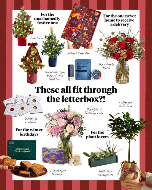
These all fit through the letterbox?!
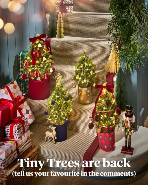
Tiny Trees are back (tell us your favourite in the comments)
Tiny Trees, big magic
TINY TREES. BIG MAGIC!
Join our (free) rewards club
Join our exclusive VIP loyalty programme today
Henry cares wildly that your flower delivery arrives on time
Our logistics team is committed to on-time delivery
Our miniature Christmas trees are compact and come with decorations and lights included.
They may be small, but our letterbox Christmas trees bring main character energy to any room.
Customer satisfaction is our top priority. Contact support if there is a problem with your order.
We treat every order like it's our own. If something isn't 100% right with your flower delivery or gift, our Customer Delight team will always go the extra mile to fix it.
Sounds like a thoughtful friend, not a retailer.
warmthoughtfulplayfulplain-spoken British
Warm, chatty British English. Sentence-case heads; short sentences and fragments; we to you; parenthetical asides; "care wildly" as a verb with named staff; FAQ answers that open with "Yes." or "No."
care wildlycaring wildlythoughtfulletterbox flowersCustomer Delight teamHappiness guaranteedshow you caredelight
"Bloom and Wild" spelled out in copy (the site always writes the ampersand)ALL-CAPS headlinesoccasion marketing without an opt-out (Thoughtful Marketing Movement)
Source: bloomandwild.combloomandwild.com/about-usbloomandwild.com/businessbloomandwild.com/careersfacebook.com/ads/library




The site never shows a reversed logo: the header is always white and the footer linen. Paid social does use a white wordmark on a pine band or a dark photo; no white file is published, so a white version is a recolour of the supplied single-colour (#000000) SVG. Clear space and minimum size are not published.
A classic, bookish serif mark with one botanical flourish says florist and gift-shop at once.

| Wordmark | BLOOM / &WILD stacked, black, 130x60 in the 1440 header, about 90x40 centred on phone |
|---|---|
| Mark | flowered ampersand, square favicon and app icon |
| Footer | ampersand-with-bouquet illustration, 160x147, on #F9ECD7 |
A stacked wordmark in serif capitals, BLOOM above &WILD, with a flower growing out of the ampersand, one colour (#000000) top left in the white header. The mark alone (flowered ampersand) is the favicon and app icon; the footer uses a larger illustrated ampersand holding a bouquet on linen.
Not published: clear space; minimum size; reversed version.
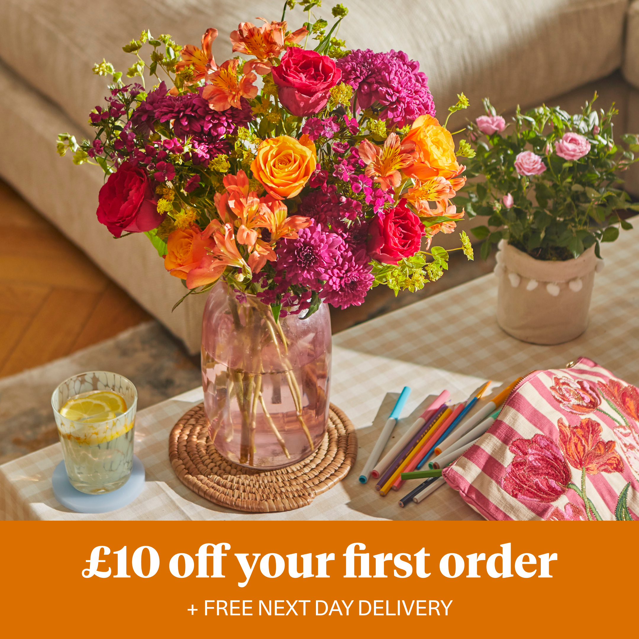
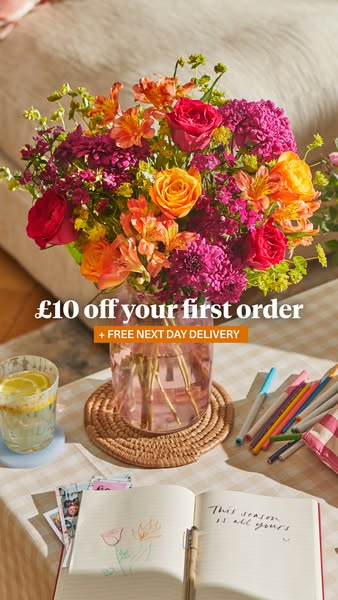
Take £10 off your first order
Take £10 off your first order
A quiet frame that lets the flowers and the seasonal campaign colour carry emotion.
| Ink | #262626 (never #000 text) |
|---|---|
| Ground | #FFFFFF; linen #F9ECD7 bands |
| Accent | #FDF888 banners, tabs, tags; text on it #262626 |
| Campaign | one of #212C12, #700E32, #752C38, #034A32, #2D5443 per band, with white text |
| Muted | #534E46 eyebrows; #E2E0DC field borders |
A quiet neutral frame. White page and charcoal type; linen for the warm frame; highlighter yellow for small attention moments; one deep seasonal colour per campaign band; amber only on stars. Photos supply most of the colour.
Not published: official palette names and usage rules.
Counting down the days
A warm bookish serif against a neutral Swiss grotesk: personal and practical in one page.
| Their face | Use | License | Open stand-in |
|---|---|---|---|
| Tiempos Headline | Emotional band heads, hero heads and H1s | Commercial (Klim Type Foundry), self-hosted as TiemposHeadlineWeb-Bold woff2; stand-in Source Serif 4 800 at font-variation-settings "opsz" 16 | |
| Unica 77 LL | Body, nav, captions | Commercial (Lineto), self-hosted as Unica77LLWeb-Regular woff2; stand-in Arimo 400 | |
| Unica 77 LL | Informational heads, card titles, FAQ questions, buttons, prices | Commercial (Lineto), Unica77LLWeb-Medium woff2; stand-in Arimo 500 |
| Display | Tiempos Headline 700: 52/64 H1, 44/56 band heads, 32/40 tile heads (phone 36/40, 32/40, 24/32) |
|---|---|
| Heading | Unica 77 500 (real weight): 32/40 H2, 24/32 card titles and FAQ questions, 20/28 product names; the stand-in Arimo weights per size are in the type ladder |
| Body | Unica 77 400: 16/24; 14/20 supporting |
| Buttons | Unica 77 500 16px |
Two families. Tiempos Headline Bold for big emotional heads; Unica 77 Regular and Medium for body, informational heads, card titles, buttons and prices. Sentence case throughout, no tracking.
Not published: type scale.
Source: bloomandwild.combloomandwild.com/about-usbloomandwild.com/business
Do Tiempos Headline 700 (stand-in Source Serif 4 800, "opsz" 16, no tracking) at 44/56 for the emotional band head, sentence case, #262626 on white or #FFFFFF on a campaign colour; everything else Unica 77 (stand-in Arimo): 400 body 16/24, informational heads 32px on a 56px line (phone 24px on 40px lines) at Arimo 600, 24/32 tab titles at Arimo 500, 24/32 FAQ questions at Arimo 600 (Arimo 500 at 20/24 on phone).
Bold serif headline over a plain grotesk · every page: band heads, hero heads, H1s; body and secondary heads below them
Do #FDF888 rectangle, 2px radius, hugging a 24/32 Unica 500 #262626 title with 8px 12px padding (20/24 on phone), centred on the bottom edge of a square photo: 48px single-line tabs overlap the photo by 24px; blog tabs grow to at most the card width minus 8px each side (302 at 1440, 136 on phone) and wrap inside it. On banners a full #FDF888 ground 164px tall at 1440 inset by the 48px page margin.
Highlighter-yellow title tabs over photos · home category carousel ("Seasonal stems", "Festive bakes"), blog cards, the Take £10 off banner, "new" nav tags, Bestseller badge
Do #F9ECD7 full-width bands: a 30px top bar with 14px links, the 513px footer with the illustrated ampersand-bouquet mark at left, and full-bleed or 48px-inset bands holding a 32px Unica head on a 56px line and one dark button.
Linen frame · top utility bar, footer, promise and rewards bands, How it works
Do The text side of a split band (hero: photo on 7 of 12 columns, field on the other 5 with a 464px text block; seasonal band: 6/6 with a 576px text block; photo 0 radius) filled with one deep colour from the season (forest #212C12, burgundy #700E32, pine #2D5443, bottle green #034A32, plum wine #752C38), centred white Tiempos 44/56 head, 16/24 white body, white solid + white outline buttons or an underlined white link.
One deep seasonal colour field per campaign band · home hero text panel, the Tiny Trees split band, promo tiles in the product grid
Do 48px tall, 2px radius, 13px 19px padding inside a 1px border (20px edge to label; padding 0 20px if the ring is an inset shadow), 16px weight 500 label; solid #262626 with white text, or the outline twin (white fill, 1px #262626 border). Secondary actions are underlined 16-18px weight 500 text links ("Shop all", "Get help here").
Square charcoal buttons · every CTA (Claim offer, View, Send, Join now, Send a gift)
Do Rich, warm, saturated scenes of the gift in a real home (festive tables, kitchens, sofas), often with hands; product cards on a soft white daylit set with window shadows. All photos 0 radius, 1:1 in cards, 4:3 or 5:4 in split rows, wide 2.86:1 page headers.
Warm, styled lifestyle photos, square-cut · everywhere imagery appears
Specimens use sample copy, not Bloom and Wild’s.
A crisp, editorial frame with a few handmade touches.
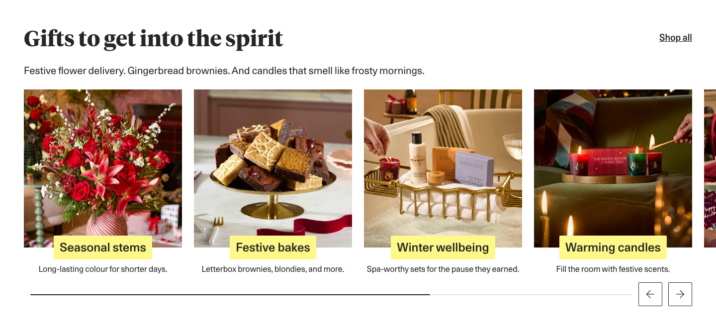


Square everything: photos, cards, banners. 48px buttons with 2px corners, charcoal solid or outline. Yellow tabs overlapping the bottom of card photos. A pill search field (the one round element) and circular category thumbnails with labels. Carousels with square outline arrow buttons and a thin progress line. FAQ lists with hairline dividers. White review cards with a 1px border and green Trustpilot stars (third-party).
Not published: component library.
Light icons match the light grotesk and stay out of the way.






Plain charcoal line icons. Thin outline UI icons (search, account, heart, basket, chevrons, arrows) in charcoal #262626 at 20-24px, drawn as filled paths; solid black flat pictograms (card, greetings card, lorry, hand with sparkles) at 80px on the Business page; amber solid review stars.
Not published: icon set name or grid.
Lettering on an arc feels hand-made and joyful, like a florist's stamp.

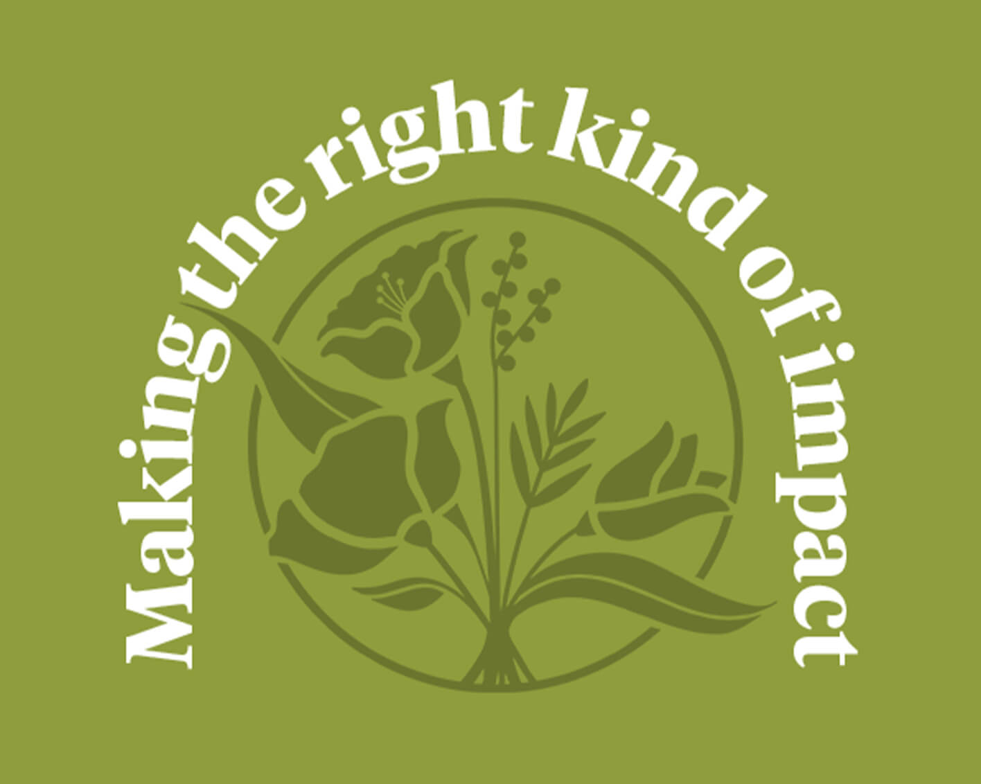


Lettering more than drawing. Used sparingly as lettering and botanical decoration: curved, arched bold-serif lettering ("Happiness guaranteed" in pine #2D5443; "Making the right kind of impact" and "The Thoughtful Marketing Movement" in white), a tonal olive botanical roundel, and flat stencil-cut tulips and leaves (orange, red, dark green) on the gift card. Flat fills, no outlines, no gradients.
Not published: illustration style guide.
Source: bloomandwild.combloomandwild.com/about-usbloomandwild.com/business
Real homes and warm light make the gift feel personal and give the campaign its mood.

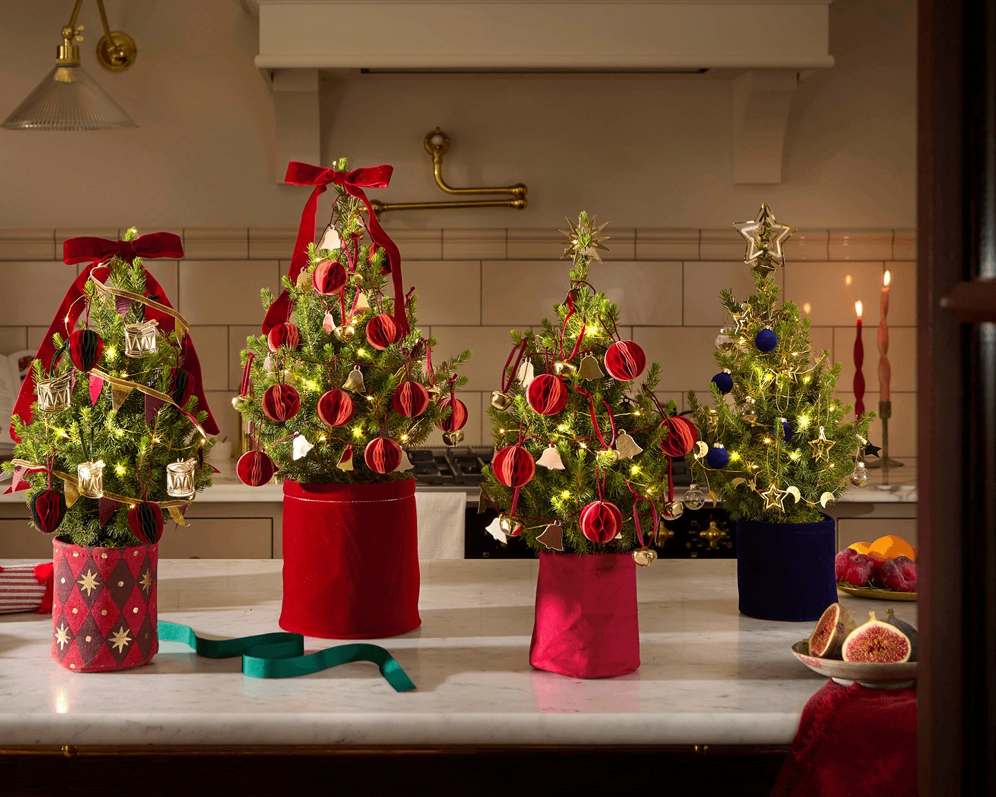


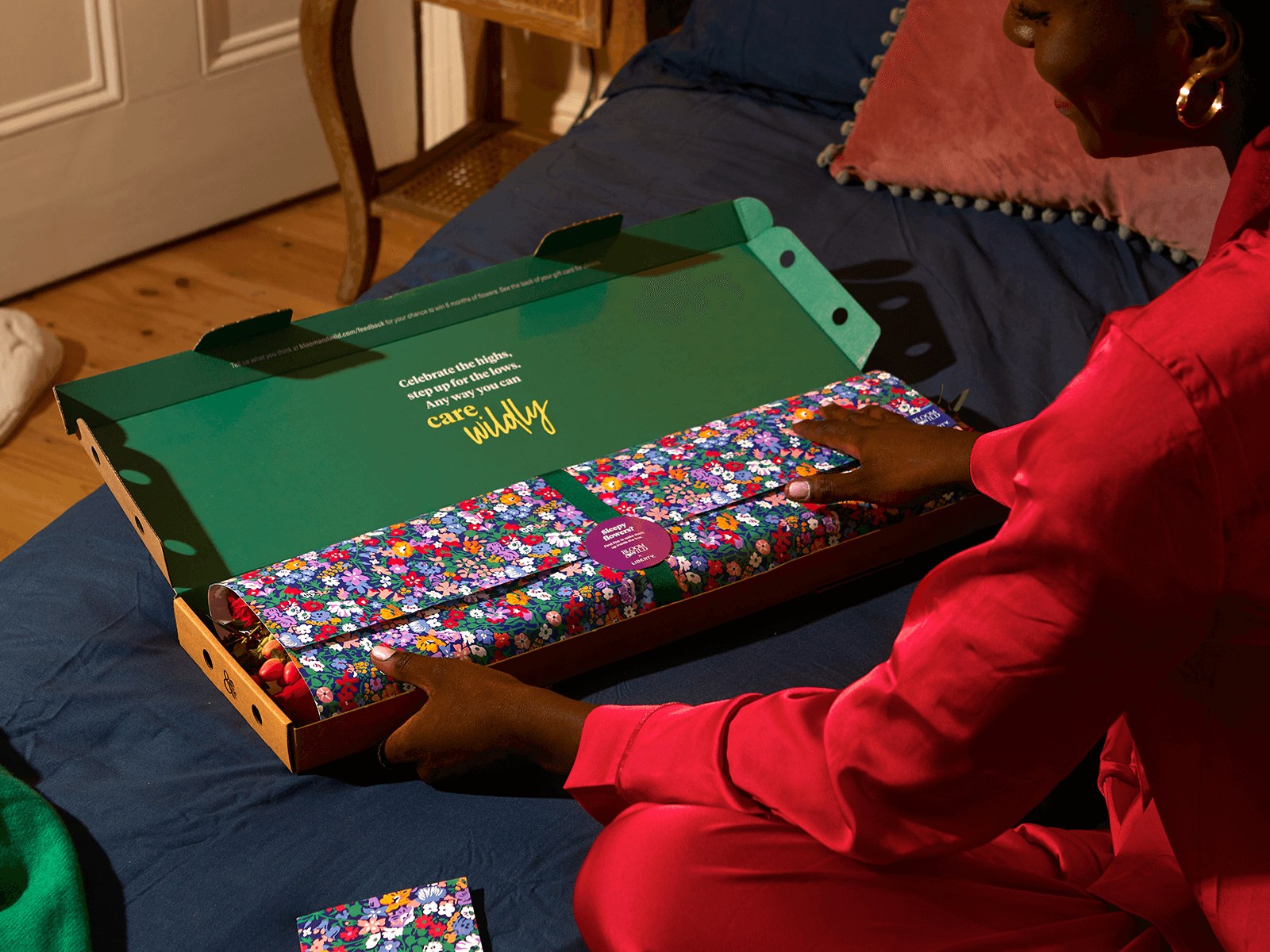
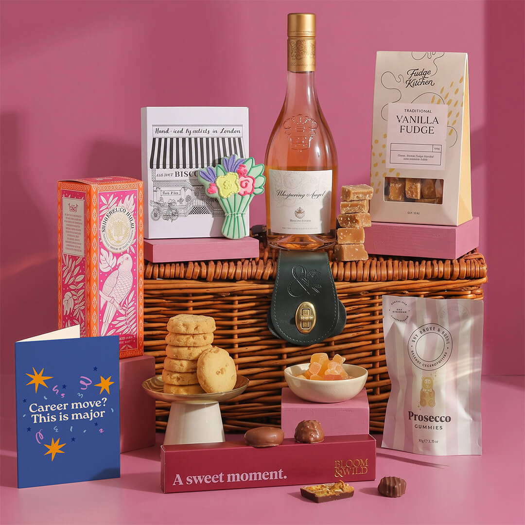

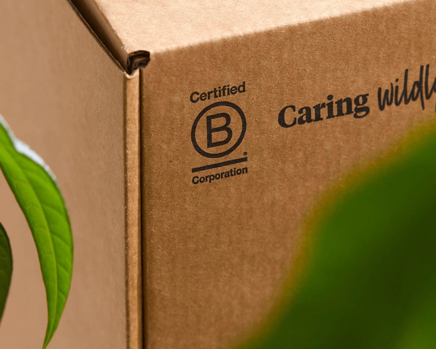
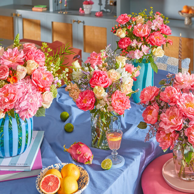

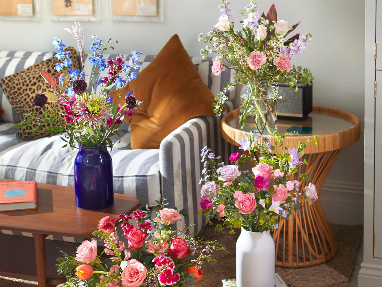
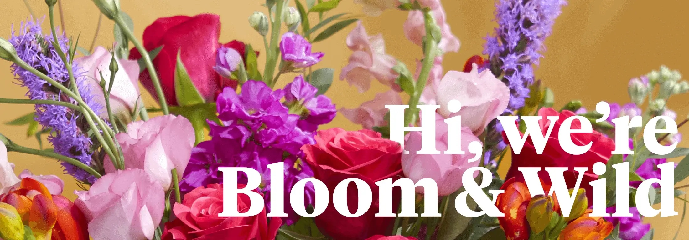
Warm, lived-in scenes carry the gift. Three families: (1) styled lifestyle scenes in warm, lived-in British homes (festive tables, kitchens, sofas, beds) with the gift in use, saturated reds, pinks and greens, warm lamp or window light, often hands and partial figures; (2) product cards on a soft white daylit set with window-shadow patterns, the bouquet in a glass vase on a rattan tray, square; (3) a few portraits (founder at home, a grower) and packaging close-ups. Photos meet text side by side in split bands (7/5 hero, 6/6 seasonal band), under yellow title tabs, or as a wide header with white serif lettering over it.
Not published: photo guidelines.
Source: bloomandwild.combloomandwild.com/about-usbloomandwild.com/businessbloomandwild.com/send-flowers
1440 desktop with 48px page margins (1344px content), 24px on phone. Header: 30px linen utility bar, white header with logo left, pill search centre, icon links right, a text nav row and circular category thumbnails. Bands: split bands with photo sides alternating (hero 7/5 with a 464px text block; seasonal band 6/6 with a 576px text block), full-width carousels of square cards, inset banners, centred 660px FAQ and long-copy columns. Linen footer with mark, socials, app badges, B Corp logo and five link columns. Phone stacks everything into one column; carousels stay swipeable.
Measured from bloomandwild.com/%20(computed%20styles%20of%20the%20rendered%20elements%20at%201440x900%20and%20390x844,%20headless%20Chromium,%20after%20network%20idle%20+%203s%20and%20cookie%20%22Reject%20all%22,%202026-11-17)'s headless Chromium at 1440x900 and 390x844 after network idle + 3s, cookie "Reject all"; computed styles of the rendered elements (the span inside each heading), band rectangles and inner padding.
| Measure | Desktop | Phone |
|---|---|---|
| Page margin | 48px | 24px |
| Section padding | 48px | 24px |
| Hero text width | max 464px, centered | full width |
| Card gap | 24px | 24px |
| Navigation | 143px | 143px |
Page H1 (About, Business)
Tiempos Headline · 52px (phone 36) · line 1.23 · weight 800
Hero and section head
Tiempos Headline · 44px (phone 32) · line 1.27 · weight 800
Tile head (modular hero tiles, promo tiles)
Tiempos Headline · 32px (phone 24) · line 1.25 · weight 800
Informational head
Unica 77 LL · 32px (phone 24) · line 1.75 · weight 600
Card title
Unica 77 LL · 24px (phone 20) · line 1.33 · weight 500
FAQ question
Unica 77 LL · 24px (phone 20) · line 1.33 · weight 600
Lead / intro line
Unica 77 LL · 20px · line 1.4 · weight 400
Standalone link
Unica 77 LL · 18px · line 1.33 · weight 500
Body
Unica 77 LL · 16px · line 1.5 · weight 400
Small
Unica 77 LL · 14px · line 1.43 · weight 400
Micro
Unica 77 LL · 12px · line 1.17 · weight 400
How Bloom and Wild’s own landing pages are built, observed on bloomandwild.com/%20(computed%20styles%20of%20the%20rendered%20elements%20at%201440x900%20and%20390x844,%20headless%20Chromium,%20after%20network%20idle%20+%203s%20and%20cookie%20%22Reject%20all%22,%202026-11-17), 2026-11-17. The full measurements are in spec.md.
Source: bloomandwild.combloomandwild.com/about-usbloomandwild.com/business
How the system carries across formats, from the site.
| Format | Loudness | Must appear | What varies |
|---|---|---|---|
| Landing page | White page with the linen 30px top bar, white header (wordmark left, pill search, icon links), then a 7/5 split hero: photo on 7 of 12 columns, one deep seasonal colour field on the other 5 with a centred white Tiempos 44/56 head, 16/24 body and a white solid + white outline button pair. Then a Trustpilot strip, a highlighter-yellow inset offer banner with a charcoal button, a 44px Tiempos section head over a carousel of square photo cards with yellow title tabs, a charcoal-button product carousel, a linen Rewards or promise band with 32px Unica heads, a centred FAQ column, and the linen footer. Sentence-case copy, we/you, "care wildly". | campaign colour, photography, which bands | |
| About or story page | Wide photo header with white serif lettering, centred 14px eyebrow and 52px Tiempos H1, centred intro and button pair, a 4-up stat row (24px Unica 500 numbers), alternating 50/50 photo/text rows with 32px Unica heads and bulleted facts, a founder spotlight with a Tiempos head, two illustrated tiles, FAQ, linen footer. | stats and story | |
| Product listing | 32px Tiempos centred title, circular category thumbnails, filter chips, 3-up square product cards (photo, heart, 20px name, 16px category, amber stars, 20px price, charcoal Send button), deep-colour promo tiles inset in the grid with a white Tiempos head. | products and promo tiles | |
| Gift card / printed card | White card with the black wordmark centred, a Tiempos bold headline ("A £35 gift card for you"), Unica body, flat stencil-cut tulips and leaves in the corners. | illustration and message | |
| Social post, portrait | One warm styled photo or a flat paper/cream ground, one Tiempos Headline bold line in sentence case, nothing else loud. No logo on the canvas (the avatar carries it). | photo vs collage vs handwritten note; headline colour white on photo, #262626 on white, burgundy on paper | |
| Social post | Layout A from the portrait row cropped to square: full-bleed warm photo, one white Tiempos sentence-case headline bottom-centred, optional parenthetical aside. No logo. | photo; white on photo or #262626 on a white/linen ground | |
| Paid social ad: first-order offer | One offer line in Tiempos bold sentence case ("£10 off your first order" or "20% off your next order") with a tiny caps line beneath ("+ FREE NEXT DAY DELIVERY"), on either a solid colour band under a 3x2 or 2x3 grid of cut-out bouquet photos, or centred low over one full-bleed bouquet photo with a small colour tag. | band colour (pale yellow, lime green, burnt orange), grid vs single photo, the discount | |
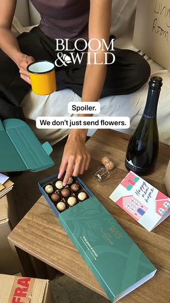
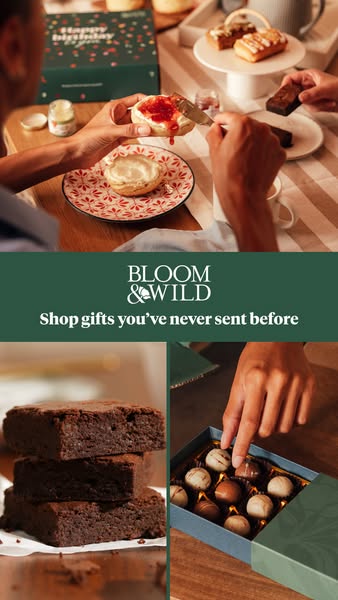
| Paid social ad: new-range announcement | Announces gifts, not just flowers, in one short Tiempos bold line ("Big news. We don't just send flowers.", "Spoiler. We don't just send flowers.", "Shop gifts you've never sent before"), either in a forest-green band carrying the stacked wordmark between two photos, or white over one full-bleed lifestyle photo with the wordmark centred above. | band vs full-bleed, seasonal sticker, photo | |
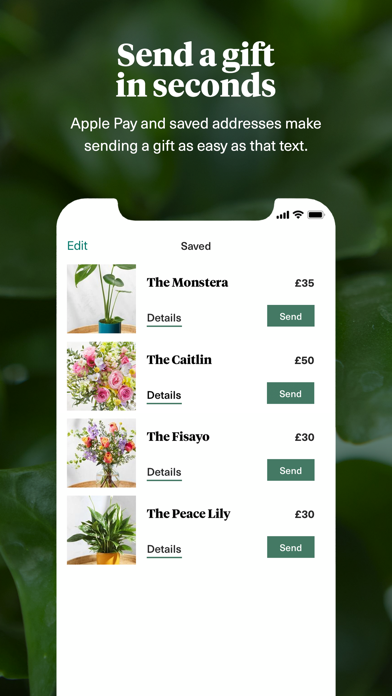
| Store listing screenshot | Deep green leaf-photo ground, a centred white Tiempos bold two-line headline in sentence case, a white Unica sub line (one phrase may be yellow), and a phone frame cropped at the bottom showing the app screen. | headline, sub line, app screen |
Source: bloomandwild.com/pressbloomandwild.combloomandwild.com/about-usbloomandwild.com/thoughtful-marketingfacebook.com/ads/libraryapps.apple.com/gb/app/bloom-wild-flowers-gifts/id936651689
Your name and logo, Bloom and Wild’s system.
Talk about my brand Use this brand in Claude
Get your brand audit Put your brand in Claude What goes in a brand book
Each value is marked published, observed, our reading or our recipe, with its source. Checked 2026-11-18. Not affiliated with Bloom and Wild.
Tell us what you want to make. We’ll talk through how to put these ideas to work for your brand.