Server-First
Render components on the server and send lightweight HTML, with no unnecessary JavaScript. Observed
Brand book
The early web, launched into space. Astro wraps a plain-HTML idealism in a night-sky look: dark grounds, gem gradients that glow like nebulae, and a rocket in the logo, so a framework about shipping less feels like a mission rather than a tool. Our reading

How much glow: from a plain #0D0F14 page with white Obviously titles (press page, blog) to a violet-bloom hero with stardust and gem icons (homepage). Nothing published sets the level.
Our engine's setting, built from their rules.
Cover the logo. It should still read as Astro: a navy-black sky, gem-gradient glows and rings, wide Obviously headlines over light Inter, and a pill plus install command.
Put another framework's logo on it. If the night sky, the four gems and the cited speed number don't feel out of place, it's generic, and it goes back.
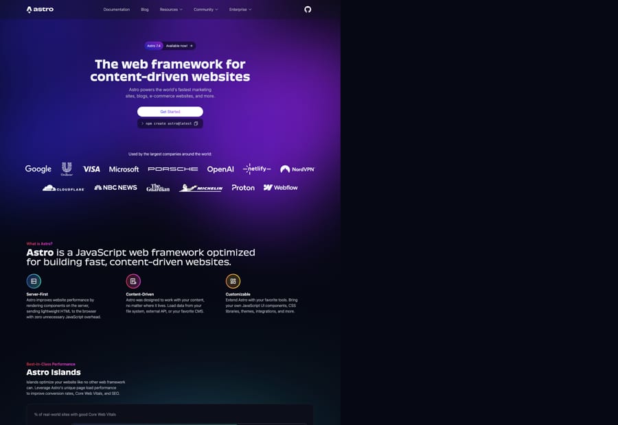
The web framework for content-driven websites. Observed
Render components on the server and send lightweight HTML, with no unnecessary JavaScript. Observed
Built to work with your content wherever it lives: files, an API or a CMS. Observed
Bring your own UI components, CSS, themes and integrations; zero lock-in. Observed
Astro started about three years before 2023 with a one-page manifesto and a hidden console.log easter egg that led to a secret early-access Discord. In 2023, after three months of community interviews with Streiloff & Co, it refreshed the logo, chose Obviously and MDIO, paired a dark-mode site with its own palette and illustration, and promoted Houston, a CLI 'blob' by Nate Moore, to mascot.
Being a web developer as a superpower: create and share instantly, worldwide (paraphrase).
PublishedMake every Astro site, and the whole web, faster (paraphrase).
PublishedCommunity-built, open source, sponsor-funded; 'build the web we want, together'.
PublishedCategory. JavaScript web framework (homepage); web framework for content-rich sites (press). Published
WordPress, Gatsby, Next.js and Nuxt: the comparison set in the homepage Core Web Vitals chart.Frameworks designed for web apps (press page framing).
Astro is a web framework that takes the best of the early internet, plain HTML and CSS, and runs it on a next-generation architecture so every Astro site, and the web as a whole, gets faster. Where most frameworks target web apps, Astro is built for content-rich sites where performance matters most: content can come from anywhere and deploy everywhere.
The web framework for content-driven websites Observed
Build the web you want. Published
let's build the web we want, together Published
One line leads: 'The web framework for content-driven websites', backed by three pillars (Server-First, Content-Driven, Customizable) and Title Case section promises (Astro Islands, Zero Lock-in, Fully Featured). The press page adds the boilerplate and the closing 'build the web we want, together'.
Source: astro.buildastro.build/pressgithub.com/withastro/astro.build src/pages/_components/landing-page/Intro.astro (main, read 2026-10-31)
71% of real-world Astro sites have good Core Web Vitals.
The fastest framework ever built, period.
A friendly, lightly playful voice keeps a performance-focused framework welcoming to its community.
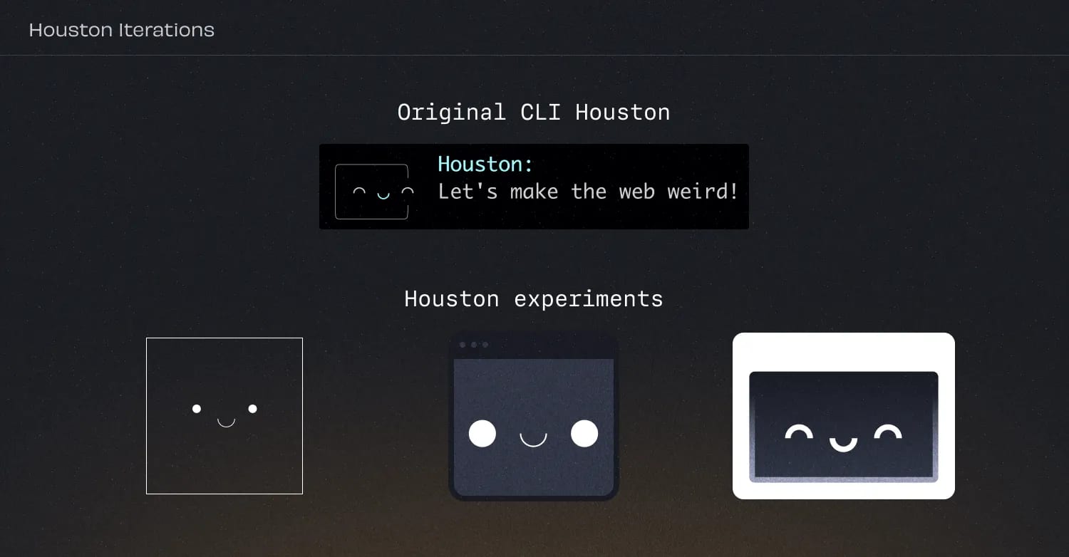
WhimsicalApproachableFriendly
No voice guide is published. The rebrand names Houston's personality (whimsical, approachable, friendly) as Astro's own; the site writes plain, short developer sentences, sentence-case heroes, Title Case section names, and space puns in headings.
content-drivenserver-firstislandsfast
Source: astro.build/blog/welcome-worldastro.build/press
| Traits | Whimsical, approachable, friendly |
|---|---|
| Hero case | Sentence case (observed) |
| Section titles | Title Case (observed) |


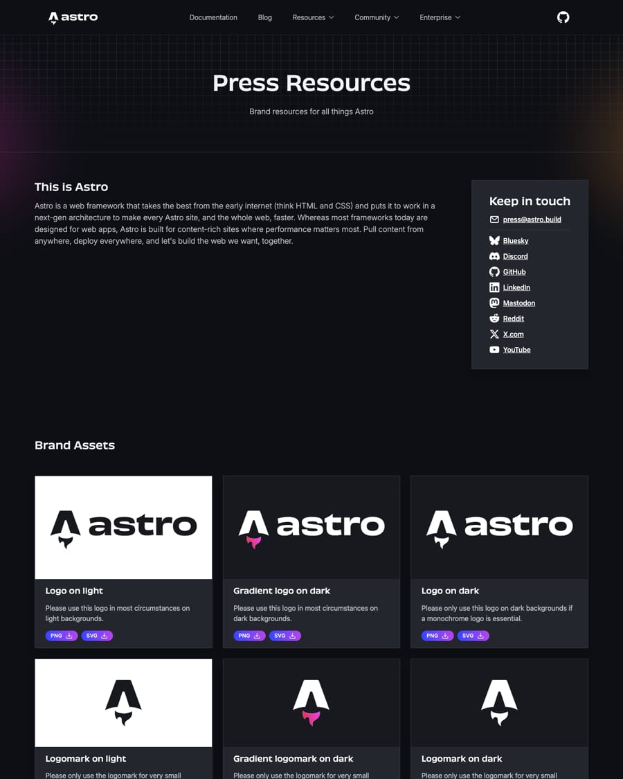
Official files from astro.build/assets/press/ (PNG copies alongside). File names describe the ink, not the ground: astro-logo-dark = dark ink for light grounds; astro-logo-light(-gradient) = white ink for dark grounds. The 2023 logo replaced the 2021 version; use only the latest. Shown for reference; not affiliated.
astro
astro
The refresh centered the mark and improved the wordmark's readability; the gradient flame turns the A into a launching rocket.
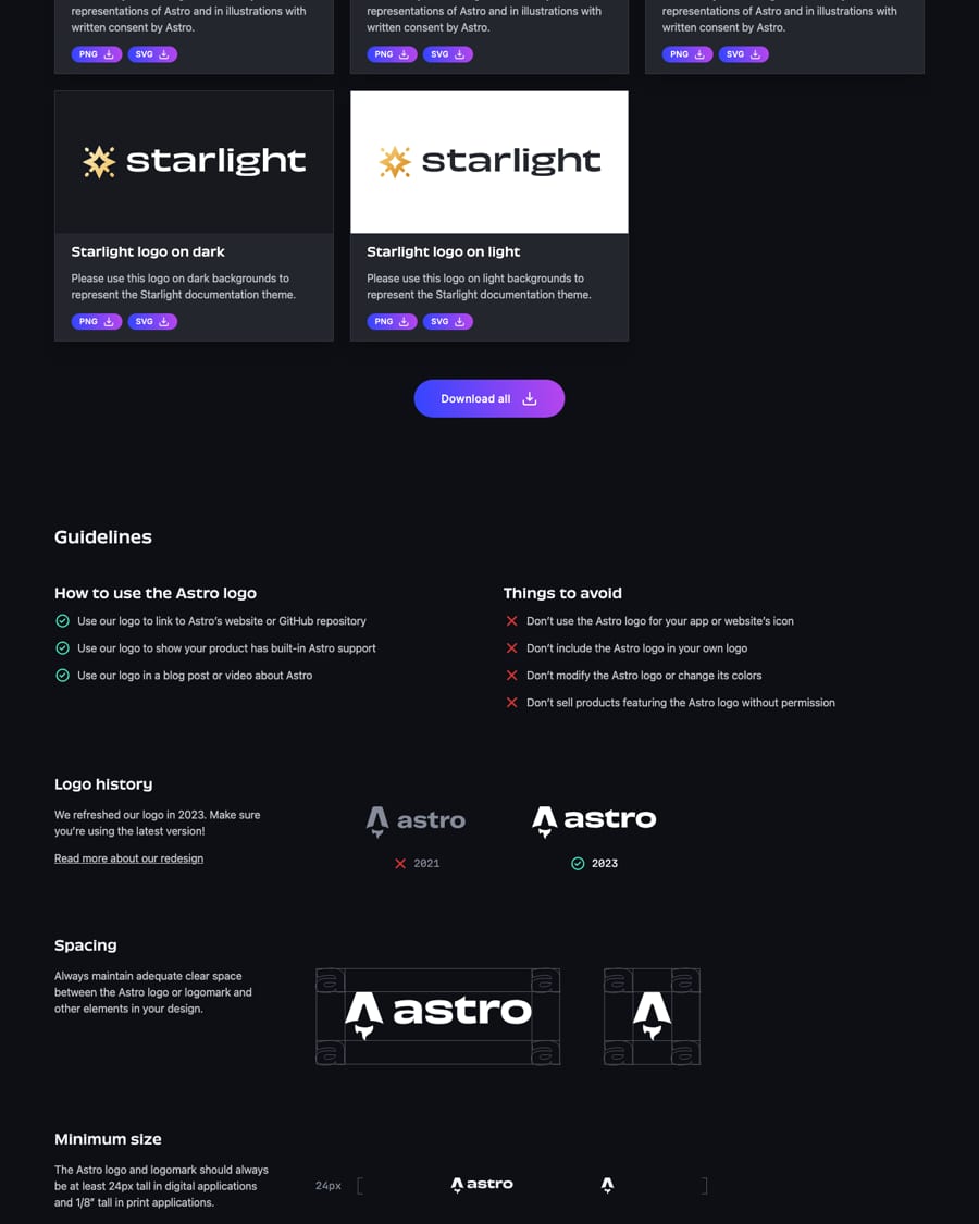
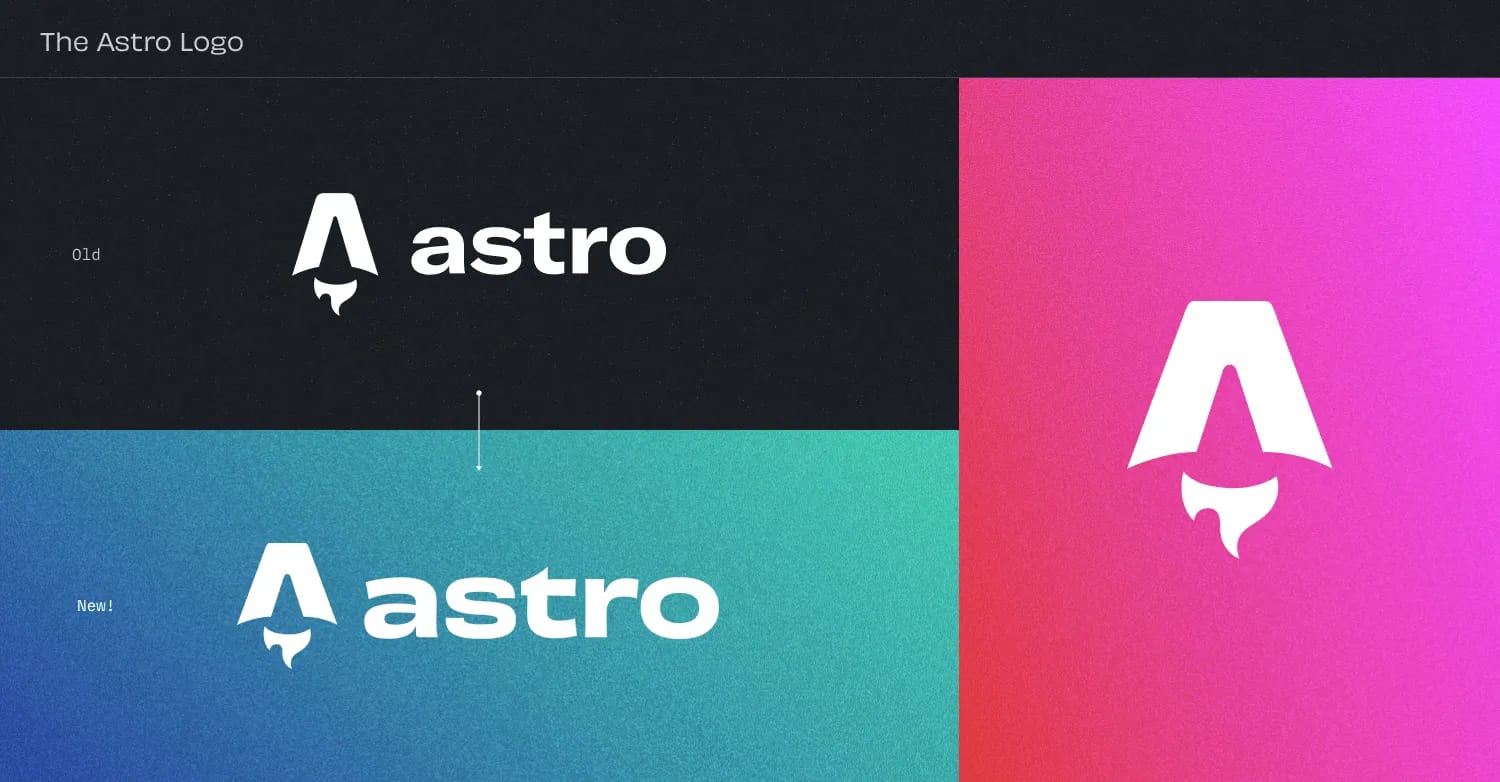
| Clear space | adequate on all sides; diagram uses the lowercase 'a' as the unit (shown, not stated as a rule) |
|---|---|
| Minimum | 24px tall digital; 1/8 inch tall print |
| Default on light | astro-logo-dark (ink #17191E) |
| Default on dark | astro-logo-light-gradient (flame #D83333 to #F041FF) |
| Logomark | very small uses only |
The 2023 logo pairs a rocket-flame 'A' mark with a wide lowercase 'astro' wordmark. Press files come in dark ink for light grounds, white with a red-pink gradient flame for dark grounds (the default on dark), and monochrome white when a single color is essential. The logomark alone is for very small uses. The 2021 logo is retired.
Keeping text neutral on a dark sky lets the saturated gradients read as light sources: the brand's own way not to look like other dark-mode devtools.
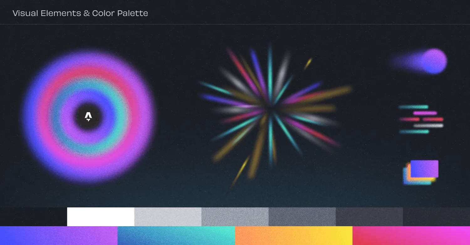
| blue-purple | 83.21deg #3245FF to #B845ED |
|---|---|
| blue-green | 247.23deg #4AF2C8 to #2F4CB3 |
| red-pink | 66.77deg #D83333 to #F041FF |
| orange-yellow | 266.93deg #F8E42E to #FF7D54 |
| Grounds | #060913 / #0D0F14 / #0C0F19 |
Dark grounds (#060913 homepage, #0D0F14 press and blog) with off-white #F2F6FA headings and #BFC1C9 body text. Color arrives as four two-stop gem gradients (blue-purple, blue-green, red-pink, orange-yellow) in icon rings, eyebrows, button text and soft glows. The rebrand palette image shows grays from white to charcoal above the four gradient bars.
Not published: color proportions or ratios; contrast rules; print values (CMYK, Pantone).
Source: github.com/withastro/astro.build tailwind.config.ts (main, read 2026-10-31)astro.build/blog/welcome-worldastro.build/%20(2026-10-31)
The web framework for content-driven websites
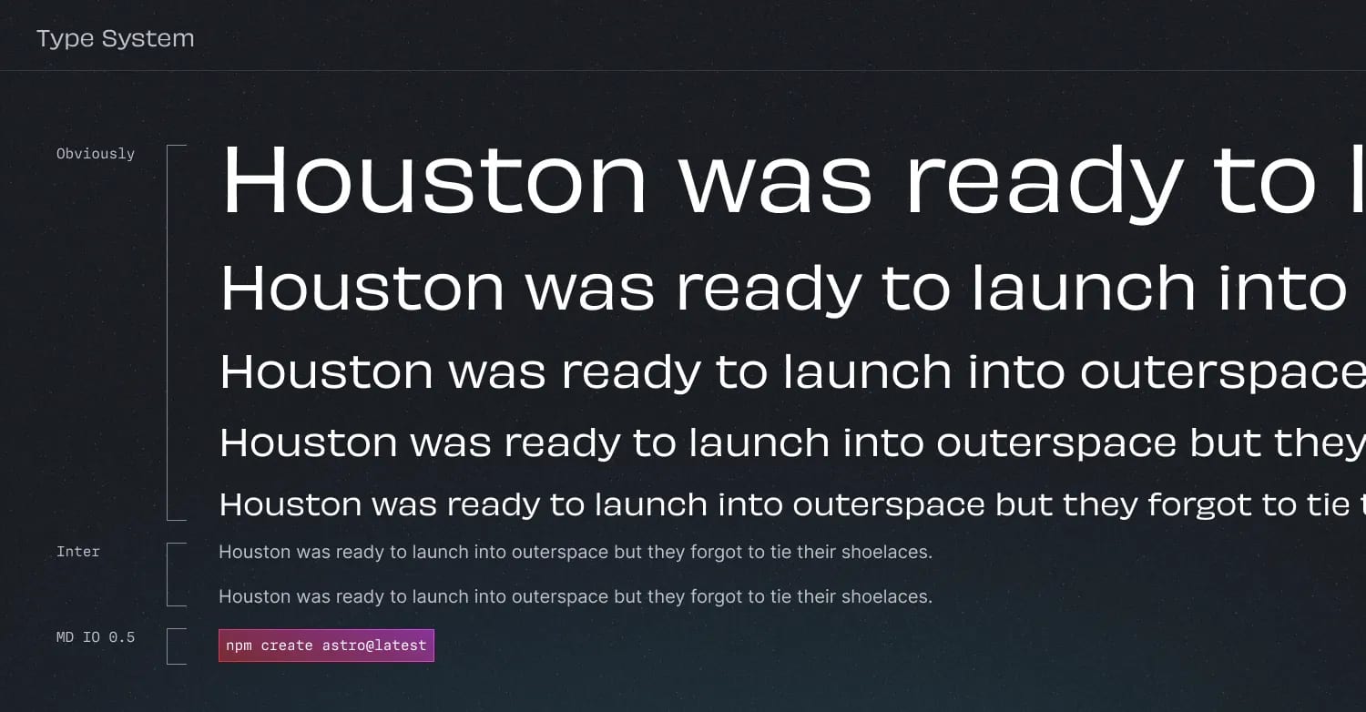
A wide, confident display face against airy light Inter gives the 'vibrant personality' the rebrand asked for while keeping long text legible.
| Their face | Use | License | Open stand-in |
|---|---|---|---|
| Obviously | Headlines and titles; variable weight 290-475, width 490 on the site | Proprietary (OH no Type Company); licensed by Astro, not supplied | Archivo (expanded) A wide open grotesk to be calibrated against the homepage H1; the site's own metric fallback is Verdana |
| Inter | All reading text, light (200-300), buttons 400, small titles 600 | Open (SIL OFL 1.1); variable woff2 in the fonts folder | Inter Not a stand-in: Inter is the real face and is open |
| MDIO | Code and the install command, light | Proprietary (Mass-Driver); not supplied | IBM Plex Mono An open mono at a light weight; the site's metric fallback is Courier New |
| Hero | Obviously 700, 48/30px, 1.1 |
|---|---|
| Section title | Obviously 400 (wght 475 via strong), 30/24px |
| Heading weights | 290 / 380 / 475, wdth 490 |
| Body | Inter 300, 16px, 1.5 |
| Lead | Inter 300, 18px (CSS asks 200, but the served Inter face spans 300-600, so it renders at 300; build 300, never 200) |
| Code | MDIO light, 14px |
Obviously, a wide variable grotesk, sets headlines: bold 700 for the hero and closing CTA, a light 290 for the intro statement with the brand name in 475, 380 on press and blog headings. Inter Light (200-300) carries reading text; MDIO Light sets code. Headings are often centered in the hero and left-aligned in sections.
Source: astro.build/blog/welcome-worldgithub.com/withastro/astro.build src/styles/fonts.css (main, read 2026-10-31)github.com/withastro/astro.build src/styles/tailwind.css (main, read 2026-10-31)astro.build/%20(2026-10-31)
Server-First
Server-First
Four gem gradients · Feature icon rings, eyebrow labels, the primary button, card fills and background glows
Maximum Flexibility Zero Lock-in
Maximum Flexibility Zero Lock-in
Gradient-text eyebrow over a white title · Above every homepage section title (What is Astro?, Best-In-Class Performance, Maximum Flexibility, Ecosystem)
Get Started plus the install command · Hero and final CTA
Start building with Astro today
Start building with Astro today
Night sky with nebula glow · Hero ground, section backdrops (stardust), final CTA starfield, press-page header grid
Specimens use sample copy, not Astro’s.
Each element is a small light source or a terminal, so the page reads as both space and code.
| Panel radius | 12-16px |
|---|---|
| Button | pill (rounded-full) |
| Grid | 100px, bg-grid.png |
Gem icons (gradient ring, black disc, white glyph), pill buttons and tabs, translucent dark panels with hairline borders, a stacked CTA of white pill and code block, nebula glows and stardust, and a faded 100px grid on page headers.
Source: github.com/withastro/astro.build tailwind.config.ts (main, read 2026-10-31)github.com/withastro/astro.build src/components/GemIcon.astro (main, read 2026-10-31)astro.build/%20(2026-10-31)
Feature icons are Remix Icon line glyphs (server, file list, dashboard) set white inside gradient-ringed gem circles.
Feature icons are Remix Icon line glyphs (server, file list, dashboard) set white inside gradient-ringed gem circles. The repo's own UI icons are 24px filled-outline shapes in currentColor. No icon guideline is published.
| Gem | 48/56px |
|---|---|
| Glyph | 20/28px |
| UI icons | 24px viewBox |
Source: github.com/withastro/astro.build src/components/GemIcon.astro (main, read 2026-10-31)github.com/withastro/astro.build src/icons/ (main, read 2026-10-31)
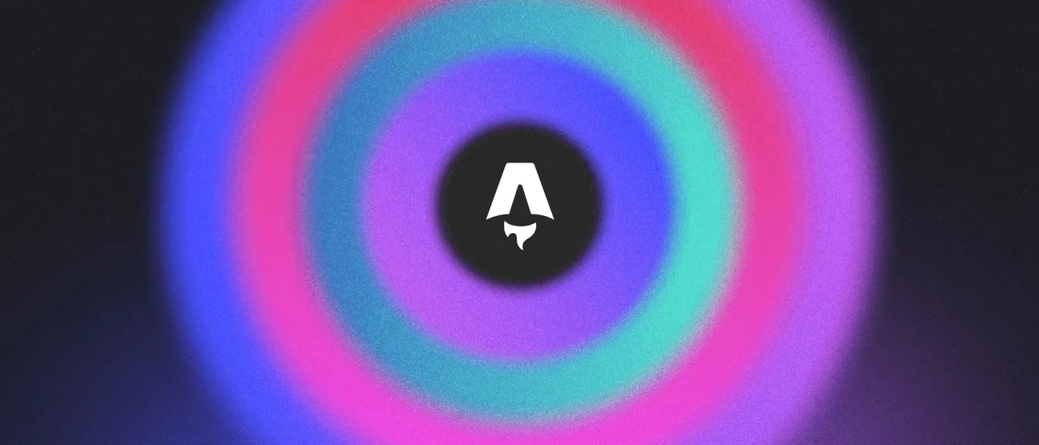
Soft glowing light on a dark field makes code abstractions feel cosmic and friendly.
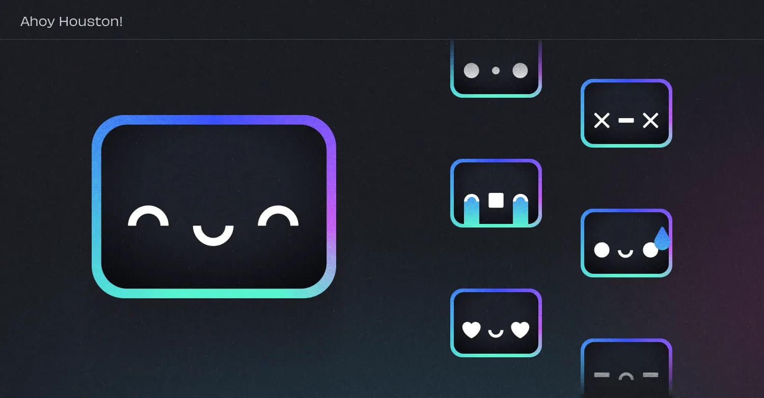
| Houston | square screen face, blue-green/purple gradient outline |
|---|
The rebrand introduced an original illustration style: blurred concentric rings, bursts of colored light streaks, a comet and stacked cards, all in the gem colors on dark. Houston, a square screen-faced mascot with a gradient outline, can be dressed for any occasion or emotion. Houston is for Astro's own community use only.
Not published, and the homepage uses no photography: product screenshots (themes), partner-agency tiles and a starfield image fill the visual slots.
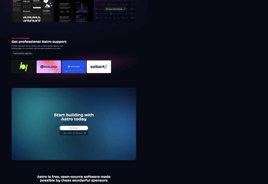
| Photography | not published |
|---|
Source: astro.build/%20(2026-10-31)
The repo defines a slow 6s float and gentle 300-500ms ease-out transitions; cards grow 3% on hover and logo rows gain color on hover.
The repo defines a slow 6s float and gentle 300-500ms ease-out transitions; cards grow 3% on hover and logo rows gain color on hover. The rebrand launched with a video by Streiloff & Co.
| float | 6s ease-in-out infinite, +/-8px |
|---|---|
| hover | 300-500ms ease-out |
| card | scale 1.03 |
Source: github.com/withastro/astro.build tailwind.config.ts (main, read 2026-10-31)
Centered hero, then left-aligned sections inside a 1280px container (max-w-screen-xl) with 16px (phone) and 32px (desktop) gutters; generous vertical gaps (mt-20 to mt-36); 1-2-3 column card grids with 8-16px gaps.
Measured from astro.build/press's Astro publishes no brand PDF. Logo law from the press page (astro.build/press/, read 2026-10-31); brand idea, faces and mascot from the 2023 rebrand post; tokens from the open-source site repo github.com/withastro/astro.build (sparse clone, main, read 2026-10-31); voice and proof from the homepage (observed 2026-10-31).
| Measure | Desktop | Phone |
|---|---|---|
| Page margin | 112px | 16px |
| Section padding | 144px | 80px |
| Hero text width | max 704px, centered | full width |
| Card gap | 16px | 16px |
| Navigation | 80px | 80px |
Hero H1
Inter · 48px (phone 30) · line 1.1 · weight 700
Final CTA H2
Inter · 36px (phone 20) · line 1.111 · weight 700
Intro statement
Inter · 36px (phone 24) · line 1.111 · weight 290
Section title
Inter · 30px (phone 24) · line 1.2 · weight 700
Chart label
Inter · 20px · line 1.4 · weight 700
Lead
Inter · 18px · line 1.5 · weight 300
Eyebrow
Inter · 16px · line 1.5 · weight 600
Card / point title
Inter · 16px · line 1.5 · weight 600
Body / description
Inter · 16px · line 1.5 · weight 300
Button / tab label
Inter · 16px · line 1.5 · weight 400
Nav link
Inter · 16px (phone 20) · line 1.5 · weight 300
Chart score
Inter · 30px (phone 24) · line 1.2 · weight 600
Footer heading
Inter · 16px · line 1 · weight 600
Small / pill
Inter · 14px · line 1.4286 · weight 300
Install command
Inter · 14px · line 1.4286 · weight 300
Code sample
Inter · 13.6px · line 1.65 · weight 400
Mono label
Inter · 12px · line 1.333 · tracking 0.3px · weight 400
Big zero
Inter · 200px · line 1 · weight 700
How Astro’s own landing pages are built, observed on astro.build, 2026-10-31. The full measurements are in spec.md.
Source: github.com/withastro/astro.build tailwind.config.ts (main, read 2026-10-31)astro.build/%20(2026-10-31)
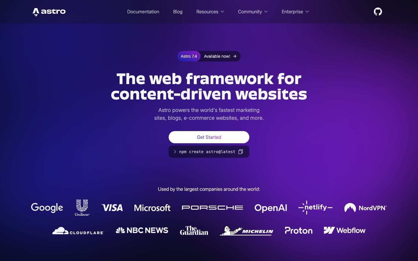
It keeps the early-web idealism and makes Astro visibly unlike other devtools. Our reading
How our engine applies Astro's system to each format. This is our recipe built from their published sources, not something Astro publishes. Level = how much glow and gradient the format carries (0 plain, 5 full nebula).
| Format | What they did | Source |
|---|---|---|
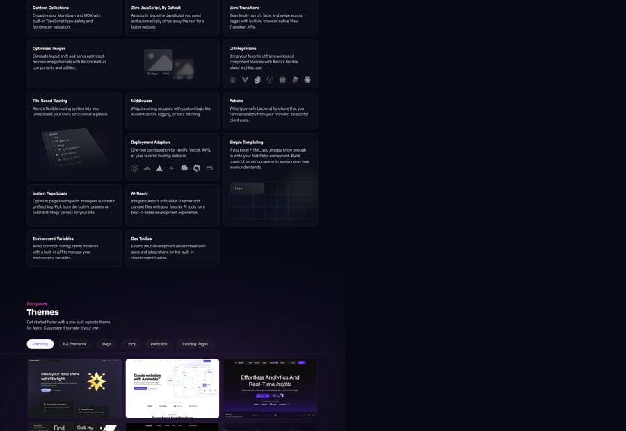
| web page | Homepage: violet-bloom hero, centered Obviously H1, white Get Started pill over the npm command, logo wall, gradient-eyebrow sections, CWV chart panel, feature card grid, themes tabs, agency tiles, starfield final CTA. | astro.build |
| press page | Plain #0D0F14 page with grid header, asset tiles on white or #17191E, gradient PNG/SVG pills. | astro.build/press |
| blog post | Dark article with Obviously headings, Inter body, framed illustrations with a small caption bar. | astro.build/blog/welcome-world |
| CLI | Houston appears in the npm create astro helper. | astro.build/blog/welcome-world |
| Format | Loudness | Must appear | What varies |
|---|---|---|---|
| Landing page | Build it the way astro.build is built (kit.spec.page): #060913 ground; an 80px non-sticky bar with the monochrome #F2F6FA logo; a centred hero on the blurred violet glow image with a release pill, a 48px bold display H1 in #F2F6FA, an 18px Inter 300 lead in #BFC1C9, a white pill whose Get Started label is blue-purple gradient text over the dark install-command block, then a monochrome logo wall; then left-aligned sections in a 1216px column, each a red-pink gradient eyebrow, a 30px white Title Case title and a half-width #BFC1C9 description, followed by real proof in #0C0F19 panels and cards with 1px rgba(133,139,152,0.2) hairlines and 16px radii; pill buttons and tabs only; a starfield closing CTA card; a sponsors panel; the four-column footer. Homepage voice, not the campaign voice | number of sections and cards, which proof each section shows, which gem gradient per point, stardust glows | |
| Deck | Dark grounds, Obviously titles, Inter Light body, gradient logo on dark, one gem gradient per slide | a glow or illustration on title slides | |
| Proposal page | #0D0F14 ground, Obviously headings, Inter Light body, white pill CTA, sourced numbers only | one gem icon row | |
| Social post | Dark ground, gradient glow, Obviously headline, gradient logo | illustration light forms | |
| Dark or white body per client, Inter text, one pill button, logo per ground rule | a small gradient header | ||
| Error message | Plain, friendly sentence, Inter on dark | none (Houston is Astro's own, so not in third-party work) |
Source: astro.build/pressastro.build/blog/welcome-worldgithub.com/withastro/astro.build tailwind.config.ts (main, read 2026-10-31)
Your name and logo, Astro’s system.
Use this kit for my brand Use this brand in Claude
Get your brand audit Put your brand in Claude What goes in a brand book
Each value is marked published, observed, our reading or our recipe, with its source. Checked 2026-10-31. Not affiliated with Astro.