Asana Work Graph®
One connected map of every person, task, project, goal and dependency, so people and agents know who does what, by when. Observed
Brand book
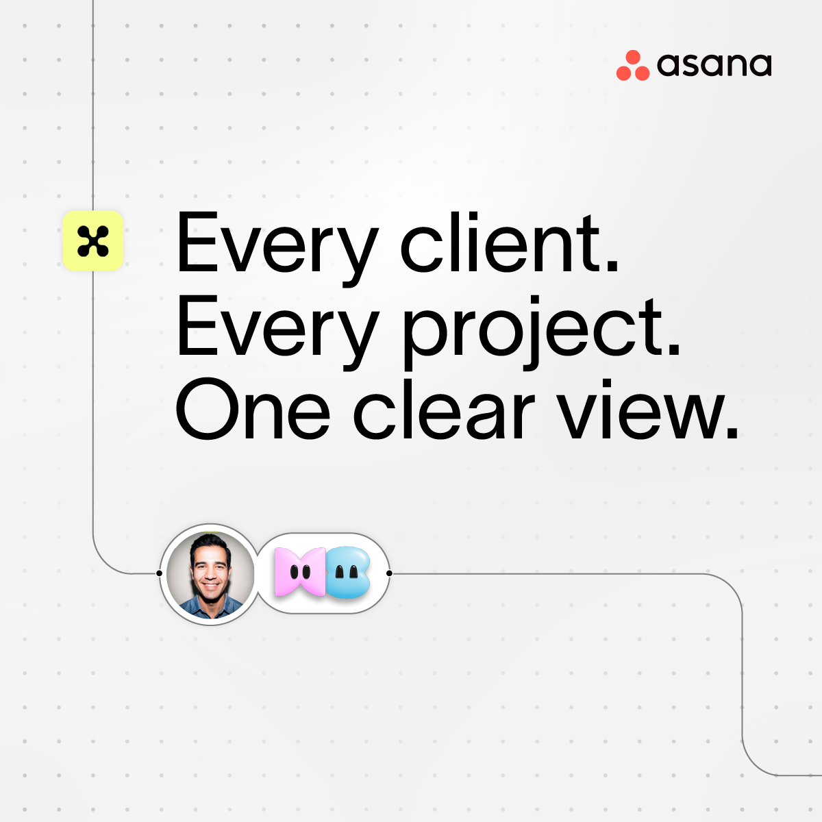
People and agents in one flow, drawn literally. Asana turns its own interface into the brand: workflow lines connect human avatars to Workling agents and task pills, while the type stays quiet and black-and-white so a single coral-to-fuchsia phrase carries the energy. Our reading

How loud the system gets: one gradient phrase and a quiet product UI on a web page, full workflow scenes with Worklings and the dot grid on billboards and posters.
Our engine's setting, built from their rules.
Cover the logo. It should still read as Asana: Light Swiss headline with one coral-to-fuchsia phrase, black pill buttons, and workflow lines connecting avatars, Worklings and task pills.
Put another work-management logo on it. If the workflow-and-Workling graphics and the gradient phrase don't feel borrowed, it is generic.
Every gradient sits on headline type only, never on a colored content ground.
The operating system for human-agent teams. Observed
One connected map of every person, task, project, goal and dependency, so people and agents know who does what, by when. Observed
Every workflow, app and agent runs in one shared space with people. Observed
AI Teammates learn from the work and keep context across projects. Observed
Every agent has an identity, scoped permissions and an audit trail. Observed
The OS for human-agent teams
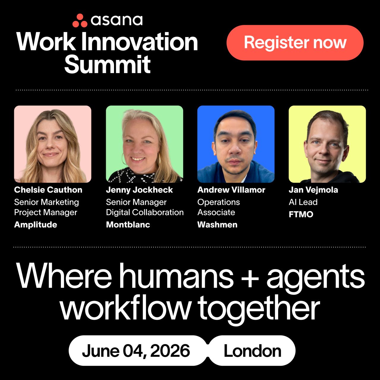
Where humans + agents workflow together
Work has a new flow.
Your team just got bigger
Founders Dustin Moskovitz and Justin Rosenstein saw talented people at Facebook lose their days to meetings and status chasing, so they built a shared picture of who is doing what, by when. That Work Graph, built for people, is now the base for people and AI agents working together.
Start with customers: listen to their needs and design what they will love (paraphrase).
PublishedFocus on what matters and simplify complexity (paraphrase).
PublishedProgress beats perfection: ship lovable work fast and learn (paraphrase).
PublishedCollaborate early and trust each other (paraphrase).
PublishedTake responsibility, individually and together (paraphrase).
PublishedHow we work matters as much as what we build (paraphrase).
PublishedCategory. Work management, reframed as the OS for teams of people and AI agents Published
Scattered work: tasks in spreadsheets, decisions in chat, files in email.AI tools that help individuals but not teams.
Asana is the operating system for human-agent teams. Built on the Asana Work Graph and years of multiplayer architecture, it is where an organization's people and AI agents run critical workflows together, from a shared plan with shared memory and enterprise governance.
The OS for human-agent teams Published
Where humans + agents workflow together Published
Work has a new flow. Published
Supercharge your teams to get things done Observed
The FY27 guide carries its messaging inside the visuals: the billboard line "The OS for human-agent teams", the poster line "Where humans + agents workflow together" and "Work has a new flow." The homepage repeats the first as its H1 (in one A/B variant) and backs it with four pillars: Work Graph, Multiplayer, Shared memory and Enterprise governance.
Source: assets.asana.biz/asset/a4bdc79a-88a2-463f-8243-38fe90b79c88/Asana-Brand-Guidelines-FY27.pdfassets.asana.biz/asset/a4bdc79a-88a2-463f-8243-38fe90b79c88/Asana-Brand-Guidelines-FY27.pdfassets.asana.biz/asset/a4bdc79a-88a2-463f-8243-38fe90b79c88/Asana-Brand-Guidelines-FY27.pdfasana.com/companyasana.com
Plain, concrete copy suits a product sold as relief from "work about work".
ClearHumanEnergeticProductive
Not published in the guide. On asana.com: sentence-case declaratives, short problem statements in plain words (spreadsheets, chat, Friday status decks), and claims about humans and agents working together. The trademark guidelines add one hard rule: Asana is an adjective.
Not published: tone of voice, word lists or editorial style.


Logo files drawn from the SVGs on asana.com (nav logo, footer logomark), shown for reference. Asana, the Asana logo and Work Graph are trademarks of Asana, Inc.; its trademark guidelines restrict use by others. Not affiliated.
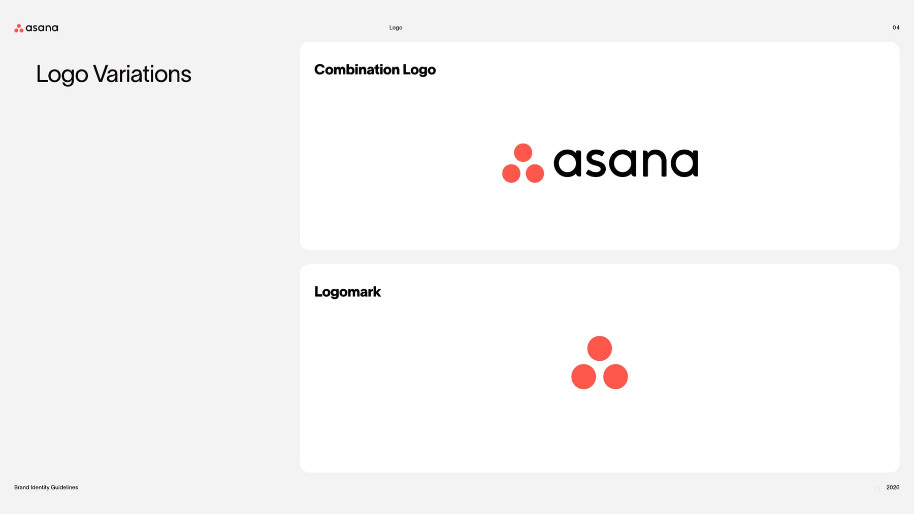
Three dots arranged as a triangle read as people coming together; keeping them coral everywhere makes the mark recognizable at any size.
| Clear space | height of the symbol |
|---|---|
| Symbol color | Asana Coral #FF584A |
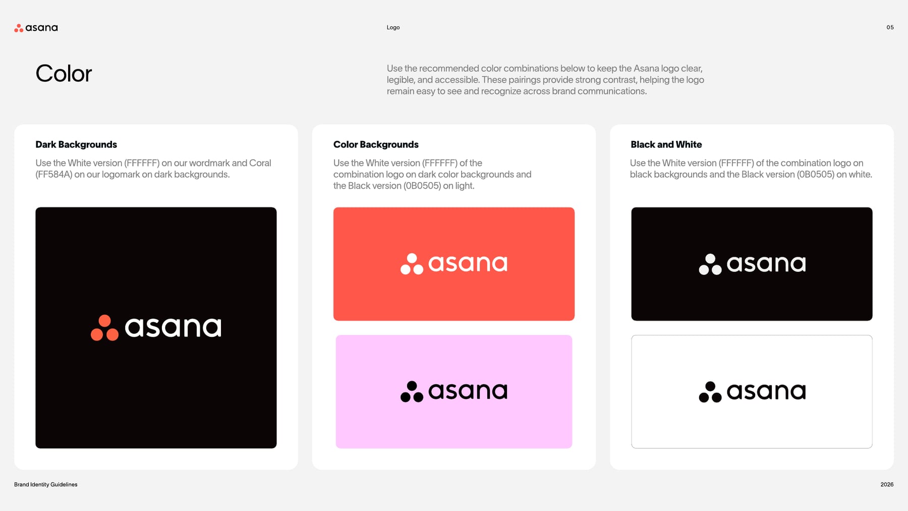
| Wordmark | Asana Black #0B0505 or white |
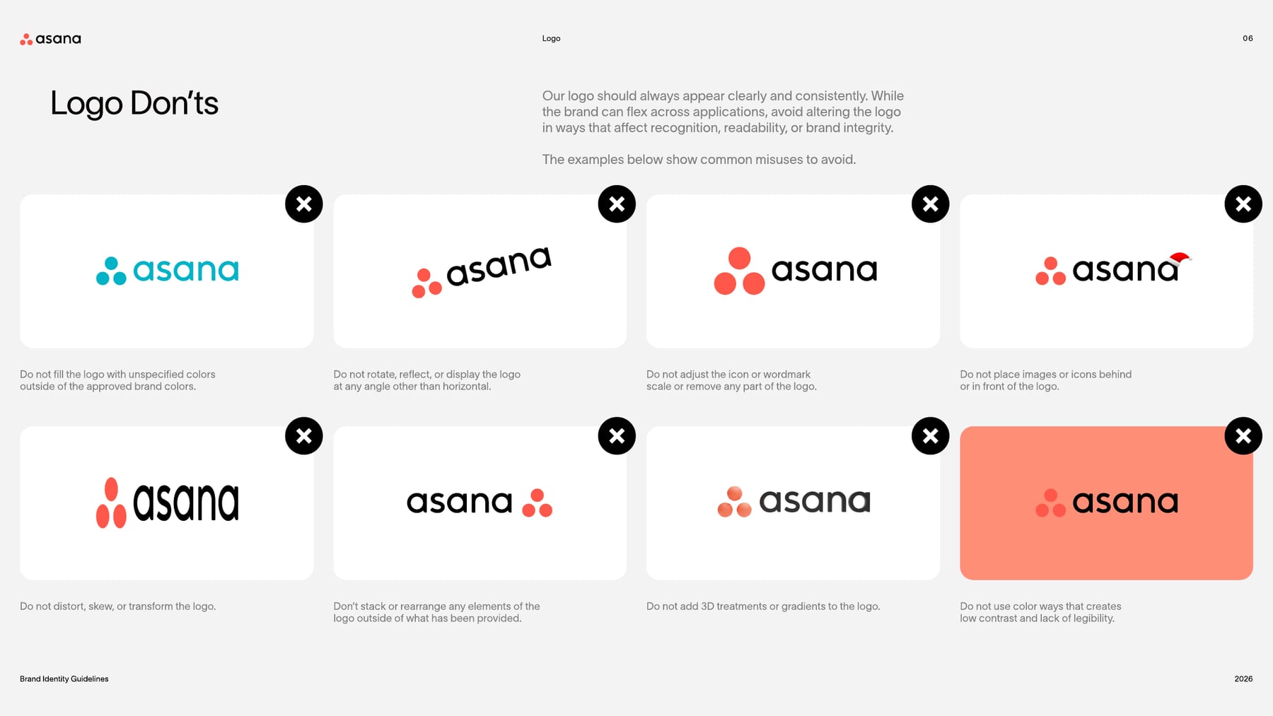
Two lockups: the combination logo (coral three-dot logomark left of the lowercase asana wordmark) and the logomark. The web brand page (updated June 25, 2026) also names a vertical lockup for space-constrained digital displays. The symbol is always coral; the wordmark is black on white or light grey and white on black.
Not published: minimum size.
Source: assets.asana.biz/asset/a4bdc79a-88a2-463f-8243-38fe90b79c88/Asana-Brand-Guidelines-FY27.pdfassets.asana.biz/asset/a4bdc79a-88a2-463f-8243-38fe90b79c88/Asana-Brand-Guidelines-FY27.pdfassets.asana.biz/asset/a4bdc79a-88a2-463f-8243-38fe90b79c88/Asana-Brand-Guidelines-FY27.pdfasana.com/brand
The OS for human-agent teams
Amplify your impact with AI
What work will your AI Teammates do?
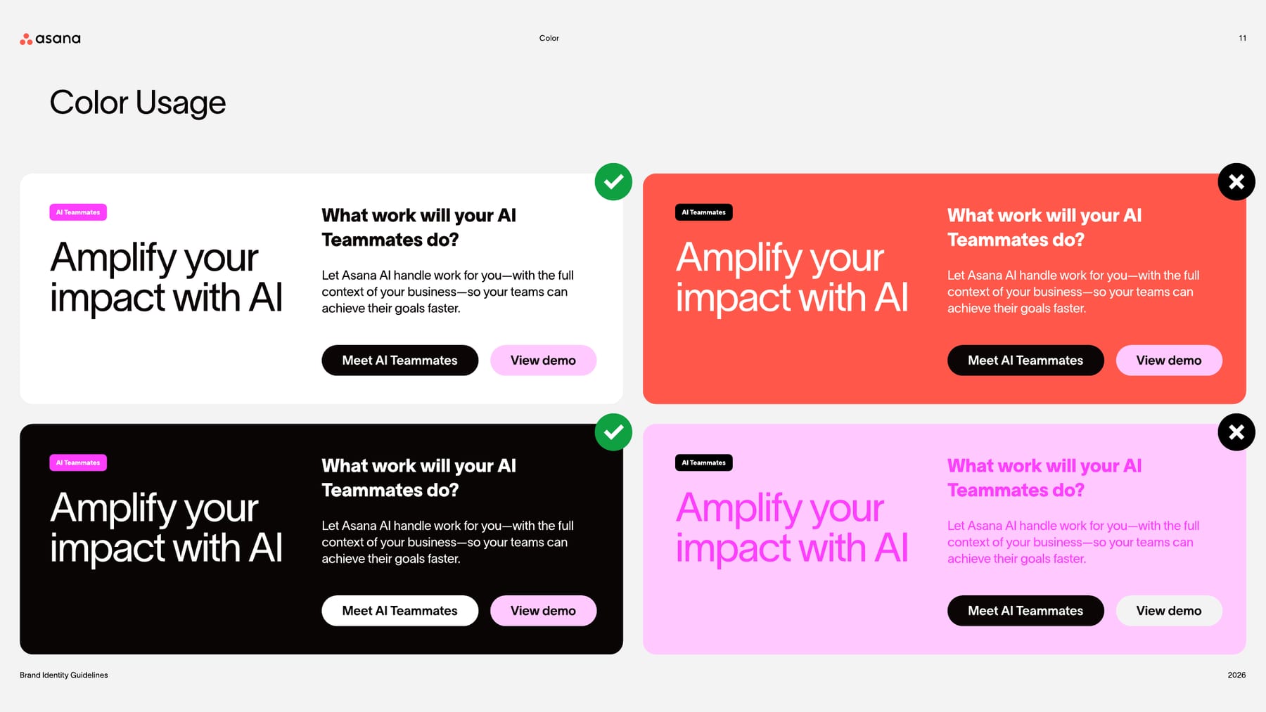
Neutral black-and-white modules keep product content legible, so a single coral-to-fuchsia gradient carries the brand energy.
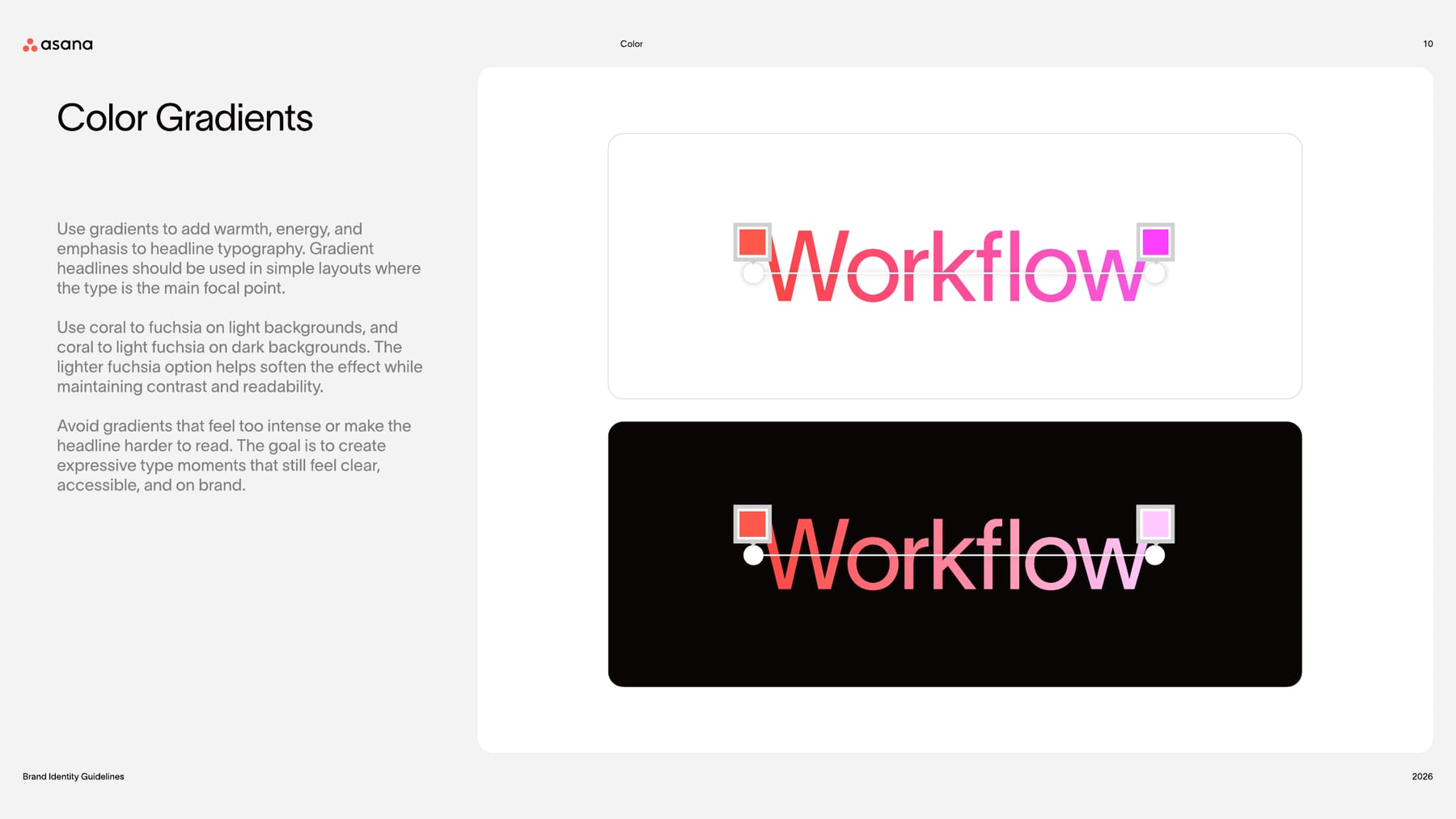
| Gradient on light | #FF584A to #FD3FFD |
|---|---|
| Gradient on dark | #FF584A to #FFC9FF |
| Site gradient (observed) | #FF453E to #F481F4 |
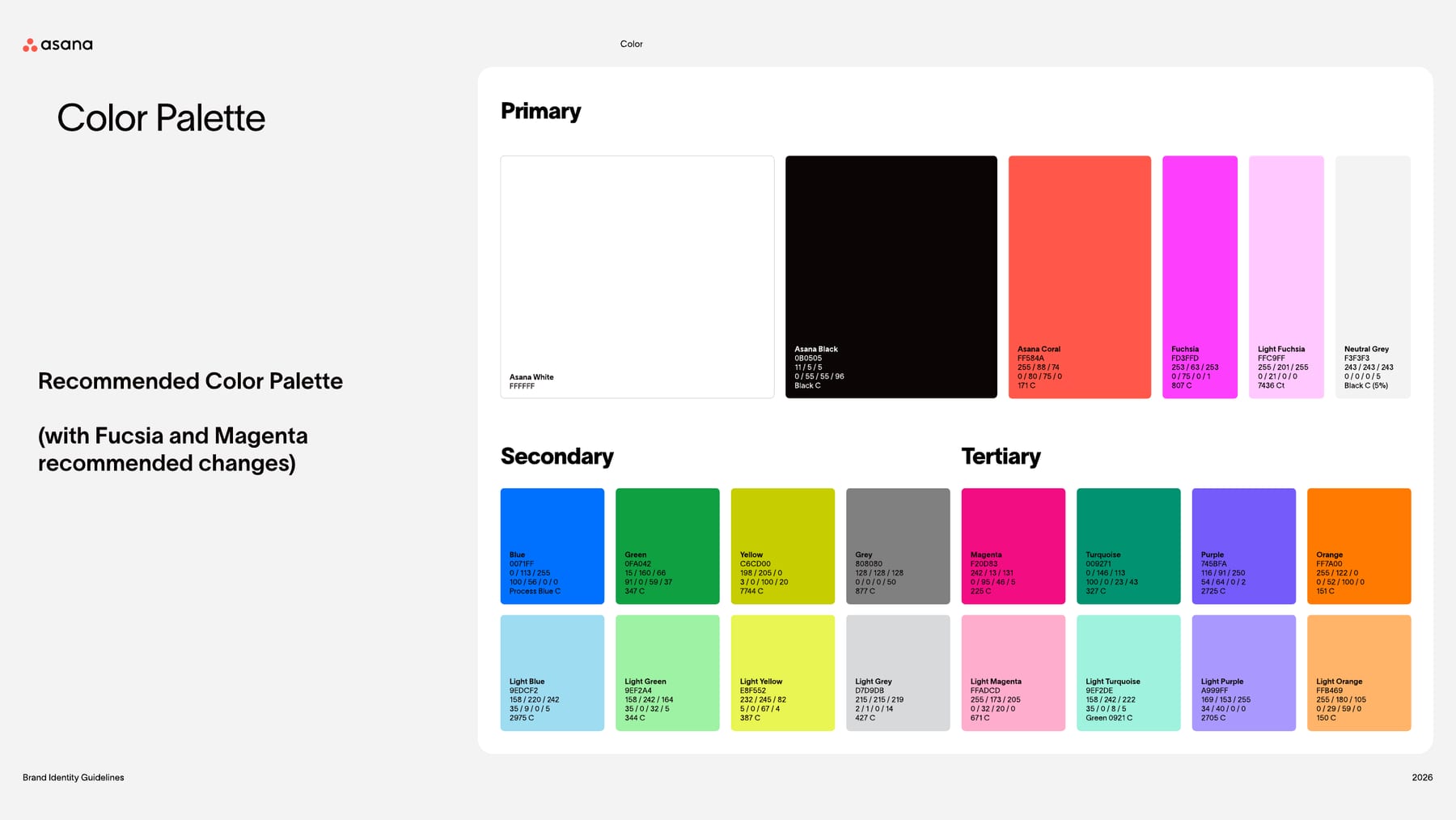
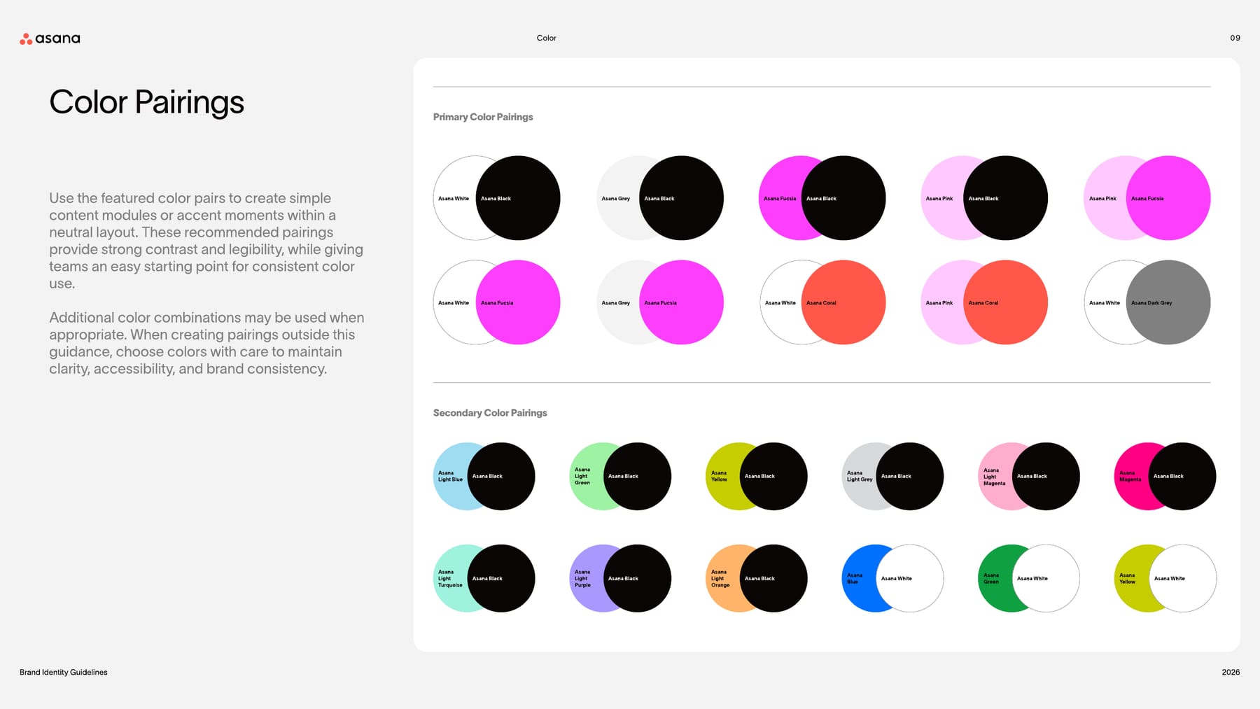
Six primaries (Asana White, Asana Black, Asana Coral, Fuchsia, Light Fuchsia, Neutral Grey), a secondary set (Blue, Green, Yellow, Grey with light tints) and a tertiary set (Magenta, Turquoise, Purple, Orange with tints), each with RGB, CMYK and Pantone. Content modules sit on white or black; coral and fuchsia arrive as the logo, a gradient phrase and accents.
Not published: color proportions or ratios; a contrast standard.
Source: assets.asana.biz/asset/a4bdc79a-88a2-463f-8243-38fe90b79c88/Asana-Brand-Guidelines-FY27.pdfassets.asana.biz/asset/a4bdc79a-88a2-463f-8243-38fe90b79c88/Asana-Brand-Guidelines-FY27.pdfassets.asana.biz/asset/a4bdc79a-88a2-463f-8243-38fe90b79c88/Asana-Brand-Guidelines-FY27.pdfassets.asana.biz/asset/a4bdc79a-88a2-463f-8243-38fe90b79c88/Asana-Brand-Guidelines-FY27.pdf
The OS for human-agent teams
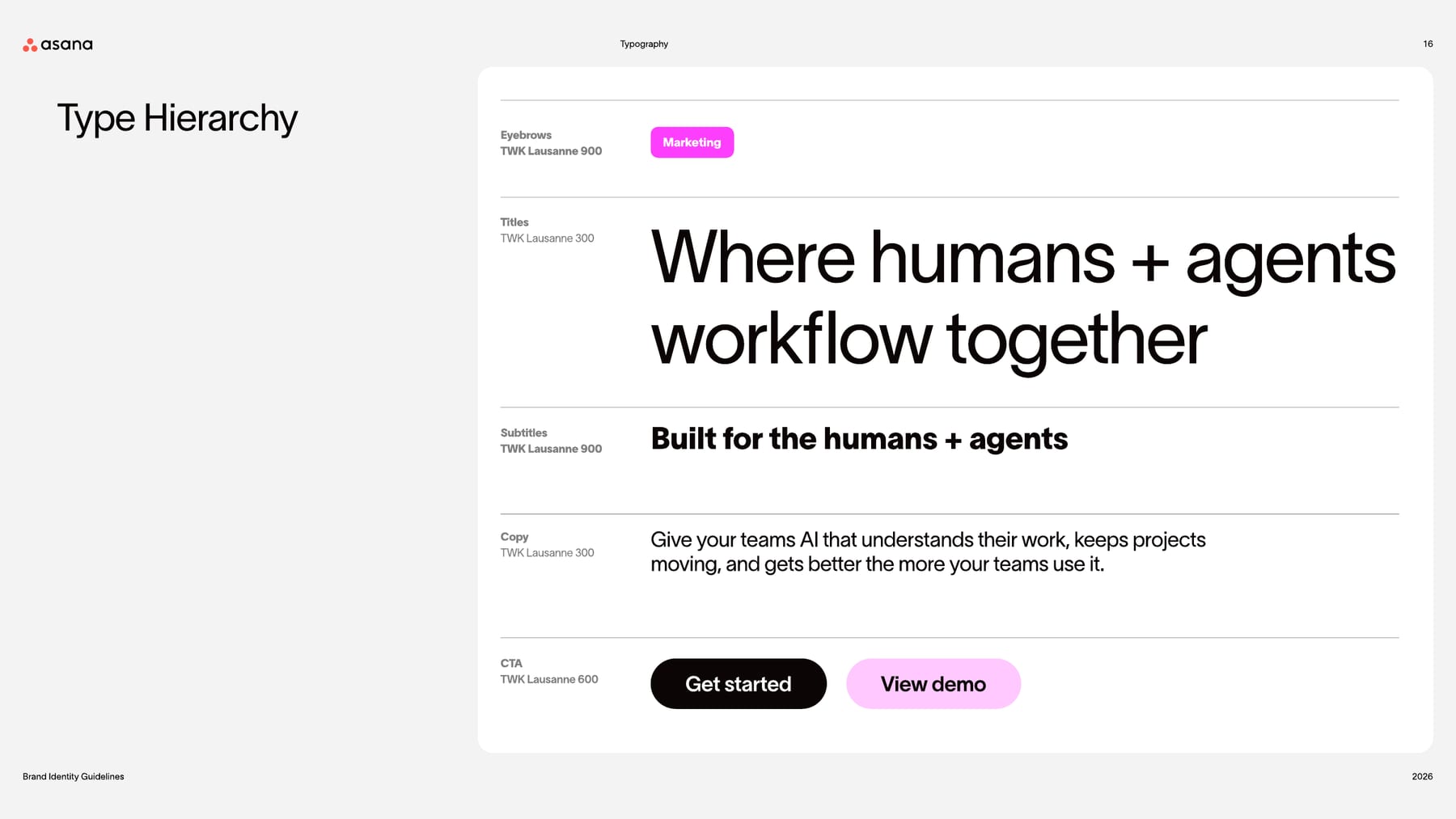
Very large Light headlines with tight tracking feel calm and modern, and leave the coral-to-fuchsia phrase to carry the emphasis.
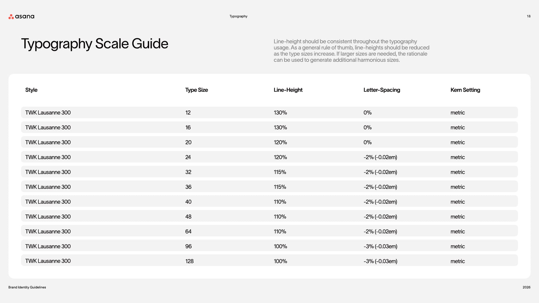
| Their face | Use | License | Open stand-in |
|---|---|---|---|
| TWK Lausanne | Titles 300, CTAs 600, eyebrows and subtitles 900 (guide); site 300-500 | Commercial typeface (TWK prefix: the Weltkern foundry); Asana's licence does not transfer | Figtree Closest rendered width (1.2% mean error over 12 lines) and ink darkness at real weight +100 among 15 open sans faces tested against the live site. |
| TWK Lausanne | Copy in 300 | Commercial | Figtree Same calibration; Arial is the guide's own fallback. |
| Face | TWK Lausanne 300 / 600 / 900 |
|---|---|
| Fallback | Arial |
| Stand-in (ours) | Figtree at real weight +100 |
One family, TWK Lausanne, a Swiss sans in three weights: 300 (primary: titles and copy), 600 (secondary: CTAs) and 900 (tertiary: eyebrows and subtitles). The guide publishes a full size scale from 12 to 128px with line heights from 130% down to 100% and tracking down to -3%. Arial is the fallback. asana.com sets everything in Lausanne 300-500.
Source: assets.asana.biz/asset/a4bdc79a-88a2-463f-8243-38fe90b79c88/Asana-Brand-Guidelines-FY27.pdfassets.asana.biz/asset/a4bdc79a-88a2-463f-8243-38fe90b79c88/Asana-Brand-Guidelines-FY27.pdfassets.asana.biz/asset/a4bdc79a-88a2-463f-8243-38fe90b79c88/Asana-Brand-Guidelines-FY27.pdfassets.asana.biz/asset/a4bdc79a-88a2-463f-8243-38fe90b79c88/Asana-Brand-Guidelines-FY27.pdfassets.asana.biz/asset/a4bdc79a-88a2-463f-8243-38fe90b79c88/Asana-Brand-Guidelines-FY27.pdfassets.asana.biz/asset/a4bdc79a-88a2-463f-8243-38fe90b79c88/Asana-Brand-Guidelines-FY27.pdfassets.asana.biz/asset/a4bdc79a-88a2-463f-8243-38fe90b79c88/Asana-Brand-Guidelines-FY27.pdf
The OS for human-agent teams
Coral-to-fuchsia gradient phrase · one phrase of a hero or billboard headline (human-agent, workflow, agent)
Launch Planner: GTM in 4 weeks
Workflow lines and nodes · hero and billboard backgrounds, section dividers, diagrams
Reviewer Kim
Product-native pills · on workflow paths and in copy-led layouts
Agentic Work Management
Infrastructure dot grid · only behind brand diagrams and workflows
Launch Coordinator
Worklings (AI Teammate characters) · anywhere an AI agent appears: product icons, pills, cards, over photography
Specimens use sample copy, not Asana’s.
Every element is a piece of the product's own UI, so a billboard reads as Asana even without the logo.
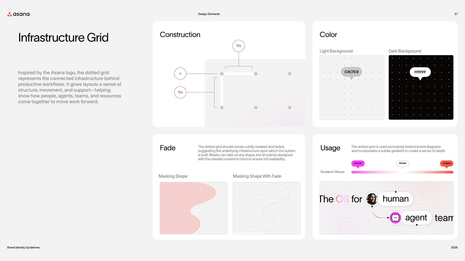
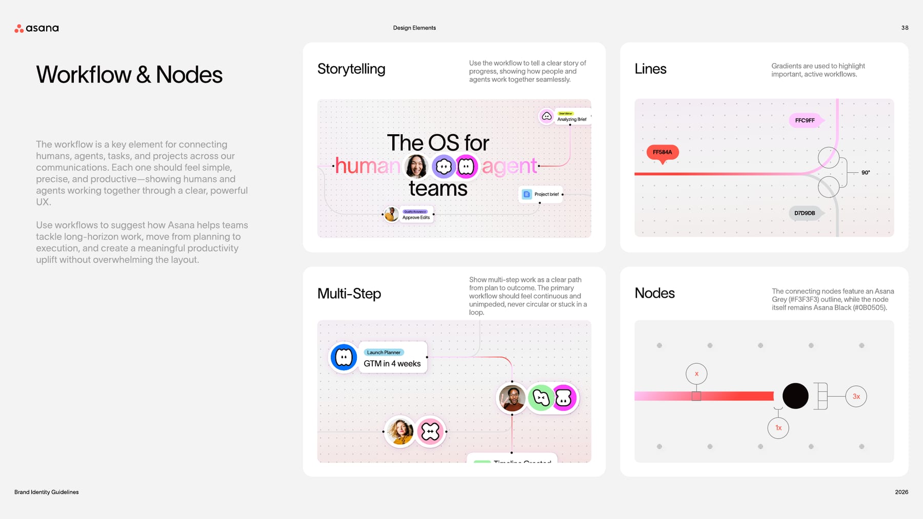
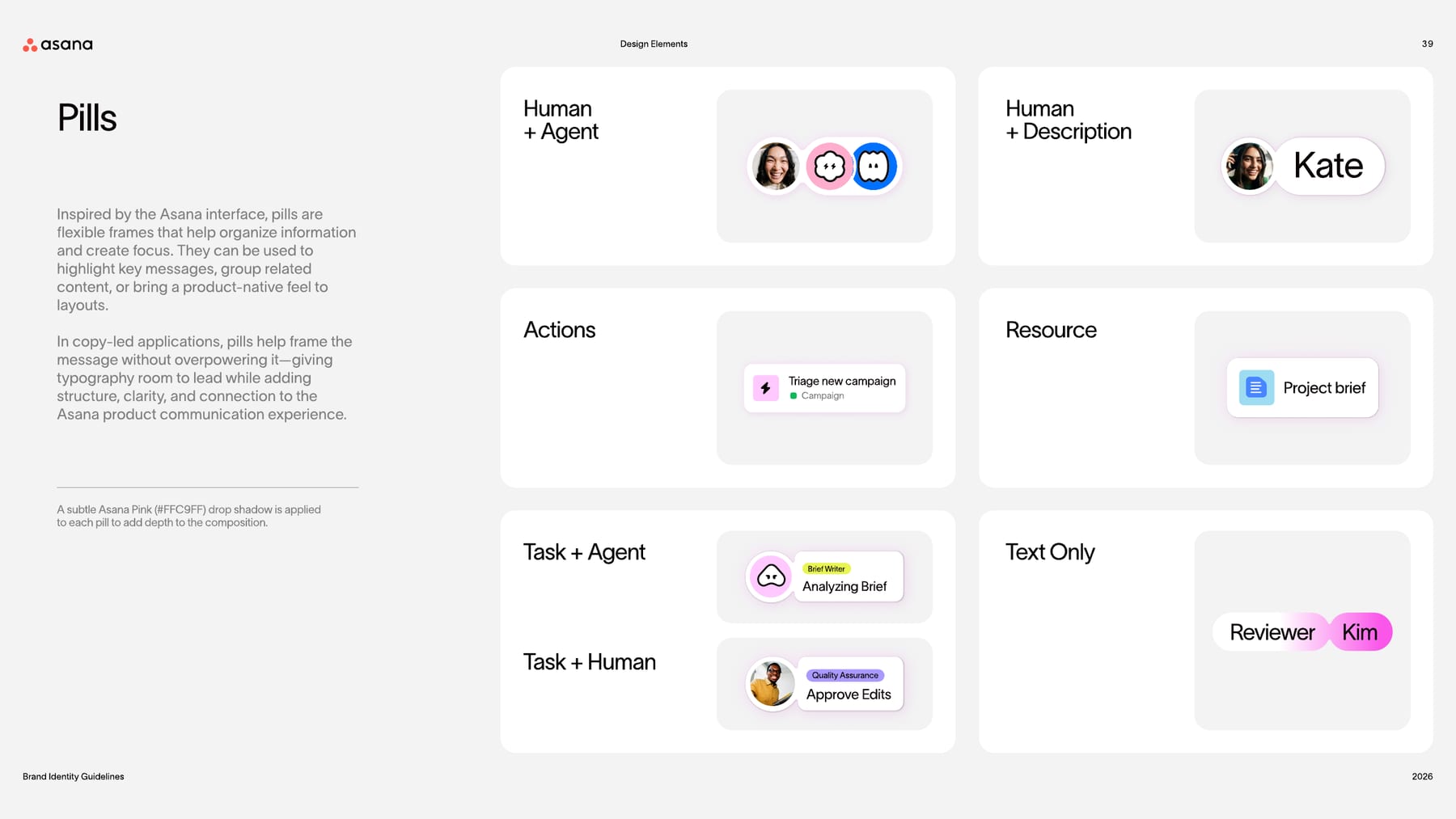
Three product-derived elements: the infrastructure dot grid (from the logo's dots), workflow lines with nodes (connecting humans, agents, tasks and projects) and pills (interface frames for people, agents, tasks and resources).
Source: assets.asana.biz/asset/a4bdc79a-88a2-463f-8243-38fe90b79c88/Asana-Brand-Guidelines-FY27.pdfassets.asana.biz/asset/a4bdc79a-88a2-463f-8243-38fe90b79c88/Asana-Brand-Guidelines-FY27.pdfassets.asana.biz/asset/a4bdc79a-88a2-463f-8243-38fe90b79c88/Asana-Brand-Guidelines-FY27.pdf
Giving each agent a face makes "human-agent teams" literal: agents sit beside human avatars as teammates.
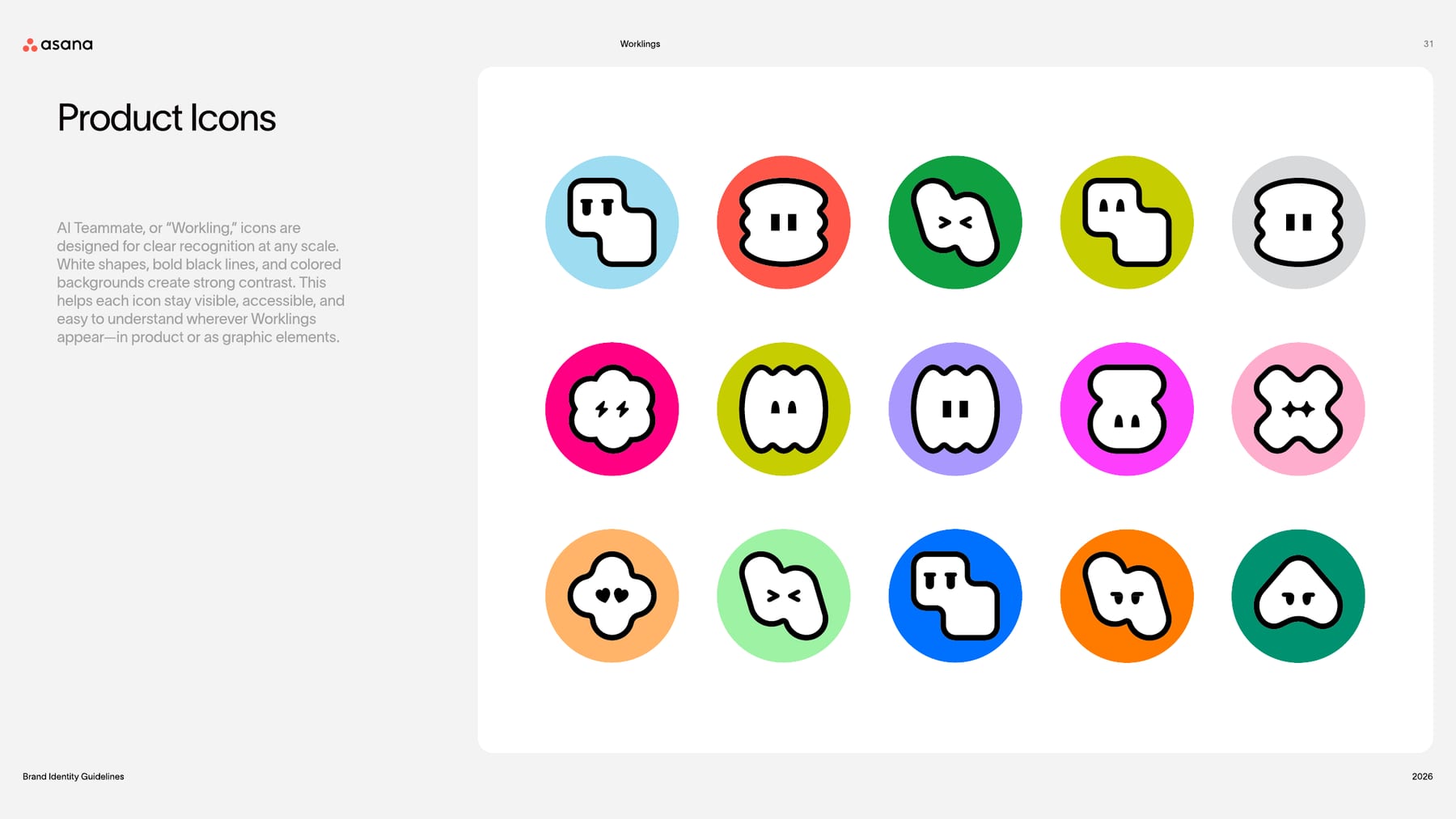
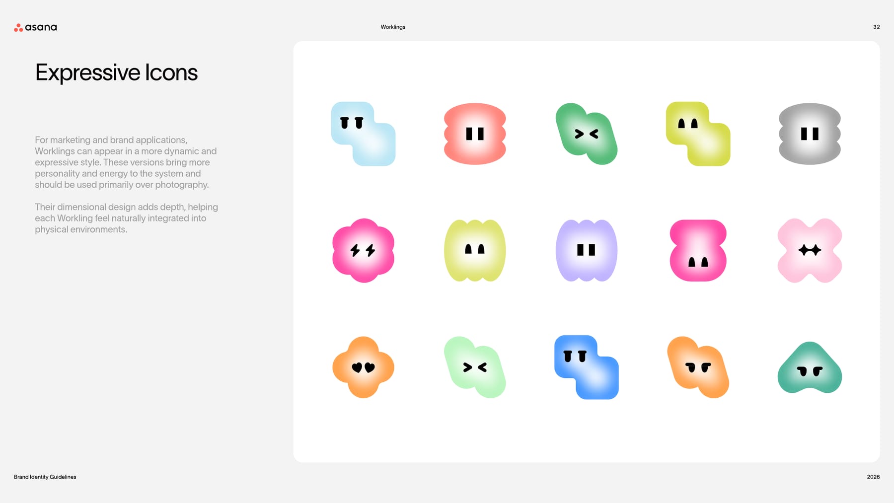
AI Teammates appear as Worklings, blob characters with two simple eyes. Product icons: white shape, bold black line, colored circular background, built for recognition at any size. Expressive icons: dimensional, softly lit versions for marketing, mainly over photography.
Not published: icon grid, stroke weight or sizes.
Source: assets.asana.biz/asset/a4bdc79a-88a2-463f-8243-38fe90b79c88/Asana-Brand-Guidelines-FY27.pdfassets.asana.biz/asset/a4bdc79a-88a2-463f-8243-38fe90b79c88/Asana-Brand-Guidelines-FY27.pdfassets.asana.biz/asset/a4bdc79a-88a2-463f-8243-38fe90b79c88/Asana-Brand-Guidelines-FY27.pdf
The fisheye bend says systems support people rather than overpower them, the same idea as the tagline.
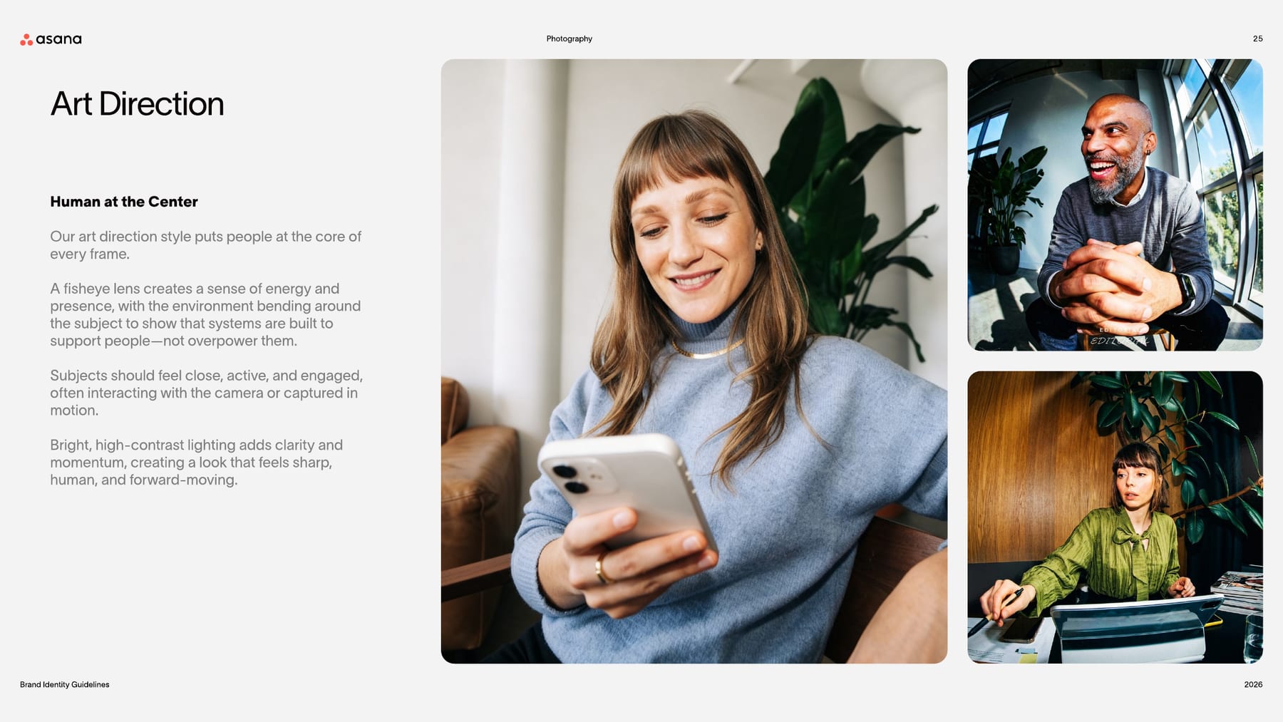
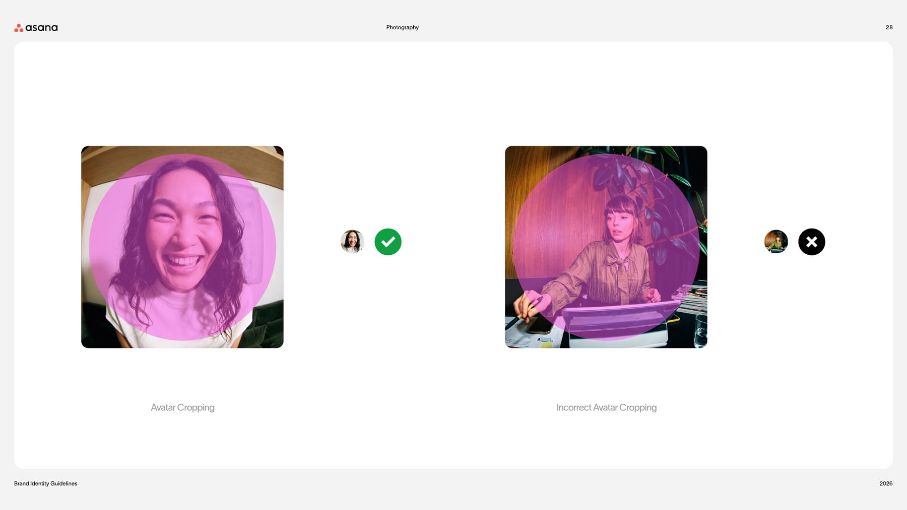
Art direction "Human at the Center": people at the core of every frame, shot with a fisheye lens so the environment bends around them, close, active, often engaging the camera, in bright high-contrast light. Avatars are cropped to a circle around the face.
Source: assets.asana.biz/asset/a4bdc79a-88a2-463f-8243-38fe90b79c88/Asana-Brand-Guidelines-FY27.pdfassets.asana.biz/asset/a4bdc79a-88a2-463f-8243-38fe90b79c88/Asana-Brand-Guidelines-FY27.pdfassets.asana.biz/asset/a4bdc79a-88a2-463f-8243-38fe90b79c88/Asana-Brand-Guidelines-FY27.pdfassets.asana.biz/asset/a4bdc79a-88a2-463f-8243-38fe90b79c88/Asana-Brand-Guidelines-FY27.pdfassets.asana.biz/asset/a4bdc79a-88a2-463f-8243-38fe90b79c88/Asana-Brand-Guidelines-FY27.pdf
Not published in the guide.
Not published in the guide. On asana.com the hero workflow animates on a canvas, accordion images enter with a short overshoot (0.5s cubic-bezier(0, 1.08, 0.77, 1.01)), and buttons fade their fill in 0.15-0.3s.
Not published: motion principles, durations or easing.
Source: asana.com
The OS for human-agent teams
AI that works the way your team works
By building scalable workflows and leveraging AI with intention
Get started easily
Why projects slip when work is scattered
The only platform that can support your company at any scale
The guide shows applications, not a grid: big Light headline centred or top-left, a workflow of pills around it on a faded dot grid, asana.com in a corner. The homepage is white with rounded inset black and off-white panels, a 1288px content column and two 628px columns.
Measured from asana.com's computed styles and geometry of the live homepage (the "The OS for human-agent teams" A/B variant) at 1440 and 390, headless Chromium, 2026-10-31.
| Measure | Desktop | Phone |
|---|---|---|
| Page margin | 76px | 24px |
| Section padding | 120px | 48px |
| Hero text width | max 873px, centered | full width |
| Card gap | 22px | 22px |
| Navigation | 68px | 68px |
Hero H1
TWK Lausanne · 102px (phone 48) · line 0.9 · tracking -2.55px · weight 400
Section H2
TWK Lausanne · 54px (phone 30) · line 1 · tracking -1.08px · weight 400
Quote
TWK Lausanne · 36px (phone 20) · line 1.3 · tracking -0.36px · weight 400
Subhead (logo stat, link-card and problem titles)
TWK Lausanne · 30px (phone 20) · line 1.2 · weight 500
Hero lead
TWK Lausanne · 26px (phone 18) · line 1.3 · tracking 0.52px · weight 350
Card and accordion title
TWK Lausanne · 24px (phone 18) · line 1.2 · weight 500
Body large
TWK Lausanne · 20px (phone 15) · line 1.5 · tracking 0.4px · weight 350
Body
TWK Lausanne · 16px (phone 14) · line 1.5 · tracking 0.32px · weight 350
Small / legal / meta
TWK Lausanne · 13px (phone 12) · line 1.5 · tracking 0.26px · weight 350
Eyebrow (uppercase)
TWK Lausanne · 16px (phone 11) · line 1.5 · tracking 0.64px · weight 500
Skill chip (uppercase)
TWK Lausanne · 11px · line 1.5 · tracking 0.44px · weight 500
Button
TWK Lausanne · 16px (phone 14) · line 1.5 · weight 500
Nav link
TWK Lausanne · 14px (phone 16) · line 1.5 · weight 500
Footer heading
TWK Lausanne · 14px · line 1.75 · weight 500
Footer link
TWK Lausanne · 16px · line 1.5 · weight 400
One or two sentences on what this does for the reader.
One or two sentences on what this does for the reader.
Card: white, 1px #E7E7E7 border, 8px corners (Teammate cards); link cards use 10px on #FAFAFA panels; media 16px; panels 20px.
How Asana’s own landing pages are built, observed on asana.com, 2026-10-31. The full measurements are in spec.md.
Source: assets.asana.biz/asset/a4bdc79a-88a2-463f-8243-38fe90b79c88/Asana-Brand-Guidelines-FY27.pdfassets.asana.biz/asset/a4bdc79a-88a2-463f-8243-38fe90b79c88/Asana-Brand-Guidelines-FY27.pdfassets.asana.biz/asset/a4bdc79a-88a2-463f-8243-38fe90b79c88/Asana-Brand-Guidelines-FY27.pdfassets.asana.biz/asset/a4bdc79a-88a2-463f-8243-38fe90b79c88/Asana-Brand-Guidelines-FY27.pdfasana.com
The layout is the product promise: the workflow drawn around the headline shows people and agents working together before any copy is read. Our reading
How our engine applies Asana's system to each format. This is our recipe built from their rules, not something Asana publishes.
| Format | What they did | Source |
|---|---|---|
| billboard | White board, logo top centre, centred two-line headline with a gradient phrase, workflow pills around it, lead line under it. | assets.asana.biz/asset/a4bdc79a-88a2-463f-8243-38fe90b79c88/Asana-Brand-Guidelines-FY27.pdf |
| poster | Portrait: logo top left, asana.com top right, three-line left-aligned headline with a gradient word, workflow of Workling and avatar pills down the right. | assets.asana.biz/asset/a4bdc79a-88a2-463f-8243-38fe90b79c88/Asana-Brand-Guidelines-FY27.pdf |
| street-level billboard | Fisheye photo of a person with task pills and the line "Work has a new flow." | assets.asana.biz/asset/a4bdc79a-88a2-463f-8243-38fe90b79c88/Asana-Brand-Guidelines-FY27.pdf |
| digital billboard | Landscape screen: centred "The OS for human agent teams" with avatar and Workling pills inside the line, workflow around it. | assets.asana.biz/asset/a4bdc79a-88a2-463f-8243-38fe90b79c88/Asana-Brand-Guidelines-FY27.pdf |
| web page | asana.com homepage: white page, centred 102px Light headline with a gradient phrase over a workflow canvas, black pill buttons, rounded dark panels. | asana.com |
| Format | Loudness | Must appear | What varies |
|---|---|---|---|
| Landing page | Build it the way asana.com is built (kit.spec.page): white page, sticky white 68px nav with pill buttons, centred Light hero headline (stand-in Figtree 400) with one coral-to-pink gradient phrase over the workflow canvas, black pill CTAs, 1288px content, rounded inset #0D0D0D and #FAFAFA panels (radius 20px), black footer with the coral logomark | which sections and how many cards; the guide's Light Fuchsia #FFC9FF secondary CTA in place of the outline pill | |
| Deck | White or black slides, large Light headlines, one gradient phrase per title, pill labels, logo bottom or top corner | a workflow diagram on a faded dot grid for process slides | |
| Billboard / poster | Headline with a gradient phrase, Worklings and avatar pills on a workflow, faded dot grid, asana.com | photo (fisheye) or white ground | |
| Social post | One headline with a gradient phrase or a fisheye photo with an expressive Workling | pills and a short workflow | |
| White ground, black type, black pill CTA, coral logo | one gradient word in the hero line | ||
| Product UI | Product-style Worklings, black and white surfaces, Light Fuchsia active states | palette colors for project and agent tags |
 Client managementMeta · Nov 2026 – now
 Run critical workflows with humans and agents on one…Google · Jun 2026 – now
 Asana organizes work so teams know what to do, why it…Google · Mar 2025 – now
 WISLondonLinkedIn · Apr – May 2026
Source: assets.asana.biz/asset/a4bdc79a-88a2-463f-8243-38fe90b79c88/Asana-Brand-Guidelines-FY27.pdfassets.asana.biz/asset/a4bdc79a-88a2-463f-8243-38fe90b79c88/Asana-Brand-Guidelines-FY27.pdfasana.com/brand
Your name and logo, Asana’s system.
Use this kit for my brand Use this brand in Claude
Get your brand audit Put your brand in Claude What goes in a brand book
Each value is marked published, observed, our reading or our recipe, with its source. Checked 2026-10-31. Not affiliated with Asana.