AI networking fabric (training and inferencing)
Arrcus is the only provider with purpose-built ethernet fabrics for both Observed
Brand book
Arrcus looks like the network it sells: a calm, open, all-blue system where structure is light (ice and white grounds, rounded Varela) and power shows as depth (gradients that run from steel blue into deep navy, plexus video of nodes and links). The friendly rounded Varela keeps an infrastructure brand approachable; orange is held back as a single "go" signal. Our reading

The hero background: looping network-plexus video on home and ACE, the still network image on /about and /news; its carousel copy changes (Sovereign AI, Unified AI Networking Fabric).
Share of the home page height at 1440 (7775px) by band ground, measured in measure/home-desk.json; the hero hex is the mean colour of the video frame.
Our engine's setting, built from their rules.
Only the palette blues and grounds appear; dark areas are blue gradients or #213F6A, never black or purple.
On the website at most one #E77C20 element is in view (progress bar, nav underline or the closing CTA pill), and orange is never a web ground or text colour. Posts and video cards may use the orange gradient ground.
Every head is Varela 400 in Title Case (no bold); copy is Open Sans; eyebrows are uppercase Open Sans 500 with 6px tracking; buttons use the system-ui stack.
Buttons are pills (30-40px radius) in #0F7ED6, #80ADD0 or white outline; cards have 6px radius and no borders.
The supplied SVG lockup with NETWORK DIFFERENT™: colour on white/ice, white on navy or gradients.
ACE™, AINF™, ACE-AI™, ArcOS® carry their mark on first prominent use, matching /trademarks.
Every customer, partner, investor or number is one arrcus.com shows; AINF percentages keep their third-party source.
Arrcus sells networking software (ArcOS, ACE and the AINF inference fabric) that runs on open, multi-vendor hardware so operators and enterprises can build AI, cloud and telco networks at hyperscale without legacy-vendor lock-in. Our reading
Arrcus is the only provider with purpose-built ethernet fabrics for both Observed
The Network for Sovereign AI Observed
One simple network. One scalable architecture. One seamless experience. Observed
Built with the Best. Open to All. Observed
The Network for Sovereign AI
Discover the Power of Smart Distributed Networking™ with Arrcus Connected Edge (ACE™)
The AI era demands networks built for it. Arrcus delivers high-performance routing, switching, and AI fabric — from training at scale to inferencing at the edge.
Ready to Power Your AI Network?
(paraphrase) From a software network OS (ArcOS) to the ACE platform, and now to the Ethernet fabric for AI, with the performance, cost efficiency and sovereignty operators want.
(paraphrase) Strong teams over strong individuals; hire people better than us.
Observed(paraphrase) Honest, constructive feedback; share ideas early; no ego.
Observed(paraphrase) Take ownership, move fast, listen to users, build products that matter.
ObservedCategory. AI-Native Networking Software Observed
legacy vendors / traditional monolithic systems / proprietary networking fabrics (unnamed on the site)
(paraphrase of the "About Arrcus" press-release boilerplate) Arrcus provides high-performance routing and switching. Its ACE platform, powered by the ArcOS network operating system, is an agile alternative to monolithic systems for datacenter, core and edge. For AI it offers ethernet fabrics for training (scale-out, scale-across) and inferencing (AINF, policy-driven across edge, datacenter and cloud), lowering token latency and cost per token and enabling sovereign AI. Headquartered in San Jose, California.
Network Different Observed
The Network for Sovereign AI Observed
The Unified AI Networking Fabric Observed
Built with the Best. Open to All. Observed
Power Of One Observed
Hyperscale performance. Network freedom. Observed
Transforming how the world connects Observed
Ready to Power Your AI Network? Observed
The Intelligence Layer for AI Inference Observed
The inference era needs a smarter network. AINF delivers it. Observed
The hyperscale networking software company Observed
Arrcus | AI-Native Networking Software Observed
Hyperscale performance. Network freedom.
The Intelligence Layer for AI Inference
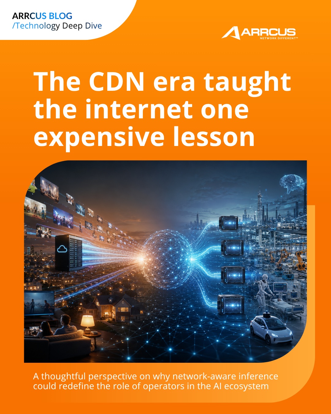
The CDN era taught the internet one expensive lesson
TELUS in Proof-of-Concept with Arrcus Inference Network Fabric (AINF) to Power Sovereign AI and Distributed Inferencing for Mission-Critical Applications in Canada
Powering the AI-Driven Network Revolution
Ready to Power Your AI Network?
Ready to power your AI network?
Explore ArcOS™
Explore ArcOS
One simple network. One scalable architecture. One seamless experience.
Simple, scalable, seamless networking.
AINF makes AI inference faster and cheaper.
The Arrcus Inference Network Fabric (AINF™) is a policy-driven network spanning edge, datacenter, and cloud — giving you control over where inference runs and how data moves, while reducing latency, improving throughput, and lowering cost per token at scale.
confidenttechnicalopenforward-looking
fabricpolicy-drivensovereign AIinferencingtoken latencycost per tokenedge, datacenter, and cloudopenhardware-agnosticsoftware-definedhyperscalescale-out and scale-acrossPower of Onenetwork different
exclamation marks in heads (the only one is the button "Yes, let’s go!")lowercase product names without their mark on first use (ACE, AINF, ArcOS)consumer slang or emoji
Source: arrcus.comarrcus.com/why-arrcusarrcus.com/about-usarrcus.com/connected-edge
Source: arrcus.comarrcus.com/why-arrcusarrcus.com/about-usinstagram.com/arrcusinc/p/Db33JBHjwqRinstagram.com/arrcusinc/p/DZummxDkfdK



Arrcus publishes no logo guidelines; placements and colours here are measured from arrcus.com, its Instagram posts and YouTube cards.
One faceted A mark, always locked to the wordmark.


One faceted A mark, always locked to the wordmark. Three blue facets (#80ADD0, #345E9E, #045DA3) sit left of a wide, heavy ARRCUS wordmark in #36424A, with NETWORK DIFFERENT™ in small caps under its right half. The white version runs in the footer and on every social post and video card; the mark alone appears as the favicon and on the footer product chips.
| Nav size | 173x32 at 1440, left margin 60px |
|---|---|
| Footer size | 165x30 white on #213F6A |
| Mark colours | #80ADD0 / #345E9E / #045DA3 |
| Wordmark colour | #36424A |
Not published: clear space; minimum size; misuse rules.
Source: arrcus.com/arrcus-logo-color.svgarrcus.cominstagram.com/arrcusinc/p/Db33JBHjwqRyoutube.com/watch
Test Drive ACE™
Test Drive ACE™
Cool blues only, plus one orange signal.
Cool blues only, plus one orange signal. White and #F3F7FA split about 60% of a page; blue gradients (cards and bands) about 25%; the navy hero and #213F6A footer the rest. On the site #0F7ED6 lives on buttons and outline rings only, and #E77C20 on the hero progress bar, nav hover underline and the closing CTA button. Social posts and video cards are louder: full-bleed blue (#0A8DF5 to #004CAE) or orange (#FF9205 to #F87201) gradient grounds.
| Ground | #FFFFFF / #F3F7FA alternating |
|---|---|
| Heads | #213F6A (#193152 on first light section) |
| Copy | #637C9B on light; white / #9ABEDA / #C5D6E5 on blue |
| Action | #0F7ED6 |
| Signal | #E77C20 |
| Card gradient | radial #1B4079 21.82% -> #80ADD0 75% at 64.69% 185.63% |
| Band gradient | #0B589E -> #2B2037 |
| Footer | #213F6A |
Source: arrcus.comarrcus.com/connected-edgearrcus.com/about-usarrcus.com/newsinstagram.com/arrcusinc/p/Db33JBHjwqR
Network Different
Varela for every head, Open Sans for every line of copy.
Varela for every head, Open Sans for every line of copy. Heads run Varela 400 (70 hero, 50 section, 36 statement, 24 card) with slight negative tracking at large sizes; copy is Open Sans at a generous 1.55-1.75 leading; eyebrows are spaced uppercase Open Sans 500 at 6px tracking; the footer uses Varela Round; buttons and nav render in the OS system-ui face. Social posts switch to Open Sans Bold heads.
| Their face | Use | License | Open stand-in |
|---|---|---|---|
| Varela 400 | every head, card title, band statement | SIL OFL 1.1 (Google Fonts) | Varela (real face, files supplied) |
| Open Sans (variable 300-800) | leads, body, eyebrows, card copy, news titles, quotes | SIL OFL 1.1 (Google Fonts) | Open Sans (real face, files supplied) |
| Varela Round 400 | footer links and product names only | SIL OFL 1.1 (Google Fonts) | Varela Round (real face) |
| system-ui stack | buttons, nav links, top utility links | OS font (not distributable) | keep the stack: system-ui, -apple-system, "Segoe UI", "Open Sans", ... |
| H1 | Varela 70/80.5, -1.3px (phone 38/46) |
|---|---|
| Section head | Varela 50/64, -1.3px (phone 30/44) |
| Statement | Varela 36/48, -0.13px |
| Card head | Varela 24/36, +0.13px |
| Lead | Open Sans 22/34 400 (phone 18/32) |
| Body | Open Sans 16/28 400 |
| Eyebrow | Open Sans 14/22 500 uppercase, 6px tracking |
| Button | system-ui 16 500 |
Source: arrcus.comarrcus.com/connected-edgeinstagram.com/arrcusinc/p/Db33JBHjwqR
Do 6px-radius card filled with radial-gradient(302.41% 284.1% at 64.69% 185.63%, #1B4079 21.82%, #80ADD0 75%): light steel top fading to navy at the bottom. Padding 40px 30px. White Varela 24/36 head top-left (36/46 on the large AINF card); a translucent white angular shard (images/card-a-shard.svg, 175x144) flush with the right edge, starting 130px down (200px on the 452x548 card); a #9ABEDA 16px weight-500 Open Sans link with a thin right arrow at the bottom-left. 290x353 in a four-up row at 1440, full-width stacked swiper on phone.
Blue gradient card with the faint A shard · home solution cards (Networking for Distributed AI...), AINF card, /connected-edge product cards, Technical Documentation cards
Do Full-bleed deep navy-blue ground (looping images/hero-network-video.mp4, or images/header-network-bg.jpg as a still) with faint node-and-line plexus. Left: spaced-caps #9ABEDA eyebrow (Open Sans 14px 500, 6px tracking), white Varela 70/80.5 head at -1.3px, white Open Sans 22px sub, #80ADD0 pill. Right on home: three stacked 492x201 glass cards (linear-gradient 234.94deg rgba(255,255,255,.12) -> .27, 6px radius) each with a 44px white line icon and a 22px white label. A 5px #E77C20 bar grows along the hero bottom edge as the carousel advances.
Network-plexus navy hero with glass cards and orange progress bar · home hero (video), /about, /news, /connected-edge headers (video or the same network background image)
Do Open Sans 14/22 weight 500 uppercase at letter-spacing 6px (#9ABEDA on dark, #213F6A on light), 8-16px above a centred Varela head (50/64 at -1.3px, #213F6A or #193152) and a centred 22/34 #637C9B lead capped near 800px.
Spaced-caps eyebrow over a centred Varela head · every hero and most sections: ABOUT ARRCUS, NEWSROOM, KEY FEATURES, CASE STUDIES, FAQS, and BUILT WITH THE BEST. OPEN TO ALL.
Do Pills only (30px radius, 18px 30px, 60-62px tall; nav 40px radius 14px 26px). On light: 1px #0F7ED6 outline with #0F7ED6 label. Nav: #0F7ED6 fill. Hero: #80ADD0 fill. On dark bands: white 1-2px outline with white label and arrow. The single #E77C20 filled pill sits in the closing Ready to Power Your AI Network? band.
Pill buttons in blue, orange only to close · every page
Do Full-bleed band filled with linear-gradient(181.22deg, #0B589E -4.18%, #2B2037 263.5%) (news, associations) or radial-gradient(141.92% 615.96% at 50% 39.31%, #0B589E, #2B2037) (closing CTA, 430px tall, centred white Varela 50/64 head, white 22/34 sub, orange pill). The aubergine end barely shows: the band reads as saturated mid-blue darkening to navy.
Deep blue-to-aubergine bands · home Arrcus in the News, home and /connected-edge closing CTA, /about Industry Associations
Do Sections alternate #FFFFFF and #F3F7FA full-bleed with 103px top and 136px bottom padding at 1440 (84-97px on some); content sits in a 1320px column with 60px page margins.
Light/ice alternation · every page body
Specimens use sample copy, not Arrcus’s.
The A shard is the one recurring device.
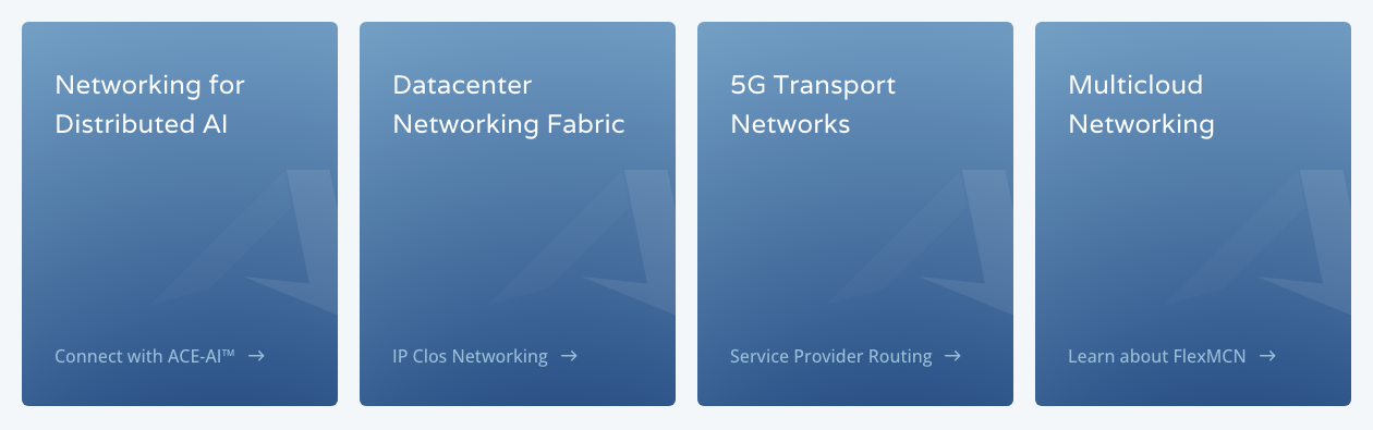


The A shard is the one recurring device. A faint angular white fragment of the A mark sits on the right edge of every blue card, 130px down under the head, and larger across the slate CTA strip. Around it: glass cards on the hero, thin white tab bars and progress tracks under carousels, the orange progress bar, and segmented pill tab switchers (Leadership Team / Board / Advisors, Press Release / Company News).
Small solid glyphs in one colour each.

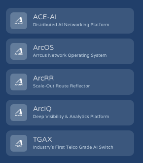


Small solid glyphs in one colour each. White hero icons (cloud with gauge, rising bars with arrow, check shield) sit at 44px on the glass cards; #9ABEDA dot-cluster icons (a central glyph ringed by dots) at 52px head the ACE pillar cards; a white A mark on #637C9B rounded squares marks each product; a white doc glyph marks document cards. The one line icon is the #E8832C circled plus (1.5px stroke) that marks features on /connected-edge.
Isometric, glowing tech scenes carry the product story.






Isometric, glowing tech scenes carry the product story. Chips, server racks, clouds and GPU towers sit on dark navy grids joined by cyan and teal light traces, in 776x260 banner crops above the text of the Why Arrcus cards; a darker violet-navy isometric telecom scene (satellite, towers, city) heads the case study. Product diagrams are flat white discs with logos (the ACE diagram). Video heroes show a network plexus of nodes and links.
Source: arrcus.comarrcus.com/connected-edgeinstagram.com/arrcusinc/p/Der0bDwEY4n
Photography is rare on the website and people-only.





Photography is rare on the website and people-only. Leadership headshots are cut out (transparent PNG) over a blue gradient panel in 282x343 6px cards, and one candid team photo (Bangalore office) sits beside the /about hero text, in natural colour with no tint and no text on the photo. Social posts add stock-style scene photos (a server room, a night skyline) cropped with two rounded corners.
Source: arrcus.com/about-usinstagram.com/arrcusinc/p/Ddj_j_mj3s8instagram.com/arrcusinc/p/DZummxDkfdK
A 1440 canvas with 60px margins and a 1320px column. A 48px #F3F7FA utility strip sits over a 98px white nav: logo left, centred menu (AINF, ACE, Solutions, Learn, Partners, About, Support), blue Test Drive ACE pill right. The hero runs 600-814px. Sections alternate white and ice with about 103px top and 136px bottom padding; a centred eyebrow, head and lead lead into 3- or 4-up 6px cards or a horizontal swiper. Pages close on a gradient CTA band, then the #213F6A footer (logo, 3 big links, socials, a column of product chips, four link columns).
Measured from 's computed styles and bounding boxes of every band at 1440 and 390, cookie bar and chat widget hidden.
| Measure | Desktop | Phone |
|---|---|---|
| Page margin | 60px | 30px |
| Section padding | 103px | 80px |
| Hero text width | max 625px, centered | full width |
| Card gap | 20px | 20px |
| Navigation | 146px | 146px |
Hero headline
Varela 400 · 70px (phone 38) · line 1.15 · tracking -1.3px · weight 400
Section head
Varela 400 · 50px (phone 30) · line 1.28 · tracking -1.3px · weight 400
Statement / large card head
Varela 400 · 36px (phone 24) · line 1.28 · tracking -0.13px · weight 400
Card head
Varela 400 · 24px · line 1.5 · tracking 0.13px · weight 400
Lead
Open Sans (variable 300-800) · 22px (phone 18) · line 1.545 · weight 400
Hero sub
Open Sans (variable 300-800) · 22px (phone 18) · line 1.3 · weight 400
Card body
Open Sans (variable 300-800) · 16px · line 1.75 · tracking 0.13px · weight 400
Eyebrow
Open Sans (variable 300-800) · 14px (phone 13) · line 1.57 · tracking 6px · weight 500
Arrow link
Open Sans (variable 300-800) · 16px · line 1.5 · weight 500
Button label
Open Sans (variable 300-800) · 16px · line 1.5 · weight 500
Nav link
Open Sans (variable 300-800) · 16px (phone 18) · line 1.75 · weight 400
Attribution
Open Sans (variable 300-800) · 14px · line 1.71 · weight 700
Footer label
Varela 400 · 15px (phone 16) · line 1.67 · tracking -0.1px · weight 400
Footer link
Open Sans (variable 300-800) · 13px (phone 16) · line 1.85 · tracking -0.1px · weight 400
Legal
Open Sans (variable 300-800) · 11px · line 1.9 · weight 400
How Arrcus’s own landing pages are built, observed on arrcus.com/%20(home);%20measure/home-desk.json,%20measure/home-phone.json;%20live%20headless%20Chromium%20on%20https://arrcus.com/%20at%201440x900%20and%20390x844%20with%20the%20HubSpot%20cookie%20bar%20and%20chat%20widget%20hidden%20(2026-11-18), 2026-11-18. The full measurements are in spec.md.
Source: arrcus.comarrcus.com/about-usarrcus.com/connected-edgearrcus.com/news


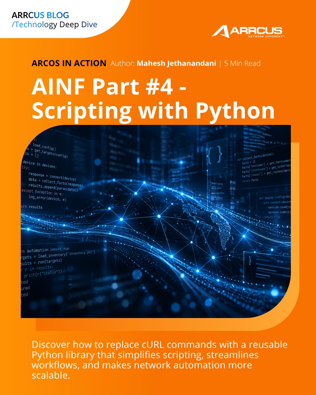

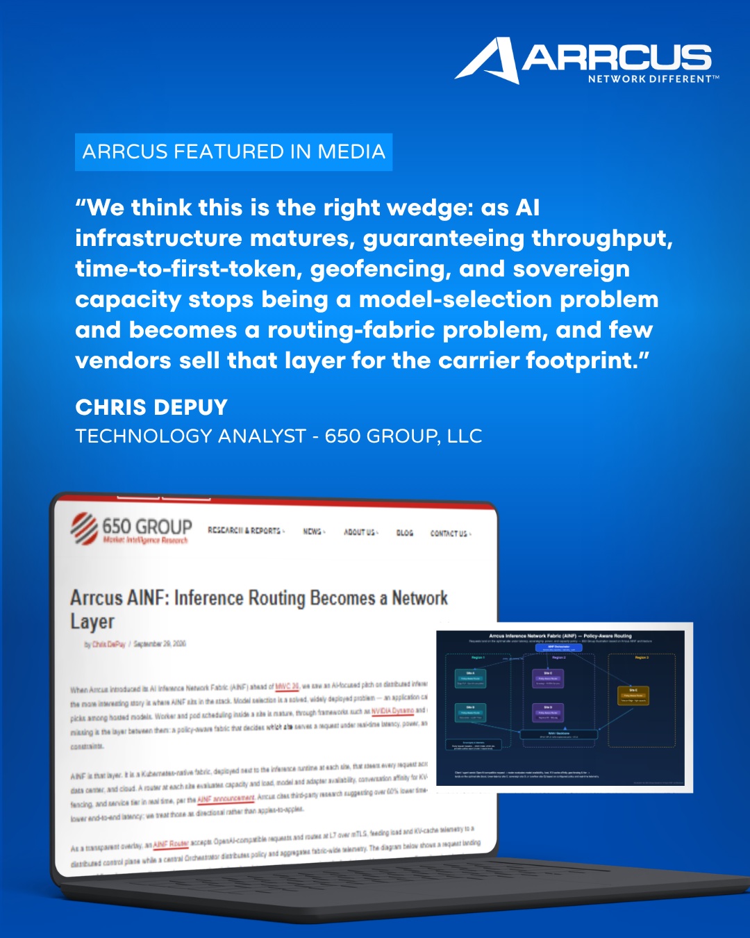

How loudly the system plays by format: our reading from arrcus.com, 7 Instagram posts and 8 YouTube title cards.
| Format | Loudness | Must appear | What varies |
|---|---|---|---|
| Landing page | Utility strip + white nav with colour logo and blue pill; navy plexus hero with spaced-caps eyebrow, white Varela H1 and pill; partner logo strip; alternating white/ice sections with centred Varela heads; blue gradient cards with the A shard; gradient closing band with the single orange pill; #213F6A footer | Hero background (video or still), number of card rows, testimonials swiper | |
| Social post, portrait | Blue (or orange) full-bleed gradient ground, white Arrcus logo top-right, white Open Sans Bold headline left-aligned at x108, one photo or illustration with two diagonally opposite ~110px rounded corners on an offset lighter tint block, one plain sub line. The canonical template is the blog card (3 of 7 posts). | Variant by job: blog card (tab + kicker + headline + image + sub), press release (PRESS release lockup + date + 6-line headline + partner logo bar over a photo), media quote (label box + quote + name/title + device mockup). Orange ground for alternate blog posts. Event posts are co-designed with the event and use its type. | |
| Social post | The portrait blog card compressed to a square: gradient ground, white logo top-right, Open Sans Bold headline at x108, the rounded-corner image on its tint block, no CTA. | Drop the sub line or the blog tab first when space runs short; never shrink the headline below 70px. | |
| Video thumbnail | Blue (or orange) gradient ground with a darker wave along the bottom, white Arrcus logo top left, white regular-weight title left, a column of rounded-corner image tiles on the right joined by a thin blue line, a row of white chevrons bottom left. | Orange ground for alternate series; the logo may be dropped when the title runs three lines; a CEO-announcement variant swaps the tiles for a cut-in portrait and a WATCH NOW pill. | |
| Event post | Event posts are co-designed with the event: blue or white ground, large white or black bold event title, date, place and time as pills or session cards, a speaker portrait, the Arrcus logo large (~380px) and a small pill label. | Use the event's own type and logo tile; the Arrcus gradient only appears as the ground. |
Source: arrcus.comarrcus.com/connected-edgearrcus.com/about-usarrcus.com/trademarksinstagram.com/arrcusinc/p/Db33JBHjwqRyoutube.com/watch
Your name and logo, Arrcus’s system.
Talk about my brand Use this brand in Claude
Get your brand audit Put your brand in Claude What goes in a brand book
Each value is marked published, observed, our reading or our recipe, with its source. Checked 2026-11-17. Not affiliated with Arrcus.
Tell us what you want to make. We’ll talk through how to put these ideas to work for your brand.
