Tools for Vehicle Intelligence + Dana
Tools and infrastructure for building, testing and validating physical AI, now run through Dana, the agentic platform (paraphrase). Observed
Brand book
It sells deep infrastructure to automakers and militaries, so the site looks like an engineering document: a ruled grid, monospace labels and no decorative colour, which reads as rigour. Video of real machines supplies scale, and the iridescent silver imagery stands in for "intelligence" without resorting to blue-tech clichés. Our reading

The imagery: real machine photography (mining trucks, cars, labs, ships) or iridescent rainbow-on-silver renders; band ground switches only between white and mist #ECEDF4.
Our engine's setting, built from their rules.
Press-kit file, one flat colour (#111111/black on light, white on dark), top-left in a pill header; never retyped.
UI uses only white, #111111, greys (#BEC2CB, #ECEDF4, #272A30, #5B616E); colour comes only from imagery. Dana blue only on Dana.
Sections sit in white cells divided by 1px #BEC2CB lines with square cell corners; photos inside cells take a 4px radius; no shadows or rounded cards.
Every section starts with a black square + 12px mono uppercase eyebrow.
Heads are Applied Sans (or calibrated stand-in) weight 500, -0.02em, Title Case; body 20/32.
Pill radius, 48px, black outline or black fill with white text; sentence-case label, no icon.
Real machines/teams or iridescent silver renders; 16:9 square-cornered in cells; type only over full-bleed video.
Numbers only as the site states them (1,000+, 40+, 30+; 18 of top 20 automakers per press kit); no invented metrics.
The physical AI company: one end-to-end platform (tools, OS, autonomy) that makes every moving machine intelligent, across land, sea, air and space (paraphrase). Observed
Tools and infrastructure for building, testing and validating physical AI, now run through Dana, the agentic platform (paraphrase). Observed
An operating system spanning domains so any vehicle can run intelligence applications (paraphrase). Observed
Validated multi-domain autonomy stacks for road, off-road, sea and air (paraphrase). Observed
Research on foundation models for autonomous driving and robotics (paraphrase). Observed
Building Physical AI That Moves the World
Physical AI, from Sea to Space.
Bringing Intelligence to A Billion Machines
Build Physical AI. Change the World.
Founded by engineers from Y Combinator, Google, GM and Bosch who set out to make machines intelligent across industries (paraphrase).
Category. Physical AI Observed
(paraphrase) Applied Intuition is a Silicon Valley physical AI company founded in 2017, building the digital infrastructure to bring intelligence to every moving machine. It serves automotive, defense, trucking, construction, mining and agriculture through tools and infrastructure, operating systems and autonomy, and is headquartered in Sunnyvale, California.
Building Physical AI That Moves the World Observed
Physical AI that Moves the World™ Observed
Bringing intelligence to every moving machine on the planet Observed
Physical AI, from Sea to Space. Observed
Bringing Intelligence to A Billion Machines Observed
One Platform for All Moving Machines Observed
One Platform Observed
Build Physical AI. Change the World. Observed
Powering the Next Industrial Revolution Observed
One Platform, All Industries Observed
Building Software-Defined Vehicles at Agent Speed
Autonomy at the Scale of a Nation
Where can you make the most impact?
AI Infrastructure for Every Ship
Mining rigs. Drones. Trucks. Robotics.
Tools. Agents. Data.
Building Physical AI That Moves the World
Building physical AI that moves the world.
1,000+ engineers. 40+ ex-CTOs. 30+ former founders.
Over 1,000 world-class engineers
Dana: build physical AI at agent speed.
Dana is the first agentic platform for building, testing, deploying, and operating intelligent machines across industries, at scale.
AmbitiousEngineering-plainConfidentIndustrialGlobal
physical AIevery moving machinefrom sea to spaceend-to-endagenticvehicle intelligenceautonomy stacksoftware-defined vehicles (SDV)dual-use






One flat colour, never a gradient or a container of its own.


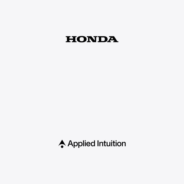
One flat colour, never a gradient or a container of its own. The arrowhead-and-dot mark sits left of the "Applied Intuition" wordmark: #111111 on light, white on video, dark or iridescent grounds; 190x24 in the frosted header pill, the mark alone in a 52px frosted circle on phone, and a white lockup split from a partner logo by a thin vertical rule in partner announcements.
Source: appliedintuition.com/press-releasescdn.sanity.io/files/a86leg7v/production/434ae9ab47a0b843a00664fd5840b0f212a0da1c.zipappliedintuition.com
The interface has no brand hue.
The interface has no brand hue. It runs on white #FFFFFF, ink #111111 and greys (#BEC2CB hairlines, #ECEDF4 mist band, #272A30 graphite footer, #5B616E/#94969D secondary text, #E3E5ED chips); colour arrives only through photography and the iridescent renders.
Source: appliedintuition.comappliedintuition.com/aboutappliedintuition.com/productsappliedintuition.com/press-releases
Building Physical AI That Moves the World
One grotesk family does everything.
One grotesk family does everything. Applied Sans Display/Text sets heads at weight 500 with -0.02em tracking and body at 400, 20/32, and Applied Sans Mono sets 12px caps labels; heads are Title Case and numbers run huge (80px) in the same face.
| Their face | Use | License | Open stand-in |
|---|---|---|---|
| Applied Sans Display | Hero, heads, lead paragraphs, buttons; appliedSansDisplay (variable 300-500, oblique 0-10deg) | Proprietary custom face; open stand-in Inter Tight at -0.011em, also for 20/32 lead copy (calibrated 2026-11-16) | |
| Applied Sans Text | Footer, founder bios, small text; appliedSansText (variable 300-500) | Proprietary; open stand-in Geist at -0.1px for 16px text (calibrated 2026-11-16) | |
| Applied Sans Mono | Eyebrows, dates, tag chips; 12px uppercase; appliedMono (400, 500) | Proprietary; open stand-in Geist Mono +0.45px (calibrated) | |
| Pretendard JA / KO | Japanese and Korean site versions | Open (SIL OFL) |
Source: appliedintuition.comappliedintuition.com/aboutappliedintuition.com/productsappliedintuition.com/press-releases
Do Content sits in white cells separated by 1px #BEC2CB lines; split rows are a 1/3 text cell (463px, padding 48 top/bottom, 48 divider side, 24 viewport side) and a 2/3 media cell (16:9 image 856x482 radius 4px, same insets) alternating left/right, each row ~578px tall; partner logos in 6 square 231px tiles; news in 3-up cells.
Hairline cell grid · Every section after the hero on home, about, products and press
Do A ~6px solid #111111 square, then Applied Sans Mono 12/20 uppercase +0.3px #111111, its cap-top 33px above the cap-top of a 36/44 weight-500 Title Case head (24px gap with text-box trim; 25px / 16px gap on phone).
Square + mono eyebrow · Top of every split row, product card and news meta
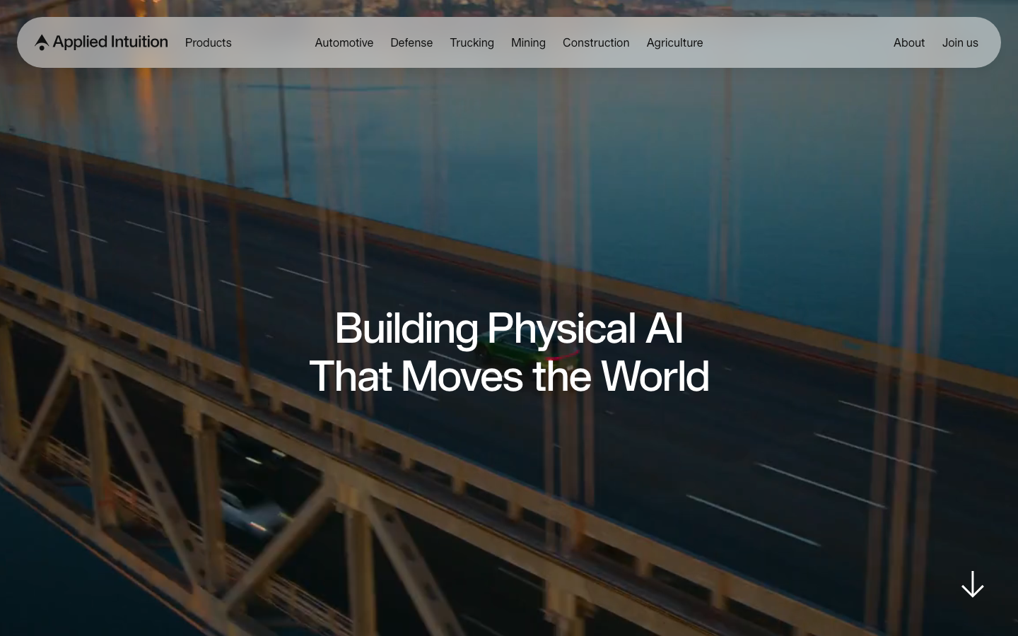
Do 100vh (min 600px) muted video on #000000; frosted 50% white pill header 72px tall, inset 24px, logo left, nav center, About/Join us right; home H1 60/68 white weight 500 centered; inner pages H1 bottom-left with a 22px sub-line; white 32px down-arrow bottom-right.
Full-bleed video hero with floating pill nav · First viewport of home, about, products, careers, industry pages
Do Imagery of white/silver terrain, clouds or waves washed with a thin-film rainbow (magenta-orange-cyan) on a cool grey sky; used full-bleed behind centered #111111 text or as the ground of partner lockups with white logos split by a 1px white rule.
Iridescent rainbow on silver · About closing CTA band, product cards, og image, partner press graphics
Do Radius 100px, 48px tall, 24px side padding, 16px label; outline #111111 1px for Learn more, #111111 fill with white text for the single strong action (Join us, Contact Us, Load more).
Monochrome pill buttons · All CTAs
Do #272A30 ground, two halves split by a vertical hairline; left: tagline "Physical AI that Moves the World™" then Products / Industries / Company columns (white heads, #94969D links, 16px Applied Sans Text); right: Follow us on + X/LinkedIn/YouTube, language switch, mission line, copyright; 32px up-arrow bottom-right.
Graphite split footer · Every page
Specimens use sample copy, not Applied Intuition’s.
The page is drawn like an engineering sheet.
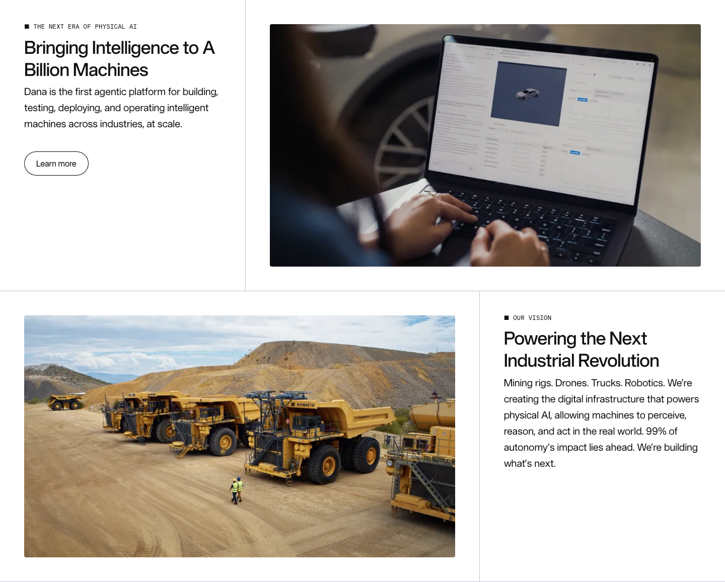
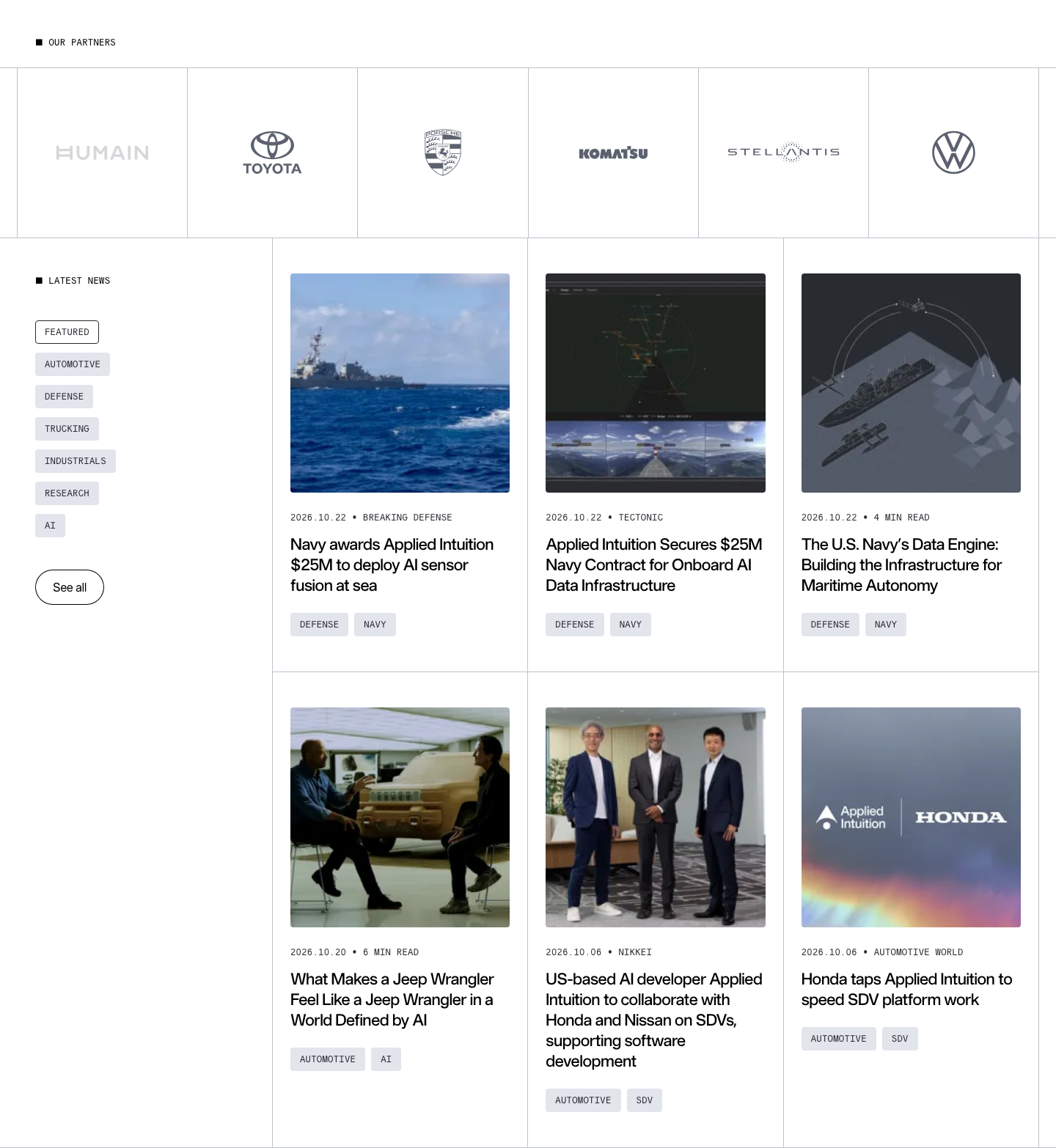
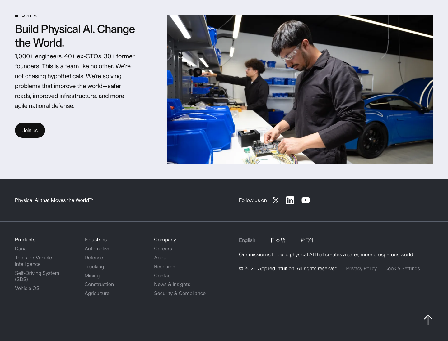
The page is drawn like an engineering sheet. Hairline cell grid; square bullet before mono eyebrows; pill buttons; grey mono tag chips; frosted pill header; long-shaft line arrows; press graphics use a faint square grid with + crop marks.
Source: appliedintuition.com
Icons stay grey and single-colour.


Icons stay grey and single-colour. Isometric 3D objects (sphere in a ring, stepped pyramid, interlocked rings) head features on the industry pages, and thin currentColor line glyphs (long-shaft arrow, chevron, download tray, menu) run the interface; social icons are solid.
Source: appliedintuition.comappliedintuition.com/autonomous-vehiclesappliedintuition.com/autonomous-truckingappliedintuition.com/mining-fleet-management-systemappliedintuition.com/case-studies
Illustration is rendered, not drawn.


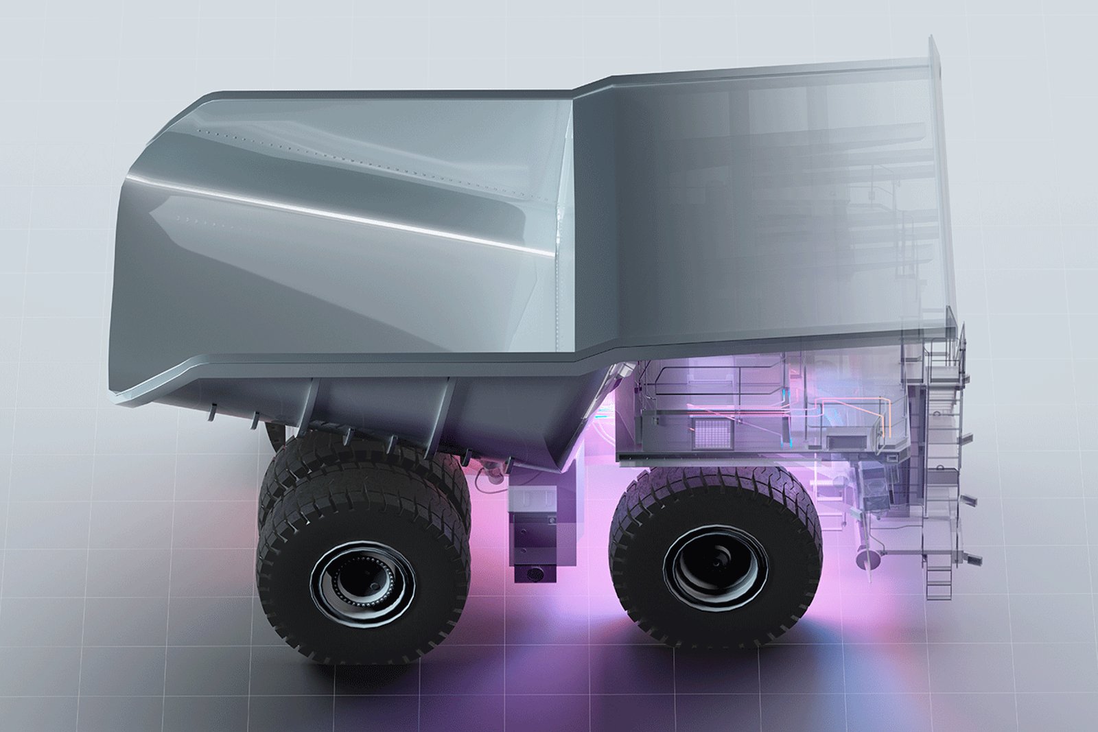


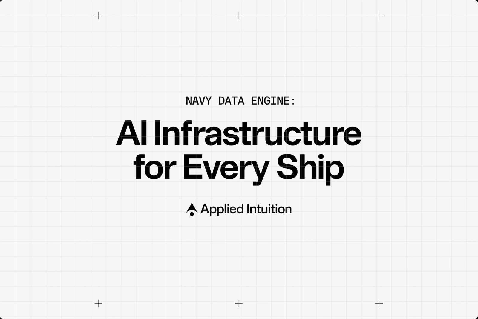

Illustration is rendered, not drawn. Iridescent thin-film rainbow over silver terrain, clouds and waves stands for intelligence; x-ray translucent vehicles glow magenta, orange or cyan from inside; dark simulation scenes use cyan and magenta lanes and boxes; press cards sit on light grid paper with + crop marks. The only flat drawings are the grey line spot illustrations on the careers benefits.
Source: appliedintuition.comappliedintuition.com/aboutappliedintuition.com/productsappliedintuition.com/press-releases
Real machines and the people who build them.
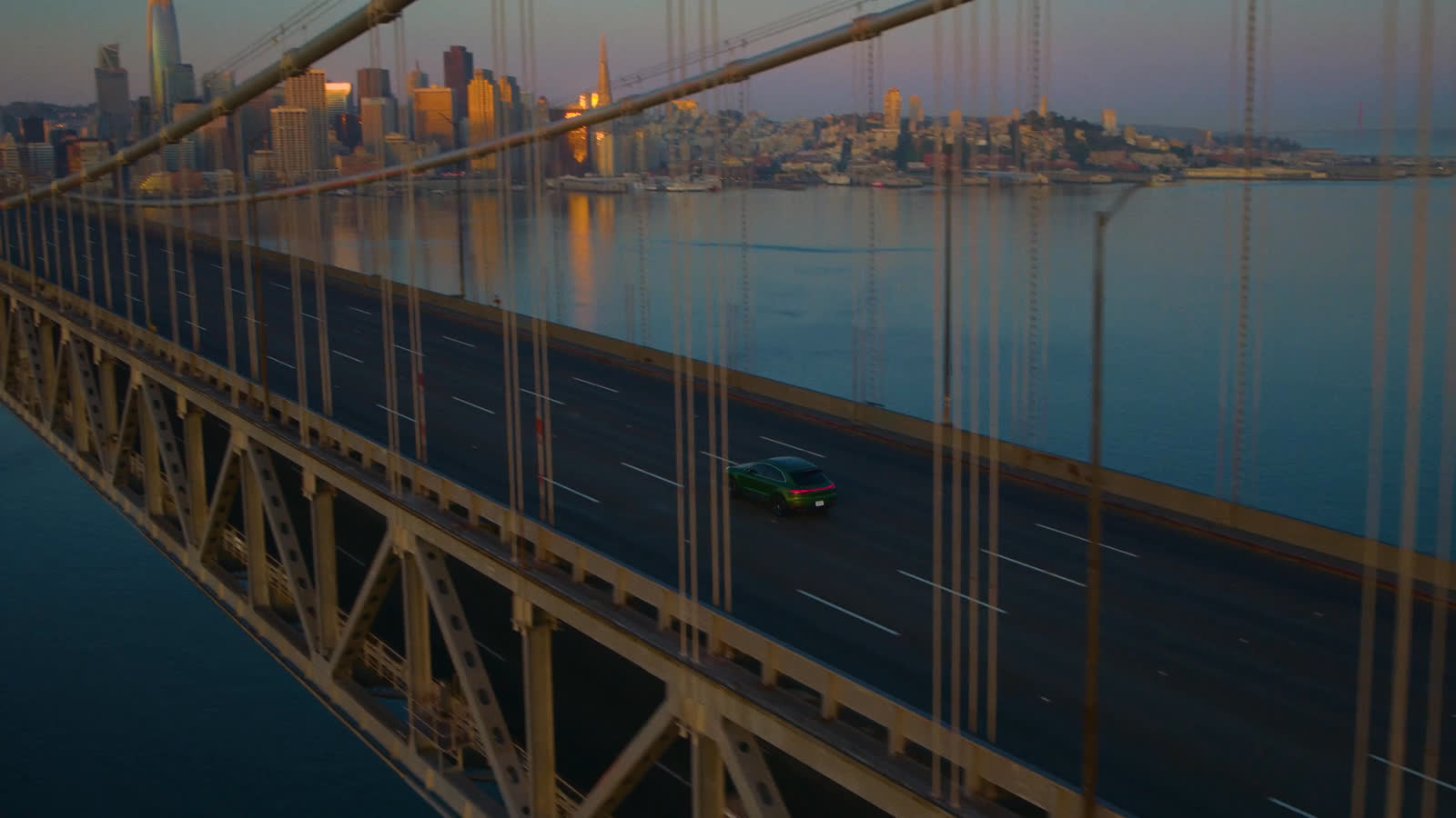

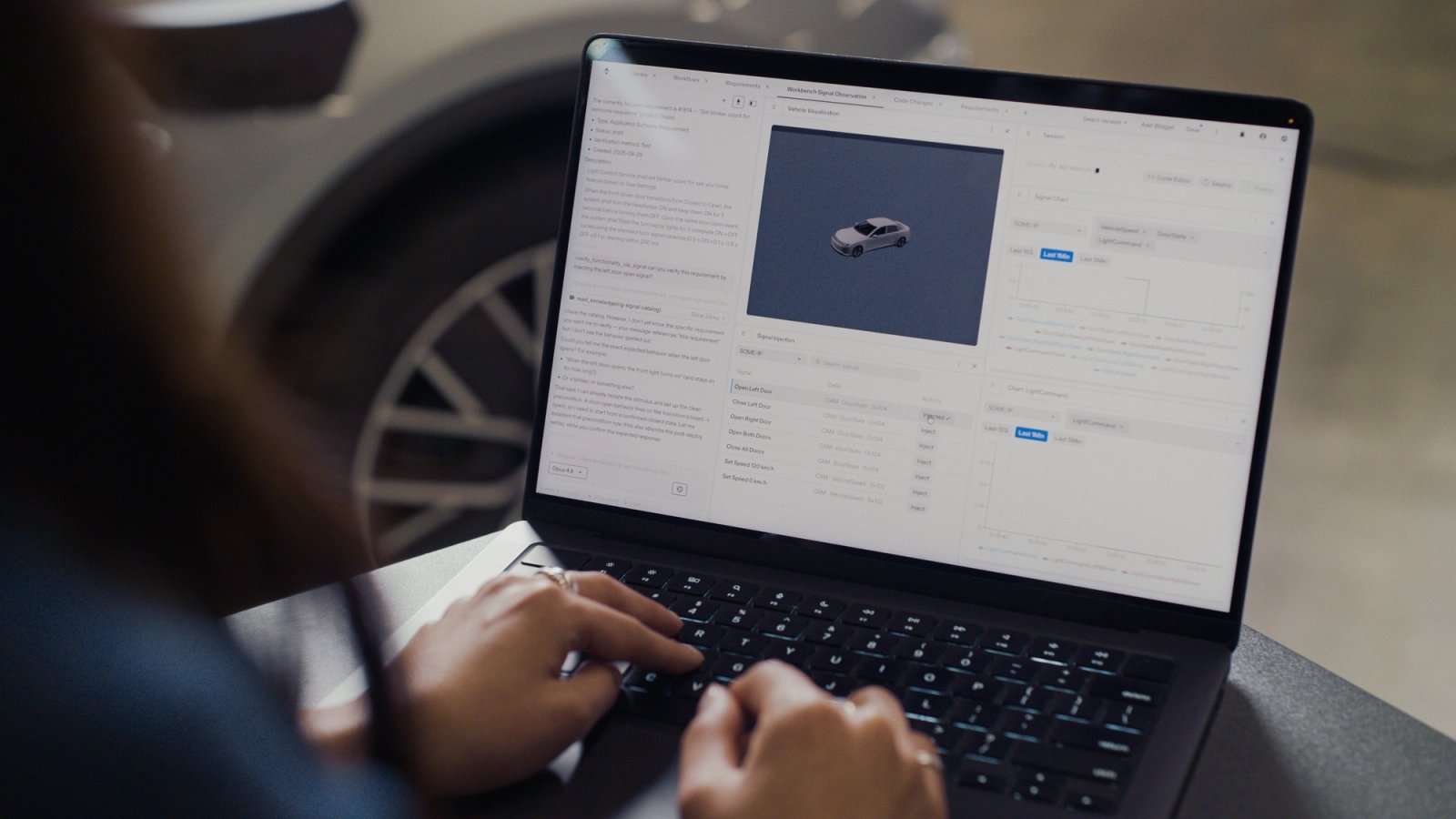

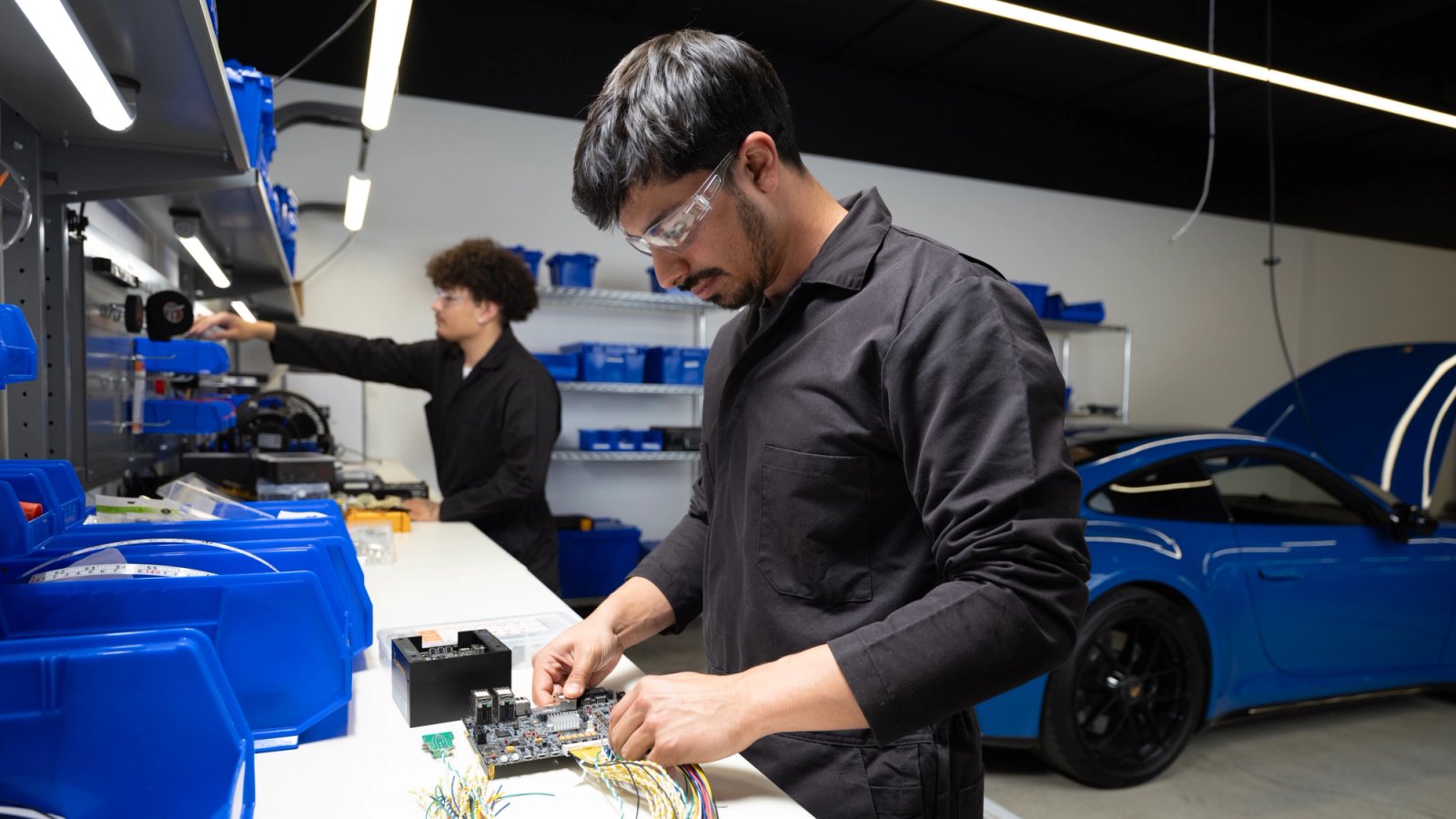

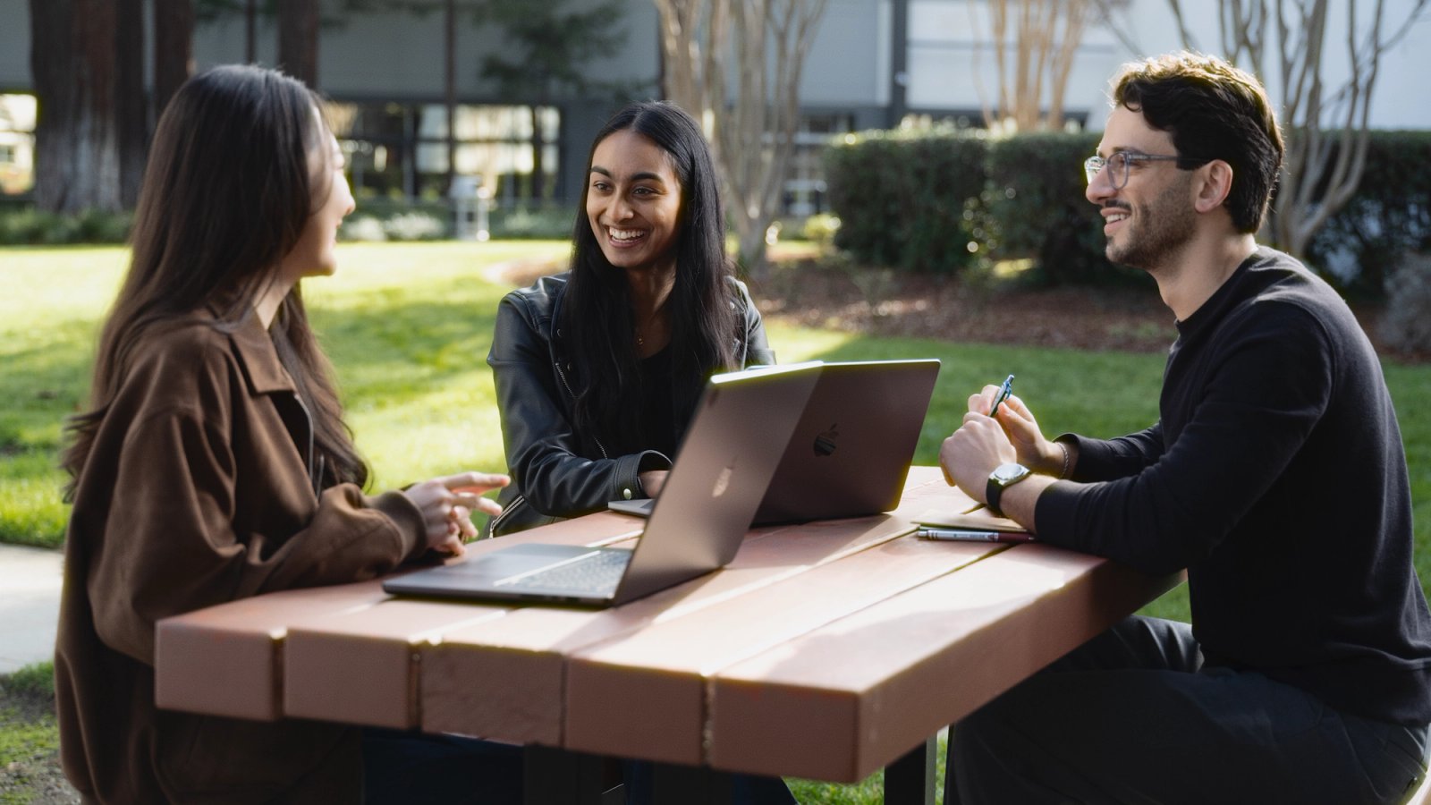
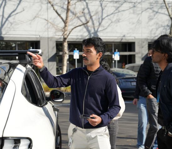
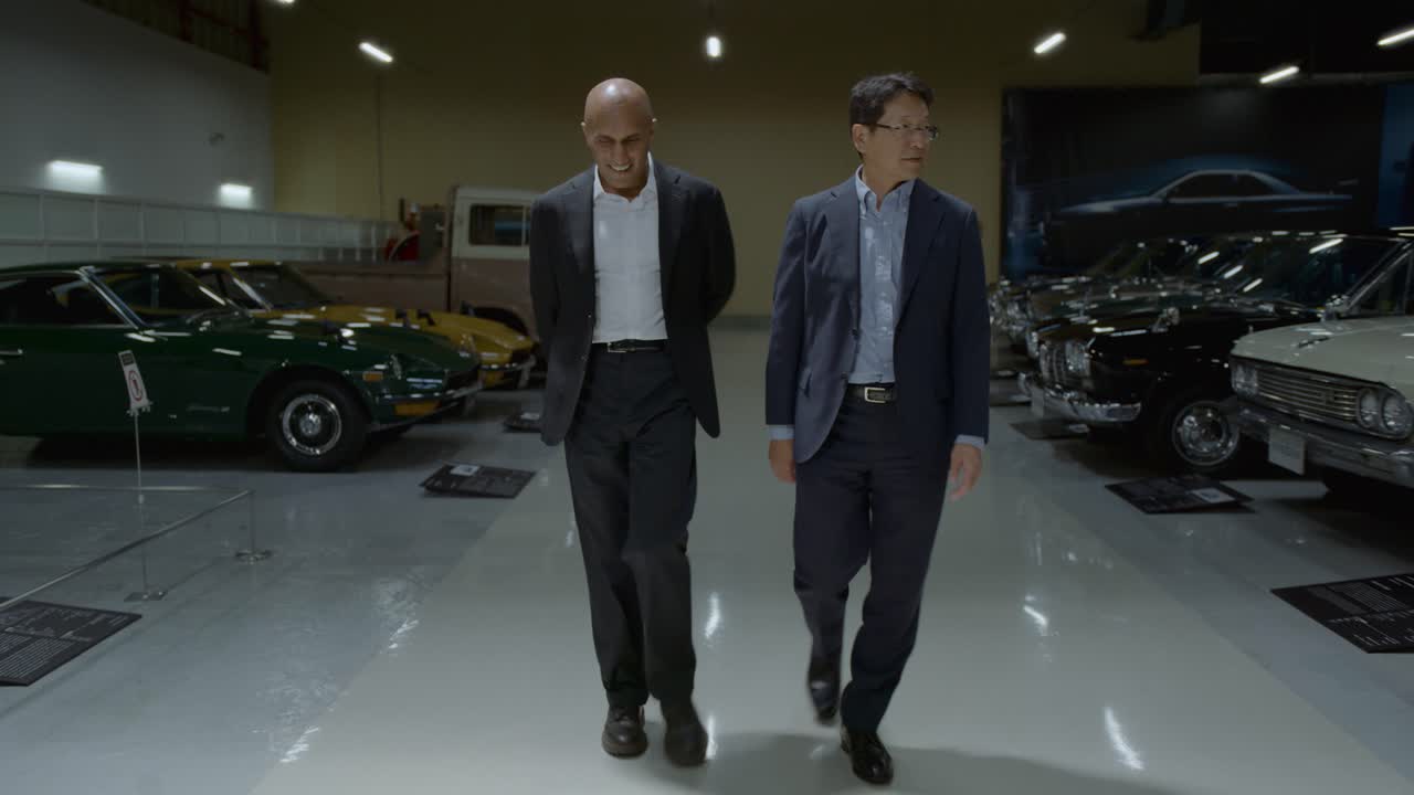
Real machines and the people who build them. Mining haul trucks in daylight, bridge traffic at dusk, truck cab interiors, engineers at benches beside cars and humanoid robots, founders in the garage; natural, slightly cool grade, documentary framing, 16:9 crops at 4px radius inside grid cells; full-bleed video for heroes with white type directly on it.
Everything sits in a ruled grid of cells. 1440: 24px outer gutter; 100vh video hero; split rows 578px (463 text | 928 media, alternating), partner tiles 231px, news rail 348 + 3x348 cells, all as white cells on 1px #BEC2CB lines; mist #ECEDF4 across the whole careers band (text and media cells); graphite footer split at 720. Phone 390: 16px gutters, everything stacks (eyebrow, head, image, copy, button), 32/64 band padding.
Measured from Observed on appliedintuition.com home, about, products, press-releases, careers, dana on 2026-11-16; anatomy measured on the homepage 2026-11-16's computed styles of every band at 1440 and 390 (npm run fidelity -- measure) plus a headless Playwright pass for nav, footer, chips, states and font calibration.
| Measure | Desktop | Phone |
|---|---|---|
| Page margin | 24px | 16px |
| Section padding | 48px | 32px |
| Hero text width | max 567px, centered | full width |
| Card gap | 1px | 1px |
| Navigation | 72px | 72px |
Hero headline
Applied Sans Display · 60px (phone 32) · line 1.133 · tracking -0.66px · weight 500
Section head
Applied Sans Display · 36px (phone 22) · line 1.222 · tracking -0.4px · weight 500
Card head
Applied Sans Display · 22px · line 1.273 · tracking -0.24px · weight 500
Lead paragraph
Applied Sans Display · 20px (phone 16) · line 1.6 · weight 400
Button label
Applied Sans Display · 16px (phone 14) · line 1.5 · weight 400
Nav, footer, small text
Applied Sans Text · 16px · line 1.3 · tracking -0.1px · weight 400
Eyebrow, meta, chips
Applied Sans Mono · 12px · line 1.667 · tracking 0.45px · weight 400
How Applied Intuition’s own landing pages are built, observed on appliedintuition.com/%20(home);%20bands%20from%20measure/home-desk.json,%20measure/home-phone.json,%20live%20headless%20Playwright%20on%20https://www.appliedintuition.com/%202026-11-16, 2026-11-16. The full measurements are in spec.md.


How the system carries across formats, from appliedintuition.com and its own press graphics only.
| Format | Loudness | Must appear | What varies |
|---|---|---|---|
| Landing page | Full-bleed muted video hero on #000000 with frosted 50%-white pill nav (72px, inset 24px) and a centered 60px weight-500 white Title Case H1; then hairline-grid split rows (square + mono eyebrow, 36px head, 20/32 body, outline pill Learn more; 16:9 photo in the 2/3 cell, alternating sides); a 6-up partner logo tile row; a 3-up news grid with mono dates and grey chips; a careers split that is mist #ECEDF4 across the whole band with the black Join us pill; #272A30 split footer with the ™ tagline. | ||
| Social post | Centered announcement card on #F6F6F8 paper: optional mono kicker ending in a colon, a 2-line Title Case display headline in #111111, the horizontal black logo below. Grid + crop marks for product/program posts; plain paper with the partner logo on top for partnership posts; full-bleed photo with no type for coverage posts. | Ground A (grid + crop marks) or Ground B (plain paper, partner logo above) or a full-bleed brand photo/iridescent render with only the white lockup. Observed variant (TÜV, UN): frame rules inset about 7% with + crop marks at the four corners, a small caps strap centered above and below the frame, the partner mark centered and no AI logo. | |
| Social post, landscape | The same card cropped to 1.91:1 (the site crops its 3:2 graphics to rect 0,213,3000,1575 for og:image): content stays centered and inside the middle 630px band. | ||
| Deck | Not seen on its own domains; see gaps. | ||
| Not seen on its own domains; see gaps. | |||
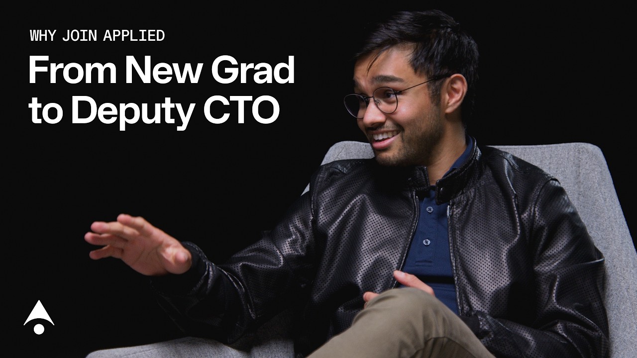
| Video thumbnail | Full-bleed real video still (dark interior, studio or window light), no scrim or panel; top-left stack of a mono caps kicker and a white Title Case headline; the small white mark bottom-left. | ||
| Vertical video cover (Shorts ad) | Full-bleed vertical still, small white mark top-left, a 2-3 line white hook lower-left; no kicker. | ||
| Display ad (Google responsive) | Assets only: mark, "APPLIED INTUITION" name, a 2-3 word Title Case product head, one sentence, one photo or render, "Learn More". The layout is Google's. |
Source: appliedintuition.com/press-releasesappliedintuition.comappliedintuition.com/aboutappliedintuition.com/productsadstransparency.google.com/advertiser/AR06608155944830369793
Your name and logo, Applied Intuition’s system.
Talk about my brand Use this brand in Claude
Get your brand audit Put your brand in Claude What goes in a brand book
Each value is marked published, observed, our reading or our recipe, with its source. Checked 2026-11-16. Not affiliated with Applied Intuition.
Tell us what you want to make. We’ll talk through how to put these ideas to work for your brand.