Homes
Stays in hosts’ homes, browsed by place. Observed
Brand book
Airbnb gets out of the way of the places. The homepage has no headline and no hero image: a search bar, then rows of real listings. The brand shows up as restraint: a small Bélo, a rare Rausch, one owned typeface, and hosts’ photos doing the selling. Our reading

Rows, places and listings change for every visitor; campaigns bring film, animation and bigger type.
Source: airbnb.comweb.archive.org/web/20200107200319/https://airbnb.design/introducing-airbnb-cereal
Not published as a ratio. Measured share of the airbnb.com homepage at 1440 (2476px capture): about 31% white ground, 44% #F7F7F7 footer band, 24% photography, under 1% Rausch..
Two voices. The homepage is plain and factual; newsroom and campaigns are warmer and story-led. Levels are our reading.
Our engine's setting, built from their rules.
Cover the logo. It should still read as Airbnb: a pill search with a red circle, rows of rounded real photos, small grey prices, Cereal-like type.
Put another name on it. If nothing else changed, the search-first header, 3D category icons and Guest favorite badges are missing.
A community marketplace where hosts offer homes, experiences and services to guests in almost every country (paraphrase of the newsroom boilerplate). Published
Stays in hosts’ homes, browsed by place. Observed
Activities hosted by locals, browsed by type (Cultural tours, Food tours ...). Observed
Services booked like stays (launched in the 2025 Summer Release). Published
Become a host, with AirCover and Earnings Protection. Observed
Explore experiences nearby
Stay in Wisconsin Dells
Places to stay in St. Louis
Available next month in Gatlinburg
Founded 2007 when two hosts welcomed three guests in San Francisco (newsroom). The Bélo symbol stands for belonging (Goods Toolkit). In 2018 Airbnb introduced its own typeface, Airbnb Cereal, drawn with Dalton Maag to work "from button to billboard".
Category. Travel marketplace: Homes, Experiences (labelled Activities in the desktop tabs) and Services. Observed
Airbnb was born in 2007 when two hosts welcomed three guests to their San Francisco home, and has since grown to millions of hosts in almost every country (paraphrase).
Belong anywhere Published
Inspiration for future getaways
Prices include all fees
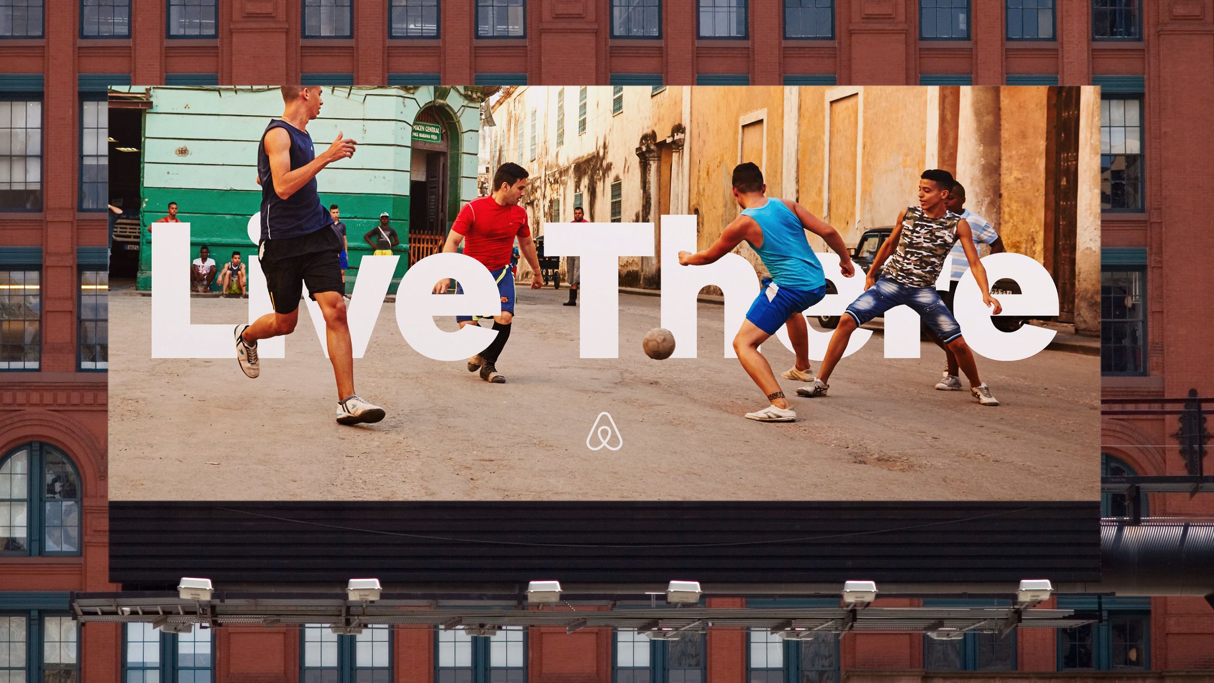
Introducing Airbnb Cereal
Made Possible by Hosts
Airbnb 2026 Summer Release
Airbnb’s public material says little about messaging rules. The newsroom boilerplate tells the origin story (two hosts, three guests, 2007) and the scale; the Cereal story names the mission, that anyone can belong anywhere. The homepage carries almost no marketing copy: place-led row titles and facts.
Source: news.airbnb.com/about-usweb.archive.org/web/20200107200319/https://airbnb.design/introducing-airbnb-cerealnews.airbnb.com/made-possible-by-hostsairbnb.com
Cabin in Gatlinburg
Amazing Cozy Cabin Getaway!!
Short-term rental in Austin
An Airbnb in Austin
Trust comes from plain facts; warmth comes from people’s stories.
WarmPlainHumble
Two voices. Product copy is short, sentence case and factual ("Cabin in Gatlinburg", "$1,534 for 2 nights"). Campaign and newsroom copy is story-led and warm, about hosts, guests and belonging. The Goods Toolkit asks for humble, understated branding and no internal jargon.
Become a hostGuest favoritePrices include all feesStart your searchInspiration for future getaways
Airbnb as a generic noun for any rental“bnb”, “Air” or “b&b” in partner names
Source: images.brilliantmade.com/uploads/attachment/file/154157/Merch%202025.pdfairbnb.comnews.airbnb.com/made-possible-by-hosts
| Case | sentence |
|---|---|
| Row title pattern | verb or noun phrase + city |
Source: airbnb.comimages.brilliantmade.com/uploads/attachment/file/154157/Merch%202025.pdf


Logos shown from Brandfetch for reference. Airbnb and the Bélo are trademarks of Airbnb, Inc., whose guidelines bar their use without written permission. Not affiliated, and not for download.
airbnb
airbnb
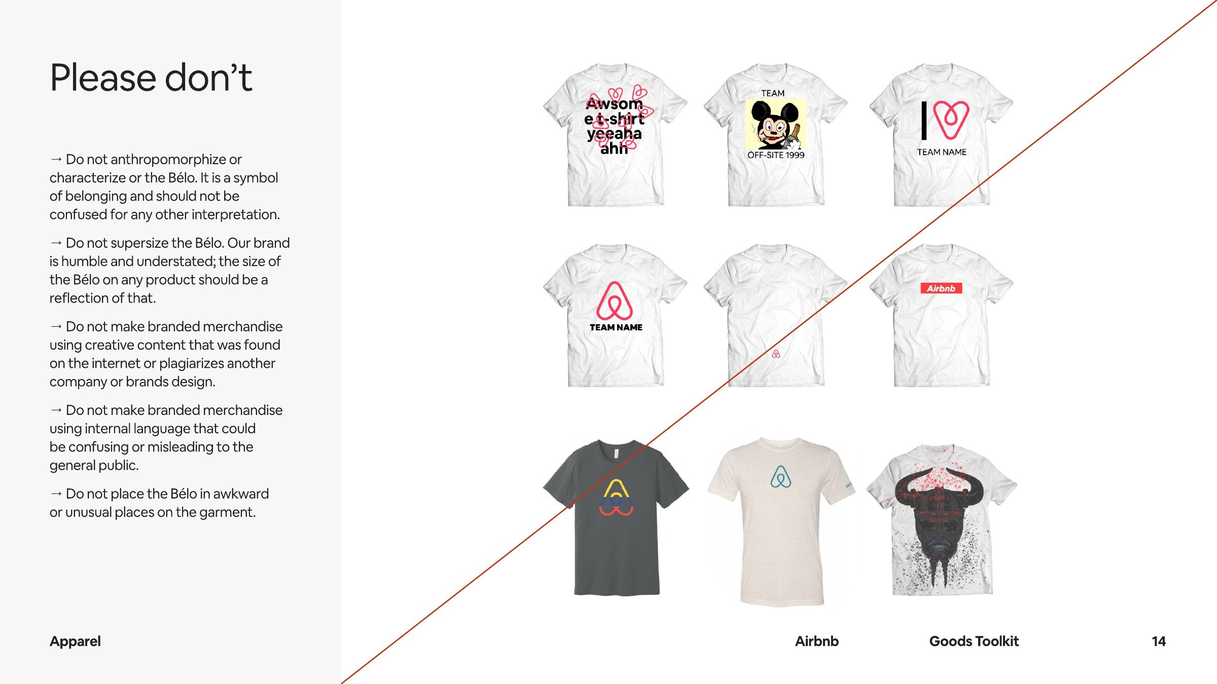
The Bélo stands for belonging; keeping it small and alone keeps it humble.
| Header lockup | 102x32 at x 48, y 32 (airbnb.com) |
|---|---|
| Apparel Bélo | never wider than 1 inch (Goods Toolkit p.9) |
| Clear space | not published as a measure |
Two marks: the Bélo symbol and the Airbnb lockup (Bélo + lowercase wordmark). The Goods Toolkit says the Bélo is most often used on its own, in Rausch, Hof or white, and pairs it with a lowercase bold Cereal wordmark for team names. The trademark guidelines forbid third parties from using the Bélo in any form. airbnb.com shows the Rausch lockup at 102x32 top-left.
Source: images.brilliantmade.com/uploads/attachment/file/154157/Merch%202025.pdfairbnb.com/help/article/3233news.airbnb.com/media-assetsairbnb.com
Stay in Wisconsin Dells
Rausch is rare, so it reads as Airbnb wherever it shows.
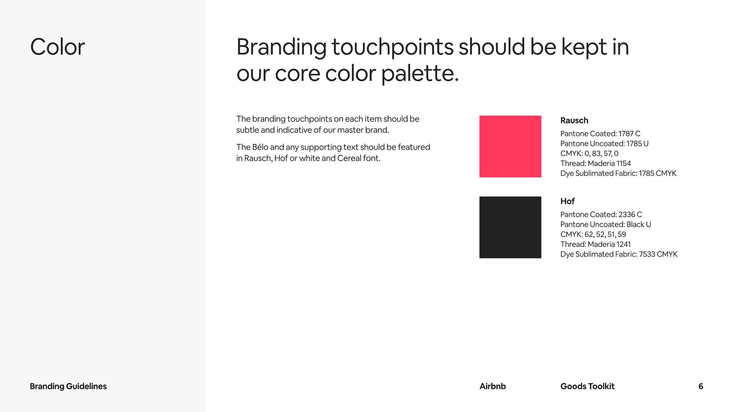
Rausch is rare, so it reads as Airbnb wherever it shows. The trademark guidelines even ask others not to use it prominently.
| Rausch | Pantone 1787 C / 1785 U, CMYK 0 83 57 0, site #FF385C |
|---|---|
| Hof | Pantone 2336 C / Black U, CMYK 62 52 51 59, site #222222 |
| Search | #DA1249 |
| Gradient | #E61E4D, #E31C5F, #D70466 |
The Goods Toolkit publishes two core colors, Rausch and Hof, with Pantone, CMYK and thread values but no hex; white is the third Bélo color. airbnb.com names the same colors in its CSS (--palette-rausch #FF385C, --palette-hof #222222) plus a grey ramp (Foggy, Bobo, Deco, Bebe, Faint) and a Rausch gradient. The homepage is white and grey; Rausch appears only in the logo and the search circle (#DA1249).
Not published: Hex values (the guide gives Pantone and CMYK; hexes are the site tokens); A color ratio; The grey ramp (observed only).
Source: images.brilliantmade.com/uploads/attachment/file/154157/Merch%202025.pdfairbnb.com/help/article/3233airbnb.com
Belong anywhere
Places to stay in St. Louis
PLACES TO STAY
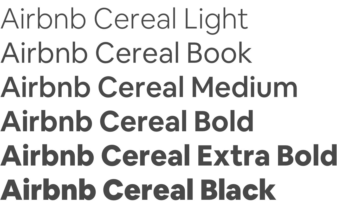
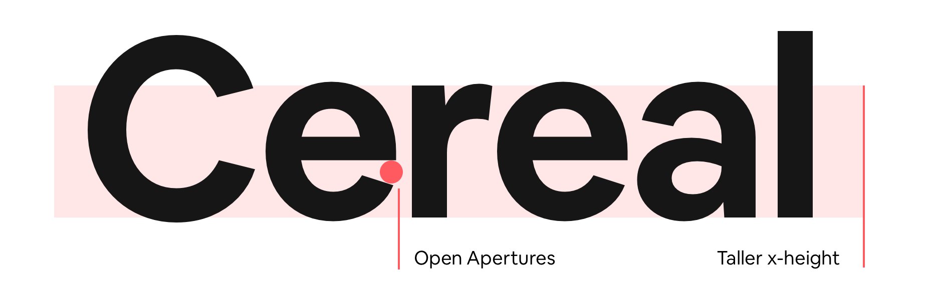
A single owned face carries the same voice across product, print and outdoor.
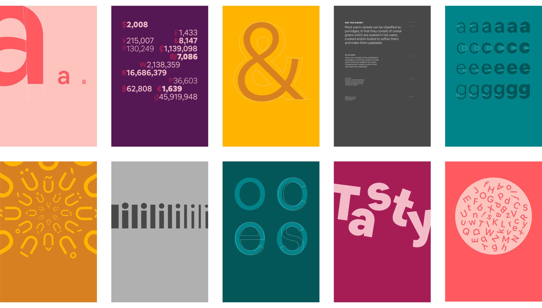
| Their face | Use | License | Open stand-in |
|---|---|---|---|
| Airbnb Cereal | Titles, wordmarks, campaign type | Proprietary to Airbnb (custom typeface made with Dalton Maag, 2018); not an open font | Public Sans 700 (for Cereal 600) Within 1% width and 2% ink of Cereal 600 on the 20px section title; x-height 2% short (see calibration) |
| Airbnb Cereal (Book / Medium) | All UI text, served as "Airbnb Cereal VF" | Proprietary to Airbnb | Public Sans 400 / 600 Body line within 0.1% width and 2.5% ink; Cereal 500 card titles within 0.4% width at Public Sans 600 |
| Real face | Airbnb Cereal (proprietary) |
|---|---|
| Stand-in | Public Sans, Cereal weight + 100 (see calibration) |
| UI scale | 10, 11, 12, 13, 14, 18, 20, 22 px |
One family: Airbnb Cereal, drawn with Dalton Maag and launched in 2018 to work “from button to billboard”. The story says it opened apertures and raised the x-height for legibility and balanced the Book weight for small UI sizes. airbnb.com serves a variable version ("Airbnb Cereal VF") and sets everything from 10px tab labels to 22px titles, mostly at 500 and 600.
Source: web.archive.org/web/20200107200319/https://airbnb.design/introducing-airbnb-cerealairbnb.com
Line icons stay out of the way; the 3D objects add warmth and play to the one place that names what you can book.
| Line icons | 12, 16, 24 px |
|---|---|
| Tab objects | ~44px art |
Two icon families on airbnb.com: outline line icons on a 32-unit grid (search, profile, menu, arrows, heart) in #222222, and photoreal 3D object icons for the category tabs (a globe, a house, a hot-air balloon, a service bell) introduced with the 2025 redesign.
Not published: Icon grid and stroke rules (observed only).
Source: airbnb.com
Photography of real places carries the brand on the web.
The homepage has no illustration. The 2021 Winter Release used puzzle-piece home illustrations, and the 2023 Get an Airbnb ads were animated by Buck, but no illustration rules are public.
Not published: Illustration style rules.
Photos are the product: the place you will actually stay.
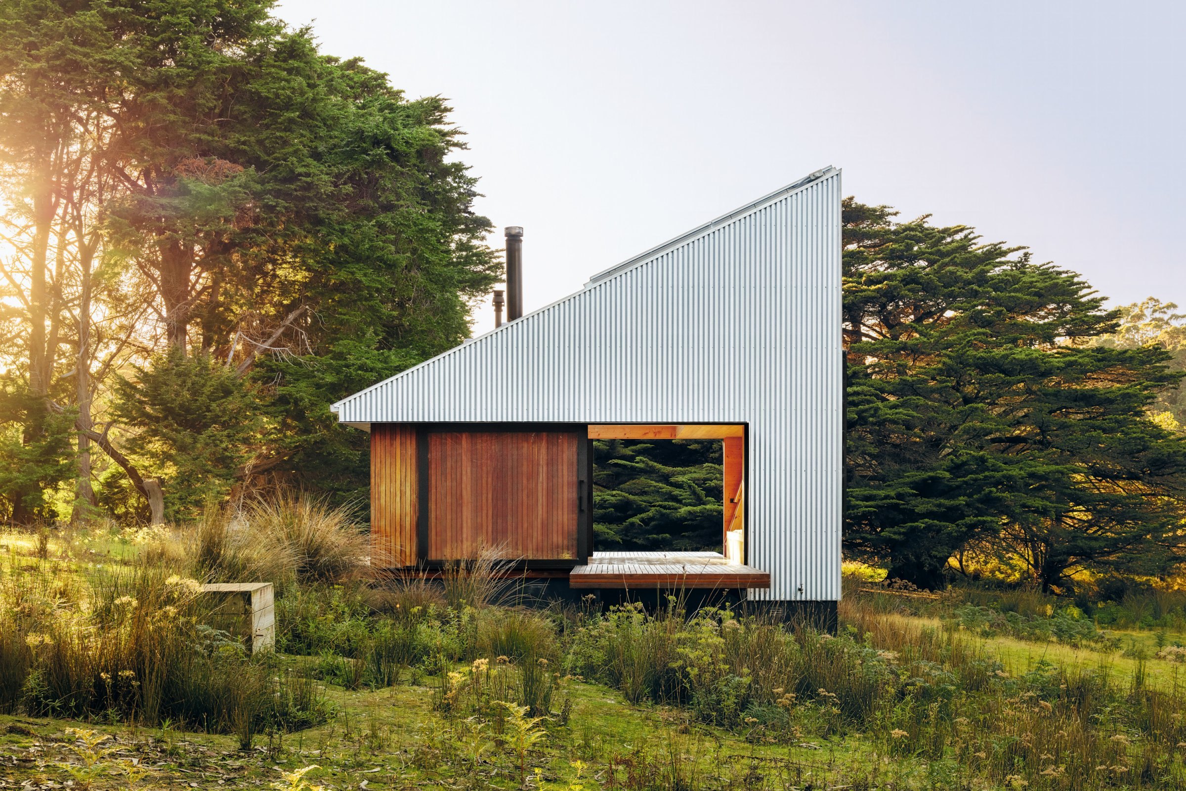
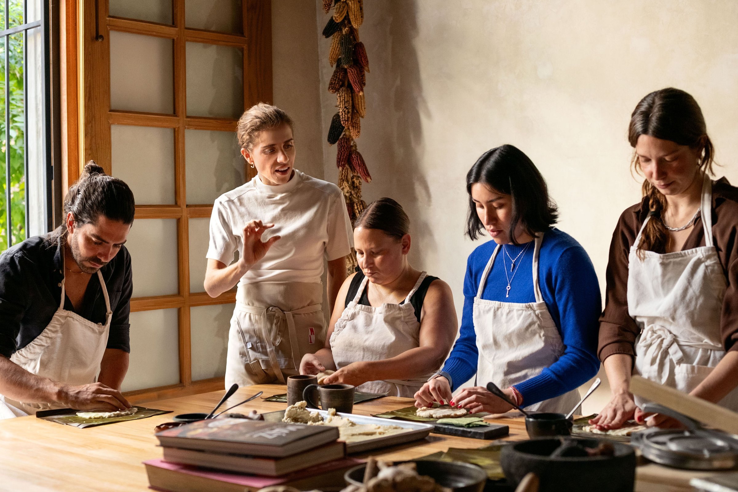
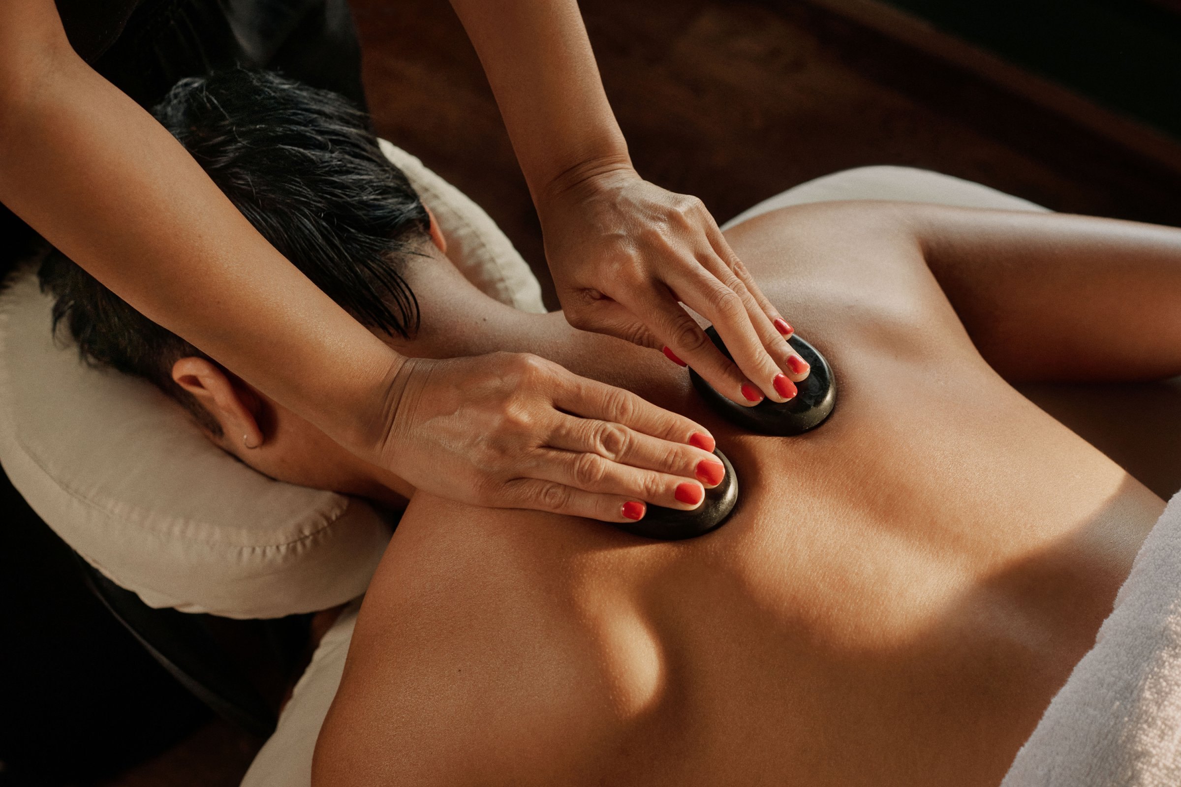
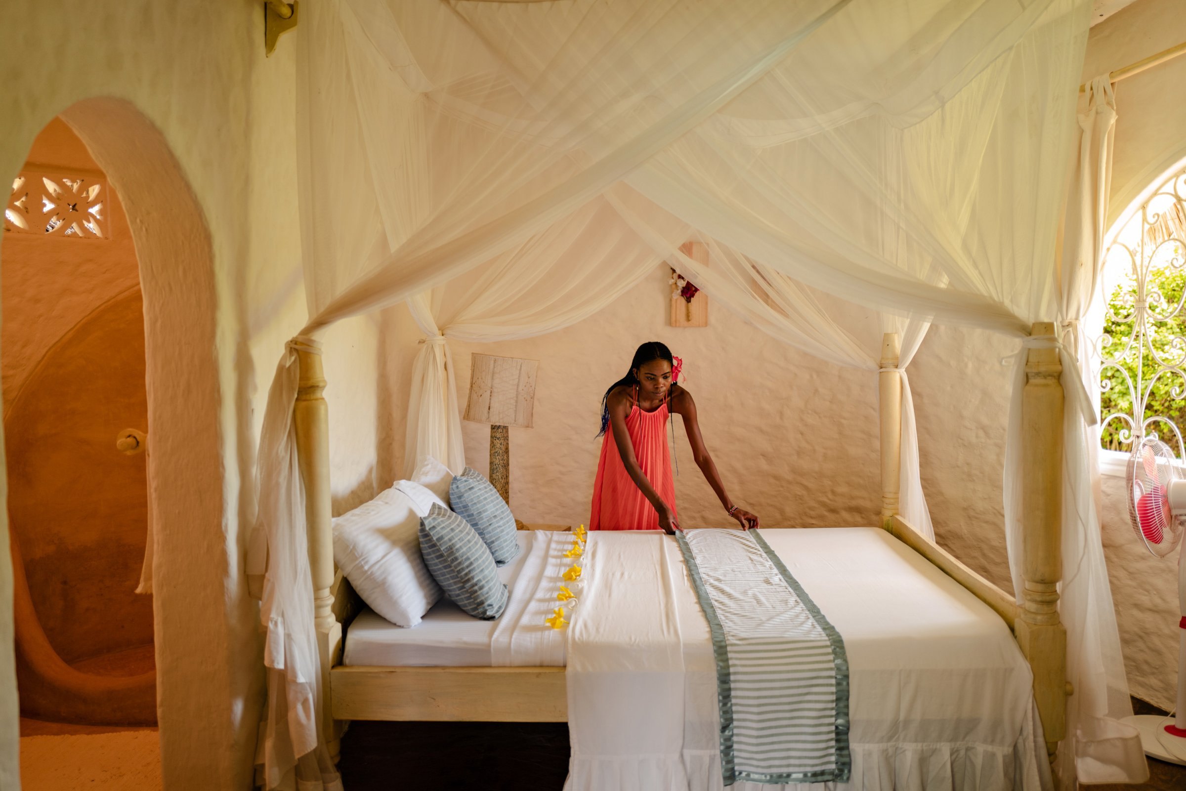
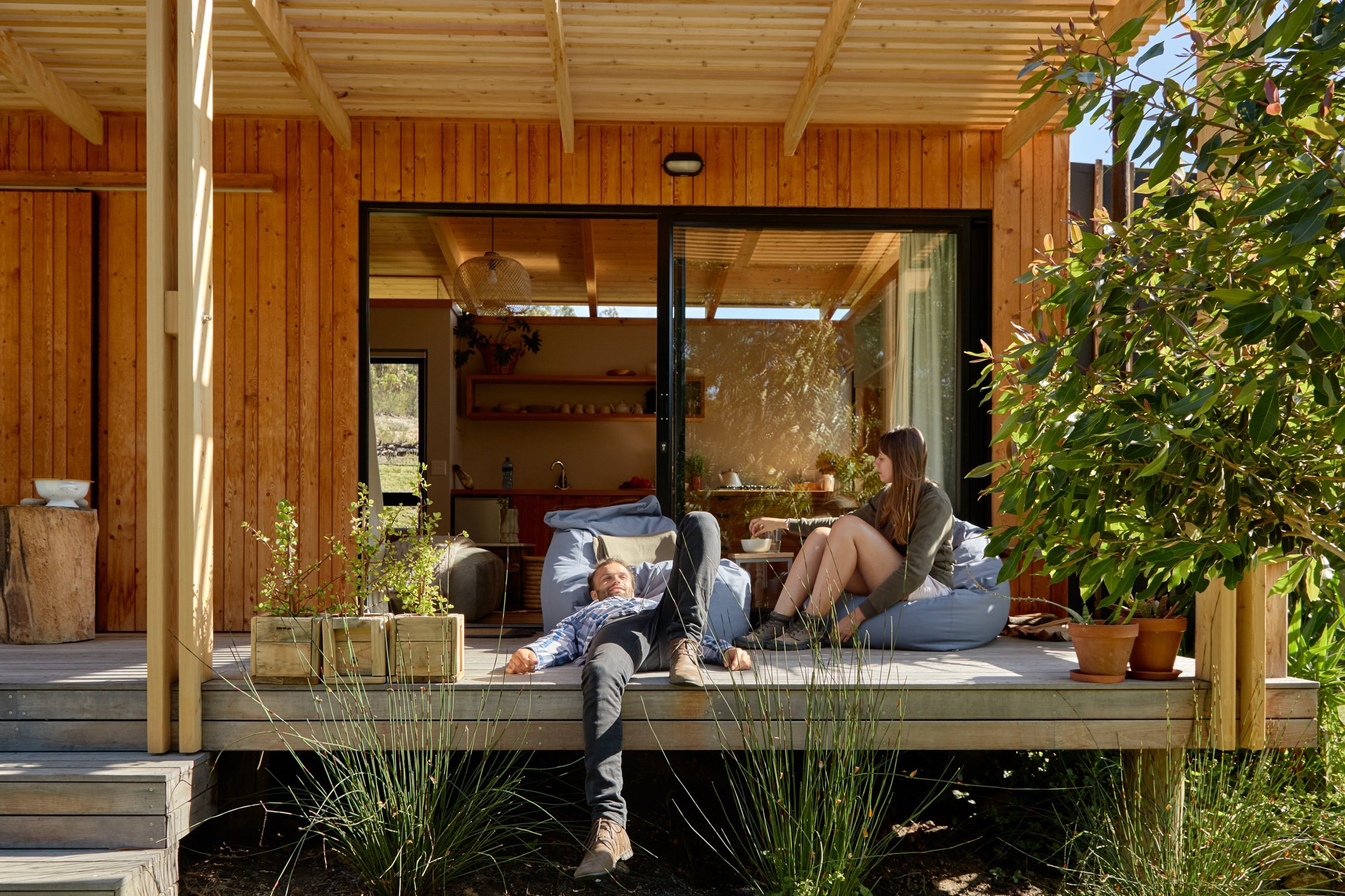
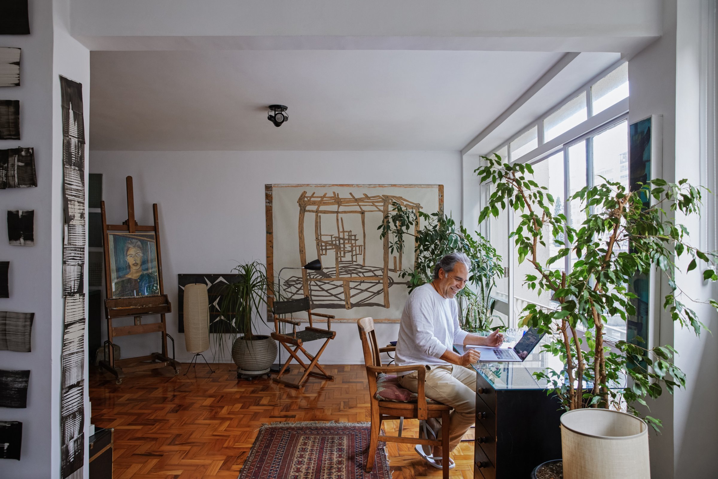
| Listing image | 182x173 desktop, 165x157 phone |
|---|---|
| Tile | 125x119 desktop |
Real listings and real experiences, shot in natural light, cropped tight and shown in rounded rectangles with no overlays. Newsroom photography credits photographers and hosts by name and favours people in real spaces.
Not published: Photography rules (only examples are public).
Motion rewards an action and then gets out of the way.
| Tab icon | one-shot webm, 72px box |
|---|
UI motion is quiet: carousels slide, the fees toast rises and hides, and the selected category icon plays a short 3D animation once.
Not published: Motion durations and easing.
Source: airbnb.com
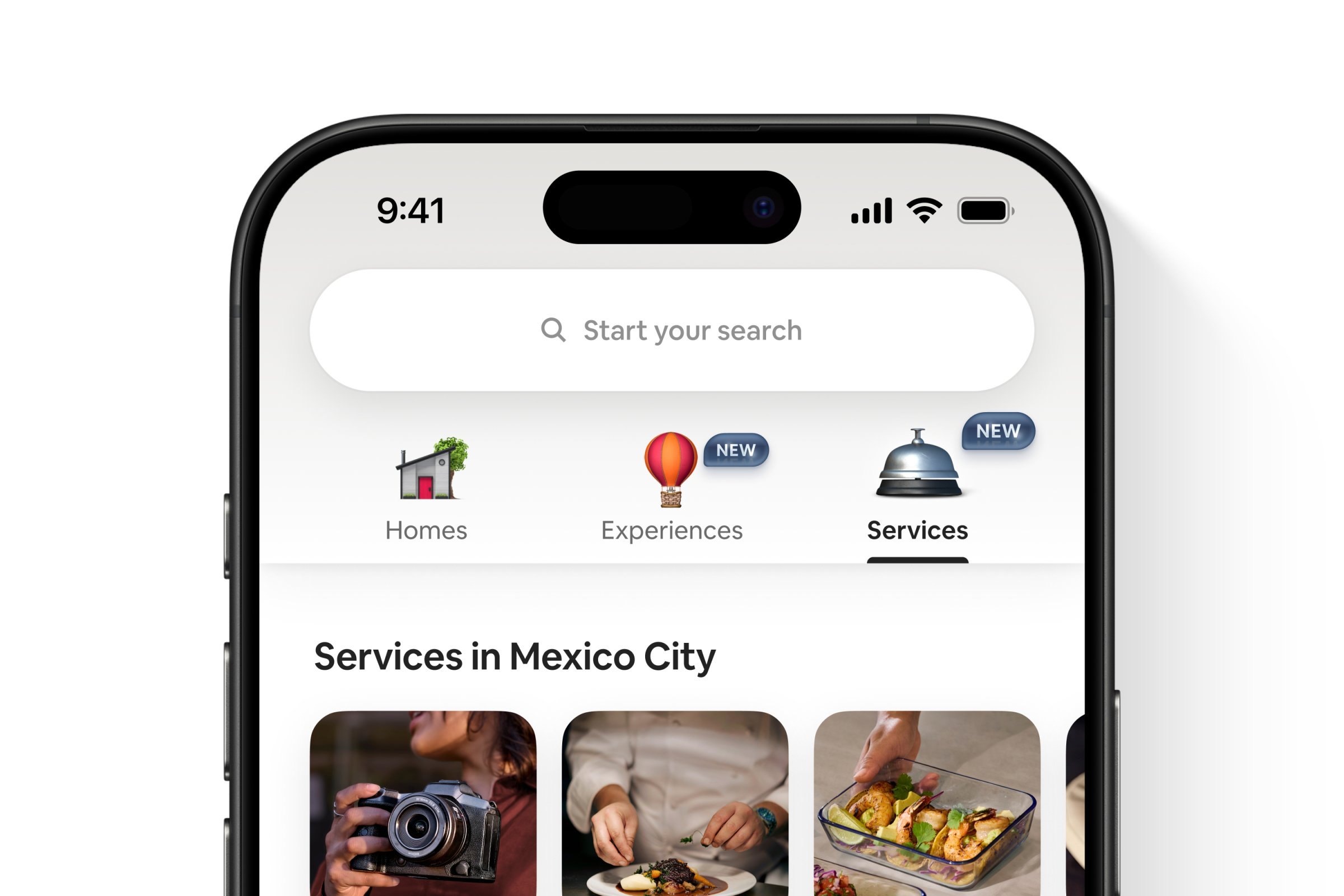
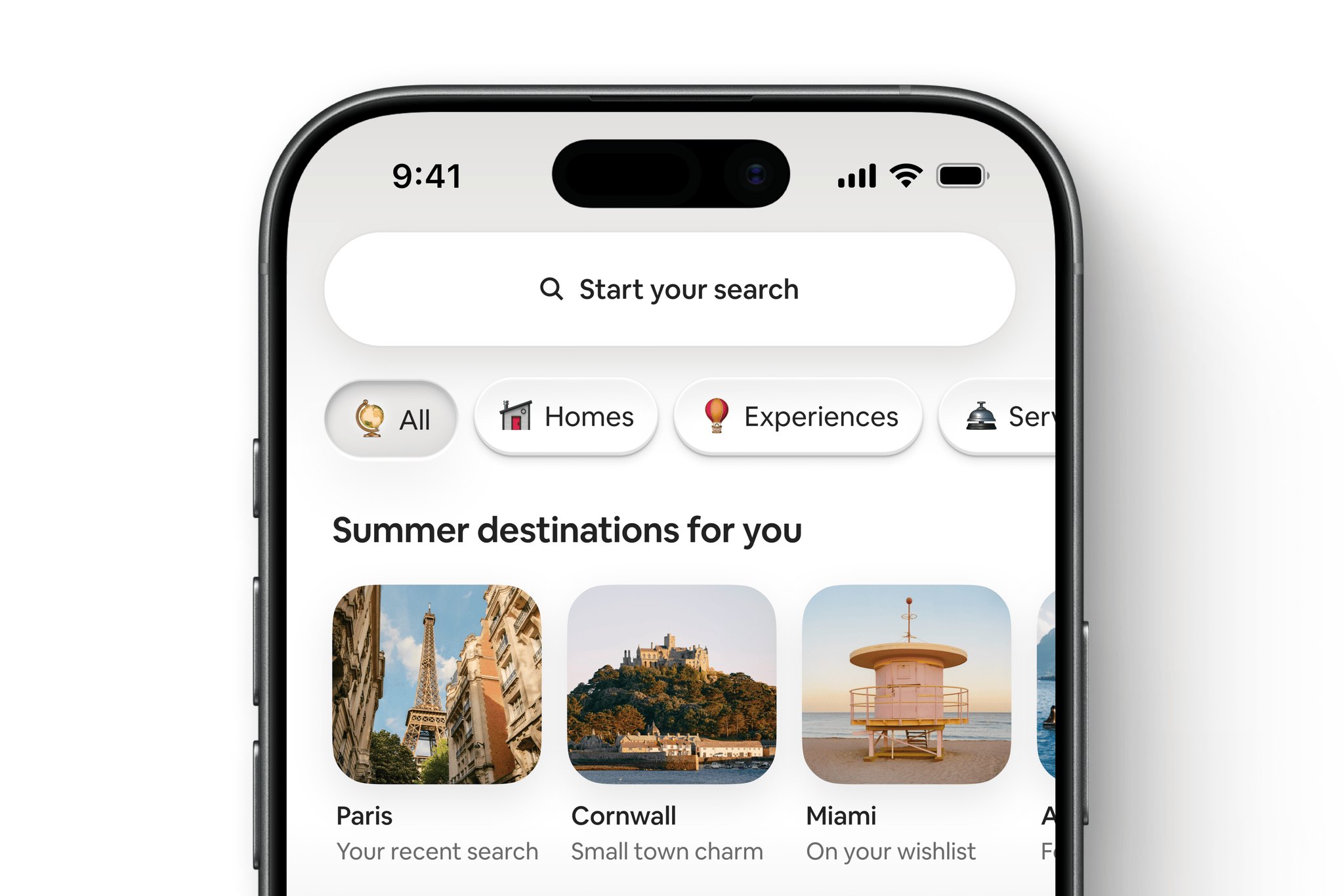
Do No headline, no hero photo. The page opens on a white header (white to #F8F8F8 gradient, 1px #EBEBEB bottom line at y 200) holding the logo, four illustrated category tabs and an 850x66 white search pill with a 48px #DA1249 search circle. On phones it collapses to a 342x56 "Start your search" pill..
The search bar is the hero · top of every airbnb.com page
Do On the resting homepage the only brand-color pixels are the Rausch logo (#FF385C) at top-left, the #DA1249 search circle, and (phones) the active Explore tab. Everything else is #222222 type on white and greys..
Rausch only where it means Airbnb or search · logo and search button
Do Each section is a heading row (20px title + 28px arrow circle, carousel arrows right) over one horizontal row of 16px-radius photos, 12px apart, clipped at the content column on desktop and at the screen edge on phones. Text sits under the photo, never on it, except the frosted Guest favorite badge and the heart..
Rows of rounded photos · every section between header and footer
Do Since the 2025 Summer Release the category tabs use small photoreal 3D objects instead of line icons; supplied as transparent PNGs (tab-*-trim.png). The selected tab icon animates once on load (video); its resting state is the still object..
3D object icons for categories · header tabs (globe, house, hot-air balloon, service bell)
Do Airbnb most often uses the Bélo symbol on its own, without the wordmark; in Rausch, Hof or white. The site header is the exception: the full Rausch lockup, 102x32..
The Bélo usually stands alone · merchandise, app icon, newsroom
Specimens use sample copy, not Airbnb’s.
A wide, airy grid: 48px side margins at 1440, a 1344px content column, and every section a single horizontal row of rounded photos that bleeds off the right edge. The header is white and the bottom of the page turns #F7F7F7 for SEO links and the footer.
Measured from airbnb.com's computed styles, CSS custom properties, bounding boxes and pixel samples at 1440 and 390 in headless Chromium, 2026-10-29; images downloaded from their a0.muscache.com originals; fonts calibrated by canvas rendering.
| Measure | Desktop | Phone |
|---|---|---|
| Page margin | 48px | 24px |
| Section padding | 42px | 42px |
| Navigation | 201px | 201px |
Section title (row heading)
Airbnb Cereal · 20px (phone 18) · line 1.2 · tracking -0.18px · weight 700
Band title (Inspiration for future getaways)
Airbnb Cereal · 22px · line 1.18 · tracking -0.44px · weight 600
Nav tab label
Airbnb Cereal (Book / Medium) · 14px · line 1.29 · weight 550
Become a host / footer column head / inspiration city
Airbnb Cereal (Book / Medium) · 14px · line 1.29 · weight 600
Search field label (Where / When / Who)
Airbnb Cereal (Book / Medium) · 12px · line 1.33 · weight 600
Search placeholder
Airbnb Cereal (Book / Medium) · 14px · line 1.29 · weight 400
Card title
Airbnb Cereal (Book / Medium) · 13px · line 1.23 · weight 600
Card price line
Airbnb Cereal (Book / Medium) · 12px · line 1.33 · weight 400
Experience tile label
Airbnb Cereal (Book / Medium) · 13px · line 1.43 · weight 600
Badge (Guest favorite)
Airbnb Cereal (Book / Medium) · 11px · line 1.18 · weight 700
Footer link / legal
Airbnb Cereal (Book / Medium) · 14px · line 1.29 · weight 400
Inspiration subtitle
Airbnb Cereal (Book / Medium) · 14px · line 1.29 · weight 400
Phone tab bar label
Airbnb Cereal (Book / Medium) · 10px · line 1.2 · tracking 0.2px · weight 400
Display (campaign, not on the homepage)
Airbnb Cereal · 48px (phone 32) · line 1.125 · weight 700
How Airbnb’s own landing pages are built, observed on airbnb.com, 2026-10-29. The full measurements are in spec.md.
Source: airbnb.com
It puts the hosts, not the platform, at the center. Our reading
Owning the type gives one voice across every medium. Our reading
A values message carried by type and faces alone. Our reading
One concrete reason per spot. Our reading
Makes three products feel like one app. Our reading
How our engine applies Airbnb’s system to each format. This is our recipe built from their rules and the homepage, not something Airbnb publishes. Level = how far toward the campaign end (warm story, big type) from the functional end.
| Format | What they did | Source |
|---|---|---|
| website | airbnb.com homepage: white header with search pill, rows of rounded photos, grey SEO + footer band. | airbnb.com |
| merchandise | Tees, hats, socks, totes, drinkware and paper goods with a small Bélo in Rausch, Hof or white. | images.brilliantmade.com/uploads/attachment/file/154157/Merch%202025.pdf |
| stationery | Letterhead (16pt), envelopes (18pt min), notecards (32lb min) on bright white paper. | images.brilliantmade.com/uploads/attachment/file/154157/Merch%202025.pdf%20p.24-26 |
| newsroom assets | White Bélo and lockup on the Rausch gradient for press. | news.airbnb.com/media-assets |
| product release | Twice-yearly release headers and app screenshots. | news.airbnb.com/product-releases |
| Format | Loudness | Must appear | What varies |
|---|---|---|---|
| Landing page | White page, 48px margins; small Rausch lockup top-left; a pill search or one plain place-led title instead of a hero headline; rows of 16px-radius photos 12px apart with 13px title + 12px grey price under each; one #DA1249 action; #F7F7F7 footer band with three link columns | which rows follow, and whether the top is a search pill or a short title | |
| Deck | White slides, #222222 sentence-case semibold titles, one real photo per slide in rounded corners, the Bélo small on the last slide | a Rausch-gradient title slide with the white Bélo | |
| Social post | Full-bleed real photo of a place or host, one short line, small white Bélo | square or story crop | |
| White body, Rausch lockup, rows of rounded listing photos with facts, one action | a hero photo |
Source: images.brilliantmade.com/uploads/attachment/file/154157/Merch%202025.pdfairbnb.com/help/article/3233
Your name and logo, Airbnb’s system.
Use this kit for my brand Use this brand in Claude
Get your brand audit Put your brand in Claude What goes in a brand book
Each value is marked published, observed, our reading or our recipe, with its source. Checked 2026-10-29. Not affiliated with Airbnb.