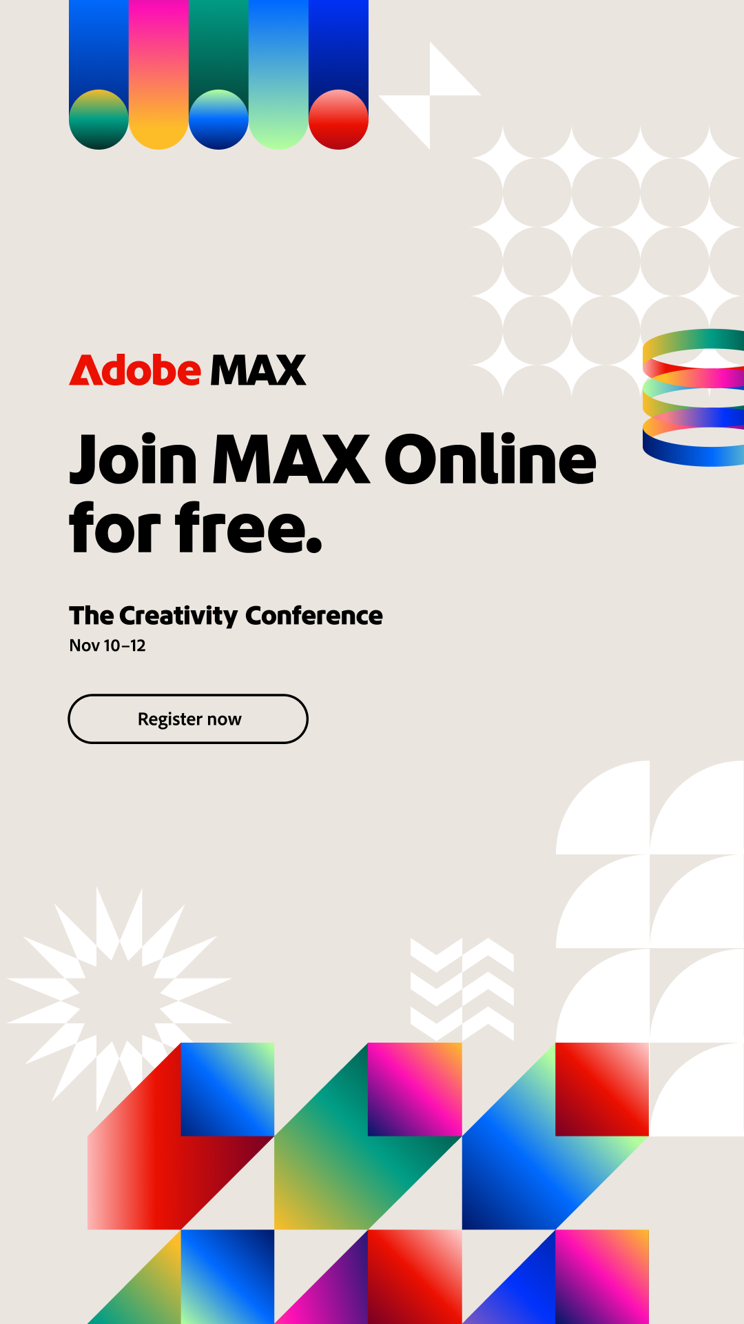
Creativity for everyone
The industry-standard creative apps, from students to professionals. Observed
Brand book
Adobe lets the work be the colour. The chrome is black, white and one heavy typeface; colour arrives through customer photos, product screenshots and the app tiles, each in its own published pair. Our reading

Tone moves along the published spectrum from motivational to supportive; headline weight and size flex with the surface (Spectrum product UI uses ExtraBold headings; Black is allowed for product branding at 18px and up).
Source: spectrum.adobe.com/page/voice-and-tonespectrum.adobe.com/foundations/typography/typography-system
Our engine's setting, built from their rules.
The creative, document and customer-experience tools for everyone, from students to global brands. Observed
The industry-standard creative apps, from students to professionals. Observed
Acrobat turns PDFs into summaries, reports and shared spaces. Observed
Adobe for Business orchestrates content and customer experiences with AI. Observed
Firefly and AI assistants inside Photoshop and Acrobat. Observed
Started in 1982 by John Warnock and Charles Geschke; today Creative Cloud, Acrobat, Firefly and the business products.
Category. Creative software, document software (PDF) and digital-experience software Observed
not published: Adobe does not name competitors on its homepage
Adobe makes the tools people and businesses use to create, work with documents and run customer experiences: Creative Cloud (Photoshop, Illustrator, Premiere and more), Acrobat, Firefly and Adobe's business products. Founded in 1982 by John Warnock and Charles Geschke.
Create at the highest level. Observed
Everything you need to make anything. Observed
Tools that work for you. Observed
The homepage sells three businesses at once, creativity (Creative Cloud, Firefly), documents (Acrobat) and customer experience (Adobe for Business), and lets a five-slide hero, a five-card carousel and a nine-card product grid carry them. Every headline is a short sentence with a period.
Adobe's apps are complex; plain, consistent language keeps them usable across dozens of products and languages.
rationalhumanfocused
Spectrum publishes one voice (rational, human, focused) and a tone spectrum from motivational to supportive, plus a full grammar and mechanics guide: sentence case, contractions, second person, no ampersands, no all-caps emphasis.
createmakefasterAIeveryone
& in body copyALL CAPS for emphasisoverly opinionated, funny or trendy languageinvented product names or concepts
Source: spectrum.adobe.com/page/voice-and-tonespectrum.adobe.com/page/principles
| Voice | rational, human, focused |
|---|---|
| Tone spectrum | motivational, helpful, instructive, reassuring, supportive |
| Most frequent tone | instructive (often) |
| Case | sentence case |
| Person | second |
Source: spectrum.adobe.com/page/voice-and-tonespectrum.adobe.com/page/grammar-and-mechanicsspectrum.adobe.com/page/principles


Files are linked from adobe.com, not re-hosted. Adobe's trademark guidelines require a licence or written permission to use Adobe logos and product icons, forbid putting them in your own logo, and forbid using Adobe trademarks in Adobe's stylized form. Construction, clear space and minimum size for the corporate logo are not published publicly. Not affiliated with Adobe.
The tile system makes every product recognisable at 18px, and the corporate mark rides along as one more tile.
| Clear space | not published |
|---|---|
| Minimum size | not published |
| Site nav | wordmark 67x16, white over the hero (observed) |
| Footer | A + wordmark 1496px wide, cropped (observed) |
Adobe uses the wordmark alone in the site nav and a giant white A + wordmark lockup in the footer; the red A tile stands for Adobe among the product tiles. Spectrum says product logos and tile colours do not change on dark backgrounds.
Source: spectrum.adobe.com/foundations/visual-language/brandadobe.com/legal/permissions/trademarks.htmladobe.com
Product colour is how people find their app; keeping the frame neutral keeps those colours meaningful.
| Adobe red | #EB1000 (observed) |
|---|---|
| Ink | #000000 |
| Surface | #F3F3F3 (Spectrum gray-75) |
| Product accent | #3B63FB (Spectrum blue-900) |
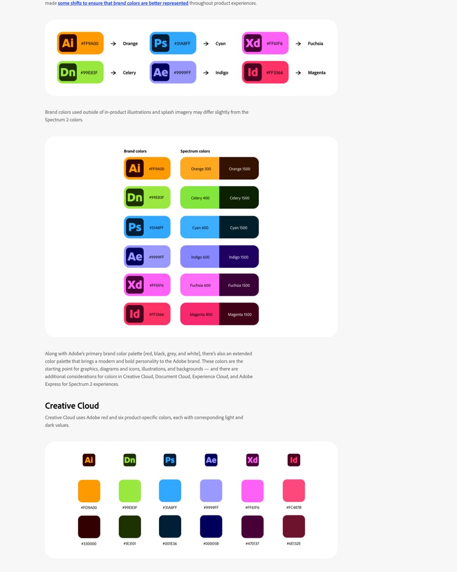
The primary palette is red, black, grey and white; an extended palette adds colour for graphics. Each Creative Cloud app has a published light/dark pair (Ps #31A8FF/#001E36), Document Cloud has three primaries plus Adobe red and six secondaries, Experience Cloud splits cool foundational and warm functional colours, and Express uses three. On the homepage the chrome is black and white only.
Not published: the hex of Adobe red on a public guideline page (#EB1000 is read from Adobe's own SVGs); colour proportions.
Source: spectrum.adobe.com/foundations/visual-language/brandgithub.com/adobe/spectrum-design-data/blob/main/packages/tokens/src/color-palette.jsonspectrum.adobe.com/foundations/color/colorsadobe.com
Create at the highest level.
One family, many weights, a predictable scale: hierarchy comes from size, weight and colour, not from extra faces.
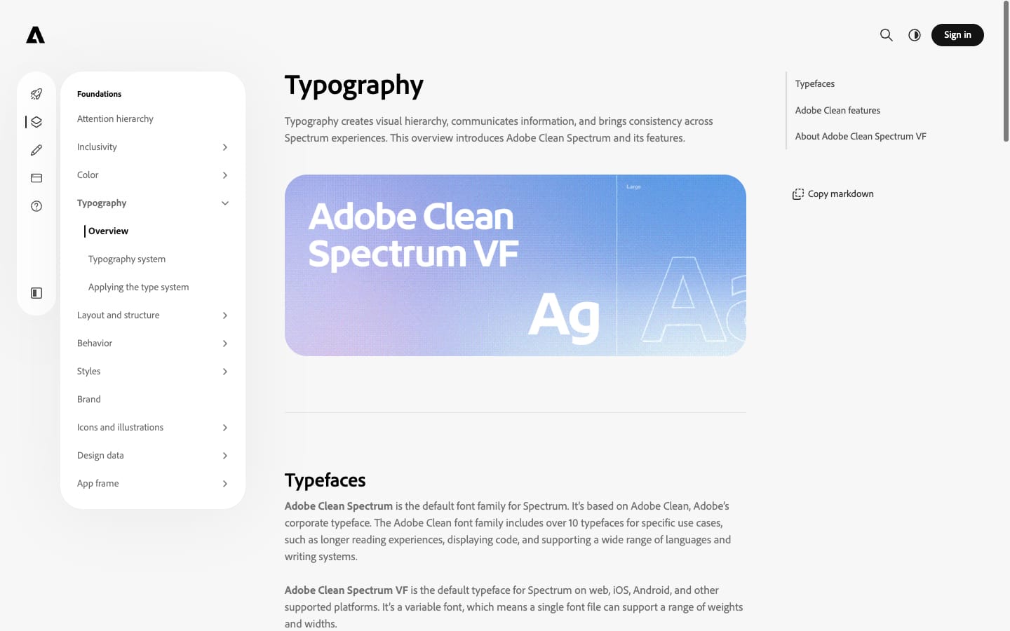
| Their face | Use | License | Open stand-in |
|---|---|---|---|
| Adobe Clean Display Black | Homepage headlines, quotes and card titles at 900 | Proprietary to Adobe; not available for others | Rethink Sans Closest line width of 13 open candidates at 80px and 56px (+1.4%, -0.3%); see kit.typography.calibration. It renders darker than the real face, so cap it at 800. |
| Adobe Clean (Adobe Clean Spectrum VF in product) | Body, labels, nav and buttons at 400 and 700 | Proprietary; Adobe's corporate typeface, a family of 10+ faces | Source Sans 3 Adobe's own open-source sans (SIL OFL); within 3% of Adobe Clean's width at 20px and 2% at 14px bold. |
| not published on the public page | Code type style in Spectrum | not published | Source Code Pro Adobe's own open mono, the natural partner to Source Sans 3. |
| Corporate face | Adobe Clean (proprietary) |
|---|---|
| Stand-ins | Rethink Sans 800 display, Source Sans 3 body |
| Scale | 1.125 from 14px |
| Homepage H1 | 80/76 900 -0.04em |
| Homepage H2 | 56/56 900 -0.03em |
Adobe Clean is the corporate typeface, a family of 10+ faces; Spectrum ships Adobe Clean Spectrum VF. The type scale is a Major Second (1.125) from a 14px base: 10, 11, 12, 14, 16, 18, 20, 22, 25, 28, 32, 36, 40, 45, 51, 58, 65, 73px. ExtraBold is the heaviest for most UI; Black is reserved for branded headings at 18px and up. Body and code use 1.5 line height. The homepage sets headlines in Adobe Clean Display Black at 80/56/24px with tight tracking.
Source: spectrum.adobe.com/foundations/typography/overviewspectrum.adobe.com/foundations/typography/typography-systemadobe.com
Do Adobe Clean Display Black 900, tight tracking (-0.03 to -0.04em in Adobe's face; -0.02em with the stand-in Rethink Sans 800 at 56-80px), line-height 0.95-1.0, sentence case ending in a period; white on photos, black on white.
The Black headline · every homepage headline and card title
Do Full-bleed photo/video and black bands are the stage; white content sections ride over them as one sheet with 32px rounded corners where they meet.
White sheet over a dark stage · section transitions
Do Rounded-square tiles in each product's published dark/light pair (Ps #31A8FF on #001E36, Ai #FF9A00 on #330000) or white on red; 18-32px; they are the only colour in the chrome.
Product app tiles · cards, badges, footer
Do 40px tall, 999px radius, white with a 14px bold black label, or a 2px white outline on dark.
White pill buttons · every CTA
Do Gradients are placed intentionally, tied to product brand palettes, and never distract from content.
Product gradients · product UI: premium and generative-AI moments
Specimens use sample copy, not Adobe’s.
All four are neutral containers that make product colour and customer work stand out.
| Sheet radius | 32px (observed) |
|---|---|
| Card radius | 16px (observed) |
| Gap | 8px between cards (observed) |
What makes adobe.com recognisable without the logo: the heavy Black headline ending in a period, the white sheet with 32px rounded corners riding over a dark full-bleed stage, rows of rounded product tiles, and white pill buttons.
Source: spectrum.adobe.com/foundations/styles/object-styles/roundingadobe.com
Adobe apps have dense toolbars; simple consistent metaphors keep them scannable.
| Stroke | 1.5px |
|---|---|
| Colour | gray 800 (#292929 light) |
| Recipe for Steal | Lucide-style outline icons at 1.5px, rounded caps, gray 800 |
Spectrum 2 icons are outlined, mostly monochrome, drawn from predefined key shapes with a 1.5px stroke and rounder corners; colour appears only in status badges, and duotone only to show direction or change.
Source: spectrum.adobe.com/foundations/icons-and-illustrations/icon-fundamentals
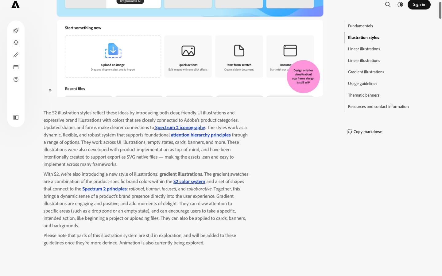
Linear illustrations stay quiet in the UI; gradient ones carry brand expression where it helps.
| Linear sizes | 48, 96, 160px |
|---|---|
| Linear colour | gray 800 |
| Recipe for Steal | one-colour line drawings at 1.5px in #292929; gradient spots only in your product colour |
Spectrum 2 has two illustration styles: linear (monochrome gray 800, built on the icon metaphors, 48, 96 and 160px) for empty states and errors, and gradient illustrations in product colours for bolder, motivating moments. Teams must request illustrations from the Brand team.
Source: spectrum.adobe.com/foundations/visual-language/illustrationspectrum.adobe.com/foundations/icons-and-illustrations/illustration
It shows the product in use and makes the screen the light source, so the work glows.
| Treatment | dark warm grade, left scrim behind text (observed) |
|---|---|
| Crop | cover, subject right of centre (observed) |
Homepage photography is cinematic and warm: real people at work with Adobe apps on screen (an editor at a desk, a creator at a monitor), shot in dim interiors, then full-bleed with type on top. Product images are bright screenshots on colour.
Not published: Adobe does not publish a photography guide publicly.
Source: adobe.com
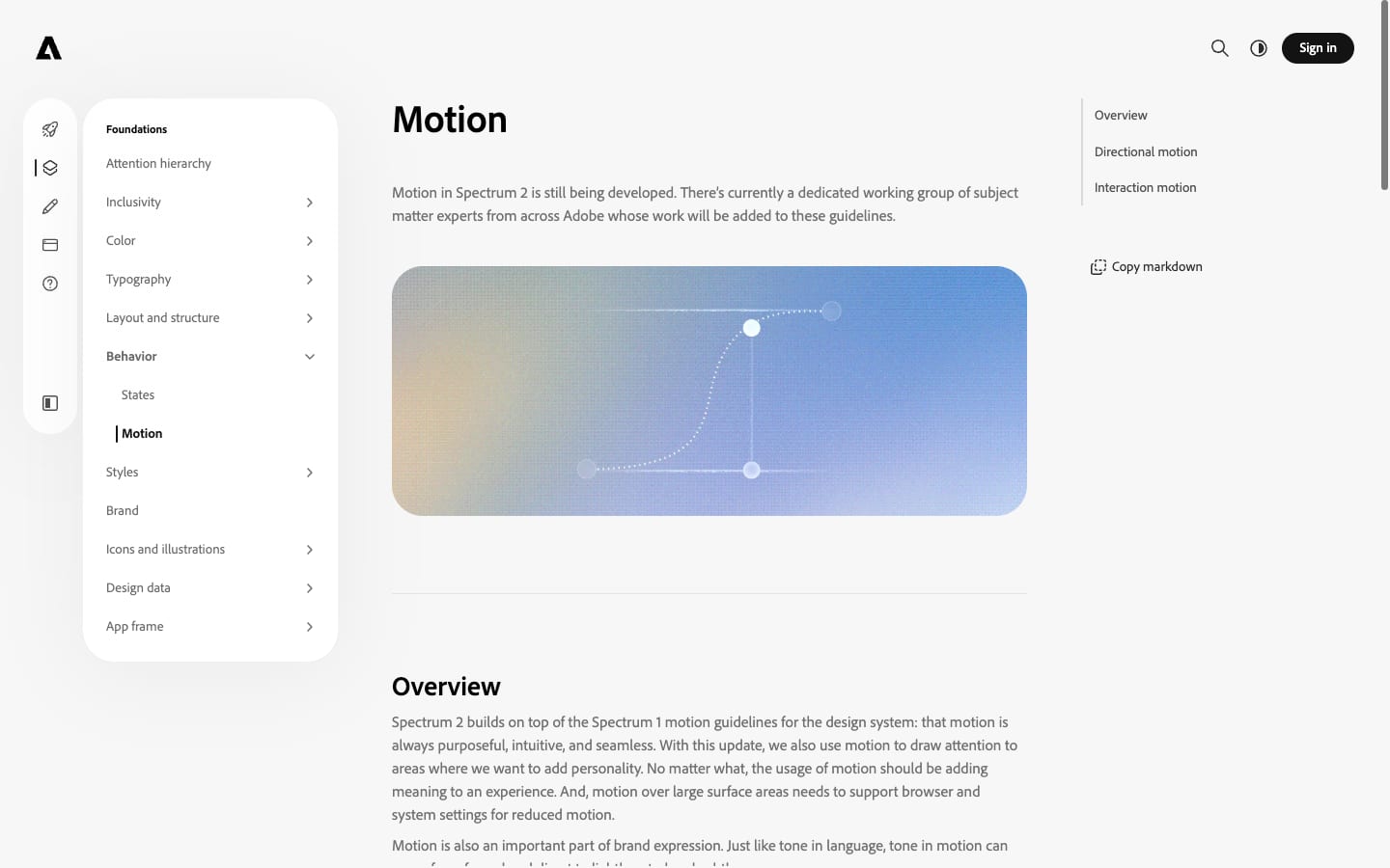
Motion adds meaning and personality without slowing down tools.
| Ease (observed) | cubic-bezier(0.42, 0, 0, 1) |
|---|---|
| State change (observed) | 300ms |
| Fade (observed) | 500ms |
Spectrum: motion is purposeful, intuitive and seamless; directional (linear for progress, diagonal for a context switch, clockwise for loading) and interaction motion (buttons scale down when pressed). Spectrum 2 motion is still being written. The homepage runs scroll-driven reveals and uses cubic-bezier(0.42, 0, 0, 1) at 0.3s for state changes.
Not published: durations and easing curves in Spectrum 2.
Source: spectrum.adobe.com/foundations/behavior/motionadobe.com
Spectrum spaces with a geometric token scale (1 to 80px) and a rounding scale (4, 8, 10, 16px, full) on a Major Second ratio. The homepage uses a 1200px container with 120px margins, 8px gaps between cards and 128px above headed sections.
Measured from spectrum.adobe.com's Brand law from Spectrum (Adobe's public design system) and Adobe's trademark page; page anatomy measured on adobe.com on 2026-10-30 at 1440 and 390..
| Measure | Desktop | Phone |
|---|---|---|
| Page margin | 120px | 24px |
| Section padding | 128px | 40px |
| Hero text width | max 484px, centered | full width |
| Card gap | 8px | 8px |
| Navigation | 80px | 80px |
Hero H1
Adobe Clean Display Black · 80px (phone 40) · line 0.95 · tracking -1.6px · weight 800
Section H2, testimonial quote
Adobe Clean Display Black · 56px (phone 32) · line 1 · tracking -1.12px · weight 800
Card and promo title
Adobe Clean Display Black · 24px (phone 18) · line 1 · tracking -0.96px · weight 800
Lead
Adobe Clean (Adobe Clean Spectrum VF in product) · 20px (phone 16) · line 1.2 · weight 400
Body, card line, footer link
Adobe Clean (Adobe Clean Spectrum VF in product) · 16px · line 1.25 · weight 400
Eyebrow, card title (carousel), footer heading, attribution name
Adobe Clean (Adobe Clean Spectrum VF in product) · 16px · line 1.25 · tracking -0.2px · weight 700
Nav link, button label, text link, category card label
Adobe Clean (Adobe Clean Spectrum VF in product) · 14px · line 1.2857 · weight 700
Legal row
Adobe Clean (Adobe Clean Spectrum VF in product) · 12px · line 1.3333 · weight 700
How Adobe’s own landing pages are built, observed on adobe.com, 2026-10-30. The full measurements are in spec.md.
Source: spectrum.adobe.com/foundations/layout-and-structure/spacing/layout-spacingspectrum.adobe.com/foundations/styles/object-styles/roundinggithub.com/adobe/spectrum-design-data/blob/main/packages/tokens/src/layout.jsonadobe.com
How our engine applies Adobe's system to each format. Our recipe from their rules and their homepage, not something Adobe publishes. Level = how much product colour and photography the format carries (0 plain, 5 full-bleed).
| Format | Loudness | Must appear | What varies |
|---|---|---|---|
| Landing page | Build it the way adobe.com is built (kit.spec.page, homepage voice): full-bleed dark photo hero with a white 80px Black headline ending in a period, a white pill CTA and small glass category cards; then a white sheet with 32px rounded corners carrying centred 56px headings, 16px-radius cards with 8px gaps and 24px Black card titles; a dark photo band and a black card grid; black footer with a giant white wordmark. Chrome only black and white; colour from photos and product tiles. | which sections and how many cards; the hero can be a still photo | |
| Deck | Black or white slides, 56px+ Black sentence-case headline with a period, one photo full-bleed per section slide, pill-shaped labels | product tiles as section markers | |
| Proposal | White sheet, 32px Black headings, 16px-radius cards, plain instructive tone, a dark full-bleed opener | a customer quote slide on a dark photo | |
| Social | Full-bleed work or photo, white Black headline, small white pill | product tile in a corner | |
| White body, black Black headline, one white-on-black pill CTA | one hero image |
Source: spectrum.adobe.com/foundations/visual-language/brandspectrum.adobe.com/page/grammar-and-mechanicsspectrum.adobe.com/foundations/styles/object-styles/roundingspectrum.adobe.com/foundations/typography/typography-systemadobe.com/legal/permissions/trademarks.html
Your name and logo, Adobe’s system.
Use this kit for my brand Use this brand in Claude
Get your brand audit Put your brand in Claude What goes in a brand book
Each value is marked published, observed, our reading or our recipe, with its source. Checked 2026-10-30. Not affiliated with Adobe.