Car insurance
Simple prices. Super fast claims. That's our promise. Observed
Brand book
ACKO sells insurance as the friend on your side, against paperwork and fine print, so the site strips colour and clutter: soft grey frosted tiles, short promises and one number per claim feel simple and app-like, while purple, borrowed from the Möbius mark, is kept for the moments that sell (bold lead words, stats, prices). Louder category colours are saved for campaigns, where each product needs to be spotted fast. Our reading

The product category: on the web it changes the 3D render and lead line; in campaigns it changes the headline/accent colour (Sunshade, Cerise, Picton Blue, Leafy Green).
Our engine's setting, built from their rules.
Real kit file; primary on white, reverse on black, white on category colours, black on light tints; tagline only on the four published placements; at least 150px wide; never tilted, recoloured or retyped.
Web pages use #EBEBEB / #F5F5F5 / #FFFFFF grounds and a #262626-to-black footer; no category-colour bands on the web.
Purple appears only in the logo, #6815E5 lead words and the violet-pink gradient on stats and pills; buttons are black.
Cards are #F5F5F5, 28px radius, soft stacked shadow with white inner highlight, ~14px gaps; product renders cropped bottom-right.
Euclid (Onest stand-in) 600 heads in sentence case on the web; Gotham Black (Montserrat stand-in) only in creatives and print; antialiased smoothing.
One category colour per creative, matched to the product; 40-60% white, 20% category, 10% #121212, 10% #926FF3.
Every price, ranking or award carries its asterisk and the UID/T&C line; only the site's own numbers (7 mins, 94.3%, 24x7, ₹2094*) are used.
Every web button is #141414 (showroom #111111) with an 88% white label, or the single outline Claims button; never a purple button on the web. Captions and UID lines are 56% black.
The home H1 sets in two lines, broken after "award-winning", left-aligned on desktop and centred on phone.
The insurer on your side: India's app-first insurance that strips out paperwork, middlemen and commission so prices stay simple and claims stay fast. Our reading
Simple prices. Super fast claims. That's our promise. Observed
100% hospital bill payments, from syringes to surgeries. No deductions. Observed
Coverage from ₹25 L to ₹100 Cr Observed
Insure your bike or scooter in just 1 minute Observed
We use technology to make insurance simple and accessible. Observed
Have an award-winning insurer by your side
Simple prices. Super fast claims.
Claims shouldn't be hard
Building the insurance experience you always deserved
ACKO began because its founders were tired of insurers treating people as policy numbers; it set out to be the friend who shows up at 3 AM, not the colleague who is nice only when they need something (paraphrase of the media-kit About ACKO).
Category. Digital insurance (car, bike, health, term life, travel) in India, sold direct through the ACKO App. Observed
ACKO is a digital-first Indian insurer selling car, bike, health, term life and travel insurance through its app and website, without intermediary commissions; the group is Acko Technology & Services Ltd., holding company of Acko General Insurance Ltd. and Acko Life Insurance Ltd. (paraphrase of the footer and about page; no published boilerplate).
Promises made. Promises kept.
Your trust isn’t assumed, its earned
Explore FREE helpful services on our app
Redefining insurance, one decision at a time
Build products that put people before paperwork
We keep things simple and smart.
Insurance is not optional.
We promise cashless car repairs at any garage you want
India’s #1 insurance app
On the same journey as you
Simple prices. Super fast claims.
Comprehensive motor cover with industry-leading claim ratios
Claims shouldn't be hard
Claims Made Easy!
7 mins. 94.3%. 24x7.
Lightning-fast claims, every time
Get comprehensive car insurance coverage with hassle-free claims processing.
Simple prices. Super fast claims. That's our promise.
WarmPlain-spokenConfidentCustomer-firstLight
Welcome ChangeACKOACKO AppACKO AirPassACKO Driveaward-winningzero paperworkcommission-freeclaimssimple#ACKOCheckKarLena
Source: acko.comacko.com/about-usacko.com/media-kitacko-cms.ackoassets.com/ACKO_Brand_Guideline_b4fdf555b0.pdf
Source: acko.comacko.com/about-usacko.com/media-kitadstransparency.google.com/advertiser/AR06187744814818131969


A three-facet purple Möbius/play mark beside an all-caps geometric ACKO wordmark in deep indigo.


A three-facet purple Möbius/play mark beside an all-caps geometric ACKO wordmark in deep indigo. It sits top-left in the floating nav pill (gradient logo ~105x21) and in white in the footer. The brand guide (media-kit download) publishes four combinations (stacked, horizontal, each with or without the WELCOME CHANGE tagline), four variations, a grid built on the letter A (2x height), clear space equal to the height of K, minimum sizes and eight misuses.
Source: acko-cms.ackoassets.com/Acko_Logo_Files_03dbe48485.zipacko-cms.ackoassets.com/ACKO_Brand_Guideline_b4fdf555b0.pdfacko.com/media-kitacko.com
ACKO runs two colour systems: a neutral website and a louder published palette.
ACKO runs two colour systems: a neutral website and a louder published palette. The website is neutral: #EBEBEB grounds, #F5F5F5 frosted cards, white bands, text at 88% black, black buttons and a black-gradient footer, with purple reserved for the logo, #6815E5 bold lead words and violet-to-pink gradient numbers and pills. The published palette is louder: Crocus purple #4E29BB as primary plus a colour per category (Auto Sunshade #F4A024, Health Vivid Cerise #EC5FAB, Life Picton Blue #1EB7E7, Travel Leafy Green #55B94D) with 8-step ramps, distributed in creatives as 40-60% white, 20% category colour on headline and accent, 10% #121212 body and 10% #926FF3 CTA.
Source: acko-cms.ackoassets.com/ACKO_Brand_Guideline_b4fdf555b0.pdfacko.comacko.com/about-usacko.com/media-kit
Welcome Change
One face, Euclid Circular B, runs the whole website.
One face, Euclid Circular B, runs the whole website. It is commercial and self-hosted: 600 heads with normal tracking, 400 body, 500 for labels and button text, 700 on SEO product pages. The type scale is fluid in rem on a 14px root at 1440: 42 / 31.5 / 21 / 15.75 / 14 / 12.25 / 10.5. The guide names Gotham (Light, Book, Bold, Black) as the primary font for marketing communication, set big, bold and short with -20 kerning; the guide itself is typeset in Euclid.
| Their face | Use | License | Open stand-in |
|---|---|---|---|
| Euclid Circular B | Every web head (600; 700 on SEO product pages) | Commercial (Swiss Typefaces); ACKO self-hosts web files; do not ship them | Onest Closest calibrated open face: width within 2%, ink within 2%, x-height +5%. |
| Euclid Circular B | Body, nav, buttons, captions | Commercial (Swiss Typefaces) | Onest Same calibration run; 400 and 500 map 1:1. |
| Gotham | Marketing communication and print: Black heads, Medium sub-heads, Book body, Light disclaimers, kerning -20 | Commercial (Hoefler&Co.) | Montserrat (uncalibrated) Gotham is not served on the web, so it could not be rendered for calibration. |
| Custom logotype | Logo only | Logo artwork; use the files |
Source: acko.comacko-cms.ackoassets.com/ACKO_Brand_Guideline_b4fdf555b0.pdf
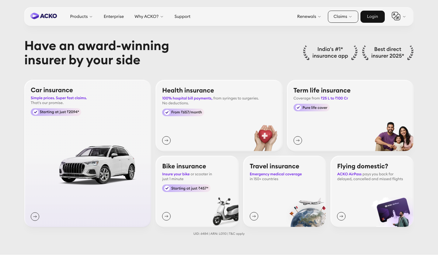
Do #EBEBEB band ground; cards #F5F5F5, radius 28px, padding 21px, the soft stacked shadow with white inner highlight; ~14px gaps; one tall card left (Car, 417x487 outer, 375x445 inside its 21px padding, with a lavender rgba(155,118,249,.32) wash at its foot) and smaller cards in a 2-row grid; each card: Euclid 600 21px title top-left, a #6815E5 bold lead line, a gradient price pill, a 3D product render bottom-right and a 28px outlined arrow circle bottom-left.
Frosted product-card mosaic on grey · Home hero (Car, Health, Term life, Bike, Travel, Flying domestic? cards); app-services band
Do A 1280x62 pill 24px from the top (y 24, inside 80px side margins), #F5F5F5 with backdrop-filter blur(8px), radius 21px, the soft stacked shadow; logo left (gradient logo ~105x21), Products / Enterprise / Why ACKO? / Support at 14px; right: Renewals, outlined Claims (1px #141414, radius 10.5px) and black Login (#141414, radius 10.5px).
Floating glass nav pill · Top of every page (home, about, media-kit, car)
9 mins average wait
9 mins average wait
Violet-to-pink gradient numbers · Home trust band (7 mins, 94.3%, 24x7); purple-pink price pills
Do The three-facet play/Möbius mark in #B59CF5/#926FF3/#4E29BB; as a background it becomes a thin outline (#121212 or lilac line-art, ~0.6px at 655px wide) or a giant frosted white-blue 3D object; in published creatives a white outline of the mark frames the subject's face.
Möbius mark as motif · Logo, favicon, media-kit hero line-art, about-hero frosted 3D render, brand-guide covers, creative photo overlays
Black rounded buttons · Every CTA on home, media-kit and about
Along for every ride
Along for every ride
Category-colour headline creative · Published creative examples (Auto, Health, Life, Travel)
Specimens use sample copy, not ACKO’s.
The web's signature is a mosaic of frosted grey cards.
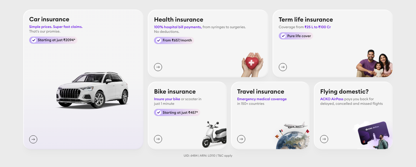
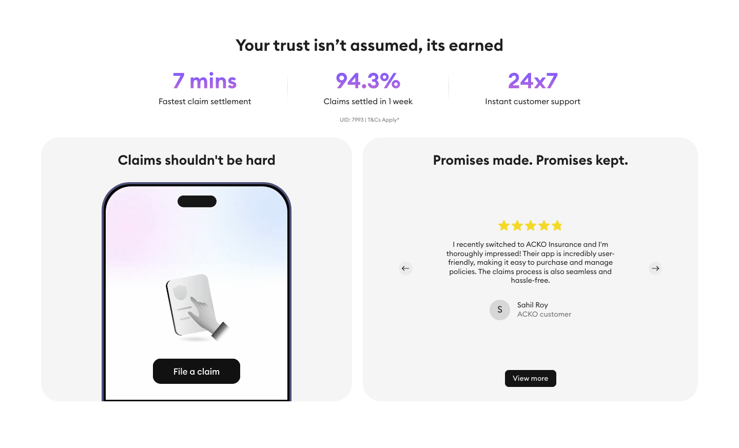
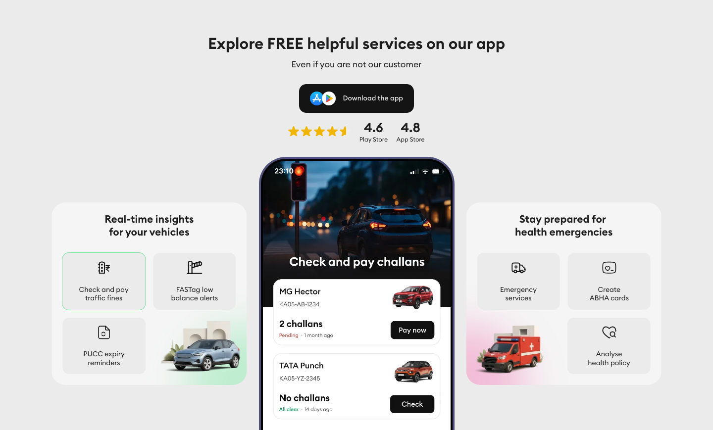
The web's signature is a mosaic of frosted grey cards. The kit: #F5F5F5 cards with 28px radius and an inner white highlight on #EBEBEB; a floating blurred nav pill; gradient price pills with a tick disc; arrow buttons in thin outlined circles; trust laurels around award claims; phone-frame mockups showing the app (claims video, challans screen); UID/T&C disclaimer lines in 10.5px under every offer.
Source: acko.comacko.com/about-us
Icons are thin, one-colour outlines.


Icons are thin, one-colour outlines. Glyphs are #121212 or black with round caps and joins, ~2.5px rendered at 42px; arrows inside outlined circles. One filled exception: the white tick disc with #3D138E check. No coloured icon set is published.
Source: acko.com/about-usacko.com
Glossy 3D product renders do the illustrating.



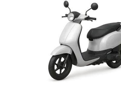


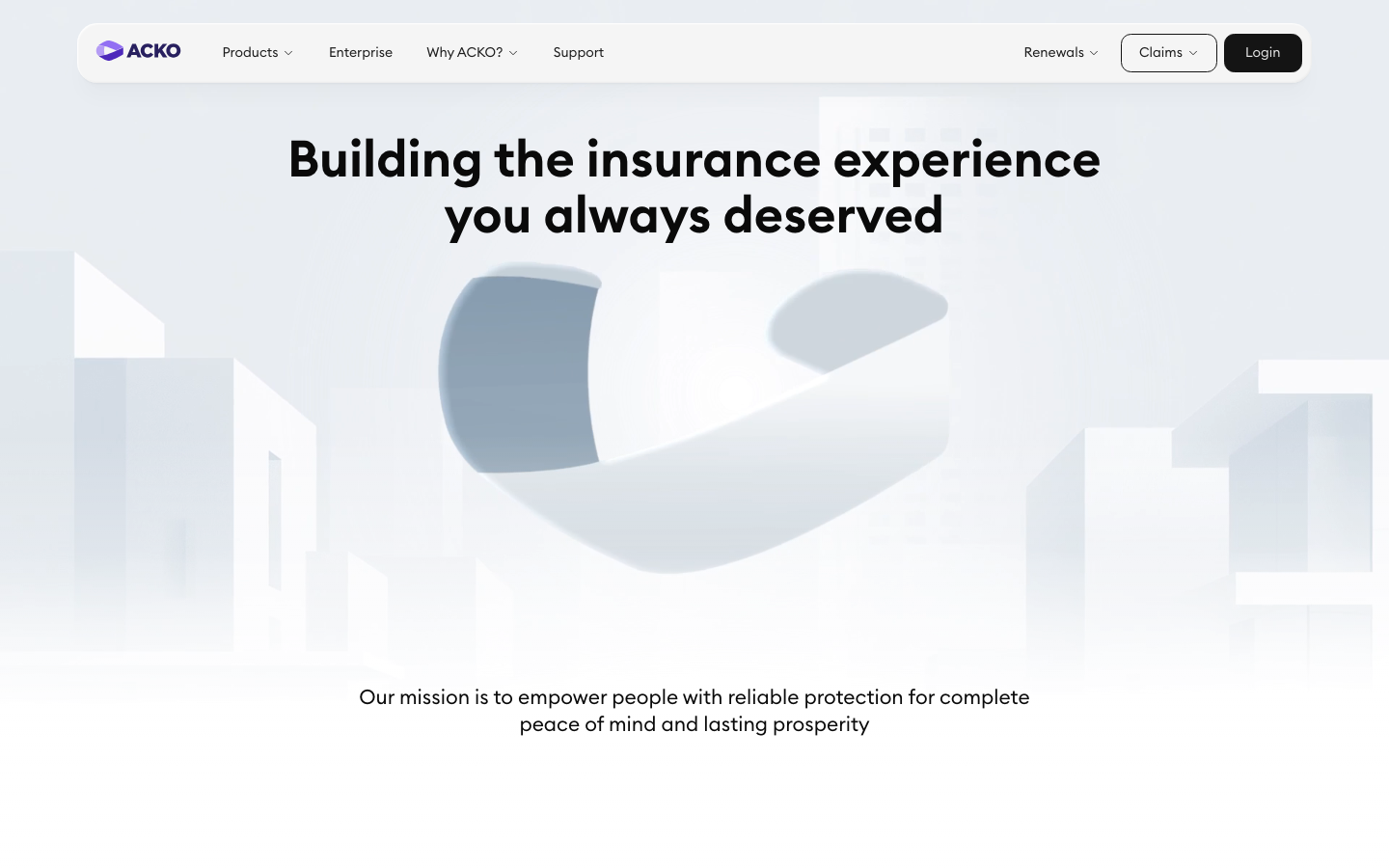
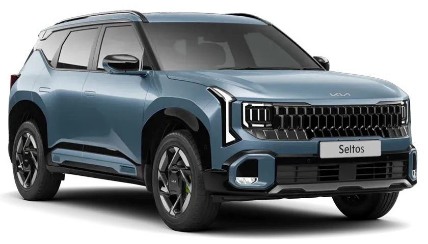
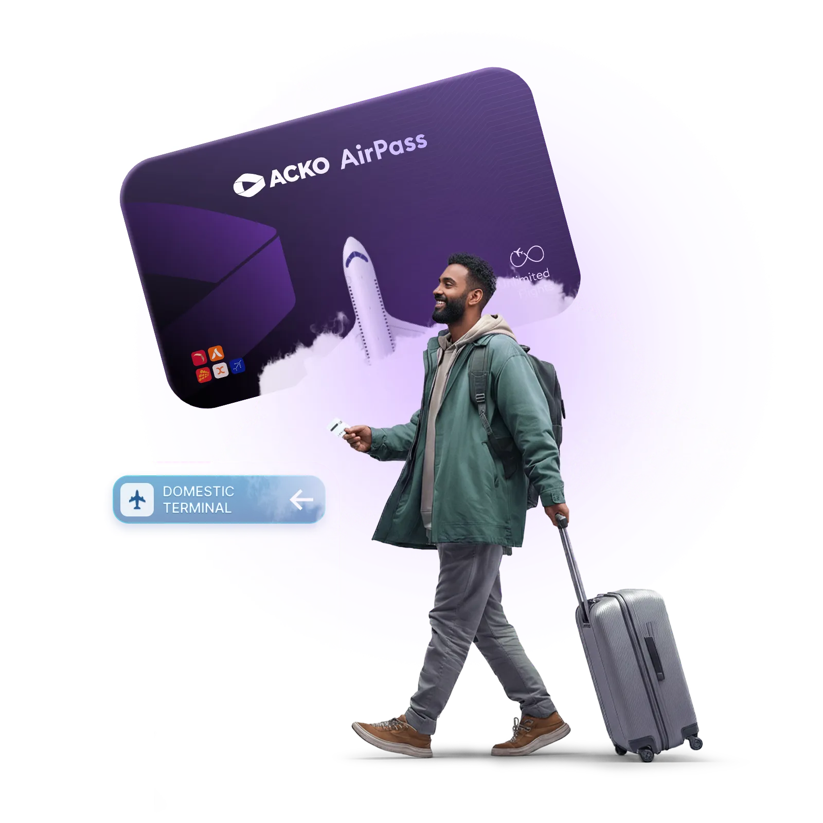
Glossy 3D product renders do the illustrating. Each is softly lit and cut out on a transparent ground: a white SUV, a red heart with a white cross held in hands, a white scooter, an Earth globe with a plane and flags, a purple AirPass card, an ambulance and a silver car on pastel gradient pads. They sit bottom-right in cards, partly cropped. Brand-level imagery uses a frosted white-blue 3D Möbius mark in a misty city (about hero) and thin line-art of the mark. Paid display ads also use flat-illustration people (a family over a pink cross); the site does not.
Source: acko.comacko.com/about-usacko.com/media-kitadstransparency.google.com/advertiser/AR06187744814818131969
Real Indian people, smiling in warm natural light.

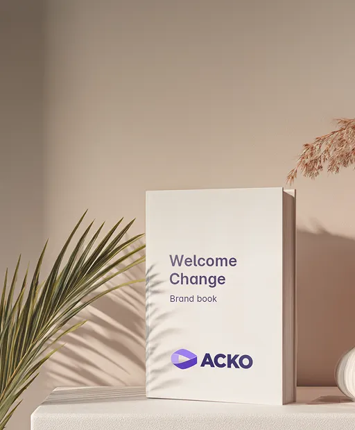


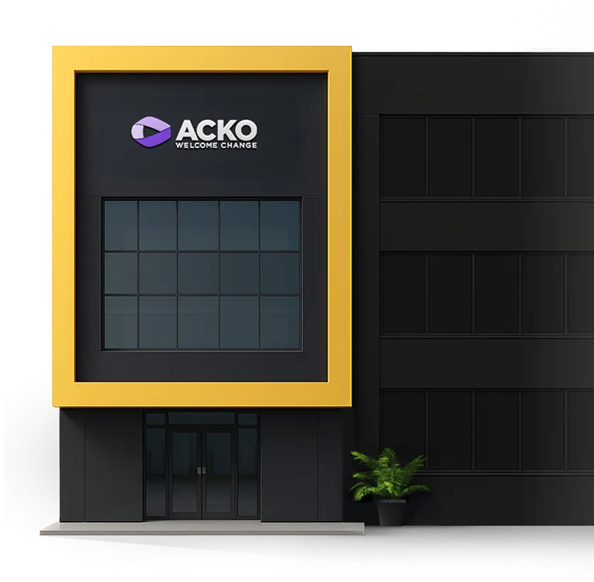
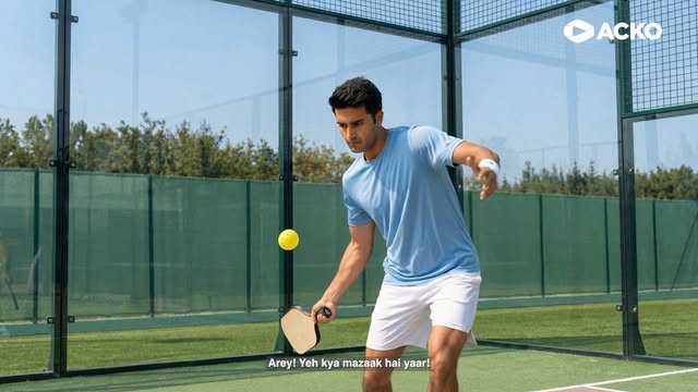

Real Indian people, smiling in warm natural light. Families look up or toward each other (father carrying daughter on shoulders with mother, on beige); leadership portraits in circles, natural backgrounds; brand-world shots are calm still lifes and mockups in warm beige light (brand book on a plinth with palm shadow, a WELCOME CHANGE billboard on a stone wall). Photos sit in rounded cards (21-35px radius) and never carry body text; creatives in the guide crop the photo with a big curve and overlay a white outline of the mark.
Source: acko.com/about-usacko.com/media-kitinstagram.com/ackoindia
1440 desktop: content 1280px inside 70px band padding (80px from the edge); a floating nav pill; bands alternate #EBEBEB (with frosted cards) and white, then a black-gradient footer. Home is a card mosaic; about is centered heads, a timeline, a dark leadership band, logo grids and a news list; the car page is a purple-gradient hero then a long white explainer.
Measured from acko.com's computed styles and bounding boxes at 1440 and 390 on the home, about, media-kit and car-insurance pages, headless Chromium, 2026-11-17.
| Measure | Desktop | Phone |
|---|---|---|
| Page margin | 80px | 14px |
| Section padding | 70px | 36px |
| Card gap | 14px | 14px |
| Navigation | 62px | 62px |
Home hero H1
Euclid Circular B · 42px (phone 21.5) · line 1.125 · weight 600
Stat number
Euclid Circular B · 42px (phone 21.5) · line 1.125 · weight 600
Section head
Euclid Circular B · 31.5px (phone 21.5) · line 1.11 · weight 600
Big-card head
Euclid Circular B · 26.25px (phone 17.9) · line 1.2 · weight 600
Card title
Euclid Circular B · 21px (phone 14.35) · line 1.25 · weight 600
Rating number
Euclid Circular B · 26.25px (phone 26.9) · line 1.2 · weight 600
Lead / sub
Euclid Circular B · 17.5px (phone 12.55) · line 1.3 · weight 400
Stat caption
Euclid Circular B · 15.75px (phone 10.75) · line 1.33 · weight 400
Body / nav / button
Euclid Circular B · 14px (phone 14.35) · line 1.25 · weight 400
Card sub
Euclid Circular B · 12.25px (phone 10.75) · line 1.29 · weight 400
Disclaimer
Euclid Circular B · 10.5px (phone 9) · line 1.33 · weight 400
How ACKO’s own landing pages are built, observed on acko.com, 2026-11-17. The full measurements are in spec.md.


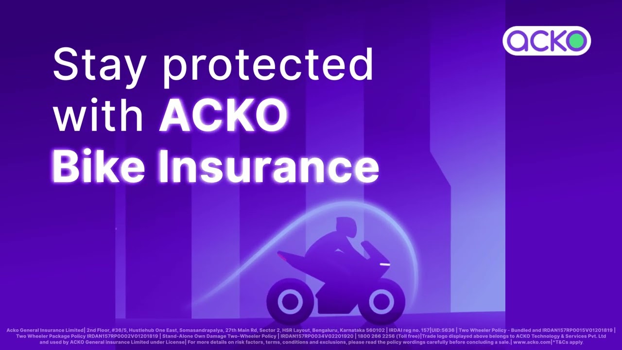
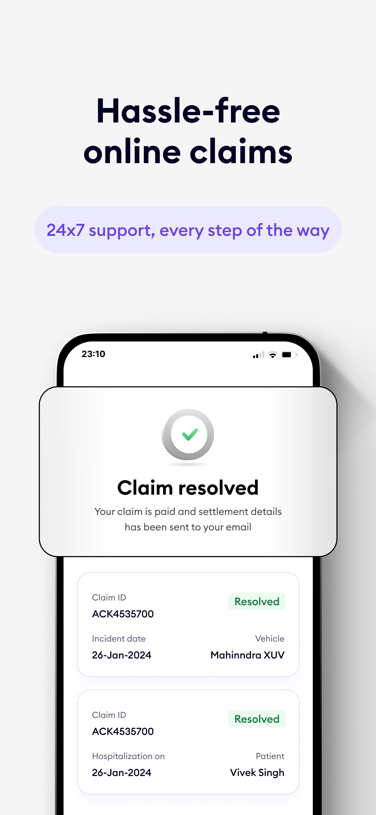
Landing page from acko.com; Social post from ACKO's share cards (og:image) and Instagram reel covers; campaign creative and Print from the published brand guide. Paid social ad, Video thumbnail and Store screenshot rows are observed from ACKO's Google ads, YouTube ad thumbnails and App Store listing.
| Format | Loudness | Must appear | What varies |
|---|---|---|---|
| Landing page | #EBEBEB page, floating #F5F5F5 glass nav pill (logo left, black Login right); left-aligned Euclid 600 42px H1 with award laurels at right; frosted product-card mosaic (28px radius, 3D renders, #6815E5 lead words, gradient price pills); white trust band with three gradient numbers; testimonial card with stars; black rounded buttons; UID disclaimer lines; #262626-to-black footer with white logo. | Band order and whether a band is grey with cards or white; product pages may open on the purple gradient hero (#150F30 to #6233CC) with a green Check Prices. | |
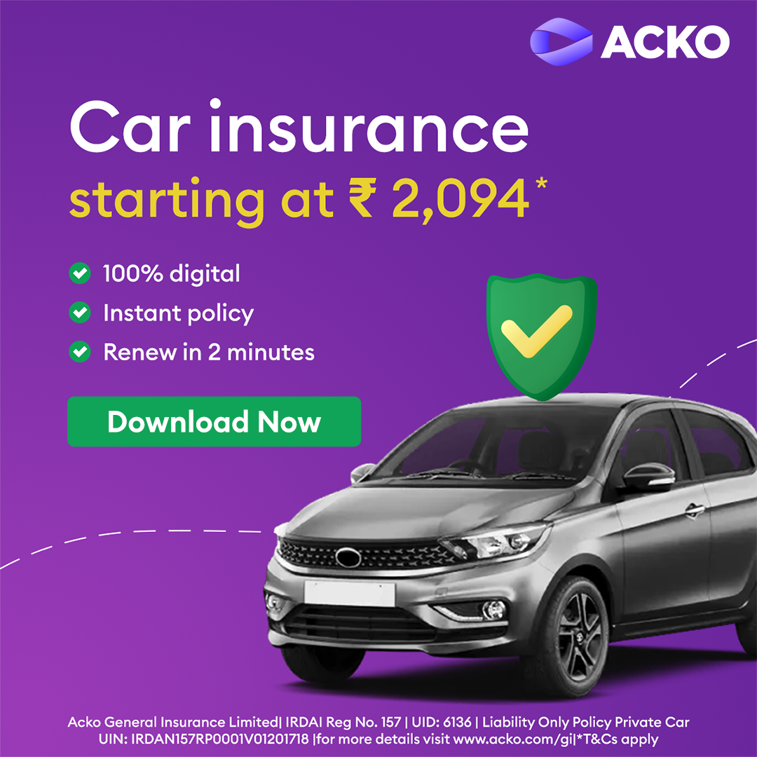
| Social post | Square purple-gradient ground (about #2B066D to #6000BC with a lighter #820BD7 glow), white ACKO logo top right, a bold sans headline of 1 to 3 short lines top left in white with one line in yellow, lime or pink, a 3D render or cut-out person on the lower right bleeding off the edge, one small button under the copy, a thin legal strip at the foot. | The accent colour and the legal-strip colour follow the product: health pink (#E35EA3), bike orange (#E69B3B), travel green (#85BA53), car dark purple (#310979). The seasonal car offer is a flat red ground with a white car. Text-only share card: centred logo, centred Euclid 600 head, one line, on a pale ground (og-about). | |
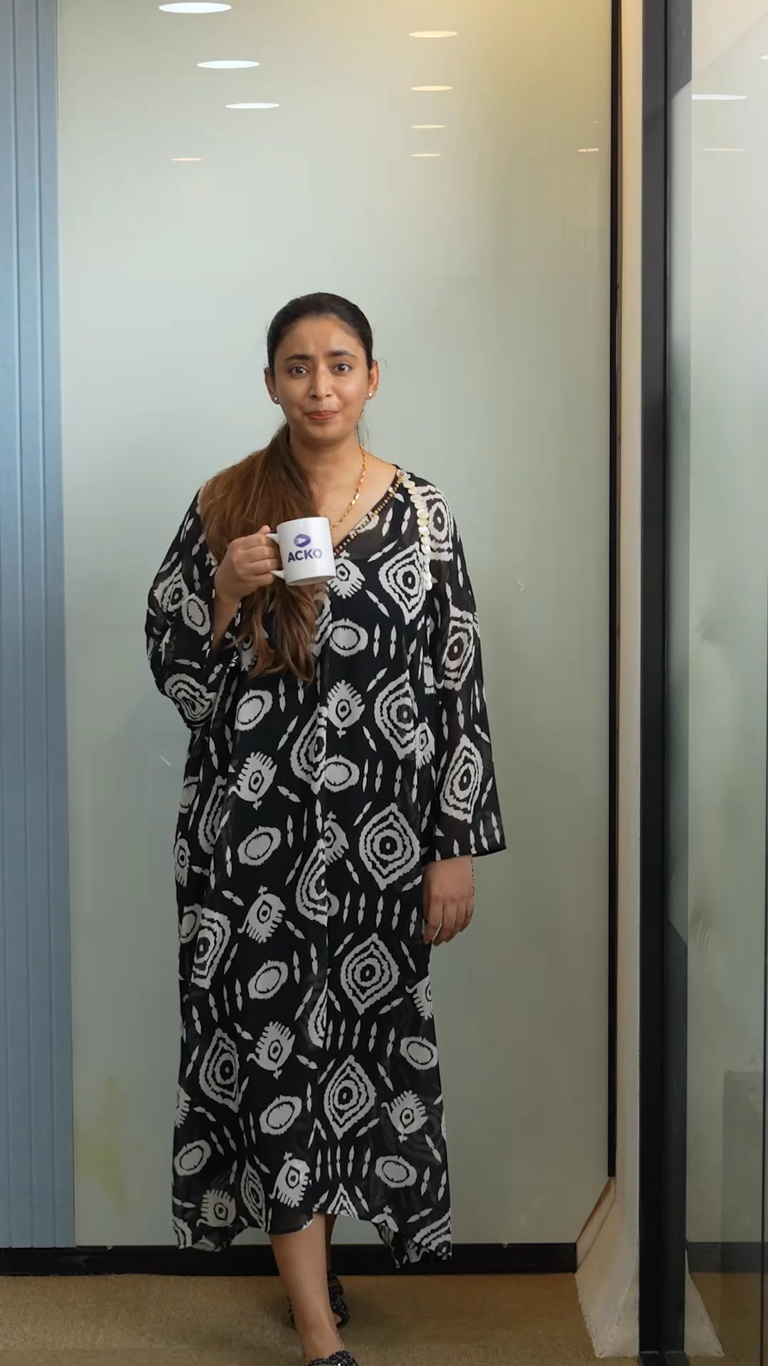
| Social post, portrait (reel cover) | Full-bleed cinematic photo still (people mid-reaction, real Indian settings), white ACKO logo (mark-white + wordmark) about 13% of width top-right, Hinglish subtitle line in white at the bottom when the film has dialogue | subject and setting | |
| Campaign creative (guide, landscape) | White ground, a big category-colour headline in Gotham Black (stand-in Montserrat 900, -0.02em), a #121212 product line, the #ACKOCheckKarLena hashtag in #926FF3, primary logo bottom-left, a photo of real people at right cropped by a curve in the category colour with a white outline of the Möbius mark over it. | Category colour (Sunshade, Cerise, Picton Blue, Leafy Green) and photo; the curve can be an arc edge or a bottom bar. | |
| Print / OOH | Gotham Black headline set big and tight in Crocus 600, Gotham Medium sub-head in deep indigo, Gotham Book body, Gotham Light disclaimer at the foot; tagline lockup allowed on building and OOH; billboard example: white panel with logo and CAR • BIKE • HEALTH • LIFE • TRAVEL in spaced caps, beige photo panel with lowercase welcome change. in white. | ||
| Paid social ad | Square purple-gradient ground (about #2B066D to #6000BC with a lighter #820BD7 glow), white ACKO logo top right, a bold sans headline of 1 to 3 short lines top left in white with one line in yellow, lime or pink, a 3D render or cut-out person on the lower right bleeding off the edge, one small button under the copy, a thin legal strip at the foot. | The accent colour and the legal-strip colour follow the product: health pink (#E35EA3), bike orange (#E69B3B), travel green (#85BA53), car dark purple (#310979). The seasonal car offer is a flat red ground with a white car. | |
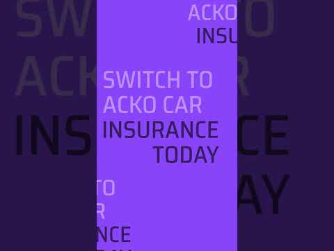
| Video thumbnail | Two registers: a film still (people in a real setting, white logo top right when the film carries it, one white subtitle line at the bottom) or a purple title card (white bold head, white logo top right, product line art). | Still or title card; the subtitle is the film's line, not a headline. | |
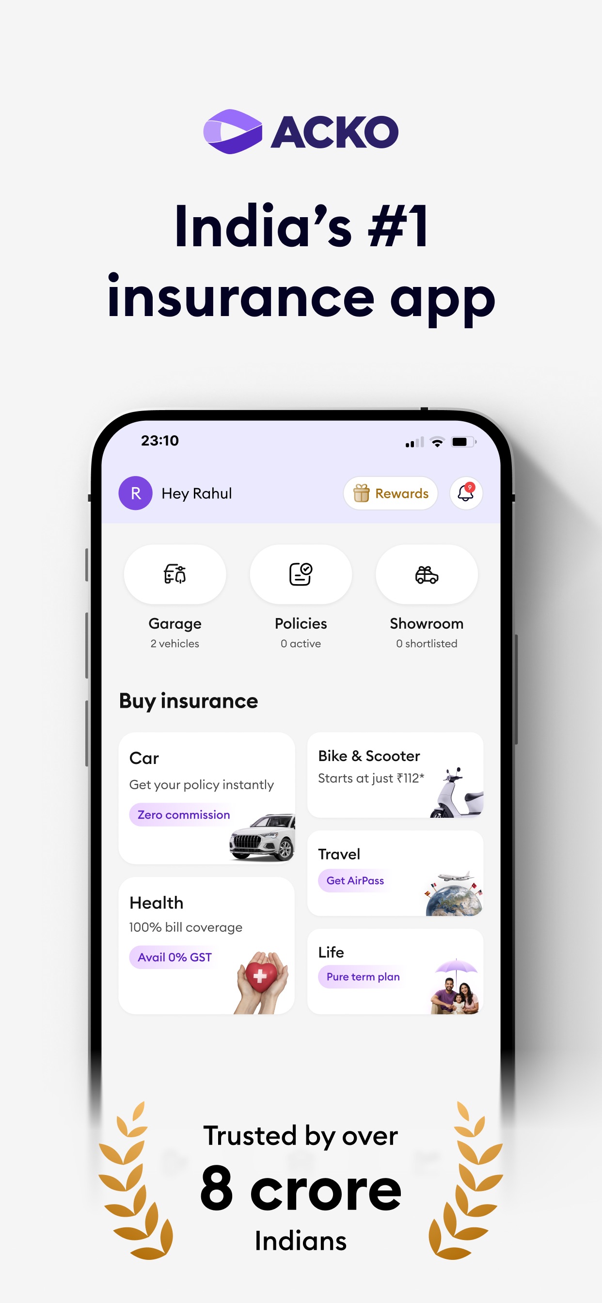
| Store screenshot | Pale lilac ground, a centred two-line bold head, a lilac pill with one support line, and a phone showing the app cropped at the bottom with a soft shadow; one UI card may break out of the phone frame. | The first screenshot adds the logo on top and a laurel proof line (Trusted by over 8 crore Indians). |
Source: acko-cms.ackoassets.com/ACKO_Brand_Guideline_b4fdf555b0.pdfacko.com/media-kitacko.comacko.com/about-us
Your name and logo, ACKO’s system.
Talk about my brand Use this brand in Claude
Get your brand audit Put your brand in Claude What goes in a brand book
Each value is marked published, observed, our reading or our recipe, with its source. Checked 2026-11-17. Not affiliated with ACKO.
Tell us what you want to make. We’ll talk through how to put these ideas to work for your brand.