The lesson
Frame a competitor comparison around the operating tradeoff the buyer feels before you compare individual features.
The move
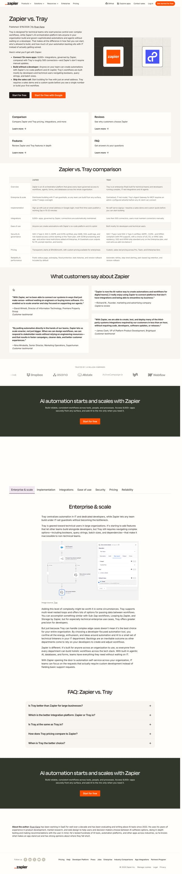
The page opens with "Zapier vs. Tray" and a thesis: Tray is for technical teams that want control, while Zapier lets anyone build and govern automations and agents. It follows with three bullets, including "Connect 12x more apps," "Build without a developer," and "Skip the sales call," plus start-for-free CTAs. A two-column "Zapier vs. Tray comparison" table covers overview, enterprise scale, implementation, integrations, ease of use, security and governance, pricing, and reliability. Below that, customer quotes and a "Compare features: Zapier vs. Tray" section expand the argument category by category.
Why it works
- Our readThe opening separates the two products by who can build, making the comparison about operating model rather than only feature lists.
- Our readThe quick bullets give the reader three concrete reasons to keep reading: app coverage, no-code building, and starting without a sales call.
- Our readThe comparison table arrives before the longer feature sections, so a buyer can get the short answer before reading the detailed case.
What not to copy
Don't copy the specific no-code-versus-developer framing unless that is the real buying tradeoff in your category. Keep the pattern of a sharp opening thesis, a scannable comparison table, and deeper sections for the claims that need support.
More from Zapier

More landing pages








Steal it for your brand.
Tell us what you want to make. We’ll talk through how to put these ideas to work for your brand.