The lesson
Open a competitor page by naming who each product is for, then prove that split with a table before the long explanation.
The move
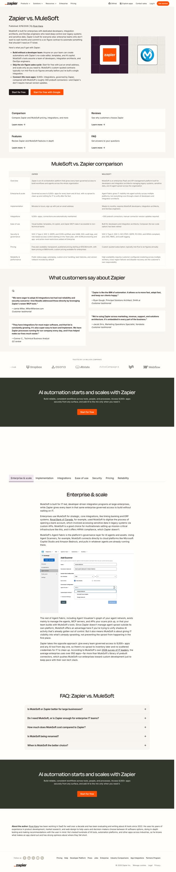
The page opens with "Zapier vs. MuleSoft" and a direct claim: MuleSoft is built for enterprises with dedicated developers, while Zapier is built for enterprise teams that do not want to wait on an IT ticket. It follows with "Here's what you'll get with Zapier" and three bullets on no-code building, starting free, and connecting more apps, plus two start buttons. Below, a navigation row points to comparison, reviews, features, and FAQ, then a "MuleSoft vs. Zapier comparison" table compares overview, scale, implementation, integrations, ease of use, security, pricing, and reliability. The page then adds customer quotes, a trust band, and a longer "Compare features: Zapier vs. MuleSoft" section organized by feature tabs.
Why it works
- Our readThe hero states who each product is built for, so the comparison starts with fit before it asks the reader to study features.
- Our readThe first bullets translate the choice into practical differences: who can build, how buying starts, and how many apps are available.
- Our readA compact comparison table appears before the longer sections, giving skimmers the answer and letting evaluators keep reading for detail.
What not to copy
Don't copy the developer-versus-everyone framing unless that is truly the difference in your market. Keep the structure of a blunt fit statement, a short proof list, a summary table, and then deeper feature sections.
More from Zapier

More landing pages








Steal it for your brand.
Tell us what you want to make. We’ll talk through how to put these ideas to work for your brand.