The lesson
Reposition a familiar product for a new audience by changing the visual language around it.
The move
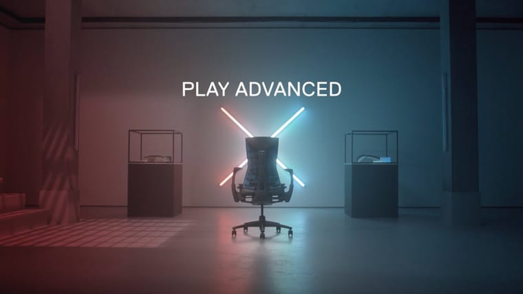
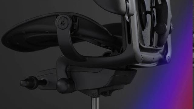
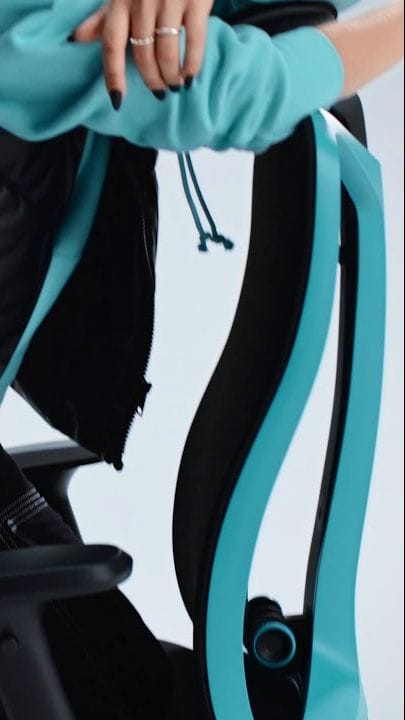
The video opens on the red-and-black Sayl Gaming Chair in profile against a gray studio background, then cuts through close-ups of the red grid back, arm, seat, and rear frame. The edit uses vertical white UI marks, small diagram graphics, and spec-style labels over the product footage. The post copy says “Elevate Your Gaming Setup” and names “Style, Support, and Comfort,” tying the design shots to gaming benefits.
Why it works
- Our readThe side-profile opening makes the silhouette easy to recognize before the video moves into details.
- Our readClose-ups of the mesh back and frame turn the chair’s design features into proof points without needing a presenter.
- Our readThe technical overlays borrow from gaming and product-spec visuals, helping an office chair feel native to a setup-focused audience.
What not to copy
Skip the generic upgrade language if your brand does not already have design credibility. Keep the move of using studio detail shots and category-native graphics to reframe the same product for a different buyer.
More from Herman Miller

More social posts



Steal it for your brand.
Tell us what you want to make. We’ll talk through how to put these ideas to work for your brand.