The lesson
Build a switcher page around the reasons a buyer is leaving their current setup before you ask them to choose your product.
The move
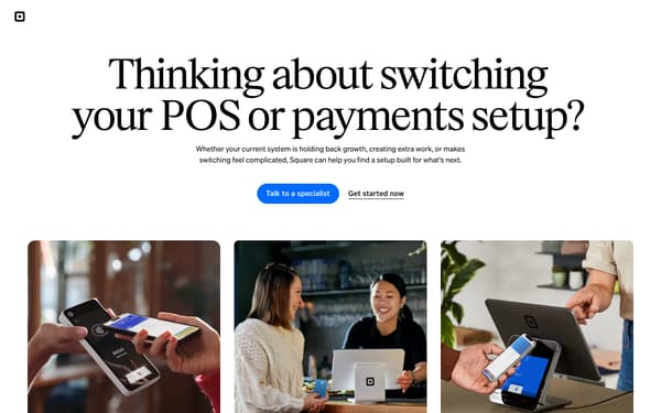
The page opens with “Thinking about switching your POS or payments setup?” and two calls to action, “Talk to a specialist” and “Get started now,” followed by photos of Square hardware in use. It then offers “Get help finding the right setup” beside a lead form, with three steps: tell Square what you use today, explore options, and move at your own pace. Below, “What’s prompting you to consider switching?” breaks the decision into outgrowing a POS, simplifying disconnected tools, and getting help switching, then adds a Miss Lily’s quote. The page closes with “What to look for when your current setup no longer fits,” an industry section under “See how Square supports businesses like yours,” and a final prompt to talk to a specialist or create an account.
Why it works
- Our readThe first action is not a product choice but “Talk to a specialist,” which fits a buyer who already feels switching is complicated.
- Our readThe section “What’s prompting you to consider switching?” mirrors common frustrations before making the Square pitch, so the reader can find their own reason first.
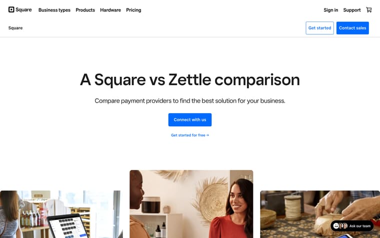
- Our readThe comparison grid keeps Square next to “Other POS providers” across practical concerns like pricing, hardware, and setup instead of arguing in general claims.
What not to copy
Don't copy the switcher framing unless your buyer is likely replacing an existing system, not buying for the first time. Keep the structure that starts with the pain of switching, then makes the next step a guided conversation.
More from Squareup
More landing pages








Steal it for your brand.
Tell us what you want to make. We’ll talk through how to put these ideas to work for your brand.