The lesson
Build a comparison page as a series of plain contrast blocks, each tied to a buyer concern and followed by proof or a next step.
The move
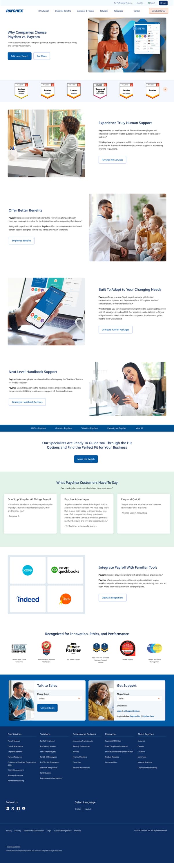
The page opens with "Why Companies Choose Paychex vs. Paycom" and the line "From customizable plans to expert guidance, Paychex delivers the scalability and service Paycom can’t." It then moves through contrast sections including "Experience Truly Human Support," "Paychex HR Services Offer Better Benefits," "Employee Benefits Built To Adapt to Your Changing Needs," and "Next Level Handbook Support." After links to other competitor pages, it adds a switch CTA, customer quotes, a section on integrations, recognition badges, and a "Talk to Sales" form.
Why it works
- Our readThe hero states the comparison in one sentence, then gives both a talk-to-an-expert path and a plans path for readers at different buying stages.
- Our readEach section names a Paycom limitation first, then answers it with the Paychex capability, so the reader does not have to infer the contrast.
- Our readCustomer quotes and award badges sit between comparison claims and the sales form, adding proof before the page asks for contact details.
What not to copy
Don't copy the competitor-claim format unless you can support each contrast clearly. Keep the repeating pattern of competitor limitation, your answer, and a relevant next click.
More from Paychex
More landing pages








Steal it for your brand.
Tell us what you want to make. We’ll talk through how to put these ideas to work for your brand.