The lesson
Put the competitor table after your main argument so buyers compare features through the frame you want.
The move
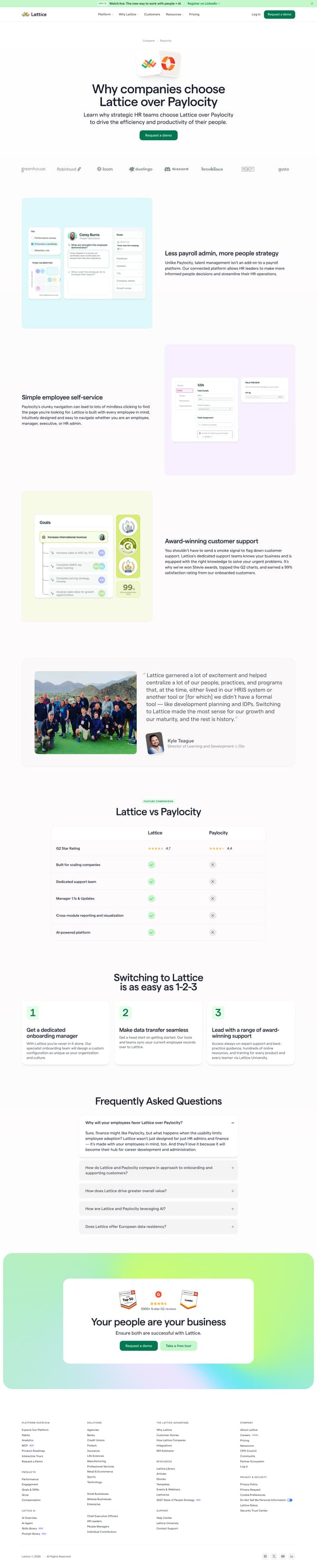
The page opens with “Why companies choose Lattice over Paylocity” and a request-demo button, followed by a logo row. It then frames the difference under “Less payroll admin, more people strategy,” with sections for employee self-service and customer support. A customer quote from Kyle Teague appears before a “Lattice vs Paylocity” feature comparison table with G2 Star Rating, support, manager workflows, reporting, and AI. The lower half turns migration into “Switching to Lattice is as easy as 1-2-3,” then closes with FAQs and a final “Your people are your business” demo call to action.
Why it works
- Our readThe hero names the competitor and the choice directly, so a buyer who searched the comparison knows they landed in the right place.
- Our readThe page argues from three concrete differences before the feature table, which gives the comparison a point of view instead of only a checklist.
- Our readThe onboarding section answers the switching concern with a simple sequence, so the page handles the fear of moving systems before the final demo ask.
What not to copy
Don't copy the payroll-platform critique unless your product is clearly positioned away from payroll administration. Keep the structure of claim, proof, table, switching steps, and FAQ.
More from Lattice




More landing pages








Steal it for your brand.
Tell us what you want to make. We’ll talk through how to put these ideas to work for your brand.