The lesson
Frame a comparison page around one repeated tradeoff, then prove it with a quick column match and a longer feature checklist.
The move
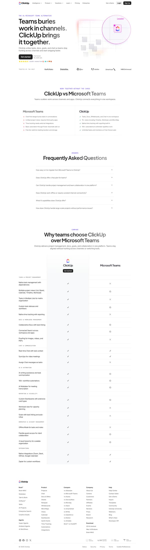
The page opens with "THE #1 MICROSOFT TEAMS ALTERNATIVE" and the headline "Teams buries work in channels. ClickUp brings it together.", followed by a Get started call to action, review proof, and a trusted-by logo row. The next section, "ClickUp vs Microsoft Teams", puts two columns against each other: Teams is described as chat-first and dependent on add-ons, while ClickUp lists tasks, docs, whiteboards, chat, views, time tracking, automations, and a Free Forever plan. A "Frequently Asked Questions" section answers migration, free-plan, collaboration, offline, AI, and scale questions. The page then closes its main body with "Why teams choose ClickUp over Microsoft Teams" and a category-by-category comparison across tasks, docs, chat, AI, reporting, workspace management, and integrations.
Why it works
- Our readThe hero says the whole argument in one contrast, so the reader knows the comparison is about work being buried in channels versus gathered in one workspace.
- Our readThe first comparison block uses short paired bullets, which lets a reader scan from Microsoft Teams limits to the matching ClickUp capability.
- Our readThe FAQ handles migration, the free plan, offline work, AI, and large-scale projects before the deeper feature checklist, so practical objections arrive before the long table.
What not to copy
Don't copy the Microsoft Teams critique unless your product really replaces chat, tasks, docs, and reporting in one place. Keep the structure of a sharp hero contrast, a short two-column comparison, objection-led FAQ, and a deeper checklist for evaluators.
More from ClickUp



More landing pages








Steal it for your brand.
Tell us what you want to make. We’ll talk through how to put these ideas to work for your brand.