
The lesson
Lead a competitor comparison with the buyer's everyday pain, then make the detailed table do the slower proof work.
The move
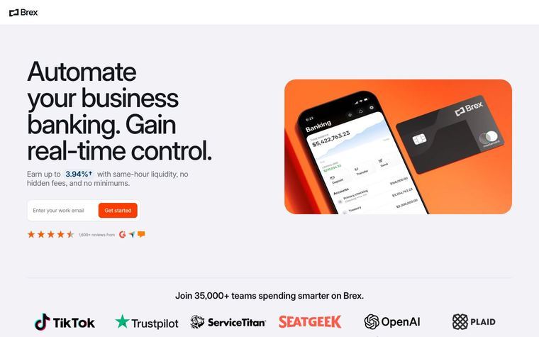
The page opens with "Say goodbye to expense reports and annual fees." beside a product image and a work email form. It follows with logo proof under "Join 30,000+ teams spending smarter on Brex," then a section called "3 reasons finance leaders choose Brex over Amex" covering card consolidation, workflow automation, and rewards. The middle of the page is a long "See how Brex compares to Amex" table grouped by rewards and perks, fees and costs, credit and spending, software, and integrations and support. It closes with review quotes, "Switch to Brex today," and a Brex vs Amex FAQ.
Why it works
- Our readThe hero does not start with a generic corporate card claim; it names expense reports and annual fees, which gives the comparison a concrete reason to exist.
- Our readThe "3 reasons" section gives readers a short argument before asking them to parse the fuller comparison table.
- Our readGrouping the table by jobs like fees, credit, software, and support lets different buyers jump to the risk or cost they care about most.
What not to copy
Don't copy the direct competitor framing unless you can back it with specific feature, fee, and workflow differences. Keep the structure of pain-led hero, short reasons, detailed grouped table, and final switch CTA.
More from Brex


More landing pages








Steal it for your brand.
Tell us what you want to make. We’ll talk through how to put these ideas to work for your brand.