
The lesson
Organize a competitor page by buying questions first, then let the feature table carry the detailed contrast.
The move
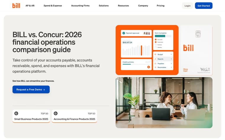
The page opens with "BILL vs. Expensify: 2026 financial operations comparison guide", a short promise about BILL's financial operations platform, and a "Request a Free Demo" CTA. It then gives "Top reasons to choose BILL over Expensify" before a long comparison table covering spend and expense, accounts payable, accounts receivable, support, mobile app, and integrations. Below the table, "Customers are saving time and money with BILL" pairs named customer quotes with trust numbers, followed by "Even more reasons to love BILL" product cards. The page closes with "See BILL in action", a short demo request form, and an FAQ list.
Why it works
- Our readThe hero states the whole scope up front, naming accounts payable, accounts receivable, spend, and expenses before asking for a demo.
- Our readThe comparison is broken into product areas like "Spend & expense", "Accounts payable", "Accounts receivable", support, mobile app, and integrations, so readers can jump to the part they care about.
- Our readCustomer quotes and trust metrics appear after the table, which gives the comparison a proof section before the final "See BILL in action" demo form.
What not to copy
Don't copy the breadth unless your product really spans several financial workflows and you can support each claim in the table. Keep the structure of a short reason-to-believe section, a categorized comparison table, proof, and a demo form.
More from Bill
More landing pages








Steal it for your brand.
Tell us what you want to make. We’ll talk through how to put these ideas to work for your brand.