The lesson
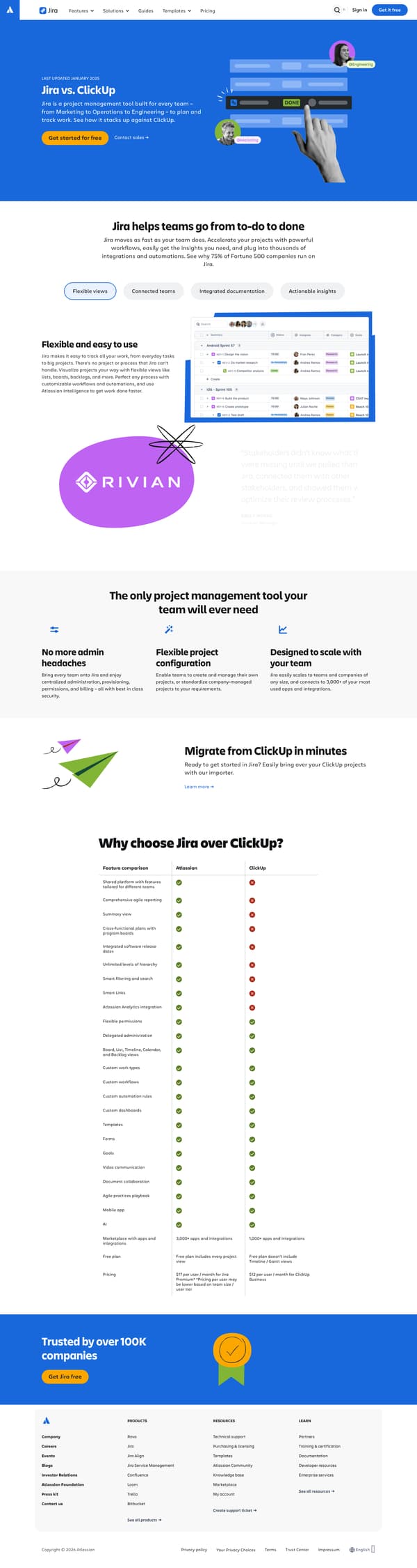
Put the migration path before the comparison table so switching feels possible before the buyer studies the feature gaps.
The move
The page opens with "Jira vs. ClickUp" and says Jira is built for every team, with calls to "Get started for free" and "Contact sales." It then argues "Jira helps teams go from to-do to done" with four benefit labels, a customer quote, and a section called "The only project management tool your team will ever need." After a short "Migrate from ClickUp in minutes" block, the page turns to "Why choose Jira over ClickUp?" and a feature comparison table, then closes with trust copy and another Jira free CTA.
Why it works
- Our readThe hero states the category and competitor immediately, so a reader knows this is about how Jira stacks up against ClickUp, not a general product page.
- Our readThe page makes Jira feel broad before it compares, moving from flexible views and integrated documentation to administration, configuration, and scale.
- Our readA migration section appears before the feature grid, so the reader sees a path out of ClickUp before weighing every checkbox.
What not to copy
Don't copy the long checklist unless your product has enough named capabilities to make the comparison feel useful. Keep the order: broad product promise, switching reassurance, then the competitor grid.
More from Atlassian







More landing pages








Steal it for your brand.
Tell us what you want to make. We’ll talk through how to put these ideas to work for your brand.